2016/06/29

Pens and Ink: Pelikan M250 Black Dark Green with Akkerman Bezuiderwoud Groen

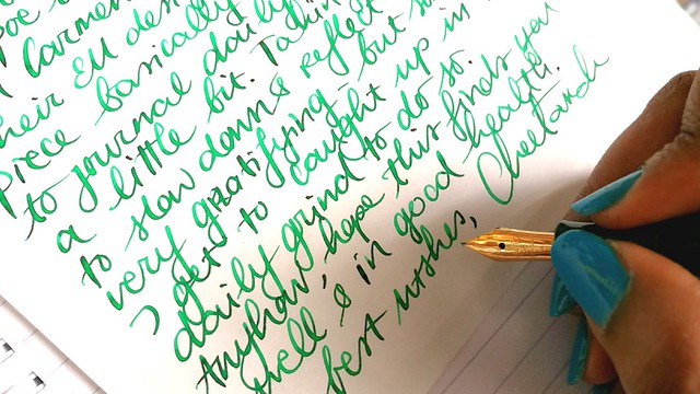
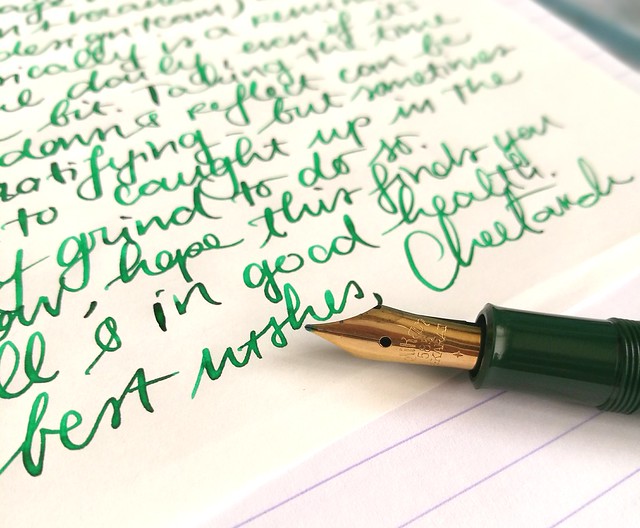
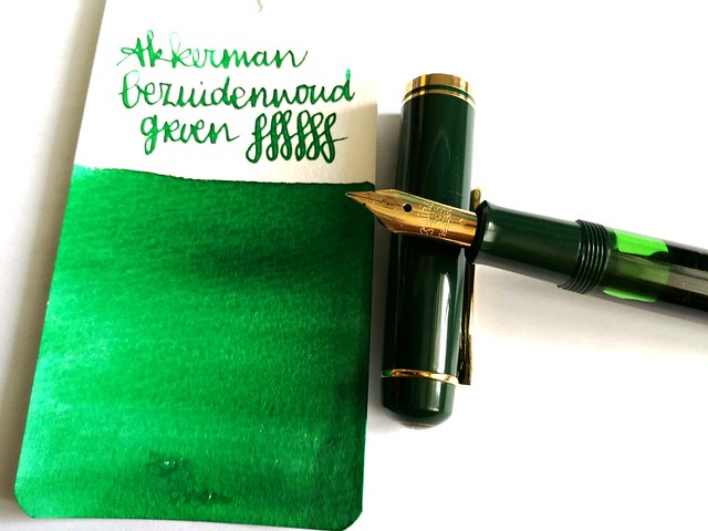
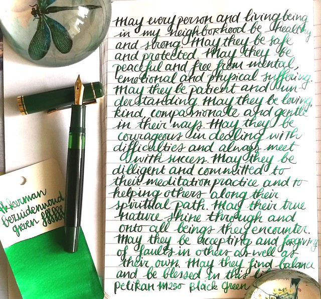
Last week on Pens and Ink I posted about my recent Pelikan M2xx series finds. This week I'm highlighting a pen I mentioned in that post, the Pelikan M250 Black Dark Green fountain pen. And I paired it with a nice green ink from Akkerman's The Hague ink line; Bezuiderwoud Groen.

pens and ink M250 green
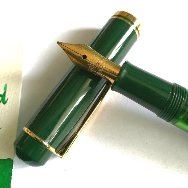
First let me start by telling you that the nib you see on the pen here is not the original nib. I replaced the original 14k gold M nib (which is the only difference between a Pelikan M200s and M250, the first has a steel nib and the latter a gold one) with an older nib from one of my vintage N400 Pelikans. Why? This nib just deserves to be in rotation more. I've seen David B. from Too Many Inks do this all the time with his Pelikans (Swap nibs between his pelikans) And I decided to give it a go myself. It did not disappoint :)

pens and ink M250 green
A closer shot of the vintage nib that came with my Pelikan N400 Tortoise, which I sadly can't properly use as the piston fill mechanism is broken. I love the engraving in the older nibs! The pen itself is one from before 1997 and there is a version from after 1997, which has a different cap and printed logo on it instead of engraved. More info on the difference between the M2xx's series, including this one you can find at The Pelikan's Perch and Reuttinger web site.

pens and ink M250 green
So I've chosen to pair the pen with an ink that would match the green cap and piston knob and since I decided to use more of my samples (and then decide if I want a full bottle of it ;) I went though my Akkerman samples and picked this one. I think if you translate "Bezuidenwoud Groen" from NL to ENG you would come up with "South Woodsy Green" ... Maybe? Just FYI, it's not a "real" word in Dutch either! Oh well, it doesn't matter, it definitely looks like a forest green to me! I think the nib also brings out great shading this ink has/ Another great green shading ink from their line is definitely the Groenmarkt Smaragd, which is more of a moss green. I own a bottle of that one, because it came with the pen I bought then. Even though I really like the color of this ink, I am not so sure I need this ink in a full bottle... yet.

writing letters
In other fun news: as you may know I've been a Swap-Bot Ambassador for a while now and recently I have started blogging for Swap-Bot Blog as well. Rachel, the owner of Swap-Bot, and I discussed it when she was visiting Amsterdam last April and we met up for dinner (together with her husband Travis and their wee one Kenneth). She is such a super fun person, kind, energetic (she runs marathons!) and creative. I'm happy to be able to contribute and collaborate with her on this project. The first blog post is already up and you guessed it, it's about writing with fountain pens! I also am hosting a swap "Fountain Pen Pal Summer 2016 Edition" on the 'bot to help more people just get out their fountain pens and write with them more. Hop on over to the swap page to see more info on the swap and the sign up dates. You have to be a member of Swap-Bot to participate though, if you're not a member yet, it's super easy, just make a profile and read these FAQ's to get you started. And perhaps I'll see your in the mail?

writing letters
Thanks for stopping by and have a great day.

namasté
2016/06/28

Craftorij Summer Challenge week 3

Another update on the Craftorij Summer Challenge. Oh boy, these have been so fun to make! But finding the time to do them daily has been proven yet again a challenge. Last year this was around the time I called it quits, but not this year! Maybe it also helped that I combined the challenges with some swap bot swap themes, to give me some extra incentive to make the pieces. At any rate, I'm actually quite proud I made it this far :) 

I left off with number 14 last time and continuing on from that...

CZC15
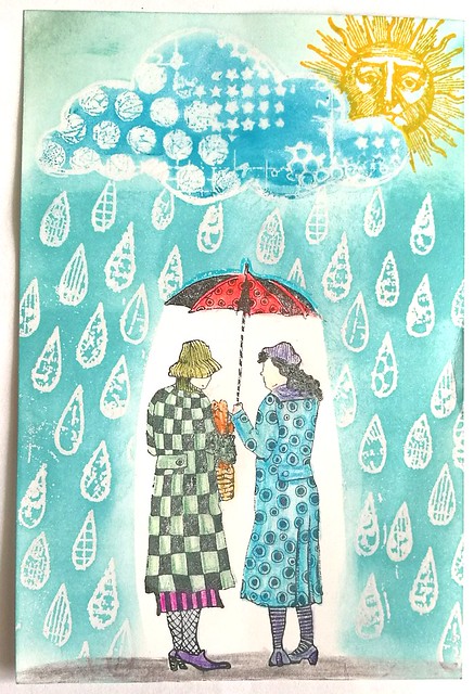
CZC 15 - The Weather
Sadly an accurate description of dutch summer :( Stamps from Viva Las VegaStamps and Carabelle

CZC16
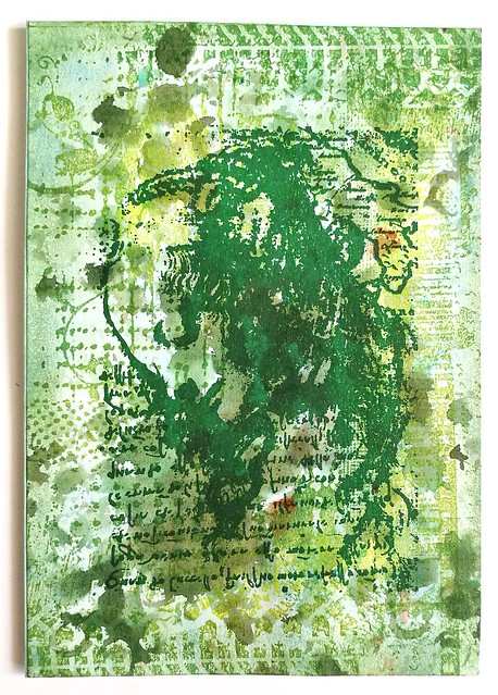
CZC 16 - Monochromatic
I also entered my piece "no love for the lovelorn" for this theme, ut I had a fun Brusho Olive green background which I made with bubble plastic which I wanted to use. Then stamped the grunge background from Carmen's Veranda and the Leonardo Woman from Lost Coast Designs over it. 
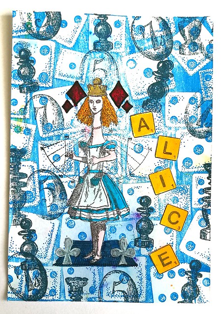
CZC17
CZC 17 - Boardgame
This theme got me stumped for a while... Not sure how I feel about this piece, but well, it does come together as a whole. Stamps from De Stempelwinkel and background from Carmen's Veranda. 

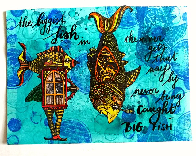
CZC18
CZC18 - Use markers with 2 different nibs
Background is a piece left over from the Nickle Teal Time Wash which I stamped Katzelkraft rounds on. The stamps with fish on them are from Viva Las VegaStamps. I used letraset promarkers to color this and the quote from Big Fish "The biggest fish in the river gets that way by never being caught" is written with a tombow fudenosuke brush pen. I sent this piece for the swap WIYM- Handmade postcard Fish swap.

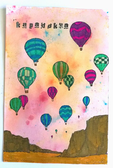
CZC19
CZC 19 - (Item of) your bucket list
Something I ticked off my bucketlist earlier this year, a hot air balloon ride at sunrise over Kapadokya. Stamp is from Carmen's Veranda on a brusho background. Colored in with Tombow brush markers. 

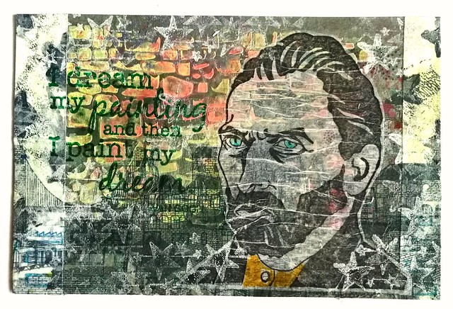
CZC20
CZC 20 - use an image of a man
Van Gogh stamp is from Carmen's Veranda and the VG quote stamp is from Magenta. Background is structure paint through a stencil, brusho effects, left over mono prints from the gelli plate, and a cityscape napkin. This piece is sent for "HMPC put a napkin on it" swap.
CZC21
CZC 21 - the 7th word of the 17th page of a book
I used Blind Willow, Sleeping Woman from H. Murakami, the word is "blushed"
background is a test paper piece where I cleaned off stencils and stamps. The woman is from Viva Las VegaStamps and the text from PaperArtsy. 


That was it for week 3!
Thanks for stopping by and have a great day :)

namasté 

2016/06/27

Mailart Monday: Hera's Texture

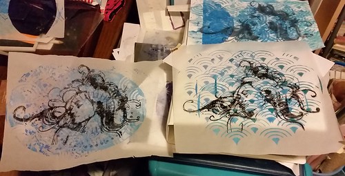
In follow up on this past Friday's post on my studies of Hera, I'm sharing a mailart piece I made with one of the gelli plate prints combining that large stamp.

Made with one of last night's print. I call her Mystique #gelliprint #monoprinting #mixedmediaartist #mixedmedia #paint #oilpastels #ecoline #xmen #mystique #comicbookinspired #creativeexpression #creativitytakescourage

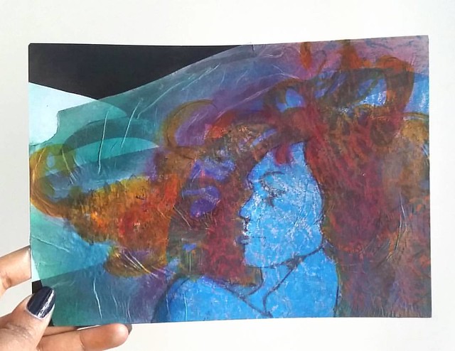
I took one of the prints made on tracing paper and did a ghost print of Hera (printed with staz-on cleaner & ink residue) on the monoprint. I adhered the piece onto a large art postcard which I used as background. Then went to color the hair with red and orange ecoline ink. I also used some metallic purple and green pearl rub ons for color on the edges. With a black fine liner I drew in the silhouette of the face a bit sharper. And even though I liked how she looked this way, I wanted to add more texture to it.

texture mail art
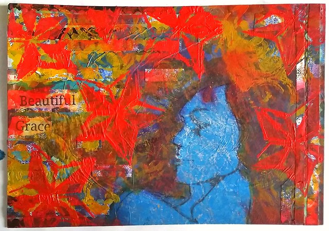
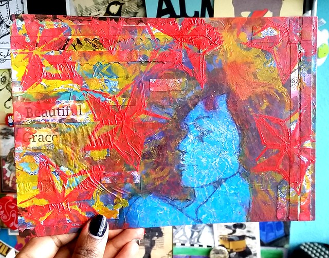
So I added more left over gelli printed paper which I cut into strips and added to the side, took some orange and red paint and stencils to overlap the piece in swirls and stars. The words "beautiful grace" come from this great large Misc. Words rubber stamp from Lost Coast Designs. I sealed the piece with a layer of artists gel medium to finish it. I just love how this piece feels, literally! So much texture! And I think Hera's transformation made her look a lot like X-men's mystique here, don't you agree?

hera texture
The colors also look a lot more vibrant in daylight!

This piece was sent for the TPS (the printing shop) mail art swap via swap bot. In this group we swap items made using your gelli prints in some way. It's a great way to use the mono print "left over's" into something else, like mail art.

Thanks for stopping by and have a wonderful day.

namasté

2016/06/24

Art Journal: A study of Hera part 3

The Studies of Hera continues. This week experimenting with some gelli printed/mono printed left overs and Staz-on ghost printing.
hera studies
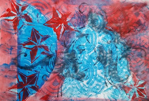
I used one of my print experiment pages from my first session of gelli print madness. The blue print on these pages are all gelli print. I stamped Hera a few times on various papers (some gelli printed) and let it out to dry. I took the print on the top right for this experiment.

hera texture
My Hera stamp was all covered with black Staz-On ink residue from all the stamping and I took my Staz-On cleaning dauber to clean the stamp. A lot of ink then came loose and didn't want to waste it. I made an imprint of the mixture of stamp cleaner and ink residue on the gelli printed paper. I like how the mixture reacted to the paper, It gave a nice blotchy effect, but also surprisingly sharp lines as well. I added the stars with a foam piece and acrylic red paint through a stencil to give it some more texture. I then dabbed my foam piece into a bit of water and started coloring the page with the red diluted ink. I left Hera, the half circle and the insides of the stars blue.

hera texture
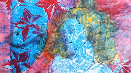
I wanted to add another color to create more distinction, so I took some yellow ecoline and a brush and colored her hair. The yellow is really bright and gives it a nice contrast with the blue and red. And I called this page done and adhered it to my art journal.

hera texture
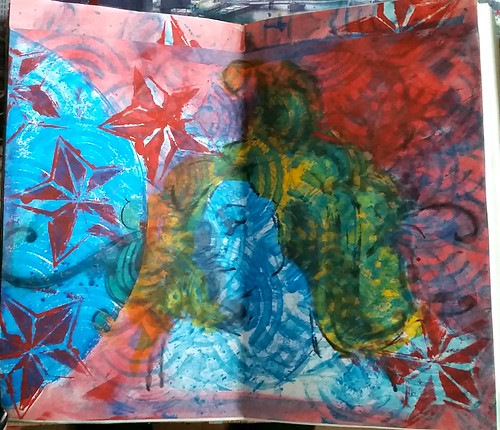
I needed to trim the sides to it fitted in the journal. With the trip I covered the top white space up. Another completely different look of Hera this way. And I love the combination of this stamp with the gelli printed back ground. More of this to come in another studies I'm sure!

Thanks for stopping by and hope this inspires you to experiment with ink residue/ghost printing on your gelli prints.

Have a great weekend.

namasté

2016/06/22

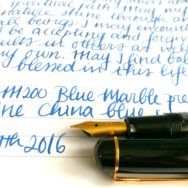
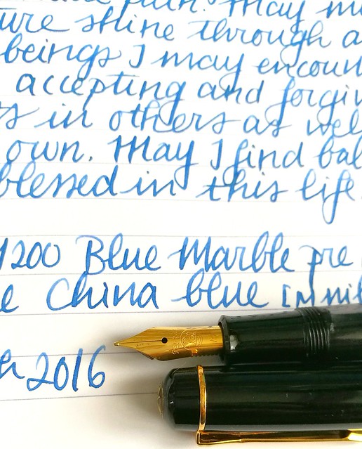
Pens and Ink: Pelikan M200 Blue Marble with Diamine China Blue

Pelikan M200
A little while ago I got a great deal on a few out of production Pelikan M2xx series fountain pens and among them is the blue marble released before 1997. I chose to pair this ink with Diamine China blue ink, which I had a sample of thanks to the Gouletpens Inkdrop from years ago. It was high time to use up the sample! 

A flock of birds #pelikan #m200 #beingpelikan #Fpgeeks #fountainpennetwork #fountainpens #fountainpen #dailycarry #dailywriting #journal #gratitutejournal #handwriting #handwritten #specialedition
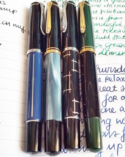
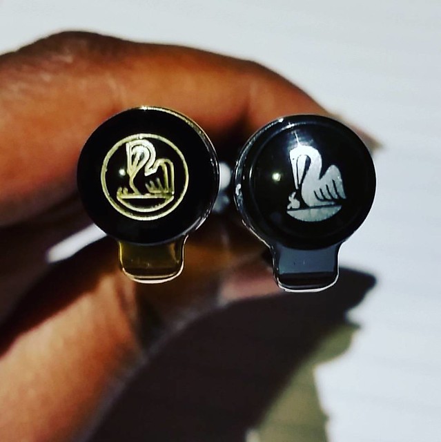
These were just sitting on a shelf at an office supple store just waiting to be picked up. From left to right: M215 blue stripe, M200 Blue marble (pre 1997), M215 Orthogons, M250 Black Dark Green (pre 1997). Most of these are not in production anymore, but the blue marble can still be found. I have a pre 1997 version though and those are a little different from the newer productions. The more clear distinction being the imprint on the cap.

A couple of chicks #pelikans #Fpgeeks #FPN #fountainpennetwork #fountainpen #beingpelikan #finnial #pelikan #funtainpen
The cap on the right is engraved and pens after 1997 have a painted logo like you see on the right. More info on how you can identify and estimate a date of your Pelikan in this very useful blogpost by the Pelikan's Perch. Joshua's site is super useful as he compiled a database of various Pelikan designs with the factual data. He also does reviews on Pelikans and keeps other fans updated on the latest of the brand. Definitely worth following if you are also into Pelikan pens! Specific info on the various Blue Marble pens I found this post on FPN very useful. 

pelikan m200 marble
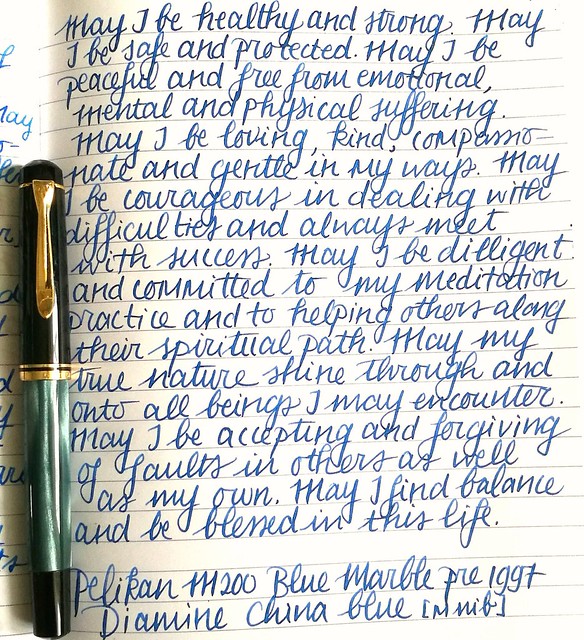
Back to the pairing. I written a page in my mindfulness metta meditation journal and it's a pretty nice conventional blue. It has some shading to it but not a lot. The medium steel nib In have on my pelikan has some spring to it and shows off some of the shading.

Pelikan M200

It's a toned down blue but I quite like it. Cleans out easily and well behaved, it's a fun suitable for work kind of color. More reviews on the ink you can find on Peninkcillin and PenPaperInkLetter blogs. 

I have a few other suggestions for work-safe blues in this post: The Namiki Falcons and Blue Hues experiment. What is your fave "suitable for work" kind of blue?

Thanks for stopping by and have a great day!
namasté

2016/06/21

Craftorij Summer Challenge week 2

We're already in the 4th week of the Craftorij Summer Challenge and it's high time for an update.

CZC7
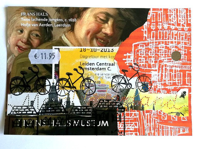
CZC 7 - use a price tag
Made a collage with travel/train card and related rubber stamps. The Frans Hals painting overlay is a left over from a postage stamp sheet.

CZC8
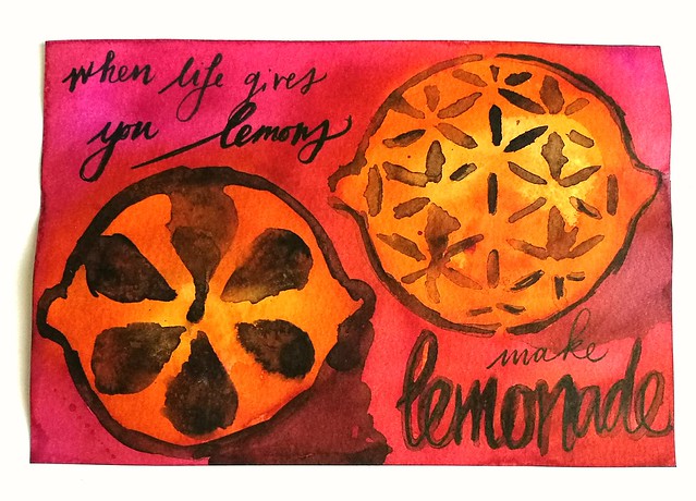
CZC 8 - Use the colors orange and pink
I used india ink and ecoline.

CZC9
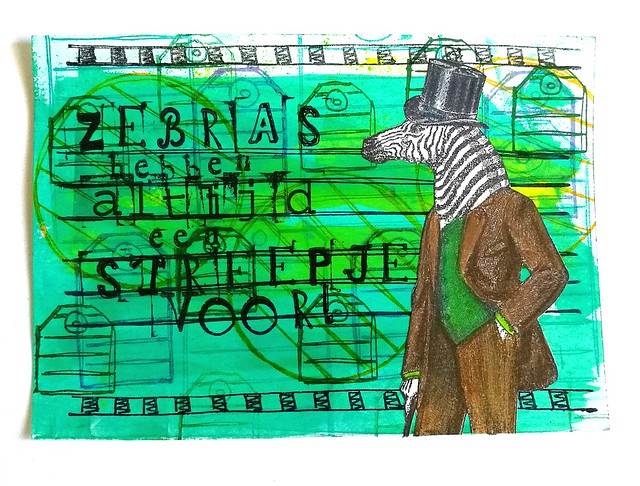
CZC 9 - use stripes
The background is a mix of acrylic paints, dylusions journaling stamps and the zebra is from Katzelkraft which I colored in with Derwent Artists Pencils.

CZC10
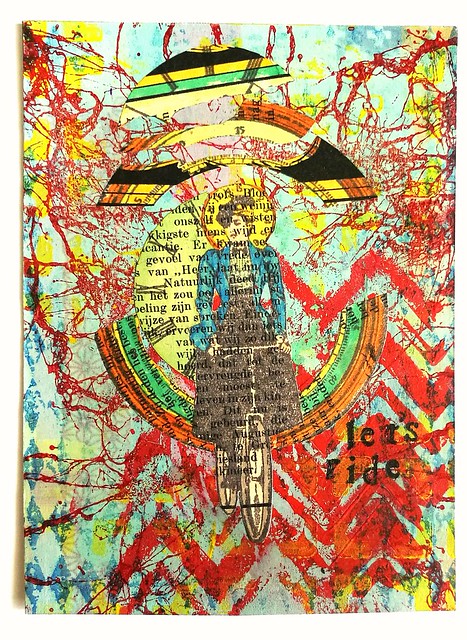
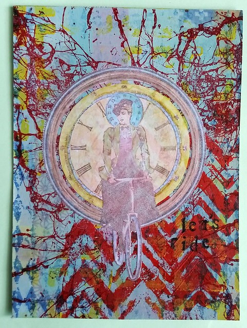
CZC 10 - use a vehicle/transportation device
Mixed media background, paint, stencils and rubberstamps. The bike lady stamped on magazine paper and decomposed.

lets ride
This is a variant edition, I made this one before the one above. I stamped the bike lady on tracing paper, colored it with promarkers as well, but the colors were just too "flat" so I took it off.

CZC 11 is to create a foldout to your card, but I skipped that one (for now)...

CZC12
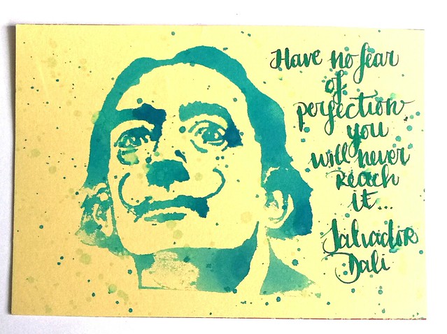
CZC 12 - use a quote
Earlier this year, I showed you how to make these "splatter pop art cards" and I used one of them for this challenge. I added the quote "Have no fear of Perfection, you will never reach it" from Salvador Dali with my Waterman 52 with Diamine Steel Blue.

CZC 13's theme is Christmas, but I also skipped that. It's depressing to think about Christmas in the middle of summer (but well, it's crappy rainy weather anyway...)

CZC14
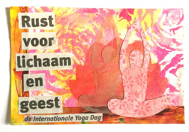
CZC 14 - Use the text of a newspaper headline
Background is made on a marbled paper, with ink and stencils. The lotus and yoga pose lady are from my Making Memories slice (made a stencil out of the lotus) The newspaper text I used says "rest for body and spirit - international yoga day" - which is actually today!

With this I'll conclude today's post and will do some yoga exercises which I have not done in a long time!

Thanks for stopping by and have a great day!

namasté

2016/06/20

Mailart Monday - VLVS mail art swap

Last week in my mailart outbox edition, I mentioned I participated in the Viva LasVegaStamps mail art swap via their facebook event page. I wanted to show you the mailart pieces I made for that swap up close today.

VLV mail art swap may
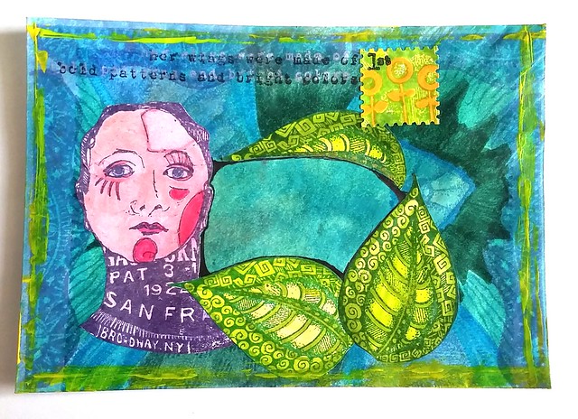
The idea of the swap was to decorate the envelope (any size, I used the regular 6x4 inch size) with VLVStamps and mail it off to your partner. This is the envelope I made. I started with putting some blue and green distress stains on my craft sheet, sprayed water over it and then pressed the envelope on it to get some blue color on the envie. I took masking tape and masked a part in the middle of the envelope where the address needed to be. Then I stamped a large zentangle stamp designed by Sandra Strait which I won years ago, over it and colored it with blue tombow markers. I stamped the woman and leaf design on separate paper, colored them & adhered to the envelope. I also made a faux postage stamp with one of the stamps and a paper punch. The edges are done with a credit card type card and some yellow paint.

rubberstamp package won!
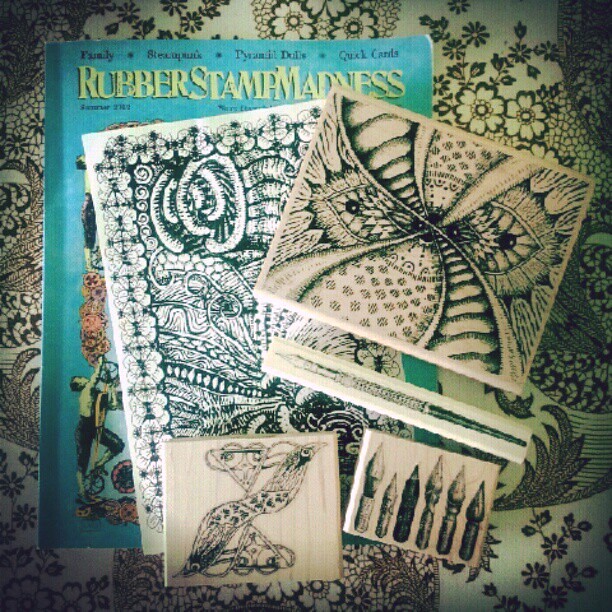
This is the package I won via Sandra's blog 4 years ago and I still enjoy using these stamps a lot!! The large stamp on top is the one I used for the back ground.

VLV mail art swap may
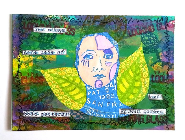
I also made a note card to go with it. The background is paint in teal, lilac and yellow. And I used the same woman and leaf stamp plus other from plates 1436 and 1457. I love the designs from Mary Vogel Lozinak a lot! I'm very happy how it turned out and I hope the recipient will too :)

awesome mail day! thanks to julie for this great mail art through #VLVS @vivalasvegastamps mailart swap :) #mailday #snailmailrevival #snailmail #mailart #swap #post #echtepostiszoveelleuker #echtepost #mixedmedia #rubberstamps
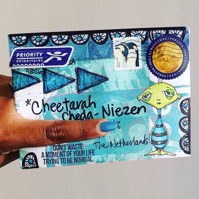
And this is what I received from my partner, Julie :) I absolutely love it! And yes the colors she chose does match the nail polish I am wearing perfectly, LOL!

Hopefully VLVSGroupies will do another mail art trade. I really enjoyed this one :)

Thanks for stopping by and have a great day.

namasté
2016/06/18

Paper Goods: On a field trip with Fieldnotes Pocket Notebook

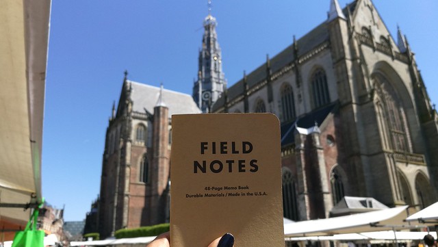
At the beginning of this month a fun bi-annual event took place in Haarlem, the Stripdagen. I went there on Sunday afternoon and it was so much fun! The weather was great and there was so much to see and to do. I decided to bring along a little pocket book and asked various artists to sketch in them, like I did last time.
fieldnotes fieldtrip
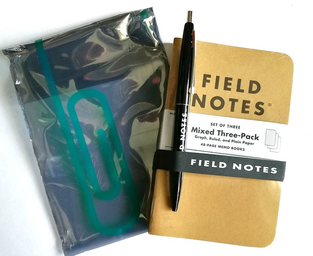
This year I took with me a Fieldnotes pocket notebook for the artists to sketch in. I kindly received a mixed Compilation set from Mishka from Bureau Direct for review purposes and it's great for an every day carry. Lightweight and a great small size (a6) for a purse/handbag or a back pocket.
fieldnotes fieldtrip
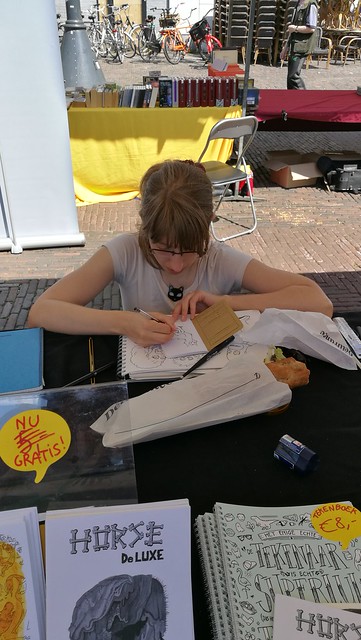
In the compilation set you will receive 3 Fieldnotes pocket notebooks (I received a mix of ruled, plain and graph paper, but you can get a 3 pack of any of the variations mentioned), one Fieldnotes band of rubber and one click ballpoint. It came in very nicely packaged in a Bureau Direct Logo plastic sleeve. I decided to take the graph notebook with me on this trip and I have a few shots of it being used in action. I asked all whom wanted to participate to draw me a kitty :)

fieldnotes fieldtrip
The first drawing in the book is done by Leslie Saurus. I really love her artwork!

fieldnotes fieldtrip
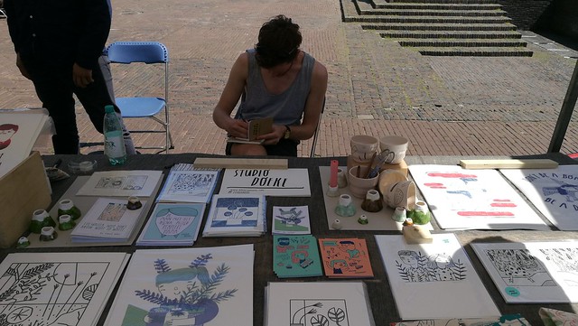
Also got a fun drawing from Doeke from Studio Doeke. He was a cheeky one and did not draw a cat for me, like last year he simply refused to do that. But he did make a fun drawing in there none the less. I suppose it will be a running gag from now on, in two years he will not draw a cat for me either ;)

fieldnotes fieldtrip
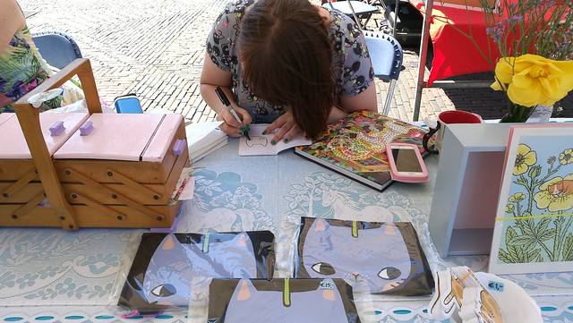
And of course, when you love cats, Anne from Pony People cannot be missed in the compilation! Here she is drawing one of her cute kitties (similar to the ones you see on the T-Shirts on her stall) in my book.

fieldnotes fieldtrip
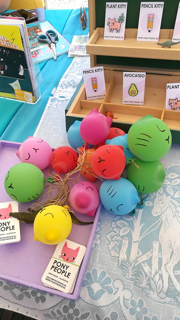
Her stall was so cutely decorated with these fun cat balloons! And look at those cute pins! I definitely got one of the pencil kitties for myself.


I do not have an in action shot of all the drawings, but here is a video of all the drawings made in the book. People used all kinds of materials to draw in it, like pencils, fineliners and even sharpies. I asked them to use one page and not the back because I didn't want any drawings being over lapped by bleed through. It was a fun and successful fieldtrip and the notebook was almost filled up all the way. At the end I added some kitty stamp prints on the cover of the notebook and named it "the kitty edition".
fieldnotes fieldtrip
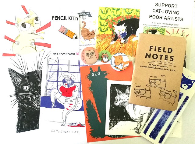
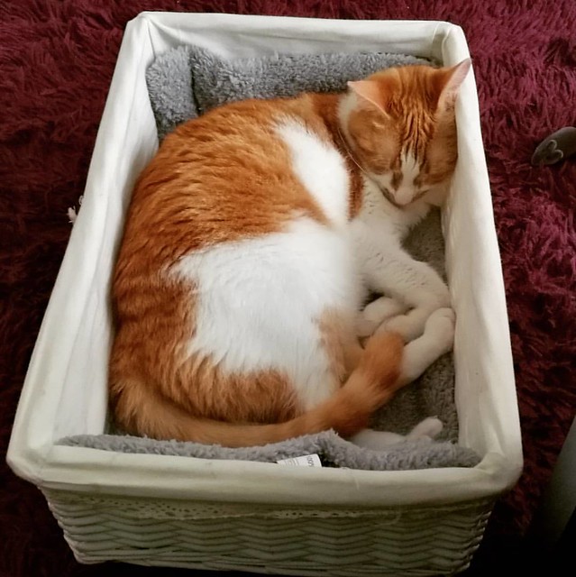
The kitty related loot from the Stripdagen. I definitely support cat-loving poor artists! Everything is super awesome, but the best thing I got was a customized drawn pin of Meesha (left to the notebook) which says "It's always nap time". And yes Meesha is currently napping in her new basket as I write this.
This little cutie got spoiled yesterday with a lot of goodies, toys and food in this basket from family. Turns out she likes the basket the most 😃 #meeshaisawesome #meeshathecat #meesha #catsareawesome #catsofinstagram #catsofig #catstagram
Soooo adorable!

I hope this gave you some idea's on how to make your Fieldnotes Pocket Notebook a special limited edition one :) The next comic con in Amsterdam is in August and I am hoping to collect more kitty drawings in the other pocket notebooks as well. 

Thanks for stopping by and have a great day.

namasté
2016/06/17

Art Journal: a study of Hera part two

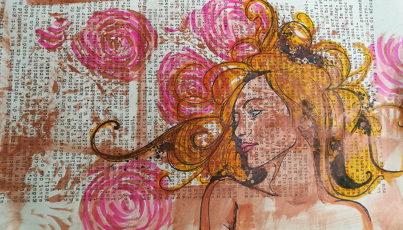
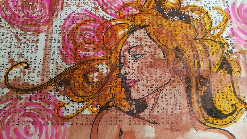
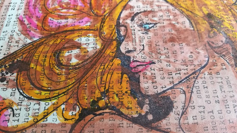
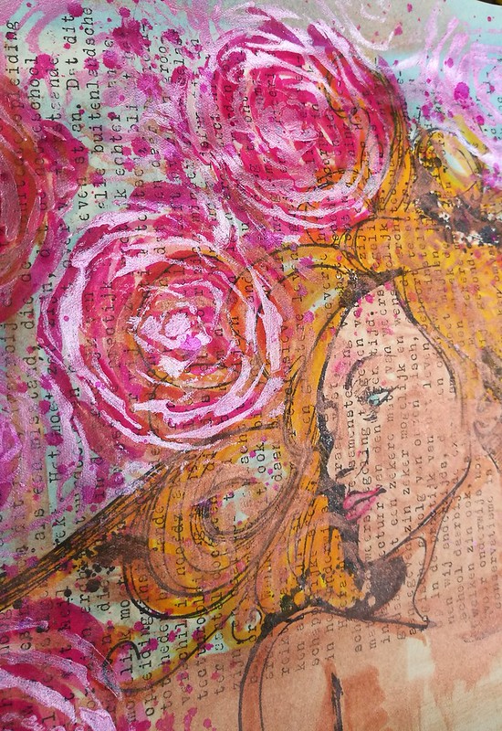
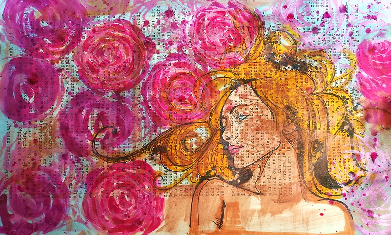
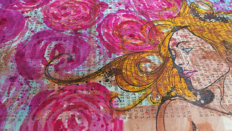
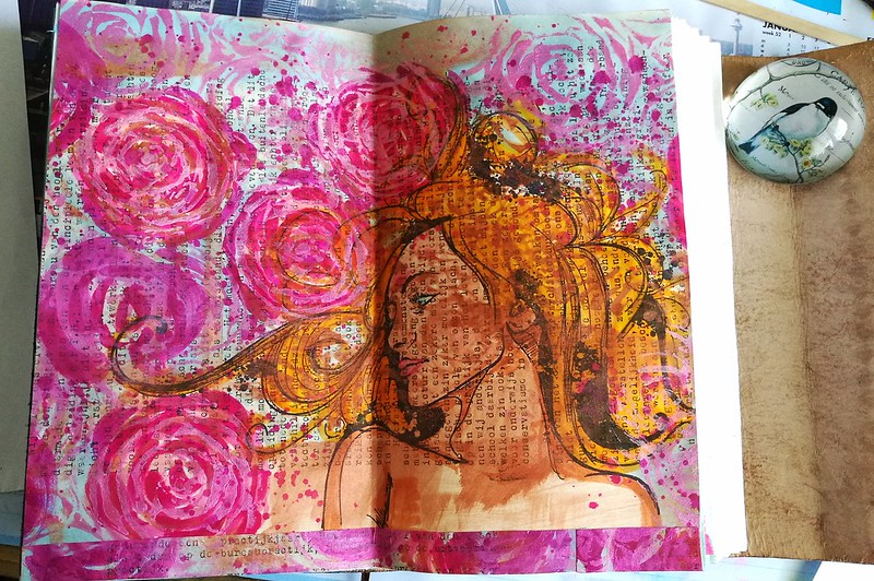
Last week I showed you a fairly simple crayon colored page of Hera in my art journal. Today I'm kicking it up a notch. I stamped her on vintage typewritten paper and added a lot of other elements to it to form a mixed media page in my journal.
hera studies roses
hera studies roses
hera studies roses
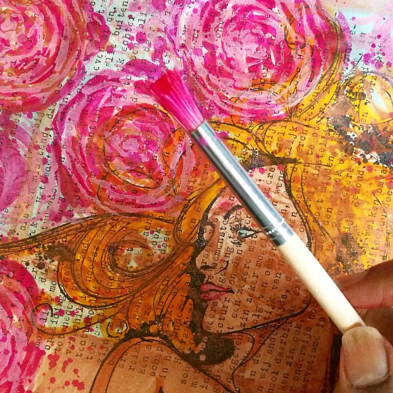
I used stencil girl succulent stencil and copper colored acrylic paint for the roses. Then stamped Hera with Staz On Black. I colored her and the roses with Tombow Dual Brush markers.

hera studies roses
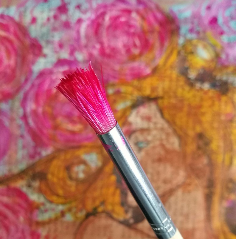
I think noodler's qin shi huang has permanently stained my brush, but I ain't mad, it looks so pretty and gave amazing results! #mixedmediaart #mixedmedia #noodlers #gouletpens #inksampler #inkygoodness #artjournal #stencilgirl #carabelle
Then I took a small round stencil brush and Noodler's ink Qin Shi Huang, which I have a sample of, to give the roses a pretty pink color. And with an overlay of the stencil, I mixed the ink with some iridescent medium to give them a halo.

hera studies roses
As a last step I took some winsor and newton blue drawing ink to give the background a light blue color. I love the pink and blue contrast.

hera studies roses
hera studies roses
In the end I also spattered a bit of pink ink over the page. And she was ready to be added to my art journal.

hera studies roses
I trimmed the page on the sides to fit the journal and adhered the trim on the bottom because the pages were taller than the typewritten page. This way it works nicely and I don't have a blank strip  of the book underneath. I have to say that I'm absolutely in love with this page and am happy the way she turned out.

With this journal page I'm entering the Mixed Media Monthly Challenge #25 (their 2nd year anniversary challenge! Congrats to them!) and picked the Butterflies and Blooms theme :)

Next week another take on the Hera stamp incorporated with gelli prints.

Thanks for stopping by and have a great weekend!

namasté