Showing posts with label diamine. Show all posts

2017/06/06

Pens and Ink: Woodshed PenCo "Creme Brulee" with Diamine Golden Sands

We're in halfway through 2017 and I have realized I have not been sharing my pens and ink pairings  on the blog like I have planned to do. My art is now the main focus of this blog, but Fountain pens and ink are still a very big hobby of mine. I have been sharing them on my FP centered IG Pensandpolish and while I have entertained the idea of creating a separate blog for my Fountain Pen endeavors, it's just way too time consuming for me to do. So I will continue to share some of my favorite pairings on the blog here, esp. ones that are made by independent manufacturer/pen makers. Starting off with this gorgeous handmade pen from the up and coming pen manufacturer/maker Mike Allen from  Woodshed PenCo.
Woodshed penco creme brulee

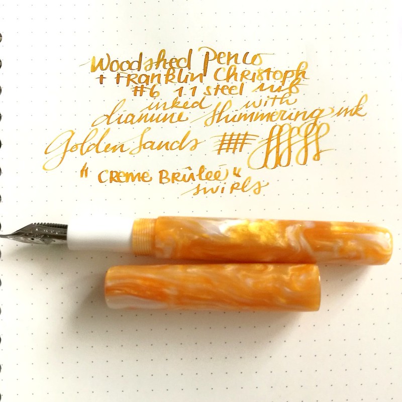
I've purchased this beautiful yellow golden colored swirly pen from Mike Allen at his sale on Instagram. He doesn't name his pens, but I dubbed this one "Créme Brûlée" because it looks like that beautifully burnt sugary caramel top of my fave dessert. The nib wasn't provided in this sale, but it takes the #6 size nibs I had a spare 1.1 nib from Franklin Christoph which fitted  beautifully on this pen. As for the ink I went with Diamine Shimmertastic Golden Sands, the color just matches the pen body perfectly. I've written on a Muji dot grid notebook on which the nib just glides and the ink shades and shimmers beautifully! 
My absolute fave of the first line from the Diamine Shimmertastic series. 
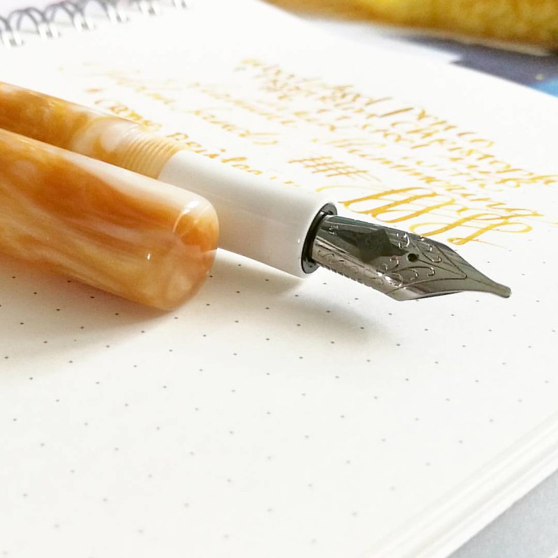
Photographing pens like they are sexy super models. Work that nib, yeah! 😂 Pen: @woodshedpenco 'creme brulee' swirl Nib: @franklinchristoph 1.1 stubbalicious Ink: Diamine Shimmering Golden Sands Paper: Muji dotgrid notebook . . . #FPN #fpgeeks #founta
A little more about The Woodshed PenCo - Mike is an US Air Force veteran whom got into making fountain pens not too long ago. He shares his process on his Instagram and has set up a Kickstarter campaign. I was lucky enough to have bought from him through a sale he was having on his IG and he has sold his pens through Etsy as well.
Woodshed penco creme brulee
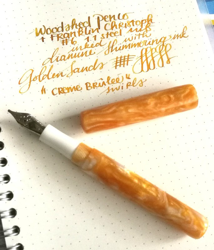
He just has one type of model so far, but more could be in the works. The pens he has for sale are really well made. The model is a bit cigar shaped and the cap does not post. I do like posting pens (so I won't loose the cap) so it was a little getting used to, but now I know to hold it in my left hand when I write. The section is tapered and fits very elegantly in hand.
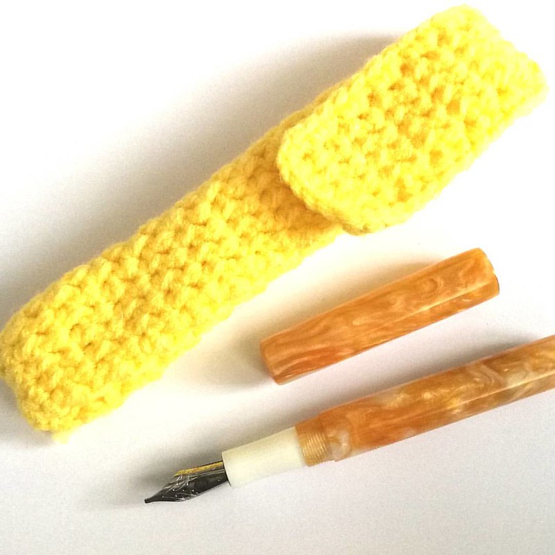


My new fave summer pen from @woodshedpenco 🌞 It's also got a cute hand knitted pen pouch!
With every pen purchase you also get a hand knitted pen pouch/sleeve which is super fun! Not only does it protects the pen, but it also adds to the handmade feel for the pen :) I got a super yellow one with my pen which is awesome :)
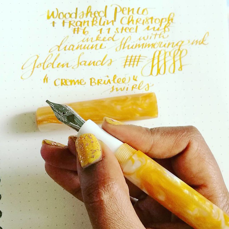

This beauty is made by the very talented @woodshedpenco The caramel swirly acrylic reminds me of 'creme brulee'  Fitted with a 1.1 nib from @franklinchristoph and inked with golden sands shimmering inks by Diamine it's the perfect sunny summery fountain p
If you're interested in one of Mike's pens, do follow his instagram and keep a watch out on his kick starter campaign. I am in no way affiliated with him, just a very happy customer and glad to support a small business. I am looking forward to a second pen coming my way and perhaps 3rd of his make will be added to my collection soon :)

 Oh by the way, if you want to have more updates on my fountain pen adventures, please have a follow on my Instagram account PensandPolish where I also try my very best to color coordinate nail polish to the pen and ink of choice. And if you post a color coordinated pictures in IG yourself with the hashtag #pensandpolish I'll feature you on my IG as well :) 

Thanks so much for stopping by and have a great day!


2016/07/06

Pens and Ink: It's clearly TWSBI and Teal today!

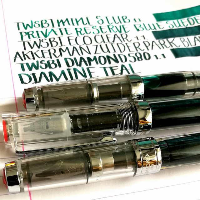
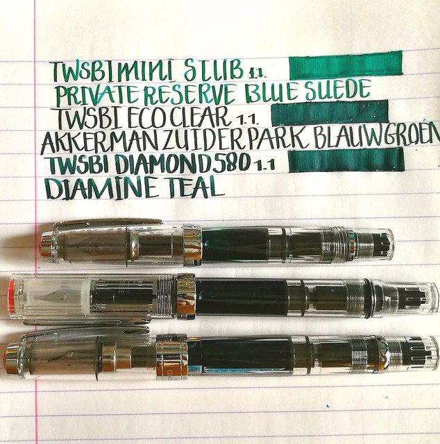
Last week in the Hague I stopped at one of my fave stores again and you don't have to be a genius to guess that it's Akkerman! I was finally going to get my long awaited TWSBI ECO clear model with the 1.1 stub nib and it did not disappoint! I definitely love the look and feel to it. And it looks GREAT in between my Diamond 580 and Mini demonstrator models as well. I just love seeing ink slosh in clear pens, it's so pretty!
twsbi 3 of a kind
I'm really happy I decided to keep my mini because it does make a pretty collection this way :) The kind lady at the store asked me if I wanted my Eco filled with ink (from the Akkerman line) and I took the opportunity to take one I haven't gotten round to testing yet; Zuiderpark Blauw-Groen. It's a gorgeous teal color. I bought another bottle of Private Reserve Blue Suede (hey, it was on sale!) and filled my mini with it. It's a gorgeous blue green color (dead ringer for J. Herbin's Emerald of Chivor base color) but the focus of this post is going to between the ZBG and the ink I've chosen to fill my Diamond 580 with; Diamine Teal.

twsbi and teal
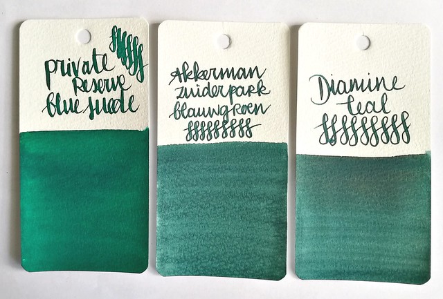
Ink swabs on maruman word card paper. From left to right: private reserve blue suede, Akkerman zuiderpark blauw-groen and Diamine teal.

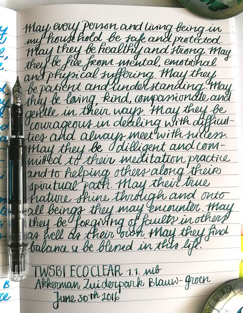
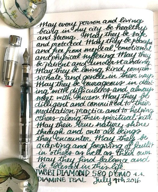
Right off the bat I thought the latter two inks look so much alike when I wrote with them and seeing the ink swabs side by side, well there is honestly not much difference at first glance! But there are a few subtle differences in writing though. A couple of example pages from my loving kindness written meditation journal.

twsbi and teal
TWSBI Eco with Akkerman Zuiderpark Blauw-Groen - a nice looking teal color. But the swab makes the ink look more interesting to me than the writing sample does. There is a bit of shading but not a lot. Also it writes a bit dry. Maybe I have to reset the nib and feed and give it a good cleaning, The lady did fill er 'up right out of the box...

twsbi and teal
TWSBI Diamond 580 with Diamine Teal - Found this ink flowing better also this ink is darker and has more shading. Granted it could be the nib that does make the difference. The 1.1 on the Diamond 580 is a number 6 vs. the number 5 on the ECO (and mini) has a broader width and writes a lot wetter.

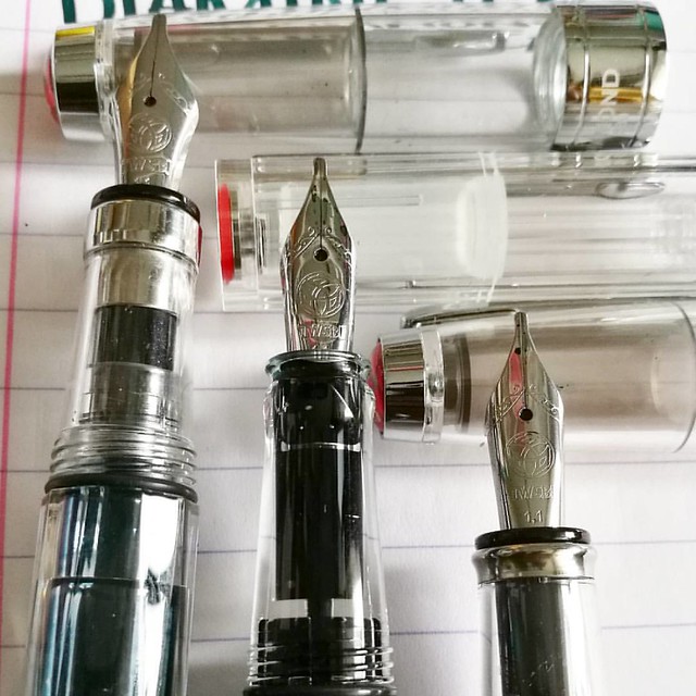
The twsbi stubbs are definitely among my fave writers. LtoR: Diamond 580, eco, mini with 1.1 stub nibs. #twsbi #fpgeeks #fpn #fountainpennetwork #fountainpen #stubnib #seriousnibbage #demonstrator #nibshot @twsbi
Comparison shot of the 1.1 stub nibs on the 3 TWSBI's. The nib on the ECOand Mini are the same. The section of the ECO is smaller than the other two pens which is just a little on the small side for me, but not uncomfortable.

It's clearly TWSBI for this friday's #fountainpenfriday @appelboompennen 😉 #twsbi #twsbieco #twsbi580 #twsbimini #demonstrator #fountainpen #fpgeeks #FPN #fountainpennetwork #stubnib #handwriting #penmanship #promotepenmanship #ilikebigstubs #battleo
The 1.1 nib definitely have differences among each other in writing. My fave writer of the 3 remains the Diamond 580, I just like the line width a little better. Also look at the shading in the Diamine Teal!

I am very pleased with the newest member in my TWSBI collection though I am still on the fence if I want a whole bottle of either ZBG or Diamine Teal. I'll need to write a bit more with them first to decide. See reviews from Ana's of The Well Appointed Desk on Diamine Teal and Akkerman ZBG for more info on the inks. Which of these would you prefer?

Thanks for stopping by and have a great day!

Namasté

2016/06/22

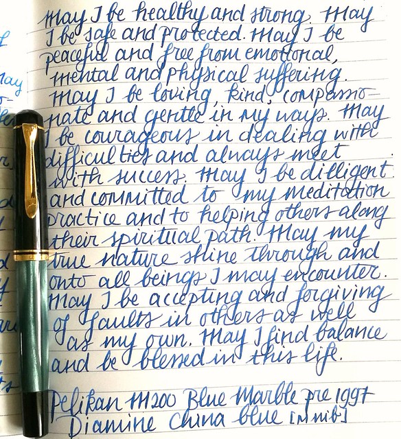
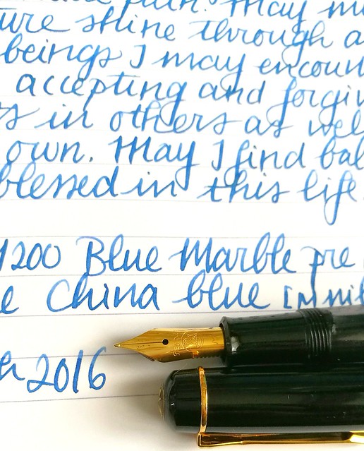
Pens and Ink: Pelikan M200 Blue Marble with Diamine China Blue

Pelikan M200
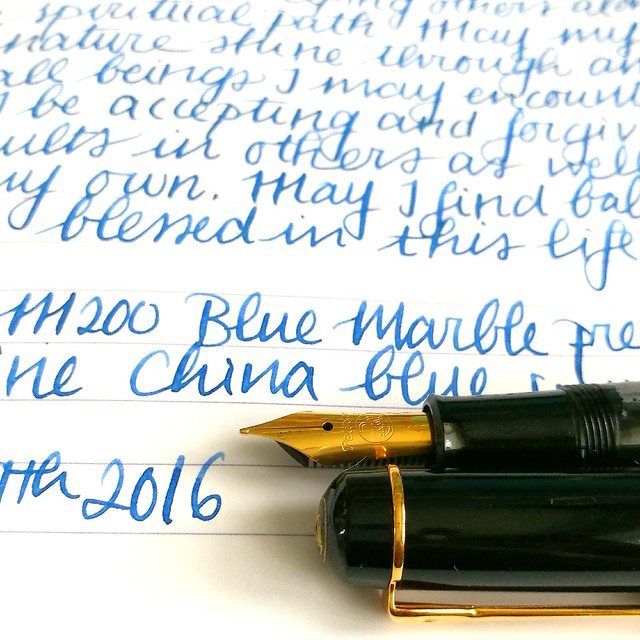
A little while ago I got a great deal on a few out of production Pelikan M2xx series fountain pens and among them is the blue marble released before 1997. I chose to pair this ink with Diamine China blue ink, which I had a sample of thanks to the Gouletpens Inkdrop from years ago. It was high time to use up the sample! 

A flock of birds #pelikan #m200 #beingpelikan #Fpgeeks #fountainpennetwork #fountainpens #fountainpen #dailycarry #dailywriting #journal #gratitutejournal #handwriting #handwritten #specialedition
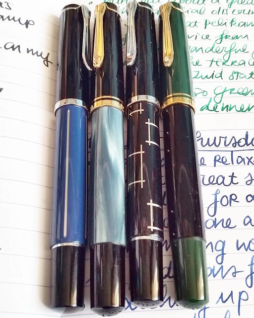
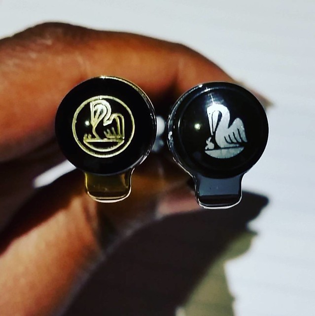
These were just sitting on a shelf at an office supple store just waiting to be picked up. From left to right: M215 blue stripe, M200 Blue marble (pre 1997), M215 Orthogons, M250 Black Dark Green (pre 1997). Most of these are not in production anymore, but the blue marble can still be found. I have a pre 1997 version though and those are a little different from the newer productions. The more clear distinction being the imprint on the cap.

A couple of chicks #pelikans #Fpgeeks #FPN #fountainpennetwork #fountainpen #beingpelikan #finnial #pelikan #funtainpen
The cap on the right is engraved and pens after 1997 have a painted logo like you see on the right. More info on how you can identify and estimate a date of your Pelikan in this very useful blogpost by the Pelikan's Perch. Joshua's site is super useful as he compiled a database of various Pelikan designs with the factual data. He also does reviews on Pelikans and keeps other fans updated on the latest of the brand. Definitely worth following if you are also into Pelikan pens! Specific info on the various Blue Marble pens I found this post on FPN very useful. 

pelikan m200 marble
Back to the pairing. I written a page in my mindfulness metta meditation journal and it's a pretty nice conventional blue. It has some shading to it but not a lot. The medium steel nib In have on my pelikan has some spring to it and shows off some of the shading.

Pelikan M200

It's a toned down blue but I quite like it. Cleans out easily and well behaved, it's a fun suitable for work kind of color. More reviews on the ink you can find on Peninkcillin and PenPaperInkLetter blogs. 

I have a few other suggestions for work-safe blues in this post: The Namiki Falcons and Blue Hues experiment. What is your fave "suitable for work" kind of blue?

Thanks for stopping by and have a great day!
namasté

2016/05/19

Kennis is verlichting - Knowledge is enlightenment

Sometimes you have this idea in your head and won't rest until you got it out of your system. Tonight I was inspired to make another entry for De Stempel Winkel's Challenge that ends tomorrow, Challenge 8 sunshine yellow.

kennis is verlichting

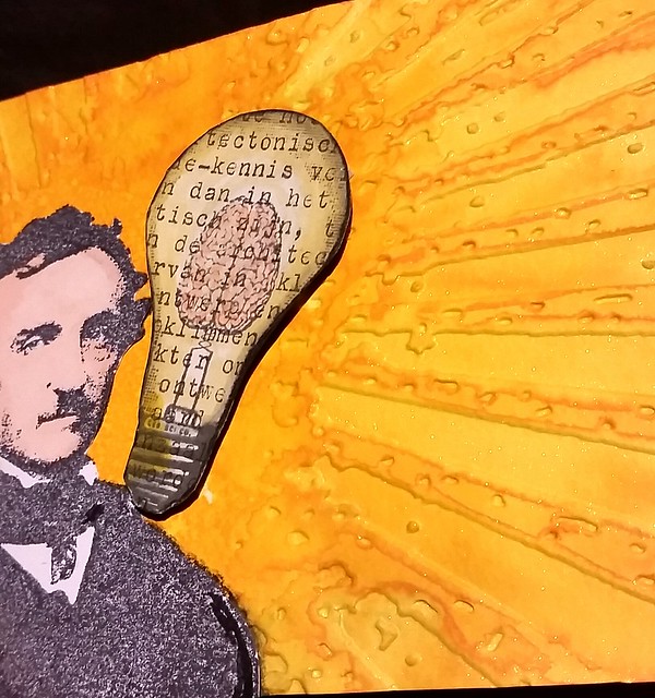
I used Diamine Sunshine yellow mixed with gold perfect pearl  powders on maruman watercolor paper. Embossed it with Tim Holtz Grunge rays with my cuttle bug. Then added more water to the embossed rays by using a water brush. The Edgar Allen Poe stamp and Light bulb brain stamp are from the stempel winkel. I stamped EAP on white sticker paper, colored in with promarkers, cut out & adhered to the piece. Then I stamped the light bulb on vintage typewritten text paper, colored it with tombows,  stuck it on a sturdy background, cut outand adhered on the piece with 3d foam stickers. The light bulb piece had "kennis" written on it, which means knowledge in English. Hence the title, which is fitting I think :)

Some detail shots :
Kennis is verlichting

Kennis is verlichting

Kennis is verlichting

The light doesn't show the shimmer, but it glitters quite nicely in daylight.

Will take a better picture when i can but for now, I'm glad I got this out of my head and on to paper :)

I'm also entering this for the Craft Stamper's 'Anything Goes' May Challenge 

Have a great day and thanks for stopping by!

namasté

2016/04/13

Pens and Ink: Omas Bologna with Diamine Syrah

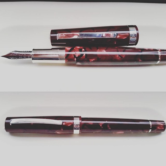
Omas pens are a thing of beauty! #omas #bologna #Fpgeeks #FPN #fountainpennetwork #fountainpen #funtainpen #italiancraftsmanship #writinginstruments #saveomas #tribute
When I saw this Omas Bologna pen I really had to have it. With help from my sweetie I got this pen for my birthday. I'm completely inlove with it.   I'm very fortunate that I was able to find one of these pens as they sold out pretty quickly everywhere.

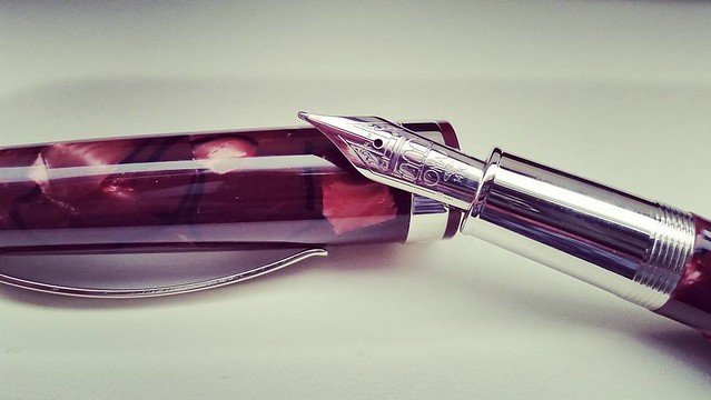
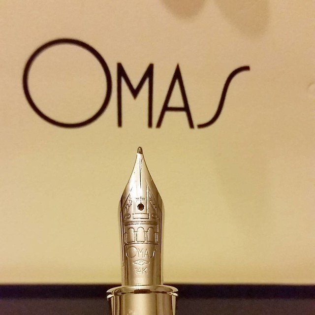
Nib shot of my newest #omas #Fpgeeks #FPN #fountainpennetwork #saveomas #funtainpen #bologna

The nib design is gorgeous and the pen material is stunning too. 
A beautiful wine red celluloid.

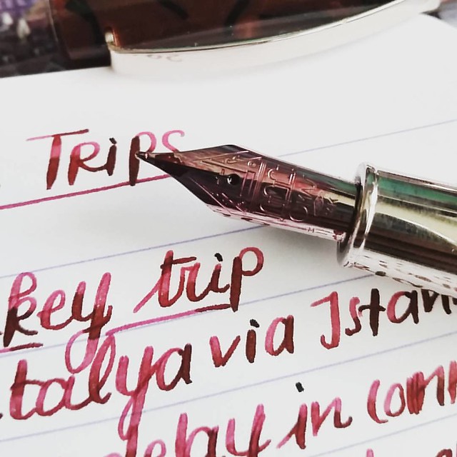
This nib is an absolute joy to write with #omas #bologna #saveomas #Fpgeeks #FPN #fountainpennetwork #fountainpen #funtainpen #diamine #syrah #italiancraftsmanship #stationeryaddict #writinginstruments #travellog #journal #dailywriting
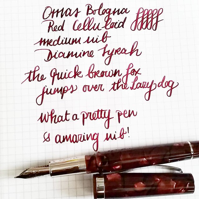
The wine red of Diamine syrah has a beautiful shade. Matches this pen body material perfectly.

Such a beautiful pen 😍 #omas #saveomas #bologna #Fpgeeks #FPN #fountainpennetwork #fountainpen #funtainpen #writinginstruments #stationeryaddict
Such a beautiful pen body. The celluloid has so much depth. 


Omas Bologna with Diamine Syrah #omas #bologna #saveomas #Fpgeeks #FPN #fountainpennetwork #fountainpen #diamine #syrah #extraflessible #winered #celluloid #currentlyinked
The nib is outstanding to write with, just the hint of flex that adds the nice flourish to my every day writing.

If you find one of these in the wild, definitely get one while you still can!

Thanks for stopping by.

namasté

2016/04/06

Pens and Ink: Omas Ogiva Alba Green with Diamine Tropical Green

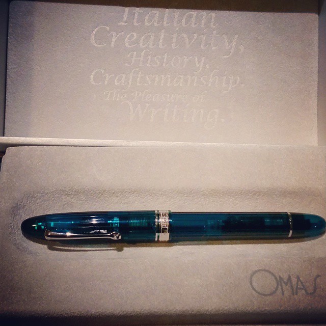
I can't stop staring... 😍 #omas #ogiva #alba #fountainpen #fpgeeks #pen #pretty #collectibles
When I saw this color pen in the Omas Ogiva Alba line when it came out, I immediately wanted it! I got it for myself as a Sinterklaas present a few years ago.

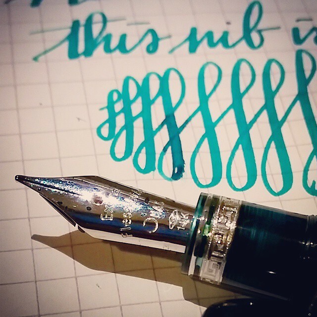
Beauty of an Omas nib #flexnibfriday #flexpen #fpgeeks #fountainpen #ogiva #alba #green #pretty #collectibles #pelikanedelstein #jade
I chose a medium Extra Flessible nib. It has beautiful line variation. This ink is Pelikan Edelstein Jade, which does have a nice shade of emerald green.

This nib is bannanas! 😍 #fountainpen #fpgeeks #omas #ogiva #alba #green #pelikanedelstein #jade #teal #pen #collection #collectibles #flexnibfriday #flessible #extraflessible #flexpen #flexnib

I do love this ink, but it wasn't a complete match with this pen. A bit of a darker green is what I was looking for.

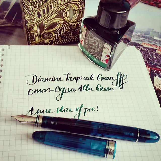
A nice slice of pie! #fpgeeks #fountainpen #fountainpenink #diamine #ogiva #alba #omas #tropicalgreen #limitededition #collection #collectorsitem #flessible #flexnib #inkbottle #penmanship #green
And a trip to Akkerman in the Hague provided again... Diamine tropical green in their 50th year anniversary bottle is a beautiful match for this pen.

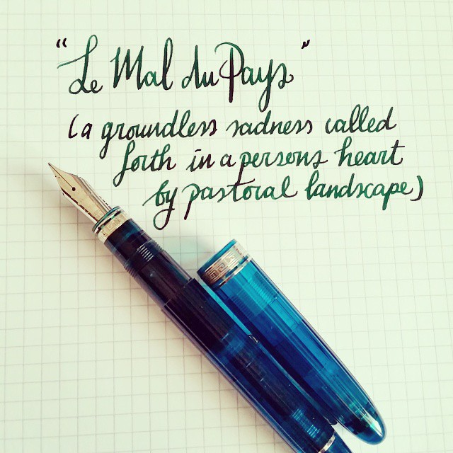
La Mal du Pays - a quote from a book I am reading at the moment. Points for you if you can guess which book that is 😉 #flexnib #flexnibfriday #omas #fountainpen #fpgeeks #teal #bluegreen
One of my fave quotes from one of my fave writers in one my fave books.

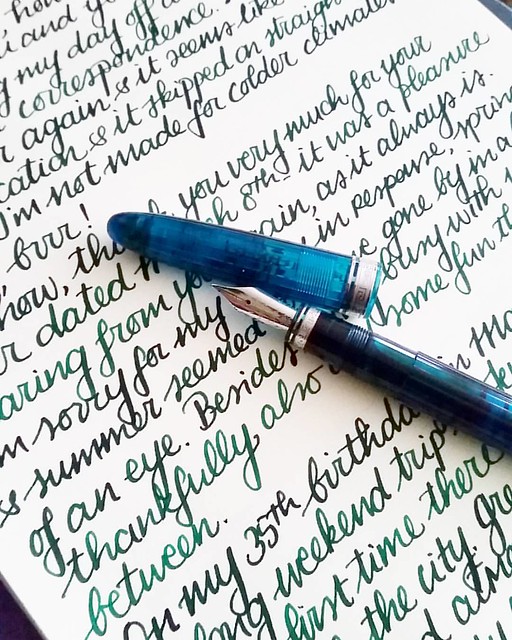
Catching up in correspondence on this cold and grey monday #omas #ogivaalba #Fpgeeks #fountainpen #pelikanedelstein #aventurine #penpal #letterwriter #correspondence #FPN #penmanship #handwriting #handwritten #shittycalligraphy #emeraldgreen
This pen and ink is a fantastic combination, it shows off shading and some sheen really well on paper. The paper I used here is Crown Mill laid paper. 

I definitely need to ink this pen up soon again, seeing I talked about my 35th birthday here... and I already gotten a year older in the mean time ;) Next week I'll show you when I received from my sweetheart for my birthday this year. Yes, it's Omas themed ;)

Thanks for stopping by!

namasté

2016/02/10

Pens and Ink: Pilot Namiki Resin Falcons & the Blue Hues experiment

During my Chistmas break from work I was catching up on Goulet Q&A (where Brian Goulet from the Goulet Pencompany answers FP and stationery related questions on a weekly basis) and in episode 106 a reader asked him
"Can the Pilot Falcon (resin) be converted into an eye dropper?" 
Which is something I have wondered about myself seeing I have 2 of these resin falcons. Brian tests them out with water and it seemed to work! But he also said it needs to be tested with inks and see if it leaks in the long run /during storage. He then asks to anyone whom owns a resin falcon to help and test this out as well. So I thought, why the hell not and satisfy my own curiosity?!

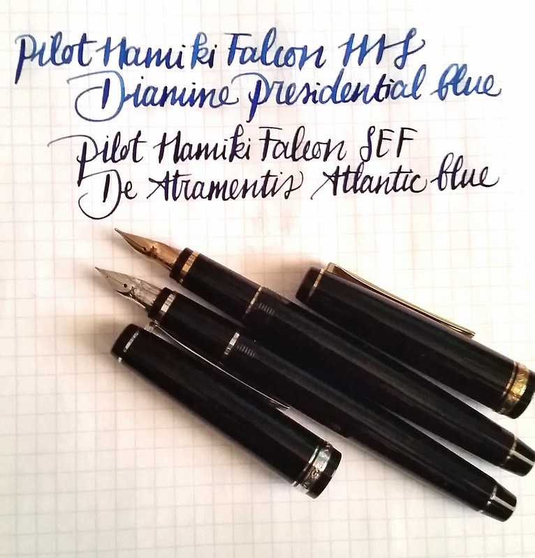
As I said I have two Falcons: an older Namiki branded one with Medium Soft nib with gold finish and a newer Pilot branded one with Soft Extra Fine nib with rhodium finish. I converted these falcons by using silicone grease and a spare O-rings I have from my TWSBI's. I put the O ring flush against the section's metal ring above the thread ends and applied a liberal amount of silicone grease on the treads of the section. With a pipette I 'droppered' the ink from the vials in the pen bodies. Then screwed tight.


Pilot Namiki Falcon MS and SEF

I used to have a monthly  Goulet Inkdrop  subscription for over 2 years and still have SO many ink samples to try out in pens. Wanted to test some blue hues and used the following samples in my Falcons: Diamine Presidential Blue (kinda fitting with the whole election race going on in the US at the moment) and De Atramentis Atlantic Blue which is darker than I expected it to be. Both are fun alternative choices if you want to have a different work-safe Royal Blue ink tone in your pen. 

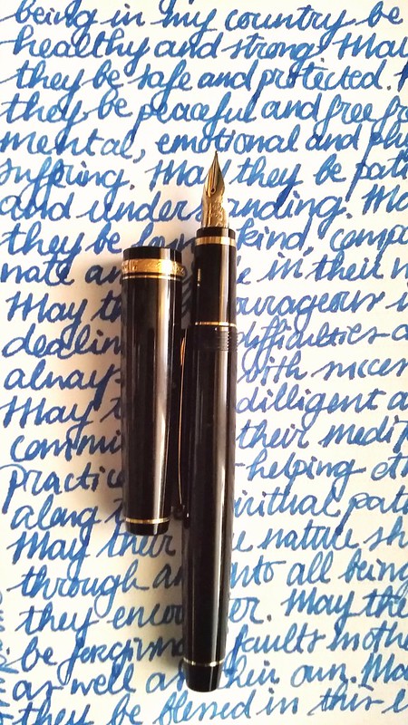
Meditative writing with Namiki Falcon MS
I used the Falcons in my daily mindfulness meditation journal and the ink flow in the writing kept up nicely. No blobs of ink gushing out of the pen as sometimes with eyedropper conversions can be the case (something to do with the heat of your hands that can build up an air bubble in the section and causes to blob ink ... or so someone told me, I flunked chemistry in high school...) I've had that in my Pilot preppy and 78G happen before, but nope not with these birds. I was very pleased with their performance.


Pilot Namiki Falcon MS and SEF
They are quite pretty Birds too. But the real questions remains, do they leak? Well I am happy to report, no they do not! I've had them lying horizontally on my desk overnight on my notepad and no leakage. I've had them stored upright in my pen cube for a night too and no leakage. 

Pretty sweet! Now I can keep using these babies to test more samples with :)

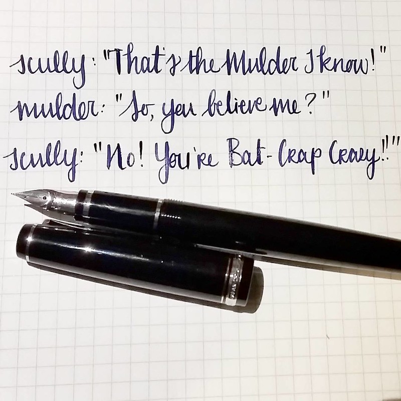
Whom else is psyched that X-files is back? I loved the last episode and this exchange 😂 Also congrats on 2600+ followers now @attilasultis 🍻 Cheers for the giveaway!
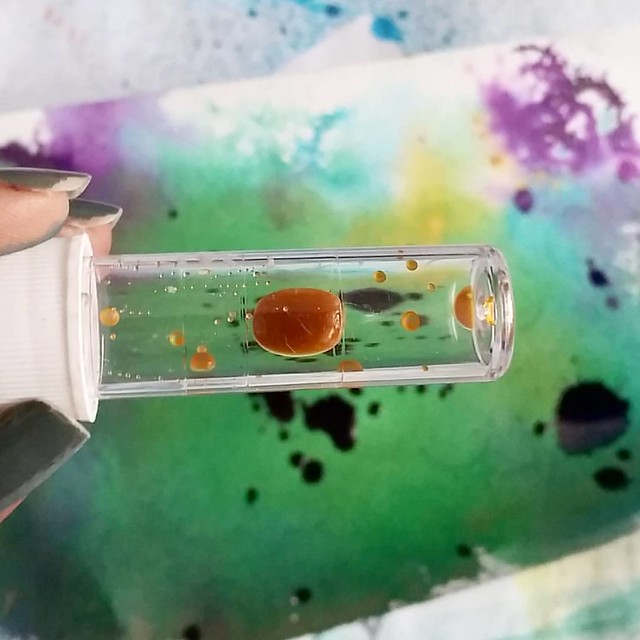
The X-Files are back, baby! Sorry, super random, but I am loving the season so far!
So I think it's definitely safe to convert your resin falcons to an eyedropper. What you do have to consider though that it is tough to gage the ink levels in the pen as it's a solid black body and no ink window. Not really a solution for that except to write with your pen until it runs dry. Or maybe carefully unscrew the section and place the body upright in an ink tray and peek in the barrel with a bright flash/phone light? I would only test this when you are at home though... ink spillage may occur.

Pilot Namiki Falcon MS and SEF
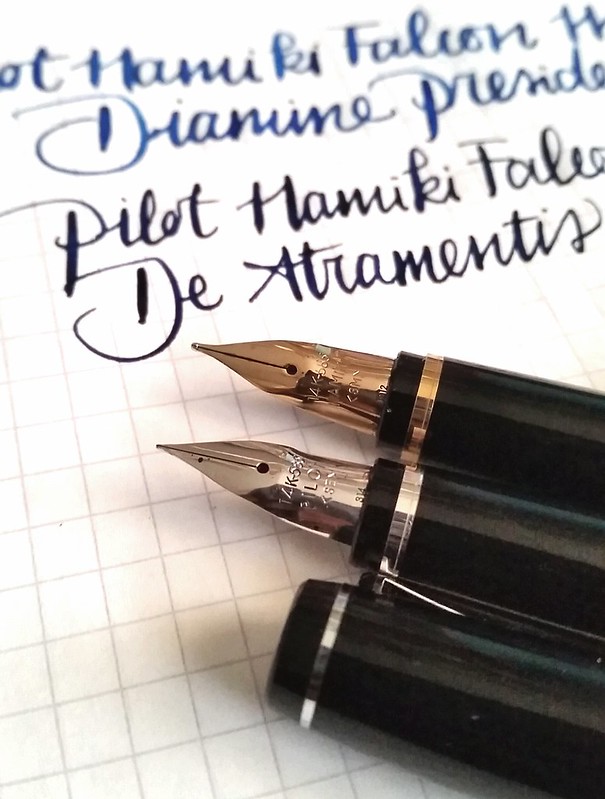
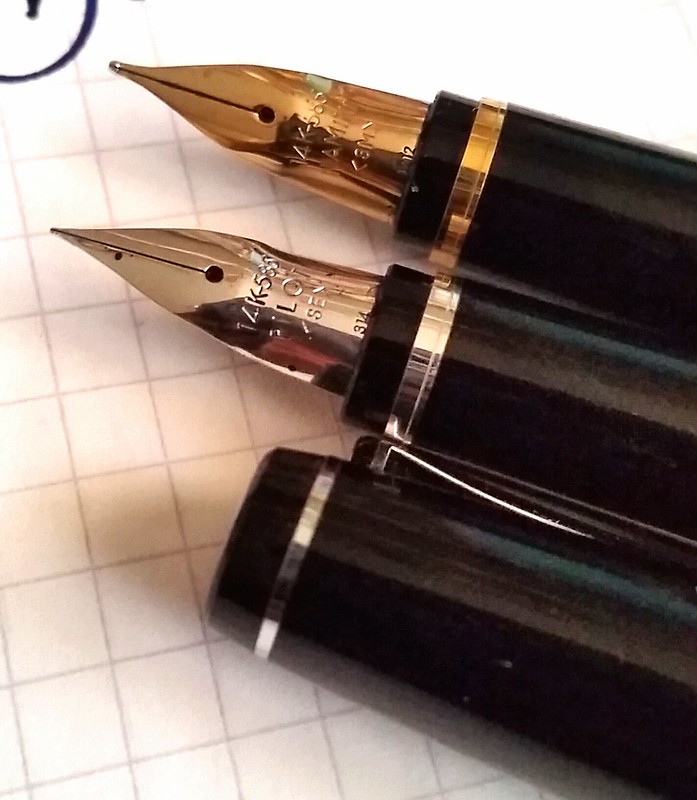
Comparison shot of the SEF pilot branded falcon and the older SM namiki falcon nibs with different Rhodium and Gold finishes. To me this is serious nibbage though some may or may not agree. Also check out Gourmetpens review with more facts, flex comparison and sexy nib shots! 

Hope this info helps when you are considering to eyedropper convert your Pilot/ Namiki Resin Falcon fountain pen. 

Thanks for stopping by!

namasté

2016/01/27

Pens and Ink: Pilot Retro Pop and Diamine Blue Pearl

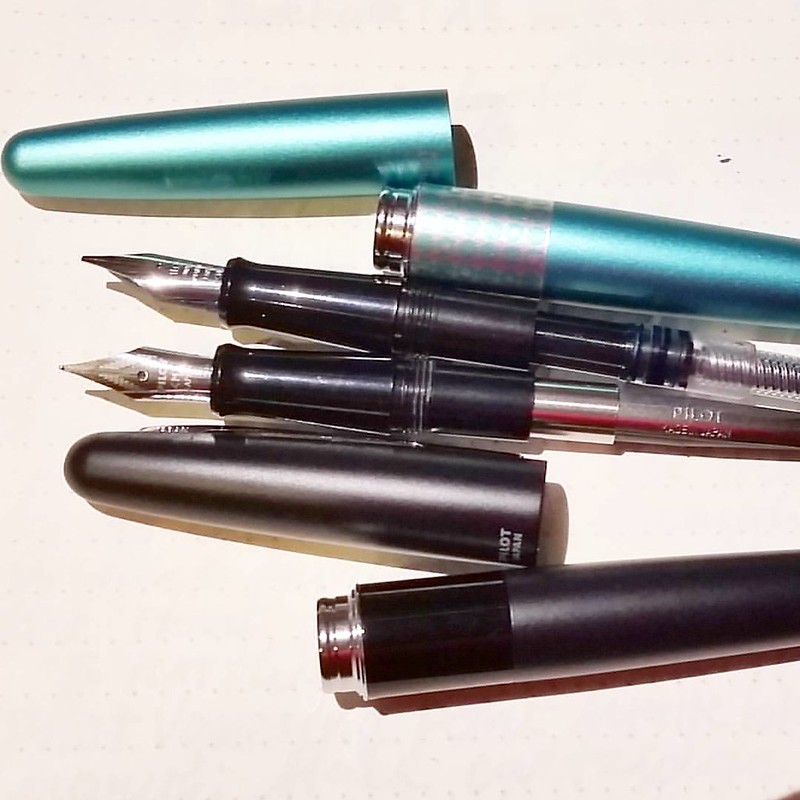
I have been seeing this pen in use by a few people on my Instagram and since it's turquoise and not that expensive,  I was at Akkerman I let myself get seduced and got one.

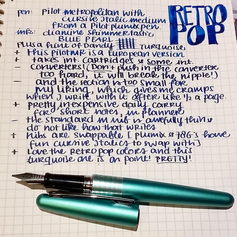
My views on the Pilot MR Metropolitan Retro Pop. #writtenreview #pilotmetropolitan #retropop #turquoise #plumix #cursive #italic #diamine #shimmertastic #bluepearl #Fpgeeks #FPN #pilotMR #review

As you can see from the written review, I have mixed feelings about it. It's pretty, but the writing experience was so-so. but after I changed the standard m nib with a plumix nib (cursive italic) it writes a whole lot nicer! The European version, which is called the Pilot MR, takes standard international cartridges, BUT you have to be careful which converter you put in there and not push it in too hard.

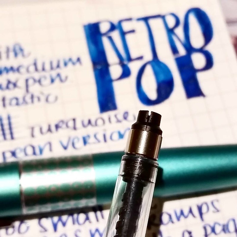
And to show you that you definitely should not push your international converter too hard into the pilot MR European version. It's a delicate fit. #Fpgeeks #FPN #fountainpennetwork

If you do, you might get unlucky and split the converter nipple which will cause serious leakage. This is a standard international converter and it was a tight fit, but I pushed too far and it broke. Fortunately the pen nipple is still intact. At the moment I'm actually using a jinhaox750 converter and that works fine (that has a bit sturdier plastic on the top, but the piston operator part is crap...)

Pilot MR retro pop EU and Pilot Metropolitan Asia with the difference in converters. #Fpgeeks #pilotnamiki #metropolitan #retropop #pilotMR #FPN #fountainpennetwork

To show you the difference in converters: Pilot MR EU version top now fitted with a jinhaoX750 converter and the Pilot Metropolitan Asia version with the Pilot Namiki Con 20 old style squeeze converter. It's too bad they made the difference because you can get more ink in the namiki cartridges/converters. And not to mention that you have to be careful using the SI converter in your MR. But if you use cartridges only you should not have a problem. 

In my review there are more pros than cons and in the end it's a nice inexpensive daily writer. I esp. like that you can swap nibs with the pilot plumix and 78G pens to make the writing experience more interesting. 

Hope this was useful if you have or planning on getting a Pilot MR. 
Thanks for stopping by!

namasté 

2015/10/25

Mailart Sunday: Having some fun with diamine shimmeritastic inks!

Not a drop wasted #shimmertastic #shimmeringink #inkymess #inkygoodness #Fpgeeks #mailartists #mailart #inksperiment #inkspiration #inkspatter #diamine #goldensands
In my last post I showed you the writing examples with Diamine Shimmertastic ink samples, Mishka from Bureau Direct so graciously provided and today I wanted to show you some mail art I made with the remaining drops that were in the sample vials. No drop was wasted! [This post is going to be image heavy]

Mail art with diamine shimmertastic inks and Maruman water color sketchbook
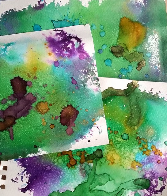
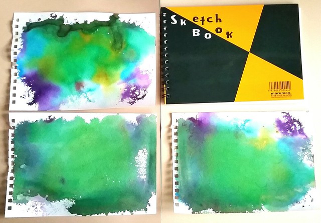
I started off with making my base back grounds first. I drizzled some drops with a pipette and tapped the inks strait from the vials on the page and sprayed water all over the pages with a mini mister, so that the colors would blend over. Then I dried the pages with my heat tool.

Mail art with diamine shimmertastic inks and Maruman water color sketchbook
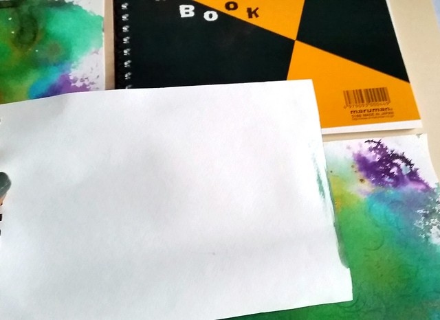
It's important that you use good absorbent yet sturdy (watercolor)paper for this. The paper I used is the Maruman Zuan B5 sketchbook which I got at my recent Pen Store haul. It's 126.5 grams of great quality water color paper and with the inks and water spillage I have doled out, it hold up pretty well! No bleed through on the other side as you can see above (the smudges on the right side is from excess water that pooled over) And warping of the page after drying is minimal.

Mail art with diamine shimmertastic inks and Maruman water color sketchbook

When the sheets were properly dry, I added some more shimmery ink drops on them by using a syringe to create random spatter patterns. I also diluted the ink a little bit in the ink vial to get more 'mileage' out of the last few drops. This way you also create some color variation, a light ombre in the color scheme. When I was satisfied with the amount of droplets, I dried the pages with my heat tool again. This time, when dried completely as shown in the picture above, the added drops are much brighter and the shimmer is more pronounced. Now to turn these pieces into mail art!

Mail art with diamine shimmertastic inks on Maruman watercolor paper

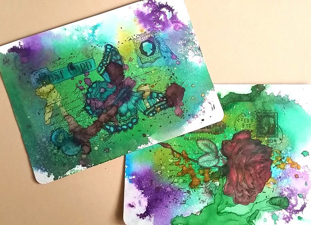
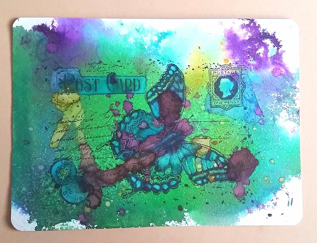
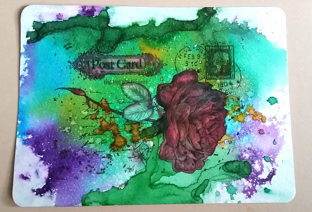
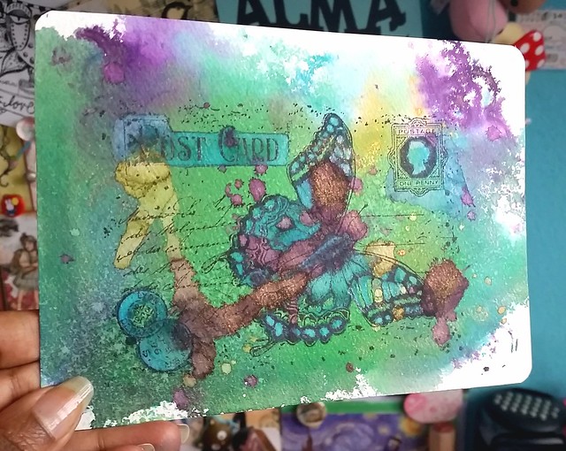
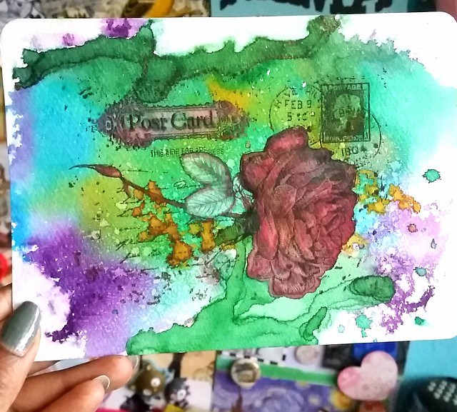
I took 2 of the background pieces I liked most and stamped Joy Crafts Old Letter Rose 2 and Old Letter Butterfly (by Noor design) on them. By this time I had run out of Shimmering inks but a good friend of mine gave me a full set of these in sample bottles so I could play with them more.  I colored some accents in the rubber stamp image, like the rose, butterfly, postage stamp etc. by using a pentel color water brush to make the image pop out more.

Mail art with diamine shimmertastic inks on Maruman watercolor paper

I used blue lightning to accentuate pieces in the rubber stamp, wings of the butterfly, postcard header, cancellation stamps and the postage stamp.

Mail art with diamine shimmertastic inks and Maruman water color sketchbook

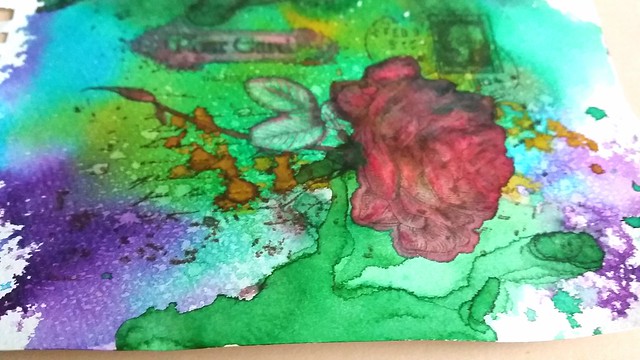
With the rose I used red luster to accentuate the petals of the rose a edges of the leafs and corners of the 'post card' header. I also diluted the Magic Forest color in the leafs to accentuate that part more.

Mail art with diamine shimmertastic inks and Maruman water color sketchbook

I also used the water color brush to create depth in the Rose petals. Make sure you use a water proof rubber stamp ink, I used memento rich cacao and tuxedo black, because your image can wash away if you don't. You can stamp over the dried image again to give the image its crispness back.

A couple of close ups of the pieces so you can see the shimmering accent better.

Mail art with diamine shimmertastic inks on Maruman watercolor paper

Mail art with diamine shimmertastic inks and Maruman water color sketchbook

The last step was to glue the pages to card stock and I rounded off the corners with a punch.

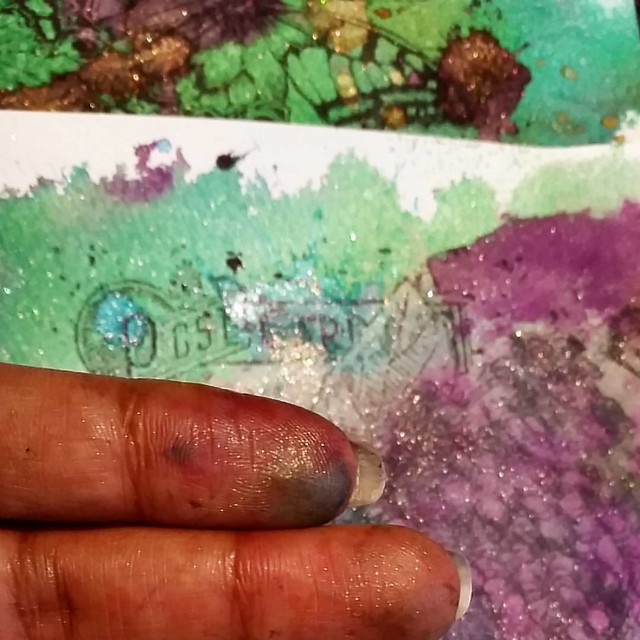
And there you have it! I hope this inspired you to mess around with shimmery inks and rubber stamped images too :) And in the end your fingers will probably look like this

Having fun with a bit of shimmer #shimmeringink #shimmertastic #diamine #joycrafts #rubberstamps #inkymess #mailartists #mailart #craftiness

And you will find glitter EVERYWHERE! But that is part of the fun ;)

Thanks for stopping by!

Namaste