Showing posts with label lost coast designs. Show all posts

2018/05/07

Bloom where you are planted - StencilGirl DT announcement!

Bloom where you are planted

It was so difficult to keep this a secret, but now I can finally tell you 
all about this awesome news: 
I am so excited to announce I'll be part of the Stencil Girl Products Design Team for this term :) You know me, I love using stencils in my work and I was just over the moon when I got the news I was accepted in this awesome team to represent this amazing company through my work! 

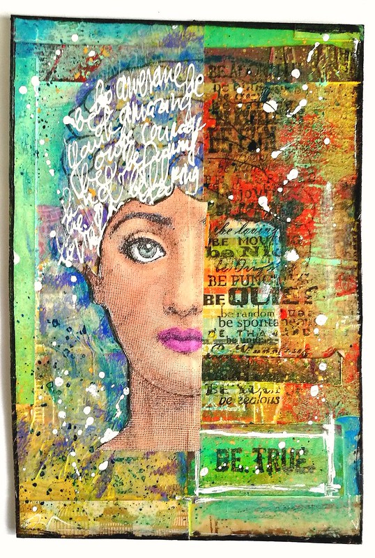
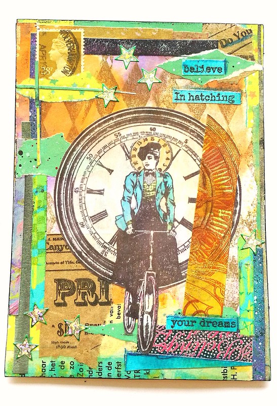
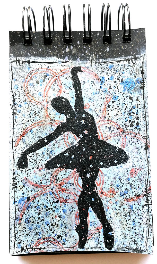
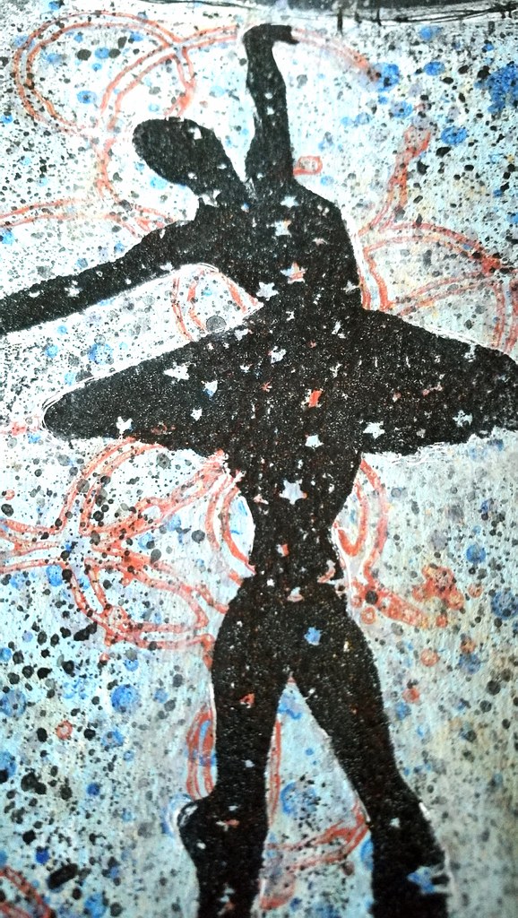
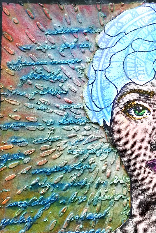
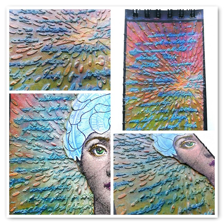
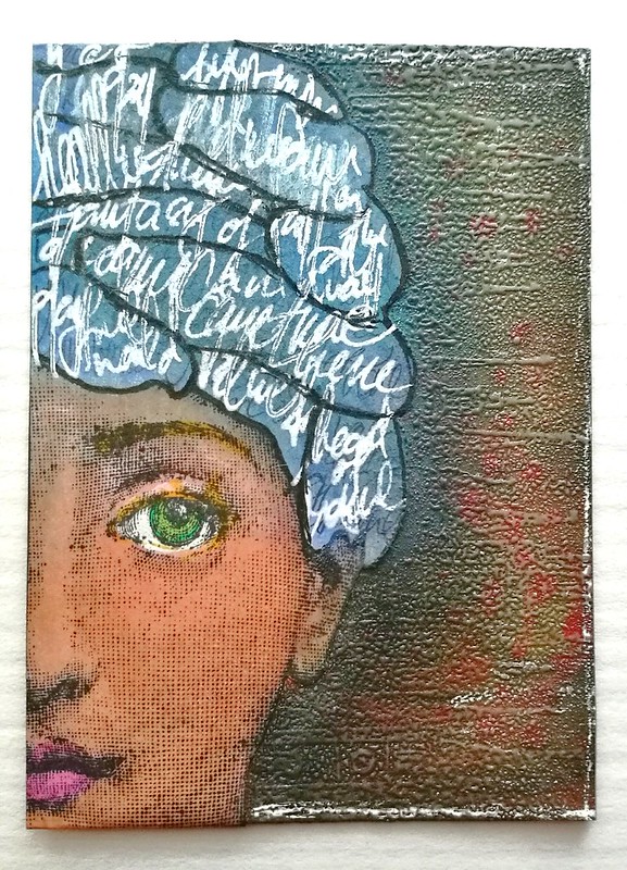
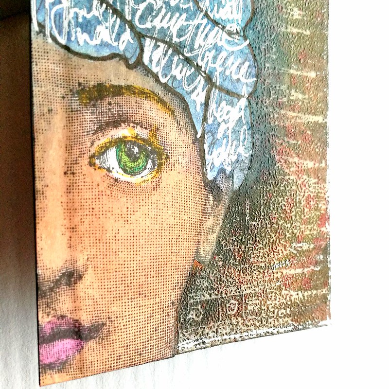
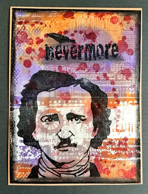
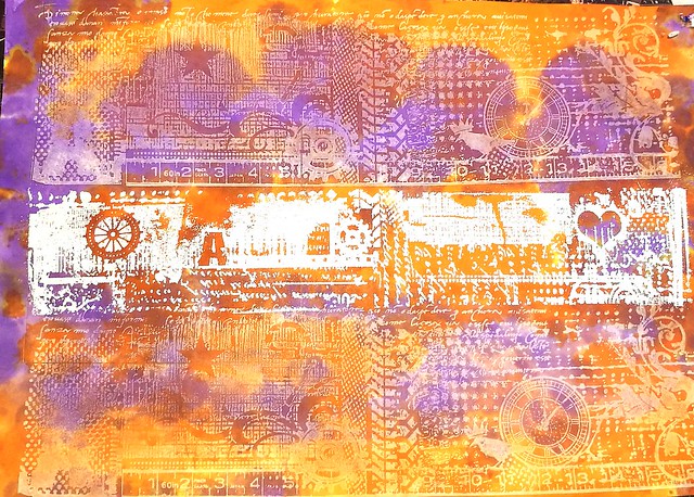
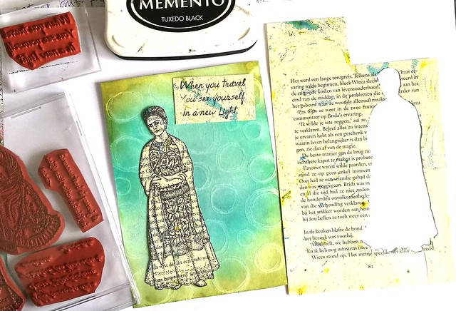
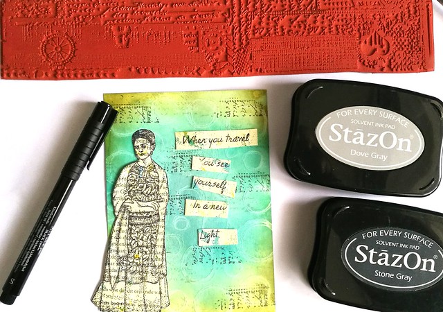
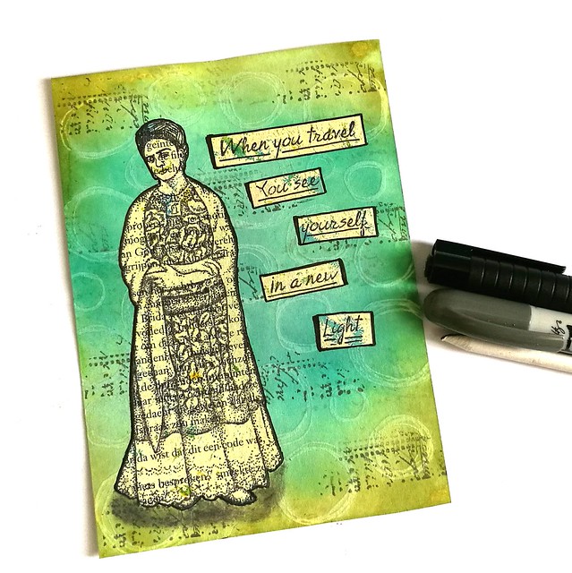
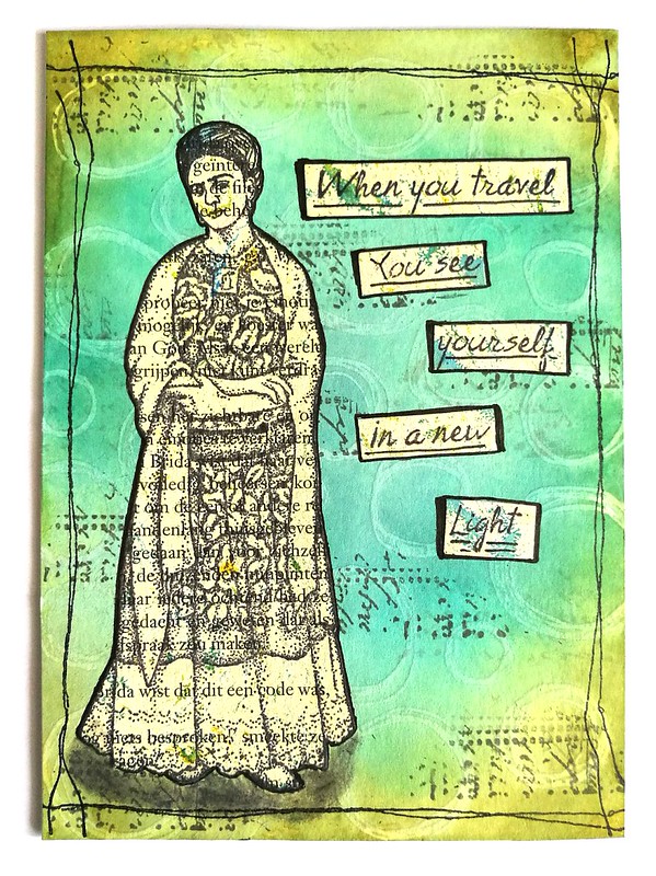
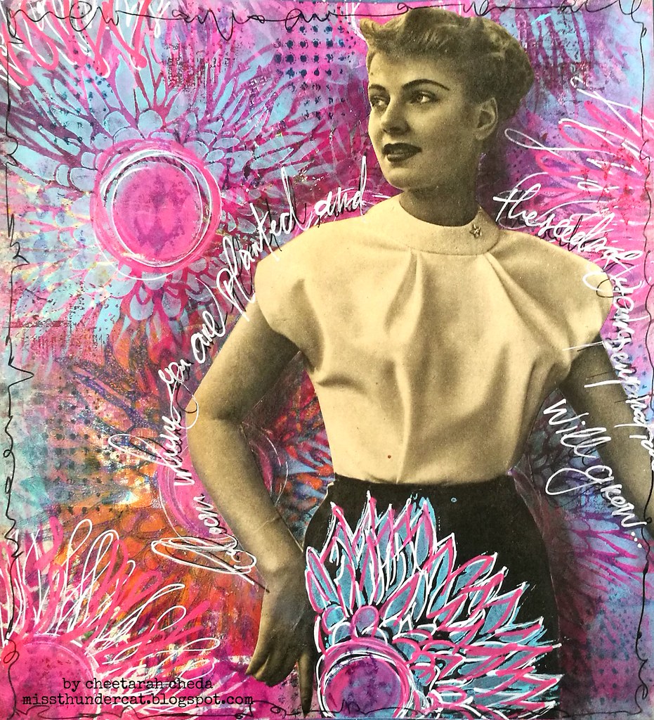
To celebrate it made this Art Journal tip-in page using one of my fave stencils/masks by Traci Bautista Deconstructed Chrysanthemum The background is made with my gelli plate and I made several prints and ghost prints on a piece of patterned paper. I also sponged some paint through the stencil in various places and accentuated them with doodles. Stamped some lush grungy stamps from Lost Coast Designs in the background for more texture. The lady is a cut out from a vintage magazine and I adhered her with matte medium. Covered her skirt with the same stencil flower pattern and gave her some shadow contrast with a grey artist pitt marker. 

Then I took my black posca pen to doodle the edges and write down the sentiment 
"Bloom where you are planted and the seeds of your perspiration will grow" 
I went over it with a white posca pen because I wanted the sentiment to POP more which now it does. 
This art journal page is to inspire me (and you) to do what you love and love what you do, so that when you bloom where you are, you will see your efforts come to fruition.  

Hop on over to StencilGirl Talk today and find out who my other wonderful creative team members are and let us know what you think :)

I would like to enter this art journal page in the following challenges:
Art Journal Journey: Flora and Fauna
Moo Mania: Flowers
Try it on Tuesday: Stencils/die cuts

Looking forward to showcase more work over the coming year with StencilGirl® stencils.  

Thanks for stopping by and have a wonderful day!

2017/06/19

Mail Art Monday - Celebrate!

celebrate

Hi friends, hope you all had an amazing weekend and a wonderful fathers day yesterday. It's monday so I have another fun project to share for this week's Mail Art Monday. It's a postcard from my Scrap Collage master board series. So this piece is cut from that huge master board  which I showed you a while back. This is piece 5 I think... I have been working on many at the same time so I lost track of how many pieces I made already. Anyhow, this one I had not added much to except for some color and stars. I used some white gesso over the card leaving out the Lady (which is from Carmen's Veranda) and then added some color with Marubu watersoluble crayons. I then took a yellow sharpie and scribbled in some starry texture with a STAMPlorations stencil (which I won from last month's challenge, yay!), then added some star sticker, spatters with white gesso and a black border with a Krink Marker. Love how the image of the woman just pops out. 

I would like to enter this in the following challenges 
LCD challenge for this month of the theme Postcards (super fun challenge and very easy, so join in the fun :) 

Have an awesome Monday and thanks so much for stopping by!


2017/06/02

Art Journal: Amazing Diva

Amazing Diva

It's such an amazingly fun challenge to create pieces using project left overs aka 'tovers only. This piece was intended to be a postcard but I loved it so much I decided to adhere it to my art journal as I couldn't part with is. I used all sorts of scraps and left over pieces here but what started it off was the top. It's a color coded row of double ink sample swatches! I keep ink samples in trays and have it organized by what I have done already but for some reason I made an oopsie and made swatches of one row twice. Well of course it's too pretty to just throw out and if you see my scrap boxes you will know I have trouble to throw out anything!  I then looked for trims in the same color family to adhere to the page. Instead of vertically like I did with this journal page, I went with horizontal lines to see how that would go. And I absolutely love the outcome here! The Frida image is a left over print from this journal page and is a stamp from Lost Coast Designs - so are the words I used. I felt like I needed a POP of color and in my scraps I found that colored in whimsical seed pod from Viva Las VegaStamps! which I had used from this journal page almost a year ago! So very cathartic to use up all these scraps and seeing how all these elements come together as one :) The "frame" is just ripped out magazine pages from FLOW magazines. Yes, I have had a TON of them due to my 3 year subscription and those are all "free game" now - ripping stuff out feel SO GOOD! LOL! 

I would like to enter this journal page in the following challenges: 


'Flowers and Friends make life a garden' 
The green and seed pod reminds me of a garden... it could be Frida's garden :)

Wow, has it been a year I have been participating? 
I really loved this past year's themes esp. what's your super power and put a stamp on it
I feel like this journal page combines the two :) 

Thanks so much for stopping by and have a wonderful weekend!


2017/05/31

Stand out from the crowd - Mixed Media Note card

Inspiration


Some mid week inspiration with some of my fave Lost Coast Designs stamps. The Gibson Women background stamp is one of my favorites and it was a delight to use. There was a faded impression of the stamp (a ghost print) on one of my gelli printed papers, which I worked on further with some more stamps and stencils. My fave color combo at the moment is magenta and aqua. I high lighted the woman by stamping the stamp on sticker paper, coloring her with promarkers, fussy cut her out and adhered her to the page on her spot. Love how she stands out from the background and other faded women. Fun way to add a spotlight to your background stamp. The dictionary word inspiration was also stamped on a piece of leftover sprayed paper and adhered to the card. I rounded off the corners, created a vignette with bronze distress stains and added some white spatters. The card was matted on lilac card stock with a light relief print but the edges were made black with pearl rub on luster. 

Would like to enter this piece in the following challenges;

To answer the question for me it's inspiration which leads to help you to stand out from the crowd :)

Simon Says Stamp Wednesday Challenge - Anything Goes

&
(they are one of my recent challenge blog discoveries and these ladies have some very fun and inspirational makes to share!!)  

Thanks so much for stopping by today and have a wonderful day!


2017/05/01

MailART Monday: The right side of the brain

Be true

A colorful and bright postcard for the beginning of May! I really hope that spring weather will hit soon and the flowers will bloom and warmth will shine through, like it does on this card. It's another of my Masterboard collage pieces and while I have made this piece initially to send out for a swap, I decided to keep it in one of my art journals. It rarely happens I can't let a piece go, but with this, I think it's the color combo and the meaning behind it... much like this journal page was to inspire oneself to be true. 

The face was stamped on the gelli print I had used in the collage background, I stamped it again on sticker paper and colored it in with promarkers and only stuck on the face part on the right. The sentiment stamp on the left side and added the same text with Molotow paint marker in white on the right. I also did the drips with that. Added some pops of colors with Caran d'Ache neopastels. 

Stamps used: 
Lost Coast Designs "franco face" 
Viva Las VegaStamps! "Be True" and "be adorable"

I would love to enter this piece in the following challenges:
Moo Mania - Faces 
Mixed Media Monthly Challenge #36 - Put a Stamp on it


Thanks for stopping by today and have a great FIRST of May :) 


2017/04/27

The Cat's Meow! - Meesha appreciation post :)

Oh what a day
It's a kitty cat special today on my blog and I wanted to share these pieces I made recently with this great cat stamp from Lost Coast Designs (at least I think it was, but I can't seem to find it on the site anymore....) The background is made with various paper scraps and I used a white, black and a copper paint marker to create some interest and outlines. The sentiment "oh what a day, what a lovely day" is from VLVS! and it's a lovely day indeed!

collaged cat ATC
The ATC is made with similar technique as the postcard, but placed the scraps horizontally instead of vertically. The cat is stamped on black paper and then embossed with white. I could not resist adding "meow" with letter stickers on it :)

So today is a special day indeed, my little fur baby Meesha has turned 3 today! She is still ever so cute and I am so happy the little critter is on our lives. She shares her birthday with the King (it's king's day today in NL!) and she definitely behaves like the queen of the house :) Here are some pictures of her for you to enjoy!

It was so difficult to leave this cutie and go to work today #meeshathecat #catsofinstagram #cats #kitty #cutenessoverload
Throwback thrusday- this was taken the first few days she was with us. A very curious and open hearted kitty we instantly fell in love with

Tiled cat picture 😃 @Regrann from @cornelius.grayl  -  Collage of kitty in her box.  #cat #cats #catsoninstagram #catsofinstagram #catcuddles #meesha #meeshathecat #catstagram #meeshaisawesome #sleepingcat #Regrann
Likes to try out all sorts of different sleeping positions in super small arias :)

Look at that face! "You weren't planning on sitting here were you?" 😹 #catantics #catsofinstagram #meeshathecat #meesha #kitty #cutenessoverload #kittycat #catsareawesome
She definitely likes to sit on my chair in my art room while I am working.... so difficult to move her off my chair when she is looking like that!

meesha
Little purrfull snuggles on the couch in the evening are the best!

meesha
And she is definitely the queen of the house... luxuriously living!

Now I'm off to give some well deserved treats to this little birthday girl!


Thanks for stopping by and have a lovely day!


2017/04/24

MailART Monday: Possibility

Possibility

This week I have another postcard to share from my masterboard cut out series. It's number 3 of the series. This one has a lot of trims from my other projects. The most notable ones would be from Processing Poppies and Bee happy. Possibility is a leftover from this journal lay out and the stamp "Flying Mona"is from Lost Coast Designs. Out of my DT time at LCD this was one of my faves from the new releases :) Super fun and quirky! The only thing I added extra was color to the image, lots of ink splatters in magenta and gold and marked the edges with a gold pen. This one is on it's way to my partner for a Springtime swap over at Swap-Bot

I would like to enter this piece in the following challenges:

Lost Coast portal to Creativity - fave background technique (using left overs/scrap collages) 
STAMPlorations - Things with wings 

Thanks so much for stopping by and have a wonderful day!


2017/02/27

MailART Monday: Believe in hatching your dreams

Hatching dreams collage PC

Today I wanted to share a MailART collage postcard I made with the "create something in 30 minutes challenge" in mind which is held over at Country View challenges. This collage is made with scraps from my "junk paper box"  in which I keep all my left over scraps and pieces from other projects. I decided to grab a hand full of papers and see what I could make from it. It's very fun to see how all of this can just come together though serendipity :) The background is a sticker paper piece on postcard size that already had the diamond from Lost Coast Designs stamped on it. The cycling steampunk Lady is a LCD favorite of mine and I had stamped and cut her out for a few other  mail art projects as well. So that was very handy to use. The sentiment from Cat Kerr was a left over cut out from THIS ART journal page and the golden colored piece of paper over on the clock is actually a piece from THIS ATC. Pretty cool how the circle alignment worked out there. All the other scraps and pieces were added together as a frame and then covered the whole piece with a shimmery coat of modge podge. This was sent to my partner for a February sender's choice swap at Creative Collage over at Swap-Bot. Of course I was in such an inspired mood, I made a bunch of other collages which I will show you later this week.

Entering this card as the my 3rd and final entry for the Rubber Dance Layers theme in february

Join our Challenge:

Also entering this in the Creative Artiste Mixed Media February Challenge


Thanks for stopping by and have a great day!


2017/01/30

MailART Monday: Bee Happy

Bee Happy

A little ode to the bees on today's MailART Monday with stamps all from Lost Coast Designs. I made a little notecard and ATC for a swap over at Art Chicks Studio facebook group.

Bee Happy
The ATC swap was centered on a resist technique and I stamped the doodles circle in opaque white colorbox ink, heat set and colored the card with distress ink and a blending tool. A classic resist technique. The bees are stamped over the card, wings glazed with crystal lacquer and added some color to the body. Stamped the dictionary words on it randomly and sprayed some mica sprays over it. The outline is tarnishes brass distress stains and matted on black card stock. Simple yet very effective :)

Bee Happy
The little card was done the same way with addition to "Bee Happy" letter stamping.

Bee Happy
The yellow and blue colors make me very happy! A hint of spring time to come :)

Stamps used from LCD:
the bee and dictionary is from Bugz set

Other materials:
Technique tuesday broadway alphabet set
Hema alphabet set
Distress inks mustard yellow, peacock feathers and tumbled glass
tombow markers
colorbox white ink
crystal glaze
distress stain tarnished brass
Ranger mica spray lapis, honey and corn flower

Thanks for stopping by and have a great day!


2017/01/21

Art Journal: Prima Ballerina

Prima Ballerina

Wanted to show you a quick page in my new black spiral art journal today. I prepped the page with my new paperartsy fresco finish paints, southeren skies mixed with a hint of mint. Stamped carabelle studio Effervescence by Ana Bondu stamp with a bronze metallic ink, spattered some blue and black paint and then stamped the ballerina with stars (from Lost Coast Designs) with versamark which I then embossed in black. The placing of the stamps are all done randomly, but I love it when coincidence come together like this. Both of the ballerina's hands are in excellent placing on the circle stamps. The one in an opening and the top even looks like she is holding a circle. Perhaps, she might be a circus performer ballerina using all these hoops :)

Prima Ballerina
Detail shot of her holding the hoop. Creating art from the heart can bring wonderful coincidences like this together :) 

Thanks for stopping by and have a wonderful weekend!


2017/01/13

Art Journal: the Frida Blues

Art journal Frida

Last weekend I found some time to play around with my Lost Coast Designs stamps again and created this page in my pocket art journal. I feel like I really need some bright bursts of colors in my journals/life right now because it's so cold and winter is in full swing now (and to counterpart my SAD blues). For the background I used Brusho Ultramarine on watercolor paper. The effects are always mesmerizing and fun. I stamped the Frida Image directly onto the paper and colored her in with tombow markers. Chose the diamonds, circles and circle border stamps for the background. Lastly I added bright yellow tombow markers to contrast in color to the blue brusho. I stamped the circles with Memento Ladybug red and adhered it to my pocket journal. Added strips of color coordinated washi tape to the top and bottom and called it done.

Art journal Frida
This page is so different than the one I did before and I love how you can use the same stamps and yet create such a different style with them :)

Stamps used from Lost Coast Designs
Others: 
Maruman Zuan Watercolor paper 
Brusho Ultramarine 
Memento inks Ladybug, mango, danube blue
Stazon midnight blue
Various colors Tombow markers
Washi tape

The " #32 Anything Goes challenge"at Loast Coast Portal ofCcreativity, is still running until the 25th, so why not take a stab at it :) I am entering this one as well (you can enter multiple projects!). It's not even required to use LCD or CV stamps but would be fun if you do!

Thanks so much for stopping by and have a great weekend!


2017/01/06

Art Journal: A bright burst of thoughts

A bright burst of thoughts

When I was walking about in the Hague I entered the Flying Tiger and saw they had a couple of spiral bound journals for sale with black sturdy pages in them. "Oh no," I thought, " this could be the beginning of new art journals!" And yeah I took them home with me to test. It's a smaller journal (A7 sized) a bit bigger than ATC size which appealed to me. I also wanted to work directly onto the paper, instead of adhering a made page into my journals like I have done before. Also I have no spiral journal. Yes, yes I'm reciting all the excuses I had in my head before buying the journal, haha!

A bright burst of thoughts
To start off I added a layer of crafter's workshop golden gesso as a primer. Then took their Burst stencil and applied some light and fluffy modeling paste to it. I placed the burst center on the right side so the rays spread out on the left. Let that dry and added dabs distress paints onto the paper from top to bottom: Fired Brick, Ripe Persimmon, Mustard Seed and Fossilized Amber. I spritzed water over it and let the colors blend and mix until the stenciled image was covered in paint. After I heat dried it I took a script stencil and applied some more fluffy paste over it.  I dabbed some evergreen bough and blue print sketch on the craft sheet and spritzed some water over it. This time took a brush to color the script in blue tones and parts around the rays as well. After that all dried I spritzed some mica sprays in buttercup and corn flower over it. The half face stamp is Franco Face from Lost Coast Designs, which I love using in my other art journals. I made several of those faces to be used in other projects. I adhered the face to the right and then lightened the aria around it with a mix of mustard seed and picket fence distress strains and applied it with a brush. To give color back to the script I used the blue Wink of Stella brush pen over the script. 
Bright Burst of thoughts
I do love how the the first page I made in the journal turned out! 
Entering this journal page in the MMMC #32 put a stencil on it.

And the Lost Coast Portal to Creativity Challenge #32 Anything goes

You might be wondering what I did with the other half of the face, right? Well I used that for an ATC which you can see below:
fantasy dream world ATC
It was made for a Fantasy themed swap at Art chicks Studio FB group.

fantasy dream world ATC
I also used the skyline stamp ATC size from Lost Coast Designs. Used clear embossing on the card then rubbed pearl metallic rubs over the raised edges. then some black distress crayon for the shadows. Written words with a white gel pen and the outline as well. Here the words are still in the girl's head, but on my art journal page she managed to get them out :)

Thank you for stopping by and wishing you a creative and wonderful weekend!


2016/10/31

Mailart Monday: a ghostly halloween

Happy Halloween

It's october 31st and that means it's finally Halloween. I made the above postcard for a fun swap, the blue ghost postcard exchange hosted by my friend Amanda at Letter Letter. The objective is to send and receive a handful of postcards to your assigned group of penpals with the message written with blue ghost ink (see a great review of the ink here by S.J Mills). So it's readable with UV light only! It's super fun and I have participated in the last couple of years too.

I chose Edgar Allen Poe as focus and made the card with stamps from Lost Coast Designs, Carmen's Veranda and the Stempelwinkel. The background is made with the large grunge border stamps, stamped with opaque white and versamark. I only embossed the middle part and left the rest white. I then got some distress stains in orange and purple on my craft sheet and blotted the ink with the stamped paper.

Happy Halloween
It came out looking like this! I cut the page to size and added the rest of the elements to it and made accents with grey and black distress markers.

Making postcards for the #blueghostexchangenumbathree :) #blueghostexchange #halloween #edgarallanpoe #rubberstamping @letterletter
I blotted the rest of the ink off a separate paper and made the postcards above. I sprayed the a bit of red brusho mix and together with the drops from Designs by Ryn they look awesome ghostly (the double print also does the trick of a ghostly image!) I hope my partners will enjoy these postcards and I can't wait to receive mine!

I am entering these cards for the mixed media monthly challenge for october with the Halloween theme
 

Have a wonderful Halloween everyone!

Thanks for stopping by!

2016/10/17

Mailart Monday: The Traveler In You

The traveler in you

In a few weeks I'll be traveling abroad and I have the "travel bug" in me, counting the days until we hop on the plane and fly off to our destination. In this mailart monday I have made a card combining the Travel Quotes from Lost Coast Designs and that beautiful image of Frida Kahlo from Carmen's Veranda. I stamped those on a marbled bookpage with memento tuxedo black and cut them out. The base of the card is made with stamping the doodle circles background stamp with white pigmented ink from dovecraft on white Neenah Classic Crest paper and heat setting it. Then I took my blending tool and peacock feathers, tumbled glass and peeled paint distress ink pads colored the background. The heat setting of the white pigment ink acted as a resist and the circle doodles showed through nicely.

The traveler in you
The background needed a bit more interest, so I took one of the grunge border stamps from Loast Coast Designs and stamped a part of the text with StazOn dove grey and stone grey. I cut the text into strips and then decided on the placement.

The traveler in you
I adhered the text and Frida image to the background and outlined it with the faber castell pitt marker. With the grey distress crayon I made some shadows on the bottom near her feet and blended it, so she looks more grounded to the card.

The traveler in you
Lastly I created a border with the stitching lines from VLV and adhered the piece to a double sided card and is ready to be mailed out. I can't wait for my next travels to unveil a new light within me :)

Have a great day and thank you for stopping by!

namasté