Hi all, excited to share my post over at StencilGirl® Talk this month where I have a special make over project to share with you. The segment is "what was old is new again" and I've found an old notebook cover which I've jazzed up using wonderful Stencils by StencilGirl® products.
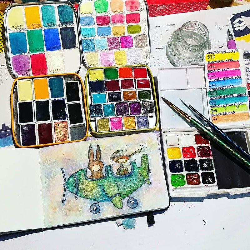
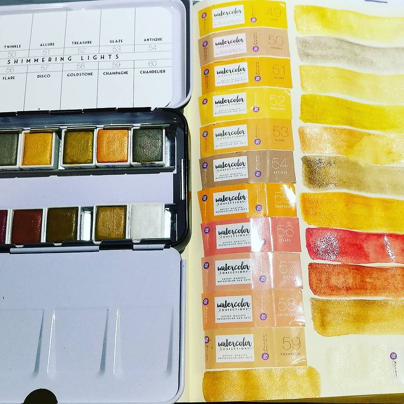
As you might have read on how Exhaustipated I get during winters (esp. when you're home sick with a strange type of flue which is going around it would seem!) I also wanted to share what helps me through these dark days. And that is color therapy in the form of doing water color practices at night. By now I have a little collection of different water colors tins filled with paint handmade by lovely artisans and the familiar brands like sennelier and schmincke. In the Black Friday Sale from a few weeks ago I've also purchased a few tins from Prima marketing series: Shimmering Lights and Decadent Pies.
Prima marketing Shimmering Lights color swabs
The Shimmering lights are beautiful golden/orangey tones with a slight shimmer. They also are quite strongly pigmented so they can be used for glazing over colors as well as being used on their own. They are labeld as artist grade paints and I'm very excited about this set. The Decadent Pies however, not as much...
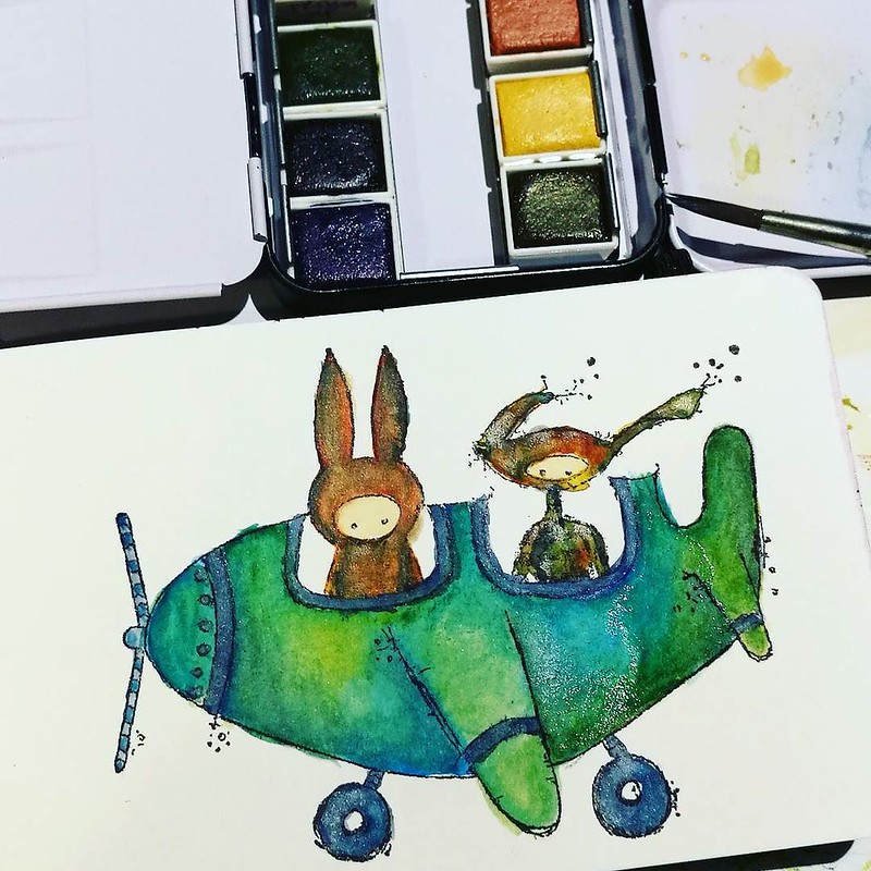
Stamp by Stampotique Originals, first layer of color with Prima Marketing Decadent Pies
There are some fun colors in the decadent pie set, but even though it says "artist grade" on the wrapping labels (not on the tin like on the shimmering lights!) it behaves more like student grade watercolors. Like the KOI Water Color set I had before I ripped those out of the plastic pans and filled with sennelier colors. OK, to be fair these do behave better and are more saturated in color than those KOI ones but still did not like the set as much as all the other sets I have. The set also have 4 shimmering colored pans, but no doubles from Shimmering lights. Didn't mean for this post to turn out like a mini water color review, but there you have it.
Stamps by Carabelle Studio's, DaVinci detailler brush size "2/0"
At any rate, I'm really enjoying the self-created "water color Therapy at night" routine (next to my writing meditations) which help me through these days where I am in much of need of sunshine. It's like I said to a friend "Color is like Vitamin C and works like an energy boost in dark times" and wouldn't you agree?
Sharing these watercolory desk shots over at my desky friends at Julia's blog for WOW 444 (such a magic number!)
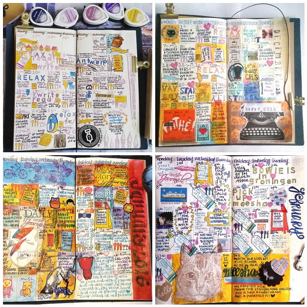
In terms of growth, it's always good to have moments to reflect upon things you have done in the past. Not only to see if they will help you move forward but also to appreciate the fact you have actually DONE these things. And in these quiet days in between the rush of Christmas and New Year's EVE creeping around, it's a good time to look back on the year I leave behind. In this post I look back on planning in my Midori Traveler's Notebook.
I have implemented my Midori Travelers Notebook planning since last year november. Next to my weekly planning in my pocket midori (which I have been lacking to do these past few month to be honest) these monthly update should give an overview of all the fun things I have done that month. And seeing the finished pages side by side definitely portraits a colorful year. Here's an overview from november 2015 through november 2016.
Following clockwise top left, November and December 2015, January and February . Key words these months were: anniversary, Antwerp, Holidays, birthday, David Bowie, Groningen and Meesha.
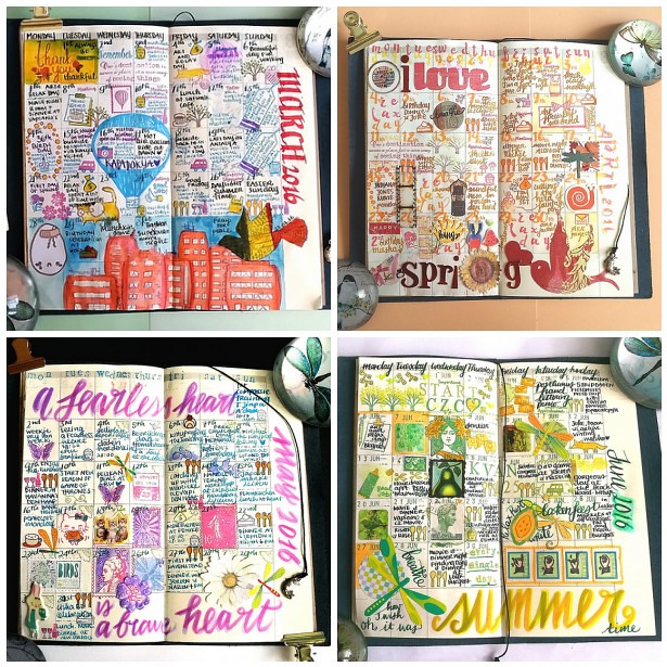
Following clockwise top left; March, April, May and June. Key words here were Brithday, Kapadokya, spring, compassion, hand lettering and summer.
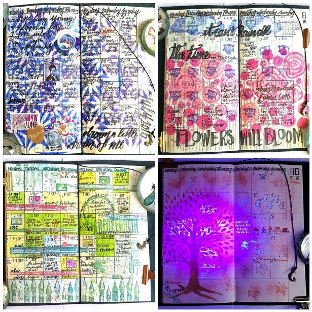
Following clockwise top left; July, August, September and October. Key words here were rain, bronchitis, flowers, penshow, meetups, halloween, fall and blue ghost.
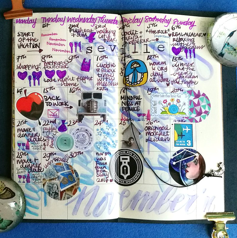
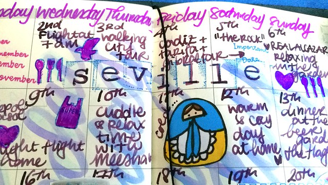
My november 2016 update is still fresh, from this week. Vacation, anniversary, Seville were the key words that month. And with Astrogirl looking back, it concluded my monthly updates of the year 2016. Below is a flipthrough I made on Instagram
My undated Midori planner is now full with a year's worth of memories. I have debated if I should continue this was for next year and after careful consideration I decided not to. While this experience was interesting and fun, it also cost me a lot of energy to create the pages. And I have a lot of exciting things coming up in the new year, the 1st half at least, which is going to need more my creative attention. Next week I will be able to tell you more about this :)
I am going to use my midori pocket planner again next year as well as a Stalogy undated planner as a gratitude journal, so it's not like I am going to quit planners completely. So I will definitely share those planning adventures with you here :)
Thank you for your continued support on my blog and elsewhere on social media through out the year! It's very much appreciated!
Wishing you all a wonderful and safe NYE celebration!
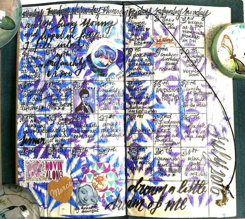
The colors I used for this month are in purple/ lavender tones. I started off with mixing some tombow markers and hand lettering the days of the week on the vertical side to give the page a starting color. Then I wrote the dates and events with my Pelikan M205 Taupe with Caran'dache storm. My fave pen and ink combination that month. I added stamp prints from Sakuralala and some fun stickers in a matching color tone so fill in some gaps. As the month went on, it became busier and it was harder for me to write down events that took place in my weekly planner. SAD really zapped my energy the last half of the month but we did end up doing some fum things esp. in the beginning.
My wedding anniversary is on the 5th of november and we always do a little get away, but this year we've decided to go for a longer (and warmer) trip to Seville, Cadiz and Gibraltar aria. It was so wonderful and I really loved documenting that bit. Read about my adventures and shopping finds in Seville HERE. It's definitely a city I highly recommend to visit as it was our second time there and certainly not the last!
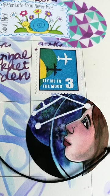
Just wanted to show you a detail in the overview. I thought it was fun to pair the "fly me to the moon" postoid sticker from MTN with S-Jane Mills artwork of Astrogirl below it. I bought to stickers last july and thought this one would be fitting to end the month with. It's also the end of the undated planner book, so my last update in this form. I will do an overview update later this week and share my thoughts using the undated monthly planner this way for a year. And if I will continue it... so look out for that post later this week.
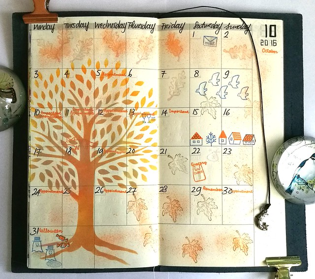
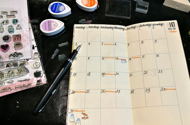
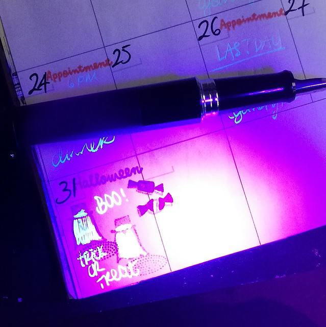
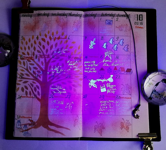
Finally had the chance to work on my October update in my Midori traveler's notebook. It sorta looks like nothing happened, but this month was busy with work commitments and my cyanotype course I participated in at the LAK. I had an idea in mind with some Blue Ghost Ink and experimented with it.
First I started off very simple, just writing down the days and dates with my trusty faber castell pitt pens. Seeing they are filled with india ink, it is water proof and also resilient against other inks.
I had my Pilot MR inked with Noodler's Blue Ghost ink and with that I wrote down the events which happened that month. Combined with stamps from Sakuralala fall collection 2015 line and memento stamp inks, they gave really fun effects!
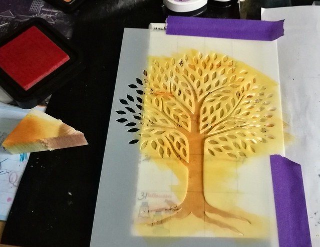
I also wanted to use this gorgeous tree stencil from the Crafter's Workshop designed by Joanne Fink (zenspirations) to convey the change in season. I began to dab some mossy green versamark chalk inks with a foam sponge and topped it off with orange distress ink to create some ombre in the tree.
Then stamped some autumn leaves stamps on the page and colored them in with the blue ghost ink.
And this is the finished spread. What's super fun is that well there is nothing to read like in the picture on top, but when you turn off the lights and shine a black light on it, it gives some really fun effects!
It's kind of hard to photograph but I hope you get the idea :)
Now to mull over a layout for this month and then my undated monthly planner is full!! How time flies!
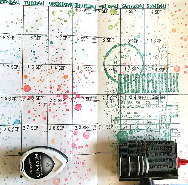
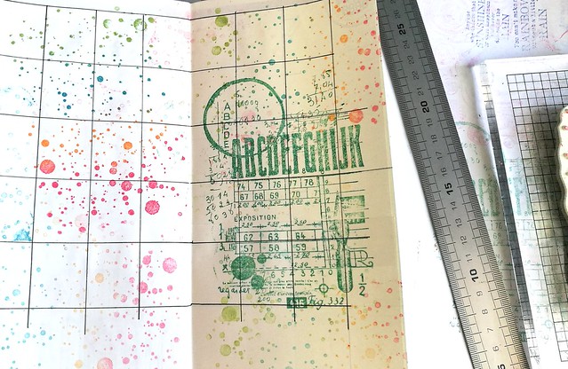
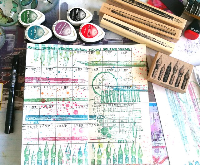
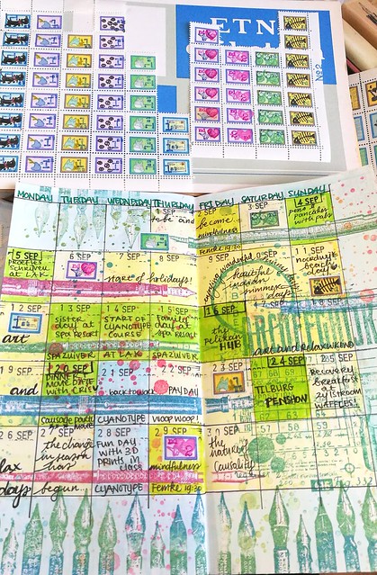
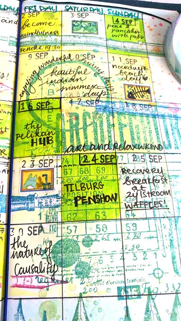
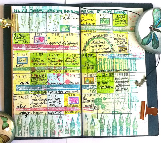
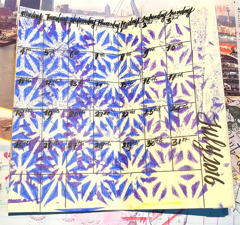
After a bit of an underwhelming August, the month of september was filled with bright and colorful days! I was excited to start on this spread because a lot of cool things happened and I wanted to use a fun combination of rubber stamps to set this month's theme which was "Ink, pens and writing". But before I got started I had to lay some ground work.
I really enjoyed the use of Carabelle stamps and Tombows in my spread of last month, but it bled through a bit on the back. A while back a friend gave me an A5 pad of cream colored Tomoe River paper and I used a couple of pages to cover the next pages I would be working on. The paper is really thin but sturdy and holds up ink like a trooper, so it was a good choice to add that as an extra barrier. I drew the month's grid with Faber Castell Pitt pen and stamped the carabelle ink spatters and journal stamp on it with various memento ink colors. Then I used the date stamper from the top picture to mark the days.
The page needed some images on pens on them and this was a great excuse to use the fountain pen and nibs rubber stamps from Impression obsession (calligraphy 1 and calligraphy 2) and Viva Las Vegastamps (fountain pen and nibs). Definitely liked the way how it all came together. Now it's time to fill up the month!
I wrote it all down with my Faber Castell Pitt artist pen because it's water proof. I colored the grids with different colors Tombows and highlighted the best days in green. For some more decoration I added a couple of my home made arti-stamps! Yes, I know I still need to do a post on how I made those!!
The best days definitely happened on the weekend. The first ever Pelikan Hub on Friday the 16th and a week later on saturday, the 28th edition of the Tilburg Penshow were definitely highlights of the whole year! And the fact I had a nice 2 week holiday in which I enjoyed wonderful " Indian summer days" at a spa resort with my sisters :)
The completed spread in full color! I thought about adding a quote like I have done in most spreads, but I felt it didn't need one. This might be my fave spread so far! I am excited to work on October's spread because I am going to use a stencil in combination with stamps. And maybe try a bit mixed media. Having experimented covering the pages with Tomoe River to counteract bleed through on the back pages, opens up exciting possibilities!
Thanks for stopping by and have a wonderful weekend.
So I have been well behind with my monthly updates in my Midori Traveler's notebook, but this past weekend I finally had some time to finish both august and september speads *big sigh of relief*
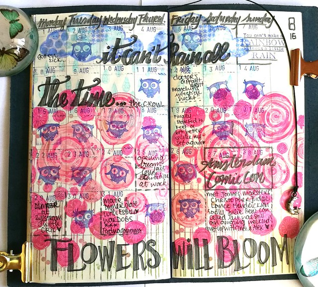
August has been a bit of a difficult month for me, as I was sick with a Bronchitis infection that lasted about 3 weeks. It seemed to rain like forever, until the last weeks rolled around and brought some much needed sunshine and happiness.
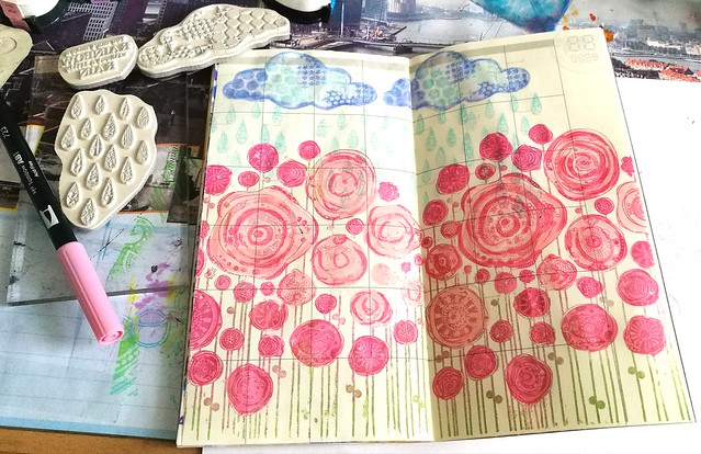
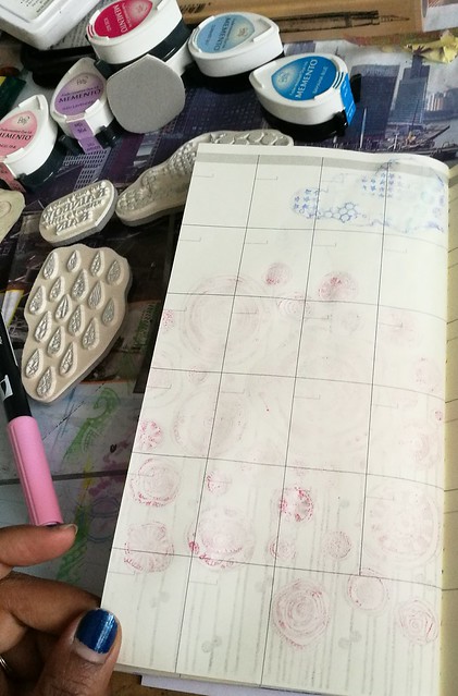
I decided to use some of my favorite Carabelle stamps to decorate the pages for august. I chose the cloud and raindrop stamps designed by Birgit Koopsen and the Pavots Rigolos by Azoline to set the mood for this month's theme. I stamped them with memento dewdrops and colored them in with tombow markers and blended it with a water brush. After the blending I immediately heat dried the page with my heat tool so the colors would not seep through the back page as much.
Sadly it did a little, but it could have been worse! But I have found a perfect solution for this problem with my next spread, which I will share with you on my september update.
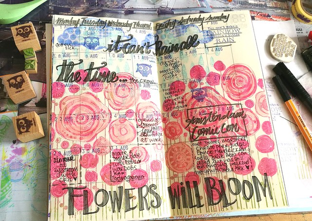
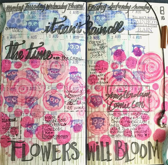
August was a slow month and I spent most of my time recovering from the infection. But one thing really stood out and that was the Amsterdam Comic Con! It was fantastic! I got to meet James Masters, Christopher Judge, Lance Hendriksen and met up with good friends in that weekend of whirlwind fun! I was glad to be recovered that weekend to enjoy it fully. Most of the days were left empty as I spent my time on the couch and re-watch episodes of Dawson's Creek. I thought it would be fun to fill those up with the cute owl emoticon stamps from Minipunkt. To remind myself that difficult times will pass I put in the quote "It can't Rain all the time" (from the Crow) and Flowers will Bloom (but it first needs rain to do so...)
With the addition of the happy owl faces, it turned out to be a fun spread after all. I spent most of my time just being and resting and the spread does reflects that. September is a whole different spread with a lot of activities and I can't wait to share that with you next week.
When I was recovering from a nasty bronchitis this month, I hardly had any creative energy but I still wanted to do my monthly update in my Midori Traveler's Notebook. Because I wasn't feeling super creative, but still wanted a pretty colorful page, I thought of a "cheat" and adhered one of my gelli prints I had done on tracing paper to the midori notebook.
And this is the result. I only added a few extra art stickers here and there, outlined the month, days and dates with a white gelpen to create some interest and that is it! Simple, quick and effective! I might use this method more often in the future. The canson tracing paper holds up fountian pen and other inks really well!
Some close up shots:
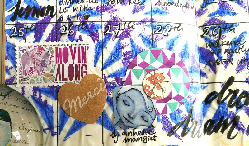
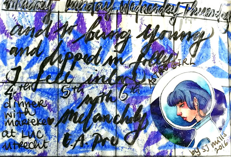
At the end of the month I had a ton of work to do on an assignment I wasn't to pleased with, so I just wanted that week to move along quickly! I had that sticker with artwork from Annette Mangseth a while now and am pleased I was able to finally use it :)
Last month I also bought some amazing artwork by Sarah Jane Mills, as I am a fan of her AstroGirl. She does this awesome "quote Monday" thing on her blog where she draws Astro girl (most of the time) and pairs it with a fun quote. So this bit of the page is sort of an hommage to her. The sticker was in the art pack I bought and thought the quote " And so being young and dipped in folly, I fell inlove with Melancholy" by Edgar Allan Poe captured the mood of this particular pose of Astrogirl.
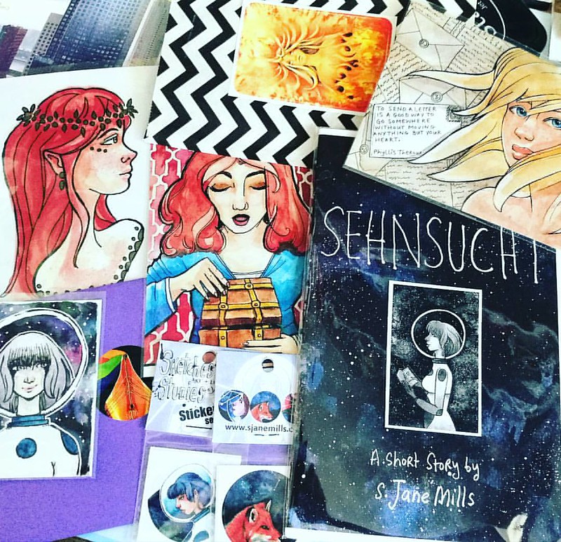
This is the full art pack I bought from Sarah Jane's Big Cartel shop: sticker packs, Sehnsucht zine (so wondefully melancholic!) and a surprise pack or prints. I esp love the one on the top right corner. Sarah was so sweet to include an original ACEO of Astrogirl, which I swooned over!! If you like her style, I urge you to check out her blog and store :)
In little over a week, august will be over and this month has been pretty un eventful so far. BUT I am SO looking forward to the last weekend as the Amsterdam Comic Con will be held then! We already got our tickets and I'm excited to see James Marsters and Julie Benz in the flesh :) I have been a long time Buffy and Angel fan, so I'm geeking out! So might I possibly have a fun update for august after all? I definitely do hope so :)
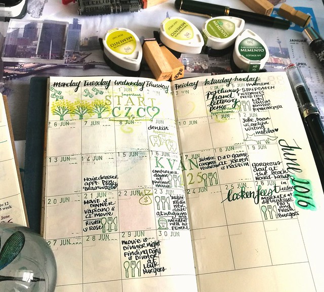
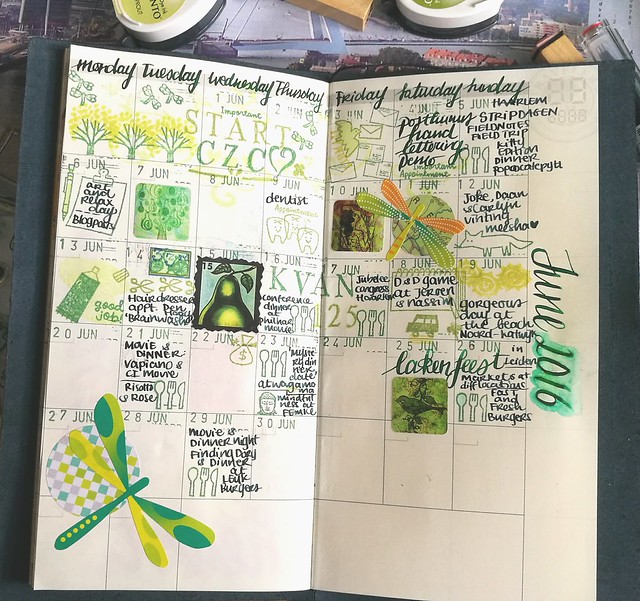
The year is now officially halfway through and like always I am thinking "how the hell did that happen?!" Also it's supposed to be summer, but it really didn't seem like it for the most part of June. I spent days longing for sunshine, but grateful for the days that were actually sunny and I had time to enjoy it. This time I didn't forget to take pictures of the process and I found a fun attribute to help me with numbering the days in the planner :)
Recently I have cleaned up some drawers in my room and found a lovely date stamp you can see on the right. I must have found it at a thrift market/yard sale at some point and forgotten I had it. But it's getting some great use now!
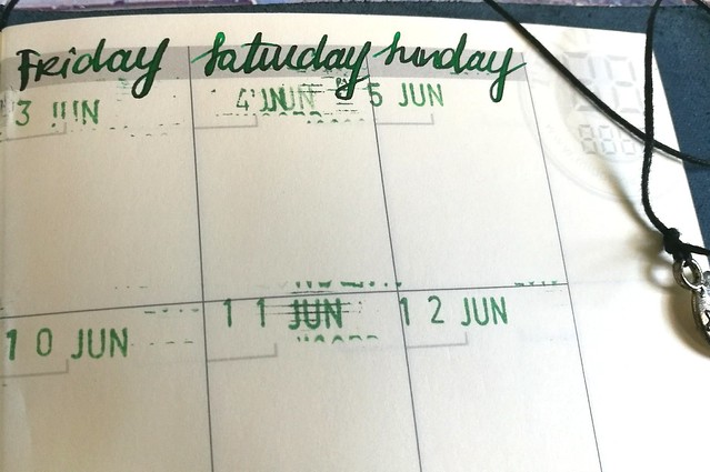
A closer look of the dates. It's a bit finicky to get a good clean print, as it's a pretty old and very used date stamp, but I suppose it's part of the charm. I chose memento Cottage Ivy stamp ink for the dates and I wrote the days of the week with my Pelikan M250 with Akkerman Bezuidenwoud Groen, And I was so pleasantly surprised the ink held up pretty well on the midori page, as it's a pretty wet writer! No feathering, just a bit longer drying time and that I forgot to take in account when I wrote the month and year on the side of the sections.
So yeah I smeared the date a bit on the right and tried to "salvage it" by using a water brush to take away the smear, but well, it got a watercolor-y effect and I just left it like that. Shit happens, right? Anyhow, I took out my fun planner stamps from Sakuralala again (it's a gift that keeps on giving really!) and yay, I had an excuse to use that cute little tooth from the Daily set because of my dentist appointment! I never been so happy to mark a dentist appointment before, ever! But still glad it's not "daily", heh! As you can see, I kept the green theme going and chose a few more Memento inks that fit that theme.
I also used my new TWSBI ECO with Akkerman Zuiderpark Blauw-Groen (which I decided I kinda do want a bottle of... sigh) to note events. This ink dries a lot faster on the page and is less prone to smearing. It's a better combo for this paper. I also added bits and pieces here and there that I felt fit the "theme". At pipoos I found Eline's Handlettering sets Bold and Light on sale and used that to note the CZC challenge and the KAVAN conference (=work related but was a lot of fun!) in the planner.
As I jotted down the events, I noticed I had a lot of "blank space" left... due to the fact I didn't jot down all my appointments and events in my pocket midori and I could not remember them at the time I made the update... Ehm, yeah, well at least the most important and fun events are on there and more space for some fun images/stamps. I found the dragonfly stickers in my stash somewhere and found the combination of green and orange pretty fun, so went further with that.
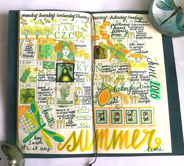
And this is the result of the full spread. I added more dragonfly elements and splashes of orange through out the page. I like the balance between the green and orange, it looks really fun this way. The square stickers I used, which I ordered through moo years ago, show my own work. I should make a sticker pack with my recent work as well :) And I also made the "YOLO" Faux postage stamps on vintage postage labels with rubber stamps from Chronicle books. I will do a tutorial and perhaps a giveaway on those in a future post, so be on the look out. "Oh, how I wish it was SUMMER time" resonates my feelings for this month. Hopefully July will be filled with more days spent at the beach :)
Since I have been asked a few times, on how I plan my mail art mailings and swaps, I have been thinking about it and what the most effective way is to keep an administration of creation. At the moment (at it has been this way for a while) I have planning systems all over the place: in my midori passport and in the full size. I have stuff on my phone planner, on my swap-bot Dashboard, facebook event pages reminders, notes on my desk... and just trying to remember it all by heart. So in short, it's all over the place (and nowhere specifically). But I know (and have done so in the past) that there is a more efficient system to keep track of all these swaps/mailings. Let me share my past plannings first with you.
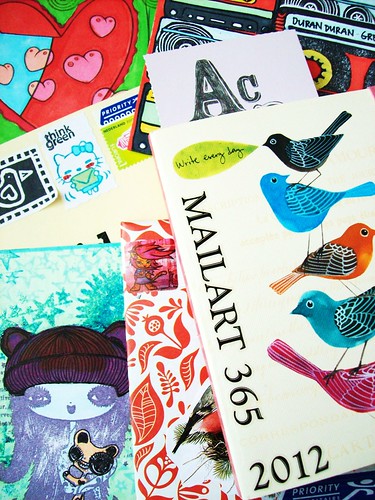
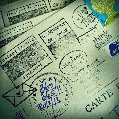
What I have done to keep track of my 365 Mail Art project in 2012/13 is getting an undated planner, a beautiful one above is with art from Gennine Zlatkis published by Chronicle books, to fit my needs for the administration log on which mail art item number is sent to whom. I also took a photo of every mail art item I send out (I still do) and logged it in my photo albums and home and on flickr. It took me over a year but I did finish off the 365 project and also did a few Bonus numbers because I has 4 weeks left in the planner.
If you follow the above picture to my flickr album, you'll find a discussion on this very topic from a few years ago! On each piece I also stamped a journal stamp (from Artemio set) and wrote the number and year on it. For mail art sent in 2014 and 2015 I used the monthly pages in the beginning of the book to keep track or mail. And eventually filled the book up completely. So this systematic way of keeping track of sent mail art worked perfectly, as it was a project with my own time and deadlines and had a specific book to log it all in.
But this year keeping track of things like this didn't work out as smoothly. I started to log it in my undated monthly MTN planner, but I also do my Monthly updates in there and I just forget to log my mail art in there as well. Also now I have a bit of a problem with keeping track of the serial number because I am making a bunch of mail art but sending them out later for swaps that fit the description. And my log numbers got a bit screwed up ...
Whoops! But I've started to get better at it again!
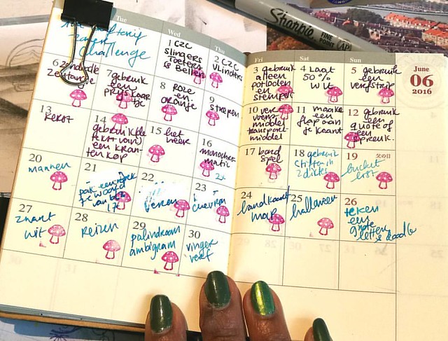
The fact that a monthly calendar system did help me out in the past, I decided to get the midori passport size monthly planner of this year (hey, it was on sale!) to fill in the daily prompts for the CZC. I then stamp a little mushroom in it to note which ones I have done. It works for me because it's an every day carry item for me and when I have some time to look over the prompts and get an idea, I just flip through my turquoise craft ideas book in the same midori to write down or sketch some specific ideas I have. And look, I'm nearly caught up with the CZC prompts!
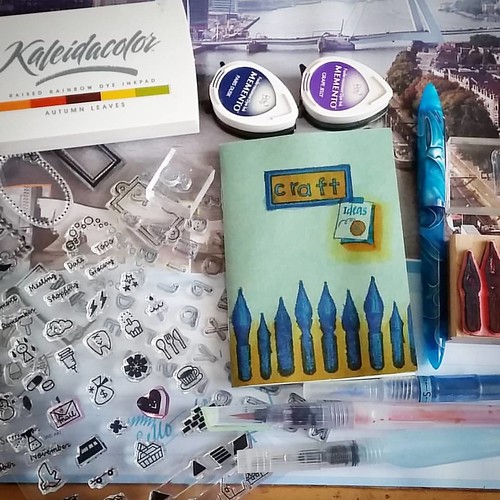
This craft idea's book is used to note thoughts I have on certain swaps and quotes I find interesting etc. It's become my inspiration book for when I'm on the road and need to jot in some crafty thoughts.
I am really interested to know; do you keep an administration of your creations? How do you log your mail out goings and what items do you use for it? I would definitely appreciate a comment below with your thoughts on the subject. It might be of help to my new set up and I will keep you all updated on my endeavors on this as well.
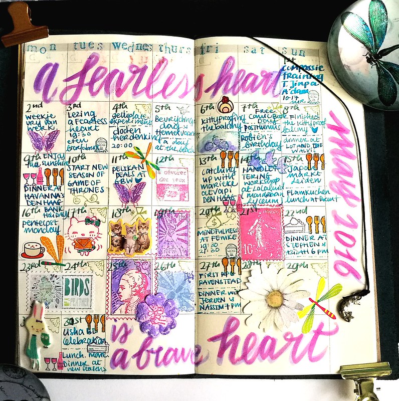
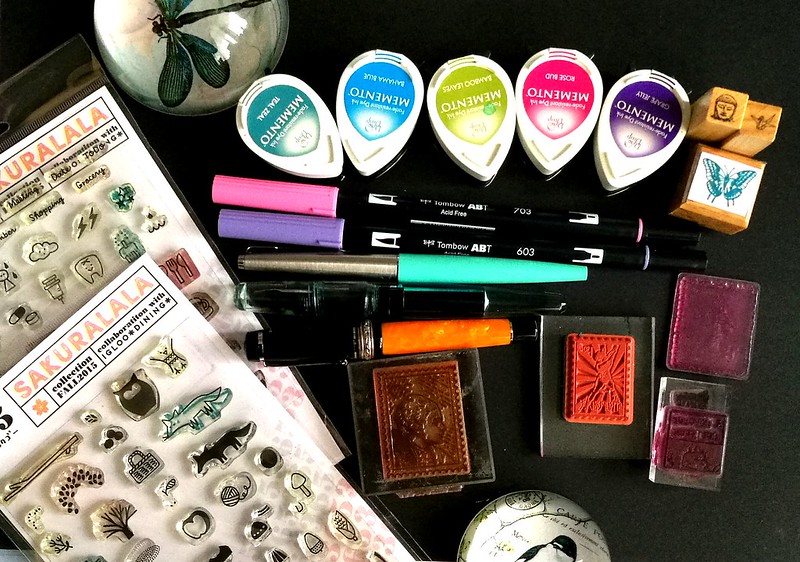
The quote "A fearless heart is a brave heart" is from Thupten Jinpa and was uttered at his book reading in the Amstelkerk in Amsterdam last month. And that actually set the theme, for the month of May was filled with compassion, a few sunny days at the beach and I attempted to see things in another way. With this months' lay out I kept things simple but I actually forgot to take pictures of the process of this month, though I do have a shot of all the materials I used.
The color scheme of the layout is blue, pink and purple., the colors I used most this month. I used the 365 stamps from sakuralala, memento dew drops, tombow markers, faux postage stamp rubber stamps and a few fountain pens: parker 45 blue with Private Reserve Daphne blue, Franklin Christoph Pocket 66 with Sailir Kingdom Note Pasanius Versicolor (I wrote most of the page with that pen) and the delta dolce vita undersize with a custom orange mix.
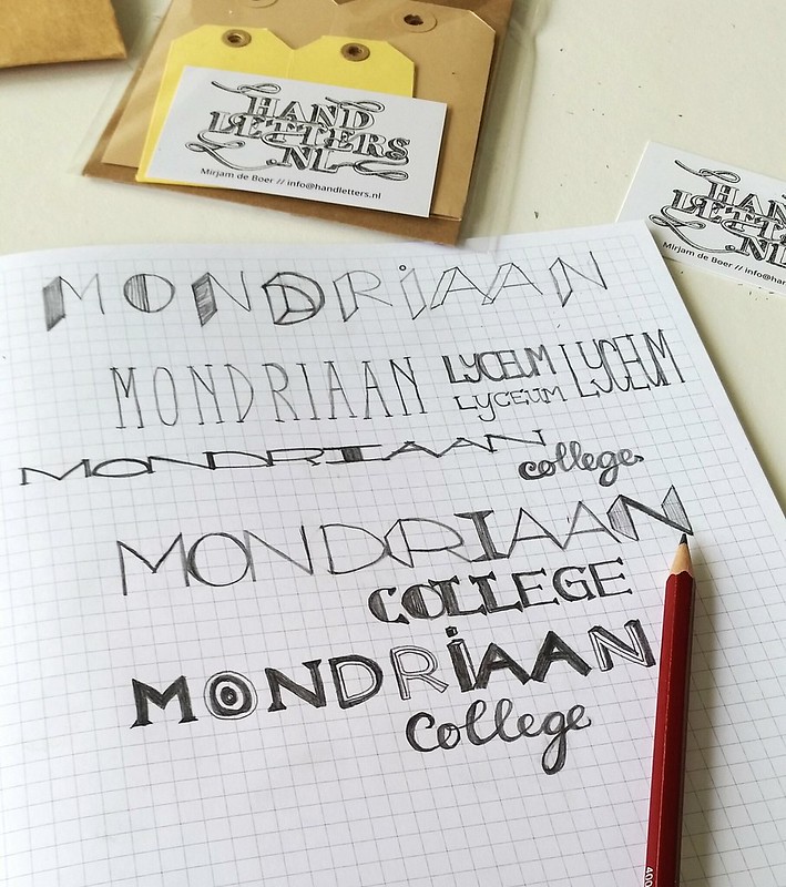
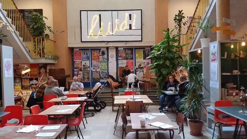
Looking at the layout and my activities in My, I see that I forgot to blog about my hand lettering workshop I did at Lola Luid.
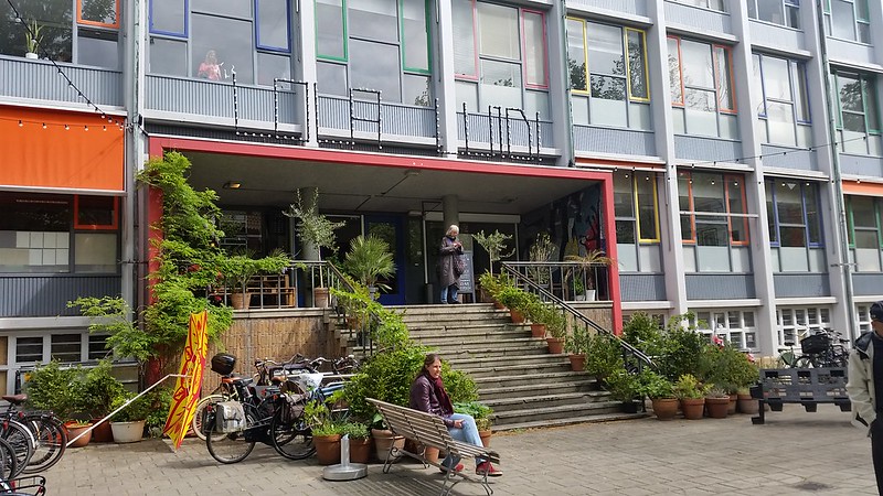
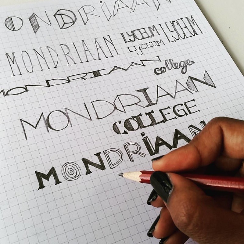
A fun fact: the location is situated at my old high school, the Mondriaan Lyceum. The old school building is now being housed by various artistic people selling their wares, or just using the space (class room) as their work space. So fun! A lot more fun then when I went to school there for sure! Some more fun pictures of that day:
The entrance of the old school building. So much green, I like it!
Entrance hall with a lunch/open work space location.
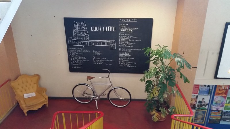
Map of all the classrooms and people/small companies in them.
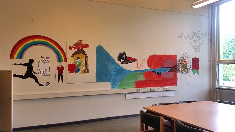
Some fun drawings on a wall in a class room.
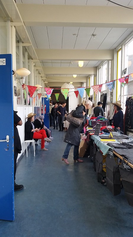
There was a flea market going on in the hallways when I was there. This saturday the 18th there is going to be another edition.
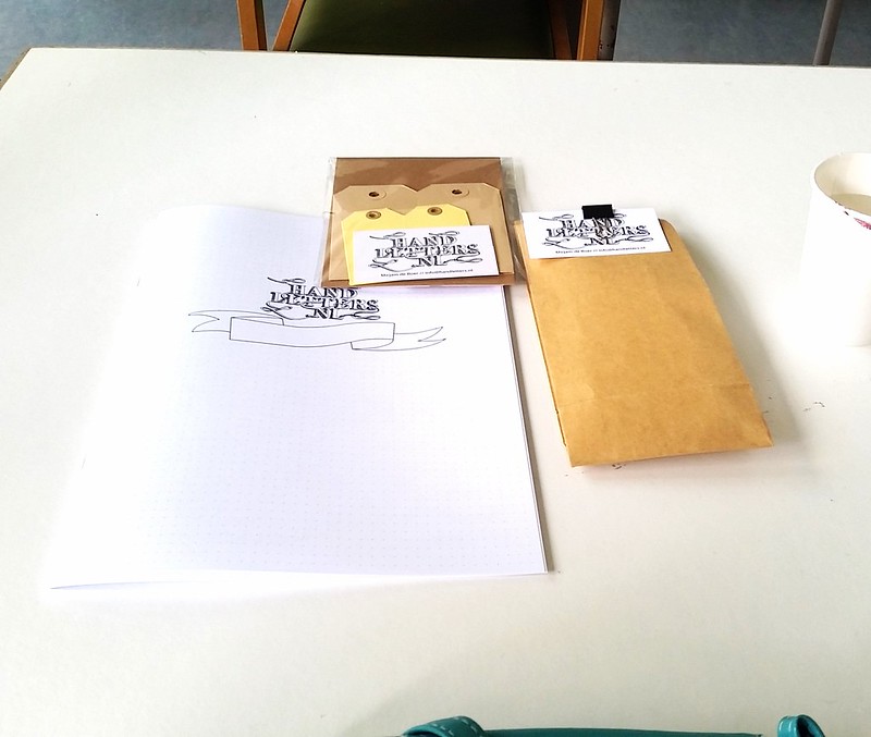
The workshop was given by Handletters.nl and it was held in my old physics class room :)
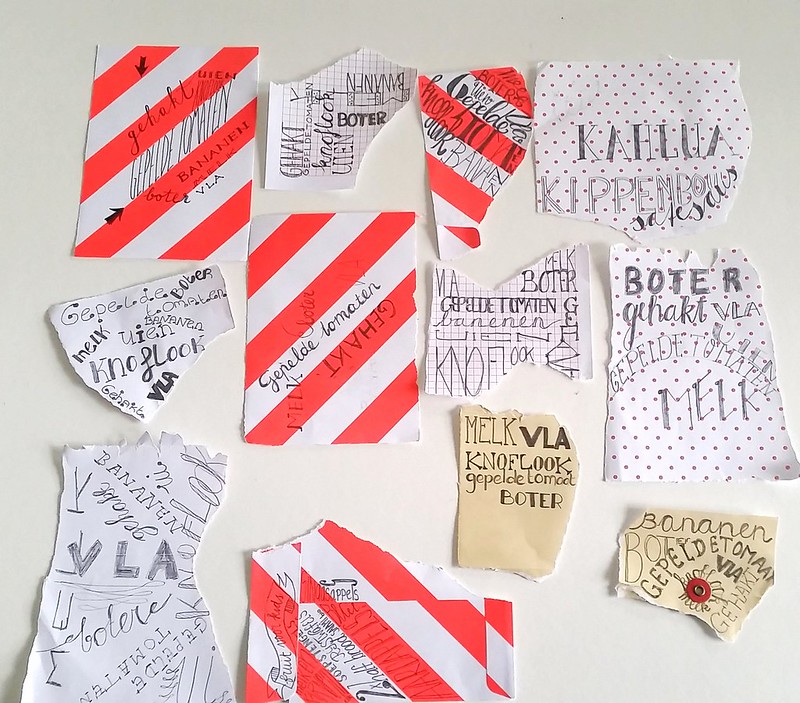
Results of the grocery list hand lettering of the workshop attendees. Mine is the third one from the top, seen from left to right.
And while it was a tad bit weird being in class in my old high school again, it definitely was a super fun day :)
I've done some more hand lettering this month (June) and I will write about that in another post (before the month is over, hopefully).