Showing posts with label bureau direct. Show all posts

2016/12/21

A Coloring Adventure: Blackwing Colors Pencils Review

blackwing coloring pencils
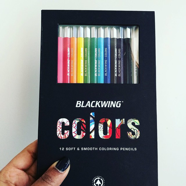
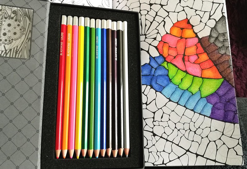
Blackwing is known for their awesome brand of graphite pencils, the Palomino Blackwing, and when I found out they had coloring pencils as well, I definitely wanted to try them. And when Mishka from Bureau Direct kindly offered this set for review I was absolutely thrilled to have that chance! Thank you again! They are absolutely a pleasure to color with. The packaging is very swanky, too.  It's a beautiful sleek and classy design in heavy cardboard,soft matte black finish and a magnetic closure. You can see the pencils through the PVC window which is convenient so you can see which colors are in there.

Blackwing coloring pencils
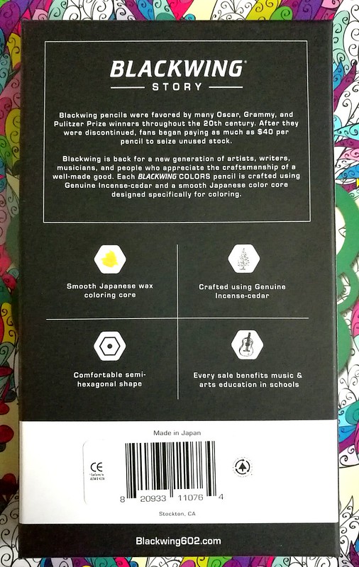
Next to reading about Blackwing's story, you can read the basic information about the pencils from the back of the box. The Blackwing Colors set (MRSP 30£) consist of 12 smooth coloring pencils made in Japan. Crafted using Genuine Incense-cedar in a comfortable semi-hexagonal shape with a smooth Japanese wax coloring base. Also every sale benefits music & arts education in schools, which is very cool of them to do so. 

Blackwing coloring pencils
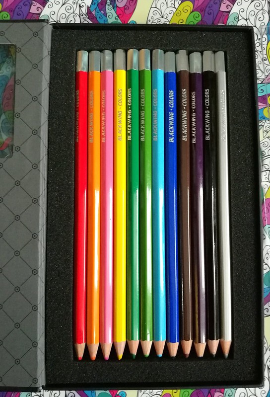
When you open the box, the inside design has an elegant harlequin motive and the pencils are cushioned in soft foam. There is also a protective see through plastic cover placed over the pencils (not pictured), which is easily removable and put back into place to keep your pencils in place (or as an extra barrier) if you choose to carry the box around. I like to foam cushion because it also protects your pencil tips from bumping against the side of the box and thus blunting them if you had just sharpened your pencils. That's a nice eye for detail there!

Blackwing coloring pencils
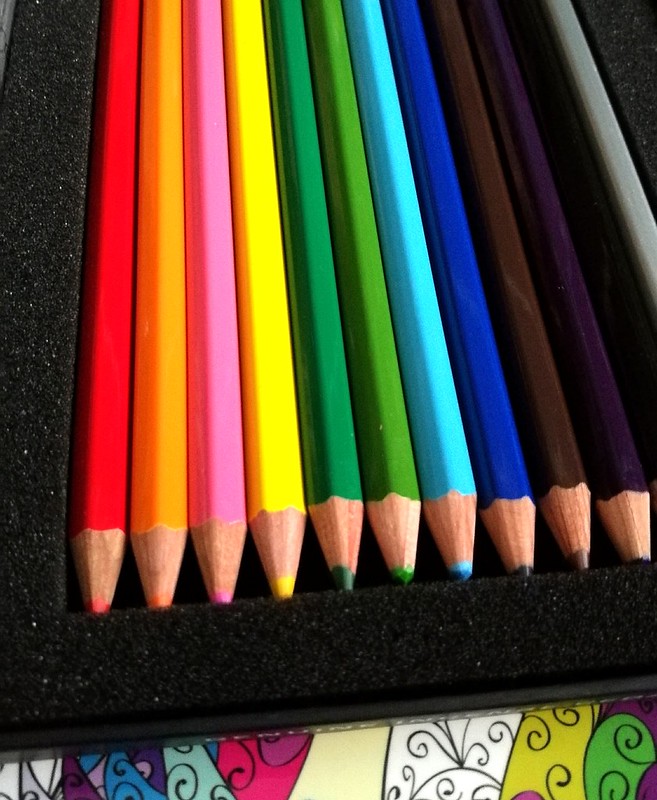
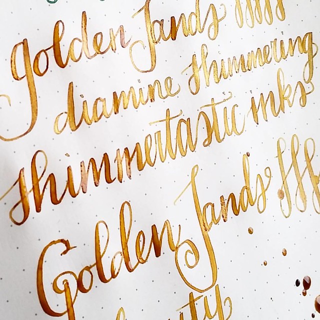
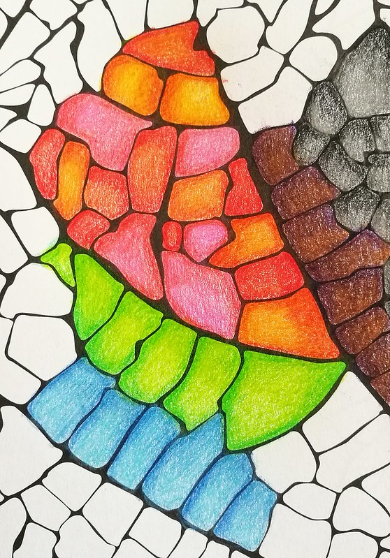
The pencils are solid colors with a silver capped end and the name "blackwing-colors" are engraved in silver as well. The only thing lacking are the names of the colors! You do have your ROYBGIV colors in the set. The colors are red, orange, pink, yellow, dark green, light green, light blue, dark blue, brown, purple, black and a fun silver color, which sets this set apart from other standard 12 pencil color sets which often offer white. If you're coloring in a low lit room, it might be hard to tell apart the darker tones, though. When testing these out one evening on my couch I thought the purple one was a darker brown one for sure and seeing my work the next morning, I discovered the purple and brown do go together nicely as well ;) I tested them in a coloring book.

blackwing colors
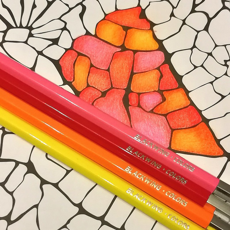
They are quite comfortable in hand. I do prefer the hexagonal shape because it prevents them rolling off my desk like the fully round pencils often do. On the subject of blending, I often use a white pencil or a colorless blender to burnish/smooth out the pencil strokes. But you can also use lighter colors in this set to get that same effect. I've done that with the color hues above. I used the lightest hues to blend the colors together to get a creamy blended effect. You can get awesome shade effects like this too, without dulling down the color which you sometimes can do if you blend with a white pencil. So the colors brightly pop out here!

blackwing colors
The pencils are in performance quite like the Derwent artist pencils, which are also wax based and super soft in use. Though with the Derwents you do have a wider variety of colors to choose from. This is a fixed set and no open stock available but you could use wax based pencils from other brands and intermix them if you would like wider range in colors. 

blackwing colors
The set on its own has a great variety of colors you can easily and smoothly mix them together to create different hues. The unique silver color adds a bit of freshness to the mix, which I quite like! 

With the pricing of 30£ for this set, it's not cheap, but you do get a nice artist grade coloring set of a well known brand in the pencil industry. It has classy packaging and sleek design. You're also supporting the arts education with purchasing this set. What's not to like?  
Also when you sign up for Bureau Direct's newsletter, you will receive a 10% discount code in your inbox every month. Just FYI :)

If you are still shopping for a Christmas gift for that creative friend of yours, this would definitely make a great one!

Thanks for stopping by and have a great day!

namasté

(disclaimer: I got this item free of charge for review purposes and was not monetarily compensated. All opinions stated here are my own and there are no affiliate links.) 

2016/06/18

Paper Goods: On a field trip with Fieldnotes Pocket Notebook

At the beginning of this month a fun bi-annual event took place in Haarlem, the Stripdagen. I went there on Sunday afternoon and it was so much fun! The weather was great and there was so much to see and to do. I decided to bring along a little pocket book and asked various artists to sketch in them, like I did last time.
fieldnotes fieldtrip
This year I took with me a Fieldnotes pocket notebook for the artists to sketch in. I kindly received a mixed Compilation set from Mishka from Bureau Direct for review purposes and it's great for an every day carry. Lightweight and a great small size (a6) for a purse/handbag or a back pocket.
fieldnotes fieldtrip
In the compilation set you will receive 3 Fieldnotes pocket notebooks (I received a mix of ruled, plain and graph paper, but you can get a 3 pack of any of the variations mentioned), one Fieldnotes band of rubber and one click ballpoint. It came in very nicely packaged in a Bureau Direct Logo plastic sleeve. I decided to take the graph notebook with me on this trip and I have a few shots of it being used in action. I asked all whom wanted to participate to draw me a kitty :)

fieldnotes fieldtrip
The first drawing in the book is done by Leslie Saurus. I really love her artwork!

fieldnotes fieldtrip
Also got a fun drawing from Doeke from Studio Doeke. He was a cheeky one and did not draw a cat for me, like last year he simply refused to do that. But he did make a fun drawing in there none the less. I suppose it will be a running gag from now on, in two years he will not draw a cat for me either ;)

fieldnotes fieldtrip
And of course, when you love cats, Anne from Pony People cannot be missed in the compilation! Here she is drawing one of her cute kitties (similar to the ones you see on the T-Shirts on her stall) in my book.

fieldnotes fieldtrip
Her stall was so cutely decorated with these fun cat balloons! And look at those cute pins! I definitely got one of the pencil kitties for myself.


I do not have an in action shot of all the drawings, but here is a video of all the drawings made in the book. People used all kinds of materials to draw in it, like pencils, fineliners and even sharpies. I asked them to use one page and not the back because I didn't want any drawings being over lapped by bleed through. It was a fun and successful fieldtrip and the notebook was almost filled up all the way. At the end I added some kitty stamp prints on the cover of the notebook and named it "the kitty edition".
fieldnotes fieldtrip
The kitty related loot from the Stripdagen. I definitely support cat-loving poor artists! Everything is super awesome, but the best thing I got was a customized drawn pin of Meesha (left to the notebook) which says "It's always nap time". And yes Meesha is currently napping in her new basket as I write this.
This little cutie got spoiled yesterday with a lot of goodies, toys and food in this basket from family. Turns out she likes the basket the most 😃 #meeshaisawesome #meeshathecat #meesha #catsareawesome #catsofinstagram #catsofig #catstagram
Soooo adorable!

I hope this gave you some idea's on how to make your Fieldnotes Pocket Notebook a special limited edition one :) The next comic con in Amsterdam is in August and I am hoping to collect more kitty drawings in the other pocket notebooks as well. 

Thanks for stopping by and have a great day.

namasté

2016/06/08

Inky goodness: J. Herbin 1670 Caroube de Chypre

So excited to try this!! Thank you @mishka5050 :) Can't wait for the launch of this ink at @bureaudirect :) #caroubedechypre #jherbin #FPgeeks #FPN #fountainpennetwork #fountainpenink #inksampler
Not a pens and ink post this week, but a focus on just the ink this Wednesday! A little while ago Mishka from Bureau Direct kindly sent me a sample vial of the coming ink in the anniversary line of J. Herbin 1670 Caroube De Chypre, which is due for release on Bastille Day, July 14th. So I'm lucky that I got a sample to try it before the release date and I finally had the time to play around with the shimmery ink a little and showing you some results today. Thanks so much again, Mishka!

j herbin caroube de chypre
J. Herbin Caroube de Chypre on with a waterman 12 Ideal nib #2 on Muji dot grid notebook paper. The ink performs well on smooth and fountain pen friendly ink paper like the above. I dipped my pen in the vial to write and then added some splatters. There is a lot of shimmery action going on there, which I really like. And the deep chocolate brown base color shows off the gold shimmer well.

j herbin caroube de chypre
I used my Pelikan 200 Cognac with a M italic ground nib for more writing and testing in my written meditation journal. The ink holds up pretty well on Clairefontaine paper as well. But sadly the shimmer doesn't show through as much as with dipping the pen in the ink vial and writing with it. It showed some shimmer the first few lines when I wrote with it.

j herbin caroube de chypre
As you can see in the above picture the first few sentences has the gold shimmer, but later on there is little shimmer. I had to shake the pen a few time to get some of the shimmer flowing into the writing again. And it does pick up a little, but not a lot.

j herbin caroube de chypre
You can see that my pelikan does hold a lot of shimmer in the barrel, so it might be that the combo of this pen and ink doesn't allow the shimmer to shine though like it deserves. The feed doesn't have a lot of shimmer on it and I think herein lies the problem.

j herbin caroube de chypre
For the shimmer to really shine though, I think you need a pen with less fins in the feed, like a vintage pen with a smooth feed or a really wet writing pen. I discovered that too with the diamine shimmering inks, though those inks have a lot more shimmer in them than the J. Herbin 1670 series.  I'll be experimenting with this ink in other pens when I get the chance (ie when I get a full bottle, my sample is nearly depleted). But for now I also wanted to show you some ink wash artwork I did. 

j herbin caroube de chypre
I stamped the dip pen stamp from Viva Las Vegas Stamps with versamark ink on smooth white glossy paper and embossed it with clear embossing powder. Then I wrote Caroube de Chypre, J. Herbin 1670 with a versamark embossing pen and embossed that with clear embossing too. I took a small paint brush and a little bit of water and started to wash the ink from top to bottom over the embossed parts. 

j herbin caroube de chypre
The embossed parts work as a resist, so the image shows up through clearly and you can wipe excess drops of ink on the embossed parts away. When the image was dry I took my brush, dipped it in the water a bit and spattered over it. I let that dry and then I dipped the brush in the ink vial and spattered non diluted ink over it.

j herbin caroube de chypre
This is the end result, a beautiful chocolate brown shimmery gold speckled ink wash! I'm going to do some experimentation on watercolor paper like I did with the Diamine shimmery inks, but I definitely love the smooth glossy look this paper has. I'm also loving this embossing ink resist technique a lot and will incorporate them more in inky goodness posts :) 

More reviews with lush pictures on Caroube de Chypre can be found at The Clumsypenman and Gourmetpens. And if you do not want to miss out on this ink when this gets released in July, why not subscribe yourself to Stationery Wednesday newsletter and blog from Bureau Direct for more info and a 10% discount code being distributed weekly!

Disclaimer: this sample was sent to me free of charge for review purposes. All opinions are my own and there are no affiliate links. 

Thanks for stopping by and have a great day!

namasté

2016/05/15

Paper goods: Papelote Notebook Cover & Clairefointaine 1951 vintage notebook

It's wonderful "journaling on the beach" weather! Papelote notebook cover from @bureaudirect is super handy!  #bureaudirect #stationeryaddict #stationerywednesday #journaling #journalonthego #papelote #notebookcover #brushpens #artjournal #lovingkindness
It was a beautiful day out and we decided to make good use of it and go to the beach. The perfect opportunity to test out the great Papelote A5 Notebook Cover outdoors! This notebook cover, together with the Clairefontaine 1951 retro cloth bound notebook was so kindly sent to me by Mishka from Bureau Direct for review purposes! Thank you so much Mishka!!

Journaling on the go

The papelote notebook cover is made with soft cotton cloth and comes in various designs. I was sent the red and white striped with blue inseam cover. A lovely combination! The cover has an elastic strap attached to it, which can hold 5 writing utensils. It comes with a pencil to get you started. You can see the array of items I've chosen to carry with it; a few fine Steadtler fine liners, a faber castell brush marker, sakura gelly roll pen and a water brush pen. The size I have here is the A5 size, which can fit any A5 size notebooks like the Leuchtturm 1917 and Rhodia notebooks. I chose the Clairefontaine 1951 vintage style notebooks, because of the fact it has fountain pen friendly paper and well just look at it.

Clairefontaine retro 1951 notebooks
It's pretty and it's turquoise! They come in 3 different sizes, the pocket sizeA5 exercise and A5 clothbound books. I got to test them all and they fit in very nicely in the notebook cover.  

Starting off the day with a little writing in my journal. Papelote notebook cover and claire fontaine retro notebooks from @bureaudirect #dailywriting #journal #papelote #clairefontaine #bureaudirect #writing #mindfulwriting #gratitutejournal #stationerya
 Also I used some fun journal rubber stamps to categorize my notebooks :) 

A fun turquoise set: clairefontaine vintage 1951 pocket book, J. Herbin rollerball with Blue Pervence ink cartridges. Thanks @bureaudirect @mishka5050 😊
Fun fact, Bureau Direct also offers the pocket books in a fun compilation with the J. Herbin rollerball pen and ink cartridges. The turquoise set comes with J. Herbin Bleu Pervence turquoise ink cartridges. They also have the bottled ink here. A scrumptious set for a turquoise fanatic like me :D

Anyhow, back to the notebook cover! You can carry a lot of tools inside the cover besides just the notebook due to the flexibility of the soft cotton cloth cover!

Journaling on the go
Look at that! Doesn't that look scrumptious?? Yes, the brownie was really yummy as well ;) So what did I take with me in my notebook cover? Take a look below:

Journaling on the go
I tucked in a pack of water color pencils, a pocket size coloring book, the Lamy Safari Dark Lilac (see my pens and ink post about it here), a pocket sketchbook and...

Did you know you can also tuck in an A5 clipholder in the back of the papelote notebook cover?! It gives more "body" to the cover and you can just sit anywhere and write :) you can get all the items pictured at @bureaudirect for your own "on the go" journ
An A5 Clipboard! The cover has a seem opening on the back where you can tuck this baby in! I found this discovery brilliant as you can add sturdiness to the cover which allows you to sit down anywhere and write, draw, color or whatever on the go! I already had this one, but Bureau Direct are selling these clipboards by Penco as well. So what do I use my clairefontaine journal for? I use it as my Daily Gratitude and Loving Kindness journal. You have seen shots of the pages in my Pens and Ink post, surely. Every morning (or at least I try to) I write down the loving kindness meditation to set the tone for Compassion for the day. I will write another post about this type of journaling at a later point, but let me show you a page as a reminder.

Starting off the morning with some #lovingkindness #mettameditation #writtenmeditation Tools of choice: FP: Online Calligraphy 1.8m Ink: visconti turquoise cartridge Paper: Clairefontaine - #Fpgeeks #FPN #fountainpennetwork #calligraphy #shittycalligraphy
As I said before, the paper in clairefontaine books hold fountain pen inks really well. It's definitely one of my preferred notebooks for journalling as I love the line spacing (7mm) for my handwriting and the smoothness of the paper lets the nibs just glide over the paper. 

In conclusion: The combination of the Papelote Notebook Cover with these Clairefontaine 1951 notebooks is a wonderful thing! I thoroughly enjoyed using cover. A major plus point being the flexibility of it. Also a great thing about the fact that it's a cloth cover is that you can wash them quite easily if you spill any (non permanent) ink on it! The straps are mighty handy too! It works best if you have something sturdy in the cover like a clipboard or a hard cover notebook, though. If you are looking for only the notebook straps, Papelote also makes them separately which Bureau Direct also sells. Those work best on hard cover notebooks. 

Thanks again Mishka/ Bureau Direct, I've really improved on my daily writing sessions by having such a wonderful set up for it :) By the way, if you're looking into journalling yourself, and looking for something that might work for you, why don't you check out Stationery Wednesday as this month's spotlight falls on  the Bullet Journal. And while you're there, don't forget to subscribe to the newsletter if you haven't already. Next to fun news, specials and competitions, it also contains a weekly discount code for 10% off your purchase at Bureau Direct shop! That's not something you'd want to miss out on!

Hopefully this review was useful to you and inspired you to go out and journal in the wide open :) 
Thanks for stopping by & have a great sunday!

namasté

(disclaimer: I got these items free of charge for review purposes and was not monetarily compensated. All opinions stated here are my own and there are no affiliate links.) 

2016/04/27

Pens and Ink: The copper orange edition + mini Q&A

A little intermission from my Omas pens and ink postings this week as it's Kingsday in the Netherlands! Since the nation is being clad in orange today, I thought it would be a fun idea to have this week's pens and ink post to color coordinate accordingly.

Seeing I don't own many orange pens, but I know someone in particular who does like them and even customized one, I asked him to help me out this week. I've also asked him some questions on how he uses his fountain pens which also fits this months theme on Stationery Wednesday at Bureau direct"Everything you wanted to know about fountain pens, but were to afraid to ask" So thank you, my husband Cris, for indulging me and answering a few fountain pen related questions  :)

How did you get (re)acquainted with fountain pens?

My first fountain pens I used in school, which meant a lot of inky fingers and a lot of collecting of the little agitator balls that are left in standard cartridges. But stopped using fountain pens the day I left primary school behind.
I got reacquainted with fountain pens because my wife, the wonderful Miss Thundercat, started using them. While she was using more and more elaborate pens (eyedroppers, piston fillers etc) my interest was mostly just technical. The construction, the use, the techniques the idea's. When I finally got around to buying my first fountain pen, I was quite happy with the way it could be handled, wrote and the choice of inks.


What was your first fountain pen purchase?

My first fountain pen was the Lamy Al-star Black, a gorgeous, matte black, "stealth" looking pen. I thought that it was a really cool pen even though the cap look a bit "chunky" but fitting as as Al-stars are robust pens. I was sold on fountain pens ever since.


Do you have a favorite nib size?

I have a spidery cursive handwriting, so to keep it legible, I go for extra fine or fine points. I also enjoy them for art projects. I have experimented with broader nibs and trying to change my handwriting, but nothing consistent has come out of this so far.


What do you use your fountain pens for mostly?

I use it for writing projects or (small) notes and planning of RPG's mostly. I like to use hard back notebooks like Leuchtturm 1917 A5 size in dot grid. I also enjoy creating map drawings with them and different sizes nibs and ink color choices are really useful.


How did you get the idea to customize your Lamy Copper Orange?

So I started with Lamy with the Matte Black Al-star, which had all black parts and love the looks of that. I really love the deep color of the Copper Orange pen body, so I got the pen when it came out. But the chrome clip and nib just seemed "off", they didn't add to the pen and just seemed to disappear against the really outspoken color of the body. For a while the pen kinda languished on my desk, being merely "okay".
After witnessing the breaking of a really old Safari cap I had done a some research to fix it and eventually got enough to understand how they worked.
I ended up buying a Lamy Safari Charcoal to strip for parts (I didn't know I could just get the spare parts from Bureau Direct back then) and assembled the clip on the Copper Orange. My pen went from merely okay to really shining. The black clip and nib adds something to the pen. Black and orange just go really well together. After people saw this transformation on my Instagram, I got requests to customize the Copper Orange for other people. Fun to see it was a hit with others as well.

What ink do you like to pair it with?

The Terracotta from the Diamine 150 anniversary ink line goes really well with the color of the pen. It's deep and rich with enough "bite" to complement the orange of the pen.

Een foto die is geplaatst door Blaze8t88 (@cornelius.grayl) op


And I have to agree, the pen and ink combo looks wonderful... even with a fine nib! Within a year Cris's collection has grown quite a bit. To see more of his pens and map drawings, you can follow him on his Instagram.


Een foto die is geplaatst door Blaze8t88 (@cornelius.grayl) op


Thanks for stopping by!

namasté

2015/10/22

Inky Goodness: Diamine Shimmering Inks

Shimmering inks: purple pazzazz, golden sands, blue lightning and magical forest. So shiny!! @bureaudirect @mishka5050 #diamine #shimmertastic #shimmeringink #fpgeeks #fountainpenink #FPN #fountainpennetwork
Due to the generosity of Mishka from Bureau Direct, I received a few samples of the new Diamine shimmering inks in samples to try out. And wow, these are really great inks! I had the chance to pick colors I like and I picked the above ones. FYI: all the samples have been written with a vintage Waterman 12 and flexible Ideal #2 nib on Muji dotted notebook paper which is similar to Midori MD paper.

Pazzazz! #diamine #shimmertastic #shimmeringink #purplepazzazz #purple #fpgeeks #FPN #fountainpennetwork #fountainpenink @bureaudirect @mishka5050
Purple Pazzazz is a lovely deep violet color with a golden shimmer to it. The ink color reminds me a bit of Montblanc's lavender purple (old formula) that also had a hint of gold sheen to it when the inks pools up. I had a bit of trouble getting this color washed out of the feed of my pen, because the color is so rich and saturated. But eventually it does washes out completely.

This is freaking spectacular! @bureaudirect @mishka5050 #shimmeringink #diamine #shimmertastic #bluelightning #fountainpenink #fpgeeks #FPN #fountainpennetwork
Blue Lightning is the one I was so excited to try out! Turquoise and a silver shimmer?! Well the ink gods (aka Diamine) have been very good to me with producing this one! I developed an instant crush! I do wonder what base color diamine chose for this though, since it has similarities to Montblanc's Honoré de Balzac Dandy Turquoise... but that one has more red sheen to it.

Golden sands a new shimmering ink by Diamine. This is just SO beautiful! Shading and shimmer. Super nice! @bureaudirect @mishka5050 #diamine #shimmertastic #shimmeringink #goldensands #fpgeeks #FPN #fountainpennetwork
Golden Sands is definitely the underdog in the line up, but I think this one will appeal to many. It does remind me of beautiful desert in like Dubai or something... Gorgeous golden brown color with a golden shimmer. This ink also shades really well and I love how it looks in italic nibs like I have in my Pelikan M205 congac.

Need some sparkle on this grey saturday, so how about starting a new hashtag #shimmeringsaturday And my current fave combo is the Pelikan M200 Congac with Diamine golden sands. Show me some shimmer #Fpgeeks :)
The shading and shimmer pool together really well.
 

Wow, this green with a pearly shimmer to it is definitely magical! @bureaudirect @mishka5050 #magicalforest #diamine #shimmertastic #shimmeringink #fpgeeks #fountainpenink #FPN #fountainpennetwork #shimmer #allthatshimmers
Magical forest... I gotta hand it to Diamine, they sure know how to name their inks! This one is very aptly named as well. This was a surprise ink thrown in by Mishka and I was very pleasantly surprised! A gorgeous shade of emerald and the shimmer in there is also green. A very pretty pearly combination. This would look good in my TWSBI Diamond 580 green edition with 1.1 nib... oh yeah!

So I will definitely get some bottles of these and am very curious how the other colors look IRL. If you want to see a more in depth review of these inks, check out Gourmetpens review on these! Also if you are feeling bold, Leigh Reyes has made an excellent post on how to Shimmerfy your own inks!

I have made some mail art with the ink samples I received and in the next Mailart Sunday post, I will show you  how those turned out. 

Thanks for stopping by!

namaste