Showing posts with label fountain pen ink. Show all posts

2018/03/16

Art Journal: A Rainbow in Writing

rainbow writing

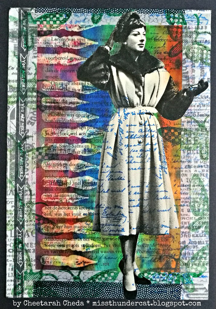
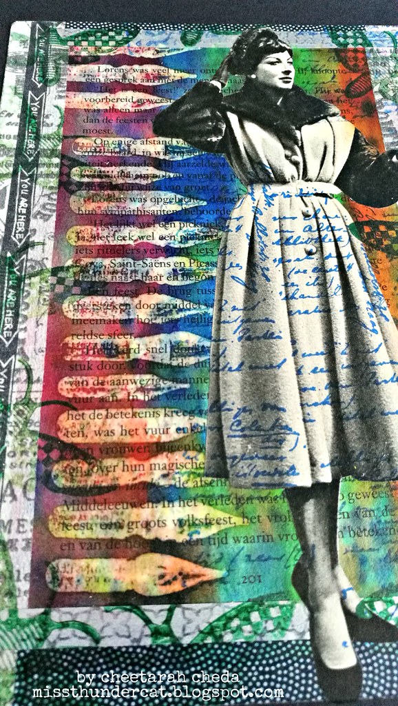
It's already halfway through March and I'm really longing for spring to finally arrive! But it's still a bit cold in my hemisphere and wanted to share a colorful art journal page to share some warmth. I've stamped the dip nibs (by darkroom door) on a book page with versamark ink and heat embossed it with transparent embossing powder. Then I dripped some various fountain pen ink over the page and diluted it with water to make a rainbow effect. The embossed parts worked as a resist. The lady is from a vintage magazine and handwriting stamp and moth are from Paper Artsy and stamped with Staz-on.

rainbow writing

I used washi tape for the edges and sealed it off with a thin layer of modge podge matte medium. Love how the resist effect worked here and how bright these beautiful colors are. Such a happy page to look at! 

Would love to enter this in the following challenges: 

Thanks so much for stopping by and have a wonderful weekend!


2017/12/28

Pens and Ink: Favorites of 2017


Faves of 2017

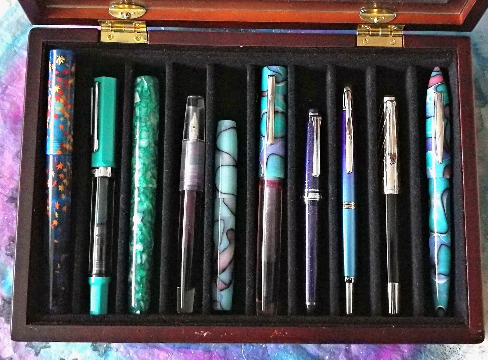
Even though my pens and inks post were few and far in between this year, I still have been using and enjoying my fountain pens pretty much daily and wanted to share my top 10 faves similar to what I have done last year. It was tough to narrow it down but these made the cut. You can see most of them in action on my instagram account Present and Connected and half of them are made by small business owners and are handmade. They are not placed in a particular order,  I really enjoy using them all equally! From left to right: Momiji leafs in night sky made by 18111.com, TWSBI ECO turquoise (special edition), Mojito by Woodshed PenCo, Lecai with Twsbi stub nib, Franklin Christoph model 45 in blue pink black (special edition), Herbert Pen Company Pink seaglass, Sailor Sapporo Purple Cosmos with music nib, Pelikan M625 Ruby with BB nib and the Edison Nouveau Premiere Seaglass LE of spring 2017 (a collaboration of Goulet Pens and Edison PenCo). Let's take a closer look at them.


2017/08/18

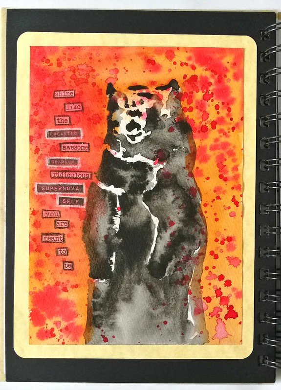
Art Journal: Supernova Bear

Art Journal: supernova bear

Today I wanted to share with you a fun and quirky art journal page I made using watercolors and the "magic ink" technique combined with stencils. It's a fairly simple process but you have to work quickly like I have described in that blogpost. I used india ink and red and orange fountain pen inks. Sadly memory fails me which fountain pen inks I used, but it were samples I needed to use up, I'm sure!

Art Journal: supernova bear
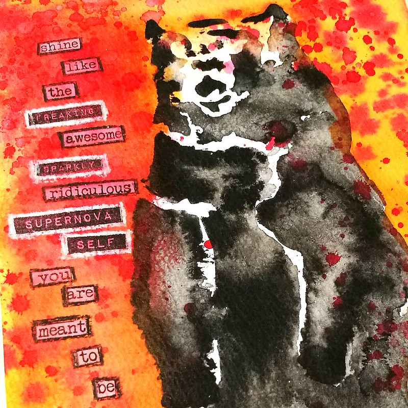
The sentiment is remixed from this Viva las VegaStamps! sentiment stamp and I have made it say "Shine like the FREAKING AWESOME SPARKLY RIDICULOUS SUPERNOVA-SELF you are meant to be"  which I lined with Stabilo marks-all pencils in black and white. 

This page definitely fits the theme "Poetry in motion" over at Art Journal Journey wouldn't you agree?  Every time I look at this page it just makes me giggle :)  Hope it does the same for you! 

I am also entering this in the HLS august watercolor challenge with optional twist Bloom -
and it's a play on words as I see this as "blooming into what you are meant to be" :)

Thanks so much for stopping by and have an awesome weekend!

2017/07/19

WIP: the ongoing struggle of an inkophile

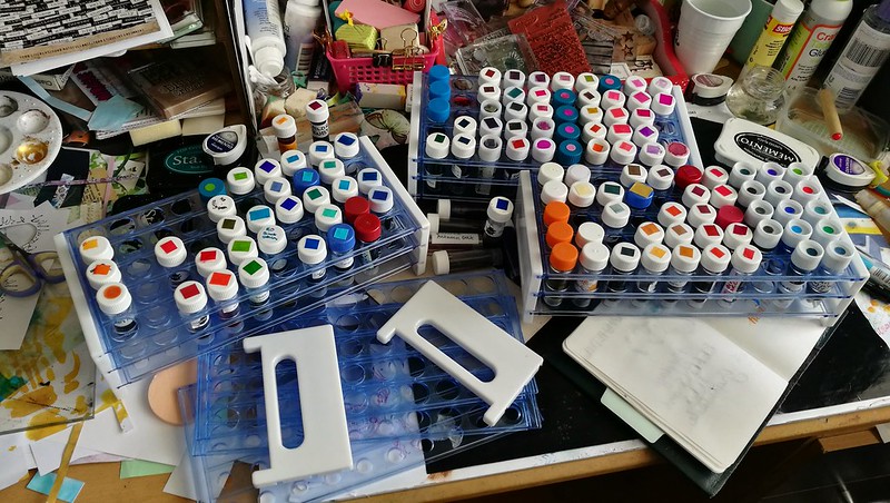
Inksample palooza - managed to cut down to 3 trays, yay!

Yes friends, take a good look at my desk in all its messy glory. To some this might be a nightmare, but for me it's a victory. First let me explain what you see here, though for fountain pen people visiting my blog, this is a familiar sight. These are test tube vials filled with fountain pen ink. Samples of ink which were either bought at various pen sites (the main one being Goulet Pens Co.) or swapped/given to me by friends. Yes, there are thousands different ink colors of there by hundreds of different brands. It can get overwhelming, to choose a color to buy a full bottle in. Where to begin and where to stop? Having a sample of an ink you are interested in does help. You can swatch them out, see if it is the shade of color you like, if it has sheen or if it's waterproof... but even a small vial of 2-3 ml of ink (times 50 per tray) has proven to be hard to fully use up. And for a hoarder like me, it's a tough challenge. But I am slowly getting there, with the help of Konmari this year.  From 6 full trays a few years ago and to now 3 is a victory! Let me tell you, it felt soooo goood to decommission that ink tray, I had to photograph and share this momentous occasion with my fellow deskers at WOYWW this week :) So plan is to keep using up those ink vials either in my art work or in my fountain pens, of course. For instance the ink below was sent to me years ago by a dear friend.

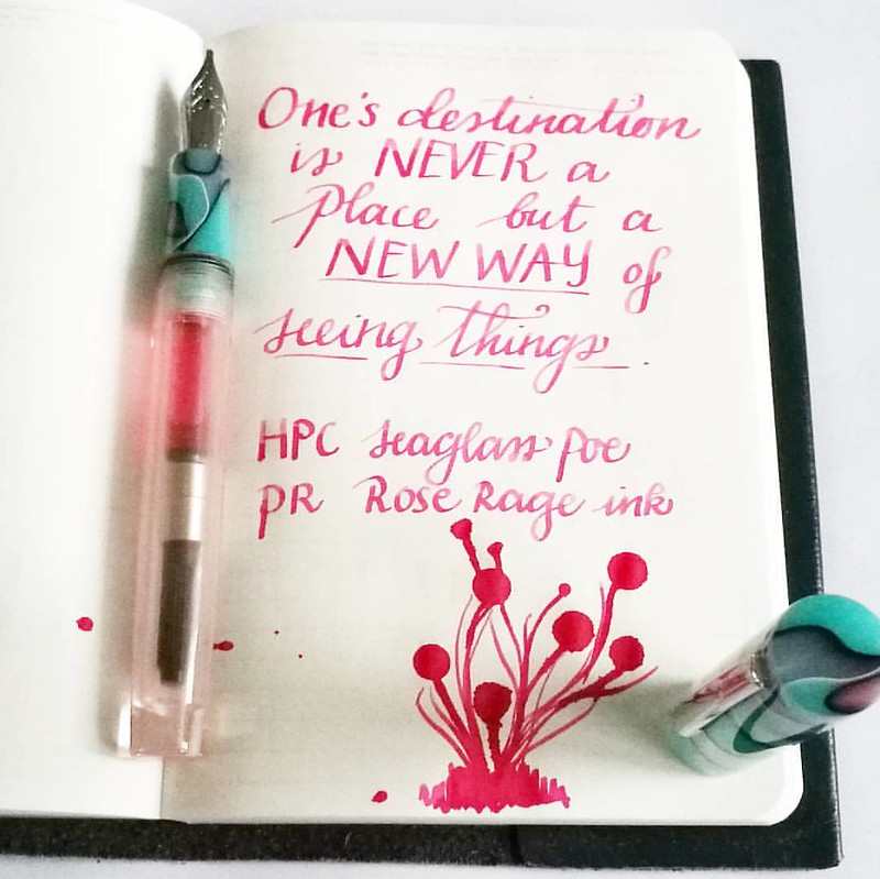
A new way of seeing things... This pink though, you need 😎 as it's so bright!  #mindfulmusings #quoteoftheday #FPN #FPGeeks #fountainpennetwork #seaglass #neonpink #privatereserve #roserage #handwritten #handwriting #dailywriting #dailyinspirat

Last week I made an art journal with this quote from a stamp and I had to write it down in my Stalogy B6 which I use for quotes. I hardly ever buy pink inks, but they are fun to enjoy once in a while. This Rose rage is a super powerful shade of pink and fun to use in my new pen from Herbert Pen Company. I know I won't be buying a full bottle of this ink but it's an on going struggle of an inkophile, not to continuously buy more and not use what you have. I am trying to be better at that. 
By the way, the work aria of my desk now is cleared of the trays 

What are you struggling to use up in your stash?

Thanks for stopping by and check out more desk stories at Julia's blog this week and play along if you want :) 

Have a great day!  


2017/06/06

Pens and Ink: Woodshed PenCo "Creme Brulee" with Diamine Golden Sands

We're in halfway through 2017 and I have realized I have not been sharing my pens and ink pairings  on the blog like I have planned to do. My art is now the main focus of this blog, but Fountain pens and ink are still a very big hobby of mine. I have been sharing them on my FP centered IG Pensandpolish and while I have entertained the idea of creating a separate blog for my Fountain Pen endeavors, it's just way too time consuming for me to do. So I will continue to share some of my favorite pairings on the blog here, esp. ones that are made by independent manufacturer/pen makers. Starting off with this gorgeous handmade pen from the up and coming pen manufacturer/maker Mike Allen from  Woodshed PenCo.
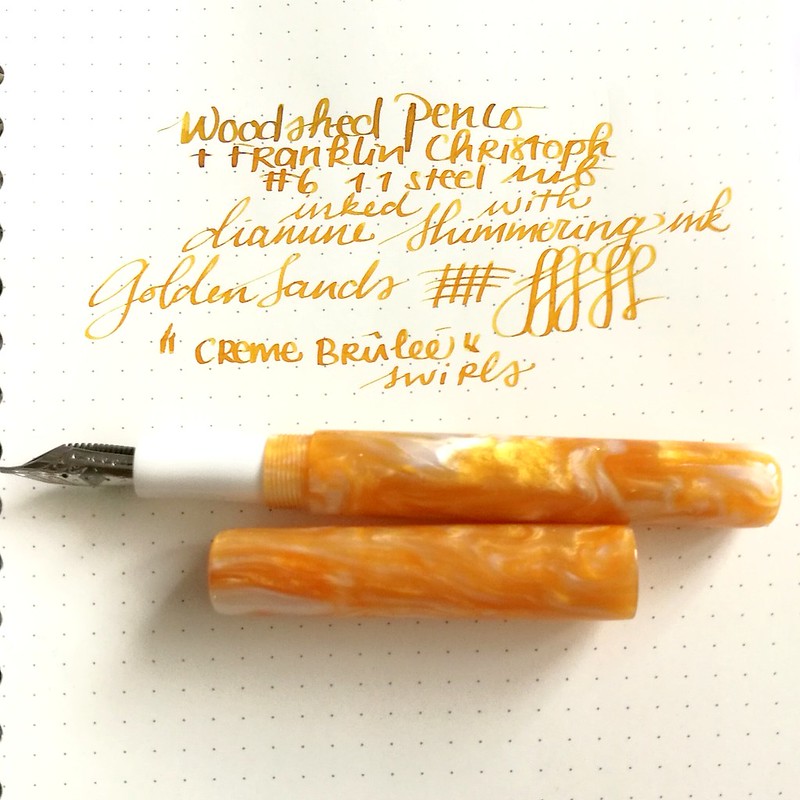
Woodshed penco creme brulee

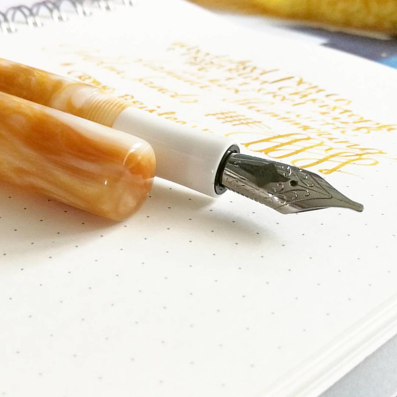
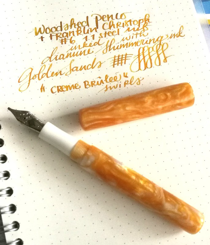
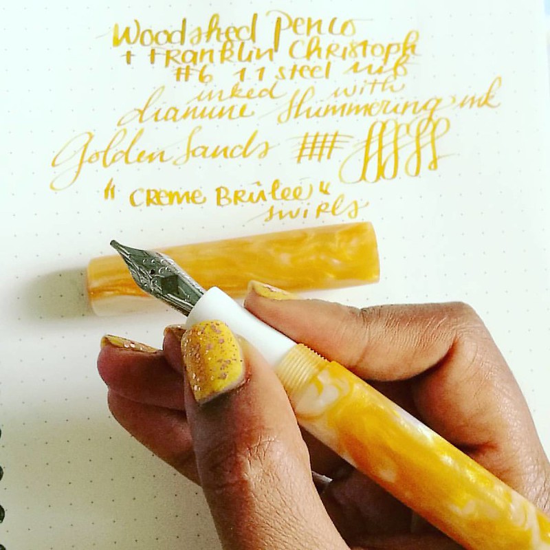
I've purchased this beautiful yellow golden colored swirly pen from Mike Allen at his sale on Instagram. He doesn't name his pens, but I dubbed this one "Créme Brûlée" because it looks like that beautifully burnt sugary caramel top of my fave dessert. The nib wasn't provided in this sale, but it takes the #6 size nibs I had a spare 1.1 nib from Franklin Christoph which fitted  beautifully on this pen. As for the ink I went with Diamine Shimmertastic Golden Sands, the color just matches the pen body perfectly. I've written on a Muji dot grid notebook on which the nib just glides and the ink shades and shimmers beautifully! 
My absolute fave of the first line from the Diamine Shimmertastic series. 

Photographing pens like they are sexy super models. Work that nib, yeah! 😂 Pen: @woodshedpenco 'creme brulee' swirl Nib: @franklinchristoph 1.1 stubbalicious Ink: Diamine Shimmering Golden Sands Paper: Muji dotgrid notebook . . . #FPN #fpgeeks #founta
A little more about The Woodshed PenCo - Mike is an US Air Force veteran whom got into making fountain pens not too long ago. He shares his process on his Instagram and has set up a Kickstarter campaign. I was lucky enough to have bought from him through a sale he was having on his IG and he has sold his pens through Etsy as well.

Woodshed penco creme brulee
He just has one type of model so far, but more could be in the works. The pens he has for sale are really well made. The model is a bit cigar shaped and the cap does not post. I do like posting pens (so I won't loose the cap) so it was a little getting used to, but now I know to hold it in my left hand when I write. The section is tapered and fits very elegantly in hand.


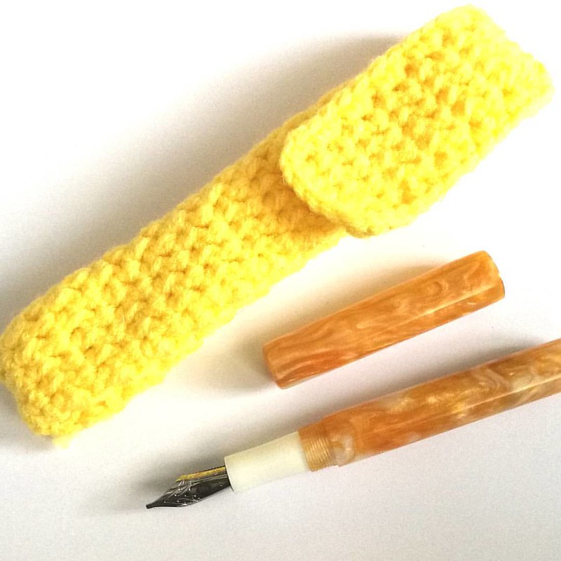
My new fave summer pen from @woodshedpenco 🌞 It's also got a cute hand knitted pen pouch!
With every pen purchase you also get a hand knitted pen pouch/sleeve which is super fun! Not only does it protects the pen, but it also adds to the handmade feel for the pen :) I got a super yellow one with my pen which is awesome :)


This beauty is made by the very talented @woodshedpenco The caramel swirly acrylic reminds me of 'creme brulee'  Fitted with a 1.1 nib from @franklinchristoph and inked with golden sands shimmering inks by Diamine it's the perfect sunny summery fountain p
If you're interested in one of Mike's pens, do follow his instagram and keep a watch out on his kick starter campaign. I am in no way affiliated with him, just a very happy customer and glad to support a small business. I am looking forward to a second pen coming my way and perhaps 3rd of his make will be added to my collection soon :)

 Oh by the way, if you want to have more updates on my fountain pen adventures, please have a follow on my Instagram account PensandPolish where I also try my very best to color coordinate nail polish to the pen and ink of choice. And if you post a color coordinated pictures in IG yourself with the hashtag #pensandpolish I'll feature you on my IG as well :) 

Thanks so much for stopping by and have a great day!

2017/02/24

Thank you card with magic INK technique

Thank you card

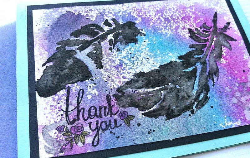
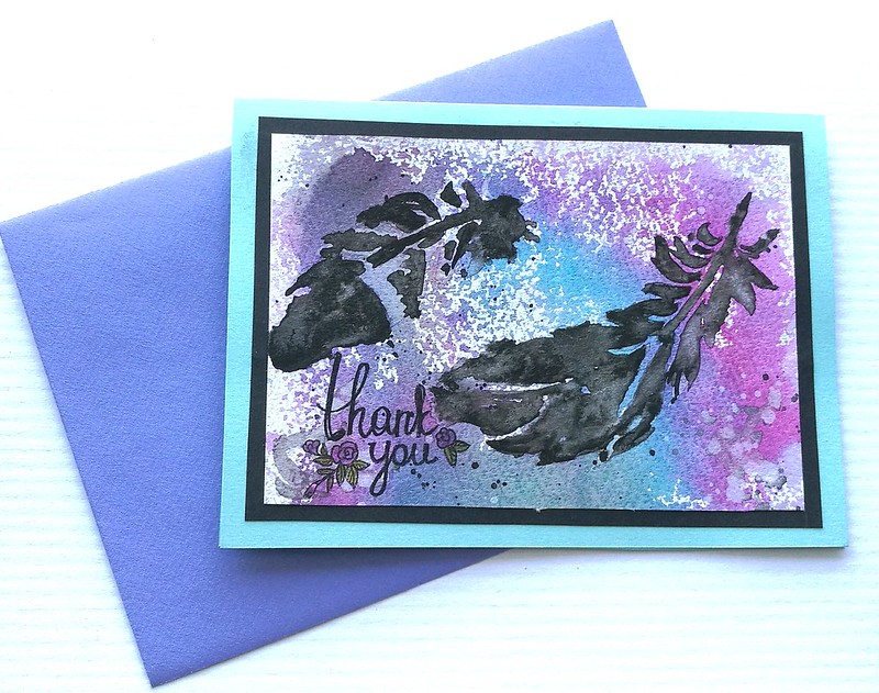
A great scours of inspiration has been watching these great little (10 min max) video tutorials on various art techniques over at YouTube. I'm following this awesome illustrator Mary Doodles and she creates fantastic illustrations using india ink combined with water colors. Check this Wolf in INK video out, isn't it MAGIC? The thank you card I am sharing has been done with that technique. Super fun and easy to do! You just have to move quickly and accept serendipity!

Thank you card
If you can't really draw, or are stumped on idea's what to draw, you can also use stencils. I have taken a feather stencil (by Viva Decor) and placed it on top of watercolor paper (maruman zuan) and brushed water over the stencil onto the paper. Removed the stencil, got my brush loaded with india ink and tapped the water on various places to make the feather appear. SO FUN to watch! The outcome is not perfect or as sharp as the stencil is, but I love the airy "feathery" feel they have. Once dry the india ink is water proof. I wet my paper a little in various places and tapped a bit of fountain pen ink in Diamine Magenta and Havasu Turquoise on the water to spread and mix. I mopped up some excess water and spattered more inda ink and a bit of water to get some more texture. The Thank You sentiment is a stamp from Studio Light, a nice hand written font adds to the whimsy of the card. Matted onto black card stock and then onto a blue card. I chose a violet envelop for it to keep the color scheme going. 

Check out more of Mary's awesome How To tutorial video's HERE. Hope this inspired you to get out some india ink and various water color ink and play with them. Once you get going, you can make a whole stack, trust me!

Entering this card in the

  HLS February Watercolor challenge


And because of the layers of colors Rubber Dance Layers Challenge


And over at Stamplorations CAS card challenge for February


This card was sent to P.W. Akkerman in the Hague for organizing such a great welcome for the first ever fountain pen meet up which was this past weekend :)

Thanks for stopping by and have a great weekend!


2017/02/01

Pens and Ink: Currently inked for InCoWriMo

currently inked for incowrimo

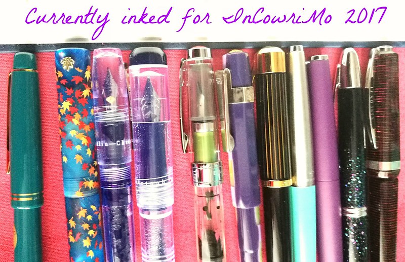
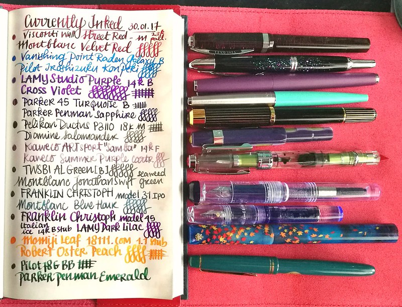
Hope you have your pens inked and stationery ready, because it's feb 1st and that means that InCoWriMo has officially started! It's going to be a challenge to write and send out mail every day, but preparation is half the work. To start I have inked up some nice fountain pens with some fun colors. Below you can see my currently inked list.

currently inked incowrimo
From top to bottom:

The list is written in a gorgeous bound notebook with Tomoe River paper made by paper for fountain pens. 
A couple of my favorites of 2016 stayed inked, but a few of them are on their last drops. I hope to be emptying them out fairly soon :) A few others will have their own Pens and Inks post up as well with more close up shots of the pairing.

What do you have inked up at the moment? And are you ready for the snail mail social? Post your pics on Instagram with #incowrimo to show your mailings :) I stared off on a good run...
Mail out day one incowrimo
These went out in the mail yesterday and hopefully one of them will be received today :) Hope to post more weekly round up's of snail mailings in the coming weeks. 

Thanks for stopping by and have a great day!


2016/12/14

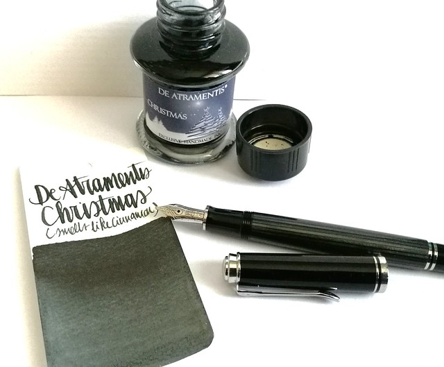
Pen and Ink: Pelikan M405 Stresemann with De Atramentis Christmas Black

Pelikan M405 Stresseman with DA Christmas

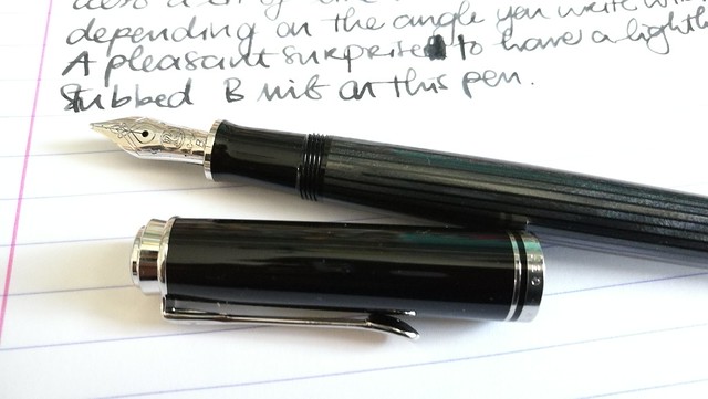
A couple of weeks ago I had the pleasure to pick up this pen; the special edition Pelikan M405 Stresemann with a broad nib. I inked it with De Atramentis Christmas Black. Thought this pair would be not only fitting in color combo, but also in the holiday spirit.

Pelikan M405 Stresemann with DA Christmas
The stresemann finish is a very classy, business like looking pen. I had admired the M805 when it came out, but that size is just a tad bit too big for me as I prefer the M400-600 suze better. So I was thrilled when Pelikan announced this special release in the M405 size. And with thanks to Filippo from the Fountain Pen Group Buy FB group, it was very reasonably priced. 

Pelikan M405 Stresemann with DA Christmas

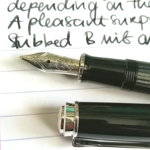
Close up of the nib.  chose a broad nib and it writes like it's slightly stubbed as it gives a very nice line variation when you write with it in a slanted angle. Maybe I got lucky, because I have not seen this in any other B nibs of pelikan before as of yet. Either way, it was a very pleasant surprise :)Read more about the pen here at the Pelikan's Perch.

De Atramentis Christmas
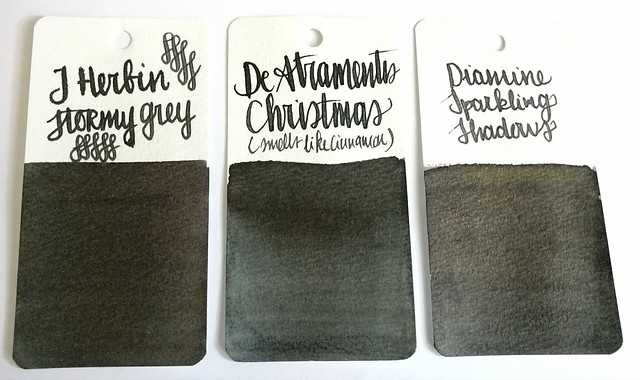
About the ink, I found it at an office supply store up in the north of NL and while I usually do not like black inks, this one definitely spoke to me. It has a very cute label AND smells like cinnamon! Also upon further investigation, this was a limited edition DA christmas ink release in 2012 and no longer available. It does look more like a dark grey in writing and on the swab cards. Except for the smell, it's not an ultra special ink. In color it comes close to J. Herbin Stormy Grey and Diamine Sparkling Shadows base color. Those other two colors would also go really well in the Stresemann as well and either of these would add a nice little scent or sparkle to your christmas cards. I better should get cracking on my cards for this year!

Thanks for stopping by and have a great day!

namasté

2016/12/07

Inky Goodness: Montblanc Miles Davis Jazz Blue

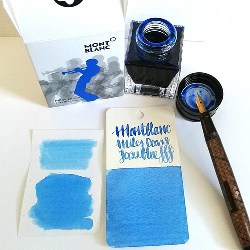
Went to Akkerman in the Hague yesterday and picked up this bottle of Montblanc Miles Davis Jazz Blue ink. First impressions; watery and a light washed out blue = me not really impressed 😒 inkswabs done on Maruman wordcards and herma smooth sticke
On a recent visit to Akkerman in the Hague I noticed the new Montblanc special edition ink on their shelves, Miles Davis Jazz Blue ink. I was super excited to try it out as I love blue inks esp if they lean toward turquoise hues so I bought it. Sadly, this is one of the very few times this ink is not the color for me and am disappointed with the special edition MB has released. Though the color on the ink swab looks like a nice saturated rich blue, it isn't. I had to swab it twice over to get some richness of color showing. The ink has a very watery consistency, almost looks like a diluted turquoise ink. Swabs on the left are done on Herma sticker paper, the top is swabbed with a q-tip once over, here you see the normal saturation and the bottom is heavily saturated. It could look good in writing with a flex nib as my test writing with the Swan flex pen looks nice on the maruman word card. Let's take a closer look at the ink. 

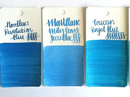
MB jazz blue flanked by Noodlers Revolution Blue which is more saturated and Toucan Royal Blue which has the same watery consistency but is darker in tone.
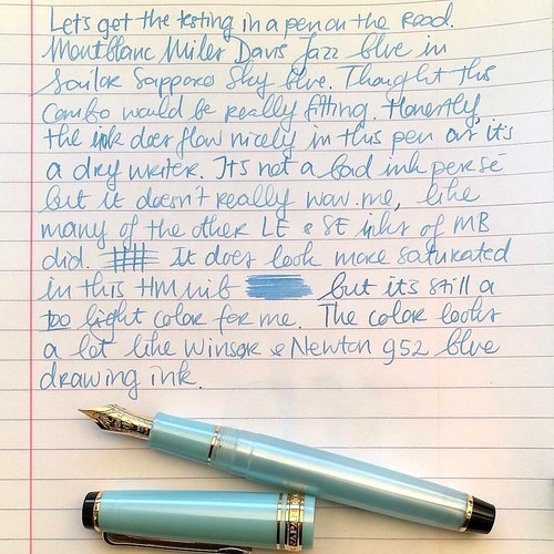
Here Montblanc Jazz Blue is flanked by Noodler's revolution blue on the left and Toucan royal blue on the right to show you similar ranges of blue in the same color tone. Jazz blue is lighter than both but in color tone it leans more toward Revolution blue, but the ink has the same watery consistency as the Toucan inks have. I inked my Sailor Sapporo Haruzora Sky Blue fountain pen with MB Jazz Blue to test how it writes in a medium nib.

Thoughts on MB Jazz Blue ink. Pen Sailor Sapporo Seasons Sky blue with HM nib. Paper Lyreca office.
This pen in particular is a dry writer. I don't often use this pen, in fact this may be the second time I have inked this pen. And even though this pen and ink combo does match nicely, the ink itself does not really "wow" me like say Dandy Turquoise does. In writing the color also looks a lot like Diamine China Blue. Writing is done on 70gms Lyreca office paper.

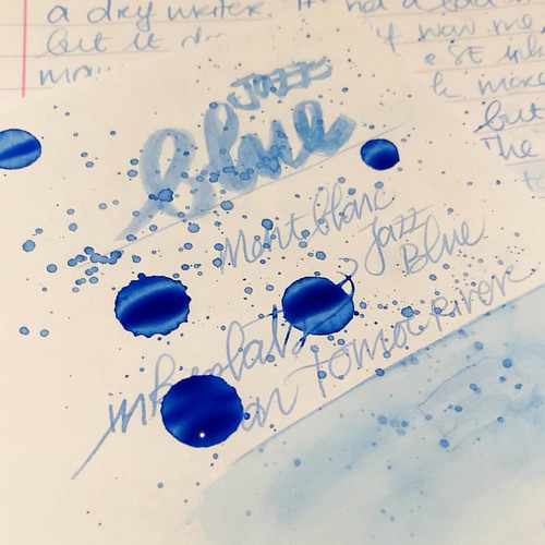
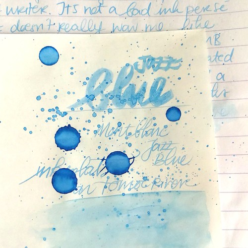
Testing MB Jazz Blue on tomoe river paper for sheen in this ink, I really doubt is has any. But well this will probably be dry like tomorrow or something before I can tell for sure. I do see potential for some pretty sky blue ink washes though!
I also did some tests on tomoe river paper to see if there is some sheen in this ink. This is the cream colored tomoe river and you can see that the ivory color does dull down the blue color of the ink ever so slightly. The ink is definitely better looking on stark white paper. I suspected this ink doesn't have any sheen and after drying time (this took a looong time to dry!) my suspicions were confirmed.

MB Jazz Blue ink
It does dry up with a nice blue halo, but no signs of redness caused by sheen of any kind. The drops look a bit pastel blue and with heavy saturation it's a high shading ink, but without any sheen. I do see a lot of potential for this ink in artistic endeavors, it definitely looks like a spring sky blue to me. Perhaps this would make a beautiful combination with Montblanc Pink in a sakura sky setting. Looking forward to test that out :)

Hope this was helpful to you, should you consider getting this ink for yourself. Let me know your opinions on this ink should you have tried it, I would love to hear it. 

Thanks for stopping by and have a great day!

namasté

2016/11/09

Pens and Ink: Pelikan M200 Taupe with Caran d'ache Storm

Pelikan Taupe with CDA storm
Keeping up with the Pelikan and purple hues theme, I got another great pairing for you today.
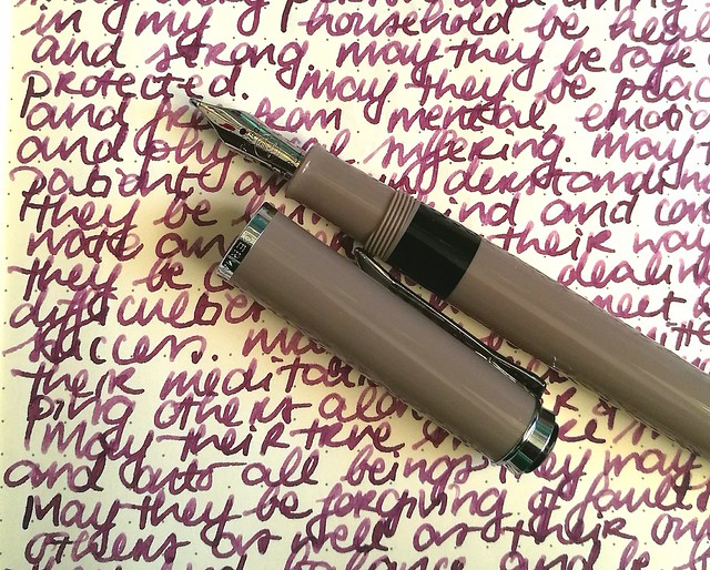
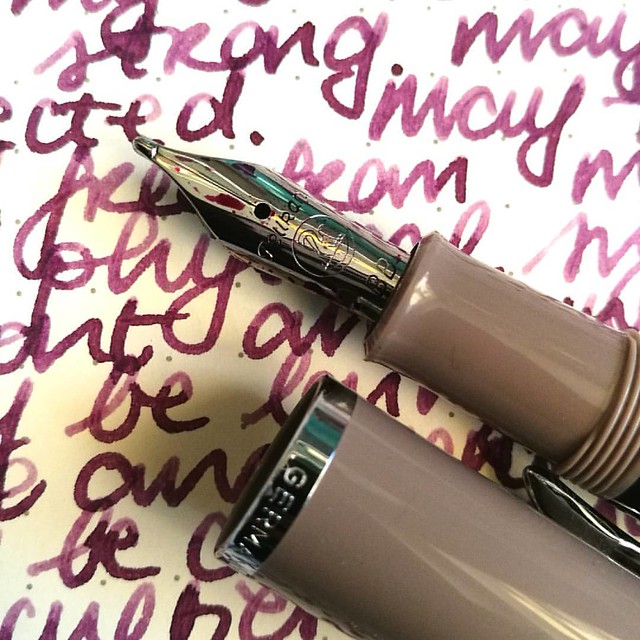
The Pelikan M205 Taupe (special edition release in 2012, more info here at the Pelikan's Perch) with Caran d'Ache colors of the earth Storm (which is discontinued with the release of the Chromatic Inks, More info about that on Gouletpens blog here).

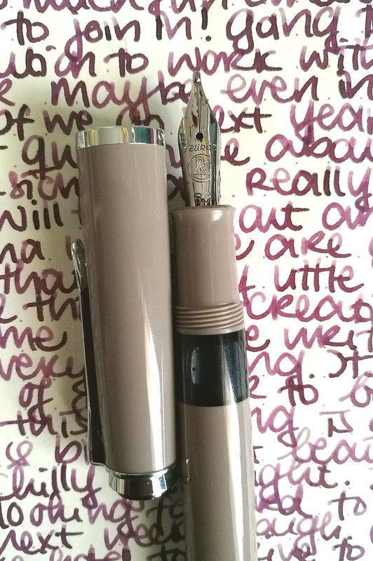
Pelikan M205 Taupe inked with Caran d'ache Storm - highlights the warm subtle purple in the pen.
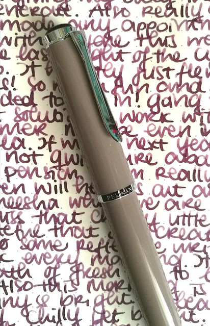
This pen was a special release in 2012, but I found it not too long ago at Akkerman in the Hague. They still had a couple of them for sale and when asking to see one up close, they provided me one which had a BB nib fitted in it. Really hard to resist that beauty! And look at that tipping! It puts down a wet and juicy extra broad line.

Pelikan Taupe with CDA storm
The color of this pen is "taupe" upon googling which hue that actually means I came across this on Wikipedia

"Taupe is a word that is used to denote any of a variety of colors. The colors it denotes fall into a range from dark tan to grayish brown or brownish gray. The word derives from the French noun taupe, which in turn is from the Latin talpa, both meaning "mole" (the mammal)." 

So it's a greyish-brown or a brownish-grey, which when you look at it, yeah I can see that. But you have a whole set of color tones that falls into the "taupe" aria and to me this pen looks more like a Mauve Taupe, the purple tone in the taupe spectrum. And because of this I thought a dusky warm purple would perfectly suit this pen. 
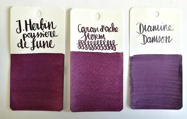
purple hues

Comparisons of some dusky purples: J. Herbin Poussiére de Lune, Caran d'Ache Storm and Diamine Damson. I chose to ink the pen with CdA Storm because of the warmth this color has and came close to Mauve Taupe. And I should use the LE inks more instead of hoarding it, right?

Pelikan Taupe with CDA storm
The BB nib in this pen shows off the shading in the ink very nicely and the ink highlights the warm tones in the pen body too. A winning combination and a joy to write with on these colder near winter days.

Thanks for stopping by and have a great day!

namasté

2016/11/02

Pens and Ink: Pelikan M1000 with Robert Oster Purple Rock

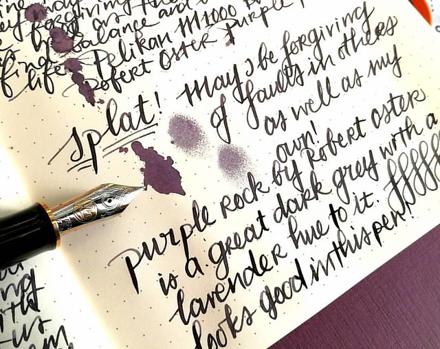
Starting off the day with a bit of #writtenmeditation in my Rhodiarama journal. Got some spatters of Purple Rock on it and you can really see that purple lavender hue on it :) Have a great day everyone 💜
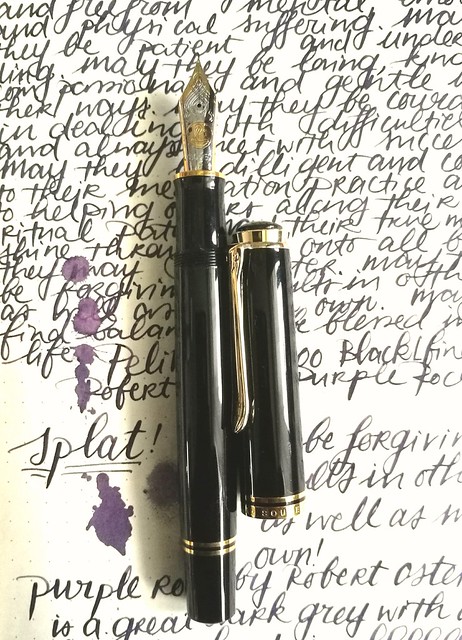
Not too long ago I had the amazing opportunity to buy a Pelikan M1000 in black with gold trim in a clearance sale for a great price. Something I could not resist even though I was wondering if I would use it enough because it came with a fine nib and is such a large pen. Well, inked with this spectacular ink Purple Rock by Robert Oster, it definitely became one of my fave writers in no time!

Something I have learned in spades last year, listen to my body and keep my energy balance in check. Always good to remind yourself of what you have learned and keep it in practice. Inked my M1000 with Robert Oster Purple Rock and the M1000 nib grade is o
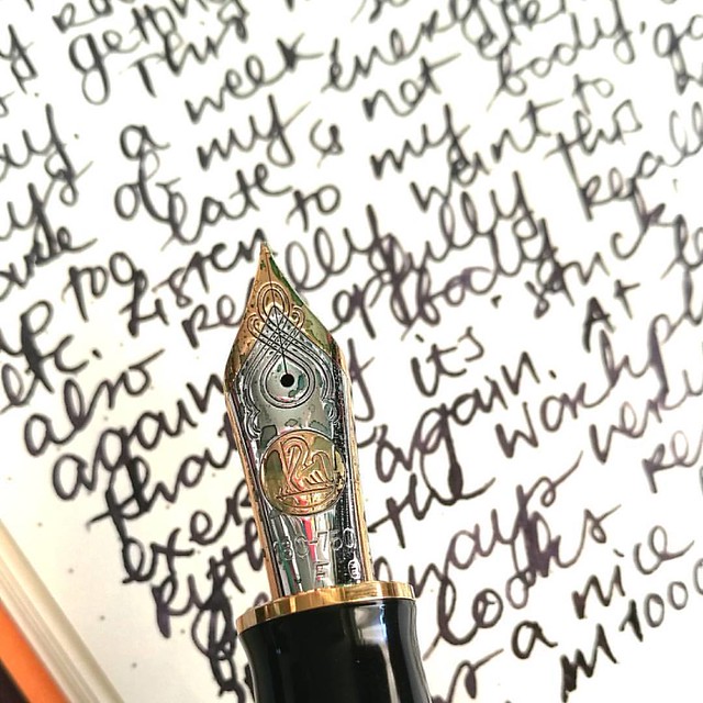
The nib on the M1000 is nothing but spectacular! It's quite a large pen (see a review of the M1000 here by SBRE Brown and here by Brad Dowdy on the Pen Addict) and the nib has some wonderful spring to it. It's one of the rare fines I truly enjoy writing with.

The first bottles I got of @robertostersignature Itvhad to be Bondi Blue beacuse turquoise and sheen?! I need that!! And am curious of the Purple Rock because I wanted a purple black. Hope it's as good as @attilasultis's swabs made it look :) Oh and it is
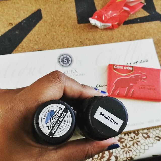
I bought the Purple Rock in my order at Sakura Fountain Pen Gallery together with the Bondi Blue. At first I thought it was more of a black with a light hint of purple, but it's a deep dark grey with a gorgeous purple hue to it. It's subtle in a fine nib though, but it's definitely more visible in broader pens or in an ink splatter like the top picture. A beautiful work safe pen and ink combo I would say. See some awesome ink tests on Robert Oster inks here by Nick Stewart at Inks and Bleach.

purple hues
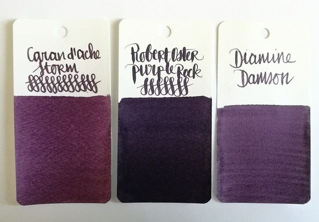
Here you have Purple Rock flanked by Diamine Damson and Caran d'Ache Storm, It's definitely a lot darker than the other two dusky purples for sure, though you can see the purple hue purple rock has very clearly in less saturated parts in the writing below and the splatter.

Pelikan M1000 with Purple Rock
Purple Rock is a great match for this gorgeous M1000 and also a fun "safe for work" color.

Next week I'll show one of the other purples in another Pelikan. 
Thanks for stopping by and have a great day!
2016/10/26

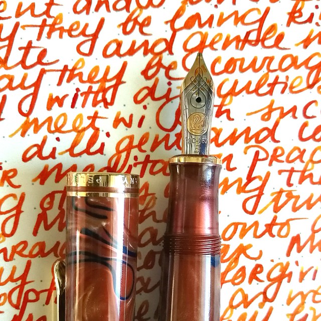
Pens and Ink: Pelikan M620 Grand Place with KWZ Monarch

Pelikan Grand Place with KWZ Monarch
Today's I'm sharing a wonderful autumn inspired combination: the Pelikan M620 Grand Place inked with KWZ Monarch ink.

Tilburg Penshow Spoils
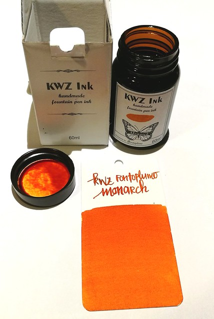
About the ink: I bought a bottle at the Tilburg Penshow in september and it's a Fontoplumo exclusive. It's made by KWZ and it's made to fit their gorgeous Limited Edition Conid Bulkfiller fountain pen. Well, I have not won the lottery yet, so the pen was not something I could obtain, but the ink definitely came home with me. It's a gorgeous warm orange color, perfect for this time of year.

pelikan
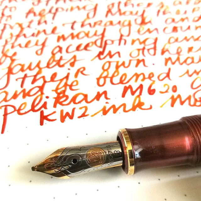
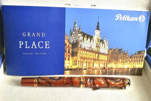
The pen I chose to try the ink in is this gorgeous Special Edition by Pelikan, the M620 Grand Place from the city series. It's a beautiful coppery brown color with dark blue swirls in it. I got really lucky obtaining this pen because it's a LE from a few years ago but a collector was selling his pen a while ago and I jumped on the chance. It is fitted with a b nib, so I figured it would be perfect to show off the great shading of the KWZ ink.

Pelikan Grand Place with KWZ Monarch
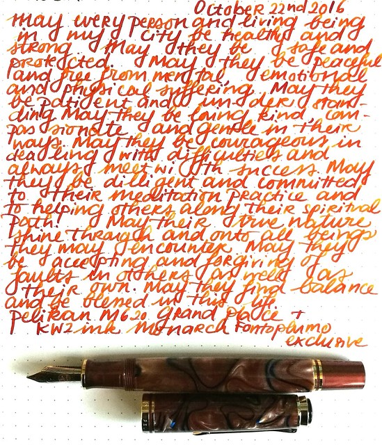
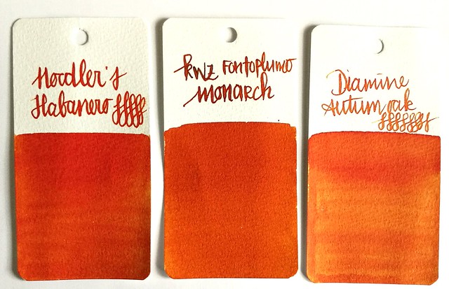
It definitely does the ink justice! It has some great shading and reminds me a lot of Diamine Autumn Oak and Noodler's Habanero (ink shot reviews by the lovely Gourmet Pens). Though Monarch is a bit browner and has a wonderful vanilla small to it! Makes writing with it a lot more fun (I kept sniffing the nib!)

orange comparisons
Comparing the inks side by side. As you can see Monarch definitely has a browner and darker tone to it. It's a subdued copper red orange ink but with writing you definitely can see some lighter tones. 

Pelikan Grand Place with KWZ Monarch
I am very much enjoying this pairing and happy to have these two special editions in my collection.

Thanks for stopping by and have a wonderful day!
namasté