Showing posts with label brusho. Show all posts

2017/08/11

Patience is a virtue!

Stampotique DT work
 I thought it would be fun to pair her with this phrase from phrase cube 3 by Terri Richardson  and make a fun sarcastic card out of it :)  The background is done with Brusho's over a script stencil and  colored her with Wink of Stella and Luna markers from zig on sticker paper, fussy cut and adhered to the page. Patience is indeed a virtue, right?

I would like to enter this card in the following challenge:
Craft Stamper Magazine Take it Make it Challenge August
Countryview Challenges - Blues and Greens 

Have a wonderful weekend and thank you for stopping by :) 


2017/07/05

SDC277 - Celebration!

stampotique new releases July

Hey all and happy Wednesday! Today starts off a new challenge over at Stampotique Originals Designers Challenge blog. The theme is SDC277 - CELEBRATE and I've made an art journal page in my pocket size art journal.  I've used various lush Stampotique stamps for this page and actually a lot of Left Over strips to form the background. List of stamps used is at the bottom of this post. 

stampotique new releases July

I believe every day should be a celebration, I  have used the "enjoy today" part of a quote stamp to reflect that. Because the background is so colorful, I colored Floating in grey tones (with letraset pro markers) but gave him a red glowing heart. The background is a piece of photo paper on which I let a bubble wrap sprinkled with crimson Brusho and water dry over night. You get such an amazing photographic result with this technique! The other piece which I have used are "mop up"pieces with the brush technique on more water absorbent paper. Stamped some textures with Kate Crane texture cube, doodled around the edges and called it done. 

Stamps used:

Others: 
Brusho's in crimson
Dylusions mixed Media stamp palette
Letraset promarkers
Perfect pearl glimmer sprays
Faber castell Pitt Marker in small

Hope this inspired you to join this fortnights challenge :) Make sure to link up your project on the InLinks page for a chance to win a 30$ gift certificate for the shop!

ALSO don't forget our bloghop which is still going on and you can leave a comment until July 6th and stop by the SODC blog on July 7th to see if you've won a prize :) 

Thanks for stopping by and have a wonderful day! 


2017/05/24

WIP: Pigment Powder Comparisons

pigment powders comparisons

Today I wanted to share an experiment I did a little while ago. I've had brusho's for a while and got a set of Ken Oliver's color bursts last year and this year I was completely tempted by Lindy's Magical Shaker so got a set of those too. I wanted to see what they looked like side by side and how they react differently, so made a color swatch on all pigment powders on a 6x6 gessoed paper on which I had put a stencil of clarity and stamped in the paste. This is my base for all the pigment powders. Do note that it's a non porous surface and they act differently on porous surfaces.

Pigment powders comparison
So after some powder puffing and spritzing of water,  here is the result! They all act in the same way, ie. you just tap some powder on the page and spritz some water over it to see the magic happening. But the result do differ slightly from each powder.

pigment powders comparisons
They all really look quite lovely and each product has their individual glow.

pigment powders comparisons
These are the Ken Oliver Colorburst powders. So pretty! Love the little specs of color on the bottom! I used all the colors in the Earth Tone set; merlot, indigo, yellow ochre, terre verte, sepia and burnt orange

pigment powders comparisons
These are the Brusho chrystal colors - very luminous and saturated colors.  I used the colors gambodge, olive green, rose, crimson, violet and Indigo. Very pretty and luminous colors! Love the color nuances and it's still vibrant after drying with the heat tool. I added some shadowing in the shallow edges with a stabilo marks all to make the design pop a bit more.

pigment powders comparisons
And lastly the Lindy's Magical Shaker's - these are soooo pretty and there is a slight shimmer to it which is magical indeed! I only used 6 colors and not the full 10 set, leaving out the black and brown colors. So the colors used are Bavarian Blue, Cuckoo Clock Cardinal, Guten Tag Teal, Lederhosen Laurel, Oktoberfest Orange, Oom Pah Pah Pink, Polka Purple and Yodeling Yellow. I REALLY love the names they gave!

pigment powder comparison

To see how they would react if you worked upon them more I added some shadows with a Stabilo black marks all pencil and a water brush when the swatches were dried completely. 

pigment powder comparison
Lindy's magical Shakers - still shimmery and does retain a good amount of color even when worked upon with a water brush. I'd say they are fairly water resistant when dry.

pigment powder comparison
Ken Oliver's Color Bursts - I found that these still were water reactive, more so than the other two, which lead to dilution of the colors when I added the shadows. Something to consider when you are working on non porous surfaces.

pigment powder comparison
The Brusho Chrystal Colors - these retain their luminous colors and are more water resistant then the other two. They are advertised as permanent when dry, but I think it's more water resistant than water proof because I did get some color bleed when working with the water brush. They could be water resistant on non porous surfaces, though!

In conclusion; although they react similar, the look is definitely different. They all have their pro's and cons and it's up to the final look you want as to which products to use. A helpful video on pigment powders I found was this one by Maremi Small Art. Though instead of Ken Oliver's Starburst she uses Magicals by Lindy's in her comparison. 

 I'm glad I made these swatches as a reference for me and I hope this helps you out as well either in their use, or when you are considering to buy the products. 

I am curious to know: 
Which ones of these pigment powders do you have and is your preference to use? 
Let me know in the comments :) 

Thank you for stopping by and have a wonderful day!


2017/03/24

Art Journal: Fragile

Art journal: Fragile
This week has been filled with springtime inspired projects. When the weather changes to brighter days so does my mood and you can really notice that in my work. I would like to share this art journal page with you I made recently and it's inspired by the prompts over at Rubber Dance blog. The theme challenge now is everything spring which is their Mid month challenge. 

Earlier this month they also had a color challenge based on the below color scheme.

And isn't it just gorgeous? Absolutely wonderful spring time colors! Due to time constraints and a holiday in the first weeks of march I wasn't able to participate, but I'm happily combining the two of these challenges together which resulted in the art journal page I am showing you today.

Art journal: Fragile
Let me tell you how I made the base. I started off by spraying some magenta, yellow and turquoise dylusions spray on a piece of A5 paper. The yellow and turquoise blended to a bit of green here and there which I loved. I then took a script and postage stamp and stamped with corresponding Staz-On colors. I placed a script stencil over it and then dabbed some Paper Artsy Fresco paint hint of mint through it. I built up everything else from here.

Art journal: Fragile
The Birds stamp is from Studio light and the flowers from Artemio. The postage border around the birds is also from Artemio. I accentuated the birds with a mint colored gelpen to have then stand out more.The Fragile stamp is from paper Artsy and I also colored it in with the mint gel pen.

Art journal: Fragile
The flowers are stamped with midnight blue & dove gray Staz-On and then overplayed with versamark and violet interference embossing powder. These wonderful flower postage stamps, also in corresponding colors, have a great pop up effect on the over all lay out.

Art journal: Fragile
I splattered some Hint of Mint paint and a bit of Liquitex Gold INK on the page, colored the border with Chipped Sapphire distress crayon and matted it onto a light blue card stock before adhering it to my black spiral bound journal. A light, happy, colorful page to ring in the first weekend of spring :)

I'm also entering this art journal page in the following challenges:
HeARTful stamping Spring + Stamp 
STAMPlorations Mixed Media Challenge March 

the Stamps and Stencils March Birds challenge

AND as invited to the Art Journal Journey Out and About challenge


Happy Spring
I digitally altered the page to add the words to it and to use as my FB banner for the coming weeks. 
Happy spring to you all!

Have a wonderful weekend and thanks so much for stopping by!


2017/03/06

MailART Monday: Just be happy!

just be happy mail art

On this week's mail art monday a colorful explosion with Brusho's and combining some awesome stamps from Visible Image. Something happy and bright in anticipation to springtime!

Just be happy mail art
The envelope I worked on already had a dotted background made with this Carabelle Studio's Stencil and some light and fluffy modeling paste. I stamped the jumping woman from Tomorrow Doesn't Exist stamp set with Colorbox navy blue and embossed with clear embossing powder. I did the same thing with the Just be Happy sentiment, though I used two colors ink. The embossed parts and modeling paste will work as a resist with the brusho.

Just be happy mail art
Working with Brusho's is always such a happy fun messy time :) I had sprinkled some Rose, Gambodge and olive Brusho's on the envelope and spritzed water all over it. Dabbed some color/water away from the embossed and stencilled aria's and just let it dry. I repeated this process until I was satisfied with the color splash on the envelope. When you do this make sure you let previous layers dry well, as not to get the colors too muddy. When dried the colors are permanent, so no need for an extra sealer. 

By the way I had placed a address label between Just be and Happy to get the right placing of the words. I added a fresh label when the envelope dried and put some some masking tape around it. I also stamped some great Visometry stamps on the edges (also with colorbox and then just heat set) for a happy and vibrant look. And the envelope is now ready to mail!

Entering this mail art envelope in the following challenges
The Three Muses - Mail Art
Everybody Art - Envelope
As you like it - what do you make other than cards 
Well mail art has been my fave thing to make and love it more so than making cards :) 

Thanks for stopping by and have a great day!


2017/01/13

Art Journal: the Frida Blues

Art journal Frida

Last weekend I found some time to play around with my Lost Coast Designs stamps again and created this page in my pocket art journal. I feel like I really need some bright bursts of colors in my journals/life right now because it's so cold and winter is in full swing now (and to counterpart my SAD blues). For the background I used Brusho Ultramarine on watercolor paper. The effects are always mesmerizing and fun. I stamped the Frida Image directly onto the paper and colored her in with tombow markers. Chose the diamonds, circles and circle border stamps for the background. Lastly I added bright yellow tombow markers to contrast in color to the blue brusho. I stamped the circles with Memento Ladybug red and adhered it to my pocket journal. Added strips of color coordinated washi tape to the top and bottom and called it done.

Art journal Frida
This page is so different than the one I did before and I love how you can use the same stamps and yet create such a different style with them :)

Stamps used from Lost Coast Designs
Others: 
Maruman Zuan Watercolor paper 
Brusho Ultramarine 
Memento inks Ladybug, mango, danube blue
Stazon midnight blue
Various colors Tombow markers
Washi tape

The " #32 Anything Goes challenge"at Loast Coast Portal ofCcreativity, is still running until the 25th, so why not take a stab at it :) I am entering this one as well (you can enter multiple projects!). It's not even required to use LCD or CV stamps but would be fun if you do!

Thanks so much for stopping by and have a great weekend!


2016/11/04

Mini Art Journal: No More Questioning

It's Sunday and raining and feel a bit "meh" but working in my art journal. But I'm a bit stuck with this page. Is it done? Does it need a quote? I just don't know... what do you think? #artistsofinstagram #artjournal #katzelkraft #brusho #derwent #artist
A while back I made the above page in my mini art journal with some gorgeous stamps from Katzelkraft and I thought it was done like this. The empty space of the background, which is made with Brusho crystals and dylusions sprays, would leave room for suggestion. But after staring at the page for a while and having made this spread on the next pages (excess baggage) it inspired me to get my letter stamps set from Eline's Hand lettering line out again and stamp in a quote that felt right.

Mini art Journal: No more questioning
When I am in my art room creating stuff, I love to listen to music while doing so. And Katy Perry's tunes are among my fave to listen to (this Peacock mailart piece was also inspired by her music) and the lyrics from the song "Love Me" inspired me to add the following quote to the page.  

Mini art Journal: No more questioning
"There is no more questioning, I'll be the one defining who I'm going to be" 

Sometimes it's hard, to pave your own path, with opinions and comparisons clouding your view of yourself. It's good to remind yourself that it's OK to be you. Wherever you are, on whatever path you are on, you're in charge of your own life. And it's OK to just BE YOU and not what everyone else expects you to be or think you should be. I feel like I have grown and learned so much about myself over the past year and a half. It still fills me with so much gratitude thinking about the moment I've decided to just stop and BE ME. So I hope this weekend you will take a moment, to stop, breathe and appreciate who you are. Embrace yourself with all your complexities and troubles and tell yourself, it's OK, you're you and it's all OK. Like Dr. Seuss said "Today you are you! That is truer than true! There is no one alive who is you-er than you!" ... Hmm, that's a good quote for another spread I think :) 

Have a great weekend and thanks for stopping by!

namasté

2016/10/28

Mini Art Journal: An Ocean of Drops

mini art journal a multitude of drops

Today I am sharing an spread in my art journal inspired by a quote from Cloud Atlas, which fits beautifully with the stamps from Viva Las Vegastamps and Designs by Ryn.

mini art journal a multitude of drops
The background is made on Maruman Zuan watercolor paper on which I used different Dylusions spray inks, brusho crystals in blues and teals and spattered liquitex acrylic inks in black and white. The brusho ceated some fun effects with the spray inks. When it dried I then stamped on the drops from Designs by Ryn with Staz on Azure. 

mini art journal a multitude of drops
A close up of the background, a multitude of drops effect. The greens are from the brusho crystals which gave a fun unexpected effect. And these drops stamps from Designs by Ryn are just amazing!

mini art journal a multitude of drops
I colored the half face with tears from VLVs with letraset promarkers and ripped it out and adhered to the page. The lettering of the quote I have done with a black brush calligraphy pen from Muji store which I forgot I had ;) It was a good test to see how it works on watercolor paper. I had to trace it a couple of times to get the deep black I wanted. It would probably work better on smoother paper. 

mini art journal a multitude of drops
The I adhered the page to my journal and added some washi on the top and bottom of the page to cover up some empty strips. I traced the quote with a sakura stardust pen to give it some sparkle. 

"What is the ocean but a multitude of drops?"

I'm entering this journal page in the october customer creation challenge at the Designs by Ryn blog. Wish me luck :)

Have a great weekend and thanks for stopping by!

namasté

2016/10/06

Mini Art Journal: Excess Baggage

Mini art Journal Excess baggage

Over at Stampotique Challenge blog the theme for this fortnight was "Your fave quote" and wanted to do a spread in my pocket art journal for it. I let this theme sit a bit with me and finally found a quote that resonated with how I was feeling at the time (my husband and I had a little spat, but no worries we always kiss and make up...). I went through my lovely Stampotique stamps this past weekend and found Mothloved to depict that feeling. And the spread shown above was born.
The quote I used is  
"Everyone you meet comes with baggage, 
find someone who loves you enough to help you unpack" 
- now, ain't that the truth? 
And little Mothloved, she carries her baggage with her everywhere she goes, but she is very lovable!

Mini art journal: excess baggage
I stated off by grabbing one of my brusho background pages (used ultramarine brusho over a script stencil) and added some more color to it: mustard seed and broken china distress inks with a blending tool. Then I stamped some script and circle stamps with matching Staz-On inks on the page for some interest. Lastly I stamped Mothloved with Memento black on the side where I wanted her to be.

Mini art journal: excess baggage
I cut the page to fit and adhered it in the journal. Mothloved is stamped on sticker paper and colored in with promarkers and then cut out. I used the same color scheme as I did with the background page, blue and yellow. On the bottom I adhered some washi tape and some extra near her feet to "ground" her more on the page. These techniques (stamping for placements, adhering a colored image op top and grounding that image with masking tape) are often used in Corrie's work. So Corrie, thank you for the inspiration :)

Mini art journal: excess baggage
After I put on more washi tape along the edges to frame the page I went to work and stamped the quote in by using Eline's Handlettering Script rubber stamps. I patiently formed every word with the separate letter stamps out of the 2 fonts, brush and stencil, then stamped the whole quote with Staz On Azure. It was definitely meditative to do.

Mini Art Journal Excess Baggage

A close up of the end result. In the end I also outlined and underlined the stamped words with a 0.1 steadtler Micron pen to give it some more depth. I also took out the extra washi tape on the left bottom side of the page as it really didn't add much to it and called this spread done. I have a strong desire to give Mothloved a big hug!

This spread is entered for the Stampotique #258 Fave Quotes challenge and if you feel inspired to join in, you can until next wednesday when the new challenge prompt will be announced! Can't wait to see what the next challenge is. 

Thanks for stopping by and have a great day!
namasté

ETA: Just found out that Stampotique team chose my entry Affectionate Seahorses as one of the gift certificate winners for the August 2016 challenge! Woot!! I am so freaking happy! Thanks so much Stampotique team, it really made my day!

2016/08/11

Craftorij Summer Challenge week 9 (the last batch)

I can honestly say that I really surprised myself and managed to finish the cards last weekend (even though I was pretty ill with a throat infection/flue type and could do much creative work at all last week!) The last prompts had a few tough ones for me because I couldn't come up with a lot of different stuff. But well I did my best and that is all you can do, right? So here they are, the last prompts of the CZC 2016:

CZC
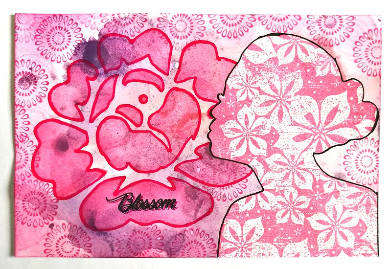
CZC54-Use a selfmade stencil
The flower is a stencil I made with the MM Slice. Bakcground is made with various distress stains and designs by Rynn Texture stamps. The floral silhouette woman is from Lost coast Designs. I stamped her onto a separate paper and adhered her to the piece. Traced with a fineliner to make her more pronounced.

CZC55
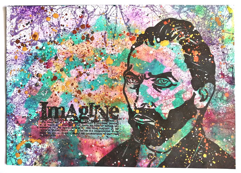
CZC55 - your hero/person you admire
for me that is Vincent Van Gogh.
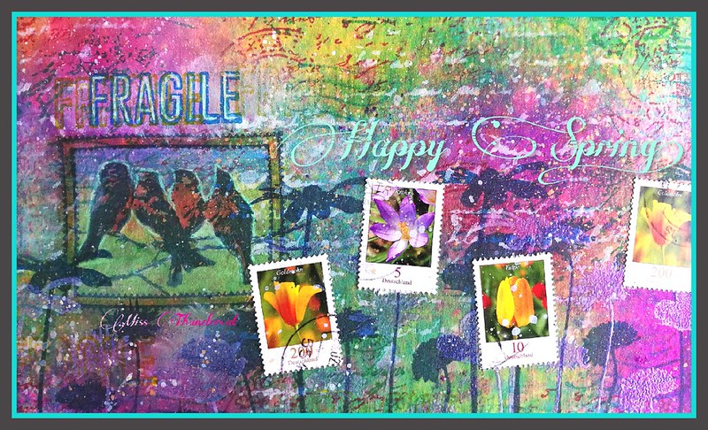
You can read how I created this piece in my previous Mailart Monday (also do not forget the giveaway!!)

CZC56
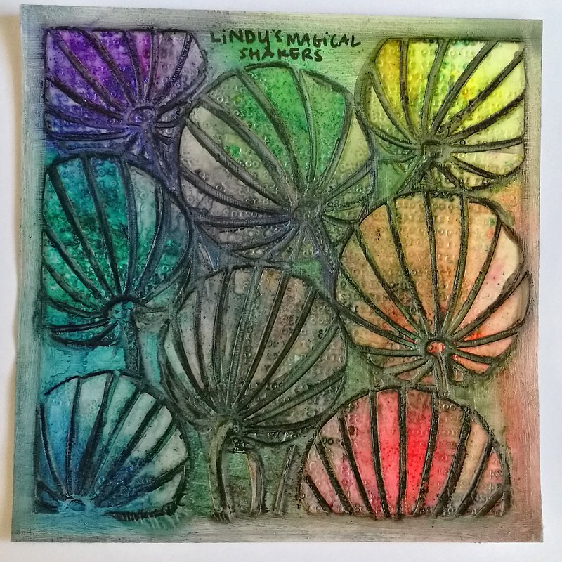
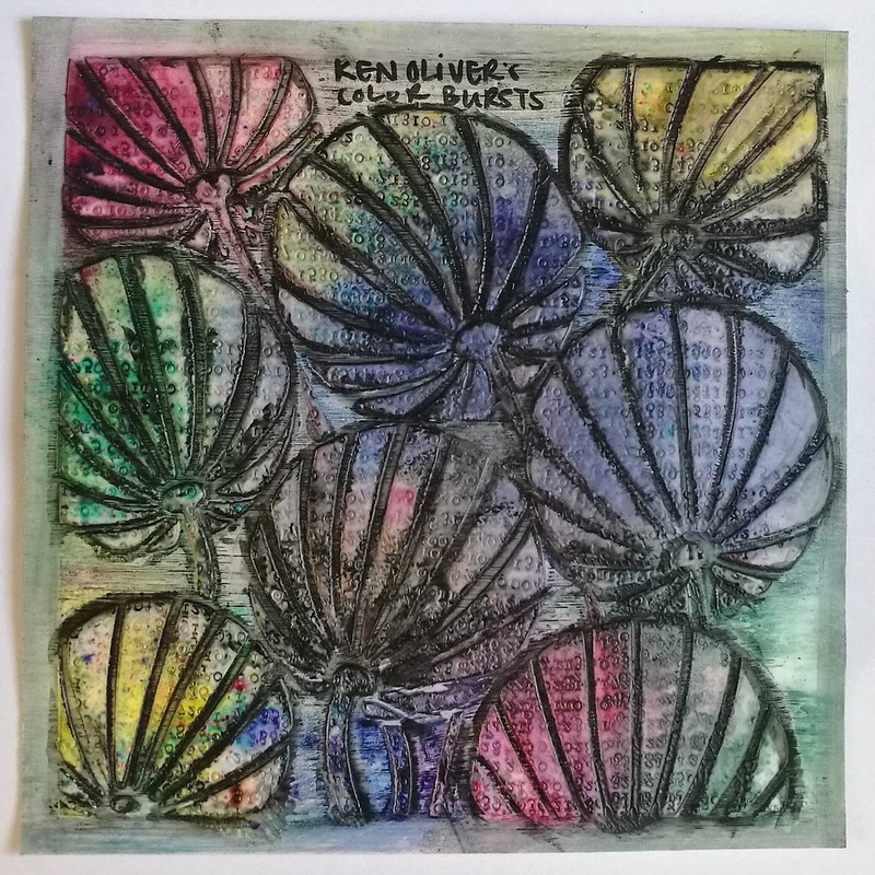
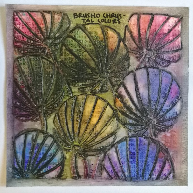
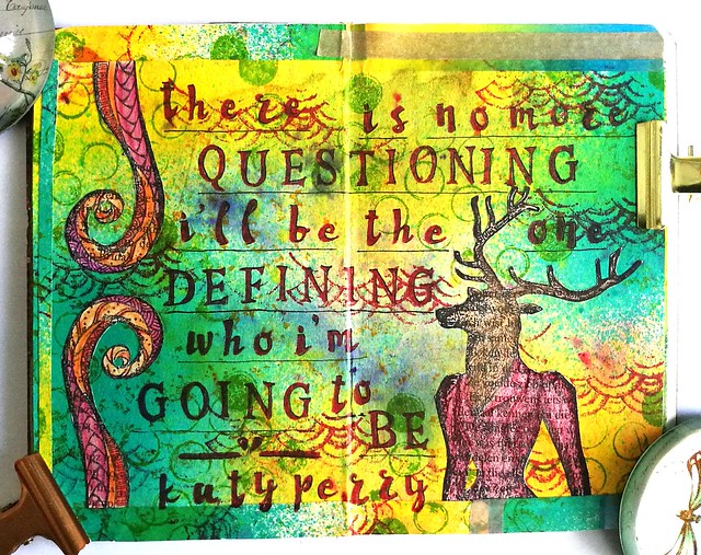
CZC56 use watercolor paint - version 1
CZC56
CZC56 use watercolor paint
I used a large stamp and painted over with gouache/aqruarelle paint and stamped it on the card stock. Then I painted more/different colors to finish the piece. Version 2
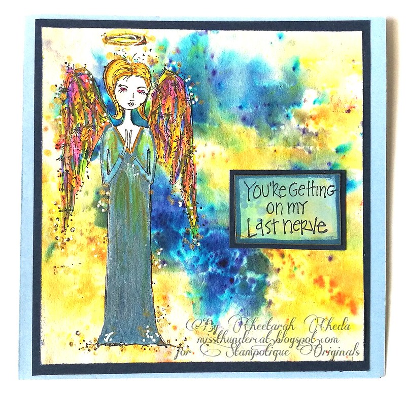
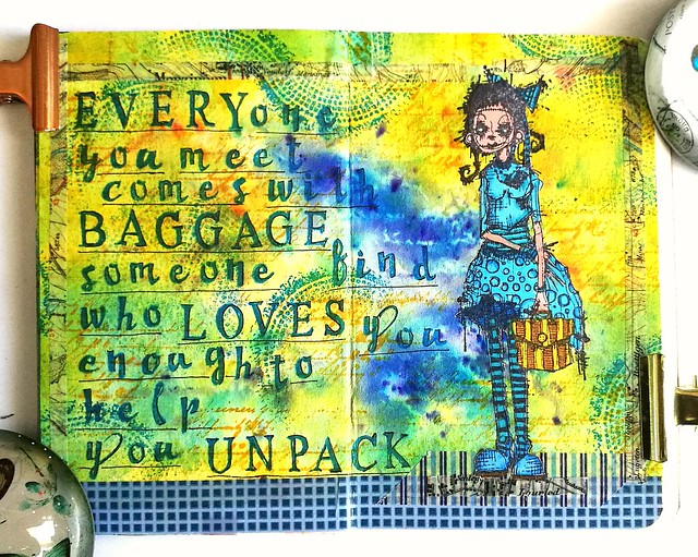
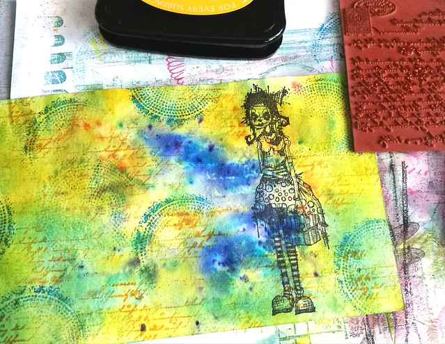
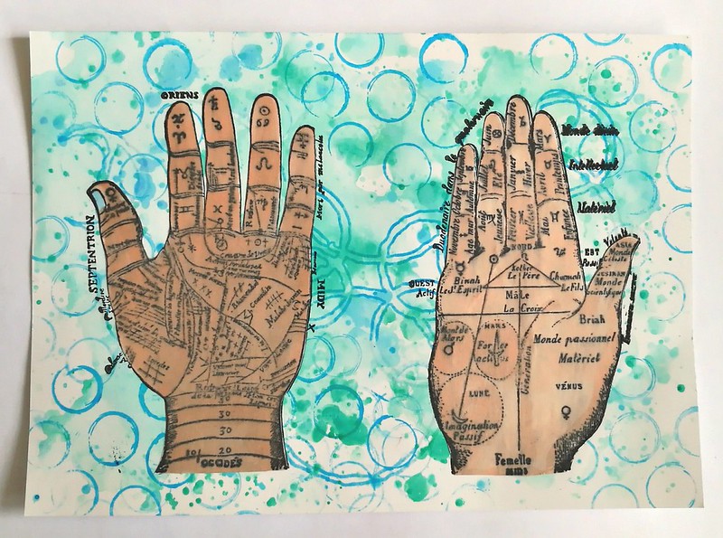
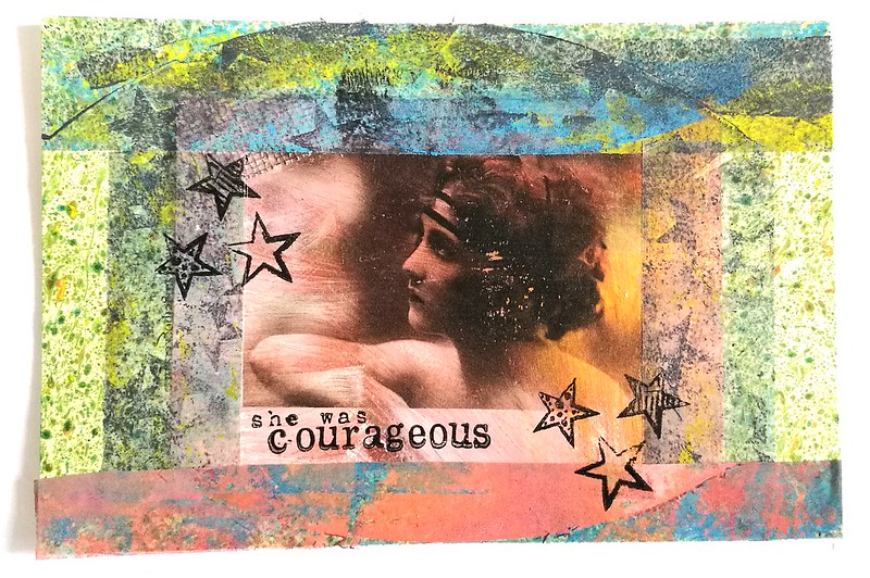
CZC57
CZC57 Hands
was not too inspired for this one, but LCD has some great images I wanted to use.
an ink spatted background on which I stamped carabelle and katzelkraft stamps. The hand images are from Lost Coast Designs and I stamped them on sticker paper, colored, cut and adhered them to the piece.
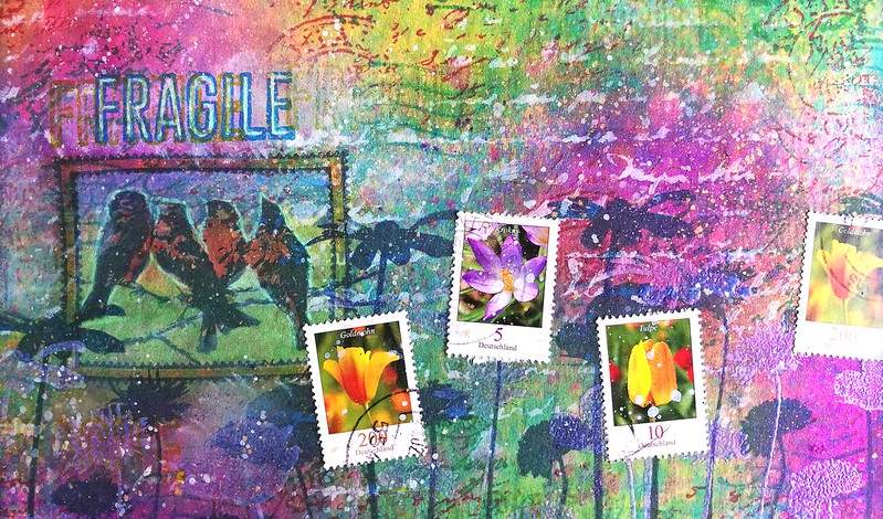
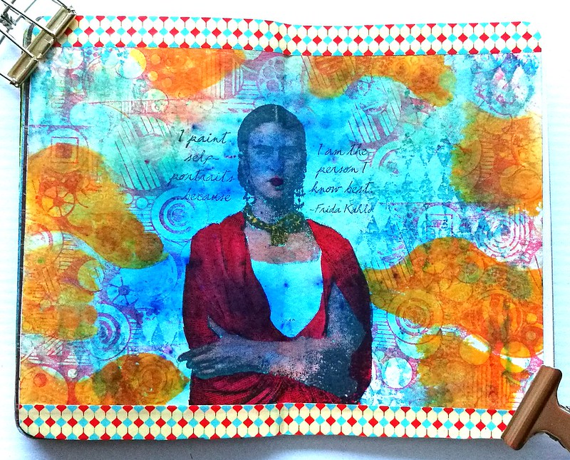
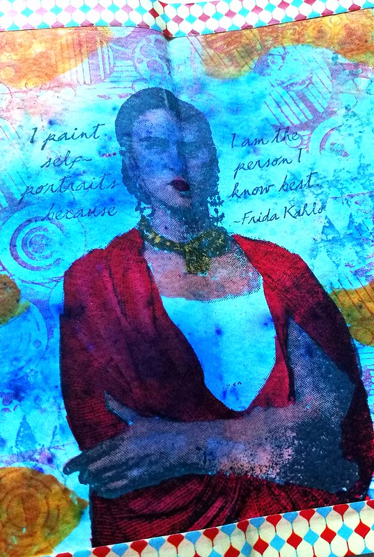
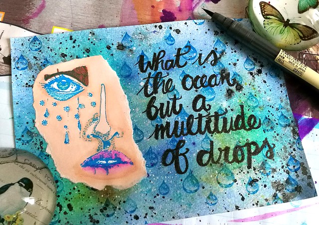
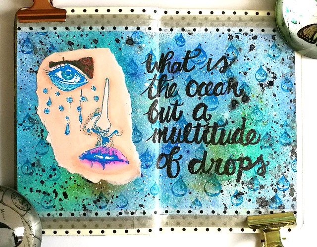
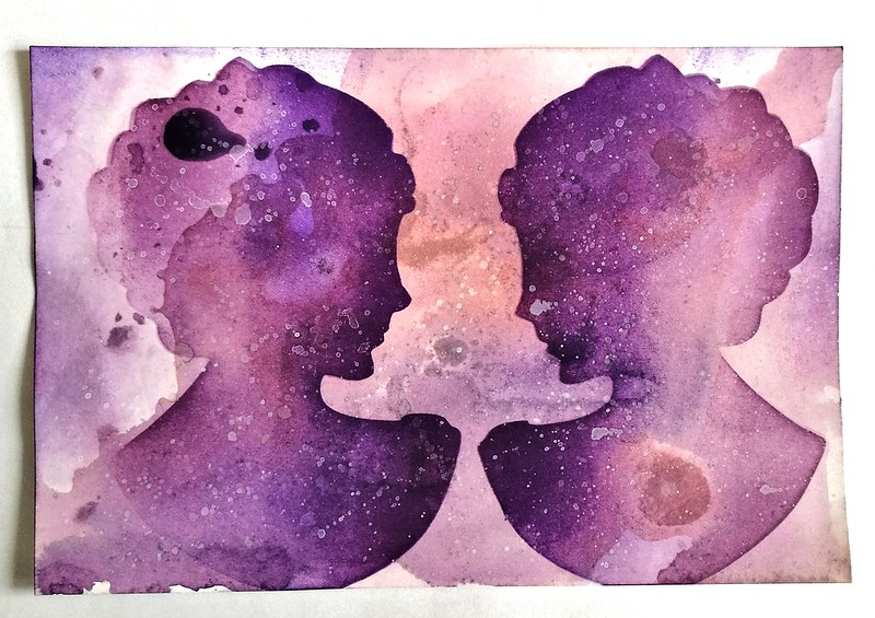
CZC58
CZC58 Reflection
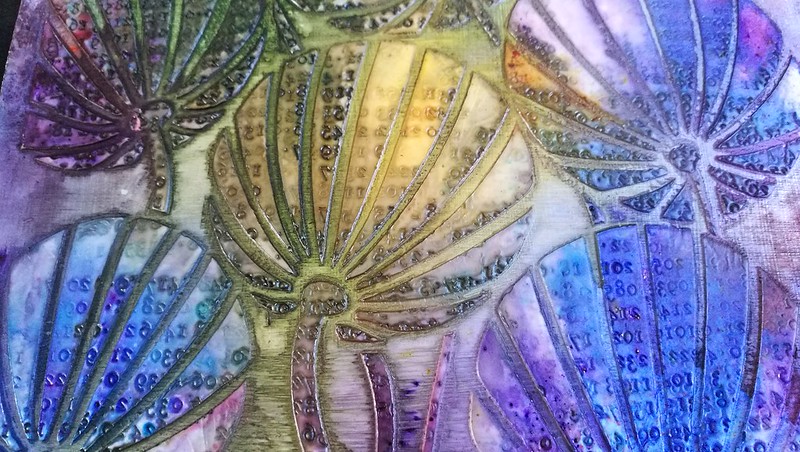
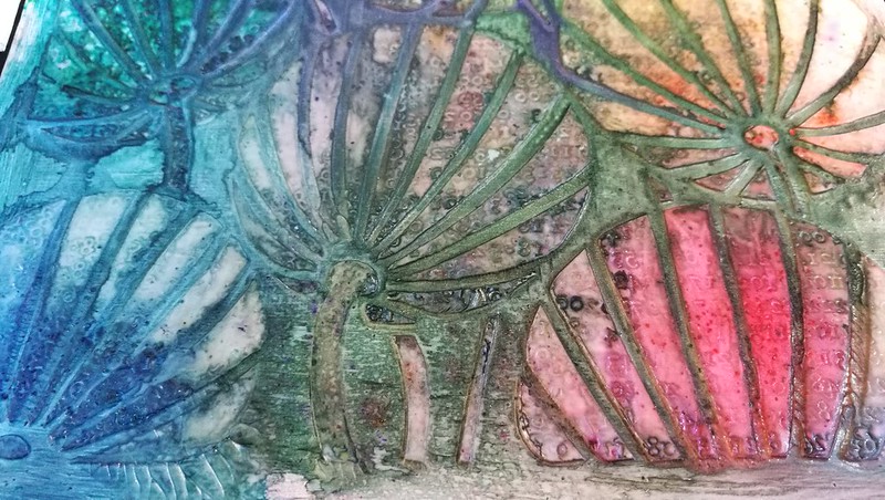
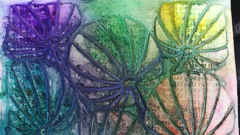
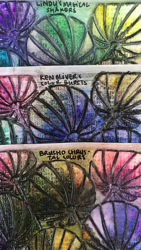
Another stencil I made with the MM Slice. The background is made with various purple distress stains and I spattered white acrylic paint over it. Then I used the stencil and dark purple memento ink and a distress tool to sponge the ink through the stencil. Looks like portraits of galaxies. This might be one of my fave pieces I have done in the challenge.

CZC59
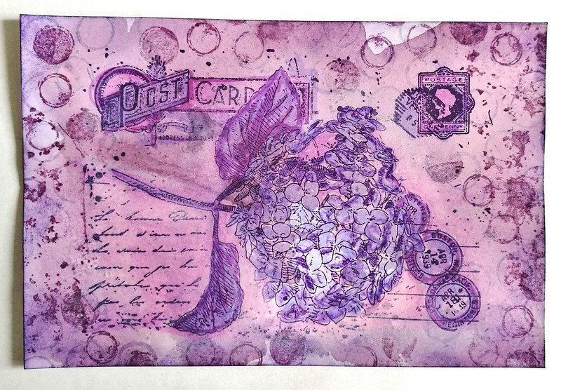
CZC59 - Use a transfer technique
I used two: the gel transfer of the image in the middle and the gelli plate packing tape transfer on the borders. I adhered it all to a marbled bookpage. stamps from VLVs and Studio Light.
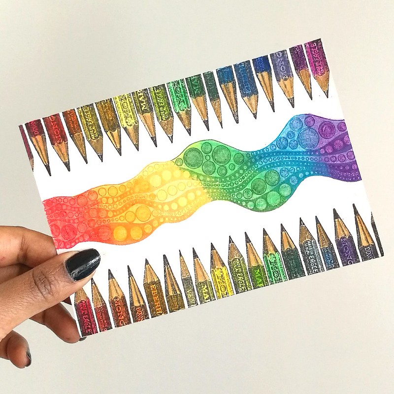
CZC60
CZC60
Stamps from joy crafts and katzetkraft
colored with tombows, distress stains, promarkers and distress crayons.

CZC61
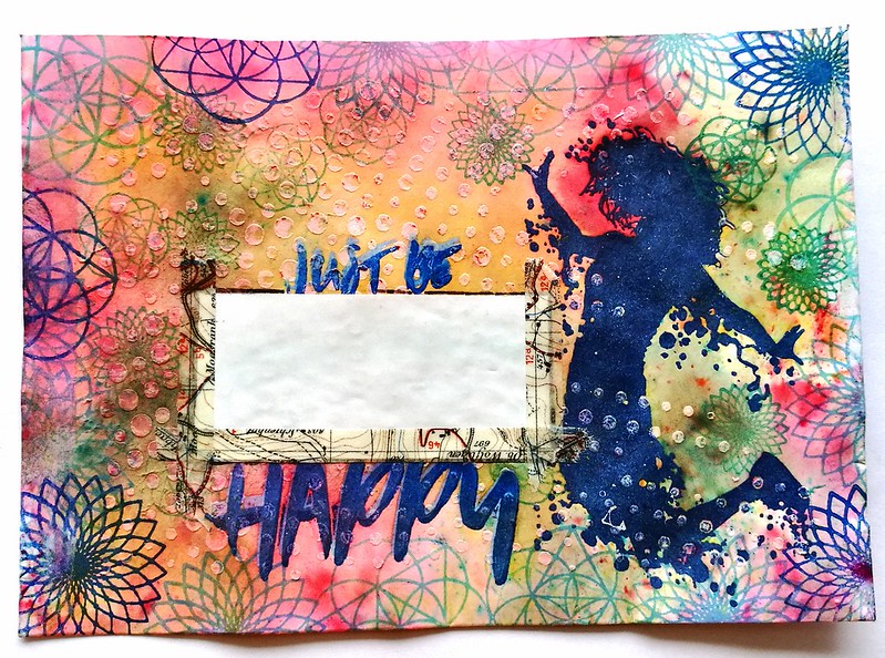
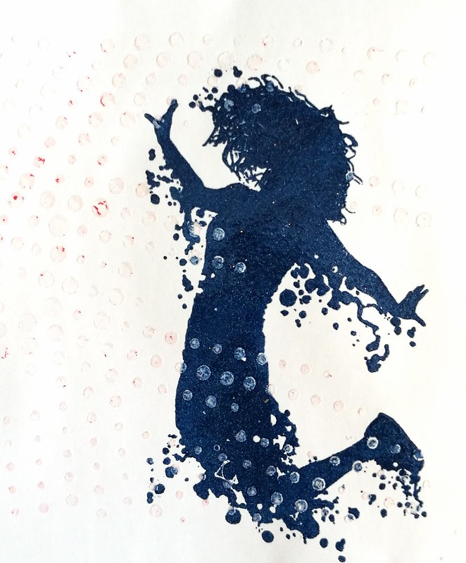
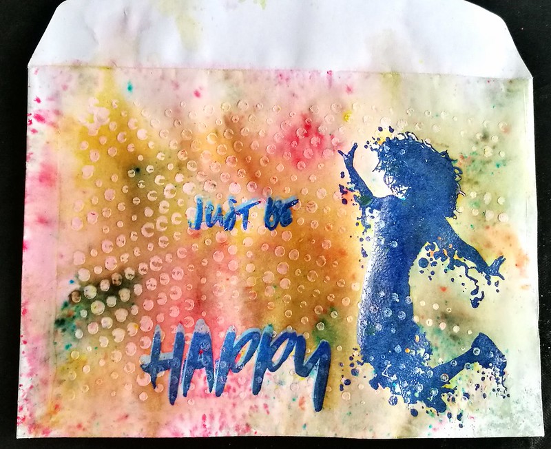
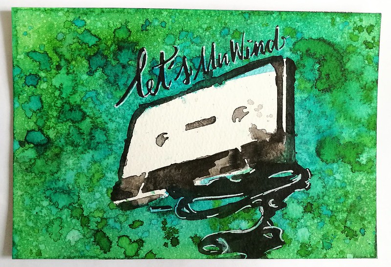
CZC61 - make something in 15 minutes
I created with ink wash with stencils, india ink and ecoline (magic ink tutorial on youtube!)
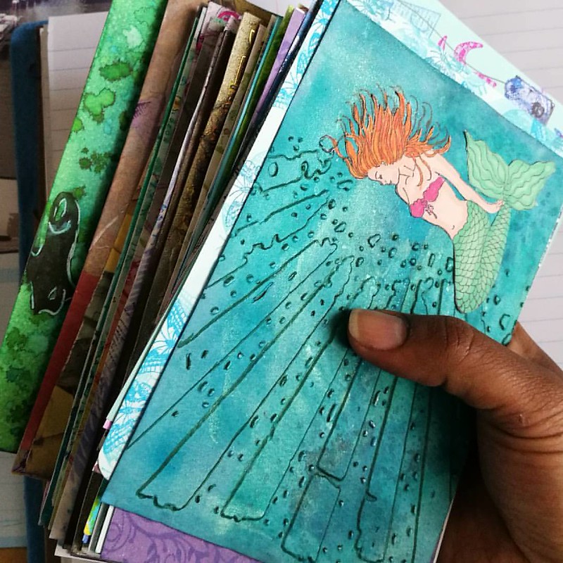
And it's indeed time to unwind as this is the last piece of the CZC 2016 challenge!

What a ride it has been! This is what the whole stack looks like in hand (minus a few which I already mailed out):
Can't believe I did it, finished the CZC index card a day challenge. I made over 61 cards in a little over 2 months time :) #crafty #craftorijzomerchallenge #craftorij #CZC #czc2016 #indexcard #mixmediaart #mixedmedia #mixedmediaartist #challenge #craftye

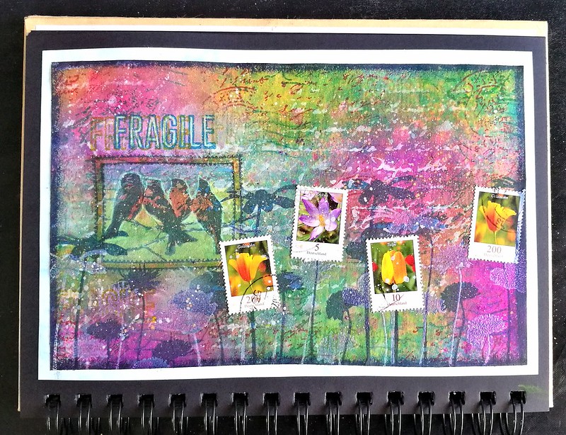
And you can flip through the album below to few all the cards I made
CZC 2016

On to next year's challenge I say :)

Have a great day and thanks for stopping by.
Namasté