2016/12/30

Monthly Planning MTN: 2016 round up

In terms of growth, it's always good to have moments to reflect upon things you have done in the past. Not only to see if they will help you move forward but also to appreciate the fact you have actually DONE these things. And in these quiet days in between the rush of Christmas and New Year's EVE creeping around, it's a good time to look back on the year I leave behind. In this post I look back on planning in my Midori Traveler's Notebook. 

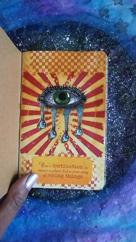
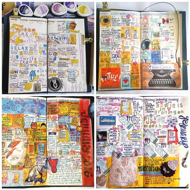
I have implemented my Midori Travelers Notebook planning since last year november. Next to my weekly planning in my pocket midori (which I have been lacking to do these past few month to be honest) these monthly update should give an overview of all the fun things I have done that month. And seeing the finished pages side by side definitely portraits a colorful year. Here's an overview from november 2015 through november 2016.

Nov 2015 - feb 2016
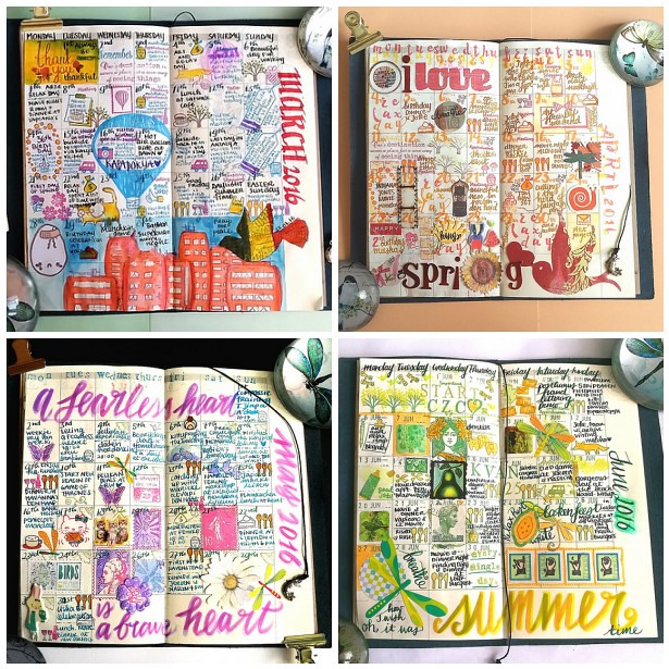
Following clockwise top left, November and December 2015, January  and February . Key words these months were: anniversary, Antwerp, Holidays, birthday, David Bowie, Groningen and Meesha.

March 2016-June 2016
Following clockwise top left; March, April, May and June. Key words here were Brithday, Kapadokya, spring, compassion, hand lettering and summer.

july 2016- oktober 2016
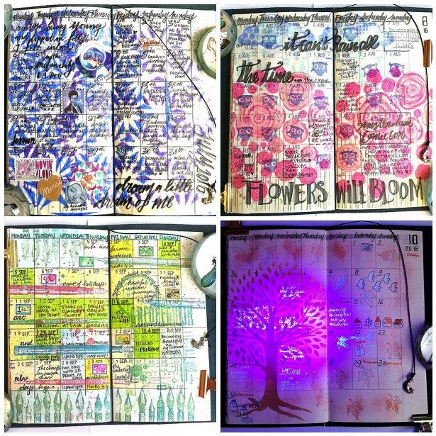
Following clockwise top left; July, August, September and October. Key words here were rain, bronchitis, flowers, penshow, meetups, halloween, fall and blue ghost.

November 2016
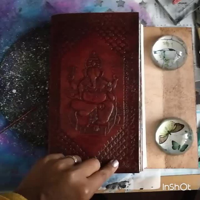
My november 2016 update is still fresh, from this week. Vacation, anniversary, Seville were the key words that month. And with Astrogirl looking back, it concluded my monthly updates of the year 2016. Below is a flipthrough I made on Instagram
A video posted by cheetarah (@missthundercat) on

My undated Midori planner is now full with a year's worth of memories. I have debated if I should continue this was for next year and after careful consideration I decided not to. While this experience was interesting and fun, it also cost me a lot of energy to create the pages. And I have a lot of exciting things coming up in the new year, the 1st half at least, which is going to need more my creative attention. Next week I will be able to tell you more about this :)

I am going to use my midori pocket planner again next year as well as a Stalogy undated planner as a gratitude journal, so it's not like I am going to quit planners completely. So I will definitely share those planning adventures with you here :) 

Thank you for your continued support on my blog and elsewhere on social media through out the year! It's very much appreciated!

Wishing you all a wonderful and safe NYE celebration!

namasté

2016/12/29

Art Journal: Journey in 2016

In terms of growth, it's always good to have moments to reflect upon things you have done in the past. Not only to see if they will help you move forward but also to appreciate the fact you have actually DONE these things. And in these quiet days in between the rush of Christmas and New Year's EVE creeping around, it's a good time to look back on the year I leave behind. In this post I look back on my art journaling journey the past year. 

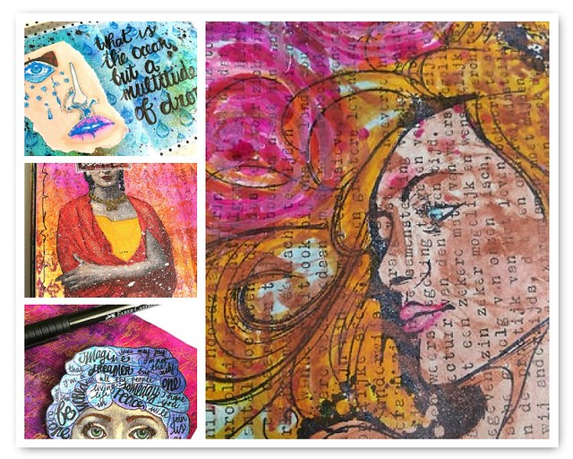
A collage of a few of my favorites pages.

In the beginning of the year I started a B5 sized journal in a book kind friends gave me. I started with zeal but halfway through the year I found out I liked a pocket size journal a lot better so I continued to work in that. I used a Hahnemühle 1584 pocket book for my art journaling in this size. 
Art journal favorites part 2
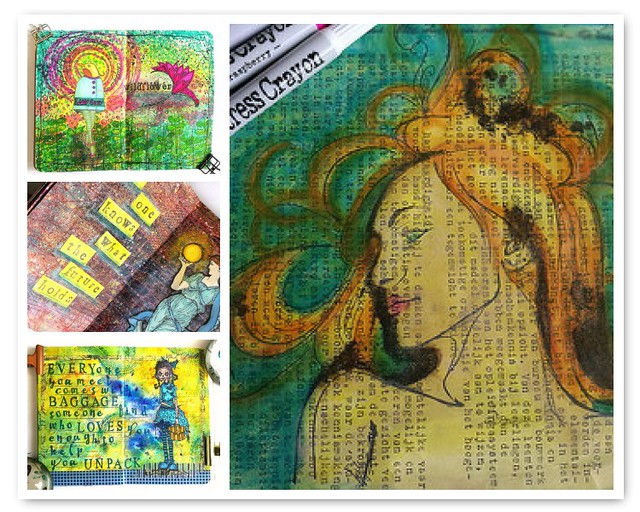
Another collage of pages in both journals. I also loved incorporating my studies of Hera in my journal.

A flip through video of both journals below:

journal journey 2016

A flip through my B5 size journal. 

pocket journal journey 2016
A flip through my pocket size art journal. 

See the process of pages in both my pocket art journal as the B5 size pages HERE and a few in my Hera Studies.

Both books still have room for lots more creativity and I am definitely going to continue in both next year.

Thank you all for your support of me and my creative journey this year, it means a lot! Hope you'll continue to do so in the year to come :)

Have a great day and thanks for stopping by!

namasté

2016/12/28

Pens and Ink: Favorites of 2016

In terms of growth, it's always good to have moments to reflect upon things you have done in the past. Not only to see if they will help you move forward but also to appreciate the fact you have actually DONE these things. And in these quiet days in between the rush of Christmas and New Year's EVE creeping around, it's a good time to look back on the year I leave behind. 

In this post I look back on my top 10 pens and inks pairings of 2016.

Top 10 pensandink posts of 2016

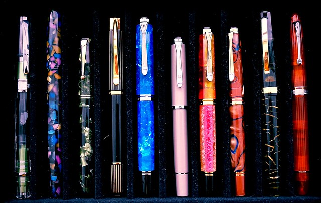
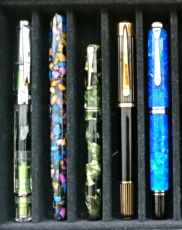
The above pens are my personal favorite fountain pens I've used over this year. They are not ranked in any way, just placed together in groups and you can see that one brands take the crown in this year's favorites, Pelikan!
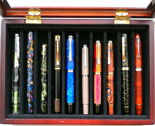
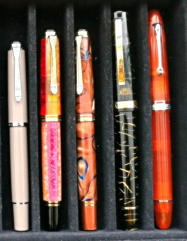
From left to right: TWSBI Al Green, Franklin Christoph Model 65 in Tiffany Stained Glass finish, Swan Leverfiller in Jade green, Pelikan P3110 Ductus, Pelikan M805 Vibrant Blue, Pelikan M205 Taupe, Pelikan M620 city series Shanghai, Pelikan M620 city series Grand Place, Omas Bologna in Black and Gold celluloid finish and the Omas Ogiva Alba in Orange.
(FYI: the Pelikan M205 Taupe looks more pink in this photo due to the warm filter over it, The pictures below represent the actual color better)

Top 10 pensandink posts of 2016
Very kind friends of mine gave me this wonderful pen box and I usually keep my currently inked pens in here. This box helps with presentation for this post as they have been in here at some point or other this year. Also it's a good cut off point to keep it at just 10 pens. I thought for sure it would be Omas, but looking back, Pelikan definitely got more writing time from me so they are more represented in this year's top 10! 

Let's take a closer look at each one. (Oh and I do apologize for the magnified dust and cat hair in the pictures, but yeah it is what it is..)

Top 10 pensandink posts of 2016
Starting at the far right is the Omas Ogiva Alba Orange and it's was a tie with the Omas Ogiva Alba Green, but this one won out due to the extra flessible fine nib. This flex nib showed the shading in writing beautifully. In the pens and ink post I had had paired it with Private Reserve Shoreline Gold (original version) but later I also loved this pen inked with Sailor Jentle Apricot. Which is the winning combination in all honesty.
Moving to the left is a pen I couldn't get out of my head when I saw it at the store after I left to get this pen (also a beautiful stunning pen from the same line, which I got for my birthday). So after a month I contacted the store and they kindly put it on hold/layaway for me. This was such a kind gesture and I'm really happy I saved up and got this pen because the pen material is just stunning. I paired the Omas Bologna in Black and Gold celluloid with Omas Dandy Turquoise. My absolute fave turquoise ink, ever.
Then comes a couple of Pelikan M620 pens from the City series I did my best to hunt down. I got lucky with a few collectors letting their pens go and I am thrilled to have them in my Pelikan Collection as they are both so very stunning. First is the Pelikan Grand Palace which I had inked with KWZ Monarch, the ink exclusive to Fontoplumo. A lovely warm autumn pair up. Which is a fun contrast to the lovely sakura spring colored match up of the Pelikan Shanghai with Caran d'Ache Sunset. Every time I look at these combos it brings back the feeling of Spring and Autumn.
Next to them is a smaller sister, the Pelikan M205 Taupe, which I actually got on a, well wouldn't say whim, but I was in a "I need a shiny new pen" mode while entering Akkerman in the Hague which is a dangerous place to be when you're in that mode! This one surprised me the most, because the color was a bit meh at first (won me over later!) but I knew that Caran d'Ache Storm would look SO great in this one. And boy was I right! The BB nib esp. makes the writing such a wonderful experience and I have this one in my 3 pen pouch with I take with me to work since I bought it! A stunning and stylish EDC (every day carry) for sure.
Top 10 pensandink posts of 2016
Starting out with another classy EDC on the left is the TWSBI AL Green which was a limited edition release. It was my "one of each" hunt for my TWSBI collection and it took me a while to find it, but thankfully Scrittura Eleganta had one with a juicy broad nib. I paired it with Montblanc Jonathan Swift, but popular consensus was to have paired it with Sailor Tokiwa Matsu as they commented on my FB/IG poll. I might try that next. 
The pen next in line is definitely a what I would consider a unicorn pen. When I saw an IG friend of mine selling this pen, I jumped on it straight away. What a stunning pen this Franklin Christoph Model 65 in Tiffany Stained Glass is! I paired it with a harder to find ink at the time, Organics Studio Jane Austen Violet, but they since then started to manufacture inks again so it's available again for the masses, huzzah! This pen though still is one of few made or as FC said in an IG convo I had with them "only 12 of them were made for the Stockroom and maybe one or two at a pen show, so you have a rare and unusual Model 65 Stabilis". So yes, this in my unicorn pen, for sure!
Then comes the only vintage pen in this year's top 10, the Swan Green Marbled self filler, a purchase from the Tilburg Penshow this year. I paired it with a mossy green Diamine Safari which the flex nib of this pen showed off really nicely. 
I have another mossy green ink in my line up, Diamine Salamander which is in my Pelikan Ductus P3110 and in the 3rd slot in my EDC 3 pen pouch. This pen was the surprise of the year. Mainly because I had no idea I would like this pen so much, but it's a beautiful, classy pen and also very comfortable in hand. In MY hand, a hand that prefers Pelikan M400/600 size pens. It lays more comfortable in hand than the Pelikan M805 which is next to it and they are essentially the same size. It's a unique pen and often referred to as the "ugly ducking" of the Pelikan family, but I love this under appreciated pen a lot. 
And then on to the last pen in my top 10; The Pelikan M805 Vibrant Blue Special Edition. It's a stunner of a pen really. I had inked it with Organics Studio Nickle Teal and enjoyed writing with this ultimate blue pairing. 

So there you have it, my top 10 pens and ink pairings of the year. I'm planning on doing more of these posts next year, but maybe not as frequent because I am planning on slowing down on pen/ink purchases for a while and enjoy what I have more. Yeah you can call it a new year's resolution of some sort, but well let's see how long that will last. Rumor has it that Lamy is going to have an ocean blue Al Star release for next year and well you bet I'll be adding that one to my collection!

Thank you for all the support you given me and my blog over the past year. It's much appreciated. Stay tuned for more round up's this week. Have a great day!

namasté
2016/12/27

Monthly Planning MTN: November 2016 update

November 2016
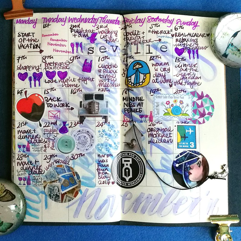
The colors I used for this month are in purple/ lavender tones. I started off with mixing some tombow markers and hand lettering the days of the week on the vertical side to give the page a starting color. Then I wrote the dates and events with my Pelikan M205 Taupe with Caran'dache storm. My fave pen and ink combination that month. I added stamp prints from Sakuralala and some fun stickers in a matching color tone so fill in some gaps. As the month went on, it became busier and it was harder for me to write down events that took place in my weekly planner. SAD really zapped my energy the last half of the month but we did end up doing some fum things esp. in the beginning.

November 2016
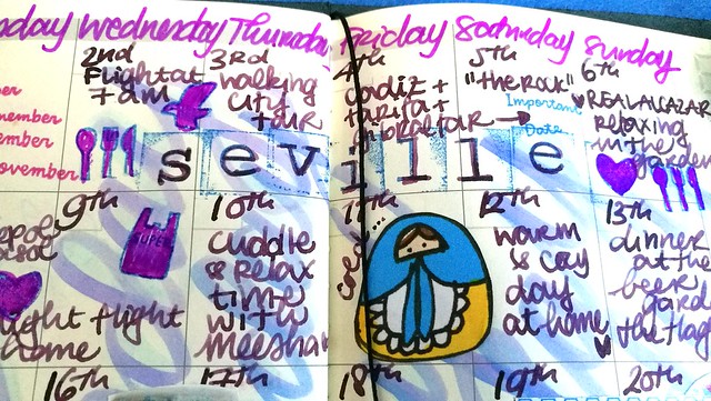
My wedding anniversary is on the 5th of november and we always do a little get away, but this year we've decided to go for a longer (and warmer) trip to Seville, Cadiz and Gibraltar aria. It was so wonderful and I really loved documenting that bit. Read about my adventures and shopping finds in Seville HERE. It's definitely a city I highly recommend to visit as it was our second time there and certainly not the last!

November 2016
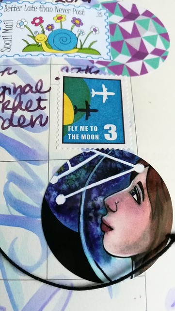
Just wanted to show you a detail in the overview. I thought it was fun to pair the "fly me to the moon" postoid sticker from MTN with S-Jane Mills artwork of Astrogirl below it. I bought to stickers last july and thought this one would be fitting to end the month with. It's also the end of the undated planner book, so my last update in this form. I will do an overview update later this week and share my thoughts using the undated monthly planner this way for a year. And if I will continue it... so look out for that post later this week. 

Have a great day and thanks for stopping by!

namasté

2016/12/26

Mailart Monday: Create Daily

ATC

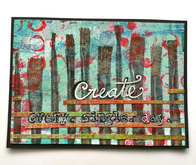
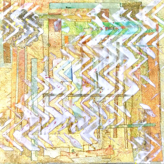
The end of 2016 is approaching and I am thinking about my goals for 2017. My musings inspired to create the ATC above, made with Gelli Plate left overs and the paint brushes stamp from Darkroom Door. I would love to keep on creating on a daily basis, make pockets of time for me in my art room just creating even if it's for just 5 minutes.

What are your goals for next year?

Hope you all had a great holiday weekend.
Thanks for stopping by and have a great day!

namasté
2016/12/23

It's the season; Let's Celebrate!

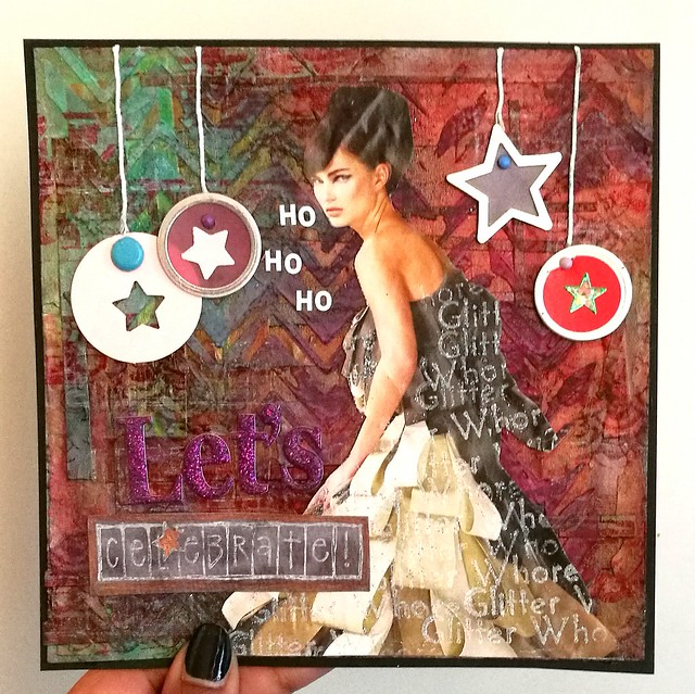
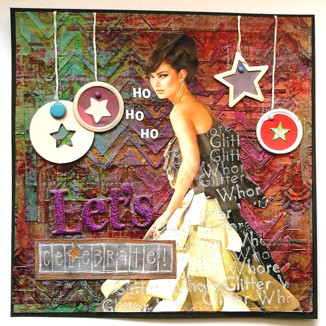
The holiday weekend is coming up and I wanted to show you a mixed media art collage I made in the spirit of the season.

Let's celebrate
I love how fun and quirky she turned out. The whole piece came together bit by bit. I wanted to use the fashionista cut out as center piece and the stamp "glitter whore" from Viva Las Vegas Stamps cemented it. I just stamped the phrase all over her dress with Brilliance cotton white and embossed it with WOW silver glitter. A full list of items used for the piece is at the bottom of this post. 
Let me show you a bit of the process.

Mixed media base
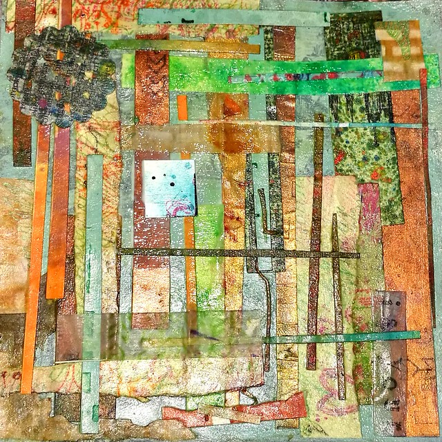
After I cleaned my desk I found all these leftover trims I did from various projects I did over the year. Yeah, shows you how often I clean my desk, heh... Instead of tossing them in the trash, I glued them all onto a 6x6 scrapbook paper which was already painted with a coat of baby blue ground paint. I used Modge Podge  Matte for this. I usually don't like to use this medium as a finish, but as a base glue for collage it's very well suited. All the little pieces stuck together really nicely.

Mixed media base
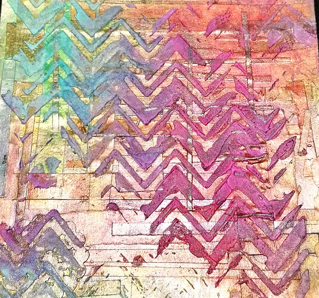
Then I coated the piece with a layer of Gold Medium from the Crafter's Workshop. It gives a nice translucent golden shimmery finish. After that dried I took a chevrons stencil and applied some of that Marshmallow fluff stuff, aka the light and fluffy modelling paste from TCW. honestly, it's SO light and fluffy and works really well over stencils. I wanted a bit of a messy look so I scraped over a few parts here and there.

Mixed media base
After that dried and hardened I went to work with some color. I used Distress stains for this, dabbed the colors directly onto the aria's and sprayed water with the mini mister on it. I let the colors overlap and wiped away some excess inks rolling off the page with a kitchen towel. Did this a couple of times until I was satisfied with the color scheme and saturation. You can't really plan that out, but I stopped when this beautiful transition of blue, purple red to pink appeared on the raised surface. I let this dry really well overnight. This is the base for the card. I only added some stamping to the background to create a bit more diversity in the grungy look and then basically glued all the other pieces on top of it.

Let's celebrate
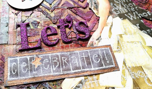
I have a ton of letter stickers but rarely use them. However this is definitely the occasion to use those pink fluffy sparkly stickers! The celebrate stamp I have had for years and it's a favorite to use this season. I stamped that with Dovecrafts cotton white on a piece of aquarelle paper which I had colored with grey ink. The edges and star I colored in with a bronze paintmarker. 

Let's celebrate
Adding metallic fortified shaped labels at the top made it look more festive. Used a paper punch for the stars on the left side. I adhered them with brads to keep them in place. Gluing on the baker's twine was hell as it kept unraveling and didn't stick well to the glue. But after a few attempts they finally got on there straight. well straight-ish. Also to share with you my humor; I find it very amusing that the "glitter whore" says "ho, ho, ho" :D I matted the piece on black card stock and called it done. 

Let's celebrate
So whatever you are celebrating, Christmas, Channuka or just the New Year which is lurking around the corner, I am wishing you all a sparkling, glittery, amazingly festive holiday season!

Thanks for stopping by!

Namasté

I'm entering this piece in 


______________________________________________________

Materials used for the holiday card project:
Paper:
Scrapbook paper 6x6 inch
Leftover trims from various projects
Fashion magazine cut out
Paper round shaped tag
Aquarelle paper
Black cardstock
Mediums/Glue:
Modge Podge matte medium
Crafter’s Workshop Gold Gesso
Crafter’s Workshop Light and Fluffy Modeling paste
Uhu Gluestick
Uhu clear universal glue
Ink/paint:
Ground paint in baby blue
Distress Stains: lucky clover, fired brick, dusty concord 
Dovecrafts white inkpad
Brilliance ink in cotton white
Staz-On ink: Cheery Red, Royal Purple and Stone grey
Stamps:
Viva Las Vegastamps; Glitter whore & numbers
Designs by Rynn; texture
Kolette Hall for Hampton Arts; Celebrate 
Various:
Mini mister water spray
Metallic edged round and star shaped tags
Star paper punch
Baker's Twine
Round Brads
Glitterpuff letter stickers in pink
Plastic letter stickers in white
Chevrons stencil
WOW silver glitter embossing powder
Bronze Edding Paintmarker

2016/12/21

A Coloring Adventure: Blackwing Colors Pencils Review

blackwing coloring pencils
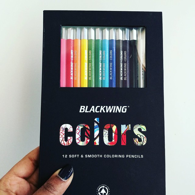
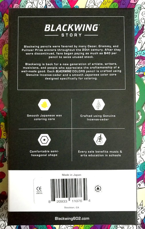
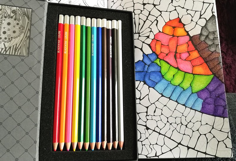
Blackwing is known for their awesome brand of graphite pencils, the Palomino Blackwing, and when I found out they had coloring pencils as well, I definitely wanted to try them. And when Mishka from Bureau Direct kindly offered this set for review I was absolutely thrilled to have that chance! Thank you again! They are absolutely a pleasure to color with. The packaging is very swanky, too.  It's a beautiful sleek and classy design in heavy cardboard,soft matte black finish and a magnetic closure. You can see the pencils through the PVC window which is convenient so you can see which colors are in there.

Blackwing coloring pencils
Next to reading about Blackwing's story, you can read the basic information about the pencils from the back of the box. The Blackwing Colors set (MRSP 30£) consist of 12 smooth coloring pencils made in Japan. Crafted using Genuine Incense-cedar in a comfortable semi-hexagonal shape with a smooth Japanese wax coloring base. Also every sale benefits music & arts education in schools, which is very cool of them to do so. 

Blackwing coloring pencils
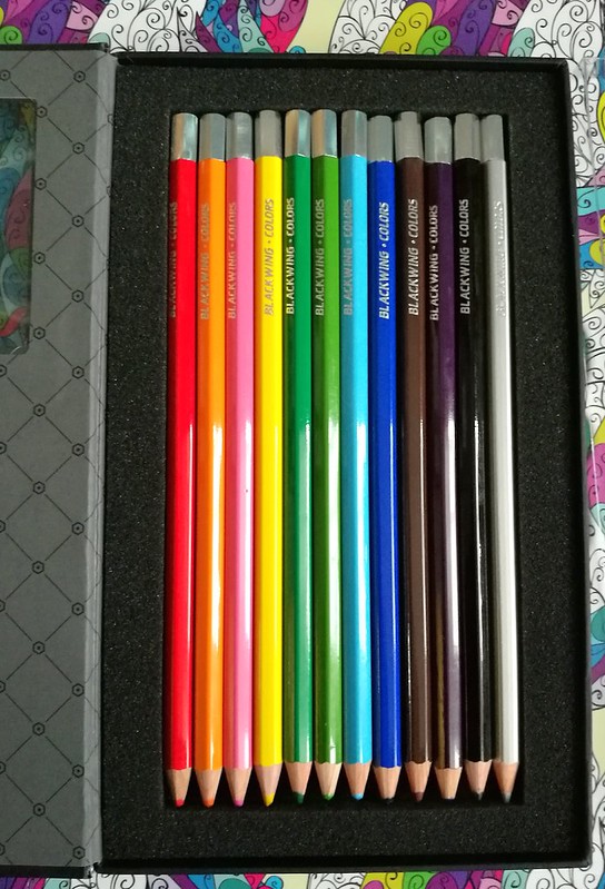
When you open the box, the inside design has an elegant harlequin motive and the pencils are cushioned in soft foam. There is also a protective see through plastic cover placed over the pencils (not pictured), which is easily removable and put back into place to keep your pencils in place (or as an extra barrier) if you choose to carry the box around. I like to foam cushion because it also protects your pencil tips from bumping against the side of the box and thus blunting them if you had just sharpened your pencils. That's a nice eye for detail there!

Blackwing coloring pencils
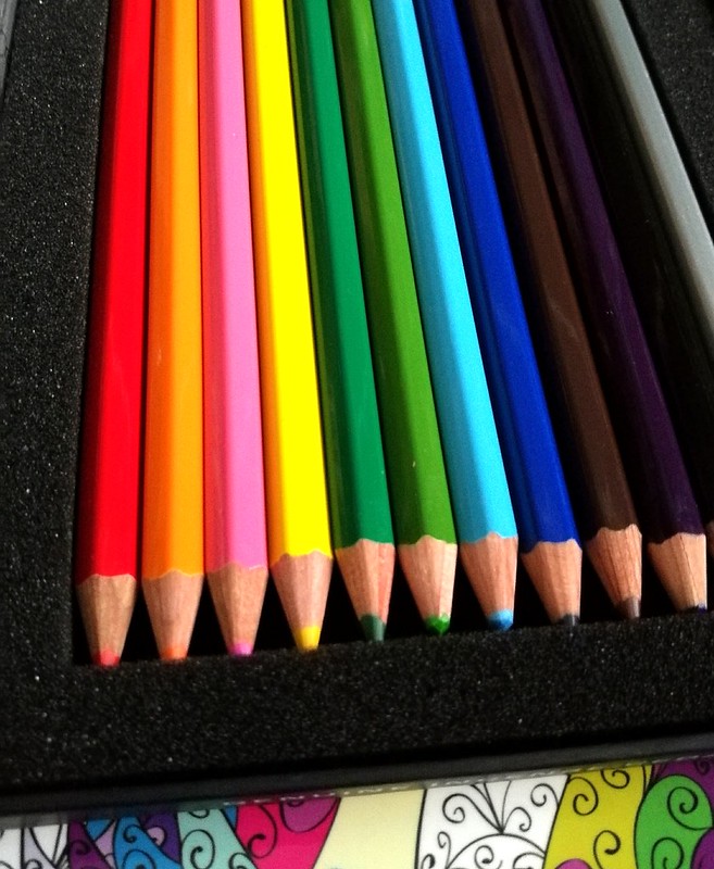
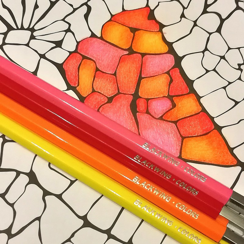
The pencils are solid colors with a silver capped end and the name "blackwing-colors" are engraved in silver as well. The only thing lacking are the names of the colors! You do have your ROYBGIV colors in the set. The colors are red, orange, pink, yellow, dark green, light green, light blue, dark blue, brown, purple, black and a fun silver color, which sets this set apart from other standard 12 pencil color sets which often offer white. If you're coloring in a low lit room, it might be hard to tell apart the darker tones, though. When testing these out one evening on my couch I thought the purple one was a darker brown one for sure and seeing my work the next morning, I discovered the purple and brown do go together nicely as well ;) I tested them in a coloring book.

blackwing colors
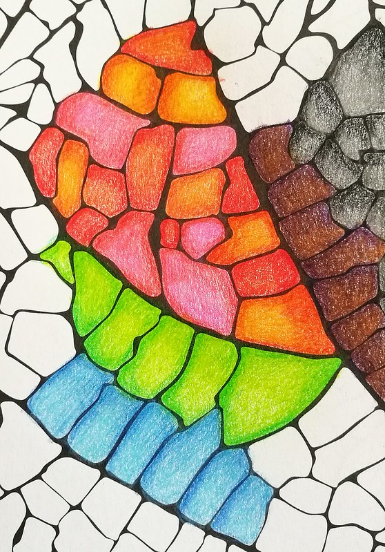
They are quite comfortable in hand. I do prefer the hexagonal shape because it prevents them rolling off my desk like the fully round pencils often do. On the subject of blending, I often use a white pencil or a colorless blender to burnish/smooth out the pencil strokes. But you can also use lighter colors in this set to get that same effect. I've done that with the color hues above. I used the lightest hues to blend the colors together to get a creamy blended effect. You can get awesome shade effects like this too, without dulling down the color which you sometimes can do if you blend with a white pencil. So the colors brightly pop out here!

blackwing colors
The pencils are in performance quite like the Derwent artist pencils, which are also wax based and super soft in use. Though with the Derwents you do have a wider variety of colors to choose from. This is a fixed set and no open stock available but you could use wax based pencils from other brands and intermix them if you would like wider range in colors. 

blackwing colors
The set on its own has a great variety of colors you can easily and smoothly mix them together to create different hues. The unique silver color adds a bit of freshness to the mix, which I quite like! 

With the pricing of 30£ for this set, it's not cheap, but you do get a nice artist grade coloring set of a well known brand in the pencil industry. It has classy packaging and sleek design. You're also supporting the arts education with purchasing this set. What's not to like?  
Also when you sign up for Bureau Direct's newsletter, you will receive a 10% discount code in your inbox every month. Just FYI :)

If you are still shopping for a Christmas gift for that creative friend of yours, this would definitely make a great one!

Thanks for stopping by and have a great day!

namasté
(disclaimer: I got this item free of charge for review purposes and was not monetarily compensated. All opinions stated here are my own and there are no affiliate links.) 

2016/12/19

Mailart Monday: Happy Holidays!

Holiday cards design 2016

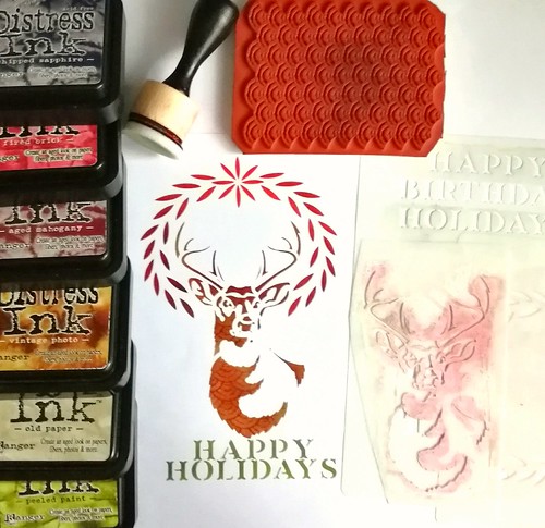
The season is nearly upon us! We've decorated our apartment in the holiday spirit and I've also made some cards to send out. Well, I've made one card, scanned it and sent off to the printer because that was the best and fastest way to do it. Sadly the prints have not arrived yet, grumble, but I can show you the card design. I've used stencils 101 by Ed Roth, a lot of distress inks with a blending tool and designs by Ryn texture stamp. I've used the stag stencil first and blotted ink through the stencil with my blending tool. When I was satisfied with the look, I took the texture stamp and stamped it through the stencil to give it some more interest. Then I went on with the wreath and blended the colors until I was satisfied with the look of it. Same as with the "Happy Holidays" sign under it. I made sure to mask off all parts of the stencil and the aria around it with low tack masking tape to get a clean and simple design. I'm quite happy with how it looks :) I am curious what the prints will look like and hopefully they will arrive any day now so they can get sent out this week, to hopefully arrive on time for the holidays. Here is the slightly altered digital version:


 I digitally altered the card to add a border and a watermark. Feel free to use the above image for your holiday cards as well (you can just download the image by right click saving). 
A little holiday gift from me to you as a thank you for your support with my blog and journey this year :)

Have you made your own holidays cards this year? 
If so, leave a link below I would love to see them :)

Thanks for stopping by and have a great day!

namasté
2016/12/16

When life gives you lemons...

When life gives you lemons male lemonade

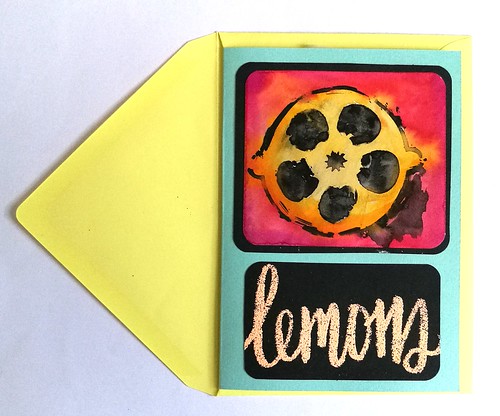
I made this notecard a while back and sent it to someone recently. The lemon was made with a stencil, india ink and ecoline, while the word was written with a versa marker and then embossed. Things have been a bit tough lately, but I'm trying to put all things in perspective. There is a lot to be thankful for and when things aren't going the way you'd hoped or expect, I'm trying to remember the following

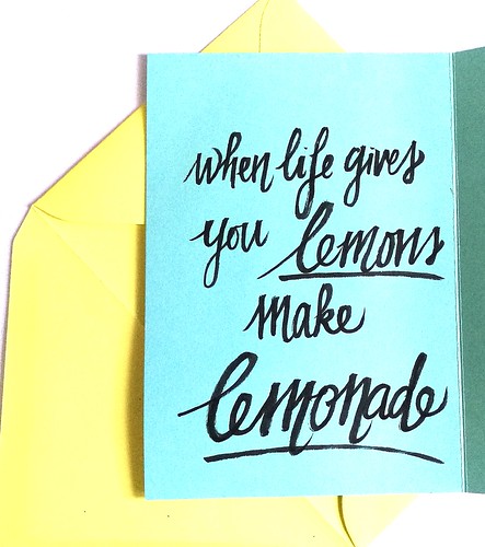
When life gives you lemons make lemonade

When life gives you lemons, make lemonade!

Wishing you all a wonderful weekend and thanks for stopping by!

namasté

2016/12/14

Pen and Ink: Pelikan M405 Stresemann with De Atramentis Christmas Black

Pelikan M405 Stresseman with DA Christmas

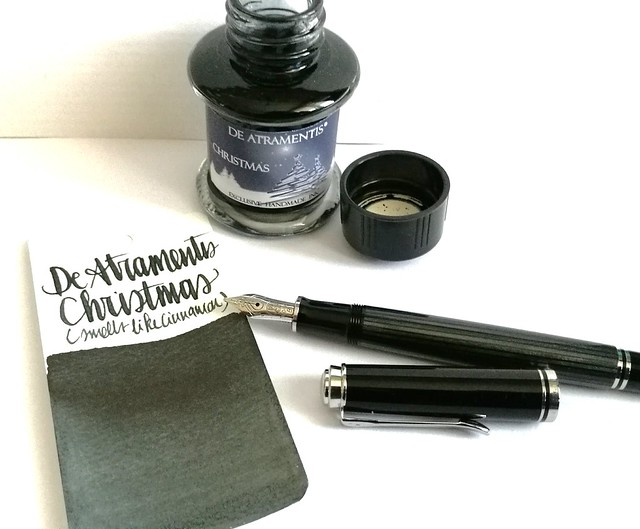
A couple of weeks ago I had the pleasure to pick up this pen; the special edition Pelikan M405 Stresemann with a broad nib. I inked it with De Atramentis Christmas Black. Thought this pair would be not only fitting in color combo, but also in the holiday spirit.

Pelikan M405 Stresemann with DA Christmas
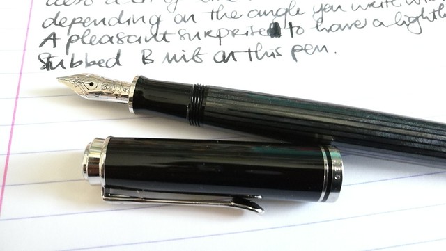
The stresemann finish is a very classy, business like looking pen. I had admired the M805 when it came out, but that size is just a tad bit too big for me as I prefer the M400-600 suze better. So I was thrilled when Pelikan announced this special release in the M405 size. And with thanks to Filippo from the Fountain Pen Group Buy FB group, it was very reasonably priced. 

Pelikan M405 Stresemann with DA Christmas

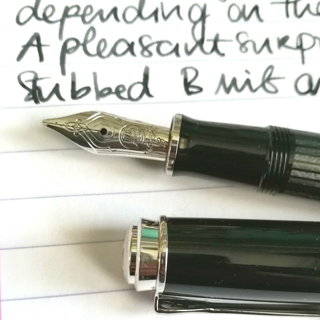
Close up of the nib.  chose a broad nib and it writes like it's slightly stubbed as it gives a very nice line variation when you write with it in a slanted angle. Maybe I got lucky, because I have not seen this in any other B nibs of pelikan before as of yet. Either way, it was a very pleasant surprise :)Read more about the pen here at the Pelikan's Perch.

De Atramentis Christmas
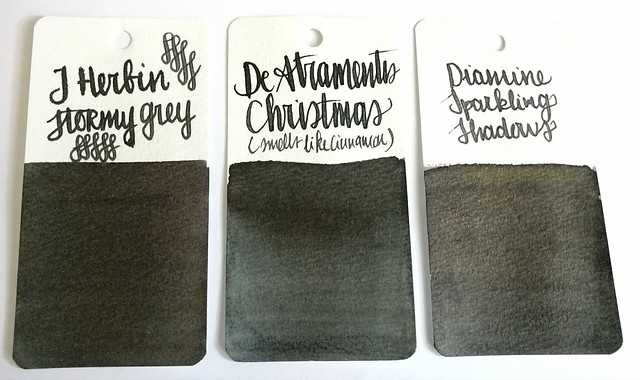
About the ink, I found it at an office supply store up in the north of NL and while I usually do not like black inks, this one definitely spoke to me. It has a very cute label AND smells like cinnamon! Also upon further investigation, this was a limited edition DA christmas ink release in 2012 and no longer available. It does look more like a dark grey in writing and on the swab cards. Except for the smell, it's not an ultra special ink. In color it comes close to J. Herbin Stormy Grey and Diamine Sparkling Shadows base color. Those other two colors would also go really well in the Stresemann as well and either of these would add a nice little scent or sparkle to your christmas cards. I better should get cracking on my cards for this year!

Thanks for stopping by and have a great day!

namasté
2016/12/12

Mailart Monday: an ode to coffee

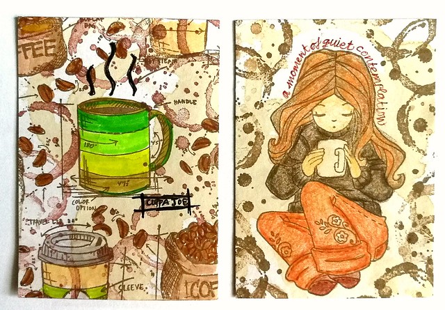
coffee ATC's

Coffee, for me, is a necessity esp. in the mornings. I can't seem to function without it. I just love everything about it, the smell, taste, the heft of a good cuppa Joe in hand. These two ATC's are an ode to that delicious beverage. They were made for a coffee themed swap over at Swapbot this summer. I used real coffee to stain the backgrounds and stamped over it with Tim Holtz Freshly Brewed stamps and coffee ring stamp from Stampers Anonymous. I colored them in with tombows. The girl on the right is from Unity Stamps (I think... ) and I colored her in with derwent artist pencils. These were really fun to make and I received equally fun ATC's in return.

something I need every morning to function properly. received this great piece of coffee art from a swap #coffee #atc #coffeebean #coffeering #swap #swapbot #received
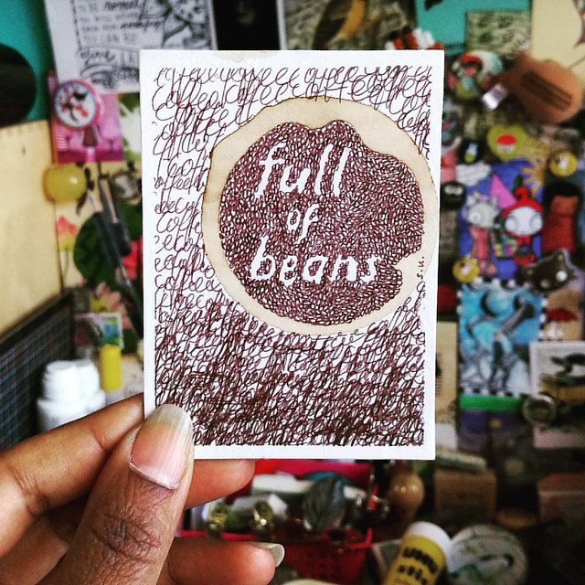
Full of beans... coffee beans!
The maker of the brilliant ATC above is SuMay on swapbot and I just totally love it. She also has an awesome flickr page of her mail art. 
an ode coffee
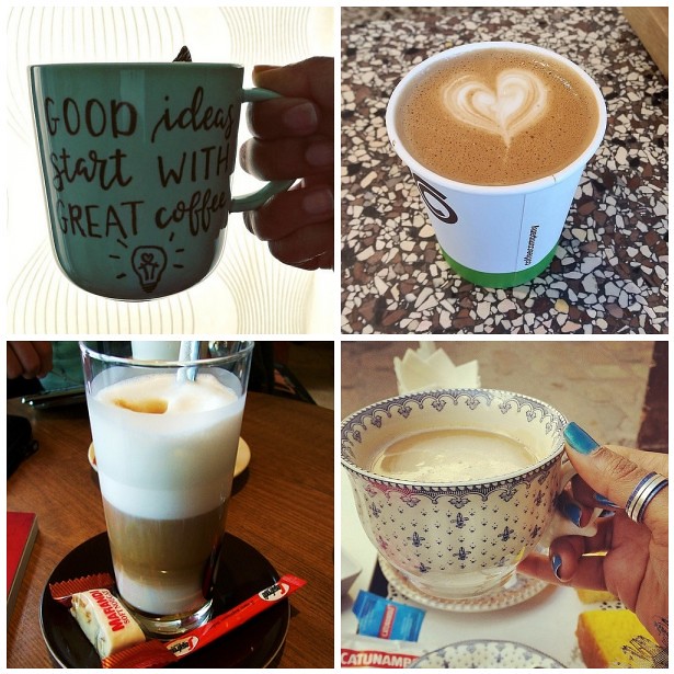
A good idea definitely starts with great coffee! I'm getting some now ;) 

Have a great day and thanks for stopping by!

namasté
2016/12/09

Shopping Highlight: Papeleria Ferrer in Seville

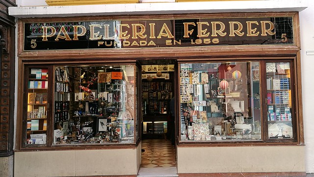
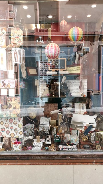
A bit behind schedule, but I didn't want to keep this gem, which I found in my travels in Seville, from you any longer. A true paradise for fountain pen lovers alike, Papeleria Ferrer in Seville.

Papeleria Ferrer
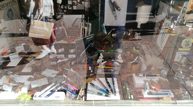
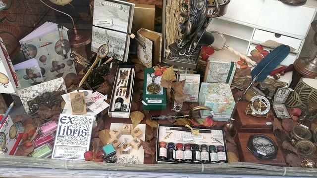
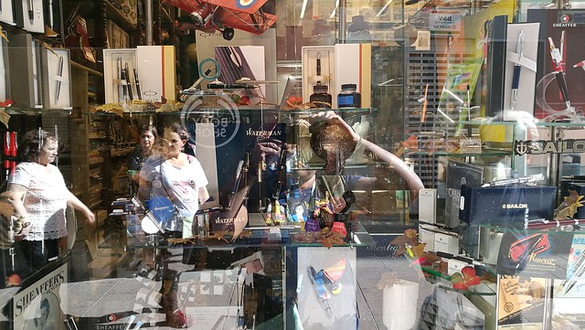
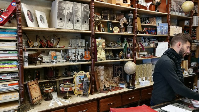
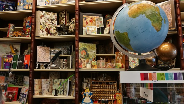
They are located on the Calle Sierpes #5 and it's really hard to miss with this gorgeous storefront. It's a small-ish store but packed full with fountain pens, craft supplies, notebooks and other fun stationery types. Pictures say more than words, so here follows a visual impression of the store.

Papeleria Ferrer
Papeleria Ferrer
Papeleria Ferrer
Papeleria Ferrer
And a glaring selfie. Yes, I'm wearing my doctor who shirt, one of many, actually. It was super bright when we came past it so all the window front pictures have a glare. Nothing can be done about that, but I do apologize for the lack of better quality pics of the storefront. Hopefully you can make out that it´s a well packed store and has very diverse stationery goods. There is a lot more to see on the inside too!

Papeleria Ferrer
Papeleria Ferrer
A variety of stationery and other fun goods

Papeleria Ferrer
Papeleria Ferrer
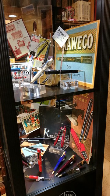
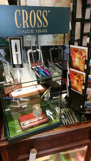
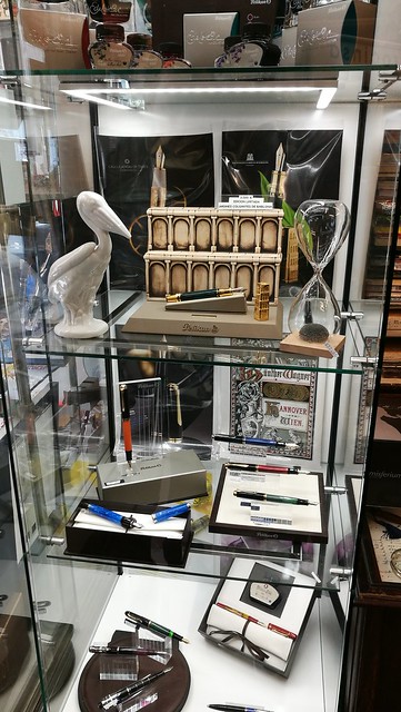
Kaweco and Cross display cases.

Papeleria Ferrer
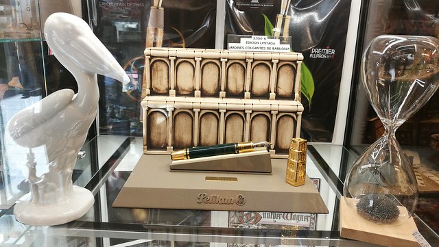
The Pelikan display case gave me pause...

Papeleria Ferrer
I gaped upon this gorgeous LE Pelikan, The hanging gardens of Babylon, and it was impressive to see it in person. At 3500€ well it's definitely one for the serious collector.

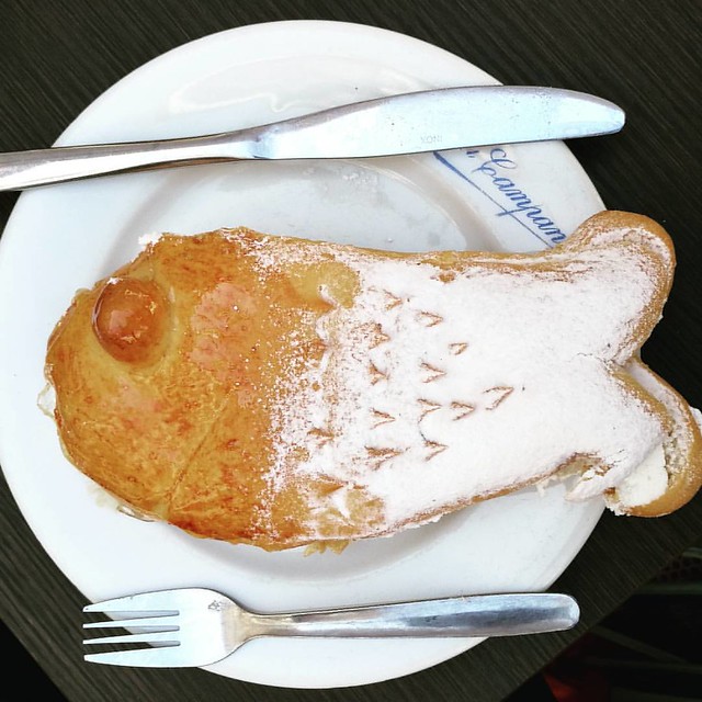
After you´re done shopping, head out to the right side where you will find La Campana for some delicious pastries.

So Seville is known for its amazing seafood 😋 #lacampana #pastries #andalucia #seville #seefood
My husband just could not resist this cream filled puffed pastry... it looked a bit fishy to me ;)

Papeleria Ferrer also has a facebook page where they update the new arrivals and when you´re in Seville it´s definitely worth a visit. 

Thanks for stopping by and have a great day!

namasté