Showing posts with label pelikan. Show all posts

2016/12/28

Pens and Ink: Favorites of 2016

In terms of growth, it's always good to have moments to reflect upon things you have done in the past. Not only to see if they will help you move forward but also to appreciate the fact you have actually DONE these things. And in these quiet days in between the rush of Christmas and New Year's EVE creeping around, it's a good time to look back on the year I leave behind. 

In this post I look back on my top 10 pens and inks pairings of 2016.
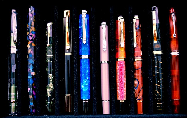
Top 10 pensandink posts of 2016

The above pens are my personal favorite fountain pens I've used over this year. They are not ranked in any way, just placed together in groups and you can see that one brands take the crown in this year's favorites, Pelikan!
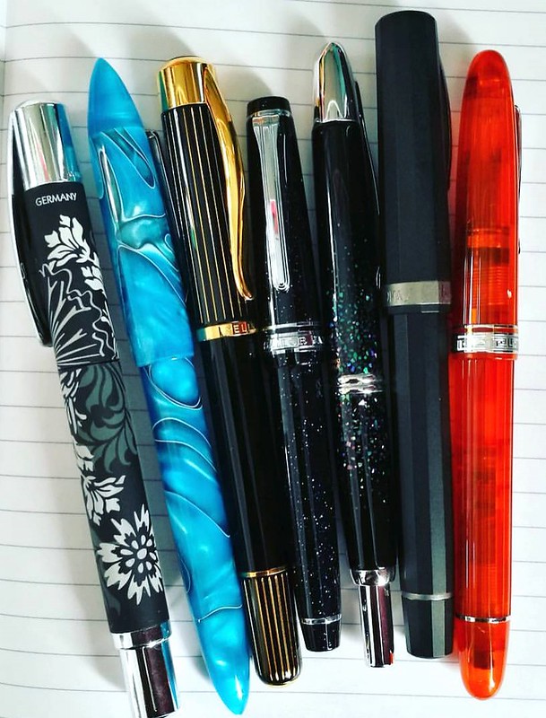
From left to right: TWSBI Al Green, Franklin Christoph Model 65 in Tiffany Stained Glass finish, Swan Leverfiller in Jade green, Pelikan P3110 Ductus, Pelikan M805 Vibrant Blue, Pelikan M205 Taupe, Pelikan M620 city series Shanghai, Pelikan M620 city series Grand Place, Omas Bologna in Black and Gold celluloid finish and the Omas Ogiva Alba in Orange.
(FYI: the Pelikan M205 Taupe looks more pink in this photo due to the warm filter over it, The pictures below represent the actual color better)
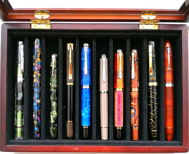
Top 10 pensandink posts of 2016
Very kind friends of mine gave me this wonderful pen box and I usually keep my currently inked pens in here. This box helps with presentation for this post as they have been in here at some point or other this year. Also it's a good cut off point to keep it at just 10 pens. I thought for sure it would be Omas, but looking back, Pelikan definitely got more writing time from me so they are more represented in this year's top 10! 

Let's take a closer look at each one. (Oh and I do apologize for the magnified dust and cat hair in the pictures, but yeah it is what it is..)
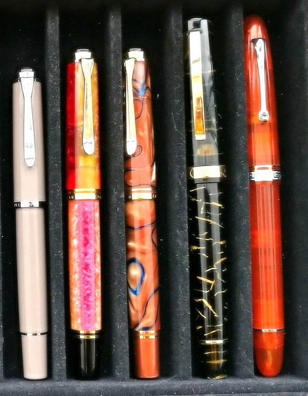
Top 10 pensandink posts of 2016
Starting at the far right is the Omas Ogiva Alba Orange and it's was a tie with the Omas Ogiva Alba Green, but this one won out due to the extra flessible fine nib. This flex nib showed the shading in writing beautifully. In the pens and ink post I had had paired it with Private Reserve Shoreline Gold (original version) but later I also loved this pen inked with Sailor Jentle Apricot. Which is the winning combination in all honesty.
Moving to the left is a pen I couldn't get out of my head when I saw it at the store after I left to get this pen (also a beautiful stunning pen from the same line, which I got for my birthday). So after a month I contacted the store and they kindly put it on hold/layaway for me. This was such a kind gesture and I'm really happy I saved up and got this pen because the pen material is just stunning. I paired the Omas Bologna in Black and Gold celluloid with Omas Dandy Turquoise. My absolute fave turquoise ink, ever.
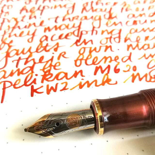
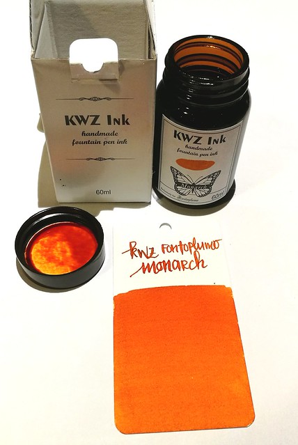
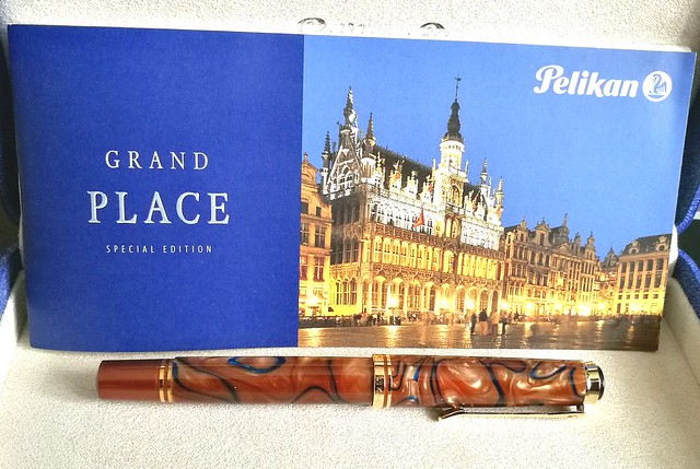
Then comes a couple of Pelikan M620 pens from the City series I did my best to hunt down. I got lucky with a few collectors letting their pens go and I am thrilled to have them in my Pelikan Collection as they are both so very stunning. First is the Pelikan Grand Palace which I had inked with KWZ Monarch, the ink exclusive to Fontoplumo. A lovely warm autumn pair up. Which is a fun contrast to the lovely sakura spring colored match up of the Pelikan Shanghai with Caran d'Ache Sunset. Every time I look at these combos it brings back the feeling of Spring and Autumn.
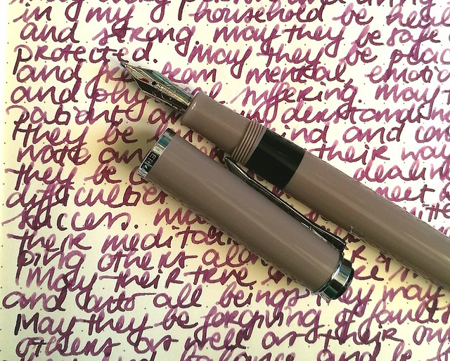
Next to them is a smaller sister, the Pelikan M205 Taupe, which I actually got on a, well wouldn't say whim, but I was in a "I need a shiny new pen" mode while entering Akkerman in the Hague which is a dangerous place to be when you're in that mode! This one surprised me the most, because the color was a bit meh at first (won me over later!) but I knew that Caran d'Ache Storm would look SO great in this one. And boy was I right! The BB nib esp. makes the writing such a wonderful experience and I have this one in my 3 pen pouch with I take with me to work since I bought it! A stunning and stylish EDC (every day carry) for sure.
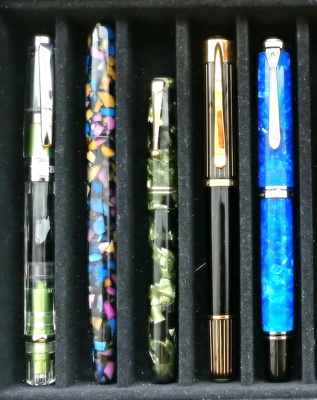
Top 10 pensandink posts of 2016
Starting out with another classy EDC on the left is the TWSBI AL Green which was a limited edition release. It was my "one of each" hunt for my TWSBI collection and it took me a while to find it, but thankfully Scrittura Eleganta had one with a juicy broad nib. I paired it with Montblanc Jonathan Swift, but popular consensus was to have paired it with Sailor Tokiwa Matsu as they commented on my FB/IG poll. I might try that next. 
The pen next in line is definitely a what I would consider a unicorn pen. When I saw an IG friend of mine selling this pen, I jumped on it straight away. What a stunning pen this Franklin Christoph Model 65 in Tiffany Stained Glass is! I paired it with a harder to find ink at the time, Organics Studio Jane Austen Violet, but they since then started to manufacture inks again so it's available again for the masses, huzzah! This pen though still is one of few made or as FC said in an IG convo I had with them "only 12 of them were made for the Stockroom and maybe one or two at a pen show, so you have a rare and unusual Model 65 Stabilis". So yes, this in my unicorn pen, for sure!
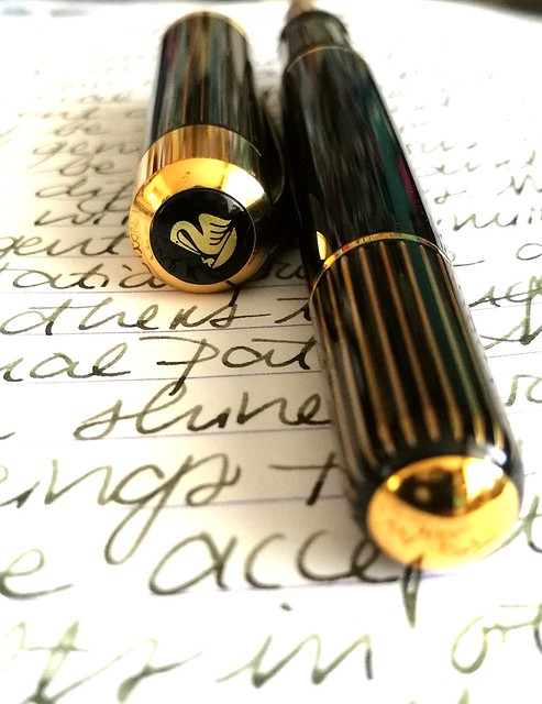
Then comes the only vintage pen in this year's top 10, the Swan Green Marbled self filler, a purchase from the Tilburg Penshow this year. I paired it with a mossy green Diamine Safari which the flex nib of this pen showed off really nicely. 
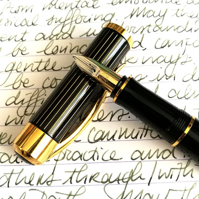
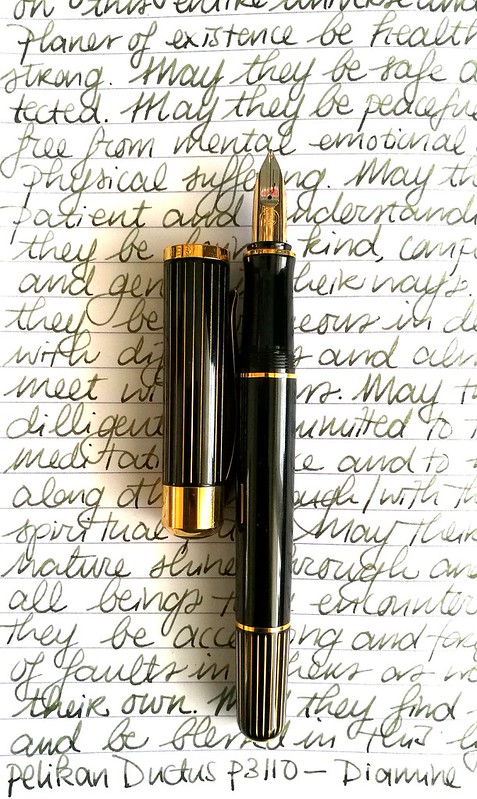
I have another mossy green ink in my line up, Diamine Salamander which is in my Pelikan Ductus P3110 and in the 3rd slot in my EDC 3 pen pouch. This pen was the surprise of the year. Mainly because I had no idea I would like this pen so much, but it's a beautiful, classy pen and also very comfortable in hand. In MY hand, a hand that prefers Pelikan M400/600 size pens. It lays more comfortable in hand than the Pelikan M805 which is next to it and they are essentially the same size. It's a unique pen and often referred to as the "ugly ducking" of the Pelikan family, but I love this under appreciated pen a lot. 
And then on to the last pen in my top 10; The Pelikan M805 Vibrant Blue Special Edition. It's a stunner of a pen really. I had inked it with Organics Studio Nickle Teal and enjoyed writing with this ultimate blue pairing. 

So there you have it, my top 10 pens and ink pairings of the year. I'm planning on doing more of these posts next year, but maybe not as frequent because I am planning on slowing down on pen/ink purchases for a while and enjoy what I have more. Yeah you can call it a new year's resolution of some sort, but well let's see how long that will last. Rumor has it that Lamy is going to have an ocean blue Al Star release for next year and well you bet I'll be adding that one to my collection!

Thank you for all the support you given me and my blog over the past year. It's much appreciated. Stay tuned for more round up's this week. Have a great day!

namasté

2016/12/14

Pen and Ink: Pelikan M405 Stresemann with De Atramentis Christmas Black

Pelikan M405 Stresseman with DA Christmas

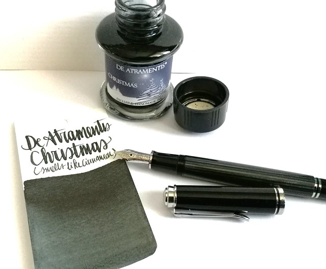
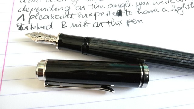
A couple of weeks ago I had the pleasure to pick up this pen; the special edition Pelikan M405 Stresemann with a broad nib. I inked it with De Atramentis Christmas Black. Thought this pair would be not only fitting in color combo, but also in the holiday spirit.

Pelikan M405 Stresemann with DA Christmas
The stresemann finish is a very classy, business like looking pen. I had admired the M805 when it came out, but that size is just a tad bit too big for me as I prefer the M400-600 suze better. So I was thrilled when Pelikan announced this special release in the M405 size. And with thanks to Filippo from the Fountain Pen Group Buy FB group, it was very reasonably priced. 

Pelikan M405 Stresemann with DA Christmas

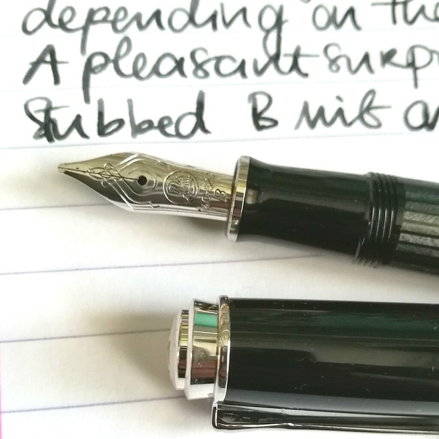
Close up of the nib.  chose a broad nib and it writes like it's slightly stubbed as it gives a very nice line variation when you write with it in a slanted angle. Maybe I got lucky, because I have not seen this in any other B nibs of pelikan before as of yet. Either way, it was a very pleasant surprise :)Read more about the pen here at the Pelikan's Perch.

De Atramentis Christmas
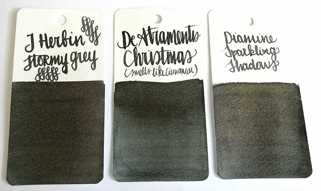
About the ink, I found it at an office supply store up in the north of NL and while I usually do not like black inks, this one definitely spoke to me. It has a very cute label AND smells like cinnamon! Also upon further investigation, this was a limited edition DA christmas ink release in 2012 and no longer available. It does look more like a dark grey in writing and on the swab cards. Except for the smell, it's not an ultra special ink. In color it comes close to J. Herbin Stormy Grey and Diamine Sparkling Shadows base color. Those other two colors would also go really well in the Stresemann as well and either of these would add a nice little scent or sparkle to your christmas cards. I better should get cracking on my cards for this year!

Thanks for stopping by and have a great day!

namasté
2016/11/09

Pens and Ink: Pelikan M200 Taupe with Caran d'ache Storm

Pelikan Taupe with CDA storm
Keeping up with the Pelikan and purple hues theme, I got another great pairing for you today.
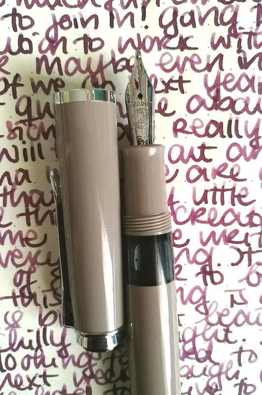
The Pelikan M205 Taupe (special edition release in 2012, more info here at the Pelikan's Perch) with Caran d'Ache colors of the earth Storm (which is discontinued with the release of the Chromatic Inks, More info about that on Gouletpens blog here).

Pelikan M205 Taupe inked with Caran d'ache Storm - highlights the warm subtle purple in the pen.
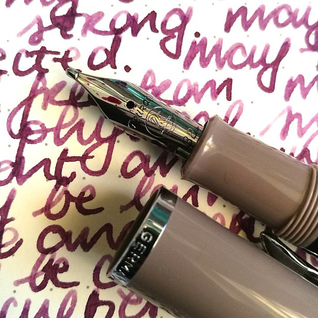
This pen was a special release in 2012, but I found it not too long ago at Akkerman in the Hague. They still had a couple of them for sale and when asking to see one up close, they provided me one which had a BB nib fitted in it. Really hard to resist that beauty! And look at that tipping! It puts down a wet and juicy extra broad line.

Pelikan Taupe with CDA storm
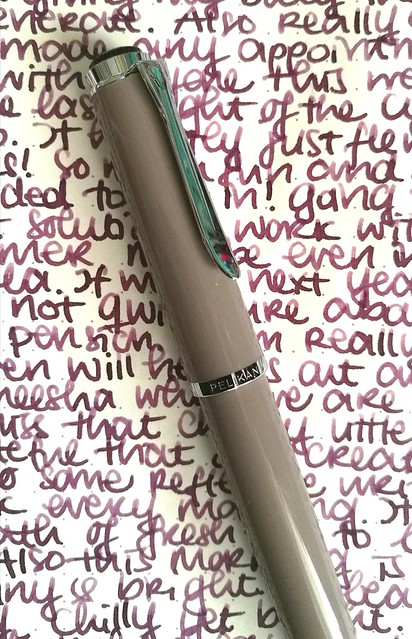
The color of this pen is "taupe" upon googling which hue that actually means I came across this on Wikipedia

"Taupe is a word that is used to denote any of a variety of colors. The colors it denotes fall into a range from dark tan to grayish brown or brownish gray. The word derives from the French noun taupe, which in turn is from the Latin talpa, both meaning "mole" (the mammal)." 

So it's a greyish-brown or a brownish-grey, which when you look at it, yeah I can see that. But you have a whole set of color tones that falls into the "taupe" aria and to me this pen looks more like a Mauve Taupe, the purple tone in the taupe spectrum. And because of this I thought a dusky warm purple would perfectly suit this pen. 
purple hues

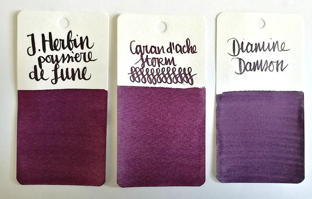
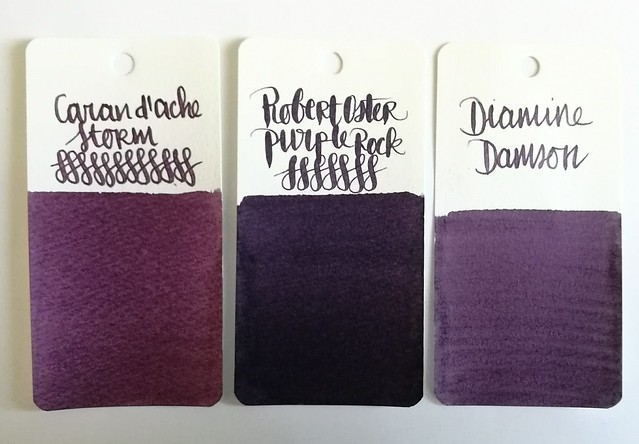
Comparisons of some dusky purples: J. Herbin Poussiére de Lune, Caran d'Ache Storm and Diamine Damson. I chose to ink the pen with CdA Storm because of the warmth this color has and came close to Mauve Taupe. And I should use the LE inks more instead of hoarding it, right?

Pelikan Taupe with CDA storm
The BB nib in this pen shows off the shading in the ink very nicely and the ink highlights the warm tones in the pen body too. A winning combination and a joy to write with on these colder near winter days.

Thanks for stopping by and have a great day!

namasté
2016/11/02

Pens and Ink: Pelikan M1000 with Robert Oster Purple Rock

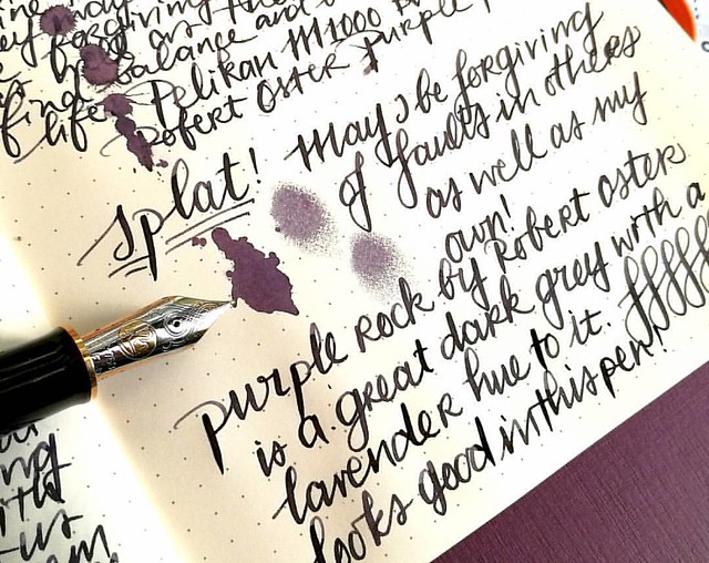
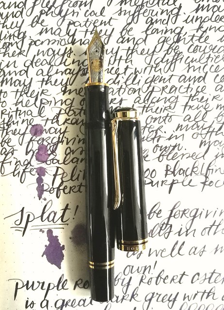
Starting off the day with a bit of #writtenmeditation in my Rhodiarama journal. Got some spatters of Purple Rock on it and you can really see that purple lavender hue on it :) Have a great day everyone 💜
Not too long ago I had the amazing opportunity to buy a Pelikan M1000 in black with gold trim in a clearance sale for a great price. Something I could not resist even though I was wondering if I would use it enough because it came with a fine nib and is such a large pen. Well, inked with this spectacular ink Purple Rock by Robert Oster, it definitely became one of my fave writers in no time!

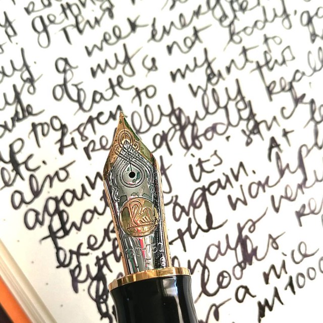
Something I have learned in spades last year, listen to my body and keep my energy balance in check. Always good to remind yourself of what you have learned and keep it in practice. Inked my M1000 with Robert Oster Purple Rock and the M1000 nib grade is o
The nib on the M1000 is nothing but spectacular! It's quite a large pen (see a review of the M1000 here by SBRE Brown and here by Brad Dowdy on the Pen Addict) and the nib has some wonderful spring to it. It's one of the rare fines I truly enjoy writing with.

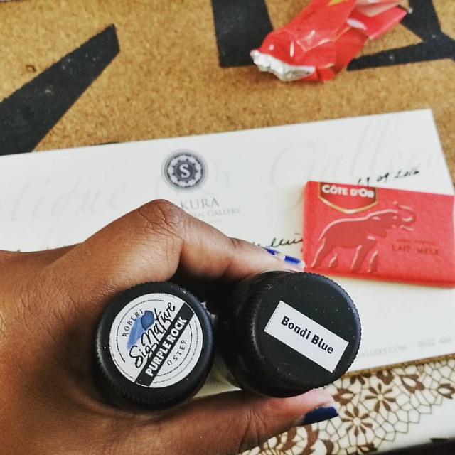
The first bottles I got of @robertostersignature Itvhad to be Bondi Blue beacuse turquoise and sheen?! I need that!! And am curious of the Purple Rock because I wanted a purple black. Hope it's as good as @attilasultis's swabs made it look :) Oh and it is
I bought the Purple Rock in my order at Sakura Fountain Pen Gallery together with the Bondi Blue. At first I thought it was more of a black with a light hint of purple, but it's a deep dark grey with a gorgeous purple hue to it. It's subtle in a fine nib though, but it's definitely more visible in broader pens or in an ink splatter like the top picture. A beautiful work safe pen and ink combo I would say. See some awesome ink tests on Robert Oster inks here by Nick Stewart at Inks and Bleach.

purple hues
Here you have Purple Rock flanked by Diamine Damson and Caran d'Ache Storm, It's definitely a lot darker than the other two dusky purples for sure, though you can see the purple hue purple rock has very clearly in less saturated parts in the writing below and the splatter.

Pelikan M1000 with Purple Rock
Purple Rock is a great match for this gorgeous M1000 and also a fun "safe for work" color.

Next week I'll show one of the other purples in another Pelikan. 
Thanks for stopping by and have a great day!

2016/10/26

Pens and Ink: Pelikan M620 Grand Place with KWZ Monarch

Pelikan Grand Place with KWZ Monarch
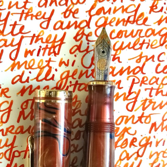
Today's I'm sharing a wonderful autumn inspired combination: the Pelikan M620 Grand Place inked with KWZ Monarch ink.

Tilburg Penshow Spoils
About the ink: I bought a bottle at the Tilburg Penshow in september and it's a Fontoplumo exclusive. It's made by KWZ and it's made to fit their gorgeous Limited Edition Conid Bulkfiller fountain pen. Well, I have not won the lottery yet, so the pen was not something I could obtain, but the ink definitely came home with me. It's a gorgeous warm orange color, perfect for this time of year.

pelikan
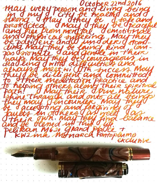
The pen I chose to try the ink in is this gorgeous Special Edition by Pelikan, the M620 Grand Place from the city series. It's a beautiful coppery brown color with dark blue swirls in it. I got really lucky obtaining this pen because it's a LE from a few years ago but a collector was selling his pen a while ago and I jumped on the chance. It is fitted with a b nib, so I figured it would be perfect to show off the great shading of the KWZ ink.

Pelikan Grand Place with KWZ Monarch
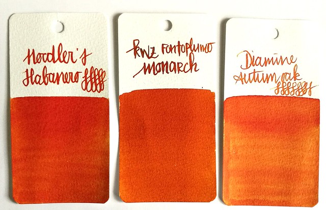
It definitely does the ink justice! It has some great shading and reminds me a lot of Diamine Autumn Oak and Noodler's Habanero (ink shot reviews by the lovely Gourmet Pens). Though Monarch is a bit browner and has a wonderful vanilla small to it! Makes writing with it a lot more fun (I kept sniffing the nib!)

orange comparisons
Comparing the inks side by side. As you can see Monarch definitely has a browner and darker tone to it. It's a subdued copper red orange ink but with writing you definitely can see some lighter tones. 

Pelikan Grand Place with KWZ Monarch
I am very much enjoying this pairing and happy to have these two special editions in my collection.

Thanks for stopping by and have a wonderful day!

namasté

2016/09/21

The Pelikan Hub 2016 round up

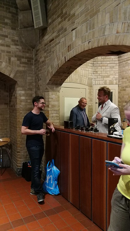
This year the Pelikan hub was also hosted in Amsterdam :) It was this past Friday and definitely was a super fun gathering! With thanks to the hubmaster SBRE Brown (and his charming wife Gourmetpens!) the generous sponsoring of Appelboom Pennen, the goodies Pelikan International has provided and all Pelikan Pen Afficionado's attending the gathering, it was pretty successful first (of perhaps many?) hubs in Amsterdam!

Pictures say more than words, so below an impression of the night where birds of a feather, flocked (in pen-geekery) together :)

Pelikan hub Amsterdam 2016
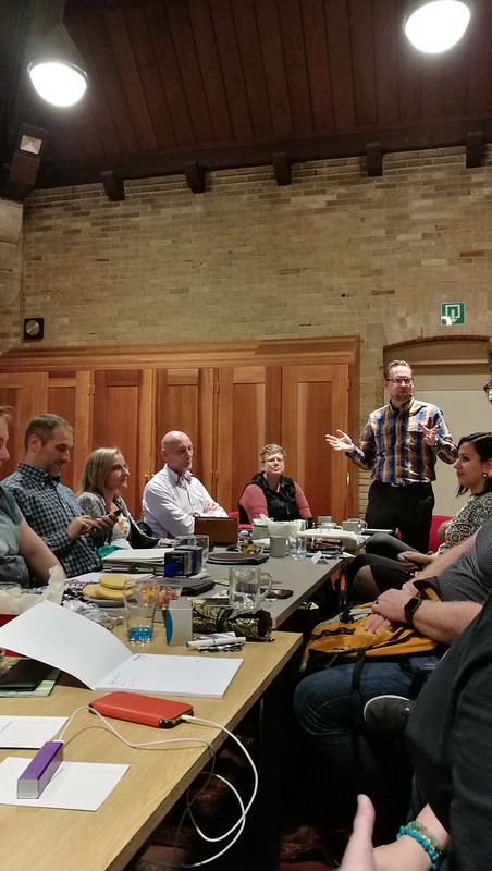
Opening speech by hub-master SBRE Brown. I think a flock of 18 people attended and the venue was a church hall which Joost from Appelboom pennen has set up.

Pelikan hub Amsterdam 2016

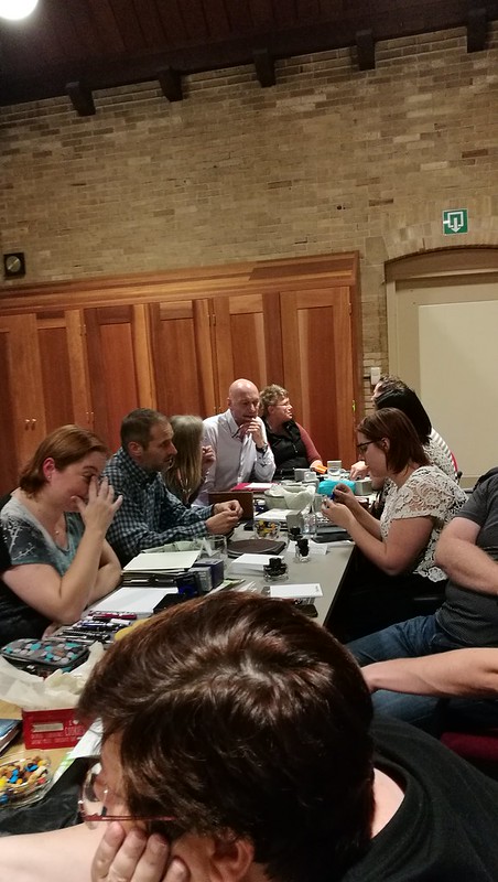
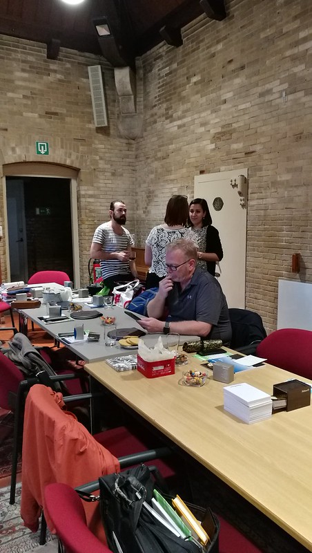
All brought pens and ink and we chatted, tried pens and shared stories. It was great fun!
Pelikan hub Amsterdam 2016

Pelikan hub Amsterdam 2016
That is Joost from Appelboom pennen behind the bar being a gracious host as well. He brought a lot of inks for us to try and some new release pelikans (I might have got one...)
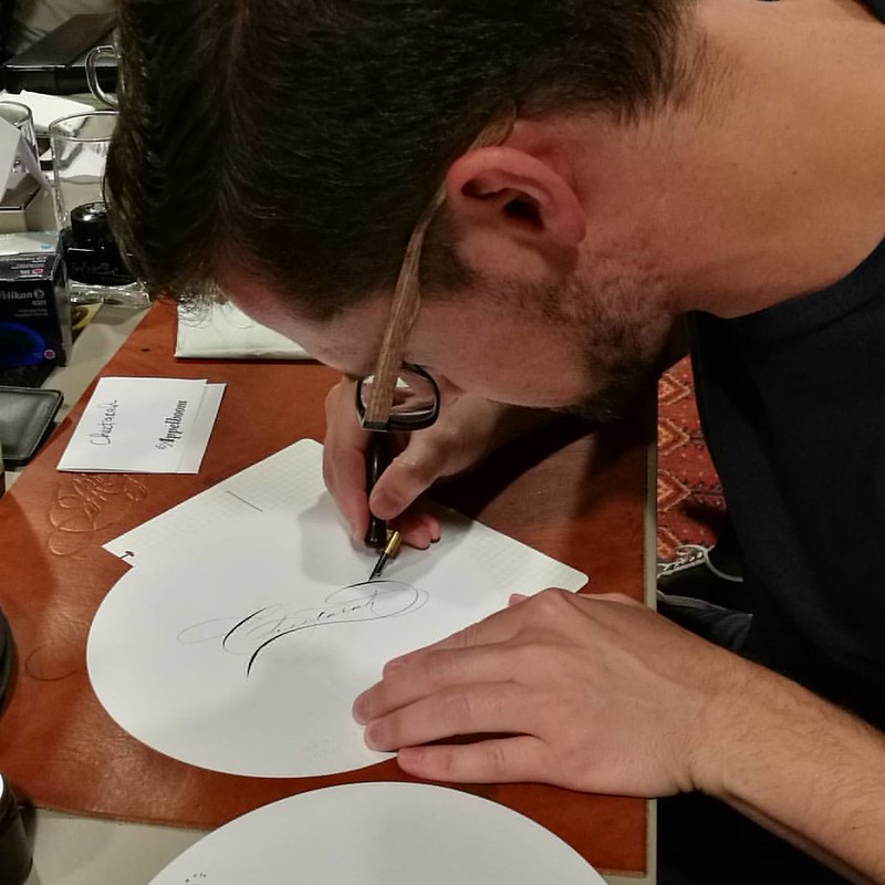
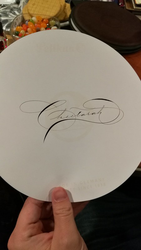
Mr Eric Orozco (top picture, busy at work ;) and Mike Ward also attended the hub all the way from the US! Mike was kind enough to do some calligraphy samples for us.

Very cool to have @mrmgward at the Amsterdam #pelikanhub and calligraphing my name :)
Pelikan hub Amsterdam 2016
He wrote my (and most of all the other attendees) name in beautiful Spencerian script. That really brought something very special to the event :)

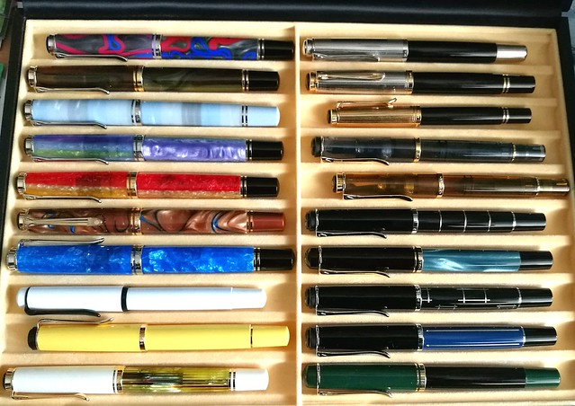
pelikan collection case
And this is my special Pelikan collection box case with the pens I brought with me to the hub.

I didn't take a lot of pictures, was too busy having fun! See Gourmetpens's round up post of the hub HERE for more pictures of the day. We stayed pretty late and here is a picture of us taking the late train back to Leiden. 

Thanks to everyone who made this possible! Hopefully next year we'll have another one of these to look forward to :)

Have a great day and thanks for stopping by.

namasté

2016/09/14

Pens And Ink: Pelikan Ductus P3110 with Diamine Salamander

Pelikan Ductus P3110

As the Pelikan Hub is on this friday (there is one going to be in Amsterdam too this year which I will be attending, yay!) I thought it would be fitting to highlight a recent acquisition I made from this brand. And it's a pen I thought I would never buy, until I read this great review by Joshua of the Pelikan's Perch a while back about the Pelikan Ductus. By chance I came across one locally where the price was right and I was sold! Or well, the kind people at the office supply store sold the pen to me :)

Pelikan Ductus P3110
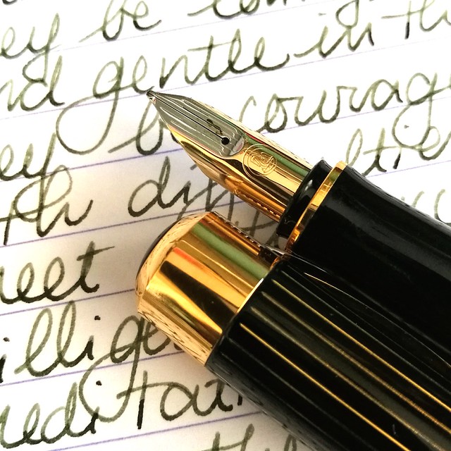
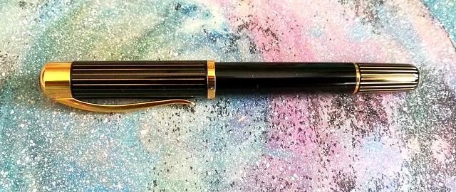
Joshua reviews the P3100 version, which has silver accents on the pen body and cap, but I purchased the P3110 version which has gold accents. And I must say, it has a very attractive finish. The brass body is coated with a black lacquer and then buffed to a shiny finish. The gold stripe accents on the cap and piston knob really make the pen pop and it reminds me of a raden finish, but without the "bling". It's a very classy looking pen. And that's why I like it, it's a very nice every day carry for the office!

Pelikan Ductus P3110
When I was thinking of an ink to pair it with, I wanted a dark green ink with some shading but also needed to be fast drying to be able to take quick notes in the office. So obviously it also need to be a safe for work kind of color. What I came up with was Diamine Salamander, a darker version of Rohrer and Klingner's Alt Goldgrün. It doesn't remind me of a salamander al all, but hey I don't come across many of those myself, so I can't really compare the green hues on that little critter. See a review of this ink by Ed Jelley here, but I don't agree with him describing this as a mucky, garbage water color though, ha! To me the color resembles a darker olive green with a hint of brown and black which you can see in the shading. A very interesting color for a very interesting and unique pen. 

The pen is a cartridge filler only (which is a bit limiting), it takes 2 short or 1 long standard international cartridges and I refilled an empty one by using a syringe. This way you can still use other (bottled) inks. At first I thought the pen would be too heavy or big and uncomfortable in my hand but having written with it for several pages, it's got quite a nice balance to it, un-posted. I do not post this pen as it does become ridiculously long and then top heavy for me.

Pelikan Ductus P3110
Let's talk about the nib as that is what most people seem to have issues with on this pen. Not on performance, no, but on looks. You can see right away why, it looks nothing like the fancy nibs on the Souverän series, at all. My pen is fitted with a 18k rhodium plated medium nib which in writing show a little line variation which is nice. I have no problem with how the nib looks and the performance of it is really nice, after I had tuned it a bit with on a maylar with high micron grid sheet. It was just a tad scratchy and now it writes smooth and glides over paper. The nib can be unscrewed from the section just like most of the Pelikan pens (I have personally tested it with my pen) so this way it's very easy to clean.

Pelikan Ductus P3110
It's a shame that this beautiful pen is considered the "ugly ducking" of the higher end in the Pelikan range. To me it's a very eye catching pen and though the nib does look different, the performance is stellar. The clip also has a nice spring to it so you can easily wear it in your shirt pocket (which I never do, I don't think I even own shirts with pockets) and also remove it without struggle from your pen pouch if you slide the clip over the pen slot, like I usually do. The only downside it has is the filling system, which I can overlook because you can at least put a long cartridge in there and fill with a syringe from a bottle. This odd little ducking is definitely unique and while it's not love at first sight it can definitely grow on you with each writing experience. 

I'm going to bring this pen to the Hub meet on Friday and am in the process of picking out a few others I am bringing along. Very excited to see what other people will bring and I will definitely share how the hub gathering went. Follow me on my Instagram if you want to see some picture updates on the day. 

Thanks for stopping by and have a great day!

namasté
2016/09/07

Pens and Ink: Recently Inked

My currently inked selection #currentlyinked #FPN #fountainpen #fpgeeks #fountainpennetwork #edc #omas #pilot #namiki #edison #pelikanductus3110 #sailor #onlinefountainpen #vanashingpoint #raden #starburst #galaxy #luckynumber7

While this section of my blog has been on hiatus for a little while, it doesn't mean that I have not been using/enjoying my pens and inks any less. Above is a group shot of pens which were inked up recently. From left to right: Online College calligraphy pen, Edison Nouveau Première LE 2014 summer edition Caribbean Sea, Pelikan Ductus P3110 (recent acquisition), Sailor 1911 Sapporo Starburst Galaxy finish, Pilot Namiki Vanishing Point Raden galaxy (brought back into rotation!), Omas Ludovico Enaudi LE in Milord size (recent acquisition) and the Omas Ogiva Alba Orange.

Some recent acquisitions I'm quite enjoying and one that is getting a second chance, the VP Raden galaxy. I could not get used to the grip section at first, but this pen is just too pretty to keep in a drawer and not being used.

Giving this one a second chance and bringing it back into rotation. I don't like the clip placepent of the VP (it affects my grip on the pen) but this pen body material sure is really pretty.
Just look at that sparkle! It's fitted with a juicy B nib and I inked it up with Sailor Jentle Sky High (discontinued ink) The nib sings on the page (Claire Fontaine paper) and I just need to use it more to get used to the clip placement. So it was taken off from my sales section and gotten back into rotation  :)

Edison Nouveau Première LE Summer 2014 Caribbean Sea with Akkerman Pulchri Pink for the #mondaymatchup #mondaymatchupgiveaway @gouletpens
And sometimes instead of going all matchy-matchy, contrasting colors are super fun too! The ENP is inked with Akkerman Pulchi Pink and I absolutely adore this combination!

This pen and ink combo makes me swoon #mondaymatchup #mondaymatchupgiveaway @gouletpens #mindfulwriting #lovingkindness #writtenmeditation #mindfulness #handwriting #handwritten #promotepenmanship #penmanship #clairefontaine #sailor #apricot #omasfountain
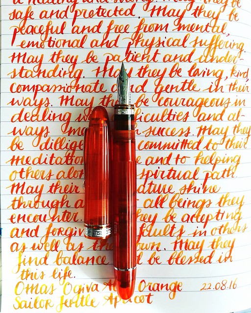
But demonstrators/clear pens I just have to match with the ink, like this Omas Ogiva Alba in Orange. I had paired it up with Private Reserve Shoreline Gold before, but Sailor Jentle Apricot (sadly also a discontinued ink) is an amazing match as well as you can see above :) 

Next week I'll show a pairing of one of my newest acquisitions.

Thanks for stopping by and have a great day.

namasté
2016/06/29

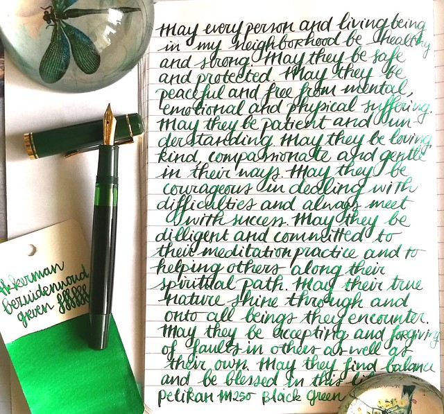
Pens and Ink: Pelikan M250 Black Dark Green with Akkerman Bezuiderwoud Groen

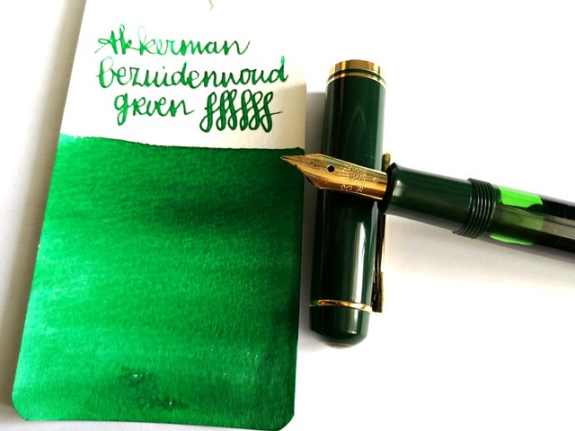
Last week on Pens and Ink I posted about my recent Pelikan M2xx series finds. This week I'm highlighting a pen I mentioned in that post, the Pelikan M250 Black Dark Green fountain pen. And I paired it with a nice green ink from Akkerman's The Hague ink line; Bezuiderwoud Groen.

pens and ink M250 green
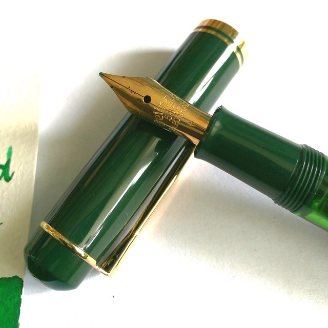
First let me start by telling you that the nib you see on the pen here is not the original nib. I replaced the original 14k gold M nib (which is the only difference between a Pelikan M200s and M250, the first has a steel nib and the latter a gold one) with an older nib from one of my vintage N400 Pelikans. Why? This nib just deserves to be in rotation more. I've seen David B. from Too Many Inks do this all the time with his Pelikans (Swap nibs between his pelikans) And I decided to give it a go myself. It did not disappoint :)

pens and ink M250 green
A closer shot of the vintage nib that came with my Pelikan N400 Tortoise, which I sadly can't properly use as the piston fill mechanism is broken. I love the engraving in the older nibs! The pen itself is one from before 1997 and there is a version from after 1997, which has a different cap and printed logo on it instead of engraved. More info on the difference between the M2xx's series, including this one you can find at The Pelikan's Perch and Reuttinger web site.

pens and ink M250 green
So I've chosen to pair the pen with an ink that would match the green cap and piston knob and since I decided to use more of my samples (and then decide if I want a full bottle of it ;) I went though my Akkerman samples and picked this one. I think if you translate "Bezuidenwoud Groen" from NL to ENG you would come up with "South Woodsy Green" ... Maybe? Just FYI, it's not a "real" word in Dutch either! Oh well, it doesn't matter, it definitely looks like a forest green to me! I think the nib also brings out great shading this ink has/ Another great green shading ink from their line is definitely the Groenmarkt Smaragd, which is more of a moss green. I own a bottle of that one, because it came with the pen I bought then. Even though I really like the color of this ink, I am not so sure I need this ink in a full bottle... yet.

writing letters
In other fun news: as you may know I've been a Swap-Bot Ambassador for a while now and recently I have started blogging for Swap-Bot Blog as well. Rachel, the owner of Swap-Bot, and I discussed it when she was visiting Amsterdam last April and we met up for dinner (together with her husband Travis and their wee one Kenneth). She is such a super fun person, kind, energetic (she runs marathons!) and creative. I'm happy to be able to contribute and collaborate with her on this project. The first blog post is already up and you guessed it, it's about writing with fountain pens! I also am hosting a swap "Fountain Pen Pal Summer 2016 Edition" on the 'bot to help more people just get out their fountain pens and write with them more. Hop on over to the swap page to see more info on the swap and the sign up dates. You have to be a member of Swap-Bot to participate though, if you're not a member yet, it's super easy, just make a profile and read these FAQ's to get you started. And perhaps I'll see your in the mail?

writing letters
Thanks for stopping by and have a great day.

namasté
2016/06/22

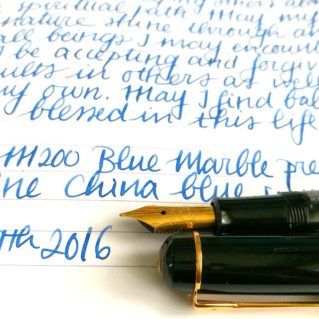
Pens and Ink: Pelikan M200 Blue Marble with Diamine China Blue

Pelikan M200
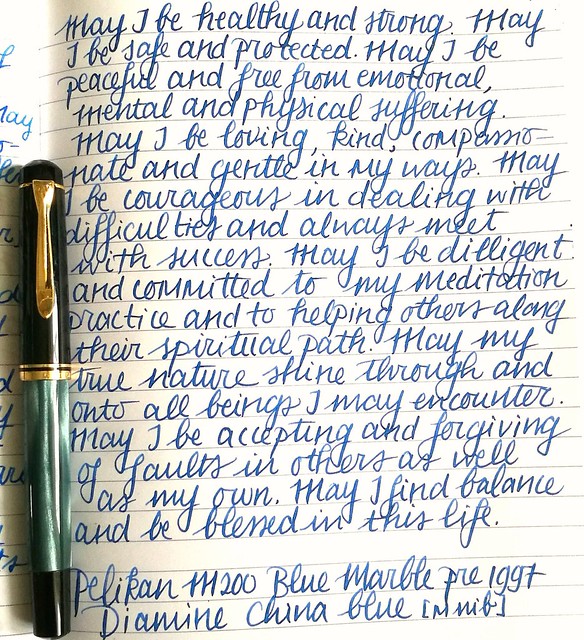
A little while ago I got a great deal on a few out of production Pelikan M2xx series fountain pens and among them is the blue marble released before 1997. I chose to pair this ink with Diamine China blue ink, which I had a sample of thanks to the Gouletpens Inkdrop from years ago. It was high time to use up the sample! 

A flock of birds #pelikan #m200 #beingpelikan #Fpgeeks #fountainpennetwork #fountainpens #fountainpen #dailycarry #dailywriting #journal #gratitutejournal #handwriting #handwritten #specialedition
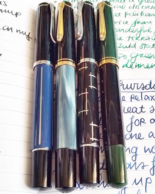
These were just sitting on a shelf at an office supple store just waiting to be picked up. From left to right: M215 blue stripe, M200 Blue marble (pre 1997), M215 Orthogons, M250 Black Dark Green (pre 1997). Most of these are not in production anymore, but the blue marble can still be found. I have a pre 1997 version though and those are a little different from the newer productions. The more clear distinction being the imprint on the cap.

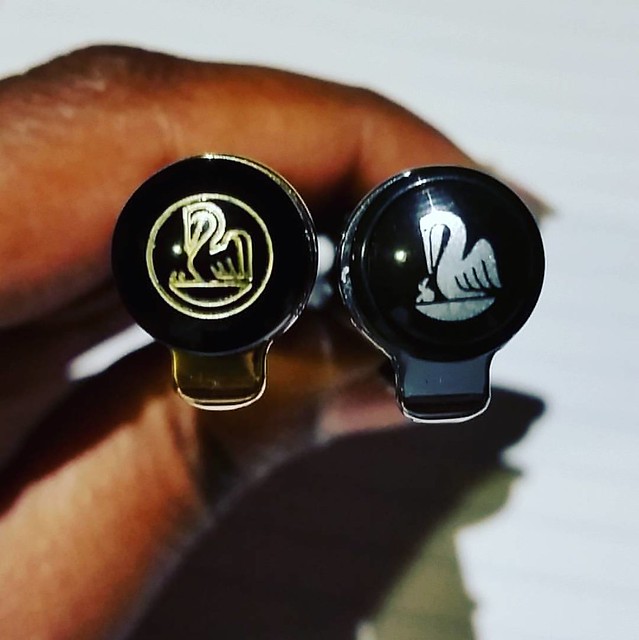
A couple of chicks #pelikans #Fpgeeks #FPN #fountainpennetwork #fountainpen #beingpelikan #finnial #pelikan #funtainpen
The cap on the right is engraved and pens after 1997 have a painted logo like you see on the right. More info on how you can identify and estimate a date of your Pelikan in this very useful blogpost by the Pelikan's Perch. Joshua's site is super useful as he compiled a database of various Pelikan designs with the factual data. He also does reviews on Pelikans and keeps other fans updated on the latest of the brand. Definitely worth following if you are also into Pelikan pens! Specific info on the various Blue Marble pens I found this post on FPN very useful. 

pelikan m200 marble
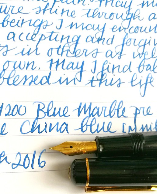
Back to the pairing. I written a page in my mindfulness metta meditation journal and it's a pretty nice conventional blue. It has some shading to it but not a lot. The medium steel nib In have on my pelikan has some spring to it and shows off some of the shading.

Pelikan M200

It's a toned down blue but I quite like it. Cleans out easily and well behaved, it's a fun suitable for work kind of color. More reviews on the ink you can find on Peninkcillin and PenPaperInkLetter blogs. 

I have a few other suggestions for work-safe blues in this post: The Namiki Falcons and Blue Hues experiment. What is your fave "suitable for work" kind of blue?

Thanks for stopping by and have a great day!
namasté