2017/05/31

Stand out from the crowd - Mixed Media Note card

Inspiration


Some mid week inspiration with some of my fave Lost Coast Designs stamps. The Gibson Women background stamp is one of my favorites and it was a delight to use. There was a faded impression of the stamp (a ghost print) on one of my gelli printed papers, which I worked on further with some more stamps and stencils. My fave color combo at the moment is magenta and aqua. I high lighted the woman by stamping the stamp on sticker paper, coloring her with promarkers, fussy cut her out and adhered her to the page on her spot. Love how she stands out from the background and other faded women. Fun way to add a spotlight to your background stamp. The dictionary word inspiration was also stamped on a piece of leftover sprayed paper and adhered to the card. I rounded off the corners, created a vignette with bronze distress stains and added some white spatters. The card was matted on lilac card stock with a light relief print but the edges were made black with pearl rub on luster. 

Would like to enter this piece in the following challenges;

To answer the question for me it's inspiration which leads to help you to stand out from the crowd :)

Simon Says Stamp Wednesday Challenge - Anything Goes

&
(they are one of my recent challenge blog discoveries and these ladies have some very fun and inspirational makes to share!!)  

Thanks so much for stopping by today and have a wonderful day!


2017/05/30

ATC: Be True

Be True ATC  
This is an ATC I made inspired by one of the many wonderful and inspiring process video's Jenn Engle has on her You Tube. In this video she uses letter stickers on her art journal background for extra texture and serendipitous design. I loved the idea so much I created an ATC using some number letters stickers of which I have so many and almost never use!

Be True ATC

I've used one of my fave butterfly stencils and next to it I added the numbers in a cascading flow over the stencil design. Then gessoed the piece with white gesso and then around the edges with black gesso. In the white parts I dripped some Roher and Klinger calligraphy ink in Alt Goldgrün and Cyan Blau. The calligraphy ink is thicker and has a shellac base so it clung to the gesso pretty well. I did spritz some water over it to get it to dilute and flow better over the raised edges. The sentiment Bue True (from VLVS!) was well as the butterfly was stamped on a left over piece of water color paper, and before I adhered it with pop up dots I spattered some white and magenta ink over the card. I added some threads in the same colors around the popped up aria's, edged the card with white ink and matted it onto black card stock. 

I really loved using the stickers this way and with definitely use this technique again :) Thanks again for the inspiration Jenn :)

I am entering this in the following challenges:
Stamps and stencils fabric and fibers
Stamping sensations May Butterflies, fairies and fantasy
STAMPlorations Mixed Media Challenge May 

Thanks for stopping by and have a wonderful weekend!


2017/05/29

Mail Art Monday: Libélula

Mail Art postcards

Today I would like to share another postcard I made with the Dragonfly hand carved stamp I created a little while ago. This one was sent to Ana in France whom suggested the name for my stamp :) It's made with Lindy's Magicals, Katzelkraft Les Rondes stamps and distress ink. The sentiment stamp is from Stampotique Originals.

Monday Mail box shot. Some mail to friends and swaps @swapbotnews.
In the end I also added some white spatters with gesso and it was mailed off with these other happy envies and postcards :) 

It's been such great weather lately, looks like spring jumped right into summer! Hope you all are enjoying these beautiful sunny days as well!

Entering this in the following challenges
 Let's Craft and Create #125 create your own background challenge
Paper Creator's challenge #58 - bright and bold
Simon says stamp monday challenge "we're going around in circles" 

Thanks for stopping by and have a wonderful day!


2017/05/24

WIP: Pigment Powder Comparisons

pigment powders comparisons

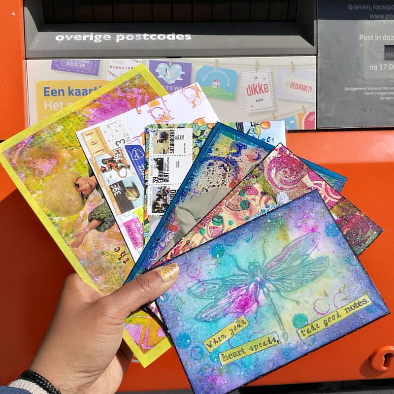
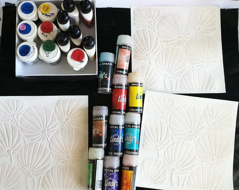
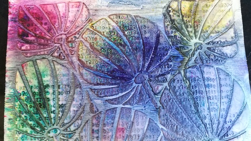
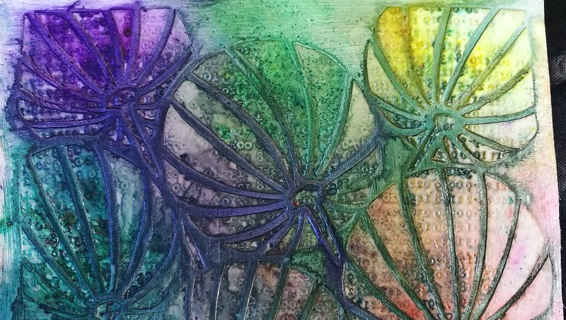
Today I wanted to share an experiment I did a little while ago. I've had brusho's for a while and got a set of Ken Oliver's color bursts last year and this year I was completely tempted by Lindy's Magical Shaker so got a set of those too. I wanted to see what they looked like side by side and how they react differently, so made a color swatch on all pigment powders on a 6x6 gessoed paper on which I had put a stencil of clarity and stamped in the paste. This is my base for all the pigment powders. Do note that it's a non porous surface and they act differently on porous surfaces.

Pigment powders comparison
So after some powder puffing and spritzing of water,  here is the result! They all act in the same way, ie. you just tap some powder on the page and spritz some water over it to see the magic happening. But the result do differ slightly from each powder.

pigment powders comparisons
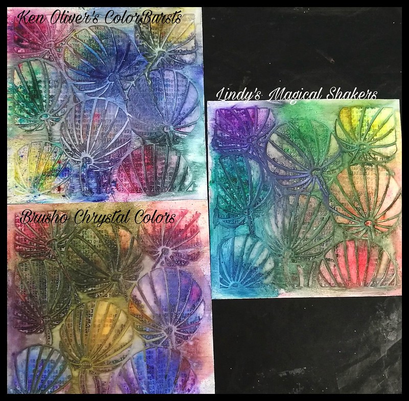
They all really look quite lovely and each product has their individual glow.
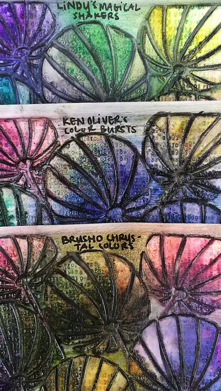
pigment powders comparisons
These are the 
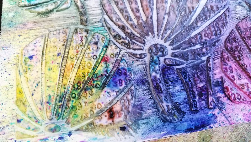
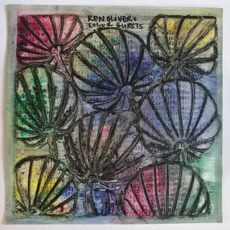
Ken Oliver Colorburst powders. So pretty! Love the little specs of color on the bottom! I used all the colors in the Earth Tone set; merlot, indigo, yellow ochre, terre verte, sepia and burnt orange
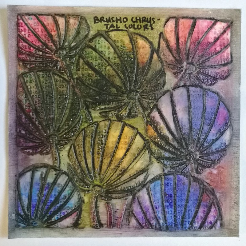
pigment powders comparisons
These are the 
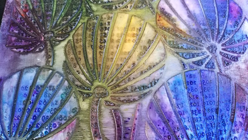
Brusho chrystal colors - very luminous and saturated colors.  I used the colors gambodge, olive green, rose, crimson, violet and Indigo. Very pretty and luminous colors! Love the color nuances and it's still vibrant after drying with the heat tool. I added some shadowing in the shallow edges with a stabilo marks all to make the design pop a bit more.

pigment powders comparisons
And lastly the 
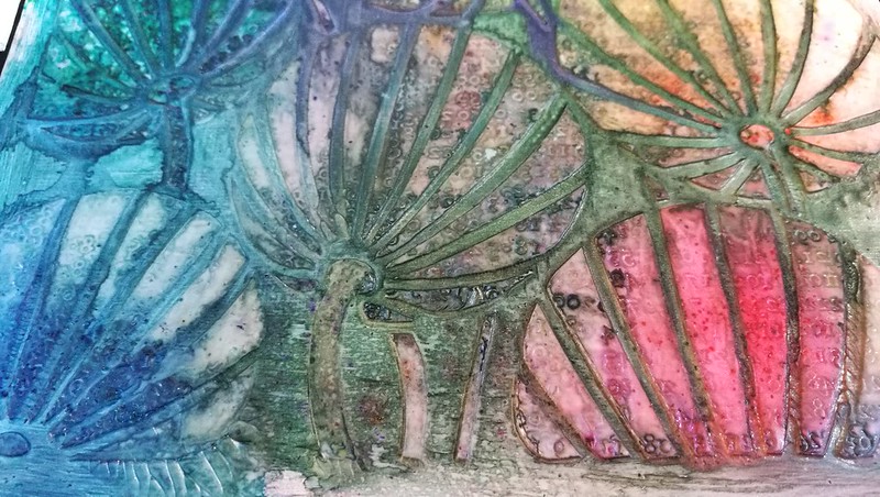
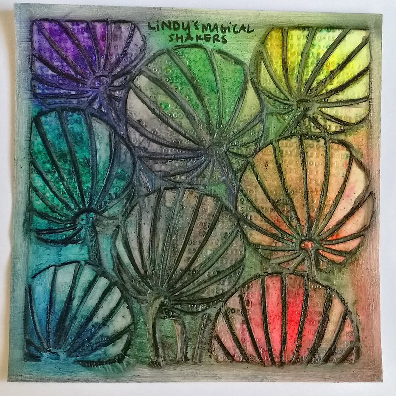
Lindy's Magical Shaker's - these are soooo pretty and there is a slight shimmer to it which is magical indeed! I only used 6 colors and not the full 10 set, leaving out the black and brown colors. So the colors used are Bavarian Blue, Cuckoo Clock Cardinal, Guten Tag Teal, Lederhosen Laurel, Oktoberfest Orange, Oom Pah Pah Pink, Polka Purple and Yodeling Yellow. I REALLY love the names they gave!

pigment powder comparison

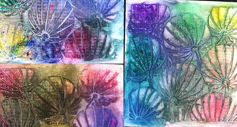
To see how they would react if you worked upon them more I added some shadows with a Stabilo black marks all pencil and a water brush when the swatches were dried completely. 

pigment powder comparison
Lindy's magical Shakers - still shimmery and does retain a good amount of color even when worked upon with a water brush. I'd say they are fairly water resistant when dry.

pigment powder comparison
Ken Oliver's Color Bursts - I found that these still were water reactive, more so than the other two, which lead to dilution of the colors when I added the shadows. Something to consider when you are working on non porous surfaces.

pigment powder comparison
The Brusho Chrystal Colors - these retain their luminous colors and are more water resistant then the other two. They are advertised as permanent when dry, but I think it's more water resistant than water proof because I did get some color bleed when working with the water brush. They could be water resistant on non porous surfaces, though!

In conclusion; although they react similar, the look is definitely different. They all have their pro's and cons and it's up to the final look you want as to which products to use. A helpful video on pigment powders I found was this one by Maremi Small Art. Though instead of Ken Oliver's Starburst she uses Magicals by Lindy's in her comparison. 

 I'm glad I made these swatches as a reference for me and I hope this helps you out as well either in their use, or when you are considering to buy the products. 

I am curious to know: 
Which ones of these pigment powders do you have and is your preference to use? 
Let me know in the comments :) 

Thank you for stopping by and have a wonderful day!


2017/05/23

Art Journal: Nourish Your Soul - VLVS!


It's my turn over at the VLVS! inspiration blog today and head on over to my blog post there as I'm sharing a tutorial on how I made this journal page. It was super fun to do and I am really loving this color combo. 

Also please come join our VLVS! Groupies on Facebook if you're not already there. We're having monthly swaps and we would love it if you would join us :)

Thanks so much for stopping by today!


Stamps used from VLVS!:
Whimsical Fairy Lady 2 by Mary Vogel Lozinak
Wire Rings by Cat Kerr

Others:
Miracale tape
Crafter's Workshop Fluffy Modeling paste
Claudine Helmut's Studio gesso
Paper Artsy Fresco paint; Hint of mint, Captain peacock, Squid ink, Sugar Plum
Lindy's Magical Hi Maintenance Magenta and Magical Shaker Guten Tag Teal
Staz-On inks: Cherry Pink, Royal Purple, Midnight Blue, Vibrant Violet
Letraset Pro markers (alcohol markers)
White gel pen
Stabilo Marks All pencils in blue and white
Pentel Water Brush
Zig Wink of Stella clear
Distress Crayon Chipped Sapphire
Distress stain in antique bronze

2017/05/22

MailArt Monday: Re-Purposed Postcards

A two-for-one on today's Mail Art Monday! I am sharing a couple of postcards I sent out for some swaps on Swap-bot.
handmade pc's
As many of you do, I am sure, I collect vintage postage stamps as well with the means to re-purpose them in my art work. This was made using ONLY postage stamps and postage "salvage" (the material around the postage sheets). This was made for a swap on Swap-Bot in which you were asked to use postage stamps only. These are all vintage postage stamps from the Netherlands. Definitely love the queen portrait stamps and managed to have a little flow/design going on as well.

handmade pc's
In the vertical view you can see the "movement" on the right side better.

handmade pc's
And here it is on its way to its destination. The card on the right is made with stickers alone. A closer look below:

handmade pc's
For this swap you were asked to use stickers only and I have made a circular theme using stickers from Flow Magazine and a few art stickers I had lying about. The bottom is a cityscape silhouette decorative tape which I thought tied the design together. 

It's always so fun to encounter swaps which inspire you to get out your stash you rarely use and play with them. Glad to say these arrived well and the recipients liked them.

Thank you for stopping by and have a wonderful day!


2017/05/19

Happiness - Mixed Media Notecard

Happiness

This card was made for friends of ours who got married recently. I used some left over gelli print where I die cut the sizzix wildflowers in. I outlined the flowers with a blue Marks All pencil and created some shadows with a water brush. The back showing through the flowers as well as the die cut moth (from Paper Artsy) is made with a large stamp from Lost Coast Designs, embossed with white WOW embossing powder and colored with a blending tool and distress inks. I matted the piece on a dark blue card on which I stamped words about love with versamark ink and embossed with a clear embossing powder by WOW. I also stamped some words on the moth as well as the gelli printed piece. A simple yet effective card to send someone well wishes on their new journey together. 

Thank you for stopping by and have a wonderful weekend!


2017/05/17

Mixed Media Mermaid (+ process video)

Mermaid

This piece I am sharing with you today, is a special one to me. And for some reason, it happens to be again with the Héra XXL stamp from Carabelle Studio. She helped me to release my inner mermaid while working on this piece. I've got a few more pics to share and the process video is below as well as a list of supplies and stamps I used.

Mermaid
She was made on an A5 piece of vintage paper which had saved from work. I have used many different materials to get her to GLOW the way she does.


Mermaid
So before I direct you to the process video, I did not record the beginning and the end fell off due to battery outage... I am still very new to making video's (this is only my 3rd) so I am learning new things, all the time, like make sure you actually press record and not pause, LOL! And keep your camera charger nearby! Well, I was doubting to actually show you the process video because it's incomplete but I can tell you what I didn't record is how I got the background color and her hair color. All is done with the Sennelier Aquarell pallet you see in the above picture. I just played around with the water colors until I was satisfied with how she looks. 

The video starts from this point on, I hope you will enjoy watching this :) 


Mermaid
In the end I wasn't totally satisfied with how the skin looked and wanted a more realistic look and skin tone. I used a mixture of distress crayons to give her that creamy soft look. Gave her left shoulder also more definition and over all more contour in the body. The crayons are really soft and easy to smooth out over different media and they worked like a charm over Sennelier watercolors. 

It's now framed and hung in the hallway next to this piece. They make quite the pair.

List of supplies:
Carabelle Studio; 
Héra XXL   

Others:
Sennelier watercolors
Memento ink pads 
Liquitex Inks
DecoART Traditions paint
Distress Crayons 
Washitape

I would like to enter this piece in the following challenges:


Mixed Media monthly #36 - put a stamp on it

Creative Artiste Mixed Media Challenge #26 - Anything Goes 

Grab our Badge


Thanks so much for stopping by and have an awesome day!

2017/05/15

Mail ART Monday: Embrace imperfection

Mail Art postcards
This week on Mail Art Monday I would like to show you a postcard I made using my Dragonfly hand carved stamp in action :)  I just used one of the prints you saw at the end of the post and worked with it. It's the one on the top right where you can see a little bit of the excess carving on the print. Hence the "she chose to embrace her imperfection" on the postcard. Imperfections are what makes things special after all! The sentence is formed by using a part of this VLVS! stamp combined with a Tim Holtz Chit Chat sticker. It's super fun how you can create your own saying by combining text stamps and stickers like that! 
There is also another hand made item in play here which is the stencil I used for the background. It's made by using one of tim Holtz Mixed media die cut on a thicker cardboard to create a stencil. It works really well! I had applied some Liquitex flexible molding paste messily around the image and also scraped a bit around the edges of the card. To give it these smashing bright colors, I used Lindy's Stamp gang products! I got a few magicals and Moon shadow sprays recently and just LOVED playing with those! I had covered the dragonfly with magenta and turquoise interference paints by DecoArt Media first. it gives it a nice shine and also protects from the water sprays. After I was done playing I used Chipped Sapphire distress inks to create a vignette and then a Krink black marker on the edges to frame the card. 

By the way Lindy's products used were from the Drop Dead Diva Set and the Buccaneer Bay Blue moon Shadow Spray

I would like to enter this card in the following challenges:

Lindy's Color Challenge


Thank you for stopping by and have a wonderful day!


2017/05/12

Shopping Highlight: Arturo Manuel Papeleria in Valencia

Arturo Manuel

Last week I was going through the pictures in my phone and I noticed that I have not yet told you about the wonderful stationery shops I had found in Valencia while being on vacation there last March. Well, let me correct that mistake and share one of them with you today, Arturo Manuel Papeleria. This is a picture of the storefront and judging by the advertisement displayed, it looked promising and let me tell you it definitely was!

arturo manuel
This is the view when you come in. It's actually quite a large store and they have a variety of items for sale, from from office furniture to luxury fountain pens and even art supplies!! Let me tell you, I was like a kid in a candy store!

arturo manuel
The view from the opposite end of the entrance. The kind lady you see at the counter helped me a lot, showing me pens (there were a couple I wanted to see) and I found more of my fave turquoise ink ever and made it my Unicorn Ink!! Yep!! Ok, this is going to be picture heavy, so you can see more pictures of the store below and all will be revealed about the Unicorn Ink as well :)