2016/01/29

Monthly planning MTN : overview november & december 2015

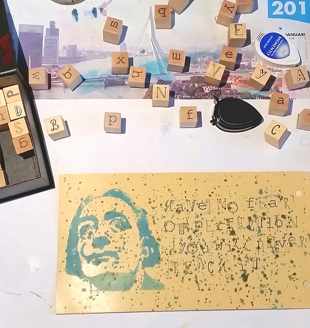
Last year I bought the blue midori and an open monthly planner to give the 'monthly planning thing' a go and make good use of my sakuralala 365 stamps. So I have finished november and also did december 2015 and wanted to share my pages and also some issues I have with the paper of the planner here.

Finally managed to fill up the november monthly planner page. While it's fun to see a finished page, still deciding if this is the route for me. Also the pages in the midori planner do have a lot of ghosting and some bleed through which is a shame.

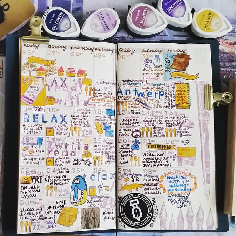
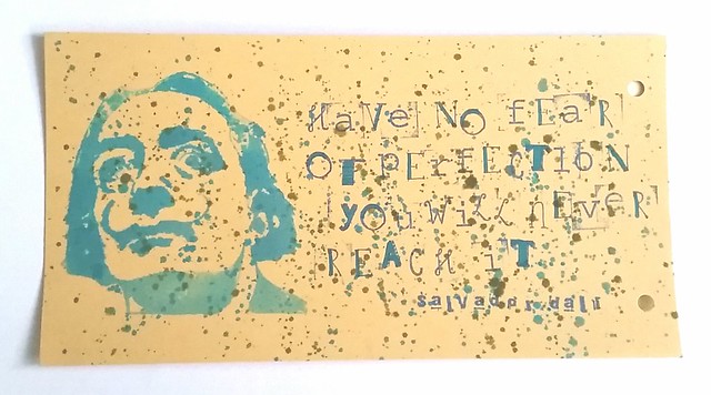
This is what the finished month of november looks like. I use this planner to track the fun things happening in the month and it was definitely a month with some great memorable moments. I love how the little planner stamps can give it such a visual overview. I decorated the lower open space with some fun stickers and other stamps, using the memento dew drop color scheme you see above.

When I was ready to start on december I encountered a problem with the paper.
This is the bleedthrough and ghosting I am getting in my Midori monthly undated planner. I use memento rubberstamp ink and fountain pen inks. Anyone else have the same problem? #plannerlove #plannerlife #memento #rubberstamps #travelersnotebook #midori #f

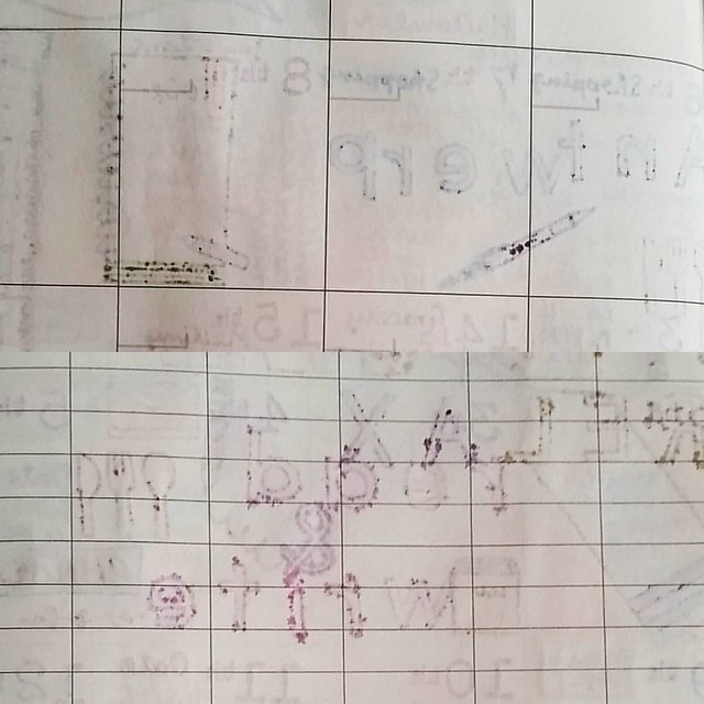
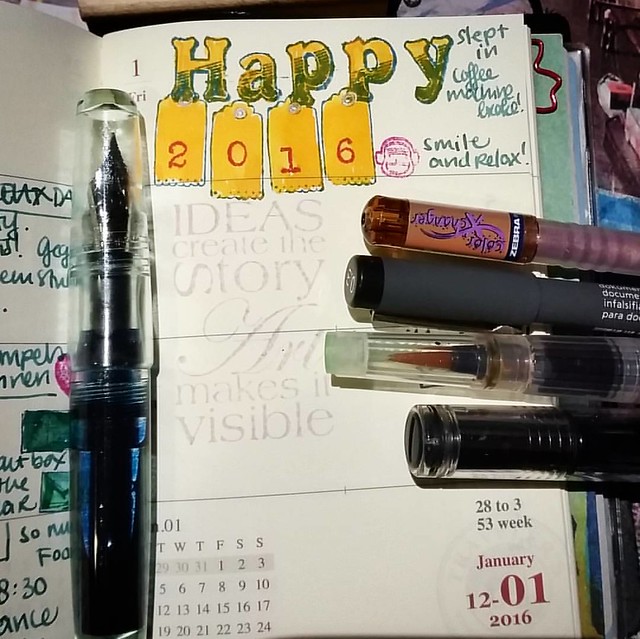
I found that I had significant bleed through on both sides of the paper as you can see here. I used the memento stamp inks and fountain pen inks and they both seem to bleed through. I've heard from some other people that this paper is indeed bleed/show through sensitive, but I have not found a solution yet. I have tried something for the december page, but I'm not satisfied with that result. I used artist Gel medium, mixed with a bit of water, to prime a few pages, but it resisted some inks and I could not work with it properly. Still I did the best I could with those prepped pages.

Monthly planner december 2015

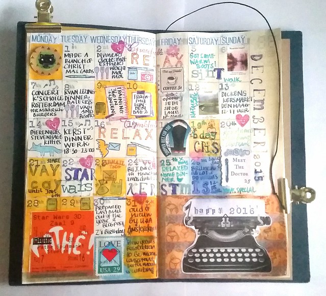
An overview of december. The right page I put on a thicker coating and the left page a medium coating. The thicker coating completely resisted all water soluble inks, so for that side I had to use Staz on stamp ink and sharpies. The left side could be worked on but still showed some resisting. I had to use my heat tool to set the ink I used (Diamine shimmertastic blue pearl which I had in my Pilot Retro Pop) I do like the overview, nice and visual again, but due to the resist it has a bit of a blurry look and less clean and sharp as november was.

Monthly planner december 2015

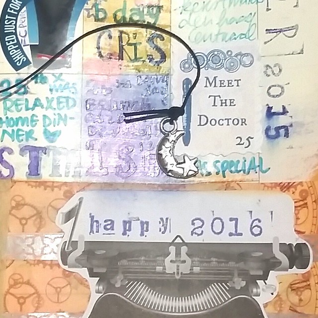
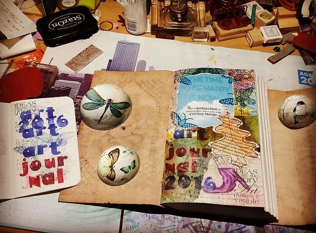
A close up so you can see the 'shiny sheen' of the gel medium I used. And I had to write over it several times sometimes to get the ink to stick. So it was an interesting experiment, but I won't be using gel medium to prep my pages again. At least not such a thick coating. By the way, that cute little moon charm I received from my penpal Ambra, I just love it :)

Since it's really fun doing these monthly overviews, I'm gonna give it another try for January and not prep the pages, but use different stamp ink. The crafty peeps at Sakuralala said they use versamark inks and  have minimal bleed through. I have a few of those chalk inks I can try to use. Also will use drier writing inks that are less absorbent on paper.  I am curious to see how this will work out in the next overview. 

If you have encountered this bleed though issue yourself and have found a remedy for it, please let me know. 
Thanks for stopping by.

Namasté

2016/01/27

Pens and Ink: Pilot Retro Pop and Diamine Blue Pearl

I have been seeing this pen in use by a few people on my Instagram and since it's turquoise and not that expensive,  I was at Akkerman I let myself get seduced and got one.

My views on the Pilot MR Metropolitan Retro Pop. #writtenreview #pilotmetropolitan #retropop #turquoise #plumix #cursive #italic #diamine #shimmertastic #bluepearl #Fpgeeks #FPN #pilotMR #review

As you can see from the written review, I have mixed feelings about it. It's pretty, but the writing experience was so-so. but after I changed the standard m nib with a plumix nib (cursive italic) it writes a whole lot nicer! The European version, which is called the Pilot MR, takes standard international cartridges, BUT you have to be careful which converter you put in there and not push it in too hard.

And to show you that you definitely should not push your international converter too hard into the pilot MR European version. It's a delicate fit. #Fpgeeks #FPN #fountainpennetwork

If you do, you might get unlucky and split the converter nipple which will cause serious leakage. This is a standard international converter and it was a tight fit, but I pushed too far and it broke. Fortunately the pen nipple is still intact. At the moment I'm actually using a jinhaox750 converter and that works fine (that has a bit sturdier plastic on the top, but the piston operator part is crap...)

Pilot MR retro pop EU and Pilot Metropolitan Asia with the difference in converters. #Fpgeeks #pilotnamiki #metropolitan #retropop #pilotMR #FPN #fountainpennetwork

To show you the difference in converters: Pilot MR EU version top now fitted with a jinhaoX750 converter and the Pilot Metropolitan Asia version with the Pilot Namiki Con 20 old style squeeze converter. It's too bad they made the difference because you can get more ink in the namiki cartridges/converters. And not to mention that you have to be careful using the SI converter in your MR. But if you use cartridges only you should not have a problem. 

In my review there are more pros than cons and in the end it's a nice inexpensive daily writer. I esp. like that you can swap nibs with the pilot plumix and 78G pens to make the writing experience more interesting. 

Hope this was useful if you have or planning on getting a Pilot MR. 
Thanks for stopping by!

namasté 

2016/01/25

Mail Art Monday - You Can Breathe Now

Monochrome ATC breathe

Mail Art can have many forms as you know and I consider ATC's as mail art too. Especially when I send most my ATC's through swaps and are mailed out.
This is one I made for the monthly Inkadinkadutchies group swap. Theme for december was "monochrome" - use mostly one color scheme. Stamp I used Grunge Flower Profile by Lost Coast Designs and the breathe banner I used dylusions bubble border (clear stamp version) and typewriter font alpha stamps.
The background is maruman zuan watercolor paper, pelikan aquarell watercolors to make the red/orange gradient color with. and I stamped the images with Staz-on Cherry black and letters with Jet black. Piece was matted on black card stock.
I love the serenity the piece has. And I'm glad it was well received my my partner.

Monochrome ATC breathe

Close up of the ATC

At Inkadinkadutchies we decided to do a monthly ATC swap and it's great fun! Every month a swap will be hosted. Check our events page on facebook to see which swaps are up. For january the theme is circles. If you want to join in, you have to be a member of our facebook group to do so. Hope to see you there and maybe we'll get partnered up :) 

Thanks for stopping by!

namasté

2016/01/22

Three times a poppy!

As you can probably tell from my blog back ground, I like poppies. I like them a lot. Ever since I saw the poppy fields in the Wizard of OZ. They are such beautiful flowers and I love the symbolism of them. Recently I found a wonderful clear stamp by Joy Crafts Silhouette Poppies and I was so inspired I created a few cards with them right away.

Three times a poppy WIP

The poppies stamp you can see on the top right corner. I stamped it first on a white background (actually on the envelope it came with) to see the details and then on water colored backgrounds I made.A few close ups of the end results.

A card I made recently using Joy Crafts Poppies silhouette stamp. #joycrafts #poppies #notecard #handmade #rubberstamped #rubberstampart #cardmaking #promarkers #colorcoordination #poppyred
This was stamped on the envelope to test. I colored the poppies in with pro markers and used blue fountain pen ink to color the background (diluted Iroshizuku Kon Peki ink). The saying 'Each flower is a soul opening up to nature" is from the flower rubber stamp set I got from The Octopode Factory a long while ago. Seemed like a good fit for this card. I had bought a bunch of 'frame note cards' in a sale lot and I just ripped the colored image off the envelope, placed it the way I liked it in the frame and sealed the back of the image with some thicker tracing paper. The border stamp is from Dylusions and I accentuated it with a copper metallic gell pen.

Three times a poppy WIP

These two are 'day and night' cards. The background is Maruman watercolor paper from Zuan B5 Sketchbook and I used Pelikan aquarell watercolors to paint on them. The paper holds up REALLY well, no bleed through or warping! The 'day' card I used diamine shimmertastic inks to color the flowers with and on the 'night' card I splattered some of that shimmertastic ink after I colored the flowers with promarkers. I like the effect it gives on both cards. I matted the cards on black card stock and then fixed them onto a red double sided note card. 

It's definitely a fun and versatile rubber stamp image to play around with. I used a few other joy craft stamps in my watercolor cards in combination with Diamine shimmertastic inks before. Definitely a fan of that flower/letters series. I will send these cards to people who can use a 'pick me up' .

Hope this inspires you to create some cards this weekend :)
Thanks for stopping by! 

namaste

2016/01/18

Mail Art Monday - Rust Elke Dag

This year I have decided to post my mail art posts on monday's, I had one planned for last week, but due to a tragic day, I just couldn't do much more than grieve

Why the change from postings on sunday's? Since I do most of my creating over the weekend, I often do not have the time to sit down and write a blog post on those days and I want to be more consistent in my updates. Also Mail Art Monday has a nicer ring to it and it's inspired by the MAM posts on Viva Las Vegas Stamps done by my friend Tera :)

Mail Art 2016 - 003 Rust Elke Dag

This is one of my mixed media collages where I have used 'junk mail' and test back ground pieces. The image of the woman is from a vintage dutch fashion magazine. I used them in mail art before, like in this one. The sentiment is actually one of my new year's resolutions, "rust elke dag" in English transplates to "rest (or relax) every day". It's so tempting to get caught up in the flow of work and other things, and not let yourself REST enough. Last year was a learning curve for me and this year I am taking what I learned to hart and let myself REST for a little while every day.

Mail art 2016-003 green background

The back wall in the living room is green and I love how this piece looks with that backdrop. I sent it to Meeltje in NL for a swap on Swap-Bot

Drinking tea and reading some, doing yoga, mindful breathing meditations are some of the methods I use to relax and unwind. Do you let yourself rest every day?

Thank you for stopping by.

namasté

2016/01/12

A tribute to Ziggy Stardust

Yesterday, for me, was one of the bluest monday's ever. By now I think the whole world knows and feels the loss of a very influential and talented person. Needles to say, I loved his music and the Labyrinth was one of my fave childhood movies. As a process of working through this loss, I have carved a stamp in his image as tribute/hommage to him. I've not felt the need to carve a stamp in well over a year, but this just came to me as a 'must do' and I when I did, I felt a sense of calm. Making something is my way of processing grief.

Processing grief #ripdavidbowie #ziggystardust #handcarvedstamps #handcarvedstamp #davidbowie #stampcarving #rubberstamps #mailartists #rubberstampart #tribute

This image was shared most on response to his death. And thought it was most fitting for the tribute stamp.

Such a sad, sad day.  R.I.P. David Bowie

Final print in my test journal. I carved it on speedy carve using speedy carve lino tools. Ink used is versa mark eggplant. Colored in with pro-color markers.

Journal entry from last night. Hand carved stamp and Lyrics written with waterman 52 and Dandy Turquoise #mondaymatchup #mondaymatchupgiveaway #gouletpens @gouletpens

In my journal with Lyrics of Moonage Daydream, one of my fave songs. Pen and ink combo is Waterman 52 red ripple with Montblanc Dandy Turquoise.

Thank you for the legacy you leave behind, David Bowie. 
You will be forever remembered and cherished.

namasté

2016/01/08

Spatter pop art - leave your perfection at the door

Salvador dali WIP

This picture inspired the title of this blog post. Kind of a Warhol meets Pollock but encompassing Dali. It's messy and imperfect but oh so fun to make! I first learned this technique from doing a workshop done by Audrey at Art Specially 2015. Also it is such a simple technique, you can whip out several of these in minutes! Beware though, you might end up with ink spatters everywhere ;)

You would need your craft sheet, card stock or water color paper (or anything that is absorbent enough) distress stains, mini misters, paint brushes, heat tool and a stamp you love. Portrait stamps work well for doing pop art, but any stamp would do really. But don't take a stamp with too much detail. You won't see that detail here anyway. This Dali stamp is by Carmen's Veranda and they have a lot of wonderful portrait stamps here.

Salvador dali WIP

So the process is quite simple: first you swipe down a range of colors from your distress stains on your craft sheet, I used 3 blue colors (faded jeans, broken china and salty ocean) and then spray it down with mini misters. Have your stack of card stock ready, and dab your stamp gently in the pool of ink on your craft sheet. Then make an impression on your card stock.Set it aside to dry and make as many impressions as you can/want to with the color puddle on your craft sheet.

Salvador dali WIP
Once you have made a few impressions, take your heat tool and dry them all. Then you can do a couple of things: re-mist the color puddle or refresh with new ink from the distress stains. I did both, First re-misted and swiped my round brush in the puddle and tapped the excess ink over the image. I heat dried the image again. I also took peeled paint reinker and another color dabbed it on the craft sheet and swiped my other brush in that and tapped it over the dried image. I liked the bit of color contrast that spatter added. Go on until you are satisfied with the spatter/splatter effect and heat dry it for one last time. Now you have a bunch of these images ready to be worked further upon, or just leave them as they are! I quite like the simplicity of the prints. But I also wanted a more 'finished' piece to 'tip in' my art journal later (my altered marbled book pages are also 'tip-ins'). I took one of the bigger card stocks I had and kept one side blank to add a quote.

Salvador dali WIP

I used a combination of alphabet rubber stamps which I got from the HEMA. I stamped down the quote
Have no fear of perfection, you will never reach it - Salvador Dali
I also added some color to the letters with a turquoise sharpie. And this is what the finished piece looks like.

Salvador dali WIP

I hope this inspires you to create some spatter pop art yourself. Would love to see if you do, share a link below :)

Thanks for stopping by!

namaste

2016/01/05

Smile and relax - Creative endeavors in 2016

Hopefully everyone has had a great start of the new year. 2016 for me began a bit rough, as the coffee machine decided to break down on january 1st (and oh boy, how I do need coffee in the mornings to be coherent) but things can get only better wish a fresh new coffee machine (which is exactly like the old one, why change a winning formula?) to start off the new year, right? My mantra for the new year will be Smile and Relax. And so far I have been telling that to myself quite often in the start of the new year because things do not always go as planned...

Breaking in my pocket midori weekly planner. 2016 started off with a broken coffee machine. Oh well. Smile and relax 😅  #MTN #midori #travelesnotebook #pocketjournal #happynewyear #creativemess #franklinchristoph #travelersfactory #lamy #fount
First entry of the year in my midori pocket notebook... Also week 53? Did we somehow end up getting an extra week last year? No complaints, it was a relaxed one for sure!
I also was pondering on my creative endeavors for 2016 and I decided to start up an Art Journal, which I have never done before. I was given a sized leather bound blank book by friends for my birthday last year and I decided it would be perfect to use it for this purpose. So in the weekend I crafted about a bit and done a few pages.

New year new crafty endeavors. I started a mixed media art journal. #artjournal #craftiness #mixedmediaartist #mixedmedia #journal #whatsonmydesk #creativemess #creativity #thetimetobehappyisnow #craftyendeavors #rubberstamped #collageart #artjournalMT
The journal is a bit bigger than A5 size and has 100 double spread pages. So I'm not doing a 365 challenge, but more a "when inspiration hits me" kind of thing and I want to do something else than mail art.The field notes booklet is there to 'catch' excessive ink off the rubber stamps.

Close up of the art journal I have started for this year.

The first page is a collage piece from my 'junk box' where I keep all excess random papers. It has a few inspiring quotes as you can see. I especially like "the time to be happy is now" - and am trying to be mindful of the fact, that all we have is NOW.

Page in my art journal. I have a lot of these marbled bookpages that I can use for this project.

A while back I made these marbles pages and have a ton of them. I finally have a place to put in the pages which I made and want to keep, like this one.Decorated the edges with masking tape. Great excuse to use more of what I have. Also something I am trying to implement this year.

Je ne sais quois. #artjournalmt #artjournal #collageart #stencil #washitape #mttape #rubberstamped #mixedmediaartist #mixedmedia #colorcoordination

When I make mail art sometimes I have a 'high production' as I make random envelopes and pages to set aside and work on them later. A few of those envelopes I found hard to mail away and the ones I have gathered in my to keep folder I will be incorporating in my art journal like I have above. The stag is a stencil I have used before, but the colors on the envelope just came out so nicely I wanted to keep it. Also I added a bit of humor to it :) The mustache is also from a masking tape I have.

The plan is to work on my art journal when I feel inspired to do so and hopefully it will be full with creative pages by the end of the year. But I want to go about it organically and not fret about it. Found a great quote by Salvador Dali to inspire me, which I have put in my daily writing journal (also something I have started recently)...

A great quote to start the week. #salvadordali #quote #journal #Fpgeeks #FPN #fountainpennetwork #lamy #franklinchristoph #pilotretropop #noodlersneponset #meditativewriting #qotd #dali #writinginstruments #toolsofthetrade #edisonnouveaupremiere

To an ex-perfectionist, this is very comforting and instead of creating something that will be 'perfect' (which it never is) I want to focus on the process of creating itself more. The Dali stamp is from Carmen's Veranda and I have a post coming up on using this stamp and quote for a 'tip in' in my Art Journal.

So there you have it, my creative endeavors for this year. Am curious to know what yours are! Leave a comment if you are going to try something new as well (or continuing something old ;) 

Thanks for stopping by!

namaste