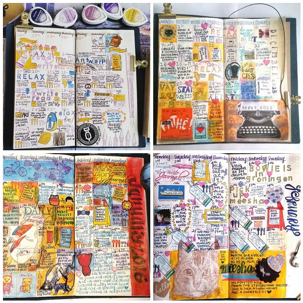
In terms of growth, it's always good to have moments to reflect upon things you have done in the past. Not only to see if they will help you move forward but also to appreciate the fact you have actually DONE these things. And in these quiet days in between the rush of Christmas and New Year's EVE creeping around, it's a good time to look back on the year I leave behind.
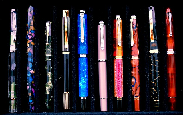
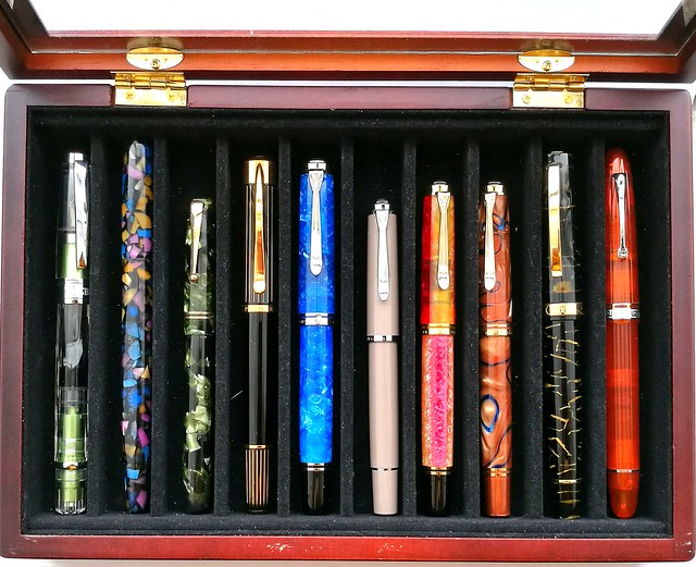
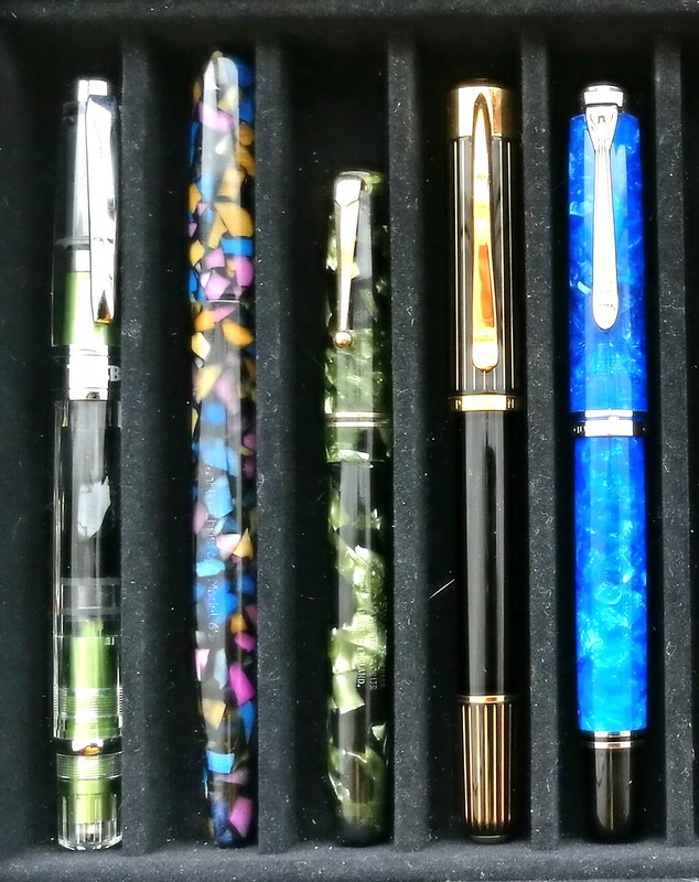
The above pens are my personal favorite fountain pens I've used over this year. They are not ranked in any way, just placed together in groups and you can see that one brands take the crown in this year's favorites,
Pelikan!
From left to right: TWSBI Al Green, Franklin Christoph Model 65 in Tiffany Stained Glass finish, Swan Leverfiller in Jade green, Pelikan P3110 Ductus, Pelikan M805 Vibrant Blue, Pelikan M205 Taupe, Pelikan M620 city series Shanghai, Pelikan M620 city series Grand Place, Omas Bologna in Black and Gold celluloid finish and the Omas Ogiva Alba in Orange.
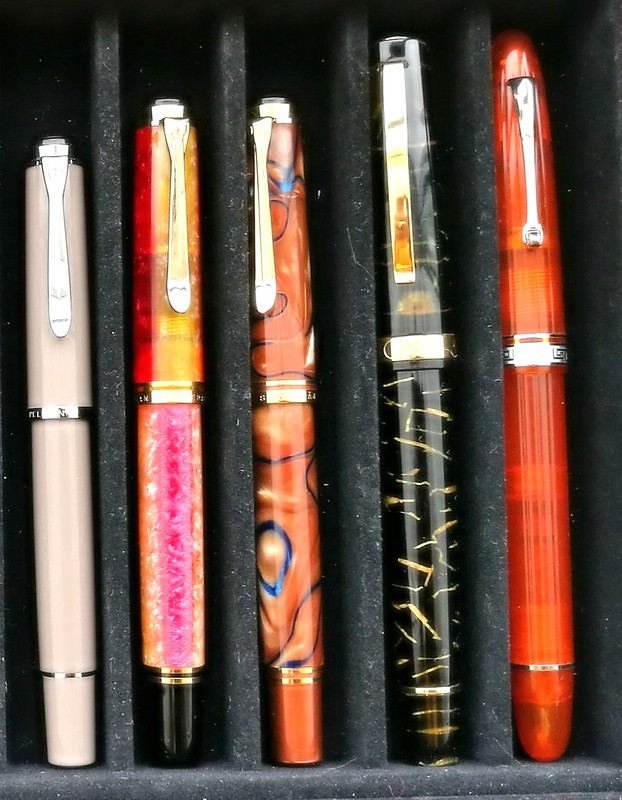
(FYI: the Pelikan M205 Taupe looks more pink in this photo due to the warm filter over it, The pictures below represent the actual color better)
Very kind friends of mine gave me this wonderful pen box and I usually keep my currently inked pens in here. This box helps with presentation for this post as they have been in here at some point or other this year. Also it's a good cut off point to keep it at just 10 pens. I thought for sure it would be
Omas, but looking back, Pelikan definitely got more writing time from me so they are more represented in this year's top 10!
Let's take a closer look at each one. (Oh and I do apologize for the magnified dust and cat hair in the pictures, but yeah it is what it is..)
Starting at the far right is the
Omas Ogiva Alba Orange and it's was a tie with the
Omas Ogiva Alba Green, but this one won out due to the extra flessible fine nib. This flex nib showed the shading in writing beautifully. In the pens and ink post I had had paired it with Private Reserve Shoreline Gold (original version) but later I also loved this pen inked with
Sailor Jentle Apricot. Which is
the winning combination in all honesty.
Moving to the left is a pen I couldn't get out of my head when I saw it at the store after I left to get
this pen (also a beautiful stunning pen from the same line, which I got for my birthday). So after a month I contacted the store and they kindly put it on hold/layaway for me. This was such a kind gesture and I'm really happy I saved up and got this pen because the pen material is just stunning. I paired the
Omas Bologna in Black and Gold celluloid with Omas Dandy Turquoise. My absolute fave turquoise ink, ever.
Then comes a couple of Pelikan M620 pens from the City series I did my best to hunt down. I got lucky with a few collectors letting their pens go and I am thrilled to have them in my Pelikan Collection as they are both so very stunning. First is the
Pelikan Grand Palace which I had inked with KWZ Monarch, the ink exclusive to Fontoplumo. A lovely warm autumn pair up. Which is a fun contrast to the lovely sakura spring colored match up of the
Pelikan Shanghai with Caran d'Ache Sunset. Every time I look at these combos it brings back the feeling of Spring and Autumn.
Next to them is a smaller sister, the
Pelikan M205 Taupe, which I actually got on a, well wouldn't say whim, but I was in a "I need a shiny new pen" mode while entering Akkerman in the Hague which is a dangerous place to be when you're in that mode! This one surprised me the most, because the color was a bit meh at first (won me over later!) but I knew that Caran d'Ache Storm would look SO great in this one. And boy was I right! The BB nib esp. makes the writing such a wonderful experience and I have this one in my 3 pen pouch with I take with me to work since I bought it! A stunning and stylish EDC (every day carry) for sure.
Starting out with another classy EDC on the left is the
TWSBI AL Green which was a limited edition release. It was my "one of each" hunt for my TWSBI collection and it took me a while to find it, but thankfully Scrittura Eleganta had one with a juicy broad nib. I paired it with Montblanc Jonathan Swift, but popular consensus was to have paired it with Sailor Tokiwa Matsu as they commented on my FB/IG poll. I might try that next.
The pen next in line is definitely a what I would consider a unicorn pen. When I saw an IG friend of mine selling this pen, I jumped on it straight away. What a stunning pen this
Franklin Christoph Model 65 in Tiffany Stained Glass is! I paired it with a harder to find ink at the time, Organics Studio Jane Austen Violet, but they since then started to manufacture inks again so it's available again for the masses, huzzah! This pen though still is one of few made or as FC said in an IG convo I had with them "only 12 of them were made for the Stockroom and maybe one or two at a pen show, so you have a rare and unusual Model 65 Stabilis". So yes, this in my unicorn pen, for sure!
Then comes the only vintage pen in this year's top 10, the
Swan Green Marbled self filler, a purchase from the
Tilburg Penshow this year. I paired it with a mossy green Diamine Safari which the flex nib of this pen showed off really nicely.
I have another mossy green ink in my line up, Diamine Salamander which is in my
Pelikan Ductus P3110 and in the 3rd slot in my EDC 3 pen pouch. This pen was the surprise of the year. Mainly because I had no idea I would like this pen so much, but it's a beautiful, classy pen and also very comfortable in hand. In MY hand, a hand that prefers Pelikan M400/600 size pens. It lays more comfortable in hand than the Pelikan M805 which is next to it and they are essentially the same size. It's a unique pen and often referred to as the "ugly ducking" of the Pelikan family, but I love this under appreciated pen a lot.
And then on to the last pen in my top 10; The
Pelikan M805 Vibrant Blue Special Edition. It's a stunner of a pen really. I had inked it with Organics Studio Nickle Teal and enjoyed writing with this ultimate blue pairing.
So there you have it, my top 10 pens and ink pairings of the year. I'm planning on doing more of these posts next year, but maybe not as frequent because I am planning on slowing down on pen/ink purchases for a while and enjoy what I have more. Yeah you can call it a new year's resolution of some sort, but well let's see how long that will last. Rumor has it that Lamy is going to have an
ocean blue Al Star release for next year and well you bet I'll be adding that one to my collection!
Thank you for all the support you given me and my blog over the past year. It's much appreciated. Stay tuned for more round up's this week. Have a great day!
namasté