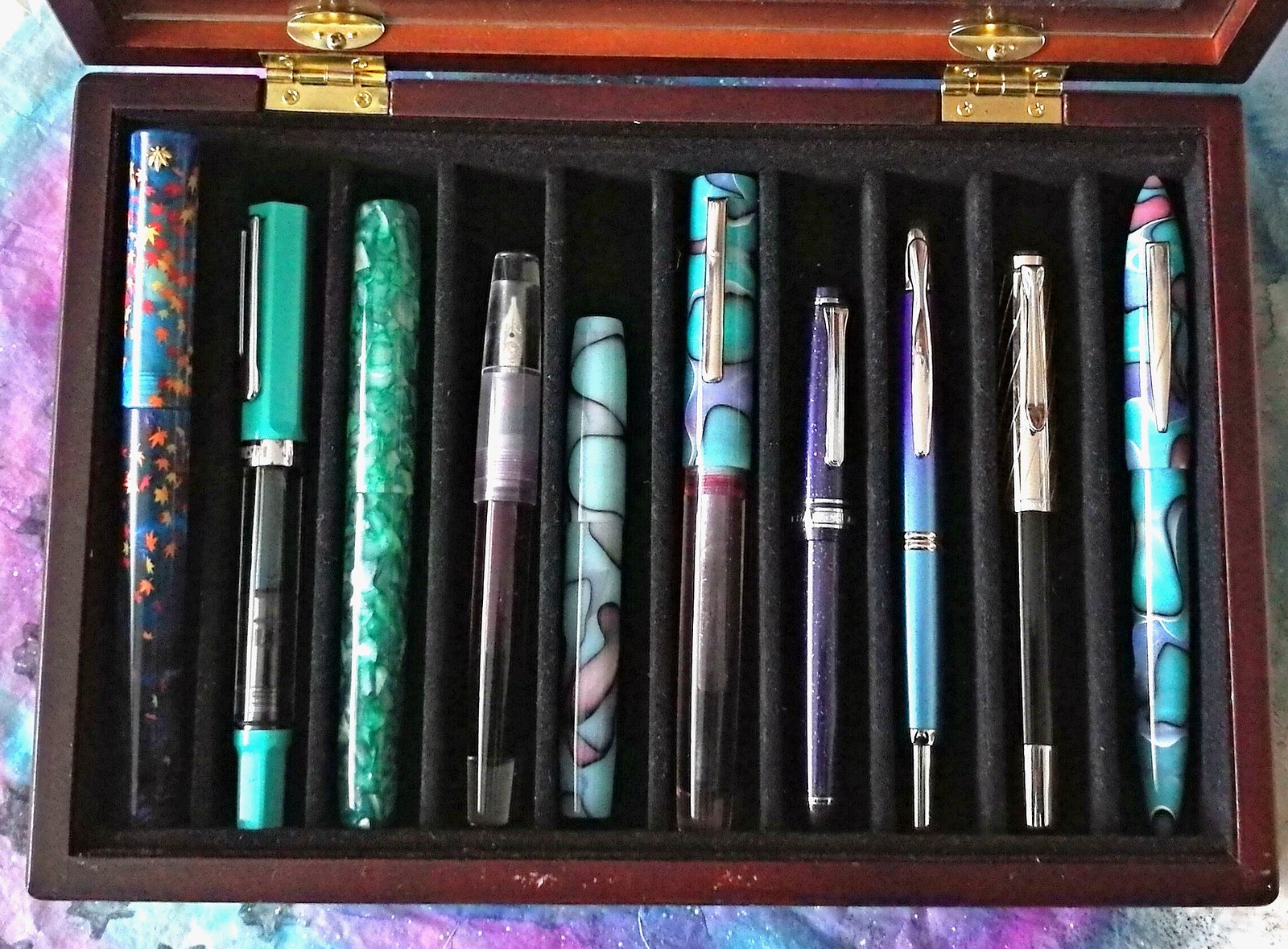
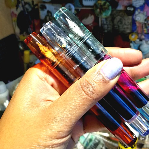
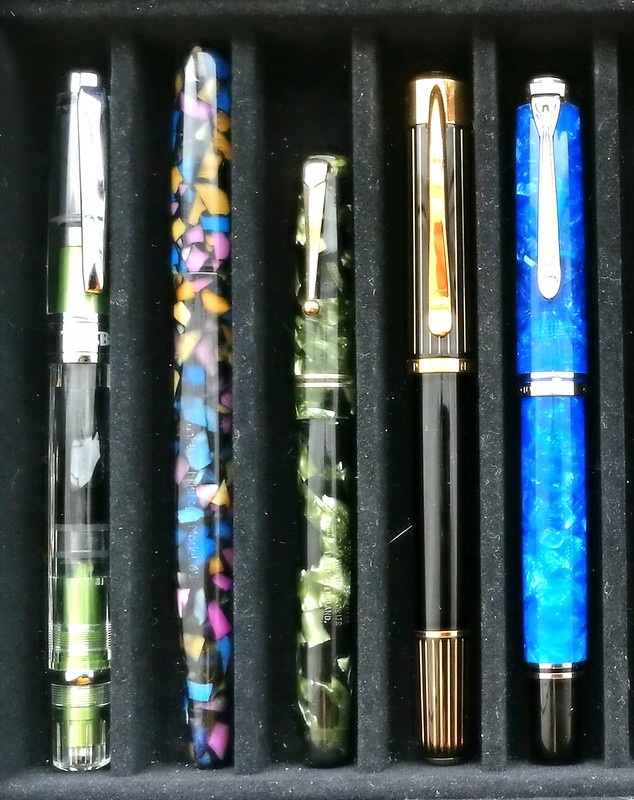
Even though my pens and inks post were few and far in between this year, I still have been using and enjoying my fountain pens pretty much daily and wanted to share my top 10 faves similar to what I have done last year. It was tough to narrow it down but these made the cut. You can see most of them in action on my instagram account Present and Connected and half of them are made by small business owners and are handmade. They are not placed in a particular order, I really enjoy using them all equally! From left to right: Momiji leafs in night sky made by 18111.com, TWSBI ECO turquoise (special edition), Mojito by Woodshed PenCo, Lecai with Twsbi stub nib, Franklin Christoph model 45 in blue pink black (special edition), Herbert Pen Company Pink seaglass, Sailor Sapporo Purple Cosmos with music nib, Pelikan M625 Ruby with BB nib and the Edison Nouveau Premiere Seaglass LE of spring 2017 (a collaboration of Goulet Pens and Edison PenCo). Let's take a closer look at them.
Showing posts with label pens and ink. Show all posts
Showing posts with label pens and ink. Show all posts
2017/07/19
WIP: the ongoing struggle of an inkophile
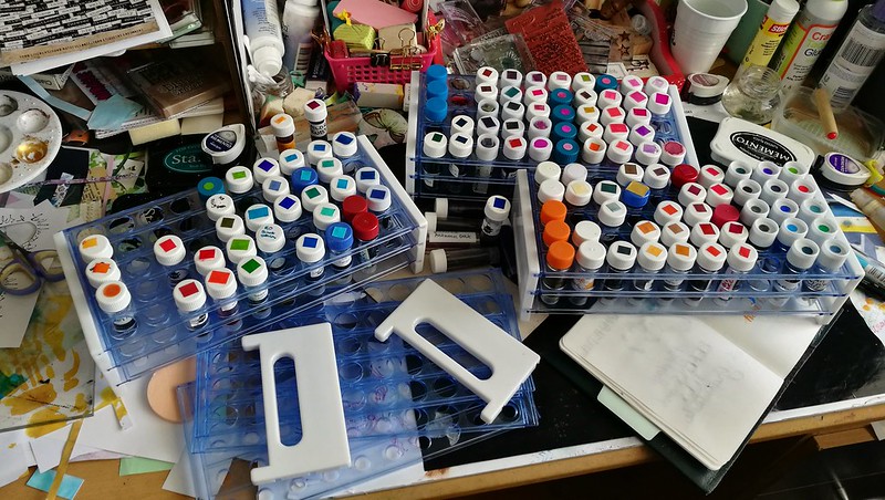
Yes friends, take a good look at my desk in all its messy glory. To some this might be a nightmare, but for me it's a victory. First let me explain what you see here, though for fountain pen people visiting my blog, this is a familiar sight. These are test tube vials filled with fountain pen ink. Samples of ink which were either bought at various pen sites (the main one being Goulet Pens Co.) or swapped/given to me by friends. Yes, there are thousands different ink colors of there by hundreds of different brands. It can get overwhelming, to choose a color to buy a full bottle in. Where to begin and where to stop? Having a sample of an ink you are interested in does help. You can swatch them out, see if it is the shade of color you like, if it has sheen or if it's waterproof... but even a small vial of 2-3 ml of ink (times 50 per tray) has proven to be hard to fully use up. And for a hoarder like me, it's a tough challenge. But I am slowly getting there, with the help of Konmari this year. From 6 full trays a few years ago and to now 3 is a victory! Let me tell you, it felt soooo goood to decommission that ink tray, I had to photograph and share this momentous occasion with my fellow deskers at WOYWW this week :) So plan is to keep using up those ink vials either in my art work or in my fountain pens, of course. For instance the ink below was sent to me years ago by a dear friend.
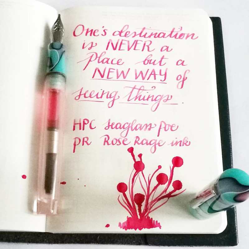
Last week I made an art journal with this quote from a stamp and I had to write it down in my Stalogy B6 which I use for quotes. I hardly ever buy pink inks, but they are fun to enjoy once in a while. This Rose rage is a super powerful shade of pink and fun to use in my new pen from Herbert Pen Company. I know I won't be buying a full bottle of this ink but it's an on going struggle of an inkophile, not to continuously buy more and not use what you have. I am trying to be better at that.
By the way, the work aria of my desk now is cleared of the trays
What are you struggling to use up in your stash?
Thanks for stopping by and check out more desk stories at Julia's blog this week and play along if you want :)
Have a great day!

2017/06/28
WIP: a nebula of sea glass (FPNL club meet edition)
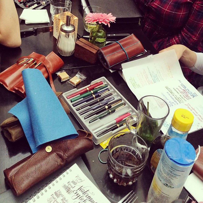
So last weekend on Saturday there was a mini summer meet of our wonderfully growing Fountain pens the Netherlands facebook group. We called it mini as about 15 members attended (in contrast to last time where there was nearly 40 attending) It was a bit unsure if I was able to make it due to another appointment, but thankfully the day freed up! So I could happily chat with my fellow FPgeeks about our newest acquisitions on pens and ink and try each other's, not exactly Every day carry, but the pens they had inked up at the moment. The table shot above shows only a portion of the long table the group shared and the fun we had. The pen tray in the middle and the corner left pen pouch are mine, by the way. Oh and Janine (you can see her lovely handwriting at the right on the Tracing paper) had the brilliant idea of having a Pannenkoek for lunch (wish I had thought of that!) hence the sweet powder sugar and syrup on the table.
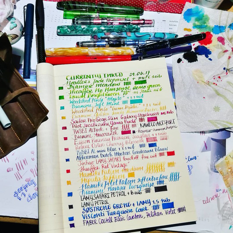
In preparation for the pen meet, I made a currently inked listing and made sure to include a special pen which arrived only a week before. The Edison Nouveau Premiere Spring LE Seaglass from Goulet Pens Co. You can see it on this desk shot, which I am sharing over at The Stamping ground for WOYWW #422, it's the blue and pink swirly pretty one! Let me show you a close up.
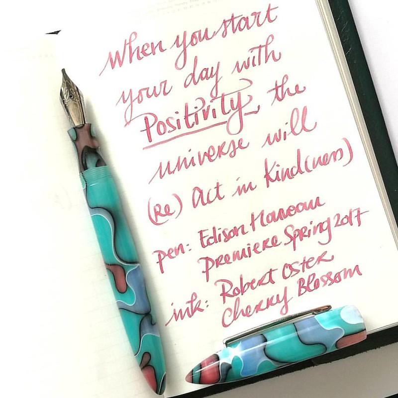
There... now ain't that a pretty one? I have inked it up with Robert Oster Cherry Blossom, as it's fitting to the pink swirls in the pen. I did have to smooth out the nib though, as it wrote quite scratchy out of the box (which was unusual because most of the time these nibs are 100% smoothed and ready to write) Fortunately I have a nib smoothing kit and it took me no time to get it tuned and ready to write :) Those swirls also really inspired me to make some mixed media goodness.
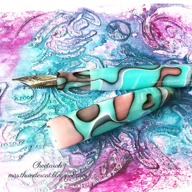
I made a little background for an art journal using a marble swirl stencil, Liquitex modeling paste and Lindy's Stamp gang magicals. So much Swirly goodness! I even took it one step further and played around with some digital overlays.
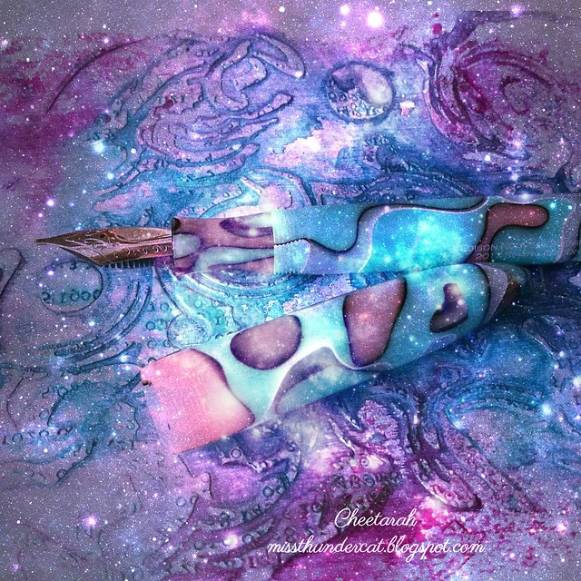
I am experimenting with some digital enhancements of my art and I really love the way this is looking :) A sea glass nebula!! Oh how i wish that pen material actually existed!! But now I think it's in need on some sparkly, shiny ink, don't you think? maybe the new Nemosine Blue Snowball Nebula sparkly ink? Or I should just "shop my stash" and find a Diamine shimmering ink for it :)
Thanks for stopping by and I hope to hop by your desk later this week.
Have a wonderful day!
2017/06/06
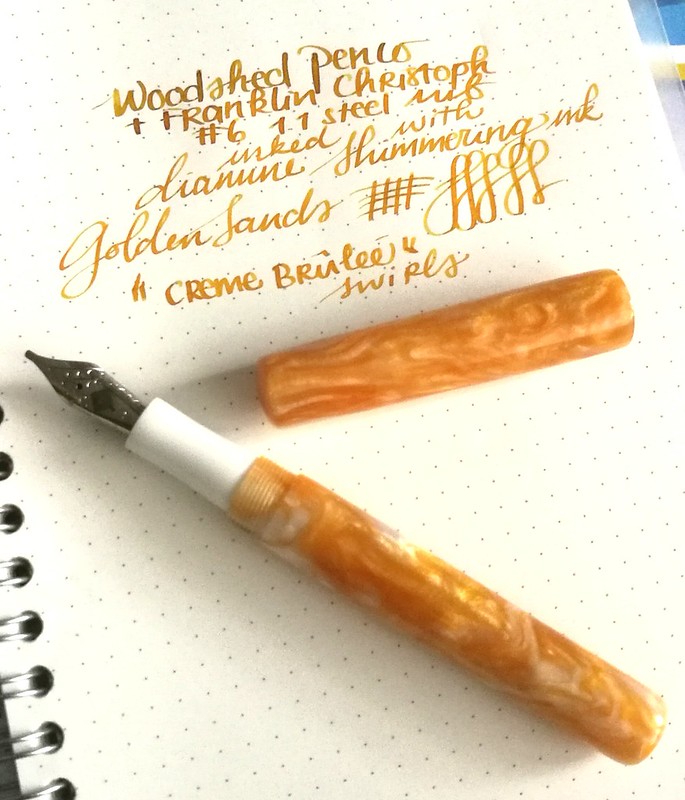
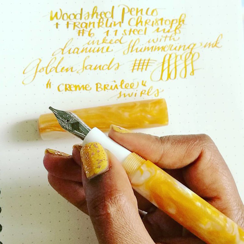
Pens and Ink: Woodshed PenCo "Creme Brulee" with Diamine Golden Sands
We're in halfway through 2017 and I have realized I have not been sharing my pens and ink pairings on the blog like I have planned to do. My art is now the main focus of this blog, but Fountain pens and ink are still a very big hobby of mine. I have been sharing them on my FP centered IG Pensandpolish and while I have entertained the idea of creating a separate blog for my Fountain Pen endeavors, it's just way too time consuming for me to do. So I will continue to share some of my favorite pairings on the blog here, esp. ones that are made by independent manufacturer/pen makers. Starting off with this gorgeous handmade pen from the up and coming pen manufacturer/maker Mike Allen from Woodshed PenCo.
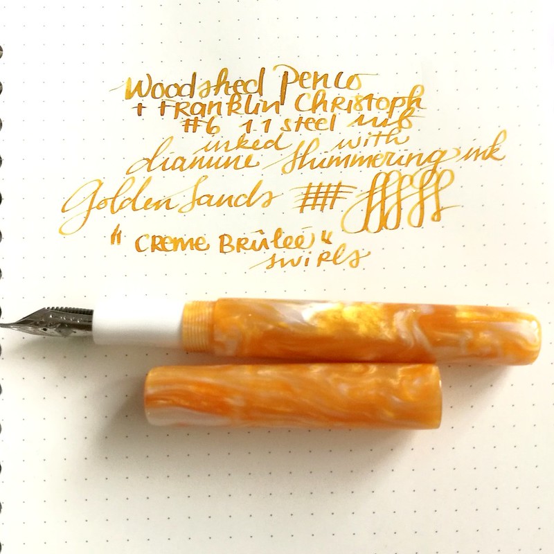
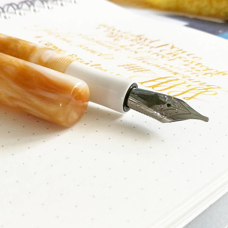
I've purchased this beautiful yellow golden colored swirly pen from Mike Allen at his sale on Instagram. He doesn't name his pens, but I dubbed this one "Créme Brûlée" because it looks like that beautifully burnt sugary caramel top of my fave dessert. The nib wasn't provided in this sale, but it takes the #6 size nibs I had a spare 1.1 nib from Franklin Christoph which fitted beautifully on this pen. As for the ink I went with Diamine Shimmertastic Golden Sands, the color just matches the pen body perfectly. I've written on a Muji dot grid notebook on which the nib just glides and the ink shades and shimmers beautifully!
My absolute fave of the first line from the Diamine Shimmertastic series.
A little more about The Woodshed PenCo - Mike is an US Air Force veteran whom got into making fountain pens not too long ago. He shares his process on his Instagram and has set up a Kickstarter campaign. I was lucky enough to have bought from him through a sale he was having on his IG and he has sold his pens through Etsy as well.
He just has one type of model so far, but more could be in the works. The pens he has for sale are really well made. The model is a bit cigar shaped and the cap does not post. I do like posting pens (so I won't loose the cap) so it was a little getting used to, but now I know to hold it in my left hand when I write. The section is tapered and fits very elegantly in hand.
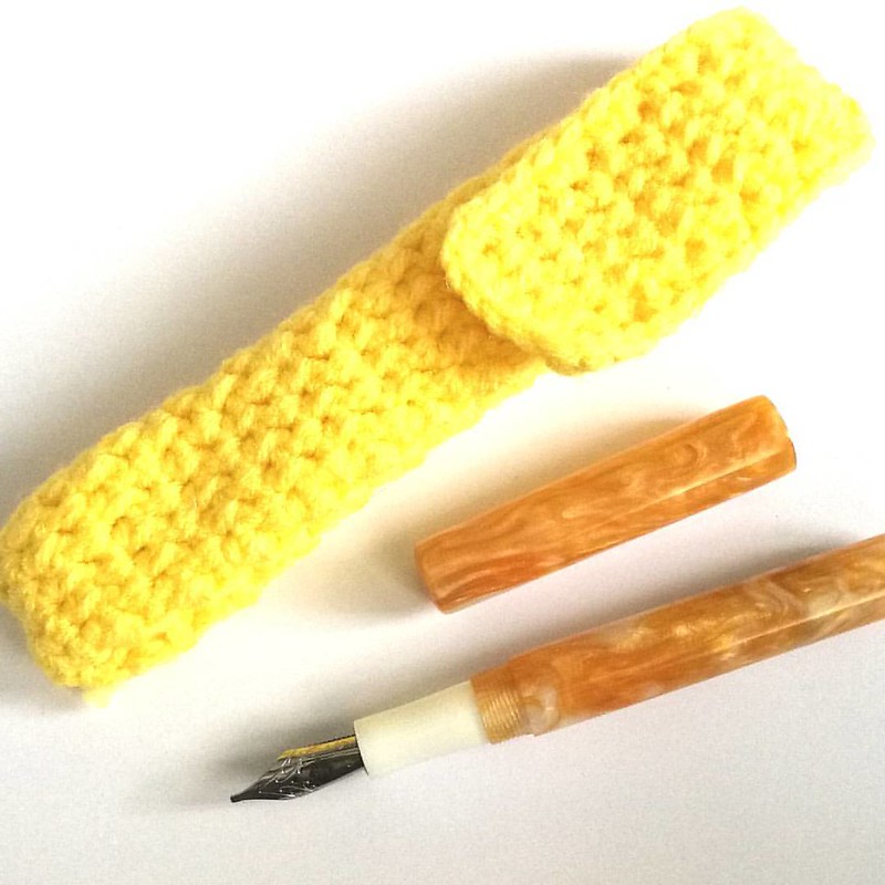
With every pen purchase you also get a hand knitted pen pouch/sleeve which is super fun! Not only does it protects the pen, but it also adds to the handmade feel for the pen :) I got a super yellow one with my pen which is awesome :)
If you're interested in one of Mike's pens, do follow his instagram and keep a watch out on his kick starter campaign. I am in no way affiliated with him, just a very happy customer and glad to support a small business. I am looking forward to a second pen coming my way and perhaps 3rd of his make will be added to my collection soon :)
Oh by the way, if you want to have more updates on my fountain pen adventures, please have a follow on my Instagram account PensandPolish where I also try my very best to color coordinate nail polish to the pen and ink of choice. And if you post a color coordinated pictures in IG yourself with the hashtag #pensandpolish I'll feature you on my IG as well :)
Thanks so much for stopping by and have a great day!

2017/02/01
Pens and Ink: Currently inked for InCoWriMo
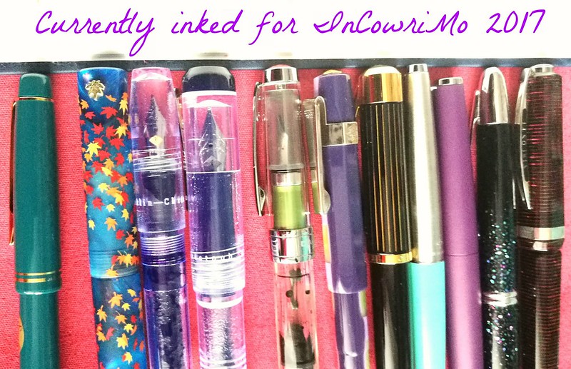
Hope you have your pens inked and stationery ready, because it's feb 1st and that means that InCoWriMo has officially started! It's going to be a challenge to write and send out mail every day, but preparation is half the work. To start I have inked up some nice fountain pens with some fun colors. Below you can see my currently inked list.
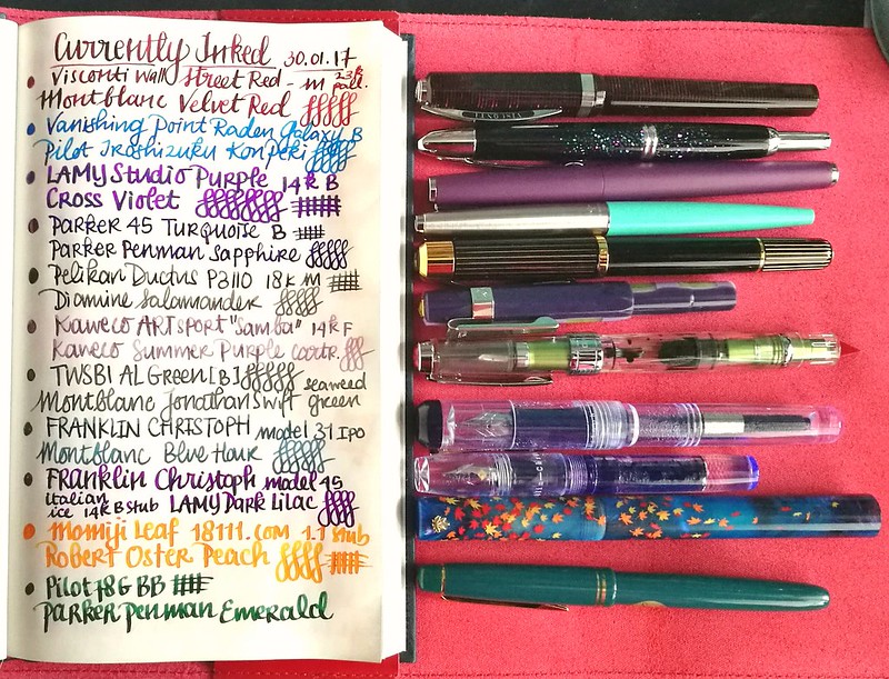
From top to bottom:
- Visconti Wall Street Red c/c, 23k pall. M, Montblanc Velvet Red
- Pilot namiki VP raden galaxy, 18k B, Pilot Iroshizuku Kon Peki
- Lamy Studio Purple, 14k B, Cross Violet
- Parker 45 turquoise, steel B, Parker Penman Sapphire
- Pelikan Ductus P3110, 18k M, Diamine Salamander
- Kaweco ARTSport "samba", 14k F, Kaweco Summer Purple
- TWSBI Al Green, steel B, Montblanc Jonathan Swift
- Franklin Christoph model 31 Blue Italian Ice IPO (Massdrop), steel B, Montblanc Blue Hour
- Franklin Christoph model 45 Italian Ice, 14k B stub, Lamy Dark Lilac
- Momiji leafs falling in night sky (handmade by 18111 on etsy), steel 1.1, Robert Oster Peach
- Pilot 78G, Steel BB, Parker Penman Emerald
The list is written in a gorgeous bound notebook with Tomoe River paper made by paper for fountain pens.
A couple of my favorites of 2016 stayed inked, but a few of them are on their last drops. I hope to be emptying them out fairly soon :) A few others will have their own Pens and Inks post up as well with more close up shots of the pairing.
What do you have inked up at the moment? And are you ready for the snail mail social? Post your pics on Instagram with #incowrimo to show your mailings :) I stared off on a good run...
These went out in the mail yesterday and hopefully one of them will be received today :) Hope to post more weekly round up's of snail mailings in the coming weeks.
Thanks for stopping by and have a great day!
2017/01/11
An ode to Franklin Christoph Model 45's
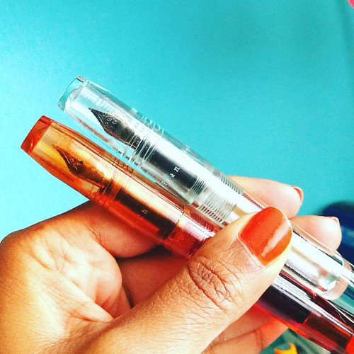
Model 45 in Amber and Antique Glass finish.
As I am planning on more pen and ink posts (which will be on a bi-weekly basis from next month on) I didn't want to deprive you all from some great fountain pens in the mean time. So I am sharing an ode to stunning Franklin Christoph model 45 fountain pens in picture format today. Enjoy :)
Model 45 in Italian Ice and Antique Glass - there is clearly a difference. (See what I did there ;)
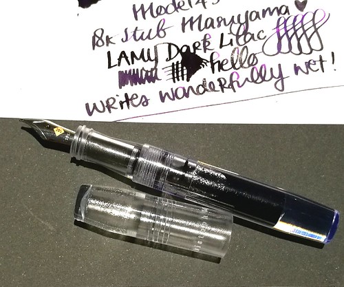
The 18k broad stub nib on the italian ice writes like a dream! Shows off the Lamy Dark Lilac ink really well.
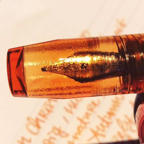
Model 45 in Amber finish, close up shot of the barrel. Beautiful craftsmanship!
They multiply like crazy! The cherry ice finish is on my wishlist. And I hope they will do a blue ice or myan blue finish in this model as well.
Thanks for stopping by and have a great day!
2016/12/28
Pens and Ink: Favorites of 2016
In terms of growth, it's always good to have moments to reflect upon things you have done in the past. Not only to see if they will help you move forward but also to appreciate the fact you have actually DONE these things. And in these quiet days in between the rush of Christmas and New Year's EVE creeping around, it's a good time to look back on the year I leave behind.
In this post I look back on my top 10 pens and inks pairings of 2016.
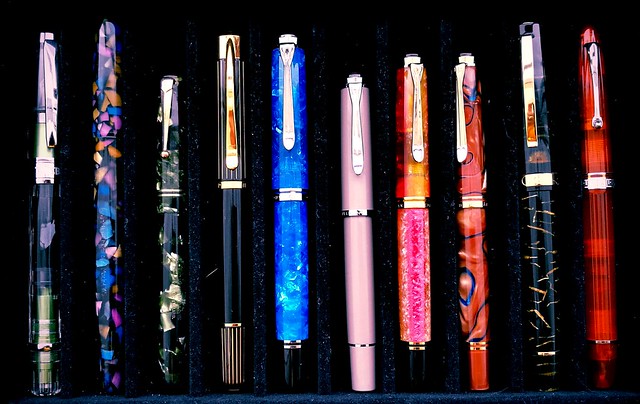
The above pens are my personal favorite fountain pens I've used over this year. They are not ranked in any way, just placed together in groups and you can see that one brands take the crown in this year's favorites, Pelikan!
From left to right: TWSBI Al Green, Franklin Christoph Model 65 in Tiffany Stained Glass finish, Swan Leverfiller in Jade green, Pelikan P3110 Ductus, Pelikan M805 Vibrant Blue, Pelikan M205 Taupe, Pelikan M620 city series Shanghai, Pelikan M620 city series Grand Place, Omas Bologna in Black and Gold celluloid finish and the Omas Ogiva Alba in Orange.
From left to right: TWSBI Al Green, Franklin Christoph Model 65 in Tiffany Stained Glass finish, Swan Leverfiller in Jade green, Pelikan P3110 Ductus, Pelikan M805 Vibrant Blue, Pelikan M205 Taupe, Pelikan M620 city series Shanghai, Pelikan M620 city series Grand Place, Omas Bologna in Black and Gold celluloid finish and the Omas Ogiva Alba in Orange.
(FYI: the Pelikan M205 Taupe looks more pink in this photo due to the warm filter over it, The pictures below represent the actual color better)
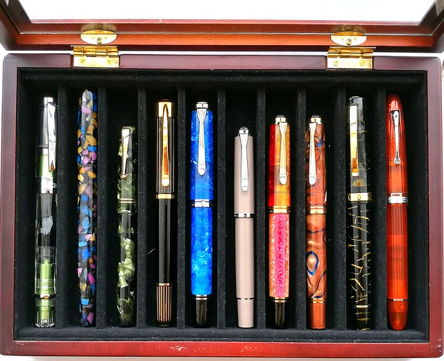
Very kind friends of mine gave me this wonderful pen box and I usually keep my currently inked pens in here. This box helps with presentation for this post as they have been in here at some point or other this year. Also it's a good cut off point to keep it at just 10 pens. I thought for sure it would be Omas, but looking back, Pelikan definitely got more writing time from me so they are more represented in this year's top 10!
Let's take a closer look at each one. (Oh and I do apologize for the magnified dust and cat hair in the pictures, but yeah it is what it is..)
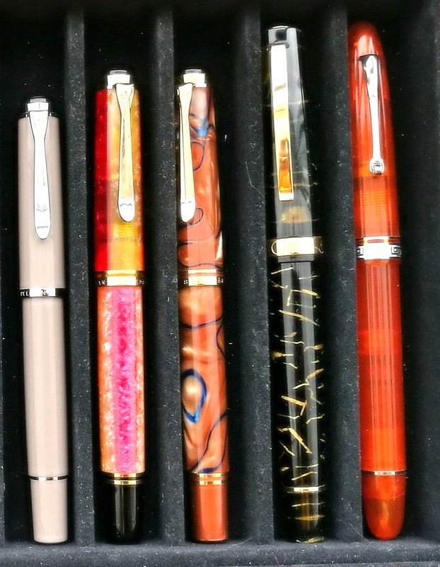
Starting at the far right is the Omas Ogiva Alba Orange and it's was a tie with the Omas Ogiva Alba Green, but this one won out due to the extra flessible fine nib. This flex nib showed the shading in writing beautifully. In the pens and ink post I had had paired it with Private Reserve Shoreline Gold (original version) but later I also loved this pen inked with Sailor Jentle Apricot. Which is the winning combination in all honesty.
Moving to the left is a pen I couldn't get out of my head when I saw it at the store after I left to get this pen (also a beautiful stunning pen from the same line, which I got for my birthday). So after a month I contacted the store and they kindly put it on hold/layaway for me. This was such a kind gesture and I'm really happy I saved up and got this pen because the pen material is just stunning. I paired the Omas Bologna in Black and Gold celluloid with Omas Dandy Turquoise. My absolute fave turquoise ink, ever.
Then comes a couple of Pelikan M620 pens from the City series I did my best to hunt down. I got lucky with a few collectors letting their pens go and I am thrilled to have them in my Pelikan Collection as they are both so very stunning. First is the Pelikan Grand Palace which I had inked with KWZ Monarch, the ink exclusive to Fontoplumo. A lovely warm autumn pair up. Which is a fun contrast to the lovely sakura spring colored match up of the Pelikan Shanghai with Caran d'Ache Sunset. Every time I look at these combos it brings back the feeling of Spring and Autumn.
Next to them is a smaller sister, the Pelikan M205 Taupe, which I actually got on a, well wouldn't say whim, but I was in a "I need a shiny new pen" mode while entering Akkerman in the Hague which is a dangerous place to be when you're in that mode! This one surprised me the most, because the color was a bit meh at first (won me over later!) but I knew that Caran d'Ache Storm would look SO great in this one. And boy was I right! The BB nib esp. makes the writing such a wonderful experience and I have this one in my 3 pen pouch with I take with me to work since I bought it! A stunning and stylish EDC (every day carry) for sure.
Starting out with another classy EDC on the left is the TWSBI AL Green which was a limited edition release. It was my "one of each" hunt for my TWSBI collection and it took me a while to find it, but thankfully Scrittura Eleganta had one with a juicy broad nib. I paired it with Montblanc Jonathan Swift, but popular consensus was to have paired it with Sailor Tokiwa Matsu as they commented on my FB/IG poll. I might try that next.
The pen next in line is definitely a what I would consider a unicorn pen. When I saw an IG friend of mine selling this pen, I jumped on it straight away. What a stunning pen this Franklin Christoph Model 65 in Tiffany Stained Glass is! I paired it with a harder to find ink at the time, Organics Studio Jane Austen Violet, but they since then started to manufacture inks again so it's available again for the masses, huzzah! This pen though still is one of few made or as FC said in an IG convo I had with them "only 12 of them were made for the Stockroom and maybe one or two at a pen show, so you have a rare and unusual Model 65 Stabilis". So yes, this in my unicorn pen, for sure!
Then comes the only vintage pen in this year's top 10, the Swan Green Marbled self filler, a purchase from the Tilburg Penshow this year. I paired it with a mossy green Diamine Safari which the flex nib of this pen showed off really nicely.
I have another mossy green ink in my line up, Diamine Salamander which is in my Pelikan Ductus P3110 and in the 3rd slot in my EDC 3 pen pouch. This pen was the surprise of the year. Mainly because I had no idea I would like this pen so much, but it's a beautiful, classy pen and also very comfortable in hand. In MY hand, a hand that prefers Pelikan M400/600 size pens. It lays more comfortable in hand than the Pelikan M805 which is next to it and they are essentially the same size. It's a unique pen and often referred to as the "ugly ducking" of the Pelikan family, but I love this under appreciated pen a lot.
And then on to the last pen in my top 10; The Pelikan M805 Vibrant Blue Special Edition. It's a stunner of a pen really. I had inked it with Organics Studio Nickle Teal and enjoyed writing with this ultimate blue pairing.
So there you have it, my top 10 pens and ink pairings of the year. I'm planning on doing more of these posts next year, but maybe not as frequent because I am planning on slowing down on pen/ink purchases for a while and enjoy what I have more. Yeah you can call it a new year's resolution of some sort, but well let's see how long that will last. Rumor has it that Lamy is going to have an ocean blue Al Star release for next year and well you bet I'll be adding that one to my collection!
Thank you for all the support you given me and my blog over the past year. It's much appreciated. Stay tuned for more round up's this week. Have a great day!
namasté
2016/12/14
Pen and Ink: Pelikan M405 Stresemann with De Atramentis Christmas Black
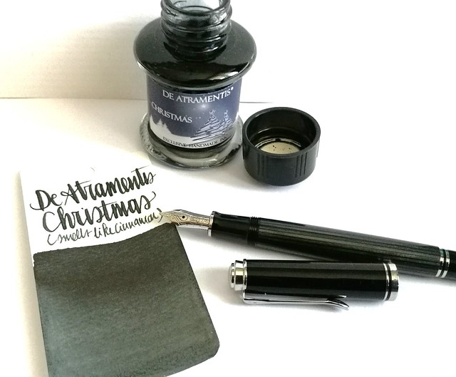
A couple of weeks ago I had the pleasure to pick up this pen; the special edition Pelikan M405 Stresemann with a broad nib. I inked it with De Atramentis Christmas Black. Thought this pair would be not only fitting in color combo, but also in the holiday spirit.
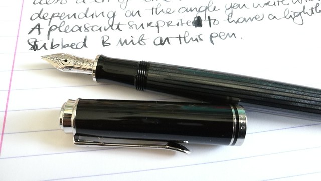
The stresemann finish is a very classy, business like looking pen. I had admired the M805 when it came out, but that size is just a tad bit too big for me as I prefer the M400-600 suze better. So I was thrilled when Pelikan announced this special release in the M405 size. And with thanks to Filippo from the Fountain Pen Group Buy FB group, it was very reasonably priced.
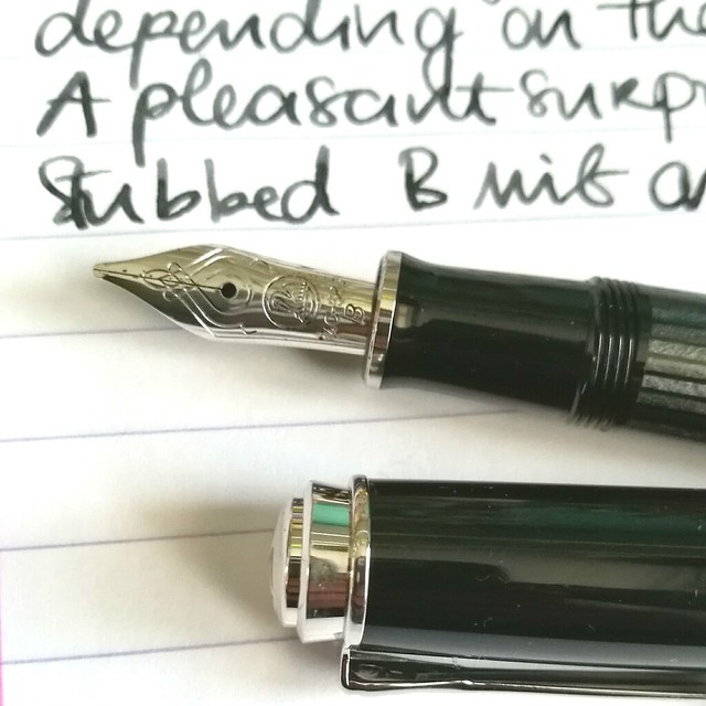
Close up of the nib. chose a broad nib and it writes like it's slightly stubbed as it gives a very nice line variation when you write with it in a slanted angle. Maybe I got lucky, because I have not seen this in any other B nibs of pelikan before as of yet. Either way, it was a very pleasant surprise :)Read more about the pen here at the Pelikan's Perch.
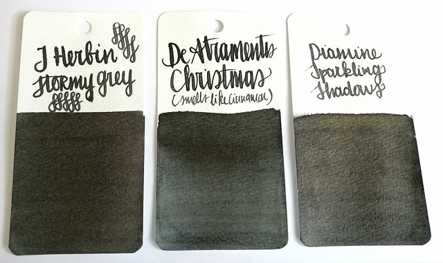
About the ink, I found it at an office supply store up in the north of NL and while I usually do not like black inks, this one definitely spoke to me. It has a very cute label AND smells like cinnamon! Also upon further investigation, this was a limited edition DA christmas ink release in 2012 and no longer available. It does look more like a dark grey in writing and on the swab cards. Except for the smell, it's not an ultra special ink. In color it comes close to J. Herbin Stormy Grey and Diamine Sparkling Shadows base color. Those other two colors would also go really well in the Stresemann as well and either of these would add a nice little scent or sparkle to your christmas cards. I better should get cracking on my cards for this year!
Thanks for stopping by and have a great day!
namasté
2016/11/16
Pens and Ink: TWSBI Al green with Montblanc Jonathan Swift
As some of you might know, TWSBI releases some Limited Edition specials from time to time and there was one special edition I was really into, the TWSBI AL Green, which was released in a small batch earlier this year. It took me a while to find it, as it seemed to be sold out everywhere, but with some luck and Google-Fu I found out they had one left at Scrittura Elegante, a stationery shop based in the Netherlands. So after not too long of a wait, the pen arrived and I excitedly tried to pick a color to match the beautiful body!
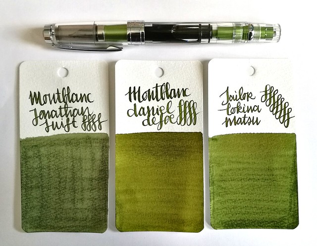
I decided a nice mossy green would suit the pen body well. The mossy greens above I thought would make a great match; Montblanc Jonathan Swift (seaweed green), Montblanc Daniel Defoe (palm Green) and Sailor Tokiwa Matsu (evergreen pine). The swabs are done on Maruman Word cards, by the way. It was a difficult choice but in the end I sent with Jonathan Swift because I had not yet used that ink in a pen before, so it was high time I break in the bottle!
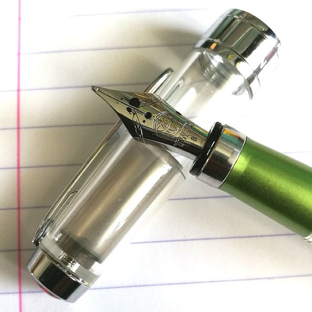
I requested a B nib on my TWSBI Al Green as I have almost all the range of the nibs in the TWSBI line up, except for this one. I have to say that I was a bit disappointed with the line width as it isn't as broad as I hoped it would be. In writing this B nib looks more like a Pelikan steel medium to me. But still, it's not that bad, the ink flow keeps up well and does bring out the shading in this JS seaweed green. See a review of the TWSBI AL Green by ArtGlen on youtube to know more about the pen.
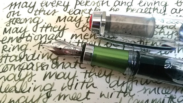
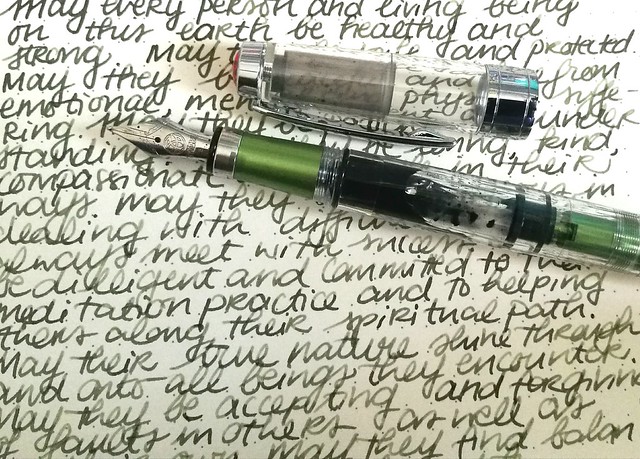
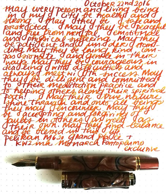
It's been a emotional week in many aspects and it's in these difficult times we need to keep our compassion high and cultivate empathy, no matter how difficult it can be. Writing the Loving Kindness Metta Meditation in my journal on a daily basis helps to gain focus and center my compassion. Carving out pockets of time to sit down and write down a hopeful, loving warm wish into the world, may not seem like much, but it's sometimes the only thing I can do to help alleviate my sorrow. In Buddhist terms sending out a positive compassionate wish to help people whom are suffering creates connectivity and empathy. If you want to know more about this, I highly recommend the book "A Fearless Heart: How the Courage to Be Compassionate Can Transform Our Lives" written by Thupten Jinpa the official English translator of his holiness the Dalai Lama, Tenzin Gyatzo. I was lucky enough to attend a workshop about compassion and a book reading by Thupten Jinpa earlier this year in May (read about it in the last paragraph here) and it was really inspiring as it was hopeful. In this world we're being confronted with large extremes nearly every day, with practicing/cultivating this meditation technique, I hope to send out more compassion to those whom need it.
This quote from the Dalai Lama is encouraging and definitely struck a chord:
This quote from the Dalai Lama is encouraging and definitely struck a chord:
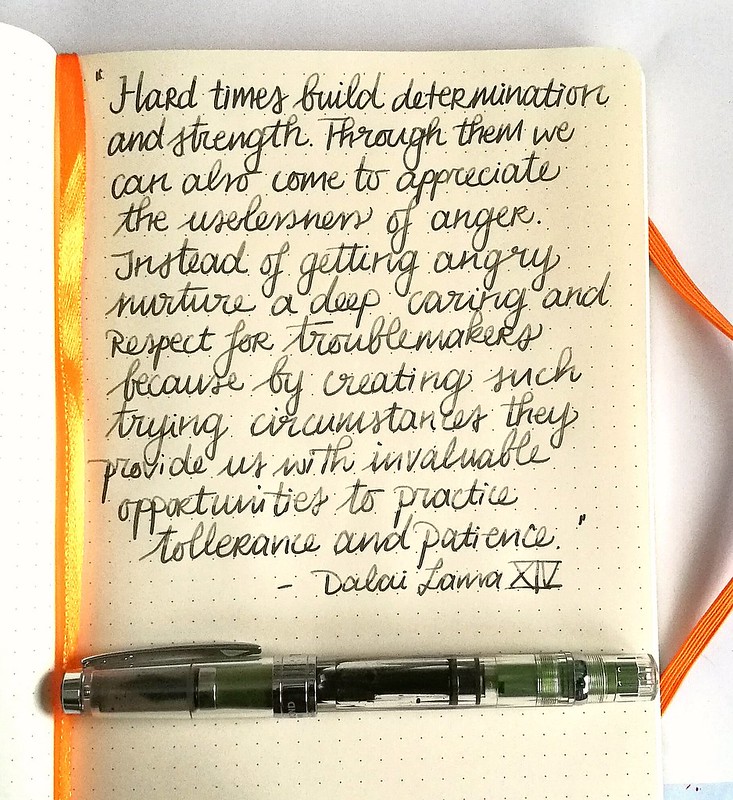
“Hard times build determination and inner strength. Through them we can also come to appreciate the uselessness of anger. Instead of getting angry nurture a deep caring and respect for troublemakers because by creating such trying circumstances they provide us with invaluable opportunities to practice tolerance and patience.” his holiness the Dalai Lama XIV
Something to ponder on with my next meditation session...
Thank you for stopping by and wishing you all a wonderful day.
namasté
2016/11/09
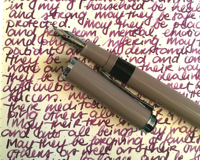
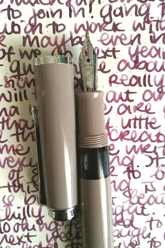
Pens and Ink: Pelikan M200 Taupe with Caran d'ache Storm
Keeping up with the Pelikan and purple hues theme, I got another great pairing for you today.
The Pelikan M205 Taupe (special edition release in 2012, more info here at the Pelikan's Perch) with Caran d'Ache colors of the earth Storm (which is discontinued with the release of the Chromatic Inks, More info about that on Gouletpens blog here).
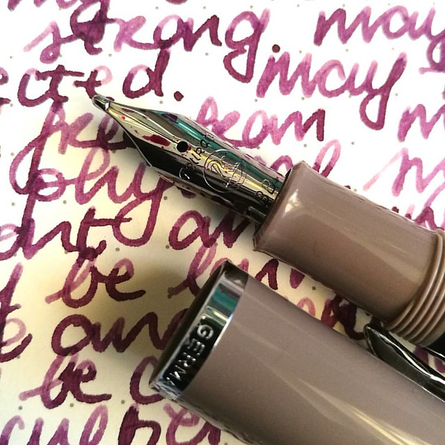
This pen was a special release in 2012, but I found it not too long ago at Akkerman in the Hague. They still had a couple of them for sale and when asking to see one up close, they provided me one which had a BB nib fitted in it. Really hard to resist that beauty! And look at that tipping! It puts down a wet and juicy extra broad line.
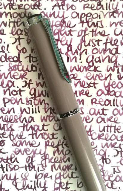
The color of this pen is "taupe" upon googling which hue that actually means I came across this on Wikipedia
"Taupe is a word that is used to denote any of a variety of colors. The colors it denotes fall into a range from dark tan to grayish brown or brownish gray. The word derives from the French noun taupe, which in turn is from the Latin talpa, both meaning "mole" (the mammal)."
So it's a greyish-brown or a brownish-grey, which when you look at it, yeah I can see that. But you have a whole set of color tones that falls into the "taupe" aria and to me this pen looks more like a Mauve Taupe, the purple tone in the taupe spectrum. And because of this I thought a dusky warm purple would perfectly suit this pen.
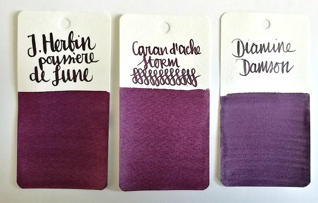
Comparisons of some dusky purples: J. Herbin Poussiére de Lune, Caran d'Ache Storm and Diamine Damson. I chose to ink the pen with CdA Storm because of the warmth this color has and came close to Mauve Taupe. And I should use the LE inks more instead of hoarding it, right?
The BB nib in this pen shows off the shading in the ink very nicely and the ink highlights the warm tones in the pen body too. A winning combination and a joy to write with on these colder near winter days.
Thanks for stopping by and have a great day!
namasté
2016/11/02
Pens and Ink: Pelikan M1000 with Robert Oster Purple Rock
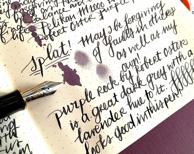
Not too long ago I had the amazing opportunity to buy a Pelikan M1000 in black with gold trim in a clearance sale for a great price. Something I could not resist even though I was wondering if I would use it enough because it came with a fine nib and is such a large pen. Well, inked with this spectacular ink Purple Rock by Robert Oster, it definitely became one of my fave writers in no time!
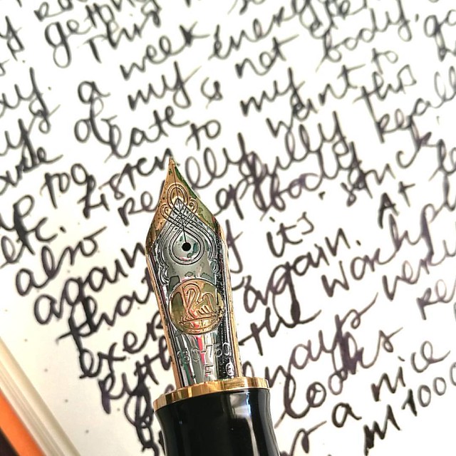
The nib on the M1000 is nothing but spectacular! It's quite a large pen (see a review of the M1000 here by SBRE Brown and here by Brad Dowdy on the Pen Addict) and the nib has some wonderful spring to it. It's one of the rare fines I truly enjoy writing with.
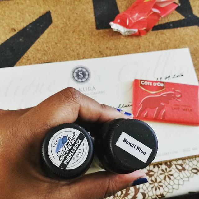
I bought the Purple Rock in my order at Sakura Fountain Pen Gallery together with the Bondi Blue. At first I thought it was more of a black with a light hint of purple, but it's a deep dark grey with a gorgeous purple hue to it. It's subtle in a fine nib though, but it's definitely more visible in broader pens or in an ink splatter like the top picture. A beautiful work safe pen and ink combo I would say. See some awesome ink tests on Robert Oster inks here by Nick Stewart at Inks and Bleach.
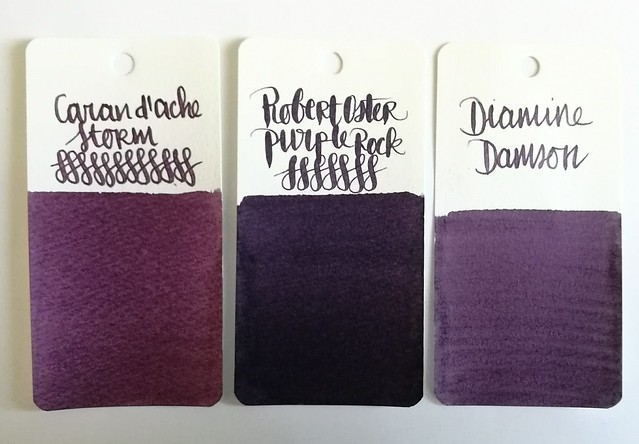
Here you have Purple Rock flanked by Diamine Damson and Caran d'Ache Storm, It's definitely a lot darker than the other two dusky purples for sure, though you can see the purple hue purple rock has very clearly in less saturated parts in the writing below and the splatter.
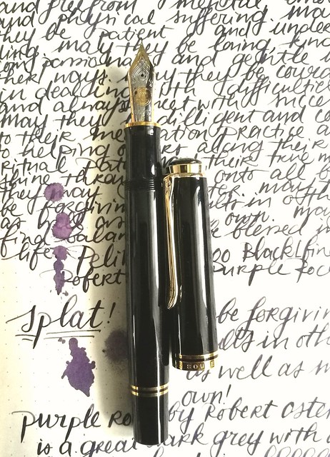
Purple Rock is a great match for this gorgeous M1000 and also a fun "safe for work" color.
Next week I'll show one of the other purples in another Pelikan.
Thanks for stopping by and have a great day!
2016/10/26
Pens and Ink: Pelikan M620 Grand Place with KWZ Monarch
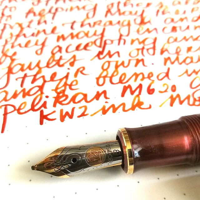
Today's I'm sharing a wonderful autumn inspired combination: the Pelikan M620 Grand Place inked with KWZ Monarch ink.
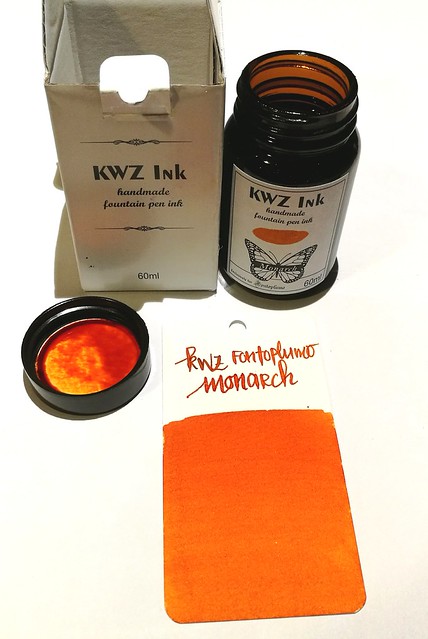
About the ink: I bought a bottle at the Tilburg Penshow in september and it's a Fontoplumo exclusive. It's made by KWZ and it's made to fit their gorgeous Limited Edition Conid Bulkfiller fountain pen. Well, I have not won the lottery yet, so the pen was not something I could obtain, but the ink definitely came home with me. It's a gorgeous warm orange color, perfect for this time of year.
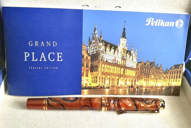
The pen I chose to try the ink in is this gorgeous Special Edition by Pelikan, the M620 Grand Place from the city series. It's a beautiful coppery brown color with dark blue swirls in it. I got really lucky obtaining this pen because it's a LE from a few years ago but a collector was selling his pen a while ago and I jumped on the chance. It is fitted with a b nib, so I figured it would be perfect to show off the great shading of the KWZ ink.
It definitely does the ink justice! It has some great shading and reminds me a lot of Diamine Autumn Oak and Noodler's Habanero (ink shot reviews by the lovely Gourmet Pens). Though Monarch is a bit browner and has a wonderful vanilla small to it! Makes writing with it a lot more fun (I kept sniffing the nib!)
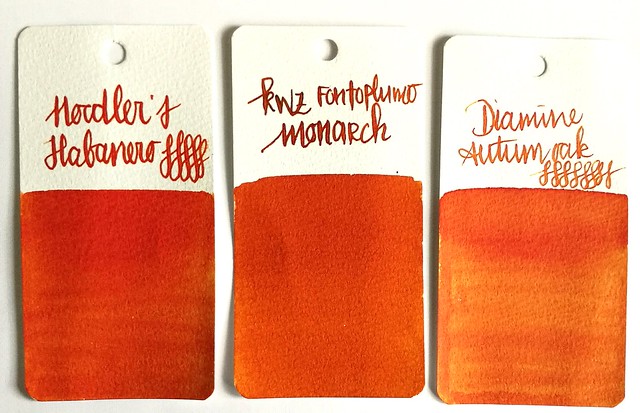
Comparing the inks side by side. As you can see Monarch definitely has a browner and darker tone to it. It's a subdued copper red orange ink but with writing you definitely can see some lighter tones.
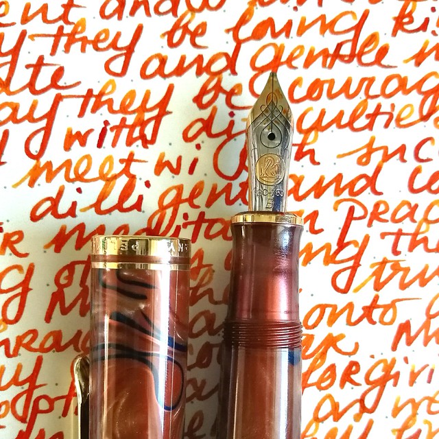
I am very much enjoying this pairing and happy to have these two special editions in my collection.
Thanks for stopping by and have a wonderful day!
namasté
Subscribe to:
Posts (Atom)