2016/05/30

Mailart Monday - Don't be a square darling!

Mail Art 039-2016
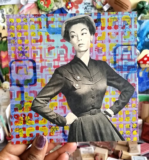
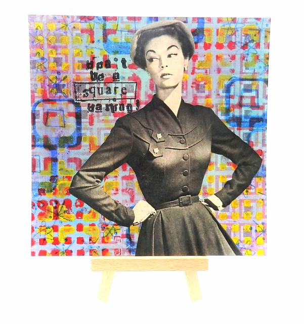
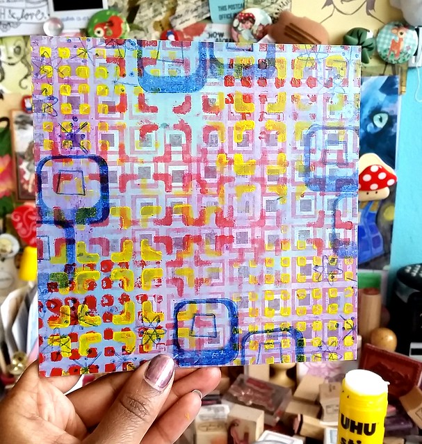
This week on mailart Monday I am sharing a collage piece I made for the SQUARED postcard swap for the Hand Made Postcard Club on Swapbot. It's was hosted by the lovely JuliaJae and the primary requirement was "Just make it SQUARE! A 6"x6" handmade postcard on heavy cardstock" And I was thinking, that it might be a good idea to use some of that of 6x6 scrapbook paper (it may have come up that I am a hoarder, so I'm sure you're not surprised that I have a ton of that paper too!) so I used one of those papers as my base.

Squared process
For the base I used a scrapbook paper from Basic Grey with retro squares on it. I started with layering baby blue paint on it. I then applied some artist medium gel and when that dried I rubbed oil pastels purple and blue on some parts. When you apply a heat tool to the oil pastel on a smooth surface it liquefies, so you can blend the pastels together on the surface. That little trick I learned on Art Specially from Marieke Blokland's mixed media make and take. Now it needed some more squares! I took a few stencils with squared images, layered them on the PC with red and yellow paint. Lastly I took a few stamps from my Atomic Age graphic stamp set and stamped that on the sides with Staz-on Hydryngea Blue.

Squared process
I found this wonderful image in one of the Beatrijs magazines I have. That look on her face, priceless!! I cut her out and adhered her with my trusty UHU glue stick. I just love the contrast of the colorful background with the grey-scale image.

Don't be a square darling! #mailartists #mailart #mixedmediaartist #mixedmedia #mailartmonday #art #square #vintage #beatrijs #vintagewoman #swap #swapbot #squared #snailmailrevival #snailmailing #snailmail #mail #sent #handmade #postcard
Lastly I added the saying "don't be a square, darling!" with alphabet rubber stamps and yes, the joke is in the rectangle ;)  I adhered a layer of medium matte gel to seal it off and it was ready to mail. I think this is one of my fave of the vintage mail art series I made up to date. Sadly I am running low of these wonderful vintage images from the magazines I got from Miss Minoes shop All Fairness a while back. But I am getting another series of magazines from her with equally gorgeous prints in them, so I can't wait to create some mail art with those.

Hope this inspired you to layer paint and pastels over your scrapbook paper, to create some fun mixed media pieces.

Thanks for stopping by and have a great day!

namasté
2016/05/27

Craftorij Summer Challenge 2016

It's almost June and that means the Craftorij Summer Challenge is nearly starting! What is the Craftorij summer challenge you ask? Well this year there is also an English FQA and I'll post it here:


"What is the Craftorij Zomer Challenge ( Craftorij Summer Challenge) or #CZC
The Craftorij is an art supply shop in the Netherlands owned bij Lia Sauer.
With a group of ladies who all got to know each other over there we started the Summer Challenge in 2014 for the first time.
For 2 months you will get a daily prompt, it is posted every night around 20.00 European time. The post will be pinned on top of the page with an example ( for your inspiration) made by one of the hosts. At the files section there will also be a list with all prompts available, so if you miss one you can always check the list.
You can make the prompt on an index card (10x15 cm in size so roughly 4x6 inches) and you can use techniques and materials you like most or which you have available. It's a Dutch group but we will also post the prompt in English for you. A
Joining us is completely FREE and there are no obligations. If you want to make all prompts (that’s what we like most of course) that’s great but if you miss a few that’s no problem too. You can always make them later.
The only thing is that it would be nice if you show us your piece of art so we can all inspire each other. If you go to the albums section you will see that for each day, we will create a new album. You can add your images to the album and post a comment immediately. This makes your image pop up in the newsfeed of the group. So no need to post it 2 times.
For reference please always use the #CZC and the number of the prompt you are making."


Last year I also did an attempt for the CZC 2015 challenge and went relaxed about it. I didn't finish the whole ride, at some point other obligations took over. But it's always fun to see what the prompts inspires you to make. Some prompts I had a strong idea on and others not so much and that is ok. The 1st warm up was "your favorite color" and even after all that glorious Posie Pink on my pens and ink post past wednesday, I assure you my fave color is still sea blue/turquoise ;) 
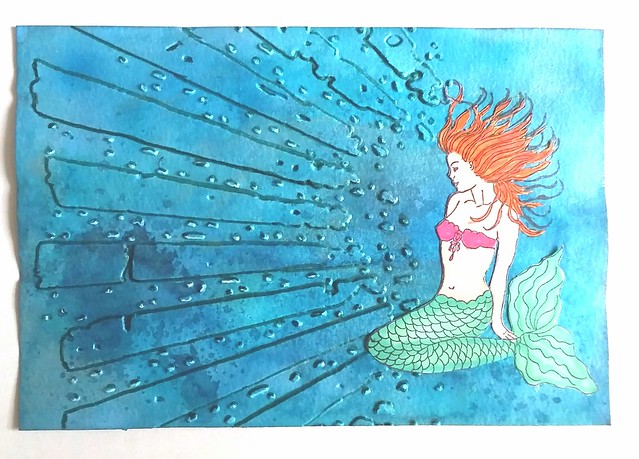
I have 2 books of maruman watercolor paper and a bunch of photo paper (from last year) on that 10x15 size so I will use that. The little mermaid was my fave movie while growing up and inspired me to make this piece for the first warm up challenge. 
CZC warm up 1 - your fave color
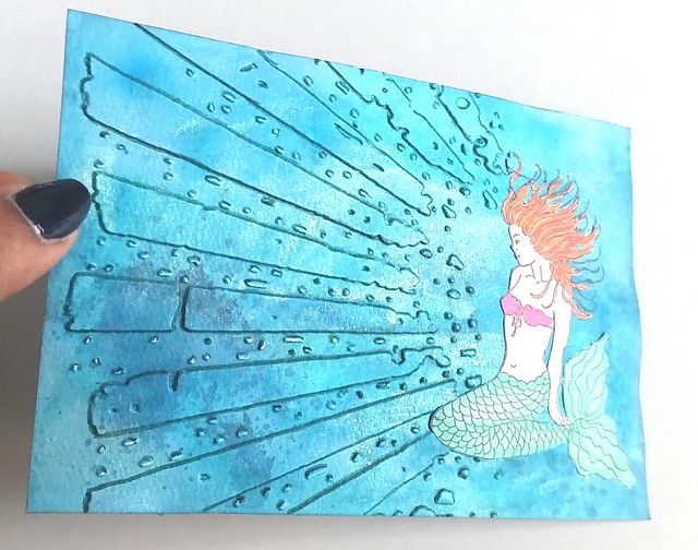
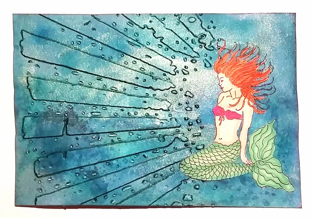
The background I made with a combination  of ecoline, winsor and newton and fountain pen inks in various sea blues on maruman watercolor paper. I mixed a bit with perfect pearl green for the shimmer. Then I ran it  through my cuttlebug with the distress rays emboss template, which I also used for the "knowledge is enlightenment piece" from last week. For depth I traced the embossed outer lines with tombow sea green dual brush pen. The mermaid I stamped and colored with promarkers on sticker paper and cut her out and adhered to the piece. I did lightly stamp her on the piece with archival black for the hair placing. And I definitely love how this looks!  
CZC warm up 1 - your fave color
I scanned the piece and while the colors look darker, she shimmer shows quite nicely! 

If you are planning on playing along with us, to see the prompts and other creations you have to join the facebook group. You don't have to make all of it, just see what the prompts your creativity inspires to make. That's is how I'm entering this summer's challenge :) 

Thanks for stopping by and have a wonderful creative weekend!

Namasté 

2016/05/25

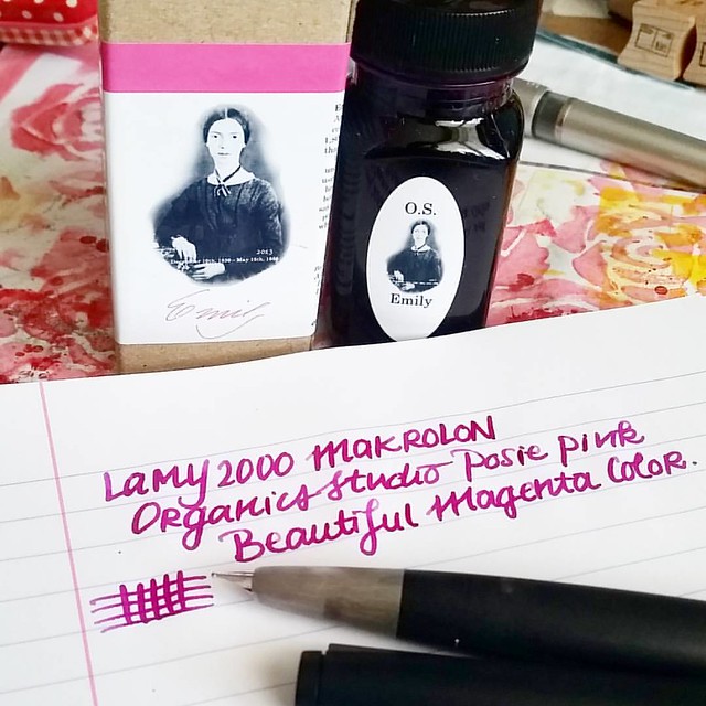
Pens and Ink: Lamy 2000 with Organics Studio Posie Pink

So this might be the most unlikely pairing for me up to date as I usually do not like pink colors and the Lamy 2000 was always a bit 'meh' to me. But combining these two together, it's an absolute winner!
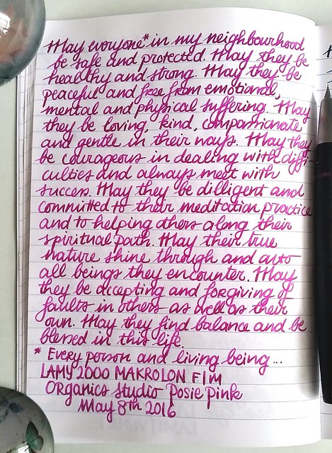
Inked my Lamy 2000 up with organics studio Etmily Dickinson Posy Pink. It's such a gorgeous color and I am generally not a Magenta color family fan. Also Organics Studio will be relaunching their inks soon! Huzzah!!
The Lamy 2000 has been said to a "must have" in everyone's fountain pen collection. Sooner or later, you end up owning one. In my case, it was quite a bit later, because I honestly never understood the appeal. And yet I own two of them. Here's how that happened.

I do like the simplicity of the Bauhaus design by Gerd A. Müller, but it was just a tad bit underwhelming for me and wasn't ready to buy it at full price. Then at the Tilburg pen show from a few years ago, I got the chance to purchase a vintage Makrolon one with an OB nib for a nice price, and thus the "staple pen" was then finally added to my collection.
That nib and that ink is an amazing combo. Love the sheen in #iroshizuku #yamabudo 💕
Vintage Lamy 2000 with an OB nib, inked with Pilot Iroshizuku Yama-Budo

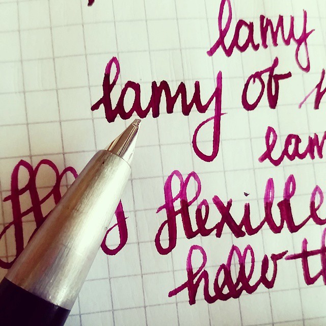
While the OB nib was fun to use, it has a very specific "sweet spot" to write with, so I hardly ever use it as I like to hold my pens a certain way to write. I wanted to give writing with the Lamy 2000 a fair chance and once more I bought the Lamy from a fellow fountain pen aficionado who was letting his pen go. It has a fine nib, which writes like medium, that's why he didn't wanted it. But another person's "I hate it" can be someone else's "I love it" (That is a constant debate between my husband and I about EF nibs!)  I actually love this specific nib width in the Lamy, it actually writes broader than most B marked pens I own! Oh and how it writes, that changed everything! So here I learned that looks can be deceiving, the pen might be a tad bit underwhelming, the writing experience isn't! The nib, which is 14k gold, writes super smooth and just glides on paper! It's very true to the designer's vision for this pen:  "When it made its first appearance in the shop windows in 1966, it was the first writing instrument of the modern era which did not seek to be a status symbol but simply an honest, high-precision tool for writing by hand." - from Lamy's website. Which is what Bauhaus is about, the functionality is key.

There are a lot of good Lamy 2000 pen reviews out there, so I'm not going to exhaust you with the specifics about the pen. See for an honest review about pen and nib at the Pen Addict here and he also posted links to other great reviews. My pens and ink posts are about pairings you can fall in love with. And let me tell you, the Lamy 2000 makrolon and Organics Studio Emily Dickinson Posie Pink is a match made in pen heaven!

lamy 2000 and posie pink

As you must know by now, I'm more of a Turquoise / blue hues loving girl. I hardly ever like pink or magenta colors. Yet there are exceptions like Yama Budo which stole my heart because of the beautiful gold sheen. But OS Posie Pink, is a straight up pink! I fell in love with after I saw it in writing in a letter to me from my friend Nicholas. So when I was in Stockholm a few years ago and saw they had a line of Organics Studio for sale at the Pen Store there, I took a bottle home with me.

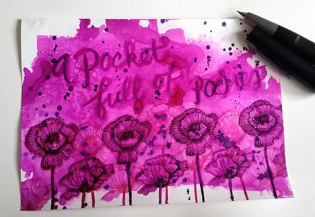
Pocket full of posies
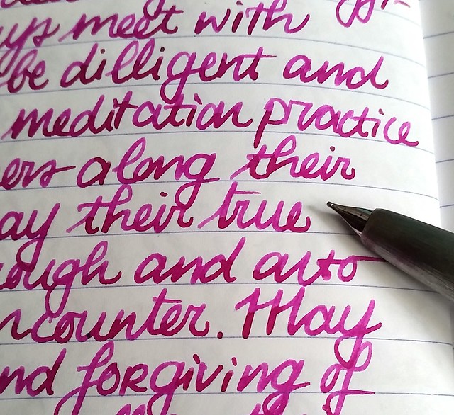
The ink has such character, the nib on the Lamy 2000 really shows off the shading!

Before you tell me off that I'm showing you another pairing with a discontinued ink line, let me share some good news. Tyler from Organics Studio has posted an announcement on their website that they will be relaunching the inks this June! I contacted Tyler to ask him which inks will be in the relaunch and this is what he said: "It looks like we will be putting out 8-12 colors at the relaunch, and posie pink will be one of them. We will also be featuring our 4 vintage ink series inks, as well as manganate, cobalt, poe, and a few other surprises :)" Thank you Tyler for sharing which OS inks will be available and it looks like Posie Pink will be up for sale sometime soon again. In celebration of this I made a pocket full of posies :) 
 
Pocket full of posies
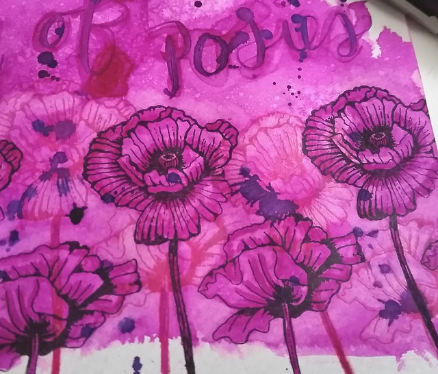
I recently got these fun flower rubber stamps and used Posie Pink on Maruman Zuan water color paper. I splattered a few drops of ink from the lamy onto the page, sprayed it with water from a mini mister, dried with my heat tool and then stamped the flowers with Staz-On Jet black and Cherry Pink. I got out a water brush and got to work on the flower petals. 


Pocket full of posies
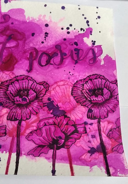
I added depth to the flowers by making the petals lighter first and also making the aria around the flowers lighter. This I did by using the waterbrush on the arias I wanted to have lighter and dab the excess water/ink away with a paper towel. Then I added more color to the petals with a few diluted drops of the ink to give more shading.

Pocket full of posies
I retracted ink from the flowers stamped in cherry pink to give the light/dark effect between the flowers more contrast. A tombow blender tool can be used for this too, but you might stain your blender brush with this. I wrote a pocket full of posies with the water brush first and then with a inked dip pen over it. Lastly I spattered the remaining ink on the dip pen over the piece. 

There might be a giveaway of some OS inks on my blog at some later point, so keep an eye out for that. But for now, I hope you are just as excited as I am for these inks to be available again soon :)

With the "pocket full of posies" artwork I'm also entering the Mixed Media Monthly challenge #24 "Butterflies and Blooms"


Thanks for stopping by and have a wonderful day!

namasté

2016/05/23

Mailart Monday - Spring Airmail

Mail art watercolor envelopes

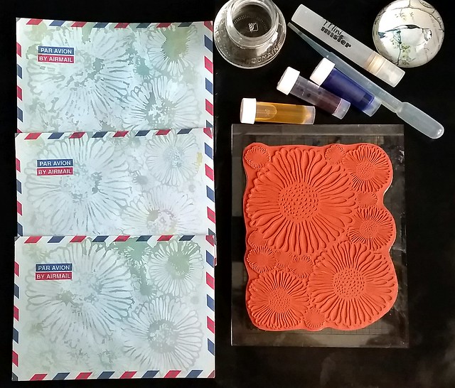
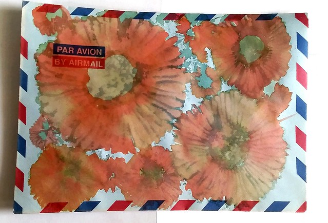
Last year I scored a bunch of these vintage airmail envelopes at a thrift market. They seem to hold fountain pen ink pretty well. I decided to experiment, jazz them up a little by using some fountain pen ink samples and a fun spring doodle flowers stamp from Lost Coast Designs.

Mail art watercolor envelopes

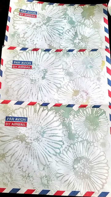
These are so simple and fun to make. Just put a few drops of the fountain pen inks on your craft sheet, spray some water over it, wipe or dab your stamp over it and stamp it on the envelope! Let them dry up or use your heat tool to dry it quicker. I only used a little bit of ink and you can create some fantastic images. You can make a bunch of them in quick succession and leave them like this for (future correspondences). Or you can add more color to them by using a water brush and more ink.

Mail art watercolor envelopes

I experimented with adding more color to this one. Definitely gives a fun effect with the layers drying on top op each other. With the next experiment I will use permanent or iron gall inks for the print and then color over with conventional inks to see if the image shows through clearer after coloring over it. 

Fountain pen inks I used for this experiment; Toucan Primrose yellow, Pilot mixable red and just a hint of Noodler's blue. 

Hope this inspire you to dabble with some "inksperimentations" yourself :) 

Thanks for stopping by and have a great day!

namasté
2016/05/21

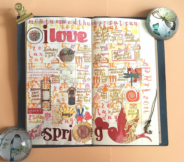
Monthly Planning MTN: April 2016 overview

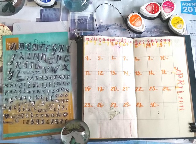
Before May is nearly over, I should share the overview on April. I honestly did not have much inspiration for this month. To give myself a little push, I decided that I should use limited colors and tools to see what I can create. When I saw this 'handlettering script alphabet' rubber stamp set from Eline's stamp line at pipoos, I knew I had to use it for this month's lay out (yes so I also bought a new supply for this month's lay out to give that "extra" nudge, sometimes you just have to bribe yourself :p).

Midori update april 2016
The stamp set includes number and extra vowels in different shapes, which is not only handy but fun in use. The color scheme I used is yellow to orange (and blood orange/red), due to the Kingsday celebration that took place in this month (orange being the national color). I used the memento drops stamp pad colors you see on the top right. I stamped "april 2016" with a combination of these colors. I really like the look of the numbers on this page and I will definitely use them more in my MTN planning.

Midori update april 2016

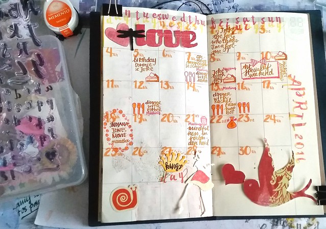
Seeing that I do keep track of my weekly activities in my pocket midori, I started with the most memorable moments of the month: the Art Specially weekend, meeting up with Rachel, Travis and their little baby Kenneth from swapbot, the Indiana Jones movie marathon and the kingsday celebration. noted the few birthday's this month, all falling in one week (= a lot of pie in one week!), my mindfulness monthly group meditation and of course PAY DAY( = got myself the case of tombows! I so love that little money bag stamp from Sakuralala's Daily stamp set!)  
So you know I like to hoard boxes with stuff. And so I have a box with random memories paper cut slices and other received cut out items which I decided to break open to add some to this page. I wanted to keep it color coded and spring themed and played with composition a bit here.

Midori update april 2016
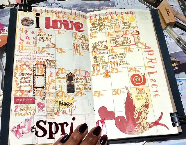
So after deciding what items to use, I started filling up the rest of the month adding more tidbits here and there. The movie strip was an excellent find for the movie marathon! Then I totally forgot I didn't add Meesha's 2nd birthday to my overview the first time!! Bad cat mom, tsk, tsk! So that was fixed (even got out my dymo labler for that one and then promptly gave Meesha a treat because I forgot her... shows how new I am with this whole cat mom thing!)

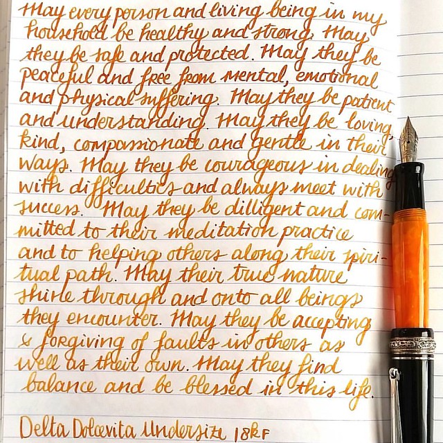
I thought the page needed the word "spring" and I found some metallic red letters I had hoarded in another box and thought that would make a great addition. By the way the fountain pen and ink I used, was only one this time, my Delta Dolcevita undersize with a custom orange mix. It's too pretty not so show that combination, so here it is:

Goodmoring! Another day, another #lovingkindness #writtenmeditation page in my #mindfulness #journal. Tools of choice: FP: Delta Dolcevita Undersize Ink: custom "autumn oak light" mix Paper: clairefontaine - #journaling #mindfulwriting #mettameditation #f
It's a bit Diamine autumn oak-y, but not quite. It's a custom mix because I had little bit of Diamine blaze orange in there, then added a few drops of Pelikan brown, then a drop of Diamine Sunshine yellow and it came out looking like this! I quite love it and hope I can recreate it again!

Midori update april 2016
And this is what the finished page looks like. I'm amazed how it turned out esp. since I had like zero inspiration when I started off. I kept true to the color scheme I set out to use and it gave the page a nice balance. It's really fun to see the months round up in colorful and illustrative form. Sometimes you just have to give yourself a little push to get that creative energy flowing and doing these pages remind me of that. Now I'm actually looking forward to do May's round up :)

Thank you for stopping by and have a wonderful weekend!

namasté

2016/05/19

Kennis is verlichting - Knowledge is enlightenment

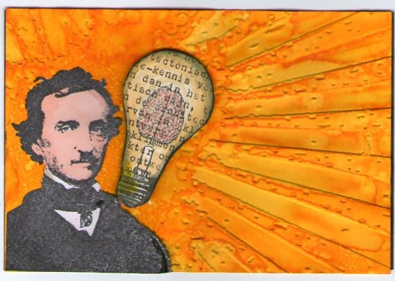
Sometimes you have this idea in your head and won't rest until you got it out of your system. Tonight I was inspired to make another entry for De Stempel Winkel's Challenge that ends tomorrow, Challenge 8 sunshine yellow.

kennis is verlichting

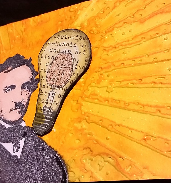
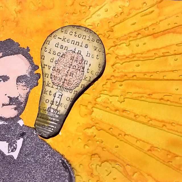
I used Diamine Sunshine yellow mixed with gold perfect pearl  powders on maruman watercolor paper. Embossed it with Tim Holtz Grunge rays with my cuttle bug. Then added more water to the embossed rays by using a water brush. The Edgar Allen Poe stamp and Light bulb brain stamp are from the stempel winkel. I stamped EAP on white sticker paper, colored in with promarkers, cut out & adhered to the piece. Then I stamped the light bulb on vintage typewritten text paper, colored it with tombows,  stuck it on a sturdy background, cut outand adhered on the piece with 3d foam stickers. The light bulb piece had "kennis" written on it, which means knowledge in English. Hence the title, which is fitting I think :)

Some detail shots :
Kennis is verlichting

Kennis is verlichting

Kennis is verlichting

The light doesn't show the shimmer, but it glitters quite nicely in daylight.

Will take a better picture when i can but for now, I'm glad I got this out of my head and on to paper :)

I'm also entering this for the Craft Stamper's 'Anything Goes' May Challenge 

Have a great day and thanks for stopping by!

namasté

2016/05/18

Pens and Ink: Omas Lucens with Omas Sepia

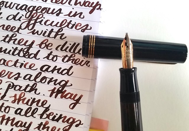
Returning to an Omas pair up this week.  This pen was one of my purchases at the Tilburg Penshow last year. The pen is a vintage Omas Lucens and has an amazing stub nib on it. Even though it did cost me a pretty penny, it simply had to go home with me. 

Omas lucens and Omas sepia
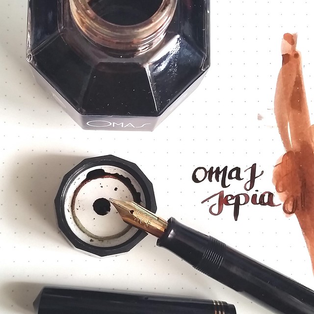
I paired it with Omas Sepia, a gorgeous vintage looking brown with a lot of character, just what this pens needs! First some more info on this pen.

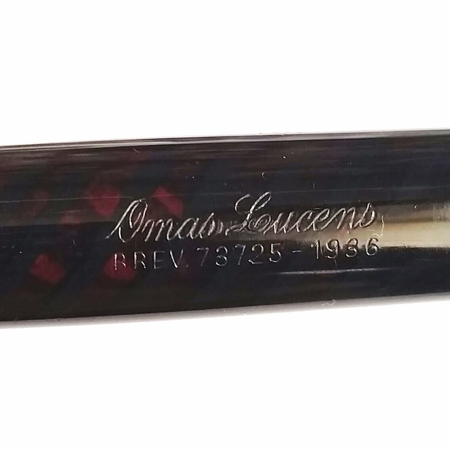
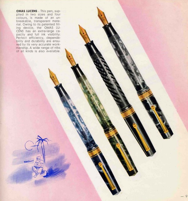
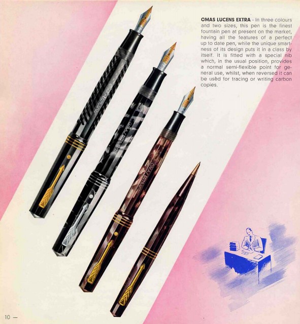
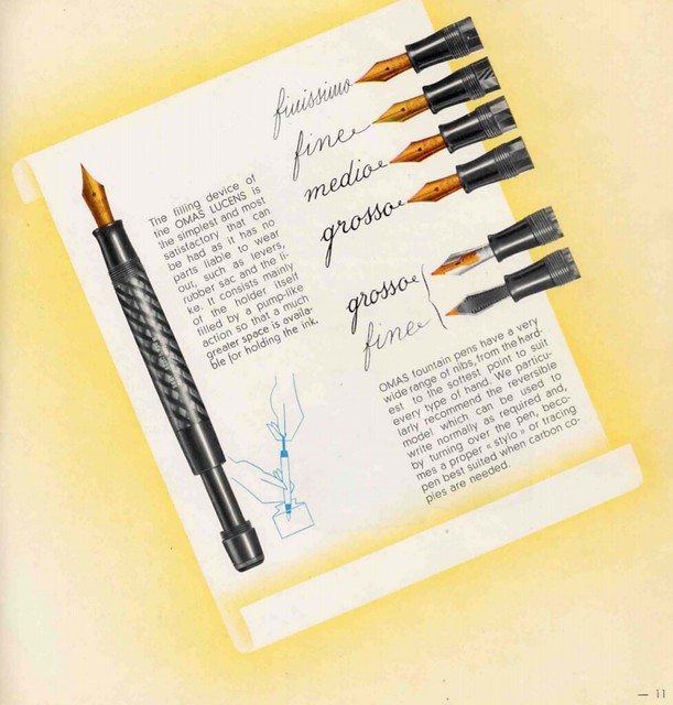
The pen has a beautiful black and amber transparent body and the engraving for such an old pen is pretty crisp on it. I found a vintage Omas booklet where these pens were described and I'll share the pages here.

Omas lucens info
The Omas Lucens has a cylindrical shape and the Omas Lucens Extra has facets as you can see below. My pen doesn't have the art deco ring band on the cap so it means it's from a later production.
Omas lucens info
The arrow clip sure does look a lot like a parker pen, doesn't it? The nib also has an arrow on it, but I can tell you that these Omas nibs are really not comparable to the parker ones!
Omas lucens info
There was a wide assortment of nibs on the Omas Lucens fountain pens. You can say the nib I have on mine is "extra Grosso" seeing the line variation it can produce, it's definitely larger than the width shown here. It's a vacuum filler pen, so it does take a bit of fiddling to get the pen working properly. But when it does, oh such lovely writing!

Omas lucens and Omas sepia
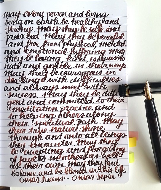
The pens surely does have some start up issues, but I got it fully working and wrote a page in my loving kindness metta meditation journal with it.

Omas lucens and Omas sepia
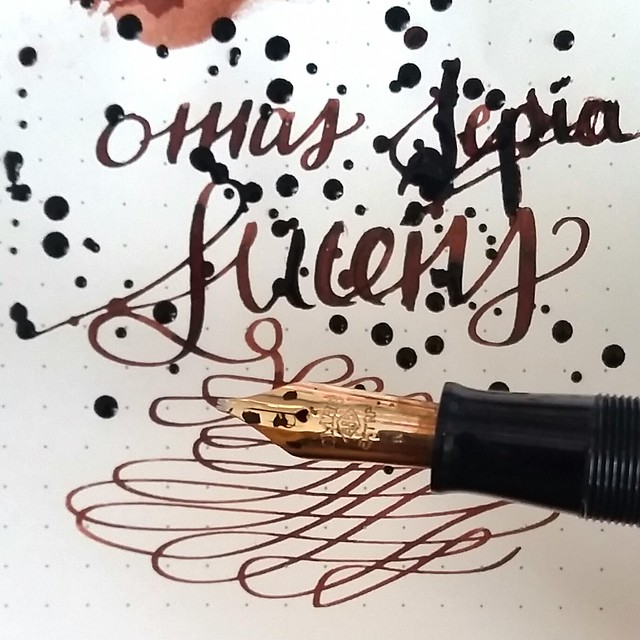
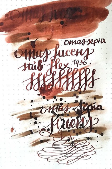
The wide stub nib shows a nice line variation and the shading of the ink pretty well. It's got a gorgeous coffee brown color to it. This pen lays down a lot of ink but Claire fontaine paper is a trooper, held up really well!

Omas lucens and Omas sepia
The nib is pretty difficult to whield I must say. Even though it flexes, perhaps it's not what you're supposed to with it. When I flex the nib, the ink flow just stops completely, but when you write normally, without too much pressure, the ink flow keeps up pretty nicely. Maybe I need to reset the feed (I heat set it a few times but still didn't work) but I am hesitant taking this pen apart seeing everything else works well. And vacuum fillers are fickle pens to fiddle around with!

About the ink, it's a beautiful vintage brown color with great depth. I'm glad I snagged a bottle of this at akkerman with Omas Turquoise when I had the chance!
Omas lucens and Omas sepia
I like to experiment with fountain pen inks in my art so it's fun to test and try different things with the ink. And with this ink I noticed that when you let it dry naturally it's dries up a reddish brown, as you see the ink smear above. When you apply a heat gun to the ink to dry it, it becomes a more burnt umber color, as you can on the writing below. That's pretty fun to see the different characteristics to an ink!

Omas lucens and Omas sepia
It's definitely a gorgeous pen and such a beautiful writer (when you can get it to work properly) but it's not a daily carry due to it's fickle filling system and start up problems. I think this is the first pen that I actually got because I wanted it in my collection and not necessarily to write with. But it's fun to take it out once in a while and take her out for a drive :) 

Hope you enjoyed this week's pairing. Next week an iconic Bauhaus style fountain pen and some great news on a returning ink company! 
Thanks for stopping by & have a great day!

namasté
2016/05/16

Mailart Monday - Fly and Float Intuitively

Mail Art 031-2016
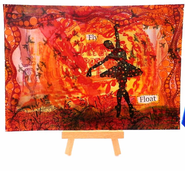
This mail art piece is made with a test page for stencils and rubber stamps. This is what you can call 'intuitive mail art'; just take something you have lying as a test piece and see where your mind takes you to make of it. 
I used this test page for a few stencilgirl stencils in my art journal, the Carmen's Veranda background flying birds for my Film Noir series, the Lost Coast Designs ATC Shrubbery background for the Day ATC and the bubbles border for the Circle ATC swap, but in the end I decided to use a different circle border instead. I began with stamping the border on all the sides to make a frame. Then I added color to the background, diluted Sailor Jentle Apricot fountainpen ink to the center circle and within the circle border (not diluted). Interesting fact, the ink mixed with part of the shrubbery stamp on the bottom and turned into a greenish color. Due to the border stamp it looks like a rolling hill. I stamped the shrubbery piece through out the bottom to accentuate the hilly look and then I thought "I have the perfect stamp to place on that hill!" The gorgeous Ballerina with stars silhouette stamp came to mind. I stamped her with Staz-on black, it looks like she is floating on the hill. The awesome new Miscl. word set from LCD actually contain the words "fly"and "float" - I stamped the large words piece on tracing paper, ripped out these words, adhered it, colored the edges with the apricot color and doodles a border around it with a black steadtler fineliner and called this piece done :) I really love the airy feel this piece has. And this was definitely fun to do!

By the way, if you are in the EU, the LCD and CV stamps are available through Inkadinkadutchies. Just send them a note through the contact page if they are not listed on the website.

Thanks for stopping by and have a great day :)

namasté

2016/05/15

Paper goods: Papelote Notebook Cover & Clairefointaine 1951 vintage notebook

It's wonderful "journaling on the beach" weather! Papelote notebook cover from @bureaudirect is super handy!  #bureaudirect #stationeryaddict #stationerywednesday #journaling #journalonthego #papelote #notebookcover #brushpens #artjournal #lovingkindness
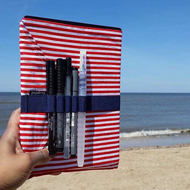
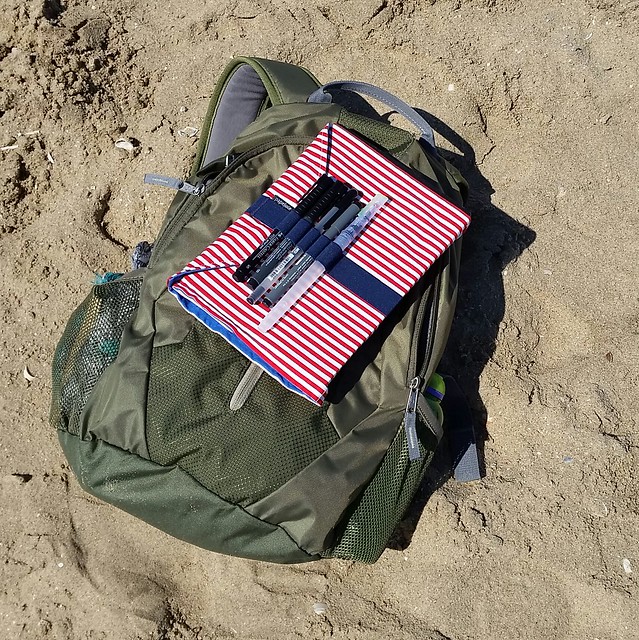
It was a beautiful day out and we decided to make good use of it and go to the beach. The perfect opportunity to test out the great Papelote A5 Notebook Cover outdoors! This notebook cover, together with the Clairefontaine 1951 retro cloth bound notebook was so kindly sent to me by Mishka from Bureau Direct for review purposes! Thank you so much Mishka!!

Journaling on the go

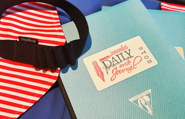
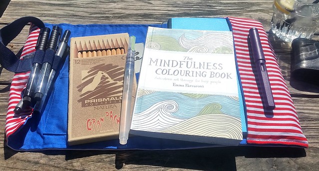
The papelote notebook cover is made with soft cotton cloth and comes in various designs. I was sent the red and white striped with blue inseam cover. A lovely combination! The cover has an elastic strap attached to it, which can hold 5 writing utensils. It comes with a pencil to get you started. You can see the array of items I've chosen to carry with it; a few fine Steadtler fine liners, a faber castell brush marker, sakura gelly roll pen and a water brush pen. The size I have here is the A5 size, which can fit any A5 size notebooks like the Leuchtturm 1917 and Rhodia notebooks. I chose the Clairefontaine 1951 vintage style notebooks, because of the fact it has fountain pen friendly paper and well just look at it.

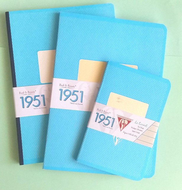
Clairefontaine retro 1951 notebooks
It's pretty and it's turquoise! They come in 3 different sizes, the pocket sizeA5 exercise and A5 clothbound books. I got to test them all and they fit in very nicely in the notebook cover.  

Starting off the day with a little writing in my journal. Papelote notebook cover and claire fontaine retro notebooks from @bureaudirect #dailywriting #journal #papelote #clairefontaine #bureaudirect #writing #mindfulwriting #gratitutejournal #stationerya
 Also I used some fun journal rubber stamps to categorize my notebooks :) 

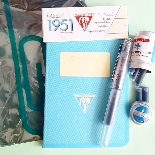
A fun turquoise set: clairefontaine vintage 1951 pocket book, J. Herbin rollerball with Blue Pervence ink cartridges. Thanks @bureaudirect @mishka5050 😊
Fun fact, Bureau Direct also offers the pocket books in a fun compilation with the J. Herbin rollerball pen and ink cartridges. The turquoise set comes with J. Herbin Bleu Pervence turquoise ink cartridges. They also have the bottled ink here. A scrumptious set for a turquoise fanatic like me :D

Anyhow, back to the notebook cover! You can carry a lot of tools inside the cover besides just the notebook due to the flexibility of the soft cotton cloth cover!

Journaling on the go
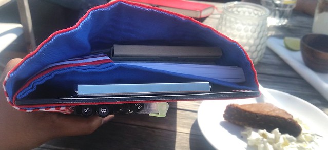
Look at that! Doesn't that look scrumptious?? Yes, the brownie was really yummy as well ;) So what did I take with me in my notebook cover? Take a look below:

Journaling on the go
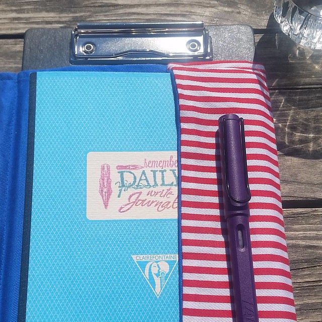
I tucked in a pack of water color pencils, a pocket size coloring book, the Lamy Safari Dark Lilac (see my pens and ink post about it here), a pocket sketchbook and...

Did you know you can also tuck in an A5 clipholder in the back of the papelote notebook cover?! It gives more "body" to the cover and you can just sit anywhere and write :) you can get all the items pictured at @bureaudirect for your own "on the go" journ
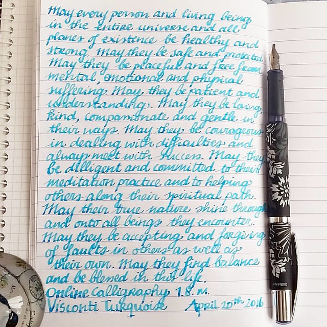
An A5 Clipboard! The cover has a seem opening on the back where you can tuck this baby in! I found this discovery brilliant as you can add sturdiness to the cover which allows you to sit down anywhere and write, draw, color or whatever on the go! I already had this one, but Bureau Direct are selling these clipboards by Penco as well. So what do I use my clairefontaine journal for? I use it as my Daily Gratitude and Loving Kindness journal. You have seen shots of the pages in my Pens and Ink post, surely. Every morning (or at least I try to) I write down the loving kindness meditation to set the tone for Compassion for the day. I will write another post about this type of journaling at a later point, but let me show you a page as a reminder.

Starting off the morning with some #lovingkindness #mettameditation #writtenmeditation Tools of choice: FP: Online Calligraphy 1.8m Ink: visconti turquoise cartridge Paper: Clairefontaine - #Fpgeeks #FPN #fountainpennetwork #calligraphy #shittycalligraphy
As I said before, the paper in clairefontaine books hold fountain pen inks really well. It's definitely one of my preferred notebooks for journalling as I love the line spacing (7mm) for my handwriting and the smoothness of the paper lets the nibs just glide over the paper. 

In conclusion: The combination of the Papelote Notebook Cover with these Clairefontaine 1951 notebooks is a wonderful thing! I thoroughly enjoyed using cover. A major plus point being the flexibility of it. Also a great thing about the fact that it's a cloth cover is that you can wash them quite easily if you spill any (non permanent) ink on it! The straps are mighty handy too! It works best if you have something sturdy in the cover like a clipboard or a hard cover notebook, though. If you are looking for only the notebook straps, Papelote also makes them separately which Bureau Direct also sells. Those work best on hard cover notebooks. 

Thanks again Mishka/ Bureau Direct, I've really improved on my daily writing sessions by having such a wonderful set up for it :) By the way, if you're looking into journalling yourself, and looking for something that might work for you, why don't you check out Stationery Wednesday as this month's spotlight falls on  the Bullet Journal. And while you're there, don't forget to subscribe to the newsletter if you haven't already. Next to fun news, specials and competitions, it also contains a weekly discount code for 10% off your purchase at Bureau Direct shop! That's not something you'd want to miss out on!

Hopefully this review was useful to you and inspired you to go out and journal in the wide open :) 
Thanks for stopping by & have a great sunday!

namasté
(disclaimer: I got these items free of charge for review purposes and was not monetarily compensated. All opinions stated here are my own and there are no affiliate links.) 

2016/05/13

Mini Art Journal - A new way of seeing things

Eyedrops ATC

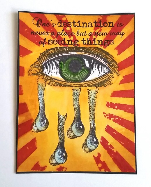
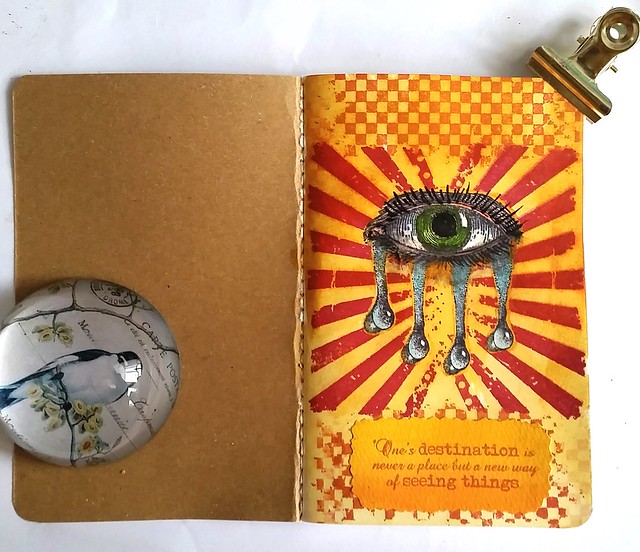
This is an ATC I made a while ago when I wanted to test the drop/tear stamp from Designs by Ryn (from water effects sheet) in combination with an eye stamp (by stampabilities). The other stamps are from Tim Holtz Grunge rays and the travel quote stamp from Technique Tuesday. I thought it made a striking card esp. with the bold colors and the rays coming from the eye. I was super pleased with the outcome, even if it was a first try. So I set it aside on my desk and moved on to other things and then the most annoying thing happened... When I wanted to write down the materials I used for this card and I couldn't find it anymore! I went through my desk and papers over a bunch of different times and could not find it anywhere! What a bummer!! But thankfully I still have the picture of it. Then I thought, wouldn't it be great to have a journal where I could test out my ATC format idea's on without risk of loosing them again? And so, the mini Art Journal was born!

Eyedrops in art journal
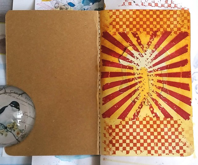
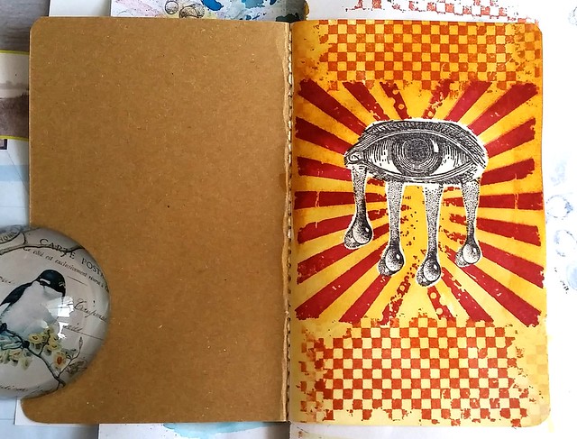
I have this moleskine sized journal with sturdy watercolor pages in them which I thought would be great for this project. It's bigger than the ATC format of course, but still small enough for projects on that scale. I stamped the eye and drops first with memento Black and made a mask for them. Stamped the Tim holz Grunge rays with Staz on Black Cherry and the checked stamp with Staz-on Saddle Brown. The background color is Distress stains Wild Honey, diluted with water and adhered with a brush, creating a gradient from top to bottom.

Eyedrops in art journal

Then I took off the mask to work on the eye & drops. As you can see I placed all the drops closer to the eye. It already has a striking result like this due to the bold background! As you can see the mask was not cut tightly around the image (I wanted to avoid bleed through in the image by color seeping in though the sides) but you can easily fix that. I used Tombow light ocher and a water brush to blend the colors in. And then I I got some more Tombow dual brush pens to color and accentuate the eye and drops.

Eyedrops in art journal

And this is the end result. I added more lashes and gave it a bit of 'smudged eyeliner" look. I had found a left over piece of water colored paper and stamped the quote on it with Staz-on Pumpkin. I just love these drop stamps from Designs by Ryn! They are so realistic and very easy to place. Not sure how I feel about starting yet another ART journal though, but I like that I have a place to collect my small scale ideas in.
Hopefully at some point I'll find the original ATC again... Or I'll just make others, now that I have the visual ideas in the journal ;) 

Have you ever lost something you created? 
I think it means that I need to do a bit of spring cleaning on my desk, haha!

Also with this post I am entering the fortnight challenge at De Stempelwinkel's challenge blog for challenge 8 'Sunshine Yellow' - wish me luck :) 

Thanks for stopping by!
Have a creative weekend.

namasté