Showing posts with label akkerman. Show all posts

2017/01/05

Fountain Pen People know why

Akkerman Den Haag

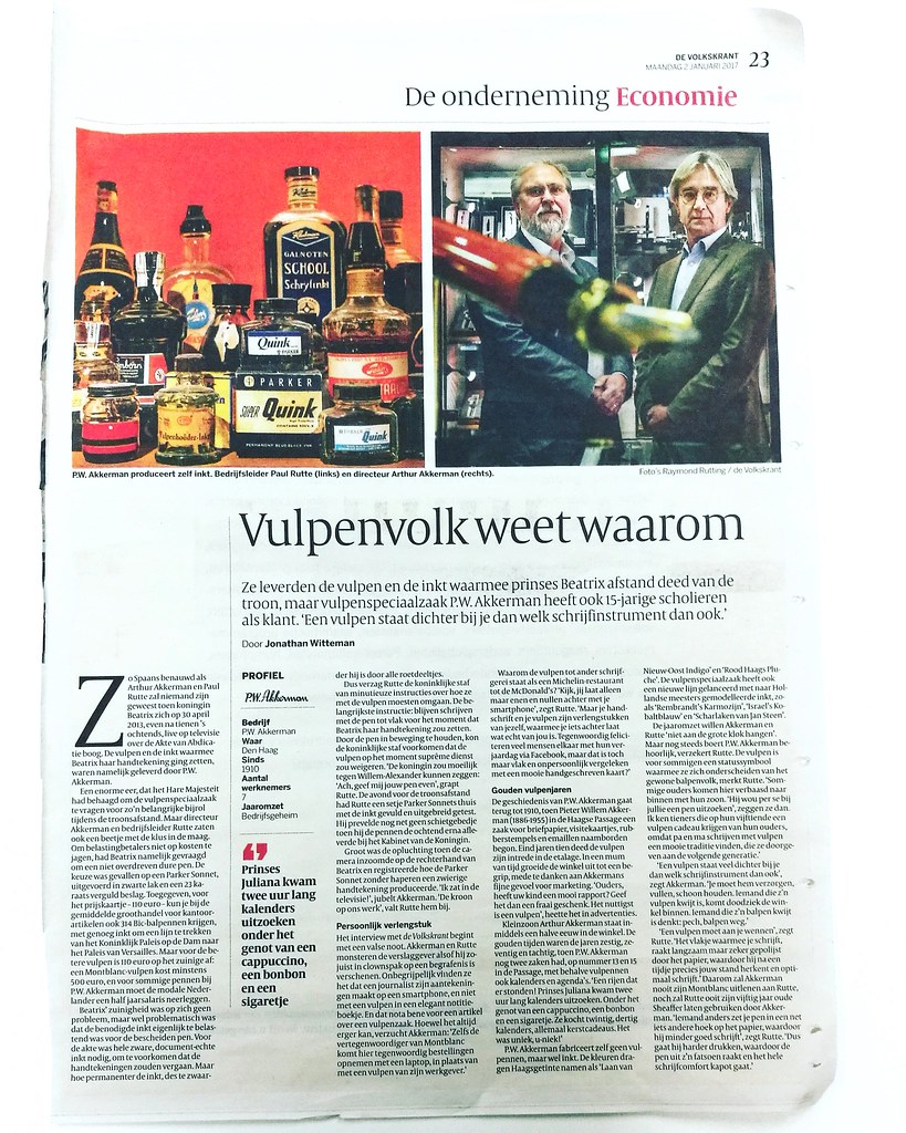
When returning to work this week, after a great week off relaxing, cleaning up my art room and being creative, I found this interesting article  on my desk placed by one of my colleagues. It's a profile piece about P.W. Akkerman in the the Hague and I thought I would share it with you here. The title of this piece struck me because yes, only fountain pen people know why this is not only great to read in modern media but also important. The Millennial certainly set off this age to be almost completely digital and with the news of the cursive writing method not being thought anymore in schools, it's esp. important to find an instrument to help you keep writing daily, analog style. For me that instrument is definitely a fountain pen. Seeing this article is written in Dutch I have translated it to English for my fellow fountain pen enthusiasts worldwide. Enjoy!

Translation of the ARTICLE in English

They supplied the fountain pen and ink with which Princess Beatrix abdicated the throne, but fountain pen specialist P.W. Akkerman has 15-year-old students as customers. "A fountain pen is closer to you than any other writing instrument whatsoever."

As “Spaans Benauwd”*  as Arthur Akkerman and Paul Rutte no one will have ever been, when Queen Beatrix on April 30, 2013, just after ten o'clock in the morning, live on television on the Act of Abdication arc. Fountain pen and ink with which Beatrix was putting her signature, were supplied by P. W. Akkerman.

The interview with the Volkskrant starts with a false note. Akkerman and Rutte jabbed the reporter as if he has just showed up in clown suit at a funeral. They find it incomprehensible that a journalist makes his notes on a smartphone, and not with a fountain pen in an elegant notebook. And please note, it’s an article about a fountain pen store of all places. Although it can always get worse, sighs Akkerman: "Even the representative of Montblanc came here today take orders with a laptop instead of a fountain pen from his employer. '

Why the fountain pen grades to other writing instruments as a Michelin restaurant to McDonald's? "Look, you leave only ones and zeros behind with your smartphone," said Rutte. "But your handwriting and your fountain pen are extensions of yourself that you leave something behind what is really yours. Nowadays many people are congratulating each other with their birthday on Facebook, but isn’t that's just flat and impersonal compared with a nice handwritten card? "

The history of P. W. Akkerman goes back to 1910, when Pieter Willem Akkerman (1886-1955) in the Hague Passage began an business for letterheads, business cards, rubber stamps and enamel nameplates. In the late 1910’s the fountain pen was introduced in the window. In no time, the shop grew into a concept, partly due to Akkerman’s  fine sense of marketing. "Parents, your child has a good report card? Give them a nice gift. The most useful is a fountain pen, " was it called in advertisements.

Grandson Arthur Akkerman is now half a century in the store. The golden age was the sixties, seventies and eighties, when P.W. Akkerman had two cases, at number 13 and 15 in the Passage, with not only fountain pens also calendars and diaries. "A rows that were! Princess Juliana arrived two hours to figure out long calendars. While enjoying a cappuccino, chocolate and a cigarette. She bought twenty or thirty calendar, all Christmas gifts. It was unique, U-NIQUE! "

P. W. Akkerman doesn’t manufacture their own pens, but they do ink. The colors carry Hague Tinted names like 'Laan van Nieuw-Oost Indigo' en 'Rood Haags Pluche'. The fountain pen specialist has also launched a new line to the Dutch masters modeled ink, such as 'Rembrandt's Karmozijn', 'Israel's Kobaltblauw' en 'Scharlaken van Jan Steen'.

About the annual revenue  Akkerman and Rutte are not really forthcoming. " But still P.W. Akkerman doesn’t do too badly, Rutte assures. The fountain pen is for some a status symbol to distinguish them from ordinary ballpoint people, Rutte noted. "Some parents come here, amazed, inside with their son. "He insisted to look for a pen here," they say. I know teenagers on their fifteenth receive a fountain pen gift from their parents because mom and dad were writing with a fountain pen themselves. It’s a beautiful tradition, which they pass on to the next generation. "

"A fountain pen is much closer to you than any other writing instrument whatsoever," says Akkerman. "You must take care of it, filling, cleaning. Someone who has lost his fountain pen, comes franticly ill into the shop. Someone who has lost his ballpoint thinks bad luck, ballpoint gone, no big deal.

"(Writing with) a fountain pen is something you need to get used to you," said Rutte. "The tip  you write with, is slowly but surely being polished by the paper, which then molds precisely to your writing angle after a while and writes best (for you)." Therefore Akkerman will never lend his Montblanc to Rutte, nor will Akkerman ever make use fifty year old Sheaffer from Rutte. "If someone else puts your pen in a slightly different angle on the paper, it can ruin your pen," said Rutte. "So if the person is going to press harder, causing the nib to change it’s angle, the whole writing comfort breaks."

* Dutch Idiom Spaans Benauwd (Become Spanish breathless)
The idiom refers to a state of fear or anxiety. Associating this with Spain takes us back to the times when Spain was the oppressor, during and prior to the Eighty Years War. (source) 


Hope you enjoyed reading the article and it has inspired you to pick up a fountain pen and write :)

Thanks for stopping by and have a great day!


2016/07/06

Pens and Ink: It's clearly TWSBI and Teal today!

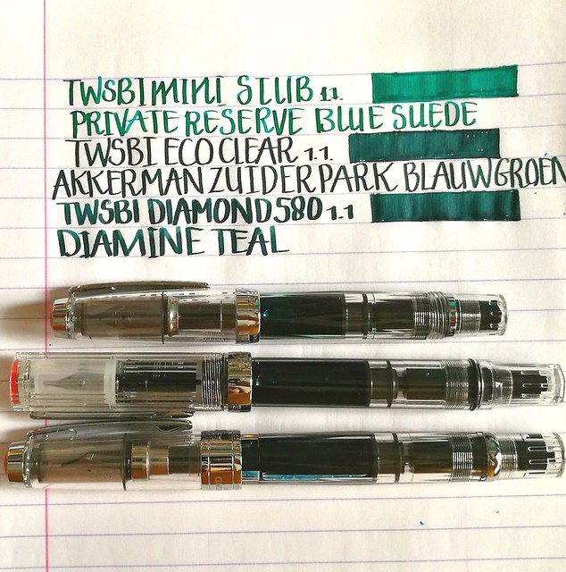
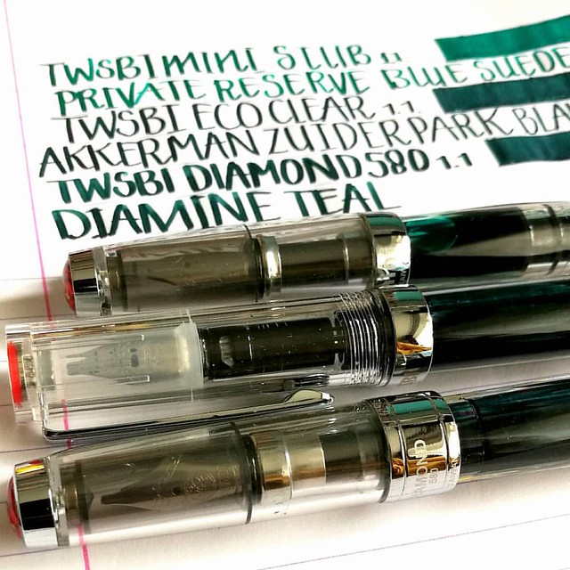
Last week in the Hague I stopped at one of my fave stores again and you don't have to be a genius to guess that it's Akkerman! I was finally going to get my long awaited TWSBI ECO clear model with the 1.1 stub nib and it did not disappoint! I definitely love the look and feel to it. And it looks GREAT in between my Diamond 580 and Mini demonstrator models as well. I just love seeing ink slosh in clear pens, it's so pretty!
twsbi 3 of a kind
I'm really happy I decided to keep my mini because it does make a pretty collection this way :) The kind lady at the store asked me if I wanted my Eco filled with ink (from the Akkerman line) and I took the opportunity to take one I haven't gotten round to testing yet; Zuiderpark Blauw-Groen. It's a gorgeous teal color. I bought another bottle of Private Reserve Blue Suede (hey, it was on sale!) and filled my mini with it. It's a gorgeous blue green color (dead ringer for J. Herbin's Emerald of Chivor base color) but the focus of this post is going to between the ZBG and the ink I've chosen to fill my Diamond 580 with; Diamine Teal.

twsbi and teal
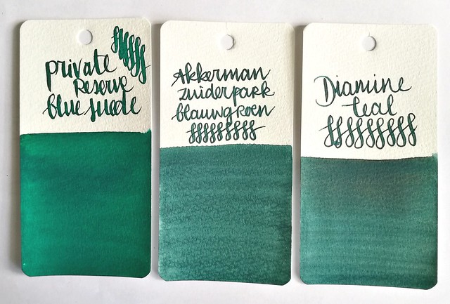
Ink swabs on maruman word card paper. From left to right: private reserve blue suede, Akkerman zuiderpark blauw-groen and Diamine teal.

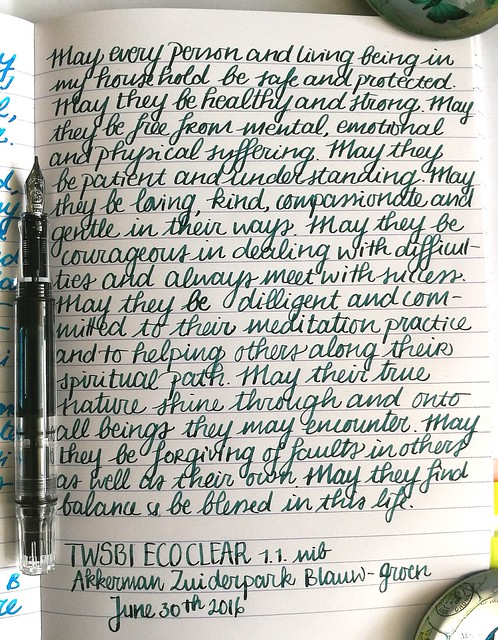
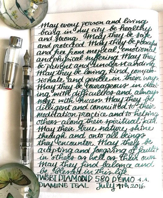
Right off the bat I thought the latter two inks look so much alike when I wrote with them and seeing the ink swabs side by side, well there is honestly not much difference at first glance! But there are a few subtle differences in writing though. A couple of example pages from my loving kindness written meditation journal.

twsbi and teal
TWSBI Eco with Akkerman Zuiderpark Blauw-Groen - a nice looking teal color. But the swab makes the ink look more interesting to me than the writing sample does. There is a bit of shading but not a lot. Also it writes a bit dry. Maybe I have to reset the nib and feed and give it a good cleaning, The lady did fill er 'up right out of the box...

twsbi and teal
TWSBI Diamond 580 with Diamine Teal - Found this ink flowing better also this ink is darker and has more shading. Granted it could be the nib that does make the difference. The 1.1 on the Diamond 580 is a number 6 vs. the number 5 on the ECO (and mini) has a broader width and writes a lot wetter.

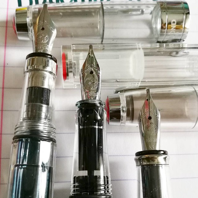
The twsbi stubbs are definitely among my fave writers. LtoR: Diamond 580, eco, mini with 1.1 stub nibs. #twsbi #fpgeeks #fpn #fountainpennetwork #fountainpen #stubnib #seriousnibbage #demonstrator #nibshot @twsbi
Comparison shot of the 1.1 stub nibs on the 3 TWSBI's. The nib on the ECOand Mini are the same. The section of the ECO is smaller than the other two pens which is just a little on the small side for me, but not uncomfortable.

It's clearly TWSBI for this friday's #fountainpenfriday @appelboompennen 😉 #twsbi #twsbieco #twsbi580 #twsbimini #demonstrator #fountainpen #fpgeeks #FPN #fountainpennetwork #stubnib #handwriting #penmanship #promotepenmanship #ilikebigstubs #battleo
The 1.1 nib definitely have differences among each other in writing. My fave writer of the 3 remains the Diamond 580, I just like the line width a little better. Also look at the shading in the Diamine Teal!

I am very pleased with the newest member in my TWSBI collection though I am still on the fence if I want a whole bottle of either ZBG or Diamine Teal. I'll need to write a bit more with them first to decide. See reviews from Ana's of The Well Appointed Desk on Diamine Teal and Akkerman ZBG for more info on the inks. Which of these would you prefer?

Thanks for stopping by and have a great day!

Namasté

2016/06/29

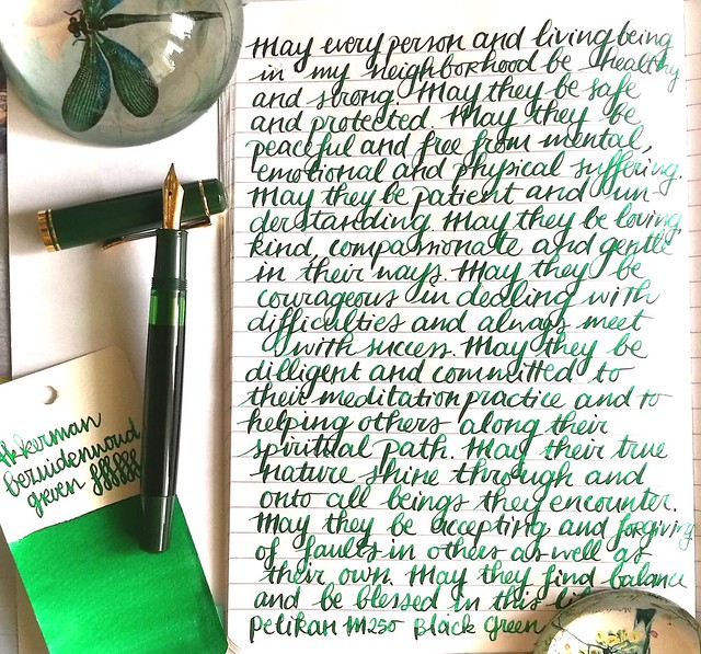
Pens and Ink: Pelikan M250 Black Dark Green with Akkerman Bezuiderwoud Groen

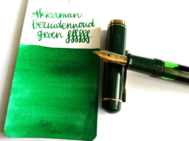
Last week on Pens and Ink I posted about my recent Pelikan M2xx series finds. This week I'm highlighting a pen I mentioned in that post, the Pelikan M250 Black Dark Green fountain pen. And I paired it with a nice green ink from Akkerman's The Hague ink line; Bezuiderwoud Groen.

pens and ink M250 green
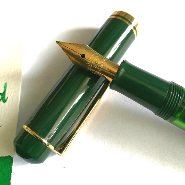
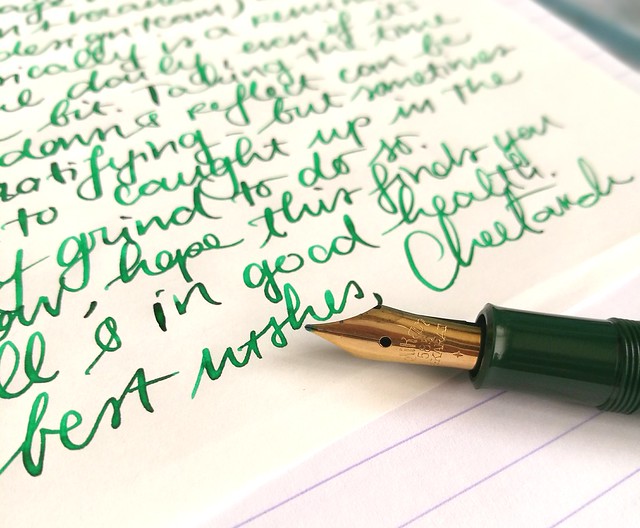
First let me start by telling you that the nib you see on the pen here is not the original nib. I replaced the original 14k gold M nib (which is the only difference between a Pelikan M200s and M250, the first has a steel nib and the latter a gold one) with an older nib from one of my vintage N400 Pelikans. Why? This nib just deserves to be in rotation more. I've seen David B. from Too Many Inks do this all the time with his Pelikans (Swap nibs between his pelikans) And I decided to give it a go myself. It did not disappoint :)

pens and ink M250 green
A closer shot of the vintage nib that came with my Pelikan N400 Tortoise, which I sadly can't properly use as the piston fill mechanism is broken. I love the engraving in the older nibs! The pen itself is one from before 1997 and there is a version from after 1997, which has a different cap and printed logo on it instead of engraved. More info on the difference between the M2xx's series, including this one you can find at The Pelikan's Perch and Reuttinger web site.

pens and ink M250 green
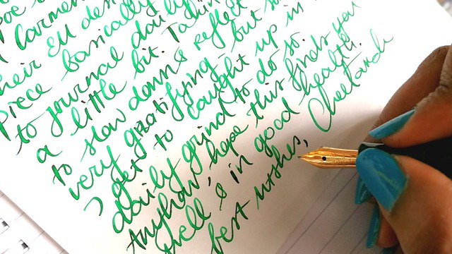
So I've chosen to pair the pen with an ink that would match the green cap and piston knob and since I decided to use more of my samples (and then decide if I want a full bottle of it ;) I went though my Akkerman samples and picked this one. I think if you translate "Bezuidenwoud Groen" from NL to ENG you would come up with "South Woodsy Green" ... Maybe? Just FYI, it's not a "real" word in Dutch either! Oh well, it doesn't matter, it definitely looks like a forest green to me! I think the nib also brings out great shading this ink has/ Another great green shading ink from their line is definitely the Groenmarkt Smaragd, which is more of a moss green. I own a bottle of that one, because it came with the pen I bought then. Even though I really like the color of this ink, I am not so sure I need this ink in a full bottle... yet.

writing letters
In other fun news: as you may know I've been a Swap-Bot Ambassador for a while now and recently I have started blogging for Swap-Bot Blog as well. Rachel, the owner of Swap-Bot, and I discussed it when she was visiting Amsterdam last April and we met up for dinner (together with her husband Travis and their wee one Kenneth). She is such a super fun person, kind, energetic (she runs marathons!) and creative. I'm happy to be able to contribute and collaborate with her on this project. The first blog post is already up and you guessed it, it's about writing with fountain pens! I also am hosting a swap "Fountain Pen Pal Summer 2016 Edition" on the 'bot to help more people just get out their fountain pens and write with them more. Hop on over to the swap page to see more info on the swap and the sign up dates. You have to be a member of Swap-Bot to participate though, if you're not a member yet, it's super easy, just make a profile and read these FAQ's to get you started. And perhaps I'll see your in the mail?

writing letters
Thanks for stopping by and have a great day.

namasté

2016/04/20

Pens and Ink: Omas AIV Liquid green with Akkerman Groenmarkt Smaragd

Time to wake up this sleeping beauty #omas #arteitaliana #vision #limitededition #fountainpen #fpgeeks #fountainpenporn #funtainpen
This is where I decided I wholeheartedly loved Omas - the first time I held the Omas Arte Italiana Vision in my hands.  The beautiful design of the pen in a gorgeous liquid green color = indeed ART. I imagine OZ having buildings with this material in the Emerald city. Or it being some kind of kryptonite ... it has that dangerous magnetic pull. At any rate I could not stop thinking about it and went back to Akkerman at the end of the day and got it home with me. 

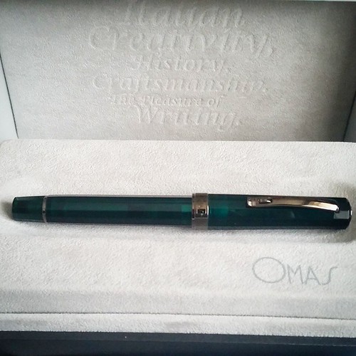
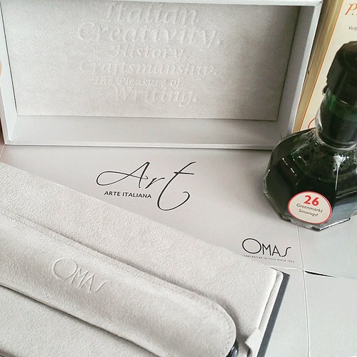
Really love the elegant packaging of #Omas #fountainpens And by the ink of choice you might have guessed which one of the two colors I went for... #fpgeeks #fountainpenporn #akkerman #arteitaliana #vision #limitededition #funtainpen #unboxing
I got a bottle of Akkerman Groenmarkt Smaragd with it, which compliments the pen perfectly.

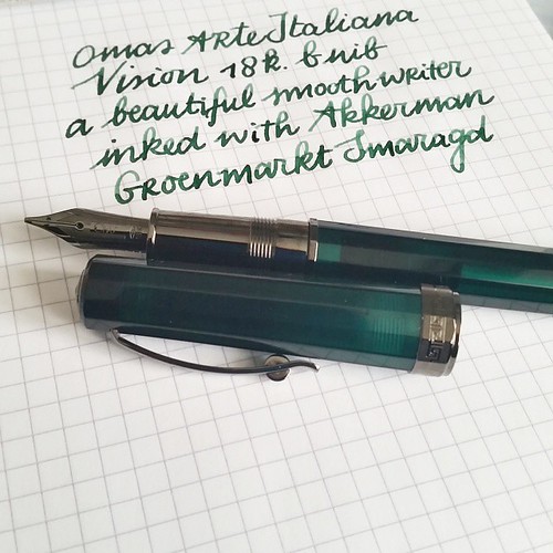
And this is how she writes. The B nib writes like it's slightly stubben and I love it! Also the shading of groenmarkt  smaragd ink is just lovely! #omas #arteitaliana #vision #akkerman #groenmarktsmaragd #fountainpenporn #fountainpenink #funtainpen #fpgee
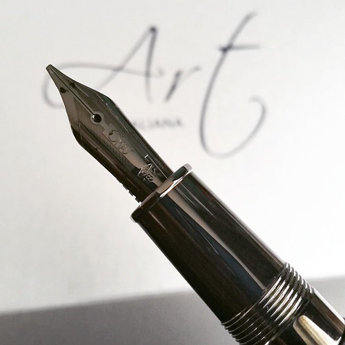
The nib is a B that writes more like an 0.8 stub. A very smooth and wet writer.

This pen is definitely a piece of art! #omas #arteitaliana #fountainpen #fountainpenporn #funtainpen #fpgeeks #stubnibsunday
Love the accents on the pen and grip section. Even though it's metal, it does not feel slippery at all in long writing sessions.

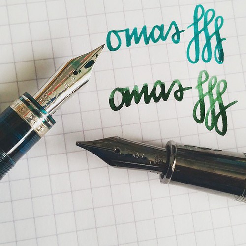
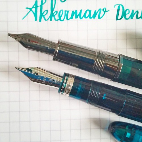
Nib width comparison extra flessible medium to 18k b - I dare not to flex the extra flessible too much because it's really, really soft. The 18b has a little spring to it. #omas #fountainpen #fpgeeks #ogivaalba #arteitaliana #vision #liquidgreen #akkerman
Section comparison to the #Omas #arteitaliana and #ogivaalba - I have to say the metal section looks stunning but the cotton resin section feels better in hand in a prolonged writing session. #fpgeeks #funtainpen #fountainpen #fountainpenporn #comparison
Comparing the Ogiva medium extra flessible with the B 18k nib and sections. Both really gorgeous pens with their own personalities.

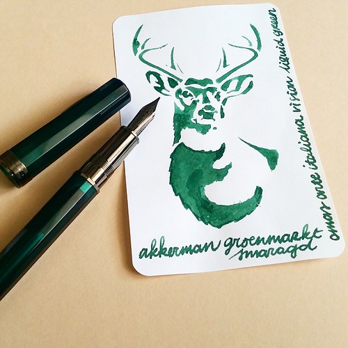
Suppose there is no surprise what my #mondaymatchup is for @gouletpens #mondaymatchupgiveaway this week 😉 Since it's the anniversary, I tried to do something special 😊 #stencildrawing #edroth #akkerman #groenmarktsmaragd #omas #arteitaliana #vi
Stencil doodles work brilliantly as well! By the way "smaragd" = Emerald in dutch & groenmarkt is an aria in The Hague. 

Next week a couple of vintage Omas pens.

Thanks for stopping by!

namasté