Showing posts with label swapbot ambassador. Show all posts

2017/05/22

MailArt Monday: Re-Purposed Postcards

A two-for-one on today's Mail Art Monday! I am sharing a couple of postcards I sent out for some swaps on Swap-bot.
handmade pc's
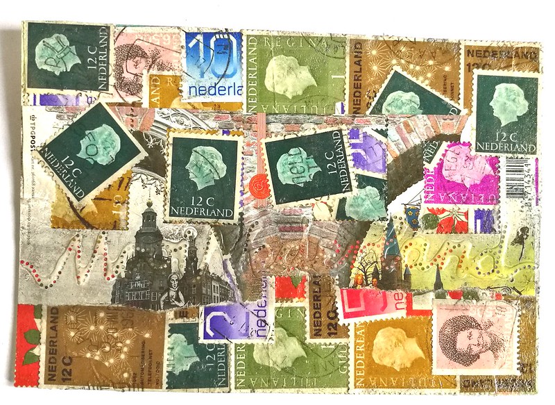
As many of you do, I am sure, I collect vintage postage stamps as well with the means to re-purpose them in my art work. This was made using ONLY postage stamps and postage "salvage" (the material around the postage sheets). This was made for a swap on Swap-Bot in which you were asked to use postage stamps only. These are all vintage postage stamps from the Netherlands. Definitely love the queen portrait stamps and managed to have a little flow/design going on as well.
handmade pc's
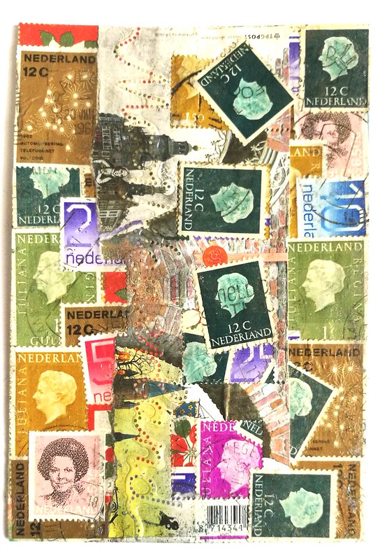
In the vertical view you can see the "movement" on the right side better.
handmade pc's
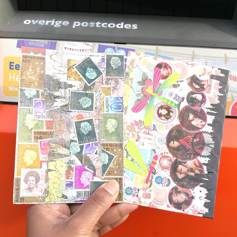
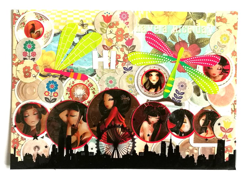
And here it is on its way to its destination. The card on the right is made with stickers alone. A closer look below:
handmade pc's
For this swap you were asked to use stickers only and I have made a circular theme using stickers from Flow Magazine and a few art stickers I had lying about. The bottom is a cityscape silhouette decorative tape which I thought tied the design together. 

It's always so fun to encounter swaps which inspire you to get out your stash you rarely use and play with them. Glad to say these arrived well and the recipients liked them.

Thank you for stopping by and have a wonderful day!


2017/05/09

ATC: Poppy Fields

poppy fields ATC

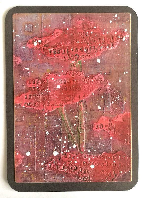
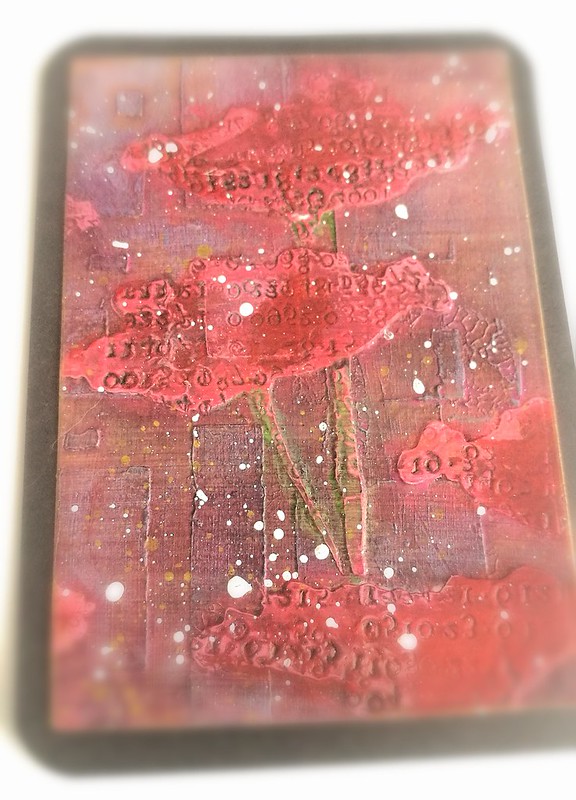
April showers and May brings flowers... at least that is the theory, because it still showers in this part of the world! Well, there are a lot of flower ATC's going on on Swap-Bot and this is the one I sent to my partner for a Mixed Media flower swap. I sorta cheated... or well, made creative use of what I had, because.... doesn't the above image look familiar to you?

poppy fields ATC

Maybe now it does... It's a piece from my processing poppies experiment I did a while back. A part of it became this journal page and I still had a piece left over. I ran in through my cuttle bug with an ATC die, some white splatters over it and matted on black card stock and it's done. Creating ATC's from left over Art Journal pages like that is great way to use up your left overs, isn't it?

I'd like to enter this ATC in the following challenges:

Creative Artiste Mixed Media Challenge #26 - Anything goes
Time out Challenge #82- Flowers with optional kissing technique
Mixed Media World #24 - Anything Mixed Media goes with optional watercolors
Simon Says Stamp Wednesday Challenge - Hint of Pink
Make My Monday #45 - May Flowers

Thanks for stopping by and have a wonderful day!

2017/03/27

MailART Monday: Do you Snail Whale?

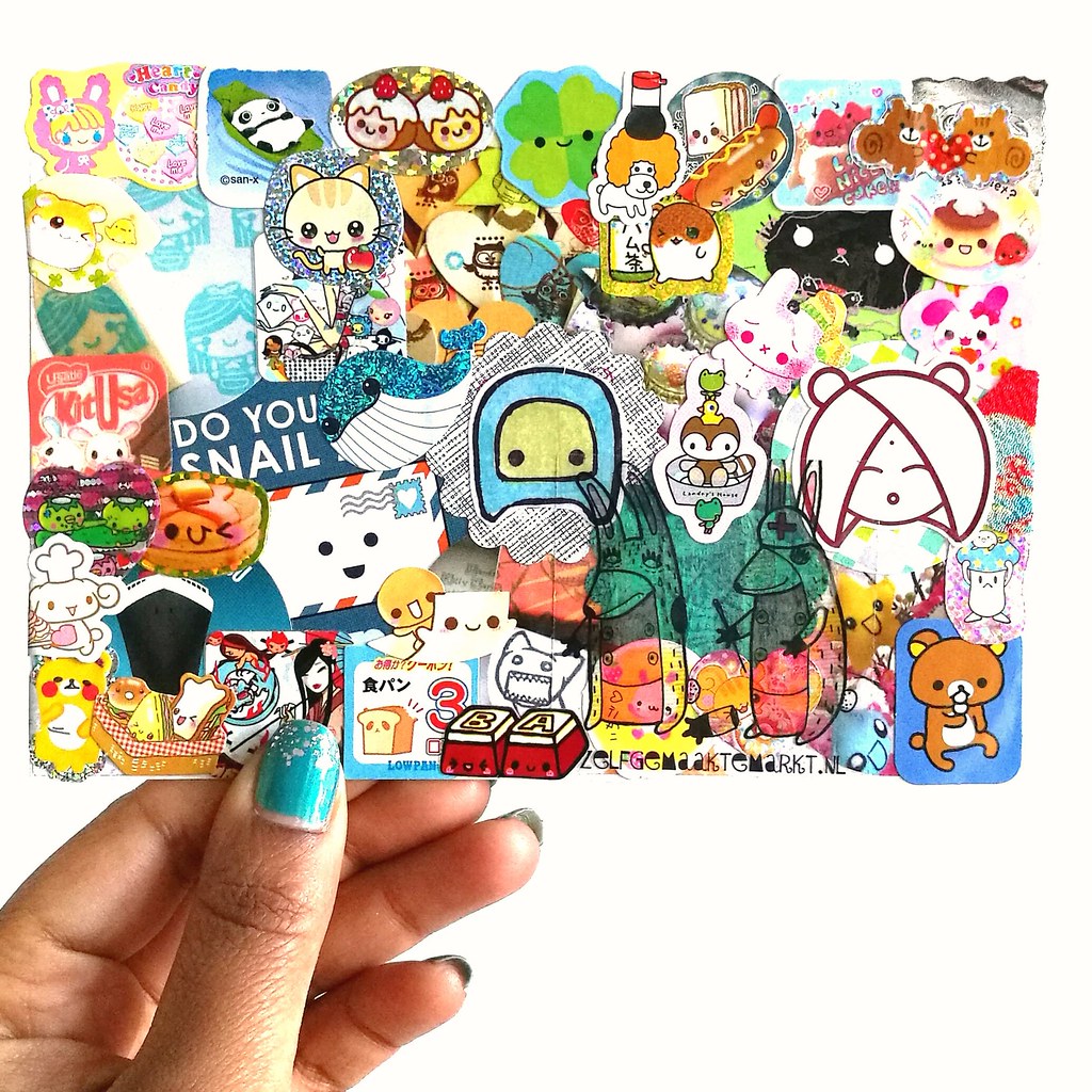
stickerslap collage for swapbot swap

Last month I started to join in some mail art swaps over at Swap-Bot again and found this wonderful swap called Sticker Shock! So I got out my tin of stickers and went to town! I can't tell you HOW MUCH FUN it was doing this :) I used to collect kawaii stickers and stationery and I still have a ton of them, so it was great to get all those little sticker flakes and put them to good use. There was some placement coordination, like the title which I hope you can spot ;)  And take a good look around, there is so much to see! From a kitty knitting a sock on a bunny's ear to an angrier kitty trying to chomp on chocolates and a lazy bear trying to get the happy pick nick sandwiches into his tummy. This is totally going on my "need to do that again!" list! And if you have been saving up stickers like I have, definitely give it a go!

Thanks for stopping by and have a wonderful day!

2016/09/19

Mailart Monday: Nature's Beauty

gelli plate printing session
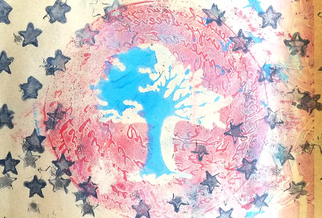
For a swap on Swap-Bot I got out my Gelli Plate and stencils to play around with. This swap hosted was by Gina Visione at The Print Shop group and called "Nature's Beauty".  The goal was to "Send a Gelli-printed, hand-stenciled (or nature-stenciled :D!), hand carved Rubber stamp or Linocut mail art postcard representing something beautiful in nature." 

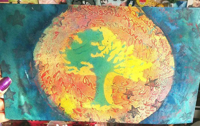
So I took one of my new nature themed stencils, Birds and tree by Clarity combined with encouraging scribbles from Stencilgirl Products and Stars from the 101 stencils by Ed Roth and made the above print with help of my Gelli plate. I printed it on vintage index paper which has a beige undertone and it's a great way to reuse some old papers I saved from the trash at work! It needed some more colors so I took out some fountain pen inks and added more color to the print.
TPS expressions of nature
I used some contrasting colors: yellow for the inner circle (Toucan Gold) and a teal/twilight color (Iroshizuku Tsuki-yo) for the outer edge of the print to give it a night sky feeling. I love how the tree just pops out from the print. I love how it turned out and am glad that my partner liked this print as well,

Looking forward to use more of my gelli printed pages in mail art and in my art journal :)

Thanks for stopping by and have a great day!
namasté

2016/08/15

Mailart Monday: Masterboard Giveaway reminder

A reminder that you can still enter to win one of the below Masterboard Mailart Inspiration cards in the mail. Just go to this blogpost, leave a comment and your name will be entered.

Something special for #mailartmonday today, doing a giveaway on my blog (link in profile) where you can receive this fun handmade mailart postcard in the mail. Just leave a comment on the blogpost and your name will be entered in the GAW. Open until aug 2
Edgar Allen Poe

Something special for #mailartmonday this week, doing a giveaway on my blog (link in profile) where you can receive this (or the Poe in previous post) fun handmade mailart postcard in the mail. Just leave a comment on the blogpost and your name will be en

Salvador Dali

Next Monday I will announce the winners :)

Thanks for stopping by and have a great day.

Namasté

2016/08/08

Mailart Monday: Masterboard Inspiration (+giveaway!)

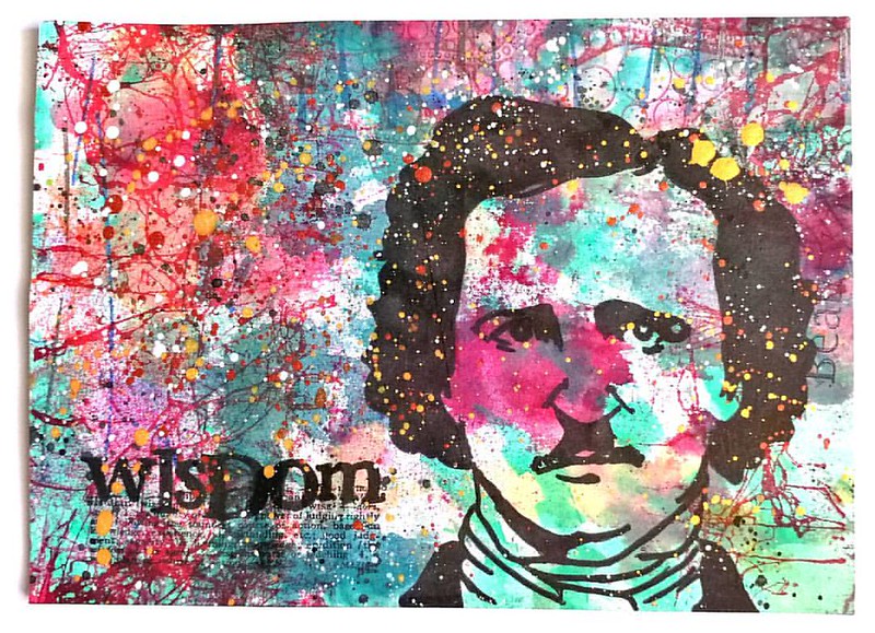
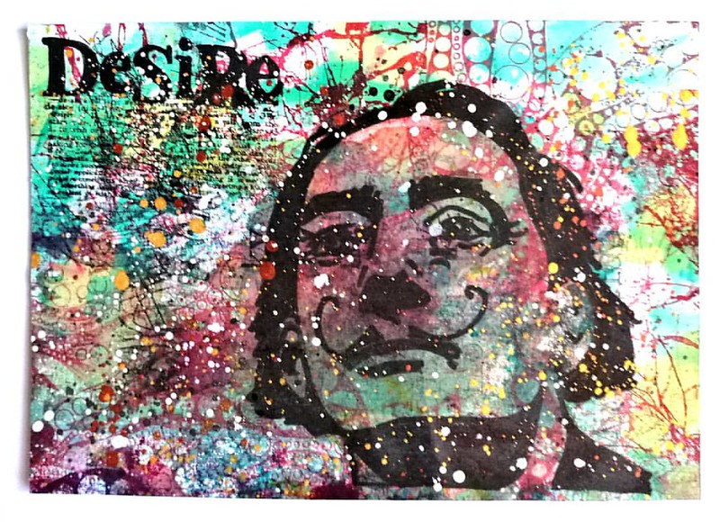
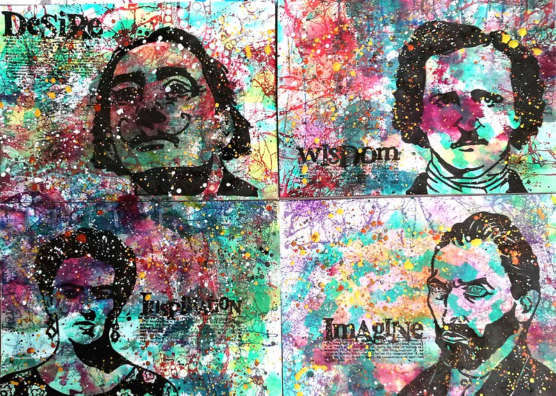
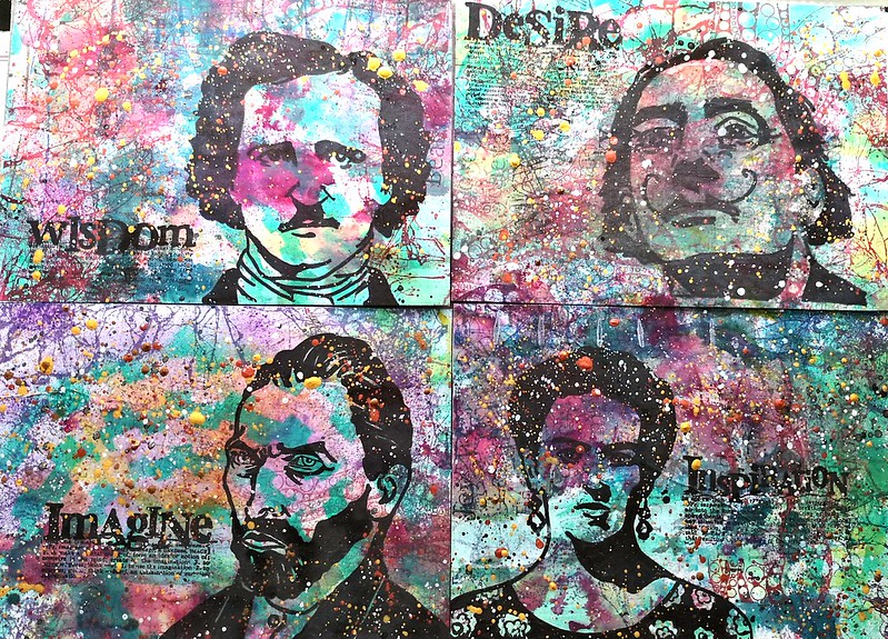
Last week I showed you a group shot of outgoing mail and I wanted to show you a closer look of the Masterboard Inspiration cards I made for this swap on swapbot.

inspiration cards mail art

First let me answer "what is a masterboard?" I think Ann in this blogpost on Wonderstange says it best "a masterboard is a great big multi-layered background that you cut up to make smaller pieces: postcards (4″x6″), ATCs (3.5″x2.5″), inchies (1″x1″), chunkies (4″x4″), and other forms of mailart with fun names." And that is exactly what I did when making the cards below.

inspiration cards mail art

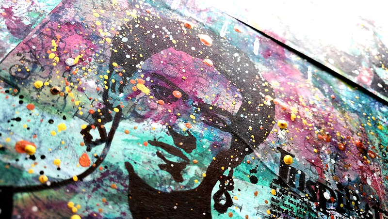
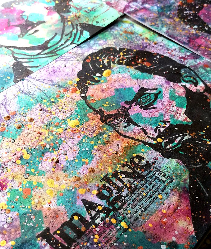
I took an A4 page which was already party covered in ink residue and stamped with large back ground stamps, layered with stencils and paint and then cut them up into 4 pieces. I chose to pair the portrait stamps from Carmen's Veranda with Lost Coast Designs dictionary words and create 4 inspiration mail art cards. I stamped them all with Staz-On black but it wasn't black enough for my liking, so I traced the images with a sharpie to make it more pronounced black.

inspiration cards mail art
In the end I also spattered some liquid acrylics in gold, bronze, silver metallic and white onto the cards to make it more interesting. What I love about masterboards is that you cam make a lot of cards in a small amount of time.

inspiration cards mail art

The bottom two already were mailed out for the swap, but the top two I still have available and I decided to do a fun giveaway for them. All you have to do is leave a comment on this post and I'll pick two entries and mail out one card to each. I will pick the winners on Monday 22nd so in 2 weeks from now. If you have a preference of Poe or Dali, let me know that in the comments to and I might just grant your request :) 

Hope this inspired you to create some master board mail art cards yourself.
Thanks for stopping by and have a great day.

namasté

2016/08/01

Mailart Monday: summer time mail

It's the heart of summer and things are slowing down everywhere. So will my mail output and updates on the blog. Usually we're in Sweden at this point, but this year we're actually staying in the country. We're going to spend more day trips to the beach and just enjoy some time off locally. Recommendation for art makers out there: if you haven't listened to these podcasts from the Art Supply Posse team, you really should subscribe! It's hosted by Ana from Wellappointeddesk and Heather Rivard. It's fun chatter about art supplies in general, how to use your own stash more and creating space for daily art making. Also be warned as they will enable you to try some more/other art supplies ;) As I have fallen for the latest episode Color me Pencil and got a bunch of Faber Castell Polychromos to play with. I'm looking forward to try these and some other new art supplies in my time off and tell you about them soon. But since it's mailart monday, let me show you what I recently sent out into the world via outbox shots.

Mail out from last week. #mailartmonday #mailart #mailartist #snailmaillove #snailmailrevolution #swap #swapbot #swapbotambassador #outbox #postbus #echtepost #echtepostiszoveelleuker #brievenbus #mixmediaart #mixedmedia #mixedmediaartist #artistsofinstag
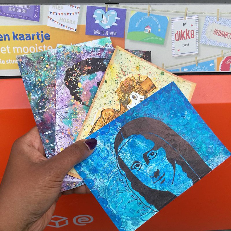
A shot of some hand made postcards I made for swap bot swaps: create a masterboard, put a foreign text on it and TPS mail art July. The latter I used some left over prints from my first gelli print session, stamped various circles rubber stamps in blue toned ink pads and the Mona Lisa Stamp is from Carmen's Veranda. I sent this piece for the foreign text swap and next time I'll show you how I made those masterboard cards.

Another transformation of Hera sent out for a @swapbotnews swap. #swaps #mailout #outbox #sent #mail #mailart #mailartist #snailmaillove #snailmailrevolution #echtepost #echtepostiszoveelleuker #rubberstampart #collage #transparencylayers #carabellestudio
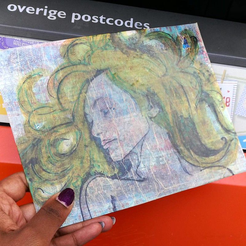
I'm still doing my hera studies and this piece was sent for the CC sender's choice july swap. The background was pieced together with left over papers and then I stamped some fun stamps over them. It was a base piece to layer hera whom was stamped on Canson tracing paper. She was then colored in with letraset promarkers. I wanted to try my new liquitex gloss varnish to adhere and seal the piece. It gave a crackle effect as you can see, but I quite like the result. So another transparency layer effect on my mail art :) I like doing these!

So as I said in the beginning, my updates will be less frequent in the month of august. 
Thanks for stopping by and hope you're all enjoying the summer as well :)

namasté

2016/07/25

Mailart Monday: Transferring and Layering

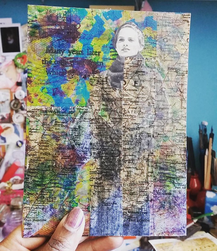
A few weeks ago I told you that I hardly ever used transparency layers on my mail art. Well I later realized that that is not exactly true. I have used a few transfer techniques in my mail art, like the packing or clear tape transfer technique. You can get some really fun and multi-layered effects when you use this technique in your (mail) art. An example below:

Experimenting with packing tape transfer today #mixedmediaartist #mixedmediaart #mixedmedia #mailartists #mailart #colorful #vintageimages #stencil #stencilgirlproducts #paperartsy #rubberstamps #paint #layers #swapbot

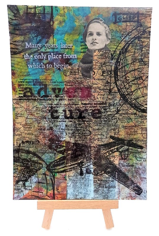
This piece is made on a background of laid paper (Crown Mill) and fountain pen inks drippings. Then layered with a stencil and blue-green paint. When that was all dried I took an image out of a vintage fashion magazine and adhered it. I always love the contrast of the grey-scale tones to the colorful background. The theme for this postcard was for the Handmade travel postcard at Creative Collage group on Swap-Bot so I wanted it to have more themes layers and I took a page from a vintage atlast and made the packing tape transfers. The packing tape layers are somewhat transparent so the background does shine through. Before I glued it all down with my trusty UHU gluestick, I sealed the background with some gel medium. I used a credit card type card to smoothen it all out on the page and let it dry before adding more to the card.

Mail Art 043-2016

I used a few rubber stamps in the travel theme from Tim Holtz and Paper Artsy Electica's and stamped it on with Staz-On Jet Black. The sentiment "many years later the only place from which to begin" is also stamped with Brilliance lavender ink. I love how all the layers came together and fit into the theme. Hope this inspired you to use some packing tape transfers in your mail art as well. 

Have a great day and thanks for stopping by!
namasté

2016/06/29

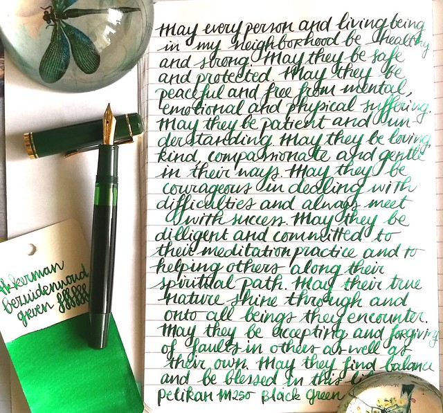
Pens and Ink: Pelikan M250 Black Dark Green with Akkerman Bezuiderwoud Groen

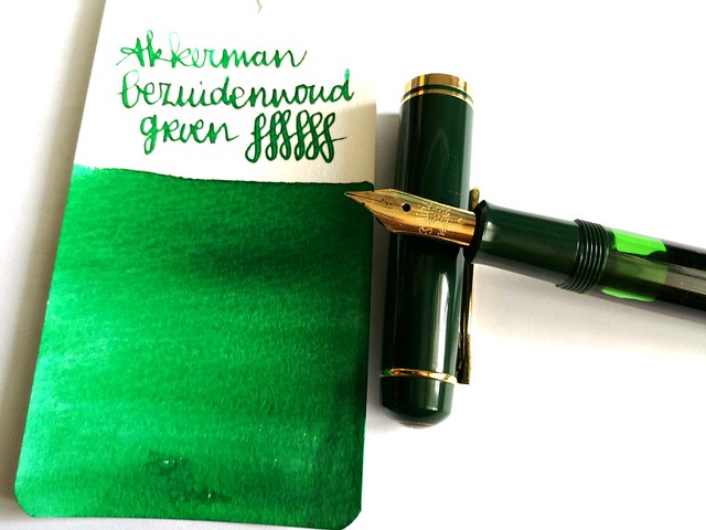
Last week on Pens and Ink I posted about my recent Pelikan M2xx series finds. This week I'm highlighting a pen I mentioned in that post, the Pelikan M250 Black Dark Green fountain pen. And I paired it with a nice green ink from Akkerman's The Hague ink line; Bezuiderwoud Groen.

pens and ink M250 green
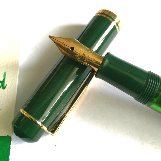
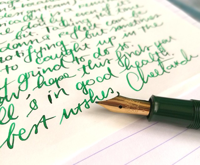
First let me start by telling you that the nib you see on the pen here is not the original nib. I replaced the original 14k gold M nib (which is the only difference between a Pelikan M200s and M250, the first has a steel nib and the latter a gold one) with an older nib from one of my vintage N400 Pelikans. Why? This nib just deserves to be in rotation more. I've seen David B. from Too Many Inks do this all the time with his Pelikans (Swap nibs between his pelikans) And I decided to give it a go myself. It did not disappoint :)

pens and ink M250 green
A closer shot of the vintage nib that came with my Pelikan N400 Tortoise, which I sadly can't properly use as the piston fill mechanism is broken. I love the engraving in the older nibs! The pen itself is one from before 1997 and there is a version from after 1997, which has a different cap and printed logo on it instead of engraved. More info on the difference between the M2xx's series, including this one you can find at The Pelikan's Perch and Reuttinger web site.

pens and ink M250 green
So I've chosen to pair the pen with an ink that would match the green cap and piston knob and since I decided to use more of my samples (and then decide if I want a full bottle of it ;) I went though my Akkerman samples and picked this one. I think if you translate "Bezuidenwoud Groen" from NL to ENG you would come up with "South Woodsy Green" ... Maybe? Just FYI, it's not a "real" word in Dutch either! Oh well, it doesn't matter, it definitely looks like a forest green to me! I think the nib also brings out great shading this ink has/ Another great green shading ink from their line is definitely the Groenmarkt Smaragd, which is more of a moss green. I own a bottle of that one, because it came with the pen I bought then. Even though I really like the color of this ink, I am not so sure I need this ink in a full bottle... yet.

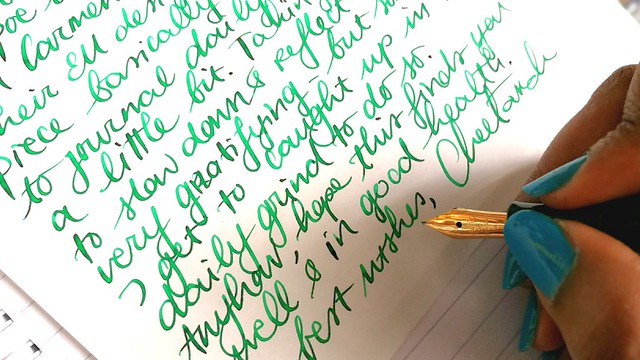
writing letters
In other fun news: as you may know I've been a Swap-Bot Ambassador for a while now and recently I have started blogging for Swap-Bot Blog as well. Rachel, the owner of Swap-Bot, and I discussed it when she was visiting Amsterdam last April and we met up for dinner (together with her husband Travis and their wee one Kenneth). She is such a super fun person, kind, energetic (she runs marathons!) and creative. I'm happy to be able to contribute and collaborate with her on this project. The first blog post is already up and you guessed it, it's about writing with fountain pens! I also am hosting a swap "Fountain Pen Pal Summer 2016 Edition" on the 'bot to help more people just get out their fountain pens and write with them more. Hop on over to the swap page to see more info on the swap and the sign up dates. You have to be a member of Swap-Bot to participate though, if you're not a member yet, it's super easy, just make a profile and read these FAQ's to get you started. And perhaps I'll see your in the mail?

writing letters
Thanks for stopping by and have a great day.

namasté

2016/04/04

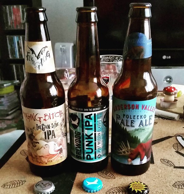
Mailart Monday - the best beer for a boss mountaineer

Some beers we tried last night and arranged in the order of preference. #specialitybeers #beer #ragingbitchipa #punkdogipa #paleale #albertheijn #smalltownbrewery

It's no secret, I like a good beer once in a while. The above beers were tried and tested, and from left to right arranged in my personal preference. 

The labels are works of art and I did my best to take it off the bottle to use for my mail art. And when this Mail Art swap "put a beer label on it" was being hosted by Tina at one of my fave Mail Art groups on swapbot, SMA, I had to get on it!

Mail Art 016-2016

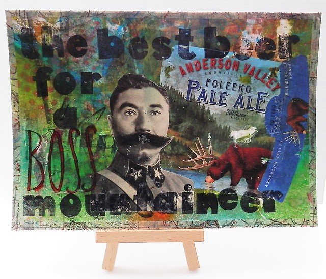
This is the collage I made for the swap. The background is a 'dirty page' aka a test page which I have on my desk for excess paints etc. I used spray paints to cover the white that was left on the page and the background was set. The Poleeko Pale Ale label was perfect for what I had in mind. The "mustache man" is from a vintage magazine and sorta looks like a Mountaineer. And he has quite a boss mustache really. With some fun font stamps I stamped the text "the best beer for a boss mountaineer" on it, covered the edges with map masking tape and covered it with matte modge podge. I'm glad this postcard was well received by Mandy :)

For this swap, I received a card made by the host herself and I loved it!

Put a beer label on it (1)

What a fun and quirky label she used! Thanks again Tina :) 

A few weeks ago I blogged about other mail art groups you can join on Swap-Bot if you want to be prompted to make themed mail art. That post also has info on how you can join Swap-Bot if you are not a member yet.

Thanks for stopping by!
Have a wonderful week!

namasté

2016/04/01

Pop a Color Technique ATC

Besides really great Mail Art swaps you can do via Swap-Bot, you can also do a whole bunch of ATC swaps there. At the group All Bout ATC's you can swap, well the title says it, ATC's mainly :) They often host fun technique swaps there and this one is for the "pop a color" series. The main design needs to be black and white with a dash of the mentioned color in the swap. For this swap, the color was Lavender. I'll show you how you can make a couple of these ATC's very easily in one go. All the stamps I used are from Lost Coast Designs. If you are in the EU you can order them from Inkadinkadutchies

Pop a color ATC's

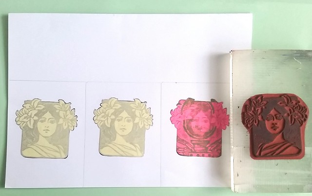
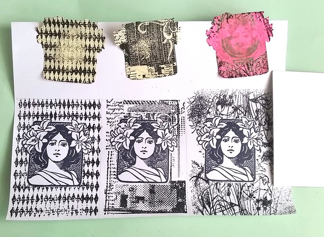
I took a sturdy piece of white paper and roughly measured the ATC size on it, three times. Stamped the Art Nouveau Woman's face with Archival black ink and then made a mask for them.

Pop a color ATC's
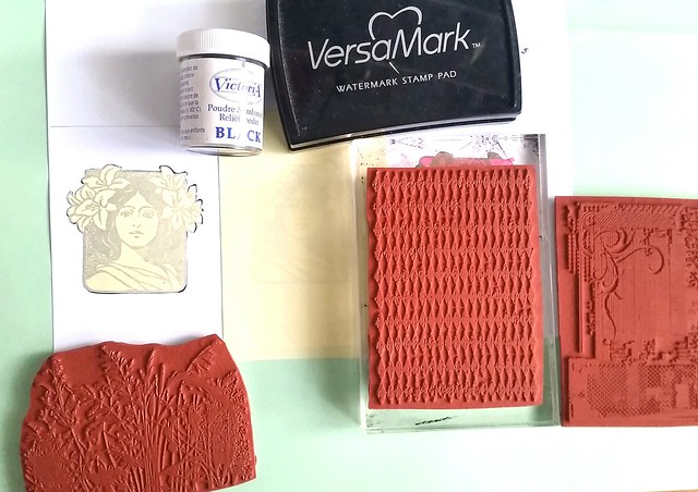
Then I chose a couple of fun ATC background stamps, got my versamark pad and black embossing powder. I cover the images next to it with the roll on post-its (also the material I used to make my masks with).

Pop a color ATC's
I stamped each section with a different back ground stamp using versamark and then put embossing powder on them and heat set with my heat tool.

Pop a color ATC's
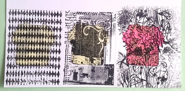
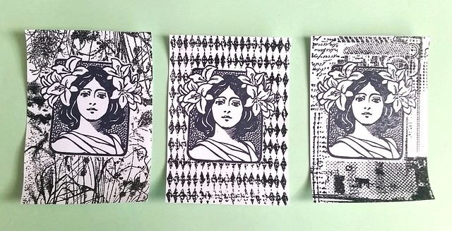
The reveal (taking off the masks) is always a fun moment. I was quite happy with the results and took an ATC size card to cut the 3 pieces out on the right size.

Pop a color ATC's
When you have done that, you can easily make corrections to the piece if you're not totally satisfied with the looks. I added a bit more leafs to the design on the left to make it look "fuller". Out of these three, I chose the right to use for this color project.

Pop a color ATC's
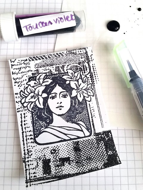
As you might know by now, I also like to use fountain pen ink to color my work. I found a nice color that would do for this swap, Toucan Violet, and honestly it does look a bit more like a lavender to me. I placed a drop on water resistent paper and got to coloring. 

Pop a color ATC's
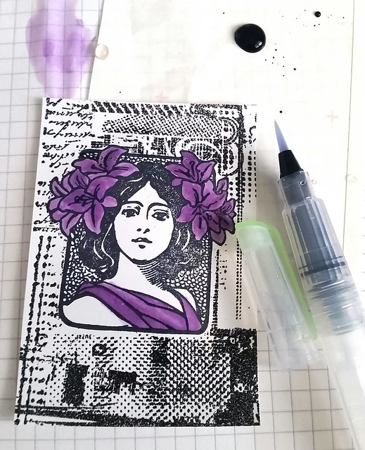
I took my Kuratake water Brush and proceeded to color the flowers and her robe with this color. Making this lighter with water and if I wanted more shade, I just picked up more of the ink.

Pop a color ATC's
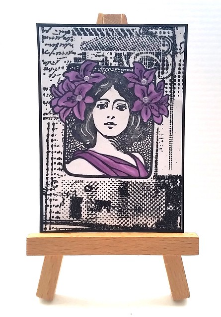
And this is the end result. I matted the piece on black card stock so it has a bit of a frame. I also added some pearl accents to the flowers and in her hair to give the ATC more of a shimmer. You can make these quite fast and easy. These did not take me longer than 30 minutes to make. 

I did something different to the other two ATC's though which I will show you next week.
Hope this inspires you to "pop a color" on your projects :)

Thanks for stopping by!
namasté

2016/03/07

Mailart Monday - In ieder stadje een ander schatje

In elk stadje een ander schatje

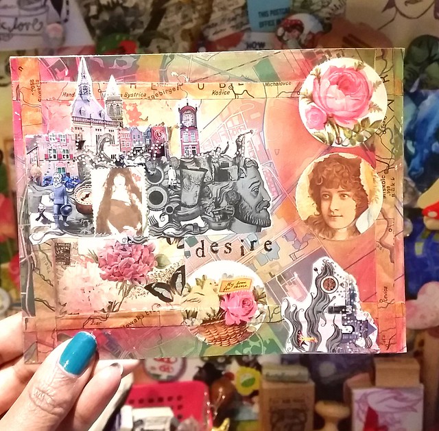
I'm a member of some fabulous mail art groups on swapbot and I made this one for a swap hosted in the group Handmade Postcards Club. There are several themed swaps hosted where you have to use the mentioned element in the handmade postcard and this required a map of some sort. 

I created a collage work of materials I keep in my "paper junk box".  
The background I used is a vintage map of a dutch city and I added border strips from a page of an old Atlas. The city imagery is from left over from older postage stamps. On the right I placed an image of a woman in the section where the postage stamp used to be. And on the left I placed an image of another woman. I added a few other vintage looking elements to it and stamped the word "desire" under the man's face. And then used some pearl/metallic rub ons in pink and red on the edges and faded out towards the middle.

I wanted to portrait the dutch saying "in ieder stadje een ander schatje" which in english means, "in every town another honey" and I think the imagery came together nicely. 

If you want to have mail art prompts to inspire you to create something different, consider joining some of the great mail art groups on swap bot. Besides the handmade postcards club these groups are definitely worth checking out:

You have to have a profile on Swap Bot and with some groups there are some extra requirements to join in. This sometimes may seem like a hurdle to join the group, but it does ensure a safer swapping environment. If you have any questions about joining swap bot, check out the New User page and the Frequently Asked questions. Also as an International Ambassador of the site, feel free to contact me via PM on swapbot, or comment on this blogpost if you need any further help.

Thanks for stopping by!

namasté