Showing posts with label mindful musings. Show all posts

2017/08/22

It's ok to just breathe

It's ok to just breathe

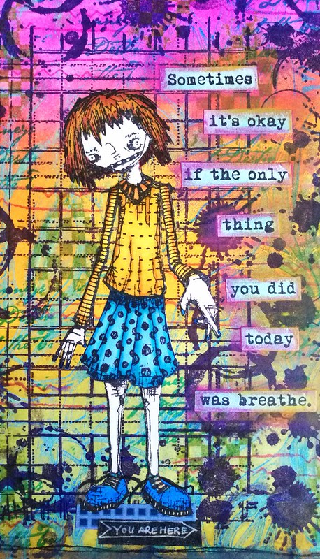
Today I am sharing the make of a card of which a similar one was published earlier this year in the in May. It's a bit of a personal story why I made this card and this is what I shared with the Craft Stamper's New Beginnings section of the magazine back in May:

What triggered me with this theme is the fact that to me every day is a new
beginning. With every day you can start a new and it's okay if you did "No Thing" and
just breathe. This card is designed to send someone comfort in difficult times, Like
when someone is suffering from a Burn-Out. The traditional "get well soon card" just
isn't what someone needs in that position and I am speaking from experience. The
sentiment "Just breathe, you are here" is so much kinder. It helps one to re-frame
one’s mind and begin again.

When you have suffered from a Burn-Out (like I have now 2 1/2 years ago) it is not in your healing process to receive cards like "hope you'll be your old-self soon" and "get well soon" because it actually works counter productive. Every one of us takes their own time to heal.  So I am sharing the make of this card so that in case you wanted to make something similar to someone who needs to hear this message.
It's ok to just breathe

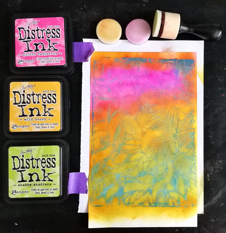
I started off with covering a gelli printed ghost print with disstress inks and blended them with a blending tool. The colors I chose were pickled raspberry, wild honey and shabby shutters. I thought they made a nice blend together.
It's ok to just breathe

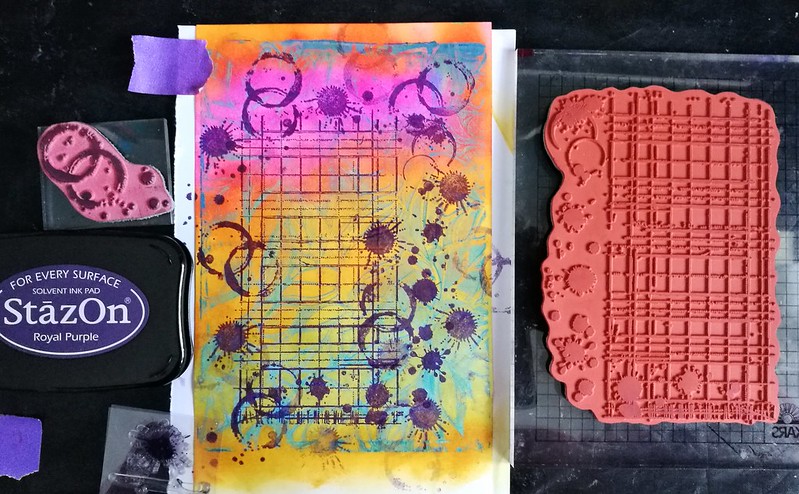
Then I did some stamping with Indigo Blue Ledger & splats, coffee rings from Tim Holtz and spatter drops by Marianne Crafts stamps with Staz-On Royal Purple.
It's ok to just breathe
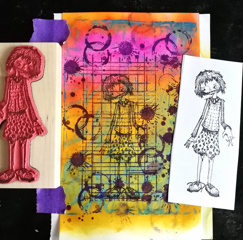
As my focal point I chose Marsha from Stampotique Originals because I like her and she will be pointing towards the sentiment. She is stamped in black so that when I cut her out and adhere her, the details like shoe laces will be there.
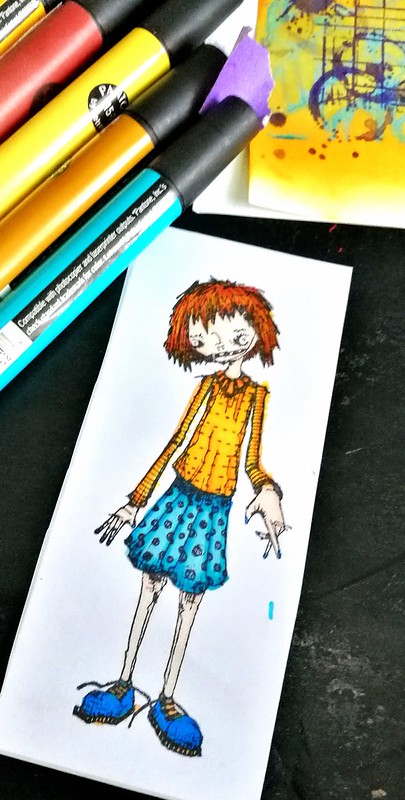
It's ok to just breathe

I colored her in with letraset promarkers (alcohol markers) on sticker paper.
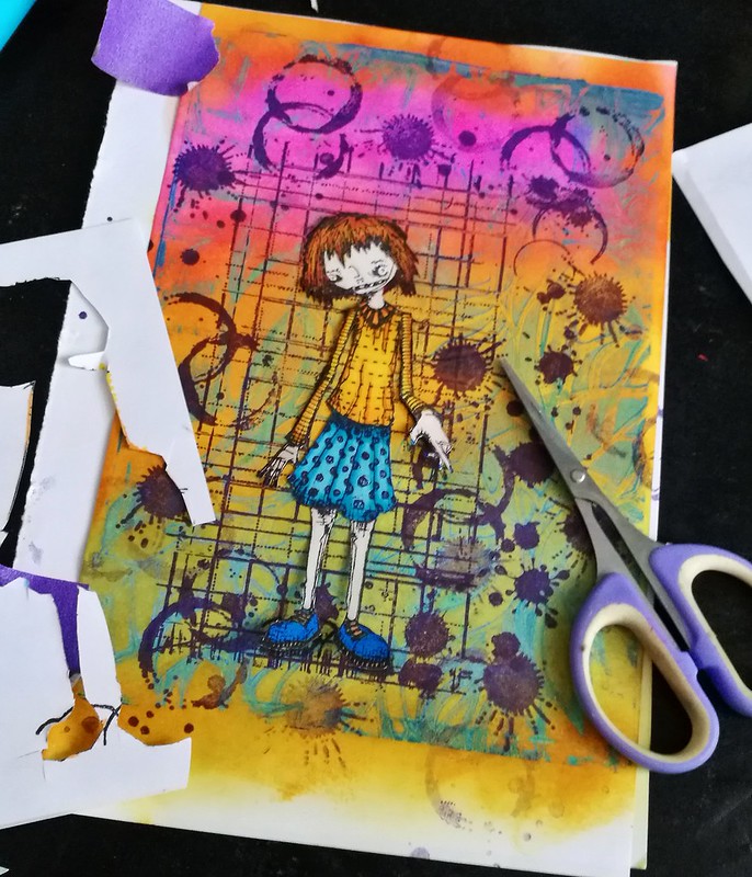
It's ok to just breathe

Fussy cut her out and adhered to the page.
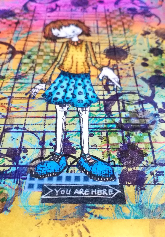
It's ok to just breathe
Grounded her with washi tape and the "you are here" is also a washi tape.
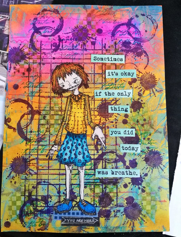
It's ok to just breathe

I added a few more Tim Holtz texture stamps in blue and green colors in the background for more interest and then added the beautiful sentiment from Viva Las VegaStamps!
"sometimes it's okay if the only thing you did today was breathe"

It's ok to just breathe

As a final touch I added some color with distress crayons in the similar colors as the inks I used. 
It was a pleasure to combine stamps as focal point by my 2 fave companies I have the honor to work with, Stampotique Originals and Viva las VegaStamps! 

I really loved making this card design, it was such a calming and healing process. I hope this will also be the case for you and that you can send a card like this to someone whom needs to hear just this message. 

Have a wonderful day and thank you so much for stopping by!


2017/04/06

Art Journal: Be true, be you - VLVS!


It's my turn over at VLVS! blog today and I'm sharing an art journal page made with lush Viva las VegaStamps! and bright colors! In lieu of what I posted for MailART Monday, it's an affirming message, to encourage yourself to be true to yourself, always. To see the whole page, process description and which stamps/materials I used I invite you to hop over to my blog post over at VLVS!

Thanks so much for stopping by and have a wonderful day!


2017/03/31

The Here and Now

Mixed media notecard

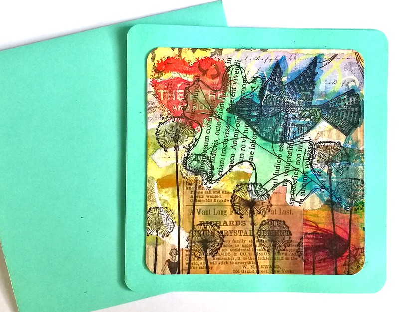
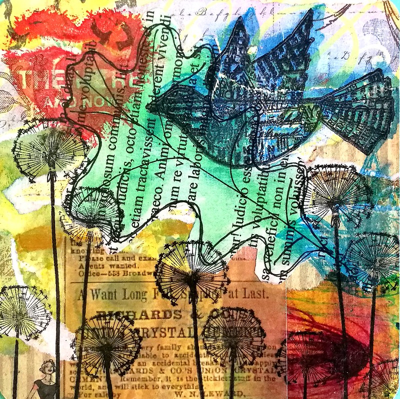
This mixed media card has a collage base with various scrap pieces from my large "junk box" filled with scrap papers. The dandelions are from Carabelle Studio's as well as the sentiment. The bird stamp is from Stamper's Anonymous.

Mixed media notecard
Being in the here and now is what I always strive to do... but today well, this past week actually, I have been very much looking forward to this weekend! It's Art Specially 2017 convention and I am really looking forward to see some of CHA's products in real life, getting to know more techniques through workshops and just having a grand old time! If you're planning on going as well, I'll maybe see you there! 

I would like to enter this card in the following challenges:

Try it on Tuesday for the Botanical Challenge
Craft Cardmakers - Spring into spring challenge
Create and makes - Anything goes opt. springtime 
Stamps and Stencils - Chirpy Chirpy Cheep Cheep Birds


Have a wonderful weekend and thanks for stopping by!
2017/03/28

It's okay, breathe today.

It's ok, breathe today

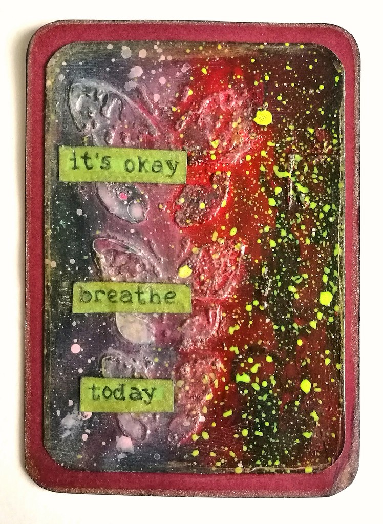
Lately, I've been feeling a bit overwhelmed. Maybe also because another birthday has come and gone (with a great trip to sunny Valencia in Spain, on which a report will be blogged at some point ;)  and faced with this perception of growing older I'm thinking "There so little time and so much I'd like to do!" But I need to keep in perspective that doing, doesn't affect the quality of BEING. I made this ATC/inspiration card to remind me of that. I took the butterfly base of one of my Cascading Butterflies sessions and played with paper Artsy Fresco paints, Liquitex INKS and Golden Fluid Acrylics in fluorescent yellow, which I received in the Artsnacks January Box this year. I love how that the spatters just pops up the whole image. The sentiment is re-mixed from this VLVS! text stamp. "It's Okay, breathe today" is something I say to myself when I feel like I am "wasting time" by not being "productive enough" and need a reminder that every breath has the same value, in doing or being. 

I would like to enter this artwork in the Moo-Mania challenge In Triplicate (so poetic that I made this ATC with this theme without even realizing!) and I love the fact that there is a challenge site that inspires to make some smaller works like Moo and ATC size :)

I also would like to enter this in the following challenge
Simon Says Stamp Monday Challenge - Things with Wings

Thank you for stopping by and have a wonderful day. 
Enjoy it, even though all you did was breathe today :)
  

2017/01/27

Art Journal: The perseverance of possibility

The perseverance of possibility

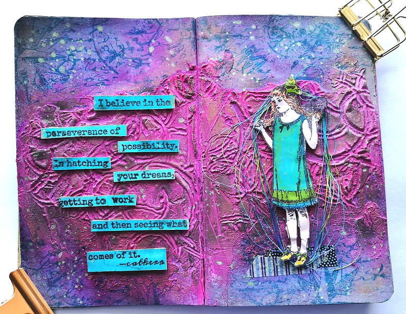
So I might have mentioned that last week I was pretty much ill with the flue and bronchitis infection the whole week. I was super tired and could not do anything but sleep the whole day, but in the evening when I felt a bit better I got to work in my pocket size art journal. So I worked on it for a couple of days and practiced my layering techniques and patience :) It was hard for me to work on things slowly, usually I work in a high pace producing 2-4 pieces when I have the whole day to create. But sometimes, when you can't work on a high pace, you just need to step back and let it be to come back at it at some other point. It all came together pretty gradually and I'm quite in love with the end result.

Potential
I started off with a spread which already had paint on it and I covered that up with a mixture of Paper Artsy fresco paints hint of mint, southern skies and a bit of Distress paint faded jeans. When the paint was still wet I mixed in a thin layer of CW Gold Gesso. When that dried I applied some Light and Fluffy Modeling paste with a palette knife and let that dry a bit.

Potential
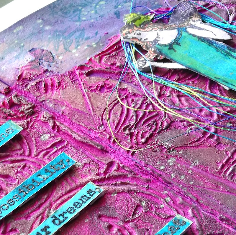
In the modeling paste I pressed the  Effervescence by Ana Bondu Carabelle stamp in various places. First the paste wasn't dry enough so I had splotches of paste that came off. Started again and again until the consistency was just right so I could get some good imprints that didn't stick to the stamp. Trial and error and a fun technique I definitely want to explore more. When I was satisfied with the imprints I made I let it dry and cleaned my stamp thoroughly. Came back to the page and spritzed some fuchsia dylusions ink mixed with burgundy mixed media spray from the november artsnacks box. Spritzed some water over it to mix and let it run everywhere and wiped the excess away. Repeated process until I was satisfied with the color.

Potential

To get the structure back I took my pearl rub ons and highlighted some aria's with bronze, gold, pearl and black metallic shimmer. Also added shimmer to the outlines of the paste and the page. I considered leaving the page like this in my journal as it's super pretty to look at.
potential
Detail shot of the structure.

But my gut said it still wasn't finished. So I went on to see which stamps I could use to this layout. Of course VLVS! has so many that spoke to my heart I went to check out those first.
The perseverance of possibility
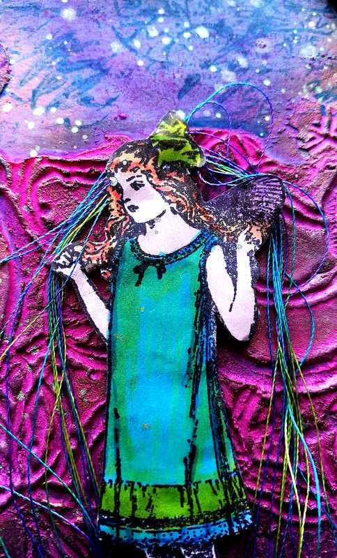
I chose this cute little fairy girl by Cat Kerr which I colored with letraset promarkers and adhered with pop up squares. I remembered I had some rainbow thread somewhere and added that around her. The colors of the thread matched her outfit colors really well.

The perseverance of possibility
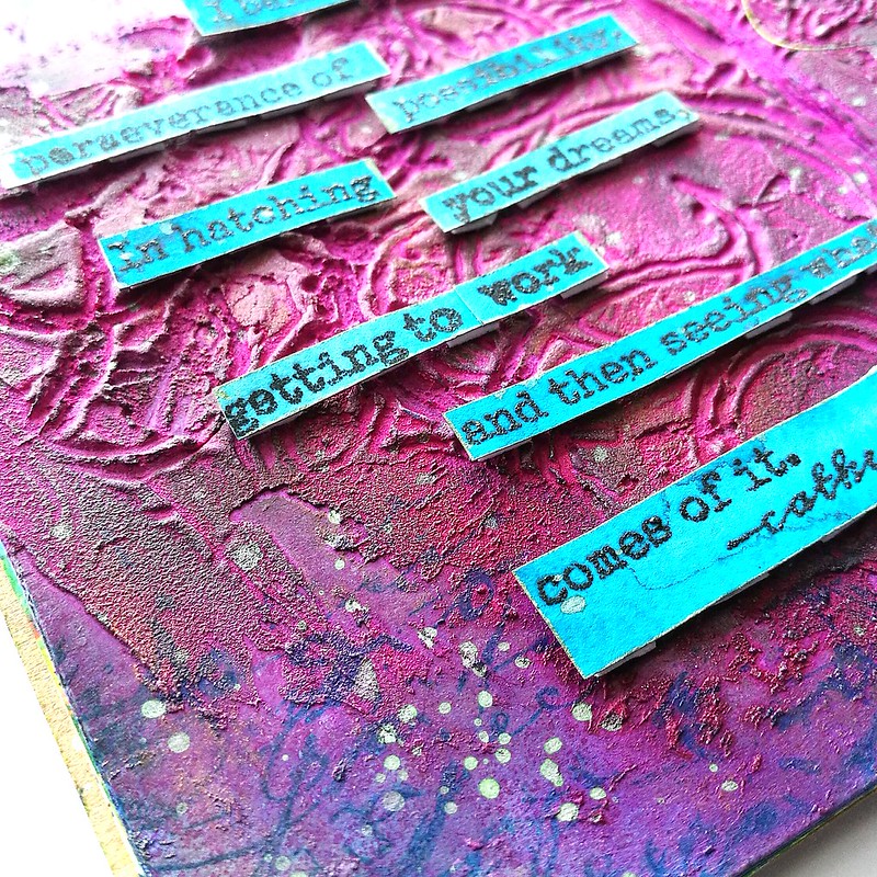
I love the quote stamps from Cat Kerr, and I believe in is one of my favorites. But I deconstructed the quote a little and left the armor bit away so it says "I believe in the perseverance of possibility. In hatching your dreams, getting to work and then seeing what comes of it." It was stamped on aquarelle paper on which I already had Sailor Jentle Yama dori fountain pen ink with pearl mint shimmer wash over it. It flowed out to such a beautiful teal blue! And I love the contrast of teal and pink. The quote stamp was embossed with black embossing powder. They were also adhered with pop up squares. On the edges I stamped a bit of text and nautical star from Artemio vintage travel collage with staz on teal. The spatters are from Wink of Luna light green diluted with water. I added some more black pearl rub on some edges and called it done.

The perseverance of possibility
I really enjoyed doing this page and it was a first for me in many ways: patience in layering, stamping in texture paste, adding thread ... I also learned a lot by doing all this and went to check out some you tube channels for some tips and tricks on what to do better next time. One thing I have learned is I definitely need to cover the creases of the pages next time, either with masking tape or gesso (or both..) because the ink stained some of the other pages through the cracks. not a lot, and thankfully most pages were glued in so didn't stain my other work too bad, but yeah, it won't hurt to secure it better next time. Also need to leave more allowance for folding, bits and pieces of the modeling paste in the middle broke off when I folded it and there is a crack running through it. So I have to plan and place my paste better next time. It's all about the love of process :) 

I hope you enjoyed reading along this process with me. 
Thanks so much for stopping by and have a great weekend!


2017/01/12

Art Journal: Inhale the future

Last week I shared some really great news with you all and today is my first post over at the VLVS! DT inspiration blog, yay! I created a mindful journal page to ring in the new year with warmth, a hopeful message and a resolution of some sort. 


Feed your Soul. 

Inhale the future, exhale the past. 

Enlighten! 

Do all things with LOVE. 

This page was created during the first couple of days of the new year and the process was really meditative. The steps of the process you can see below and I used stamps from VLVS! plate 1475 which has wonderful stamps to incorporate in mindful, meditative art journal pages. 


I trimmed the page to fit in my new spiral bound journal with black pages. I often do very colorful work so I like the fact that the journal automatically matted the adhered page.

For a detailed descriptive process/tutorial and more pictures, please visit my post at the VLVS!DT inspiration blog

The materials used:Stamps from Viva Las Vega Stamps!Feed your soul 

Stencils:
Crealies sunburst straight 
Crafter's workshop Balzer Zia Sun mask 
Donna Downey Enlighten

Inks/spray/paint:
Distress inks: squeezed lemonade, mustard seed, spiced marmelade, fired brick
Memento tuxedo black
Stazon: jet black, black cherry, rusty brown, timber brown, mustard yellow
Ranger perfect pearl spray Kiwi, dina wakely mica sprays, dylusions lemon zest
Faber castell Pitt markers
Spectrum Noir Red Sparkle brush pen
Perfect Pearl metallic Rub on paste in gold and red

Mediums/glue:
Crafter's workshop Gold Gesso
Crafter's workshop fluffy modeling paste

Thanks so much for stopping by and have a great day!


2017/01/05

Fountain Pen People know why

Akkerman Den Haag

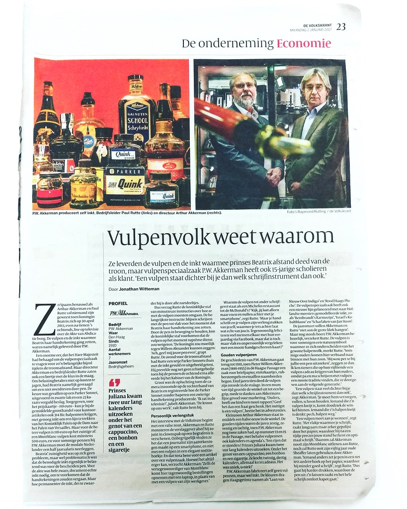
When returning to work this week, after a great week off relaxing, cleaning up my art room and being creative, I found this interesting article  on my desk placed by one of my colleagues. It's a profile piece about P.W. Akkerman in the the Hague and I thought I would share it with you here. The title of this piece struck me because yes, only fountain pen people know why this is not only great to read in modern media but also important. The Millennial certainly set off this age to be almost completely digital and with the news of the cursive writing method not being thought anymore in schools, it's esp. important to find an instrument to help you keep writing daily, analog style. For me that instrument is definitely a fountain pen. Seeing this article is written in Dutch I have translated it to English for my fellow fountain pen enthusiasts worldwide. Enjoy!

Translation of the ARTICLE in English

They supplied the fountain pen and ink with which Princess Beatrix abdicated the throne, but fountain pen specialist P.W. Akkerman has 15-year-old students as customers. "A fountain pen is closer to you than any other writing instrument whatsoever."

As “Spaans Benauwd”*  as Arthur Akkerman and Paul Rutte no one will have ever been, when Queen Beatrix on April 30, 2013, just after ten o'clock in the morning, live on television on the Act of Abdication arc. Fountain pen and ink with which Beatrix was putting her signature, were supplied by P. W. Akkerman.

The interview with the Volkskrant starts with a false note. Akkerman and Rutte jabbed the reporter as if he has just showed up in clown suit at a funeral. They find it incomprehensible that a journalist makes his notes on a smartphone, and not with a fountain pen in an elegant notebook. And please note, it’s an article about a fountain pen store of all places. Although it can always get worse, sighs Akkerman: "Even the representative of Montblanc came here today take orders with a laptop instead of a fountain pen from his employer. '

Why the fountain pen grades to other writing instruments as a Michelin restaurant to McDonald's? "Look, you leave only ones and zeros behind with your smartphone," said Rutte. "But your handwriting and your fountain pen are extensions of yourself that you leave something behind what is really yours. Nowadays many people are congratulating each other with their birthday on Facebook, but isn’t that's just flat and impersonal compared with a nice handwritten card? "

The history of P. W. Akkerman goes back to 1910, when Pieter Willem Akkerman (1886-1955) in the Hague Passage began an business for letterheads, business cards, rubber stamps and enamel nameplates. In the late 1910’s the fountain pen was introduced in the window. In no time, the shop grew into a concept, partly due to Akkerman’s  fine sense of marketing. "Parents, your child has a good report card? Give them a nice gift. The most useful is a fountain pen, " was it called in advertisements.

Grandson Arthur Akkerman is now half a century in the store. The golden age was the sixties, seventies and eighties, when P.W. Akkerman had two cases, at number 13 and 15 in the Passage, with not only fountain pens also calendars and diaries. "A rows that were! Princess Juliana arrived two hours to figure out long calendars. While enjoying a cappuccino, chocolate and a cigarette. She bought twenty or thirty calendar, all Christmas gifts. It was unique, U-NIQUE! "

P. W. Akkerman doesn’t manufacture their own pens, but they do ink. The colors carry Hague Tinted names like 'Laan van Nieuw-Oost Indigo' en 'Rood Haags Pluche'. The fountain pen specialist has also launched a new line to the Dutch masters modeled ink, such as 'Rembrandt's Karmozijn', 'Israel's Kobaltblauw' en 'Scharlaken van Jan Steen'.

About the annual revenue  Akkerman and Rutte are not really forthcoming. " But still P.W. Akkerman doesn’t do too badly, Rutte assures. The fountain pen is for some a status symbol to distinguish them from ordinary ballpoint people, Rutte noted. "Some parents come here, amazed, inside with their son. "He insisted to look for a pen here," they say. I know teenagers on their fifteenth receive a fountain pen gift from their parents because mom and dad were writing with a fountain pen themselves. It’s a beautiful tradition, which they pass on to the next generation. "

"A fountain pen is much closer to you than any other writing instrument whatsoever," says Akkerman. "You must take care of it, filling, cleaning. Someone who has lost his fountain pen, comes franticly ill into the shop. Someone who has lost his ballpoint thinks bad luck, ballpoint gone, no big deal.

"(Writing with) a fountain pen is something you need to get used to you," said Rutte. "The tip  you write with, is slowly but surely being polished by the paper, which then molds precisely to your writing angle after a while and writes best (for you)." Therefore Akkerman will never lend his Montblanc to Rutte, nor will Akkerman ever make use fifty year old Sheaffer from Rutte. "If someone else puts your pen in a slightly different angle on the paper, it can ruin your pen," said Rutte. "So if the person is going to press harder, causing the nib to change it’s angle, the whole writing comfort breaks."

* Dutch Idiom Spaans Benauwd (Become Spanish breathless)
The idiom refers to a state of fear or anxiety. Associating this with Spain takes us back to the times when Spain was the oppressor, during and prior to the Eighty Years War. (source) 


Hope you enjoyed reading the article and it has inspired you to pick up a fountain pen and write :)

Thanks for stopping by and have a great day!


2016/12/30

Monthly Planning MTN: 2016 round up

In terms of growth, it's always good to have moments to reflect upon things you have done in the past. Not only to see if they will help you move forward but also to appreciate the fact you have actually DONE these things. And in these quiet days in between the rush of Christmas and New Year's EVE creeping around, it's a good time to look back on the year I leave behind. In this post I look back on planning in my Midori Traveler's Notebook. 

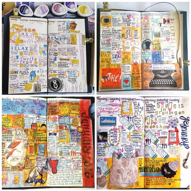
I have implemented my Midori Travelers Notebook planning since last year november. Next to my weekly planning in my pocket midori (which I have been lacking to do these past few month to be honest) these monthly update should give an overview of all the fun things I have done that month. And seeing the finished pages side by side definitely portraits a colorful year. Here's an overview from november 2015 through november 2016.

Nov 2015 - feb 2016
Following clockwise top left, November and December 2015, January  and February . Key words these months were: anniversary, Antwerp, Holidays, birthday, David Bowie, Groningen and Meesha.

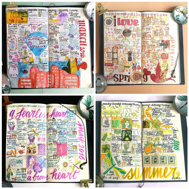
March 2016-June 2016
Following clockwise top left; March, April, May and June. Key words here were Brithday, Kapadokya, spring, compassion, hand lettering and summer.

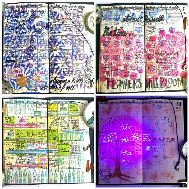
july 2016- oktober 2016
Following clockwise top left; July, August, September and October. Key words here were rain, bronchitis, flowers, penshow, meetups, halloween, fall and blue ghost.

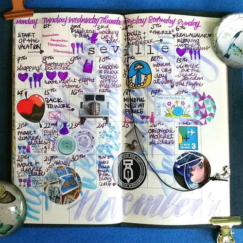
November 2016
My november 2016 update is still fresh, from this week. Vacation, anniversary, Seville were the key words that month. And with Astrogirl looking back, it concluded my monthly updates of the year 2016. Below is a flipthrough I made on Instagram
A video posted by cheetarah (@missthundercat) on

My undated Midori planner is now full with a year's worth of memories. I have debated if I should continue this was for next year and after careful consideration I decided not to. While this experience was interesting and fun, it also cost me a lot of energy to create the pages. And I have a lot of exciting things coming up in the new year, the 1st half at least, which is going to need more my creative attention. Next week I will be able to tell you more about this :)

I am going to use my midori pocket planner again next year as well as a Stalogy undated planner as a gratitude journal, so it's not like I am going to quit planners completely. So I will definitely share those planning adventures with you here :) 

Thank you for your continued support on my blog and elsewhere on social media through out the year! It's very much appreciated!

Wishing you all a wonderful and safe NYE celebration!

namasté

2016/12/12

Mailart Monday: an ode to coffee

coffee ATC's

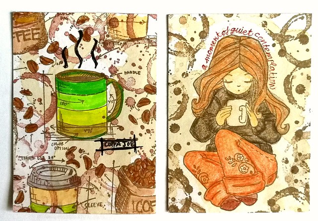
Coffee, for me, is a necessity esp. in the mornings. I can't seem to function without it. I just love everything about it, the smell, taste, the heft of a good cuppa Joe in hand. These two ATC's are an ode to that delicious beverage. They were made for a coffee themed swap over at Swapbot this summer. I used real coffee to stain the backgrounds and stamped over it with Tim Holtz Freshly Brewed stamps and coffee ring stamp from Stampers Anonymous. I colored them in with tombows. The girl on the right is from Unity Stamps (I think... ) and I colored her in with derwent artist pencils. These were really fun to make and I received equally fun ATC's in return.

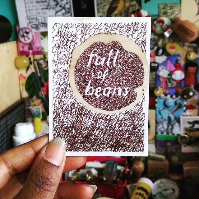
something I need every morning to function properly. received this great piece of coffee art from a swap #coffee #atc #coffeebean #coffeering #swap #swapbot #received
Full of beans... coffee beans!
The maker of the brilliant ATC above is SuMay on swapbot and I just totally love it. She also has an awesome flickr page of her mail art. 
an ode coffee
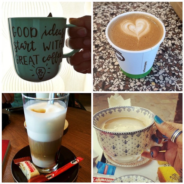
A good idea definitely starts with great coffee! I'm getting some now ;) 

Have a great day and thanks for stopping by!
namasté

2016/11/16

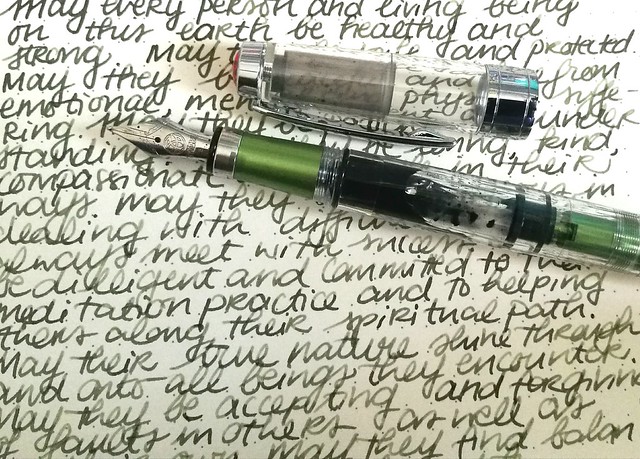
Pens and Ink: TWSBI Al green with Montblanc Jonathan Swift

TWSBI al green with MB jonathan swift

As some of you might know, TWSBI releases some Limited Edition specials from time to time and there was one special edition I was really into, the TWSBI AL Green, which was released in a small batch earlier this year. It took me a while to find it, as it seemed to be sold out everywhere, but with some luck and Google-Fu I found out they had one left at Scrittura Elegante, a stationery shop based in the Netherlands. So after not too long of a wait, the pen arrived and I excitedly tried to pick a color to match the beautiful body!

TWSBI al green with MB jonathan swift
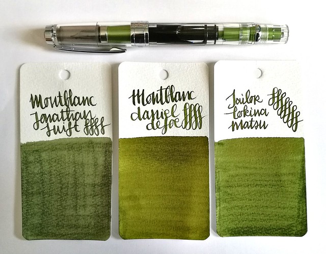
I decided a nice mossy green would suit the pen body well. The mossy greens above I thought would make a great match; Montblanc Jonathan Swift (seaweed green), Montblanc Daniel Defoe (palm Green) and Sailor Tokiwa Matsu (evergreen pine). The swabs are done on Maruman Word cards, by the way. It was a difficult choice but in the end I sent with Jonathan Swift because I had not yet used that ink in a pen before, so it was high time I break in the bottle!


TWSBI al green with MB jonathan swift
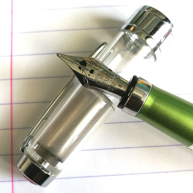
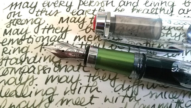
I requested a B nib on my TWSBI Al Green as I have almost all the range of the nibs in the TWSBI line up, except for this one. I have to say that I was a bit disappointed with the line width as it isn't as broad as I hoped it would be. In writing this B nib looks more like a Pelikan steel medium to me. But still, it's not that bad, the ink flow keeps up well and does bring out the shading in this JS seaweed green. See a review of the TWSBI AL Green by ArtGlen on youtube to know more about the pen.

TWSBI al green with MB jonathan swift
It's been a emotional week in many aspects and it's in these difficult times we need to keep our compassion high and cultivate empathy, no matter how difficult it can be. Writing the Loving Kindness Metta Meditation in my journal on a daily basis helps to gain focus and center my compassion. Carving out pockets of time to sit down and write down a hopeful, loving warm wish into the world, may not seem like much, but it's sometimes the only thing I can do to help alleviate my sorrow. In Buddhist terms sending out a positive compassionate wish to help people whom are suffering creates connectivity and empathy. If you want to know more about this, I highly recommend the book "A Fearless Heart: How the Courage to Be Compassionate Can Transform Our Lives" written by Thupten Jinpa the official English translator of his holiness the Dalai Lama, Tenzin Gyatzo. I was lucky enough to attend a workshop about compassion and a book reading by Thupten Jinpa earlier this year in May (read about it in the last paragraph here) and it was really inspiring as it was hopeful. In this world we're being confronted with large extremes nearly every day, with practicing/cultivating this meditation technique, I hope to send out more compassion to those whom need it.

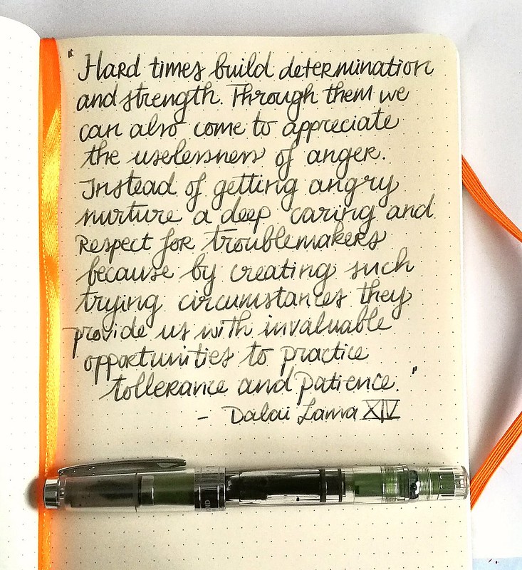
This quote from the Dalai Lama is encouraging and definitely struck a chord:
Trying times

“Hard times build determination and inner strength. Through them we can also come to appreciate the uselessness of anger. Instead of getting angry nurture a deep caring and respect for troublemakers because by creating such trying circumstances they provide us with invaluable opportunities to practice tolerance and patience.” his holiness the Dalai Lama XIV


Something to ponder on with my next meditation session...

Thank you for stopping by and wishing you all a wonderful day.

namasté

2016/11/04

Mini Art Journal: No More Questioning

It's Sunday and raining and feel a bit "meh" but working in my art journal. But I'm a bit stuck with this page. Is it done? Does it need a quote? I just don't know... what do you think? #artistsofinstagram #artjournal #katzelkraft #brusho #derwent #artist
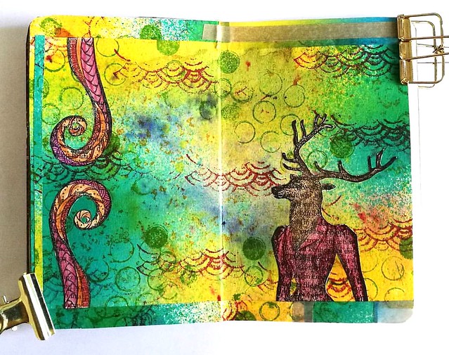
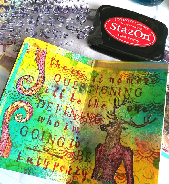
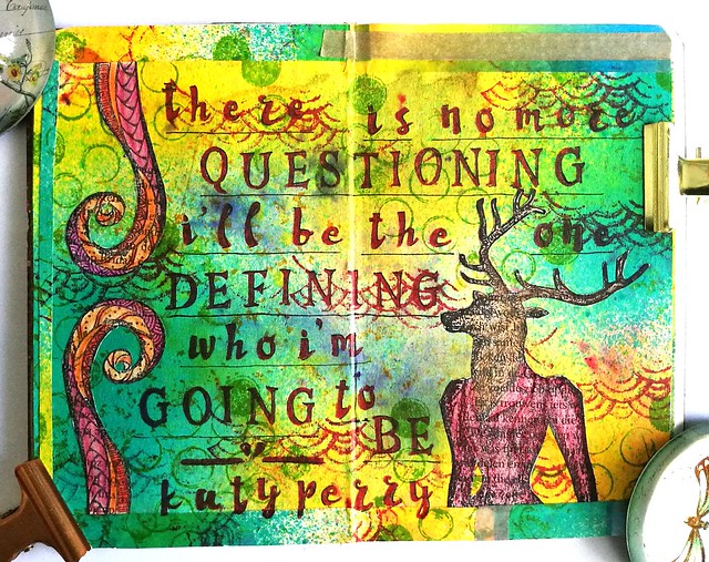
A while back I made the above page in my mini art journal with some gorgeous stamps from Katzelkraft and I thought it was done like this. The empty space of the background, which is made with Brusho crystals and dylusions sprays, would leave room for suggestion. But after staring at the page for a while and having made this spread on the next pages (excess baggage) it inspired me to get my letter stamps set from Eline's Hand lettering line out again and stamp in a quote that felt right.

Mini art Journal: No more questioning
When I am in my art room creating stuff, I love to listen to music while doing so. And Katy Perry's tunes are among my fave to listen to (this Peacock mailart piece was also inspired by her music) and the lyrics from the song "Love Me" inspired me to add the following quote to the page.  

Mini art Journal: No more questioning
"There is no more questioning, I'll be the one defining who I'm going to be" 

Sometimes it's hard, to pave your own path, with opinions and comparisons clouding your view of yourself. It's good to remind yourself that it's OK to be you. Wherever you are, on whatever path you are on, you're in charge of your own life. And it's OK to just BE YOU and not what everyone else expects you to be or think you should be. I feel like I have grown and learned so much about myself over the past year and a half. It still fills me with so much gratitude thinking about the moment I've decided to just stop and BE ME. So I hope this weekend you will take a moment, to stop, breathe and appreciate who you are. Embrace yourself with all your complexities and troubles and tell yourself, it's OK, you're you and it's all OK. Like Dr. Seuss said "Today you are you! That is truer than true! There is no one alive who is you-er than you!" ... Hmm, that's a good quote for another spread I think :) 

Have a great weekend and thanks for stopping by!
namasté

2016/11/02

Pens and Ink: Pelikan M1000 with Robert Oster Purple Rock

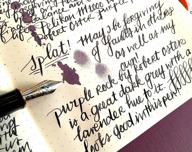
Starting off the day with a bit of #writtenmeditation in my Rhodiarama journal. Got some spatters of Purple Rock on it and you can really see that purple lavender hue on it :) Have a great day everyone 💜
Not too long ago I had the amazing opportunity to buy a Pelikan M1000 in black with gold trim in a clearance sale for a great price. Something I could not resist even though I was wondering if I would use it enough because it came with a fine nib and is such a large pen. Well, inked with this spectacular ink Purple Rock by Robert Oster, it definitely became one of my fave writers in no time!
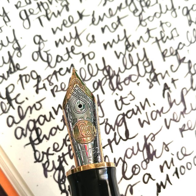
Something I have learned in spades last year, listen to my body and keep my energy balance in check. Always good to remind yourself of what you have learned and keep it in practice. Inked my M1000 with Robert Oster Purple Rock and the M1000 nib grade is o
The nib on the M1000 is nothing but spectacular! It's quite a large pen (see a review of the M1000 here by SBRE Brown and here by Brad Dowdy on the Pen Addict) and the nib has some wonderful spring to it. It's one of the rare fines I truly enjoy writing with.

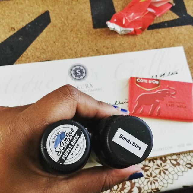
The first bottles I got of @robertostersignature Itvhad to be Bondi Blue beacuse turquoise and sheen?! I need that!! And am curious of the Purple Rock because I wanted a purple black. Hope it's as good as @attilasultis's swabs made it look :) Oh and it is
I bought the Purple Rock in my order at Sakura Fountain Pen Gallery together with the Bondi Blue. At first I thought it was more of a black with a light hint of purple, but it's a deep dark grey with a gorgeous purple hue to it. It's subtle in a fine nib though, but it's definitely more visible in broader pens or in an ink splatter like the top picture. A beautiful work safe pen and ink combo I would say. See some awesome ink tests on Robert Oster inks here by Nick Stewart at Inks and Bleach.

purple hues
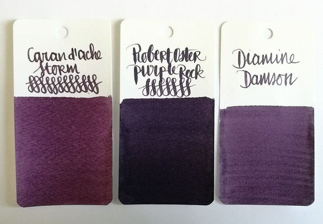
Here you have Purple Rock flanked by Diamine Damson and Caran d'Ache Storm, It's definitely a lot darker than the other two dusky purples for sure, though you can see the purple hue purple rock has very clearly in less saturated parts in the writing below and the splatter.

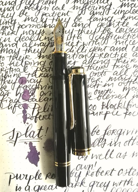
Pelikan M1000 with Purple Rock
Purple Rock is a great match for this gorgeous M1000 and also a fun "safe for work" color.

Next week I'll show one of the other purples in another Pelikan. 
Thanks for stopping by and have a great day!