Showing posts with label turquoise ink. Show all posts

2017/05/17

Mixed Media Mermaid (+ process video)

Mermaid

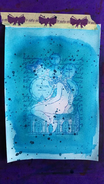
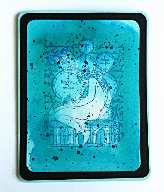
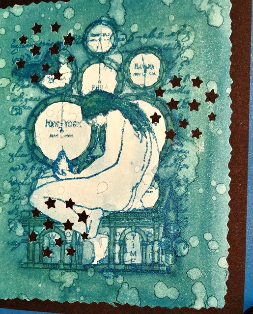
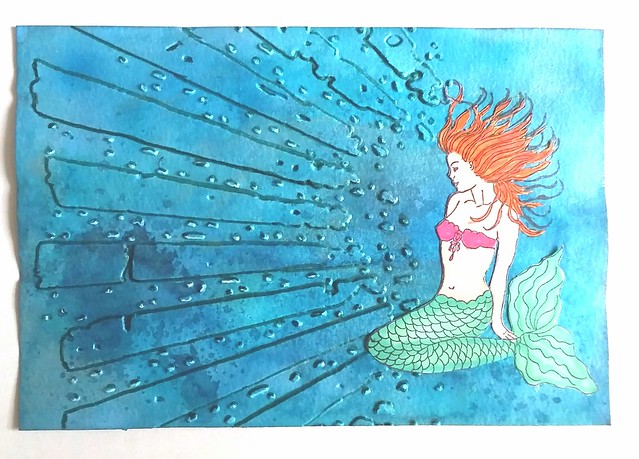
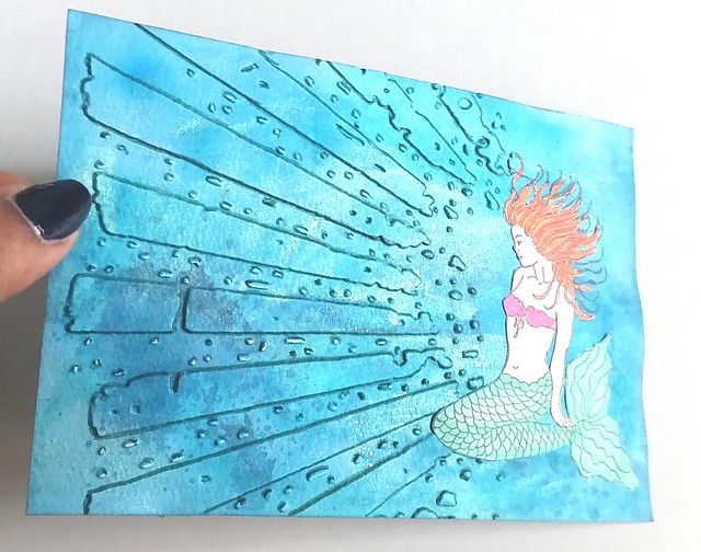
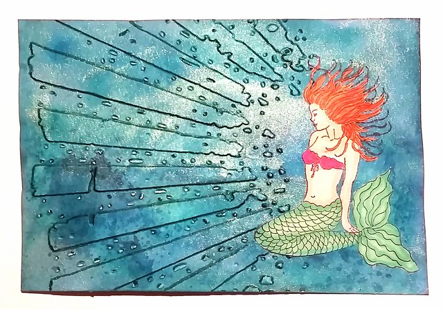
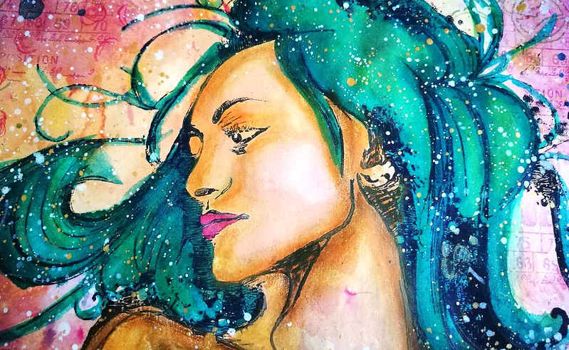
This piece I am sharing with you today, is a special one to me. And for some reason, it happens to be again with the Héra XXL stamp from Carabelle Studio. She helped me to release my inner mermaid while working on this piece. I've got a few more pics to share and the process video is below as well as a list of supplies and stamps I used.

Mermaid
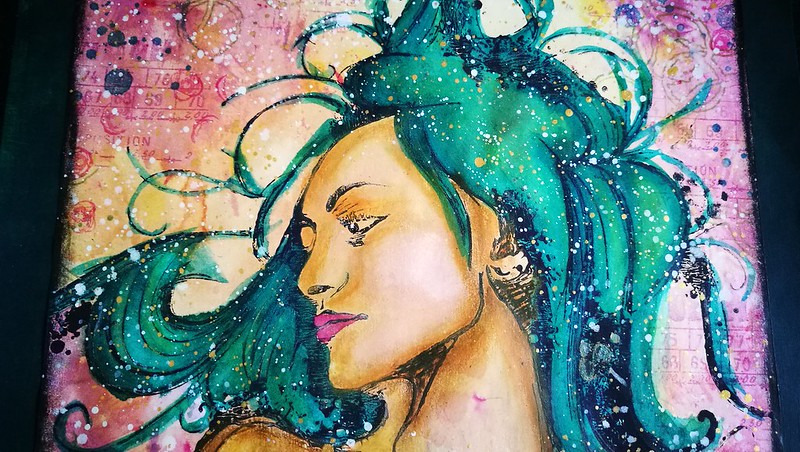
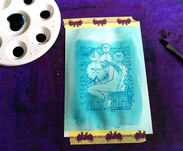
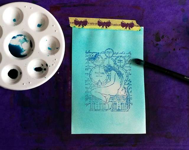
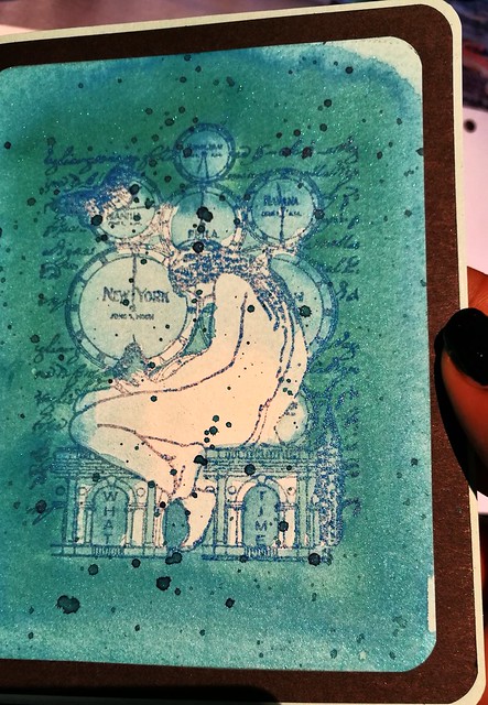
She was made on an A5 piece of vintage paper which had saved from work. I have used many different materials to get her to GLOW the way she does.


Mermaid
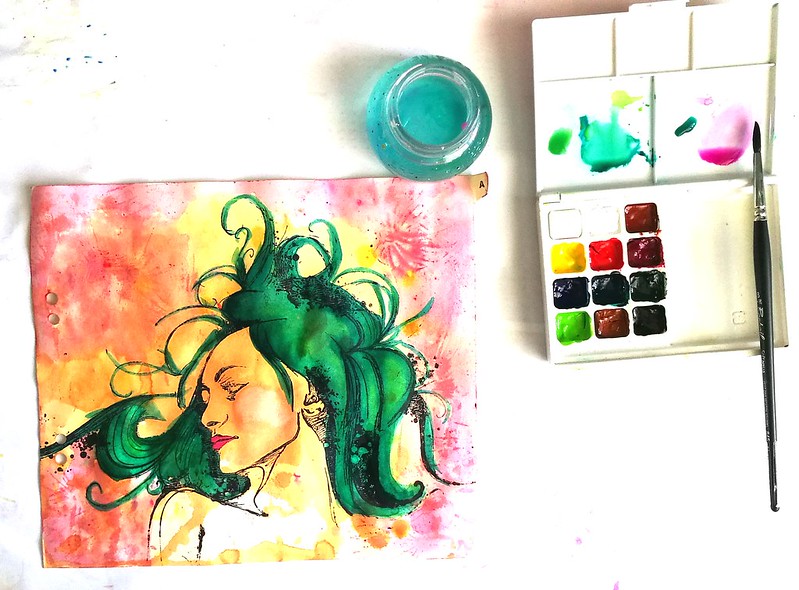
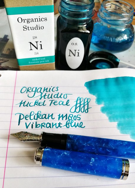
So before I direct you to the process video, I did not record the beginning and the end fell off due to battery outage... I am still very new to making video's (this is only my 3rd) so I am learning new things, all the time, like make sure you actually press record and not pause, LOL! And keep your camera charger nearby! Well, I was doubting to actually show you the process video because it's incomplete but I can tell you what I didn't record is how I got the background color and her hair color. All is done with the Sennelier Aquarell pallet you see in the above picture. I just played around with the water colors until I was satisfied with how she looks. 

The video starts from this point on, I hope you will enjoy watching this :) 


Mermaid
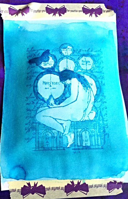
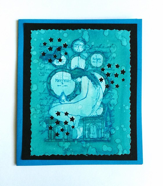
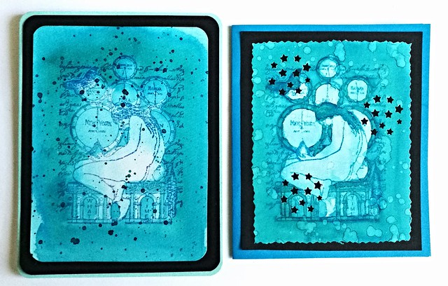
In the end I wasn't totally satisfied with how the skin looked and wanted a more realistic look and skin tone. I used a mixture of distress crayons to give her that creamy soft look. Gave her left shoulder also more definition and over all more contour in the body. The crayons are really soft and easy to smooth out over different media and they worked like a charm over Sennelier watercolors. 

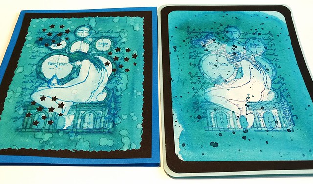
It's now framed and hung in the hallway next to this piece. They make quite the pair.
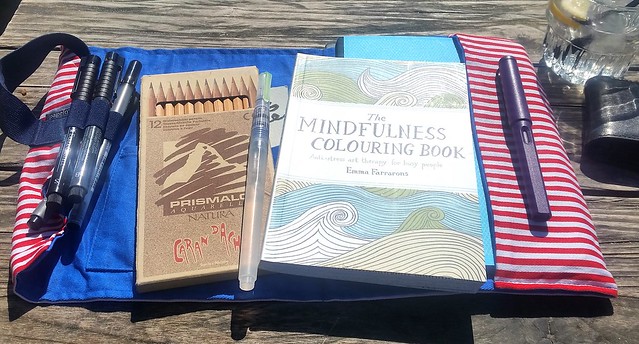
List of supplies:
Carabelle Studio; 
Héra XXL   

Others:
Sennelier watercolors
Memento ink pads 
Liquitex Inks
DecoART Traditions paint
Distress Crayons 
Washitape

I would like to enter this piece in the following challenges:


Mixed Media monthly #36 - put a stamp on it

Creative Artiste Mixed Media Challenge #26 - Anything Goes 

Grab our Badge


Thanks so much for stopping by and have an awesome day!

2017/05/12

Shopping Highlight: Arturo Manuel Papeleria in Valencia

Arturo Manuel

Last week I was going through the pictures in my phone and I noticed that I have not yet told you about the wonderful stationery shops I had found in Valencia while being on vacation there last March. Well, let me correct that mistake and share one of them with you today, Arturo Manuel Papeleria. This is a picture of the storefront and judging by the advertisement displayed, it looked promising and let me tell you it definitely was!

arturo manuel
This is the view when you come in. It's actually quite a large store and they have a variety of items for sale, from from office furniture to luxury fountain pens and even art supplies!! Let me tell you, I was like a kid in a candy store!

arturo manuel
The view from the opposite end of the entrance. The kind lady you see at the counter helped me a lot, showing me pens (there were a couple I wanted to see) and I found more of my fave turquoise ink ever and made it my Unicorn Ink!! Yep!! Ok, this is going to be picture heavy, so you can see more pictures of the store below and all will be revealed about the Unicorn Ink as well :)

2016/10/19

Pens and Ink: Omas Bologna with Montblanc Dandy Turquoise

Omas Bologna black and gold celluloid

This post is going to be an appreciation post of this pen, which is the Omas Bologna in Black and Gold Celluloid finish. I was lucky enough to find this one for sale at a local boutique and since the Omas pens are not readily available anymore, I jumped at the chance and got this gorgeous writing instrument.

Omas Bologna black and gold celluloid
Look at that stunning celluloid finish! I bet you could not resist this beauty when you've seen it up close!

Omas Bologna black and gold celluloid
It's fitted with a 14k fine "colonnade" nib. Not my preferable nib grade, but you can't be too choosy with pens that are hard to come by. Thankfully the Omas nibs are somewhat springy so it does offer a nice line variation in writing.

Omas Bologna black and gold celluloid
I've paired this pen with my fave turquoise ink, Montblanc Honoré de Balzac Dandy Turquoise, a special edition ink from last year. I love this color and have a few bottles of it, but only use it sparingly because what if I run out of it?? That is the perpetual fear of owning LE inks Isn't it? I decided this pen is definitely worth that special ink though! It's got some great shading and sheen, which even a fine nibbed pen like this Omas can bring out quite well.

Omas Bologna black and gold celluloid
I am definitely loving this pairing a lot. And this pen is just so shiny!

Omas Bologna Black and Gold Celluloid
What I also like about this pen is that it has a lovely detail on the finnial, the "O" gives it a nice finishing touch.

Omas Bologna black and gold celluloid
The clip on the pen is a bit different than their usual clips with the little wheel on the end. It's also a bit more springy than those clips. Certainly fits the overall look of the pen.

Preparing some posts for my #pensandink section on my blog. A real beauty coming up soon. #omasfountainpen #omas #fountainpen #mindfulwriting #writtenmeditation #journal #lovingkindness #turquoise #fpgeeks #fpn #fountainpennetwork
It also came in this leather pen sleeve, one that came with older Omas pens. Love the deep blue color it has and I prefer it more than the felt pen sleeves that came with the resin ogiva's for example. This has a classier feel to it. My Omas Bologna in red celluloid also has this same pen sleeve, So it think it only came with certain special edition or older pens.

Omas Bologna black and gold celluloid
I got this Bologna for a great deal at a local boutique because of a clearance sale and I still can't believe the luck I had with that! It's definitely a stunner of which I am proud to have in my fountain pen collection. If you ever have the chance of picking one of these up, definitely don't hesitate! 

Thanks for stopping by and hope you have a great day. 

namasté

2016/07/13

Pens and Ink: Vintage Lamy Studio with Kaweco Paradise Blue

Lamy mustard studio

Last year I shared a post on finding these vintage Lamy fountain pens named Lamy STUDIO on the barrel. And I finally got around using one of them, The mustard yellow one has an MK nib which stands for "medium kugel" which, to my pleasant surprise, writes really well! What is also a bonus is that it  takes "standard international cartridges" (it also fits a SI converter) and I put in one of my Kaweco Paradise Blue cartridges.

Lamy mustard studio
The steel nib writes wonderfully smooth for a 1970s/1980s school pen and has a nice wetness to it. It shows off the shading of the Kaweco Paradise Blue ink really well. It could be an excellent daily writer and with the possibility of using non proprietary Lamy cartridges makes this a very interesting pen. Note that Lamy cartridges or converters do NOT fit this pen. 

Apparently this vintage pen from Lamy can be found in two different "names" while the pen looks exactly the same. I got this info from a thread on FPN on Lamy Studio/P25 from user "dib"
"The studio was the name of the series, 25 P the article number. It is like the 27: 27 is the name, e.g. 30 / 31 or 32 the article number.
Later the 25 and 26 are called design, the 80,81 and so on profil.
I guess only the first 25 are named studio on the cap. The article number 25 P was used from the beginning, april 1969."
Lamy mustard studio

That is very interesting to know! More info on the Lamy P25 on FPN here and here. Also in one of the pictures there you can clearly see the P25 imprint on the barrel, while mine says studio. These are not very commonly fond anymore, so I got really lucky with that score. I have a Pink one for sale, should anyone be interested. A lot of other pens I'm letting go of are also listed there (prices are updated and I'm also accepting offers!). Thanks for having a look. 


Have a great day!

namasté 

2016/06/02

Inky goodness: Nickel Teal Time Wash

In my pens and ink post yesterday I paired this gorgeous combination: the pelikan M805 Vibrant blue with Organics Studio Nickel Teal.
Just love this color! And it's going to be available soon again, yay! @organicsstudio #nickelteal #organicsstudio #bluehues #fpgeeks #FPN #fountainpennetwork #fountainpen #pelikan #pensansink #vibrantblue
This ink will be in the line up of the relaunch Organics Studio will have this month. Recently I have been into ink washes, also thanks to a few great swaps on swapbot and I've made a few fun note cards with a rubber stamp emboss resist technique and the Nickel Teal ink which I want to show you today.

Nickle Teal Time wash
I started with diluting the ink in my tray. I posted a few drops of in in the tray and added drops of water to them, 3, 8, 12 and 17. In the middle I also added a little bit of shimmer in the form of blue Pearl Ex powder. I also made sure I had a bit of 100% non diluted ink in my tray as well. I stamped the image a few times on water color paper and lightly embossed it with Wow lagoon embossing powder. The image is from Non Sequitur plate Time and Space which is available at the Stempelwinkel. 

Nickle Teal Time wash
The way I started off with the wash is from light to dark layering, so I used the most diluted ink first to create an over all light tone and added darker tones to arias I wanted darker. The embossed parts of the stamp resist the ink, so the image doesn't wash away and shows through the ink clearly.

Nickle Teal Time wash
I used a mixture of wet on and wet and dry overlay wash techniques. To get the desired darker effects I waited in between layers to add more color. The less diluted, the more saturated the dried up color is, obviously.

Nickle Teal Time wash
It's fun to test out different kind of washes. Here I made the edges of the image darker and added a spatter effect with the non diluted ink over it when dried. When I was satisfied with the desired effect the wash created, it was time to make some cards out of them!

Nickle Teal Time wash
I measured and cut out both pieces so the image was in the center. With this piece I rounded off the corners with a corner punch, matted on black card stock, also rounded off the corners and then adhered it to a folded note card which I then also rounded off. I love the layered effect this created. 

Nickle Teal Time wash
With this piece I also splattered on some water drops and let that dry. That created the lighter aria's on the card. Then I cut the edges with a figure scissor. I have a fun stars punch from the HEMA which you can reposition on the whole card and I used that on this card. It creates a nice "starry night" effect with the black background. I adhered the piece to a dark blue note card. 

Nickle Teal Time wash
The cards side by side. I love this teal color! It creates such beautiful washes! The cards also have a bit of shimmer to it due to the Pearl Ex Powders which you can see a little bit here:
Nickle Teal Time wash
It's very subtle and you can only see the shimmer when the light hits the card a certain way. I definitely love how these cards turned out :)
Nickle Teal Time wash
The fortnight challenge at the Stempelwinkel stamper's #9 challenge is blue and I'm entering these cards for the challenge. 

Thank you for stopping by and I hope this inspired you to play around with ink washes as well :)

Have a great day!
Namasté

2016/06/01

Pens and Ink: Pelikan M805 Vibrant Blue with Organics Studio Nickel Teal

Pelikan M805 Vibrant blue with OS nickel teal
So you might have seen my pens and ink post from last week, where I announced some good news that Organics Studio will relaunch a few of their inks this month. And I'm happy to that they have decided to bring back one of my personal faves Nickle Teal as well :) I've found a great pairing, if I say so myself. The Pelikan M805 Vibrant Blue Special Edition!

Pelikan M805 Vibrant blue with OS nickel teal
They are almost sold out everywhere and I was lucky enough to get this gorgeous pen at a great price from the Fountainpen Group Buy facebook group, run by a great guy, Filippo Rosati. I went to pick up my Pelikan when it arrived and he is such a pleasant guy to deal with. Props to them for making such amazing group buys possible! I would not have wanted to miss this one and I'm so happy to have this amazing pen (for a great price!) in my collection! Thanks again Filippo!!

Pelikan M805 Vibrant blue with OS nickel teal
Look at that gorgeous nib! Pelikan really has the best nibs out there, always a smooth writer, right out of the box (in my experience!)

Pelikan M805 Vibrant blue with OS nickel teal
A written page in my loving kindness metta meditation journal. Nickel teal is a great ink! Beautiful shading and a gorgeous teal to turquoise color! The broad nib of the pelikan shows that off well!

Pelikan M805 Vibrant blue with OS nickel teal
If you want to know what inks will be available from Organics Studio, stay up to date with their facebook page and Instagram

I have been experimenting with ink washes recently and I will share some art work I have done with the ink tomorrow, but here's a teaser:
OS nickel teal time wash
Thanks for stopping by and I hope you will drop by tomorrow to see the process and full works I made :)

Have a great day!

namasté

2016/05/27

Craftorij Summer Challenge 2016

It's almost June and that means the Craftorij Summer Challenge is nearly starting! What is the Craftorij summer challenge you ask? Well this year there is also an English FQA and I'll post it here:


"What is the Craftorij Zomer Challenge ( Craftorij Summer Challenge) or #CZC
The Craftorij is an art supply shop in the Netherlands owned bij Lia Sauer.
With a group of ladies who all got to know each other over there we started the Summer Challenge in 2014 for the first time.
For 2 months you will get a daily prompt, it is posted every night around 20.00 European time. The post will be pinned on top of the page with an example ( for your inspiration) made by one of the hosts. At the files section there will also be a list with all prompts available, so if you miss one you can always check the list.
You can make the prompt on an index card (10x15 cm in size so roughly 4x6 inches) and you can use techniques and materials you like most or which you have available. It's a Dutch group but we will also post the prompt in English for you. A
Joining us is completely FREE and there are no obligations. If you want to make all prompts (that’s what we like most of course) that’s great but if you miss a few that’s no problem too. You can always make them later.
The only thing is that it would be nice if you show us your piece of art so we can all inspire each other. If you go to the albums section you will see that for each day, we will create a new album. You can add your images to the album and post a comment immediately. This makes your image pop up in the newsfeed of the group. So no need to post it 2 times.
For reference please always use the #CZC and the number of the prompt you are making."


Last year I also did an attempt for the CZC 2015 challenge and went relaxed about it. I didn't finish the whole ride, at some point other obligations took over. But it's always fun to see what the prompts inspires you to make. Some prompts I had a strong idea on and others not so much and that is ok. The 1st warm up was "your favorite color" and even after all that glorious Posie Pink on my pens and ink post past wednesday, I assure you my fave color is still sea blue/turquoise ;) 
I have 2 books of maruman watercolor paper and a bunch of photo paper (from last year) on that 10x15 size so I will use that. The little mermaid was my fave movie while growing up and inspired me to make this piece for the first warm up challenge. 
CZC warm up 1 - your fave color
The background I made with a combination  of ecoline, winsor and newton and fountain pen inks in various sea blues on maruman watercolor paper. I mixed a bit with perfect pearl green for the shimmer. Then I ran it  through my cuttlebug with the distress rays emboss template, which I also used for the "knowledge is enlightenment piece" from last week. For depth I traced the embossed outer lines with tombow sea green dual brush pen. The mermaid I stamped and colored with promarkers on sticker paper and cut her out and adhered to the piece. I did lightly stamp her on the piece with archival black for the hair placing. And I definitely love how this looks!  
CZC warm up 1 - your fave color
I scanned the piece and while the colors look darker, she shimmer shows quite nicely! 

If you are planning on playing along with us, to see the prompts and other creations you have to join the facebook group. You don't have to make all of it, just see what the prompts your creativity inspires to make. That's is how I'm entering this summer's challenge :) 

Thanks for stopping by and have a wonderful creative weekend!

Namasté 

2016/05/15

Paper goods: Papelote Notebook Cover & Clairefointaine 1951 vintage notebook

It's wonderful "journaling on the beach" weather! Papelote notebook cover from @bureaudirect is super handy!  #bureaudirect #stationeryaddict #stationerywednesday #journaling #journalonthego #papelote #notebookcover #brushpens #artjournal #lovingkindness
It was a beautiful day out and we decided to make good use of it and go to the beach. The perfect opportunity to test out the great Papelote A5 Notebook Cover outdoors! This notebook cover, together with the Clairefontaine 1951 retro cloth bound notebook was so kindly sent to me by Mishka from Bureau Direct for review purposes! Thank you so much Mishka!!

Journaling on the go

The papelote notebook cover is made with soft cotton cloth and comes in various designs. I was sent the red and white striped with blue inseam cover. A lovely combination! The cover has an elastic strap attached to it, which can hold 5 writing utensils. It comes with a pencil to get you started. You can see the array of items I've chosen to carry with it; a few fine Steadtler fine liners, a faber castell brush marker, sakura gelly roll pen and a water brush pen. The size I have here is the A5 size, which can fit any A5 size notebooks like the Leuchtturm 1917 and Rhodia notebooks. I chose the Clairefontaine 1951 vintage style notebooks, because of the fact it has fountain pen friendly paper and well just look at it.

Clairefontaine retro 1951 notebooks
It's pretty and it's turquoise! They come in 3 different sizes, the pocket sizeA5 exercise and A5 clothbound books. I got to test them all and they fit in very nicely in the notebook cover.  

Starting off the day with a little writing in my journal. Papelote notebook cover and claire fontaine retro notebooks from @bureaudirect #dailywriting #journal #papelote #clairefontaine #bureaudirect #writing #mindfulwriting #gratitutejournal #stationerya
 Also I used some fun journal rubber stamps to categorize my notebooks :) 

A fun turquoise set: clairefontaine vintage 1951 pocket book, J. Herbin rollerball with Blue Pervence ink cartridges. Thanks @bureaudirect @mishka5050 😊
Fun fact, Bureau Direct also offers the pocket books in a fun compilation with the J. Herbin rollerball pen and ink cartridges. The turquoise set comes with J. Herbin Bleu Pervence turquoise ink cartridges. They also have the bottled ink here. A scrumptious set for a turquoise fanatic like me :D

Anyhow, back to the notebook cover! You can carry a lot of tools inside the cover besides just the notebook due to the flexibility of the soft cotton cloth cover!

Journaling on the go
Look at that! Doesn't that look scrumptious?? Yes, the brownie was really yummy as well ;) So what did I take with me in my notebook cover? Take a look below:

Journaling on the go
I tucked in a pack of water color pencils, a pocket size coloring book, the Lamy Safari Dark Lilac (see my pens and ink post about it here), a pocket sketchbook and...

Did you know you can also tuck in an A5 clipholder in the back of the papelote notebook cover?! It gives more "body" to the cover and you can just sit anywhere and write :) you can get all the items pictured at @bureaudirect for your own "on the go" journ
An A5 Clipboard! The cover has a seem opening on the back where you can tuck this baby in! I found this discovery brilliant as you can add sturdiness to the cover which allows you to sit down anywhere and write, draw, color or whatever on the go! I already had this one, but Bureau Direct are selling these clipboards by Penco as well. So what do I use my clairefontaine journal for? I use it as my Daily Gratitude and Loving Kindness journal. You have seen shots of the pages in my Pens and Ink post, surely. Every morning (or at least I try to) I write down the loving kindness meditation to set the tone for Compassion for the day. I will write another post about this type of journaling at a later point, but let me show you a page as a reminder.

Starting off the morning with some #lovingkindness #mettameditation #writtenmeditation Tools of choice: FP: Online Calligraphy 1.8m Ink: visconti turquoise cartridge Paper: Clairefontaine - #Fpgeeks #FPN #fountainpennetwork #calligraphy #shittycalligraphy
As I said before, the paper in clairefontaine books hold fountain pen inks really well. It's definitely one of my preferred notebooks for journalling as I love the line spacing (7mm) for my handwriting and the smoothness of the paper lets the nibs just glide over the paper. 

In conclusion: The combination of the Papelote Notebook Cover with these Clairefontaine 1951 notebooks is a wonderful thing! I thoroughly enjoyed using cover. A major plus point being the flexibility of it. Also a great thing about the fact that it's a cloth cover is that you can wash them quite easily if you spill any (non permanent) ink on it! The straps are mighty handy too! It works best if you have something sturdy in the cover like a clipboard or a hard cover notebook, though. If you are looking for only the notebook straps, Papelote also makes them separately which Bureau Direct also sells. Those work best on hard cover notebooks. 

Thanks again Mishka/ Bureau Direct, I've really improved on my daily writing sessions by having such a wonderful set up for it :) By the way, if you're looking into journalling yourself, and looking for something that might work for you, why don't you check out Stationery Wednesday as this month's spotlight falls on  the Bullet Journal. And while you're there, don't forget to subscribe to the newsletter if you haven't already. Next to fun news, specials and competitions, it also contains a weekly discount code for 10% off your purchase at Bureau Direct shop! That's not something you'd want to miss out on!

Hopefully this review was useful to you and inspired you to go out and journal in the wide open :) 
Thanks for stopping by & have a great sunday!

namasté

(disclaimer: I got these items free of charge for review purposes and was not monetarily compensated. All opinions stated here are my own and there are no affiliate links.)