Showing posts with label lamy. Show all posts

2017/01/11

An ode to Franklin Christoph Model 45's

Pocket 45s #franklinchristoph #franklinchristophfanclub #pocket45 #demonstrator #fountainpen #funtainpen #fpgeeks #FPN #fountainpennetwork #stationeryaddict #penaddict #pens #toolsofthetrade #pen #writinginstruments
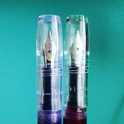
Model 45 in Amber and Antique Glass finish.

As I am planning on more pen and ink posts (which will be on a bi-weekly basis from next month on) I didn't want to deprive you all from some great fountain pens in the mean time. So I am sharing an ode to stunning Franklin Christoph model 45 fountain pens in picture format today. Enjoy :)

Franklin Christoph Model 45
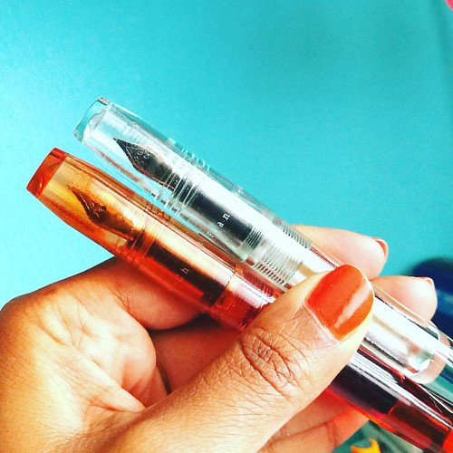
Model 45 in Italian Ice and Antique Glass - there is clearly a difference. (See what I did there ;)


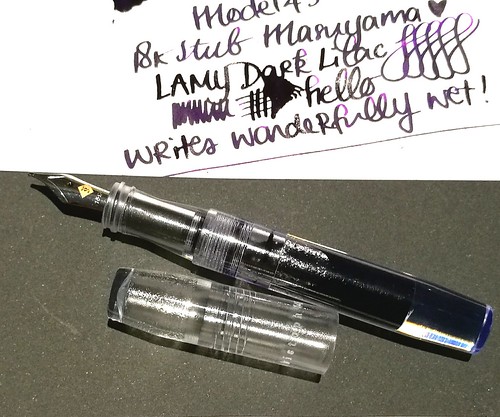
Franklin Christoph model 45
The 18k broad stub nib on the italian ice writes like a dream! Shows off the Lamy Dark Lilac ink really well.

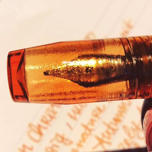
Amber #franklinchristoph #franklinchristophfanclub #pocket45 #fpgeeks #FPN #fountainpenfriday #freefountainpenfriday #Fountainpen #fountainpennetwork #SIG #seriousnibbage #diamine #autumn #autumnoak
Model 45 in Amber finish, close up shot of the barrel. Beautiful craftsmanship!

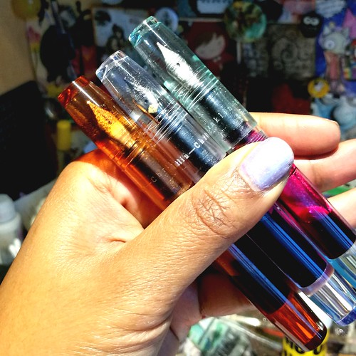
Franklin Christoph model 45
They multiply like crazy! The cherry ice finish is on my wishlist. And I hope they will do a blue ice or myan blue finish in this model as well.

Thanks for stopping by and have a great day!


2016/07/13

Pens and Ink: Vintage Lamy Studio with Kaweco Paradise Blue

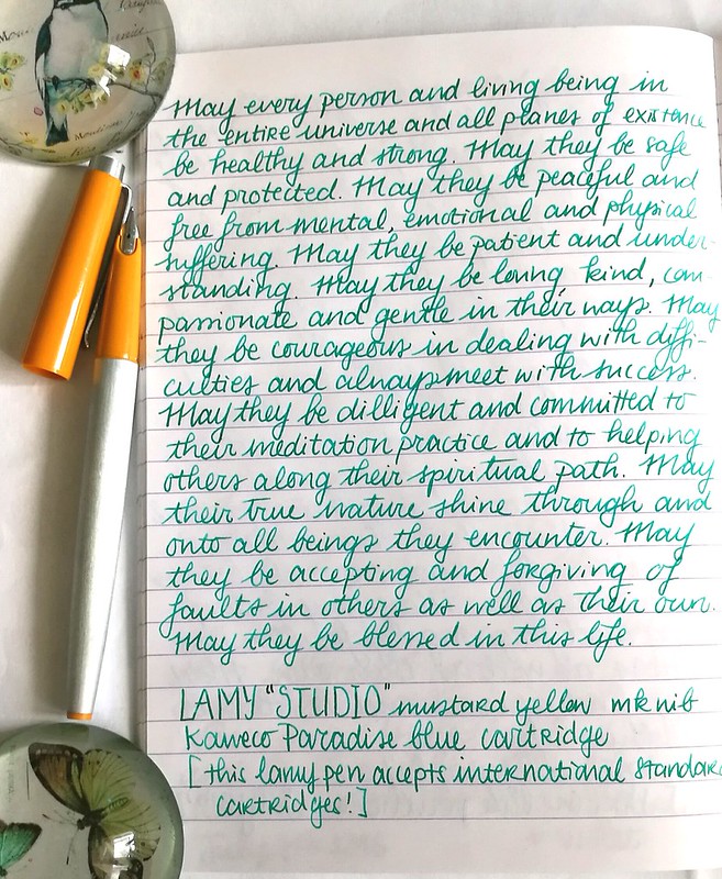
Lamy mustard studio

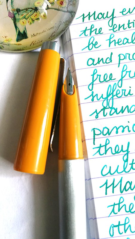
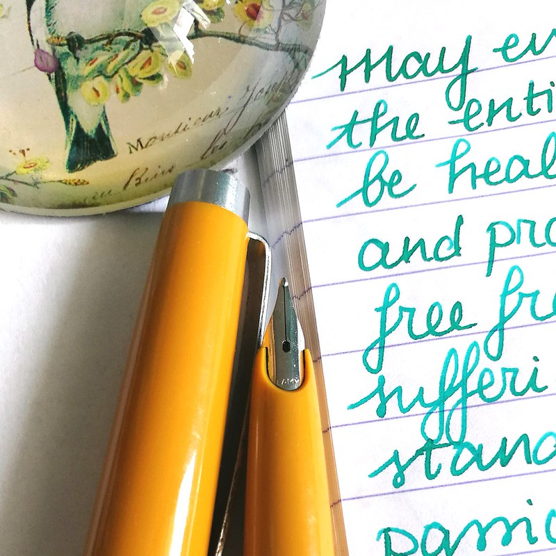
Last year I shared a post on finding these vintage Lamy fountain pens named Lamy STUDIO on the barrel. And I finally got around using one of them, The mustard yellow one has an MK nib which stands for "medium kugel" which, to my pleasant surprise, writes really well! What is also a bonus is that it  takes "standard international cartridges" (it also fits a SI converter) and I put in one of my Kaweco Paradise Blue cartridges.

Lamy mustard studio
The steel nib writes wonderfully smooth for a 1970s/1980s school pen and has a nice wetness to it. It shows off the shading of the Kaweco Paradise Blue ink really well. It could be an excellent daily writer and with the possibility of using non proprietary Lamy cartridges makes this a very interesting pen. Note that Lamy cartridges or converters do NOT fit this pen. 

Apparently this vintage pen from Lamy can be found in two different "names" while the pen looks exactly the same. I got this info from a thread on FPN on Lamy Studio/P25 from user "dib"
"The studio was the name of the series, 25 P the article number. It is like the 27: 27 is the name, e.g. 30 / 31 or 32 the article number.
Later the 25 and 26 are called design, the 80,81 and so on profil.
I guess only the first 25 are named studio on the cap. The article number 25 P was used from the beginning, april 1969."
Lamy mustard studio

That is very interesting to know! More info on the Lamy P25 on FPN here and here. Also in one of the pictures there you can clearly see the P25 imprint on the barrel, while mine says studio. These are not very commonly fond anymore, so I got really lucky with that score. I have a Pink one for sale, should anyone be interested. A lot of other pens I'm letting go of are also listed there (prices are updated and I'm also accepting offers!). Thanks for having a look. 


Have a great day!

namasté 

2016/05/25

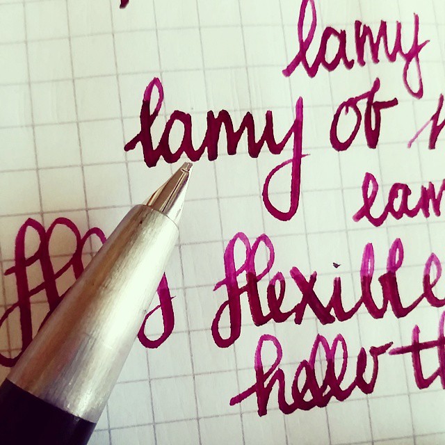
Pens and Ink: Lamy 2000 with Organics Studio Posie Pink

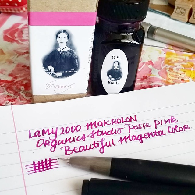
So this might be the most unlikely pairing for me up to date as I usually do not like pink colors and the Lamy 2000 was always a bit 'meh' to me. But combining these two together, it's an absolute winner!
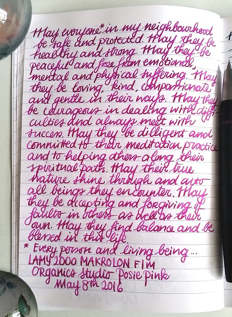
Inked my Lamy 2000 up with organics studio Etmily Dickinson Posy Pink. It's such a gorgeous color and I am generally not a Magenta color family fan. Also Organics Studio will be relaunching their inks soon! Huzzah!!
The Lamy 2000 has been said to a "must have" in everyone's fountain pen collection. Sooner or later, you end up owning one. In my case, it was quite a bit later, because I honestly never understood the appeal. And yet I own two of them. Here's how that happened.

I do like the simplicity of the Bauhaus design by Gerd A. Müller, but it was just a tad bit underwhelming for me and wasn't ready to buy it at full price. Then at the Tilburg pen show from a few years ago, I got the chance to purchase a vintage Makrolon one with an OB nib for a nice price, and thus the "staple pen" was then finally added to my collection.
That nib and that ink is an amazing combo. Love the sheen in #iroshizuku #yamabudo 💕
Vintage Lamy 2000 with an OB nib, inked with Pilot Iroshizuku Yama-Budo

While the OB nib was fun to use, it has a very specific "sweet spot" to write with, so I hardly ever use it as I like to hold my pens a certain way to write. I wanted to give writing with the Lamy 2000 a fair chance and once more I bought the Lamy from a fellow fountain pen aficionado who was letting his pen go. It has a fine nib, which writes like medium, that's why he didn't wanted it. But another person's "I hate it" can be someone else's "I love it" (That is a constant debate between my husband and I about EF nibs!)  I actually love this specific nib width in the Lamy, it actually writes broader than most B marked pens I own! Oh and how it writes, that changed everything! So here I learned that looks can be deceiving, the pen might be a tad bit underwhelming, the writing experience isn't! The nib, which is 14k gold, writes super smooth and just glides on paper! It's very true to the designer's vision for this pen:  "When it made its first appearance in the shop windows in 1966, it was the first writing instrument of the modern era which did not seek to be a status symbol but simply an honest, high-precision tool for writing by hand." - from Lamy's website. Which is what Bauhaus is about, the functionality is key.

There are a lot of good Lamy 2000 pen reviews out there, so I'm not going to exhaust you with the specifics about the pen. See for an honest review about pen and nib at the Pen Addict here and he also posted links to other great reviews. My pens and ink posts are about pairings you can fall in love with. And let me tell you, the Lamy 2000 makrolon and Organics Studio Emily Dickinson Posie Pink is a match made in pen heaven!

lamy 2000 and posie pink

As you must know by now, I'm more of a Turquoise / blue hues loving girl. I hardly ever like pink or magenta colors. Yet there are exceptions like Yama Budo which stole my heart because of the beautiful gold sheen. But OS Posie Pink, is a straight up pink! I fell in love with after I saw it in writing in a letter to me from my friend Nicholas. So when I was in Stockholm a few years ago and saw they had a line of Organics Studio for sale at the Pen Store there, I took a bottle home with me.

Pocket full of posies
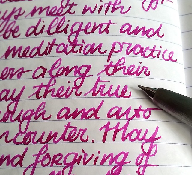
The ink has such character, the nib on the Lamy 2000 really shows off the shading!

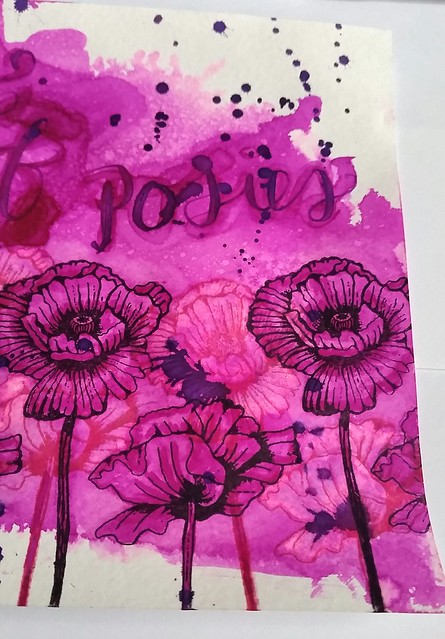
Before you tell me off that I'm showing you another pairing with a discontinued ink line, let me share some good news. Tyler from Organics Studio has posted an announcement on their website that they will be relaunching the inks this June! I contacted Tyler to ask him which inks will be in the relaunch and this is what he said: "It looks like we will be putting out 8-12 colors at the relaunch, and posie pink will be one of them. We will also be featuring our 4 vintage ink series inks, as well as manganate, cobalt, poe, and a few other surprises :)" Thank you Tyler for sharing which OS inks will be available and it looks like Posie Pink will be up for sale sometime soon again. In celebration of this I made a pocket full of posies :) 
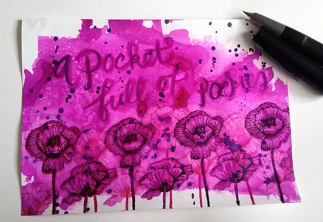
 
Pocket full of posies
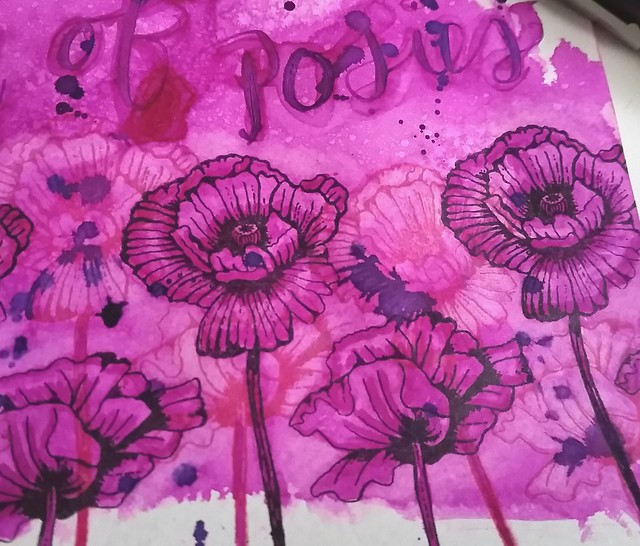
I recently got these fun flower rubber stamps and used Posie Pink on Maruman Zuan water color paper. I splattered a few drops of ink from the lamy onto the page, sprayed it with water from a mini mister, dried with my heat tool and then stamped the flowers with Staz-On Jet black and Cherry Pink. I got out a water brush and got to work on the flower petals. 


Pocket full of posies
I added depth to the flowers by making the petals lighter first and also making the aria around the flowers lighter. This I did by using the waterbrush on the arias I wanted to have lighter and dab the excess water/ink away with a paper towel. Then I added more color to the petals with a few diluted drops of the ink to give more shading.

Pocket full of posies
I retracted ink from the flowers stamped in cherry pink to give the light/dark effect between the flowers more contrast. A tombow blender tool can be used for this too, but you might stain your blender brush with this. I wrote a pocket full of posies with the water brush first and then with a inked dip pen over it. Lastly I spattered the remaining ink on the dip pen over the piece. 

There might be a giveaway of some OS inks on my blog at some later point, so keep an eye out for that. But for now, I hope you are just as excited as I am for these inks to be available again soon :)

With the "pocket full of posies" artwork I'm also entering the Mixed Media Monthly challenge #24 "Butterflies and Blooms"


Thanks for stopping by and have a wonderful day!

namasté
2016/05/11

Pens and ink: Lamy Dark Lilac vs Violet

Journaling on the go

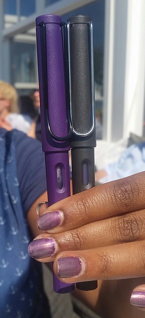
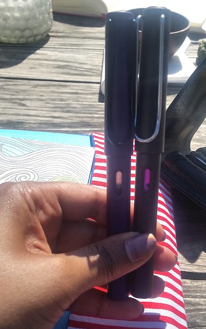
It's something we've all been waiting for and it's finally here, the special edition Lamy Safari this year is purple! Thanks for hearing our requests Lamy!! It's called the Dark Lilac and it's a gorgeous shade of dark purple. What I love most about the pen is comes with the dark clip and nib. Tt's also textured like the Lamy safari Charcoal which I really like!! (Andyes the charcoal usually also has a black clip, but my husband took this for experimentation and switched the clips to the silver colored one.) 

Texture of Lamy Dark Lilac #lamycollection #lamy #lamysafari #lamydarklilac #pensandpolish #Fpgeeks #FPN #fountainpennetwork #fountainpen #funtainpen #koh  #nailpolish #texture #purple
You can see the texture up close here (and yes I matched my nail polish to it as well ;) See my instagram account PensandPolish for more pen and nail polish matching :)

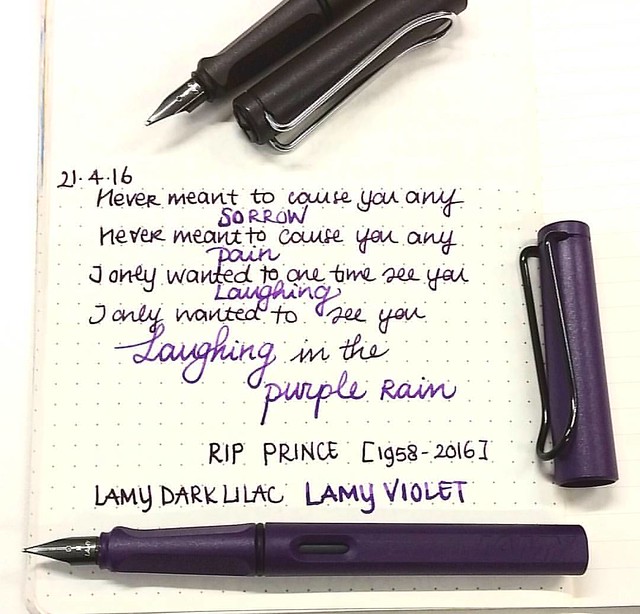
Another icon turned legend. RIP Purple Prince #purplerain #ripprince #lamydarklilac #lamyviolet #tribute #Fpgeeks #FPN #fountainpennetwork #lamycollection #Lamy #funtainpen #fountainpen #purple #lyrics #rain

The Dark Lilac came with a corresponding ink color. It's been a sad year already with great artists passing away and recently Prince passed away too :( The tribute above is dedicated to him and I cannot look at this pen without thinking about the song Purple Rain. I also compared the Dark Lilac color with the Lamy Violet above, but the medium nib on my Lamy made the ink look really dark. So I did a writing sample of both inks with a 1,5m nib (took mine from the Lamy Joy calligraphy set, but you can also get them separately).

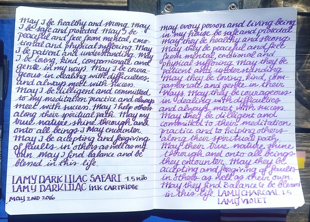
Journaling on the go

Wrote a few pages in my loving kindness metta meditation journal and you can clearly see the difference here. The Dark Lilac is definitely a lot darker than the violet and has more shading and sheen to it. Sadly there are no ink bottles of the Dark Lilac available in Europe (yet) so I can't do an ink swab comparison. Hopefully they will release the bottle in Europe at some point! But see a great inkshot review of Dark Lilac by Gourmetpens. And other great comparison reviews of Lamy Violet and Lamy Dark Lilac by the Clumsy Penman, the master "ink-fusionist" :)

Journaling on the go
As you can see I have been writing with them quite a bit, the cartridges are 1/2 empty (writing with a wide nib width also helps ;) An interesting fact you can see here on the right, the violet color clings more to the cartridge than the dark lilac. When you clean out and recycle a cartridge, it does clean out completely, but in use, it never becomes clear like the Dark Lilac on the left does. 

And with this little fun tidbit, I'm concluding this week's pens and ink :) Do you have a Lamy Dark Lilac? If so what do you think of it? If not, I got mine at the Penstore which has a great deal on it! You can also get separate nib units there, if you want them (no affiliation, I just like shopping there!). 

Next week more on Omas! Have a great day and thanks for stopping by!

namasté

2016/04/27

Pens and Ink: The copper orange edition + mini Q&A

A little intermission from my Omas pens and ink postings this week as it's Kingsday in the Netherlands! Since the nation is being clad in orange today, I thought it would be a fun idea to have this week's pens and ink post to color coordinate accordingly.

Seeing I don't own many orange pens, but I know someone in particular who does like them and even customized one, I asked him to help me out this week. I've also asked him some questions on how he uses his fountain pens which also fits this months theme on Stationery Wednesday at Bureau direct"Everything you wanted to know about fountain pens, but were to afraid to ask" So thank you, my husband Cris, for indulging me and answering a few fountain pen related questions  :)

How did you get (re)acquainted with fountain pens?

My first fountain pens I used in school, which meant a lot of inky fingers and a lot of collecting of the little agitator balls that are left in standard cartridges. But stopped using fountain pens the day I left primary school behind.
I got reacquainted with fountain pens because my wife, the wonderful Miss Thundercat, started using them. While she was using more and more elaborate pens (eyedroppers, piston fillers etc) my interest was mostly just technical. The construction, the use, the techniques the idea's. When I finally got around to buying my first fountain pen, I was quite happy with the way it could be handled, wrote and the choice of inks.


What was your first fountain pen purchase?

My first fountain pen was the Lamy Al-star Black, a gorgeous, matte black, "stealth" looking pen. I thought that it was a really cool pen even though the cap look a bit "chunky" but fitting as as Al-stars are robust pens. I was sold on fountain pens ever since.


Do you have a favorite nib size?

I have a spidery cursive handwriting, so to keep it legible, I go for extra fine or fine points. I also enjoy them for art projects. I have experimented with broader nibs and trying to change my handwriting, but nothing consistent has come out of this so far.


What do you use your fountain pens for mostly?

I use it for writing projects or (small) notes and planning of RPG's mostly. I like to use hard back notebooks like Leuchtturm 1917 A5 size in dot grid. I also enjoy creating map drawings with them and different sizes nibs and ink color choices are really useful.


How did you get the idea to customize your Lamy Copper Orange?

So I started with Lamy with the Matte Black Al-star, which had all black parts and love the looks of that. I really love the deep color of the Copper Orange pen body, so I got the pen when it came out. But the chrome clip and nib just seemed "off", they didn't add to the pen and just seemed to disappear against the really outspoken color of the body. For a while the pen kinda languished on my desk, being merely "okay".
After witnessing the breaking of a really old Safari cap I had done a some research to fix it and eventually got enough to understand how they worked.
I ended up buying a Lamy Safari Charcoal to strip for parts (I didn't know I could just get the spare parts from Bureau Direct back then) and assembled the clip on the Copper Orange. My pen went from merely okay to really shining. The black clip and nib adds something to the pen. Black and orange just go really well together. After people saw this transformation on my Instagram, I got requests to customize the Copper Orange for other people. Fun to see it was a hit with others as well.

What ink do you like to pair it with?

The Terracotta from the Diamine 150 anniversary ink line goes really well with the color of the pen. It's deep and rich with enough "bite" to complement the orange of the pen.

Een foto die is geplaatst door Blaze8t88 (@cornelius.grayl) op


And I have to agree, the pen and ink combo looks wonderful... even with a fine nib! Within a year Cris's collection has grown quite a bit. To see more of his pens and map drawings, you can follow him on his Instagram.


Een foto die is geplaatst door Blaze8t88 (@cornelius.grayl) op


Thanks for stopping by!

namasté

2015/07/23

Thriftfinds Thursdays - Vintage Lamy fountain pens

Last weekend we had a visit to the ijhallen again. It's been a while since we've been there and it was fun to browse the stalls in the wonderful shunshine. Next to some fun clothing (you can score really fun clothes for a very cheap price) I actually found a few really cool and older Lamy fountain pens! even ones I have not seen before.

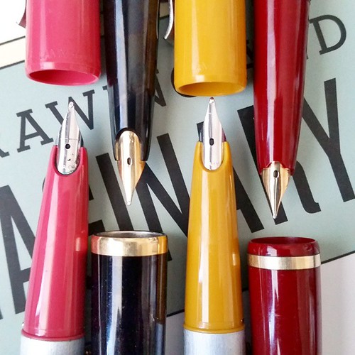
Yesterday's awesome thrifting score! LAMY studio's from West Germany(pink and musterd yellow), Lamy 27 (black) and Lamy Ratio (red) with golden nibs. And my ultra sonic cleaner is my new best friend! These were incrusted with ink! #lamy #lamylovers #fount

From left to right, Lamy Studio Pink (from West Germany), Lamy 27 Black with gold nib, Lamy Studio Musterd Yellow, Lamy Ratio with gold nib.

I am glad I invested in a sonic cleaner as these pens were really incrusted with ink. The gunk got cleaned right off the nibs! 

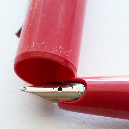
Close up of the older Lamy Studio:

Old school Lamy Studio from West-Germany. Cap and section is safari like material. #lamy #lamylovers #fountainpenporn #fountainpen #funtainpen #fpgeeks #collectibles #lamycollection #vintage #thriftfinds

You can see the inscription on the cap. It has a safari like cap and sectionand a brushed stainless steel body. Very interesting design. Another interesting fact; it takes international ink cartridges instead of propiatary Lamy ones. I have never seen these before and it's hard to find anything on the web about it... so if anyone has any info on these pens, please share :)

Thanks for stopping by!

Namaste