Showing posts with label organics studio. Show all posts

2016/06/15

Pens and Ink: Franklin Christoph M65 with Organics Studio Jane Austen Violet

FC 65 with Jane Austen Violet

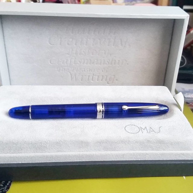
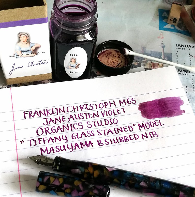
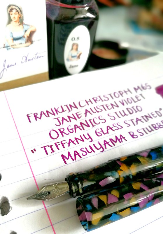
Recently I had the chance to purchase this gorgeous pen, a Franklin Christoph model 65 in a unique "tiffany stained glass" finish. It was only available at a penshow in the USA and I got lucky to be the one that snagged it off the seller at IG! The nib is a B stubbed nib by Masuyama and just writes like a dream!
I got a lot of other fun suggestions for an ink match up on my video, showing off the sparkle of the pen:


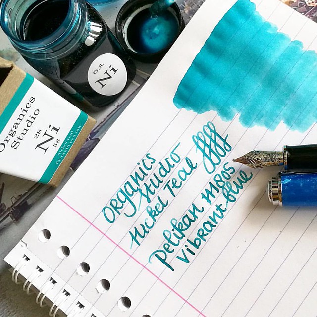
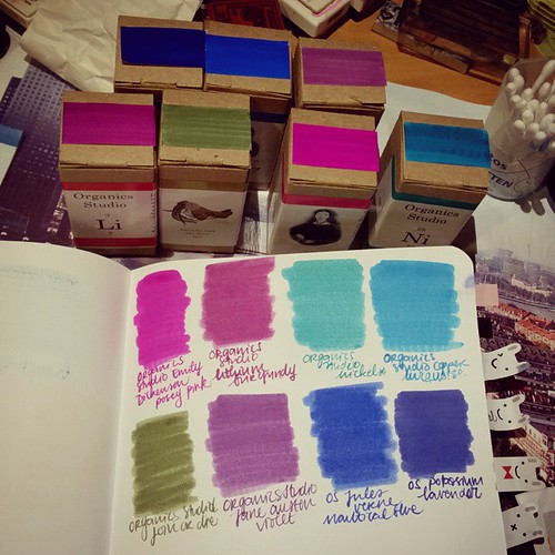
But eventually I chose for this match up:
FC 65 with Jane Austen Violet
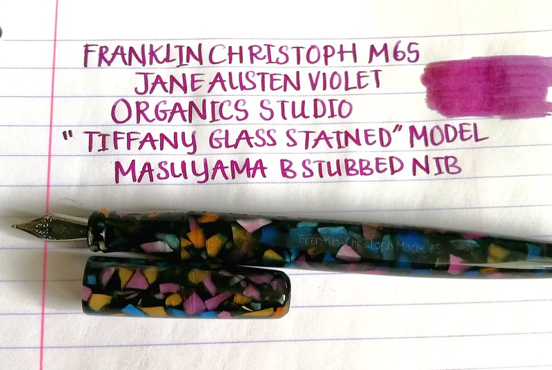
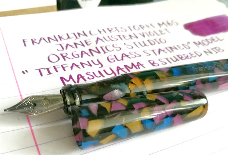
There are a lot of beautiful colors on this "stained glass" pen body material and I decided to pick an ink that matched the violet accents the most. I chose to pair it with Organics Studio Jane Austen Violet. It's a beautiful color between purple and pink and I think it suits the pens rather nicely.

ink comparison
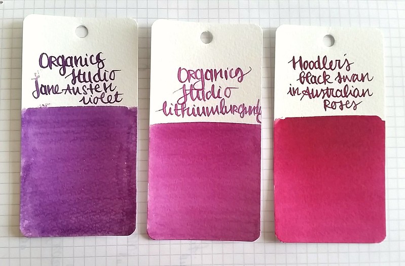
A comparison of OS Jane Austen Violet to OS Lithium Burgundy and Noodler's Black Swan in Australian roses. It's definitely a lot more lilac in swatches and ink washes, but in the FC pen with writing it's a bit more towards the lithium burgundy. These inks are handmade and I have mine for a while, so the color might be a bit different from bottle to bottle. 

FC 65 with Jane Austen Violet
By the way, I am loving my new Huawei P9 phone with the Leica camera :)

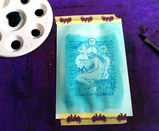
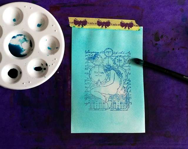
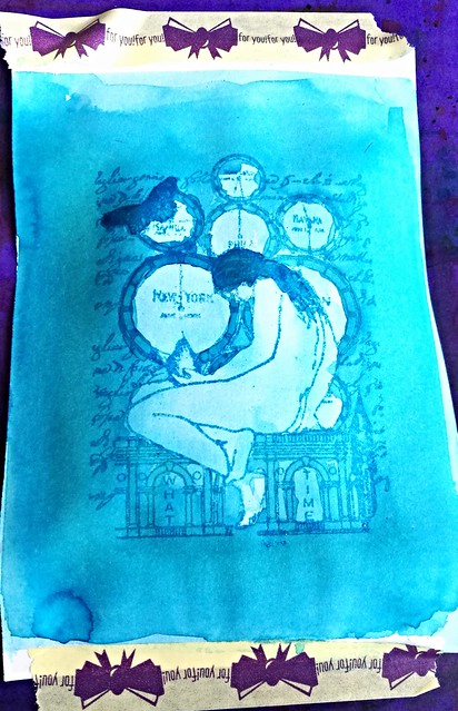
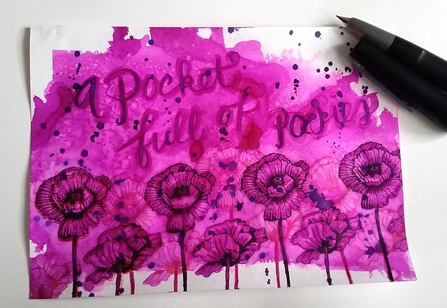
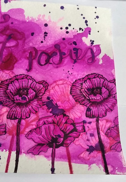
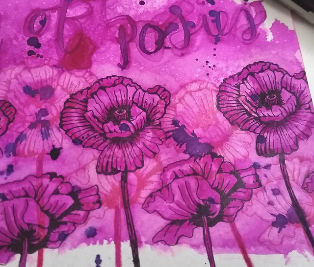
I also did a ink wash art work with the ink and found a fitting quote that fits the "mood" of this ink:
lovelorn ink wash
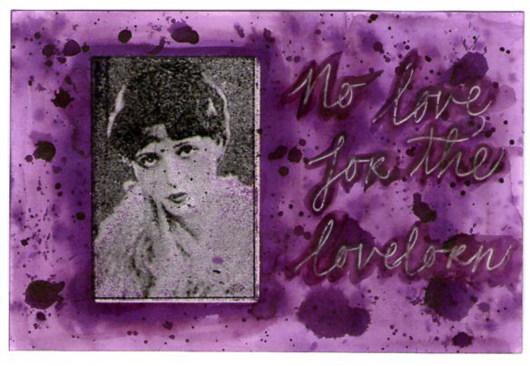
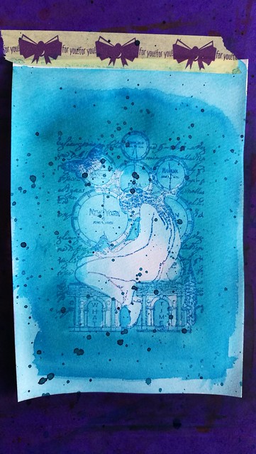
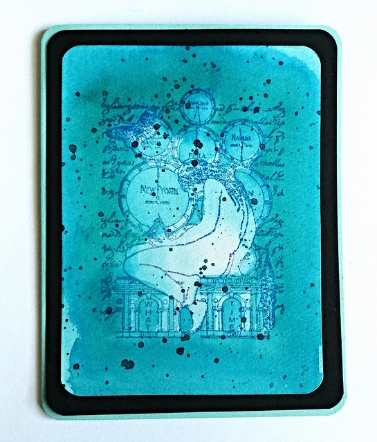
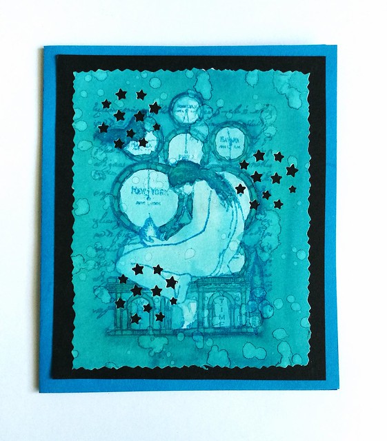
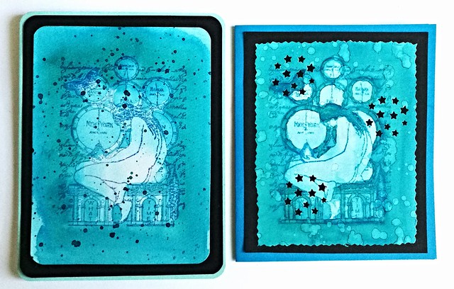
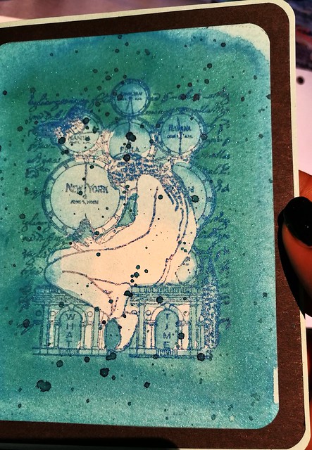
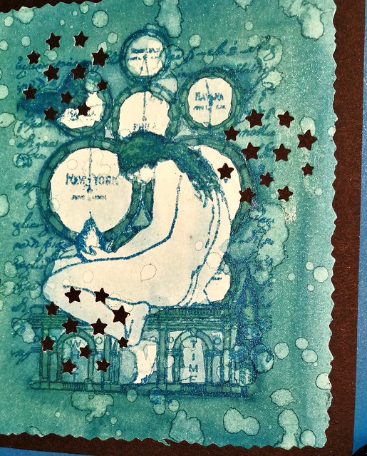
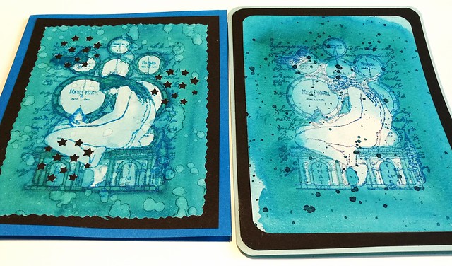
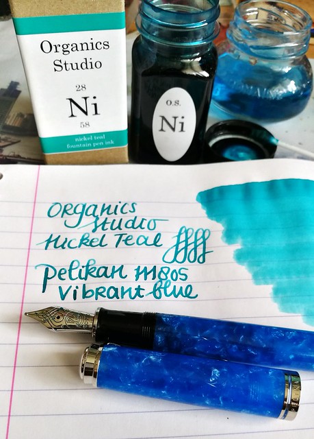
In true Jane Austen fashion: "no love, for the lovelorn" The rubber stamp is from Oxford Impressions. Ink washes are so fun to make! I used the same embossing resist techniques as with the Nickel Teal and Caroube de Cyphre. I do hope that this lady does have a happy end in love at some point... If you are into this color, you'll be happy to know that this ink is also in the new release. Seems like a few retailers are finally getting batches of OS inks in :)
A photo posted by Vanness1938 (@justvanness) on
That is definitely a great line up of inks! At this moment the inks are available at Vanness pens and Anderson pens :) 

Oh and if you want to watch a fun, set in a Jane Austen land kind of movie, watch Austenland. I just loved it (and it's with Felicity!!)

Thanks for stopping by and have a great day!

namasté

2016/06/02

Inky goodness: Nickel Teal Time Wash

In my pens and ink post yesterday I paired this gorgeous combination: the pelikan M805 Vibrant blue with Organics Studio Nickel Teal.
Just love this color! And it's going to be available soon again, yay! @organicsstudio #nickelteal #organicsstudio #bluehues #fpgeeks #FPN #fountainpennetwork #fountainpen #pelikan #pensansink #vibrantblue
This ink will be in the line up of the relaunch Organics Studio will have this month. Recently I have been into ink washes, also thanks to a few great swaps on swapbot and I've made a few fun note cards with a rubber stamp emboss resist technique and the Nickel Teal ink which I want to show you today.

Nickle Teal Time wash
I started with diluting the ink in my tray. I posted a few drops of in in the tray and added drops of water to them, 3, 8, 12 and 17. In the middle I also added a little bit of shimmer in the form of blue Pearl Ex powder. I also made sure I had a bit of 100% non diluted ink in my tray as well. I stamped the image a few times on water color paper and lightly embossed it with Wow lagoon embossing powder. The image is from Non Sequitur plate Time and Space which is available at the Stempelwinkel. 

Nickle Teal Time wash
The way I started off with the wash is from light to dark layering, so I used the most diluted ink first to create an over all light tone and added darker tones to arias I wanted darker. The embossed parts of the stamp resist the ink, so the image doesn't wash away and shows through the ink clearly.

Nickle Teal Time wash
I used a mixture of wet on and wet and dry overlay wash techniques. To get the desired darker effects I waited in between layers to add more color. The less diluted, the more saturated the dried up color is, obviously.

Nickle Teal Time wash
It's fun to test out different kind of washes. Here I made the edges of the image darker and added a spatter effect with the non diluted ink over it when dried. When I was satisfied with the desired effect the wash created, it was time to make some cards out of them!

Nickle Teal Time wash
I measured and cut out both pieces so the image was in the center. With this piece I rounded off the corners with a corner punch, matted on black card stock, also rounded off the corners and then adhered it to a folded note card which I then also rounded off. I love the layered effect this created. 

Nickle Teal Time wash
With this piece I also splattered on some water drops and let that dry. That created the lighter aria's on the card. Then I cut the edges with a figure scissor. I have a fun stars punch from the HEMA which you can reposition on the whole card and I used that on this card. It creates a nice "starry night" effect with the black background. I adhered the piece to a dark blue note card. 

Nickle Teal Time wash
The cards side by side. I love this teal color! It creates such beautiful washes! The cards also have a bit of shimmer to it due to the Pearl Ex Powders which you can see a little bit here:
Nickle Teal Time wash
It's very subtle and you can only see the shimmer when the light hits the card a certain way. I definitely love how these cards turned out :)
Nickle Teal Time wash
The fortnight challenge at the Stempelwinkel stamper's #9 challenge is blue and I'm entering these cards for the challenge. 

Thank you for stopping by and I hope this inspired you to play around with ink washes as well :)

Have a great day!
Namasté

2016/06/01

Pens and Ink: Pelikan M805 Vibrant Blue with Organics Studio Nickel Teal

Pelikan M805 Vibrant blue with OS nickel teal
So you might have seen my pens and ink post from last week, where I announced some good news that Organics Studio will relaunch a few of their inks this month. And I'm happy to that they have decided to bring back one of my personal faves Nickle Teal as well :) I've found a great pairing, if I say so myself. The Pelikan M805 Vibrant Blue Special Edition!

Pelikan M805 Vibrant blue with OS nickel teal
They are almost sold out everywhere and I was lucky enough to get this gorgeous pen at a great price from the Fountainpen Group Buy facebook group, run by a great guy, Filippo Rosati. I went to pick up my Pelikan when it arrived and he is such a pleasant guy to deal with. Props to them for making such amazing group buys possible! I would not have wanted to miss this one and I'm so happy to have this amazing pen (for a great price!) in my collection! Thanks again Filippo!!

Pelikan M805 Vibrant blue with OS nickel teal
Look at that gorgeous nib! Pelikan really has the best nibs out there, always a smooth writer, right out of the box (in my experience!)

Pelikan M805 Vibrant blue with OS nickel teal
A written page in my loving kindness metta meditation journal. Nickel teal is a great ink! Beautiful shading and a gorgeous teal to turquoise color! The broad nib of the pelikan shows that off well!

Pelikan M805 Vibrant blue with OS nickel teal
If you want to know what inks will be available from Organics Studio, stay up to date with their facebook page and Instagram

I have been experimenting with ink washes recently and I will share some art work I have done with the ink tomorrow, but here's a teaser:
OS nickel teal time wash
Thanks for stopping by and I hope you will drop by tomorrow to see the process and full works I made :)

Have a great day!

namasté

2016/05/25

Pens and Ink: Lamy 2000 with Organics Studio Posie Pink

So this might be the most unlikely pairing for me up to date as I usually do not like pink colors and the Lamy 2000 was always a bit 'meh' to me. But combining these two together, it's an absolute winner!
Inked my Lamy 2000 up with organics studio Etmily Dickinson Posy Pink. It's such a gorgeous color and I am generally not a Magenta color family fan. Also Organics Studio will be relaunching their inks soon! Huzzah!!
The Lamy 2000 has been said to a "must have" in everyone's fountain pen collection. Sooner or later, you end up owning one. In my case, it was quite a bit later, because I honestly never understood the appeal. And yet I own two of them. Here's how that happened.

I do like the simplicity of the Bauhaus design by Gerd A. Müller, but it was just a tad bit underwhelming for me and wasn't ready to buy it at full price. Then at the Tilburg pen show from a few years ago, I got the chance to purchase a vintage Makrolon one with an OB nib for a nice price, and thus the "staple pen" was then finally added to my collection.
That nib and that ink is an amazing combo. Love the sheen in #iroshizuku #yamabudo 💕
Vintage Lamy 2000 with an OB nib, inked with Pilot Iroshizuku Yama-Budo

While the OB nib was fun to use, it has a very specific "sweet spot" to write with, so I hardly ever use it as I like to hold my pens a certain way to write. I wanted to give writing with the Lamy 2000 a fair chance and once more I bought the Lamy from a fellow fountain pen aficionado who was letting his pen go. It has a fine nib, which writes like medium, that's why he didn't wanted it. But another person's "I hate it" can be someone else's "I love it" (That is a constant debate between my husband and I about EF nibs!)  I actually love this specific nib width in the Lamy, it actually writes broader than most B marked pens I own! Oh and how it writes, that changed everything! So here I learned that looks can be deceiving, the pen might be a tad bit underwhelming, the writing experience isn't! The nib, which is 14k gold, writes super smooth and just glides on paper! It's very true to the designer's vision for this pen:  "When it made its first appearance in the shop windows in 1966, it was the first writing instrument of the modern era which did not seek to be a status symbol but simply an honest, high-precision tool for writing by hand." - from Lamy's website. Which is what Bauhaus is about, the functionality is key.

There are a lot of good Lamy 2000 pen reviews out there, so I'm not going to exhaust you with the specifics about the pen. See for an honest review about pen and nib at the Pen Addict here and he also posted links to other great reviews. My pens and ink posts are about pairings you can fall in love with. And let me tell you, the Lamy 2000 makrolon and Organics Studio Emily Dickinson Posie Pink is a match made in pen heaven!

lamy 2000 and posie pink

As you must know by now, I'm more of a Turquoise / blue hues loving girl. I hardly ever like pink or magenta colors. Yet there are exceptions like Yama Budo which stole my heart because of the beautiful gold sheen. But OS Posie Pink, is a straight up pink! I fell in love with after I saw it in writing in a letter to me from my friend Nicholas. So when I was in Stockholm a few years ago and saw they had a line of Organics Studio for sale at the Pen Store there, I took a bottle home with me.

Pocket full of posies
The ink has such character, the nib on the Lamy 2000 really shows off the shading!

Before you tell me off that I'm showing you another pairing with a discontinued ink line, let me share some good news. Tyler from Organics Studio has posted an announcement on their website that they will be relaunching the inks this June! I contacted Tyler to ask him which inks will be in the relaunch and this is what he said: "It looks like we will be putting out 8-12 colors at the relaunch, and posie pink will be one of them. We will also be featuring our 4 vintage ink series inks, as well as manganate, cobalt, poe, and a few other surprises :)" Thank you Tyler for sharing which OS inks will be available and it looks like Posie Pink will be up for sale sometime soon again. In celebration of this I made a pocket full of posies :) 
 
Pocket full of posies
I recently got these fun flower rubber stamps and used Posie Pink on Maruman Zuan water color paper. I splattered a few drops of ink from the lamy onto the page, sprayed it with water from a mini mister, dried with my heat tool and then stamped the flowers with Staz-On Jet black and Cherry Pink. I got out a water brush and got to work on the flower petals. 


Pocket full of posies
I added depth to the flowers by making the petals lighter first and also making the aria around the flowers lighter. This I did by using the waterbrush on the arias I wanted to have lighter and dab the excess water/ink away with a paper towel. Then I added more color to the petals with a few diluted drops of the ink to give more shading.

Pocket full of posies
I retracted ink from the flowers stamped in cherry pink to give the light/dark effect between the flowers more contrast. A tombow blender tool can be used for this too, but you might stain your blender brush with this. I wrote a pocket full of posies with the water brush first and then with a inked dip pen over it. Lastly I spattered the remaining ink on the dip pen over the piece. 

There might be a giveaway of some OS inks on my blog at some later point, so keep an eye out for that. But for now, I hope you are just as excited as I am for these inks to be available again soon :)

With the "pocket full of posies" artwork I'm also entering the Mixed Media Monthly challenge #24 "Butterflies and Blooms"


Thanks for stopping by and have a wonderful day!

namasté

2016/03/02

Pens and Ink: Pelikan M620 Picadilly Circus with OS Lavender (+ ink giveaway!)

So shiny! Picadilly Circus M620 Pelikan City series. #fountainpen #fpgeeks #fountainpenporn #beingpelikan #funtainpen #limitededition #pelikansouverän #pelikaninternational
Another one of my Pelikan's in this weeks Pens and Ink. This was a great coïncidence spotting this pen at a somewhat local store. Tt's calledThe Picadilly Circus (although I don't really see why exactly...)  and another one in the line of the Pelikan M620 city series. It has beautiful swirls, red, grey and blue. The blue has a bit of a purple hue and I chose an ink close to that tone.

And suddenly I have a pretty decent collection of organics studio inks #ink #fountainpen #organicsstudio #fpgeeks #colorful #inkswab #test #inkjournal #posypink #burgundy #lavender #julesverne #emilydickenson #janeausten #violet #nickel #copper #green #pu
The Organics studio ink line has been discontinued for a few years now. I got these inks in Sweden a couple of years ago when they were still available at the Pen Store in Stockholm. The ink I used in my Pelikan Picadilly is the bottom right one.

Pelikan M620 Picadilly Circus with Organics Studio Lavender @gouletpens #mondaymatchup #mondaymatchupgiveaway #mondayblues #Fpgeeks #FPN #fountainpen #fountainpennetwork

This was my pair up for last week's Monday Matchup. The pen has a Medium single tone nib and writes super smooth. Though these M620 come with duo tone nibs, the lady at the shop was so kind enough to change it for me to a single tone one because I think it matches the other details, like clip and rings on the pen better.

Loving kindness #writtenmeditation #meditativewriting #mindfulness #gratefulness #gratitutejournal #pelikansouverän #m620 #picadillycircus #organicsstudio #potassium #lavender #Fpgeeks #FPN #fountainpen #fountainpennetwork
Another page from my loving kindness gratitude journal. I have to say that even though the color does match the pen, it's not my first go to color for a solid blue. But it's definitely a decent 'work safe color'. Check out this review from Katy on the Goulet Pens Blog if you wanna know more about the ink. 

If you are curious to try this ink yourself, now is your chance to win a sample :)  I am giving away 3x 5ml samples of this ink. All you have to do is go to my facebook page, like it (if you have not done so already) and comment here that you have. Then you'll be in the running to win a sample of this ink. Giveaway is open world wide and I will announce the winners next week on my blog. 

Thanks for stopping by and good luck!

namasté

2015/11/04

Pens and Ink: Omas Blue Angel with Organics studio Nautilus Blue

And once more, I've been seduced... #omas #fountainpen #Fpgeeks #LE #ogivacocktail
On a recent trip to Akkerman in The Hague I was tempted yet again by a gorgeous LE Omas Alba. This time a stunning blue cocktail, named Blue Angel.

Blue seduction in a pretty box #omas #ogivacocktail #blueangel #Fpgeeks #fountainpen #funtainpen
Blue seduction in a box.

This nib 😍 #omas #ogivacocktail #blueangel #stub #funtainpen #Fpgeeks #nibporn #organicsstudio #julesverne #nautilusblue
But what had my heart racing even more was the fact it was fitted with a beautiful stub nib! I definitely could not pass this up.

Yeah I definitely like how this writes! #omas #ogivacocktail #blueangel #organicsstudio #julesverne #nautilusblue #Fpgeeks #FPN #fountainpennetwork #stubnib #funtainpen
The ink I chose to accompany this beautiful pen, is sadly now from a discontinued line. Organics Studio Jules Verne Nautilus blue, is the adventurous deep ocean blue that certainly matches the depth of the blue in the pen very well.

It is a beauty to write with. #omas #ogivacocktail #blueangel #stubnib #Fpgeeks #FPN #funtainpen #fountainpen #fountainpennetwork
The nib writes excellent and is quite a looker too! I had to give it a good rinse with luke warm water to clean the feed from factory oils, but after that it just writes like a dream!

What is your current fave pen and ink combo at the moment?
Thanks for stopping by!

namaste