Showing posts with label montblanc. Show all posts

2017/05/12

Shopping Highlight: Arturo Manuel Papeleria in Valencia

Arturo Manuel

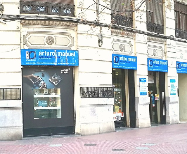
Last week I was going through the pictures in my phone and I noticed that I have not yet told you about the wonderful stationery shops I had found in Valencia while being on vacation there last March. Well, let me correct that mistake and share one of them with you today, Arturo Manuel Papeleria. This is a picture of the storefront and judging by the advertisement displayed, it looked promising and let me tell you it definitely was!

arturo manuel
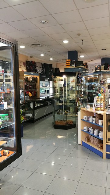
This is the view when you come in. It's actually quite a large store and they have a variety of items for sale, from from office furniture to luxury fountain pens and even art supplies!! Let me tell you, I was like a kid in a candy store!

arturo manuel
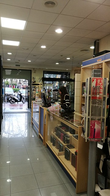
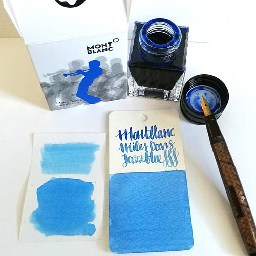
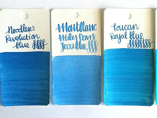
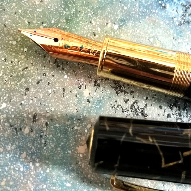
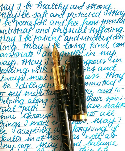
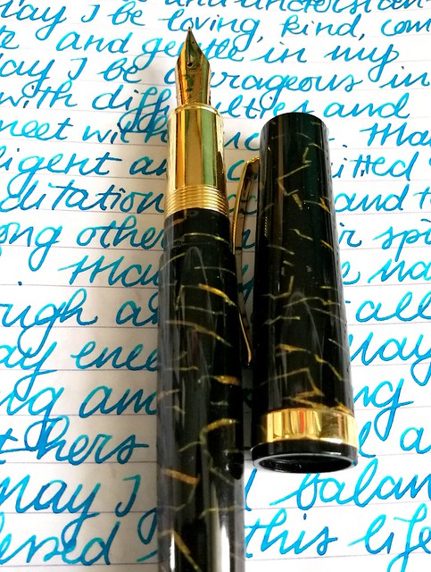
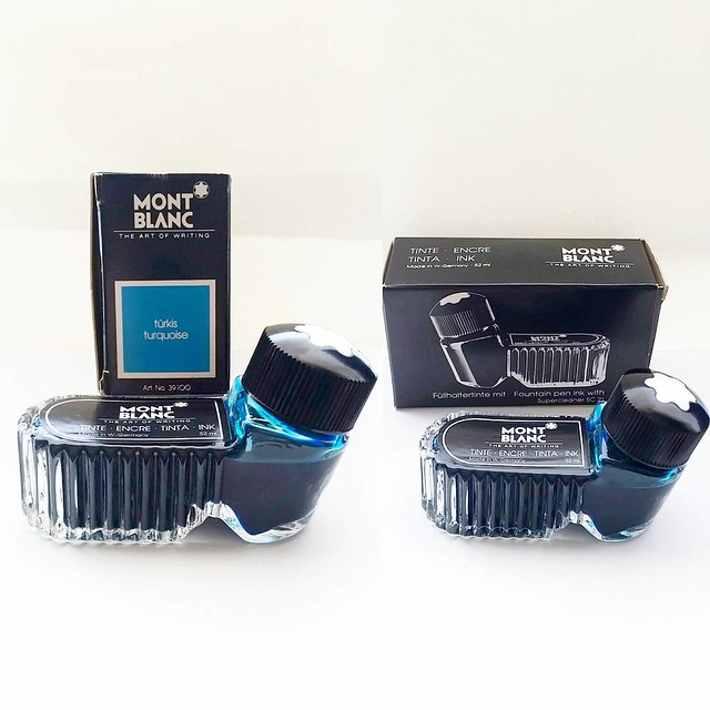
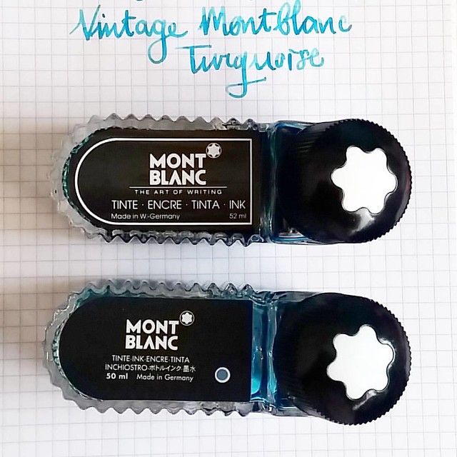
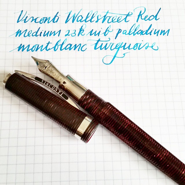
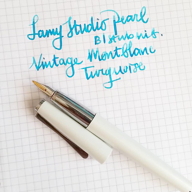
The view from the opposite end of the entrance. The kind lady you see at the counter helped me a lot, showing me pens (there were a couple I wanted to see) and I found more of my fave turquoise ink ever and made it my Unicorn Ink!! Yep!! Ok, this is going to be picture heavy, so you can see more pictures of the store below and all will be revealed about the Unicorn Ink as well :)

2016/12/07

Inky Goodness: Montblanc Miles Davis Jazz Blue

Went to Akkerman in the Hague yesterday and picked up this bottle of Montblanc Miles Davis Jazz Blue ink. First impressions; watery and a light washed out blue = me not really impressed 😒 inkswabs done on Maruman wordcards and herma smooth sticke
On a recent visit to Akkerman in the Hague I noticed the new Montblanc special edition ink on their shelves, Miles Davis Jazz Blue ink. I was super excited to try it out as I love blue inks esp if they lean toward turquoise hues so I bought it. Sadly, this is one of the very few times this ink is not the color for me and am disappointed with the special edition MB has released. Though the color on the ink swab looks like a nice saturated rich blue, it isn't. I had to swab it twice over to get some richness of color showing. The ink has a very watery consistency, almost looks like a diluted turquoise ink. Swabs on the left are done on Herma sticker paper, the top is swabbed with a q-tip once over, here you see the normal saturation and the bottom is heavily saturated. It could look good in writing with a flex nib as my test writing with the Swan flex pen looks nice on the maruman word card. Let's take a closer look at the ink. 

MB jazz blue flanked by Noodlers Revolution Blue which is more saturated and Toucan Royal Blue which has the same watery consistency but is darker in tone.
Here Montblanc Jazz Blue is flanked by Noodler's revolution blue on the left and Toucan royal blue on the right to show you similar ranges of blue in the same color tone. Jazz blue is lighter than both but in color tone it leans more toward Revolution blue, but the ink has the same watery consistency as the Toucan inks have. I inked my Sailor Sapporo Haruzora Sky Blue fountain pen with MB Jazz Blue to test how it writes in a medium nib.

Thoughts on MB Jazz Blue ink. Pen Sailor Sapporo Seasons Sky blue with HM nib. Paper Lyreca office.
This pen in particular is a dry writer. I don't often use this pen, in fact this may be the second time I have inked this pen. And even though this pen and ink combo does match nicely, the ink itself does not really "wow" me like say Dandy Turquoise does. In writing the color also looks a lot like Diamine China Blue. Writing is done on 70gms Lyreca office paper.

Testing MB Jazz Blue on tomoe river paper for sheen in this ink, I really doubt is has any. But well this will probably be dry like tomorrow or something before I can tell for sure. I do see potential for some pretty sky blue ink washes though!
I also did some tests on tomoe river paper to see if there is some sheen in this ink. This is the cream colored tomoe river and you can see that the ivory color does dull down the blue color of the ink ever so slightly. The ink is definitely better looking on stark white paper. I suspected this ink doesn't have any sheen and after drying time (this took a looong time to dry!) my suspicions were confirmed.

MB Jazz Blue ink
It does dry up with a nice blue halo, but no signs of redness caused by sheen of any kind. The drops look a bit pastel blue and with heavy saturation it's a high shading ink, but without any sheen. I do see a lot of potential for this ink in artistic endeavors, it definitely looks like a spring sky blue to me. Perhaps this would make a beautiful combination with Montblanc Pink in a sakura sky setting. Looking forward to test that out :)

Hope this was helpful to you, should you consider getting this ink for yourself. Let me know your opinions on this ink should you have tried it, I would love to hear it. 

Thanks for stopping by and have a great day!

namasté

2016/11/16

Pens and Ink: TWSBI Al green with Montblanc Jonathan Swift

TWSBI al green with MB jonathan swift

As some of you might know, TWSBI releases some Limited Edition specials from time to time and there was one special edition I was really into, the TWSBI AL Green, which was released in a small batch earlier this year. It took me a while to find it, as it seemed to be sold out everywhere, but with some luck and Google-Fu I found out they had one left at Scrittura Elegante, a stationery shop based in the Netherlands. So after not too long of a wait, the pen arrived and I excitedly tried to pick a color to match the beautiful body!

TWSBI al green with MB jonathan swift
I decided a nice mossy green would suit the pen body well. The mossy greens above I thought would make a great match; Montblanc Jonathan Swift (seaweed green), Montblanc Daniel Defoe (palm Green) and Sailor Tokiwa Matsu (evergreen pine). The swabs are done on Maruman Word cards, by the way. It was a difficult choice but in the end I sent with Jonathan Swift because I had not yet used that ink in a pen before, so it was high time I break in the bottle!


TWSBI al green with MB jonathan swift
I requested a B nib on my TWSBI Al Green as I have almost all the range of the nibs in the TWSBI line up, except for this one. I have to say that I was a bit disappointed with the line width as it isn't as broad as I hoped it would be. In writing this B nib looks more like a Pelikan steel medium to me. But still, it's not that bad, the ink flow keeps up well and does bring out the shading in this JS seaweed green. See a review of the TWSBI AL Green by ArtGlen on youtube to know more about the pen.

TWSBI al green with MB jonathan swift
It's been a emotional week in many aspects and it's in these difficult times we need to keep our compassion high and cultivate empathy, no matter how difficult it can be. Writing the Loving Kindness Metta Meditation in my journal on a daily basis helps to gain focus and center my compassion. Carving out pockets of time to sit down and write down a hopeful, loving warm wish into the world, may not seem like much, but it's sometimes the only thing I can do to help alleviate my sorrow. In Buddhist terms sending out a positive compassionate wish to help people whom are suffering creates connectivity and empathy. If you want to know more about this, I highly recommend the book "A Fearless Heart: How the Courage to Be Compassionate Can Transform Our Lives" written by Thupten Jinpa the official English translator of his holiness the Dalai Lama, Tenzin Gyatzo. I was lucky enough to attend a workshop about compassion and a book reading by Thupten Jinpa earlier this year in May (read about it in the last paragraph here) and it was really inspiring as it was hopeful. In this world we're being confronted with large extremes nearly every day, with practicing/cultivating this meditation technique, I hope to send out more compassion to those whom need it.

This quote from the Dalai Lama is encouraging and definitely struck a chord:
Trying times

“Hard times build determination and inner strength. Through them we can also come to appreciate the uselessness of anger. Instead of getting angry nurture a deep caring and respect for troublemakers because by creating such trying circumstances they provide us with invaluable opportunities to practice tolerance and patience.” his holiness the Dalai Lama XIV


Something to ponder on with my next meditation session...

Thank you for stopping by and wishing you all a wonderful day.

namasté

2016/10/19

Pens and Ink: Omas Bologna with Montblanc Dandy Turquoise

Omas Bologna black and gold celluloid

This post is going to be an appreciation post of this pen, which is the Omas Bologna in Black and Gold Celluloid finish. I was lucky enough to find this one for sale at a local boutique and since the Omas pens are not readily available anymore, I jumped at the chance and got this gorgeous writing instrument.

Omas Bologna black and gold celluloid
Look at that stunning celluloid finish! I bet you could not resist this beauty when you've seen it up close!

Omas Bologna black and gold celluloid
It's fitted with a 14k fine "colonnade" nib. Not my preferable nib grade, but you can't be too choosy with pens that are hard to come by. Thankfully the Omas nibs are somewhat springy so it does offer a nice line variation in writing.

Omas Bologna black and gold celluloid
I've paired this pen with my fave turquoise ink, Montblanc Honoré de Balzac Dandy Turquoise, a special edition ink from last year. I love this color and have a few bottles of it, but only use it sparingly because what if I run out of it?? That is the perpetual fear of owning LE inks Isn't it? I decided this pen is definitely worth that special ink though! It's got some great shading and sheen, which even a fine nibbed pen like this Omas can bring out quite well.

Omas Bologna black and gold celluloid
I am definitely loving this pairing a lot. And this pen is just so shiny!

Omas Bologna Black and Gold Celluloid
What I also like about this pen is that it has a lovely detail on the finnial, the "O" gives it a nice finishing touch.

Omas Bologna black and gold celluloid
The clip on the pen is a bit different than their usual clips with the little wheel on the end. It's also a bit more springy than those clips. Certainly fits the overall look of the pen.

Preparing some posts for my #pensandink section on my blog. A real beauty coming up soon. #omasfountainpen #omas #fountainpen #mindfulwriting #writtenmeditation #journal #lovingkindness #turquoise #fpgeeks #fpn #fountainpennetwork
It also came in this leather pen sleeve, one that came with older Omas pens. Love the deep blue color it has and I prefer it more than the felt pen sleeves that came with the resin ogiva's for example. This has a classier feel to it. My Omas Bologna in red celluloid also has this same pen sleeve, So it think it only came with certain special edition or older pens.

Omas Bologna black and gold celluloid
I got this Bologna for a great deal at a local boutique because of a clearance sale and I still can't believe the luck I had with that! It's definitely a stunner of which I am proud to have in my fountain pen collection. If you ever have the chance of picking one of these up, definitely don't hesitate! 

Thanks for stopping by and hope you have a great day. 

namasté

2016/03/09

Pen and Ink: Pelikan M620 San Francisco with Montblanc Jonathan Swift

My #mondaymatchup is the Pelikan M620 SanFrancisco with Montblanc Jonathan Swift. Thought it would be nice to do the San Fran page in my #1000dottodot book for this one :)

The next in line of my Pelikan City Series collection is the M620 San Francisco. This is a page I did in Thomas Pavitte's 1000 dots activity book, which I am a fan of. Obviously its depicting a tram in San Fransisco.

I like pairing this pen with this specific color so it seems because it's the 2nd time I have inked it recently and I reached for the same ink again:

Pelikan M620 San Francisco with Montblanc Jonathan Swift #mondaymatchup #mondaymatchupgiveaway #gouletpens @gouletpens
I like that hint of moss green in the chocolate brown swirls of the pen. The green is also called a 'seaweed green' but to me it's a bit of a 'foggy green' which actually reminds me of San Francisco. I was lucky enough to visit this gorgeous city in 2007.

Someone asked if I have had the nib worked on, because it shows some line variation. This is actually the stock nib that came with the pen! Its fitted with an older medium nib and the nib width is just a little wider than the mediums now on the pelikans. I really love how this one writes.

May they be safe and protected. #writtenmeditation #gratefulness #gratitutejournal #mindfulness #lovingkindness #pelikansouverän #pelikan #fountainpen #funtainpen #Fpgeeks #FPN #fountainpennetwork #m620 #sanfrancisco #montblanc #jonathanswift
A close up shot of the nib and of course on a page in my Metta Mediatation journal (which is getting almost full...)

Last week in pens and Ink I have hosted an Ink Giveaway and 3 people could win a 5ml sample of Potassium Lavender by Organics Studio (which has been discontinued) I randomly selected a few winners from my facebook page likes and the the three winners are:
Gnoe Graasland, TE Coke and Susan Theron
Please email me your address at miss.thundercat@gmail.com and I shall ship the ink samples to you asap.

Thank you everyone for participating! I might be doing more of these giveaways so keep an eye out for them :) 

Thanks for stopping by. 
Have a great week!
namasté

2016/01/12

A tribute to Ziggy Stardust

Yesterday, for me, was one of the bluest monday's ever. By now I think the whole world knows and feels the loss of a very influential and talented person. Needles to say, I loved his music and the Labyrinth was one of my fave childhood movies. As a process of working through this loss, I have carved a stamp in his image as tribute/hommage to him. I've not felt the need to carve a stamp in well over a year, but this just came to me as a 'must do' and I when I did, I felt a sense of calm. Making something is my way of processing grief.

Processing grief #ripdavidbowie #ziggystardust #handcarvedstamps #handcarvedstamp #davidbowie #stampcarving #rubberstamps #mailartists #rubberstampart #tribute

This image was shared most on response to his death. And thought it was most fitting for the tribute stamp.

Such a sad, sad day.  R.I.P. David Bowie

Final print in my test journal. I carved it on speedy carve using speedy carve lino tools. Ink used is versa mark eggplant. Colored in with pro-color markers.

Journal entry from last night. Hand carved stamp and Lyrics written with waterman 52 and Dandy Turquoise #mondaymatchup #mondaymatchupgiveaway #gouletpens @gouletpens

In my journal with Lyrics of Moonage Daydream, one of my fave songs. Pen and ink combo is Waterman 52 red ripple with Montblanc Dandy Turquoise.

Thank you for the legacy you leave behind, David Bowie. 
You will be forever remembered and cherished.

namasté

2015/09/03

Thriftfinds Thursday - Vintage Montblanc edition

During my holidays in Sweden I like to search the Loppis stores (thrift stores) and auktions (yard sales) for some fountain pen and craft related items. This year was a pretty well year for some cool finds. A few of them are from the brand Montblanc.

I found these lovely vintage Montblanc fountain pens at a loppis, the grey Monterosa and the black 342. Both of them have some wear and tear, the black body is marked up with scratches and the grey one lost the top and clip, but they still write really well. I revived the old ink that was in the pen to give them a test drive. The royal dark blue one still had some pretty good sheen to the ink!

A few great vintage fountain pen finds while thrifting in Sweden. Montblanc monterosa and a 342. Both write really well. Ink in the pen is revived old ink.

The nibs, after some cleaning look good too.

Some serious vintage nibbage #fpgeeks #montblanc #fountainpen #monterosa #funtainpen #seriousnibbage #vintage #thriftfinds

In a store craft in Stockholm, I came across these montblanc ink bottles.
Vintage montblanc turquoise ink. Made in West-Germany. #montblanc #fountainpenink #fpgeeks #fountainpennetwork #fpn #vintage #luckyfind #thriftfinds

As you must know by now turquoise is my fave color, so I just had to snag these up. They are made in West Germany and the ink color and quality is still very good.

Comparing two older montblanc ink bottles. Back in the day before the wall fell, they squished 2ml more ink in their bottles...
A comparison of the two older ink bottles, both turquoise ink. The bottom one I found at a local store in Amsterdam not too long ago. They were using it to dip test their pens in *shudders* so I am glad I saved it from the store from further abuse ;)

To provide you with some writing samples of both colors:

And this is how she writes.
Ink from the bottom bottle a bit more saturated ink. 

Writing sample of the gorgeous montblanc turquoise ink. Oh and a LE Lamy studio pearl with a old school b nib that writes like a stub :)
Ink from the west germany bottle, a lighter turquoise. 

The first one looks a bit more saturated but it can also be the difference in how both pens write, nib width and such. But I do enjoy both these shades of turquoise :)

Hope you enjoyed seeing these vintage gems! 
Thanks for stopping by!

namaste