Showing posts with label review. Show all posts

2018/09/05

WCW: Joan of Art watercolor play (& Review)

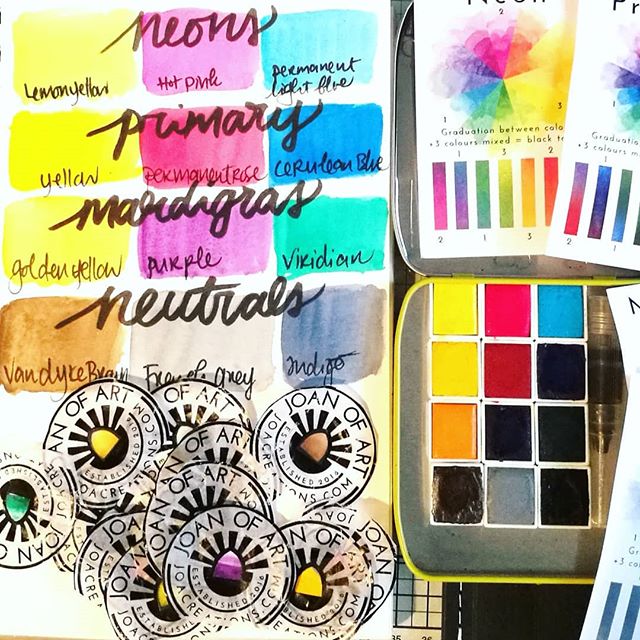
Finally had time to swatch out the watercolor sets I bought from @joacreations weeks ago. They are very vibrant and love the fact that with every set you get to see the colors you can mix with them on the back of the card. Also love their labels!! ____ #w

A few weeks ago I ordered some fun watercolors from Etsy by the brand Joan of Art and I finally had time to play around with them a bit. I've bought the 4x aquarel sets and you could choose which of the sets you would like to have included. They at the time had a limited edition set called Mardigras and I added that one instead of their earthy tones set. The shop is based in the UK, so shipping to NL was fairly priced (36€ for 4 sets including shipping) and they arrived in a little over 12 days. Bit slow than average from UK, but the UK mail and NL mail delivery were having some issues around that time, so they could be delivered to you faster.
But they arrived, beautifully packaged and I just LOVE unwrapping watercolors! It's like colorful candy but so much better & healthier for you ;) I love that they come with a card which shows you the colors you can mix with them. I do keep the wrappers in a sketchbook with watercolor swatches, but here they are all piled up and the colors swatched out for you to see. They are definitely very pigmented and lovely to work with. The pans come with a little magnet attached to the back so you can create your own palette in an Altoids tin or other metal tins. They also have a fun Watercolor Sketch tin available if you want a complete travel set. The swatches you see here are made in my Strathmore visual journal, with 100lbs watercolor paper.
You can find more information on Joan of Art HERE. Joan of Art (seriously though, what a cool name for an art supply product company right?!) was also kind enough to provide the pigment info on their blog in case people are wondering which pigments are in the set. The Mardigras set was a limited release and sadly already sold out. 

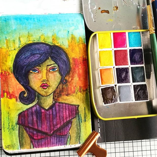
Watercolor practice sketch in my moleskine watercolor pocket book from a few days ago, to test out the @joacreations watercolor sets. The face has a starting base of a @janedavenport clear small face stamp. Not sure if I like it. The sketch, not the paint

I did a quick color sketch in my moleskine watercolor pocket sketchbook. The base is a small face from the Jane Davenport face stamp set. I drew the rest of the body with a faber castell pitt marker and added some accents with a stabilo all blue pencil (which also activates with water) I was wondering if I could create a skin tone color with all these bright sets and made a mix of van dyke brown with golden yellow and added accents of permanent rose for cheeks and indigo for the shadows. So this sketch was done at night when I didn't have natural light and at first I just didn't like it, too yellow in the face. Later when when I added more blue in shading and warmer tones in orange red around the face in the background the color of the face looks more as a tanned/east asian/indian skin tone. Still really need to practice more but that is what these sketchbooks are for - to play and practice color combinations and see what it brings you. These colors are definitely fun to play around with and I would certainly recommend them to fellow watercolor enthusiasts at any stage in their journey.

Sharing this painting sketch of at a fun - new to me blog- Paint Party Friday.
Art Journal Journey - this month's theme is "world of Fantasy" and this woman borne out of my fantasy also lives in a fantastical colorful world. In my fantasy the world always appears way more colorful as well.  

Hope this little review of the paints was useful.
Thanks for stopping by and have a wonderful day!


Disclaimer: I was not compensated for this review & bought these paints with my own money and all views posted here are my own. 

2017/08/09

WIP: Water Col-O-Ring testing

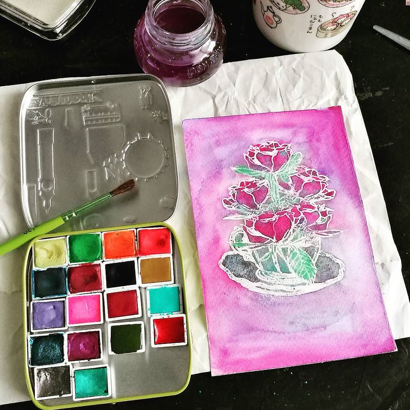
A bit of a play with some watercolors yesterday evening. Oh and if you are curious about the tin, it's a DIY watercolor palette I made of which you can see a video in my stories 😊 #watercolorstudy #watercolors #clovesandhoney #cupofroses #stamplorat
A few weeks ago I received a set of amazing shimmering watercolors I purchased from Cloves and Honey and finally got around playing with them. The Cup of Roses is a stamp I have received from my challenge winnings from STAMPlorations a few months ago and used an embossing resist technique to test the water colors. They are so vibrant and wonderful! The paper I used here is Van Gogh cold pressed 25% cotton water color paper which I purchased at TOWI in Leiden. Such a wonderful local art supply store I frequent and they have hidden gems! I also bought a bunch of old stock Schmincke water colors which I integrated in the palette above. 
I was pleasantly surprised how the paper held up! Minimum buckling/warping, great flow of water and workable time is great as well! By the way, that tin is a DIY watercolor palette. And the tin was given away with a female hygine product! I think I am making so much better use of it now ;) I filled it with different brand watercolors. This size can fit 20 half pans to fill up the tin or 16 half pan and your travel water brush. THIS FITS IN YOUR BACK POCKET OR A SMALL PURSE! I'm trying to find a minimalist way of traveling with art supplies but still with enough colors on hand for our up coming vacation and I think I have found it :)  Super excited to bring it with me on vacay!

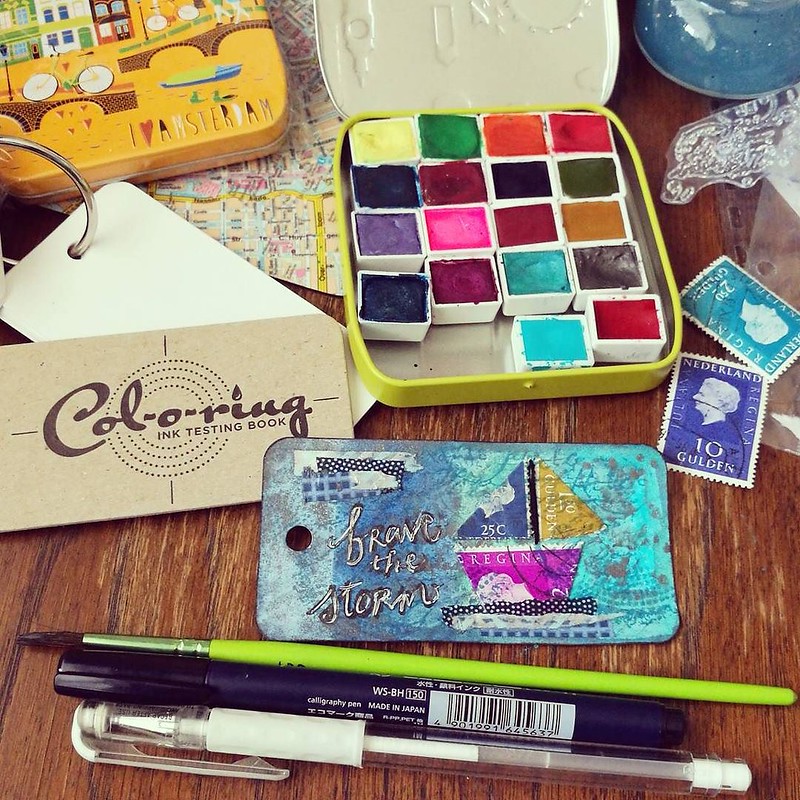
The SS Regina is ready to Brave The Storm. This was a mixed media test on the Col-O-Ring ink testing book made by @wellapptdesk to see how the paper holds up to different media. It does excellently. See my IG stories for more on this. You can utilize this
Also another paper test I was looking forward to, is this Col-O-Ring by Ana  from the Well Appointed Desk. Initially this booklet is made to use for your ink tests, mainly for fountain pen ink swabs to see how the properties of each ink behave. There are all sorts of great reviews out there and I esp. love this video from my friend Azizah (Gourmet Pens) which shows you how you can make ink swabs and how to use this little booklet for that. Because I have stocked up on Maruman Word Cards when they announced the discontinuation, I thought I could test and try different things with this beautiful hand cut and letter pressed booklet. So I did a watercolor and mixed media test over on my Instagram stories, showed the work in progress of the above little mixed media piece, which I called the 'SS Regina braving the storm'. Made the little boat from vintage postage stamps and I loved that the word Regina was used to indicate our queen back then. The paper holds up to mixed media quite well, I was very impressed to see! So you can try this booklet for different things also, little water color or Mixed Media work and even embroidery (I have used some black embroidery thread between the sails and the paper doesn't rip what I poked it with an embroidery needle!) 

I absolutely LOVED playing around and testing these new products and am happy to support these small business owners whom are providing stellar quality products! 
I'm also happy that the Col-O-Ring is now also accessibly available in the EU at Fontoplumo and thanks again Frank for providing this booklet for review :) 

Sharing these desk shots over at Julia's Stamping Ground for WOYWW#427 - have a look and see more shared desk stories and maybe even share your own work in progress/desk shot to fellow deskers :) Missed you gals and I'll be over for a visit shortly!

Thank you for stopping by and have an awesome day!


2017/05/24

WIP: Pigment Powder Comparisons

pigment powders comparisons

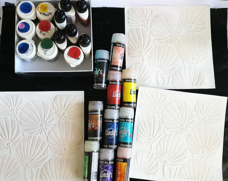
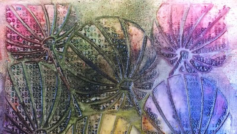
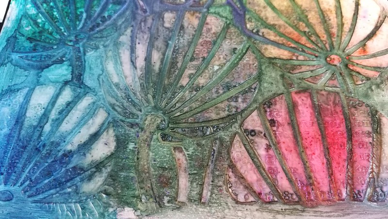
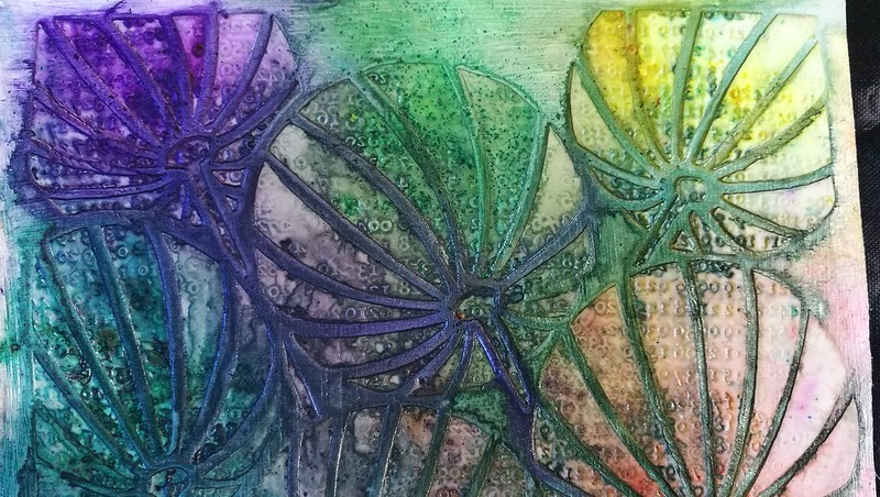
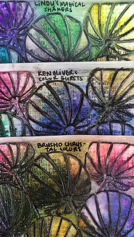
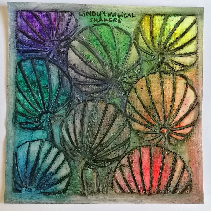
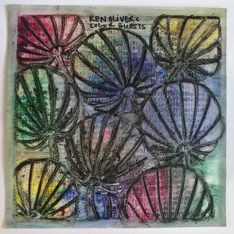
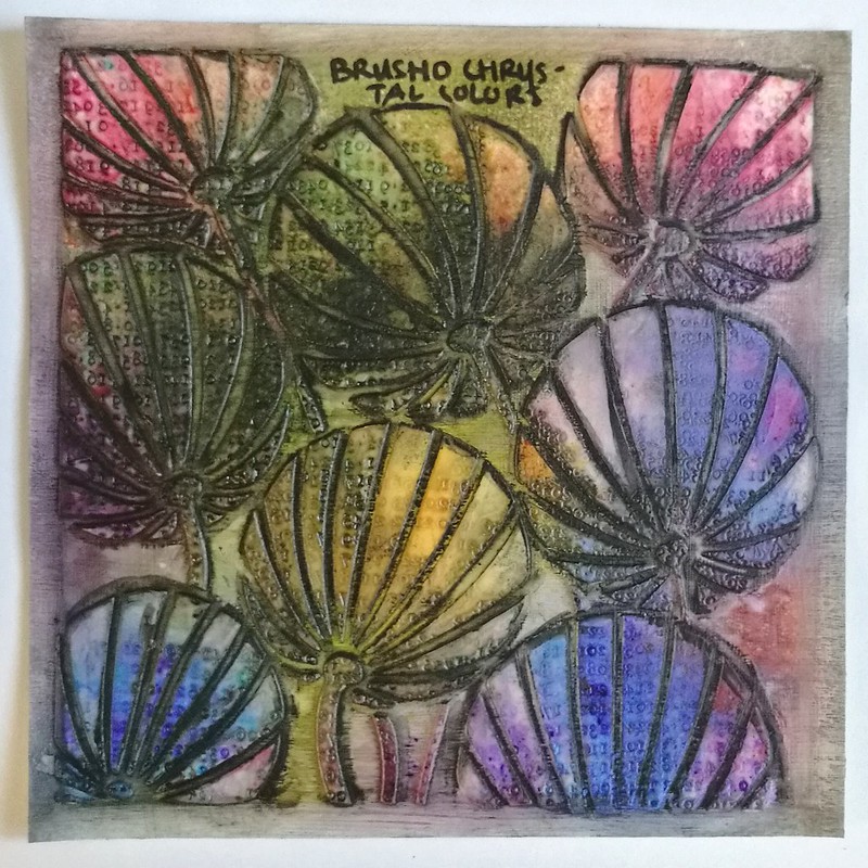
Today I wanted to share an experiment I did a little while ago. I've had brusho's for a while and got a set of Ken Oliver's color bursts last year and this year I was completely tempted by Lindy's Magical Shaker so got a set of those too. I wanted to see what they looked like side by side and how they react differently, so made a color swatch on all pigment powders on a 6x6 gessoed paper on which I had put a stencil of clarity and stamped in the paste. This is my base for all the pigment powders. Do note that it's a non porous surface and they act differently on porous surfaces.

Pigment powders comparison
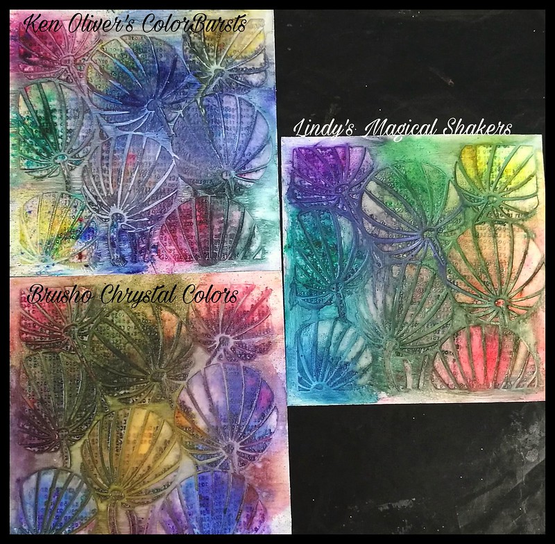
So after some powder puffing and spritzing of water,  here is the result! They all act in the same way, ie. you just tap some powder on the page and spritz some water over it to see the magic happening. But the result do differ slightly from each powder.

pigment powders comparisons
They all really look quite lovely and each product has their individual glow.

pigment powders comparisons
These are the Ken Oliver Colorburst powders. So pretty! Love the little specs of color on the bottom! I used all the colors in the Earth Tone set; merlot, indigo, yellow ochre, terre verte, sepia and burnt orange

pigment powders comparisons
These are the Brusho chrystal colors - very luminous and saturated colors.  I used the colors gambodge, olive green, rose, crimson, violet and Indigo. Very pretty and luminous colors! Love the color nuances and it's still vibrant after drying with the heat tool. I added some shadowing in the shallow edges with a stabilo marks all to make the design pop a bit more.

pigment powders comparisons
And lastly the Lindy's Magical Shaker's - these are soooo pretty and there is a slight shimmer to it which is magical indeed! I only used 6 colors and not the full 10 set, leaving out the black and brown colors. So the colors used are Bavarian Blue, Cuckoo Clock Cardinal, Guten Tag Teal, Lederhosen Laurel, Oktoberfest Orange, Oom Pah Pah Pink, Polka Purple and Yodeling Yellow. I REALLY love the names they gave!

pigment powder comparison

To see how they would react if you worked upon them more I added some shadows with a Stabilo black marks all pencil and a water brush when the swatches were dried completely. 

pigment powder comparison
Lindy's magical Shakers - still shimmery and does retain a good amount of color even when worked upon with a water brush. I'd say they are fairly water resistant when dry.

pigment powder comparison
Ken Oliver's Color Bursts - I found that these still were water reactive, more so than the other two, which lead to dilution of the colors when I added the shadows. Something to consider when you are working on non porous surfaces.

pigment powder comparison
The Brusho Chrystal Colors - these retain their luminous colors and are more water resistant then the other two. They are advertised as permanent when dry, but I think it's more water resistant than water proof because I did get some color bleed when working with the water brush. They could be water resistant on non porous surfaces, though!

In conclusion; although they react similar, the look is definitely different. They all have their pro's and cons and it's up to the final look you want as to which products to use. A helpful video on pigment powders I found was this one by Maremi Small Art. Though instead of Ken Oliver's Starburst she uses Magicals by Lindy's in her comparison. 

 I'm glad I made these swatches as a reference for me and I hope this helps you out as well either in their use, or when you are considering to buy the products. 

I am curious to know: 
Which ones of these pigment powders do you have and is your preference to use? 
Let me know in the comments :) 

Thank you for stopping by and have a wonderful day!


2017/04/20

De-stressing with Oxides

Distress oxides play

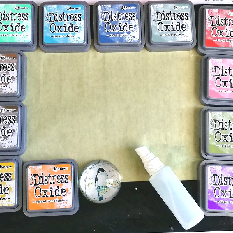
A couple of weeks ago I finally had some time to play with my Oxides inks which I got at Hobby Compleet de Duif at Art Specially earlier this month. I may be late to the party and I'm sure you by now have heard all about these products so no in depth review from me, just a few things I have noticed while playing about with them. So I got my craft sheet, oxides, water spritzer and heat tool ready to play!

Distress oxides play
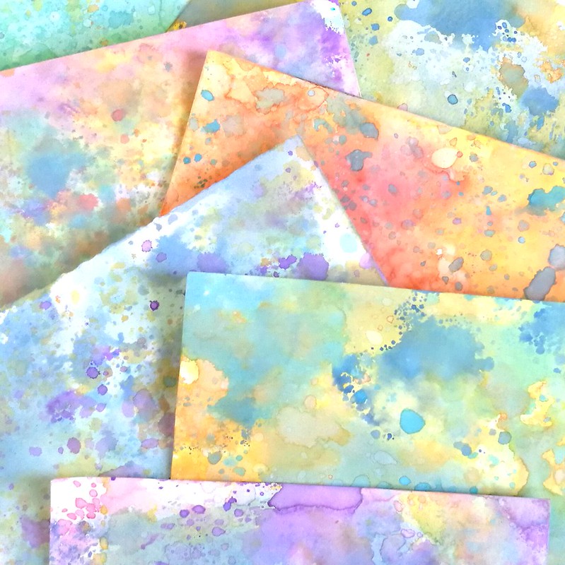
These are the background I have made after just one play session and  I can say that I am absolutely in love with these. You can make amazingly colorful back grounds with wonderful layered colors. The inks do not get muddy as they would with regular distress inks when you're layering. The colors stay crisp and have an interesting effect. Some papers work better than others and I found using water color paper you'll get a crisper look than if you would on regular card stock, but both have a fun effect. The effect changes with the amount of water you use but they all finish with a soft suede like feel to it. For more info on the inks and on how to layer them, see this great video on how Tim Holtz does it at CHA. It's super fun just to lay on color and De-stress and play! 

Distress oxides play
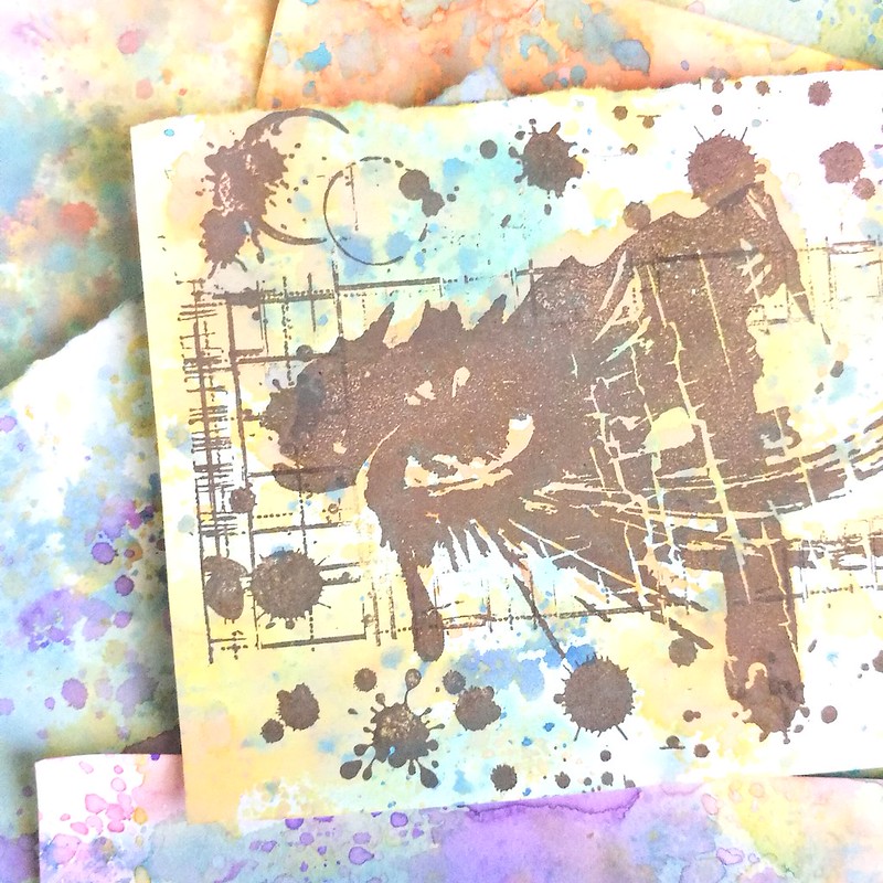
I took a few backgrounds and stamped these indigo blu stamps on them, with ranger dye ink java brown and it already has a stunning effect like this.

Inspire the future

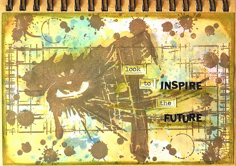
I finished a couple of pages for my journal with these tests and the above page I only added white gel pen and accents with peeled paint distress crayon. Some chit chat stickers and letter stickers to form "look to inspire the future" .
Inspire the future
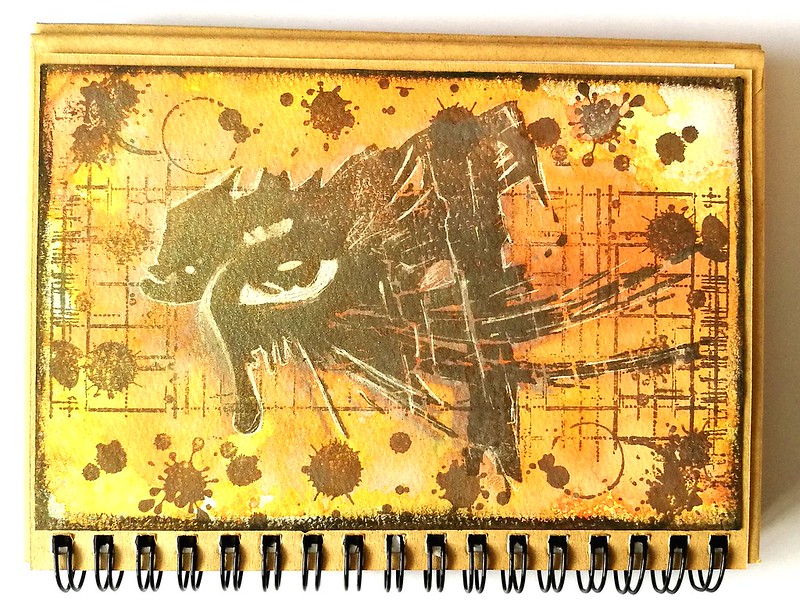
The second experiment was stamping the eye stamp with Walnut Stain oxide directly onto water color paper and spritz water all over it. That sort of dissolved the image into a blurry mess BUT the spiced marmelade orange background, remained bright and orange. I dried the page and stamped the image again with the ranger Java dye ink and accentuated with walnut stain distress crayon and a white gel pen. 

Definitely loving these effects and there are so many more ways to use them too. Jennifer McGuire has a very useful blogpost and video about it here. I loved seeing how she creates some stunning cards with these inks! Looking forward to use these inks in my upcoming projects!


Thanks for stopping by and have a great day!


2017/03/01

Art Snacks subscription update/review

So I have mentioned that even though I have received my Art Snack subscription boxes from the past 3 months I still have not had the chance to review them. But I wanted to at least show you the content of the boxes received and tell you about what I think about the products, some of which I have used already. 

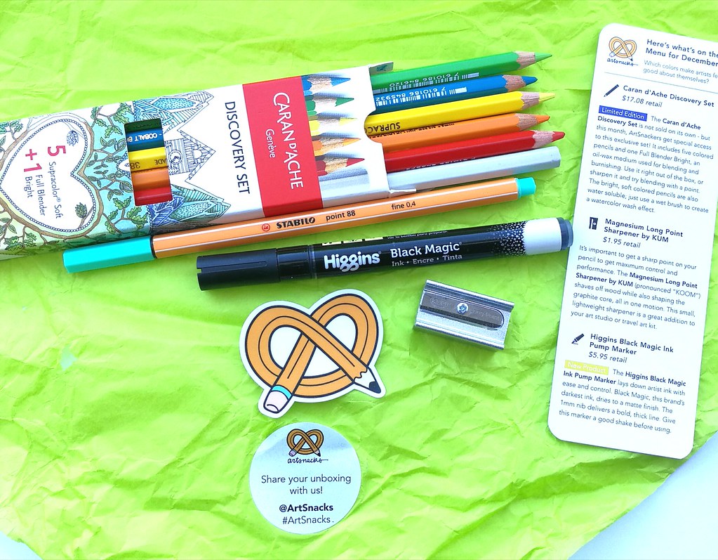
Artsnacks box content
In the december 2016 box we have the following items (taken from the artsnacks site):
Caran d'Ache Discovery Set
The Caran d’Ache Discovery Set is not sold on its own - but this month, ArtSnackers get special access to this exclusive set! It includes five colored pencils and one Full Blender Bright, an oil-wax medium used for blending and burnishing. Use it right out of the box, or sharpen it and try blending with a point. The bright, soft colored pencils are also water soluble; just use a wet brush to create a watercolor wash effect. 
Magnesium Long Point Sharpener by KUM
It’s important to get a sharp point on your pencil to get maximum control and performance. The Magnesium Long Point Sharpener by KUM (pronounced “KOOM”) shaves off wood while also shaping the graphite core, all in one motion. This small, lightweight sharpener is a great addition to your art studio or travel art kit. 
Higgins Black Magic Ink Pump Marker
The Higgins Black Magic Ink Pump Marker lays down artist ink with ease and control. Black Magic, this brand’s darkest ink, dries to a matte finish. The 1mm nib delivers a bold, thick line. Give this marker a good shake before using. 
Stabilo Point 88 Fineliner Marker Pen
The Stabilo Point 88 Fineliner Marker Pen is made to last. The pen tip is encased in metal to extend pen life, and this pen won’t quickly dry out if the cap is left off, thanks to specially formulated ink. Stabilo produces this pen in 20 vibrant colors.

My fave item was the Caran d'Ache watercolor pencils set. I have used it for the Heart Collector mailart envelopes. They blend very nicely with water. Surprised to see there is a full bright blender included in a watercolor set though. I would have thought a brush would be more fitting. But the blender is superb, as I already tried one of those. I already know the stabilo fine liner, fun to have it in my fave color though! And I am very curious to see how the Higgins Black magic Ink marker will perform on my mixed media projects.

Artsnacks box content
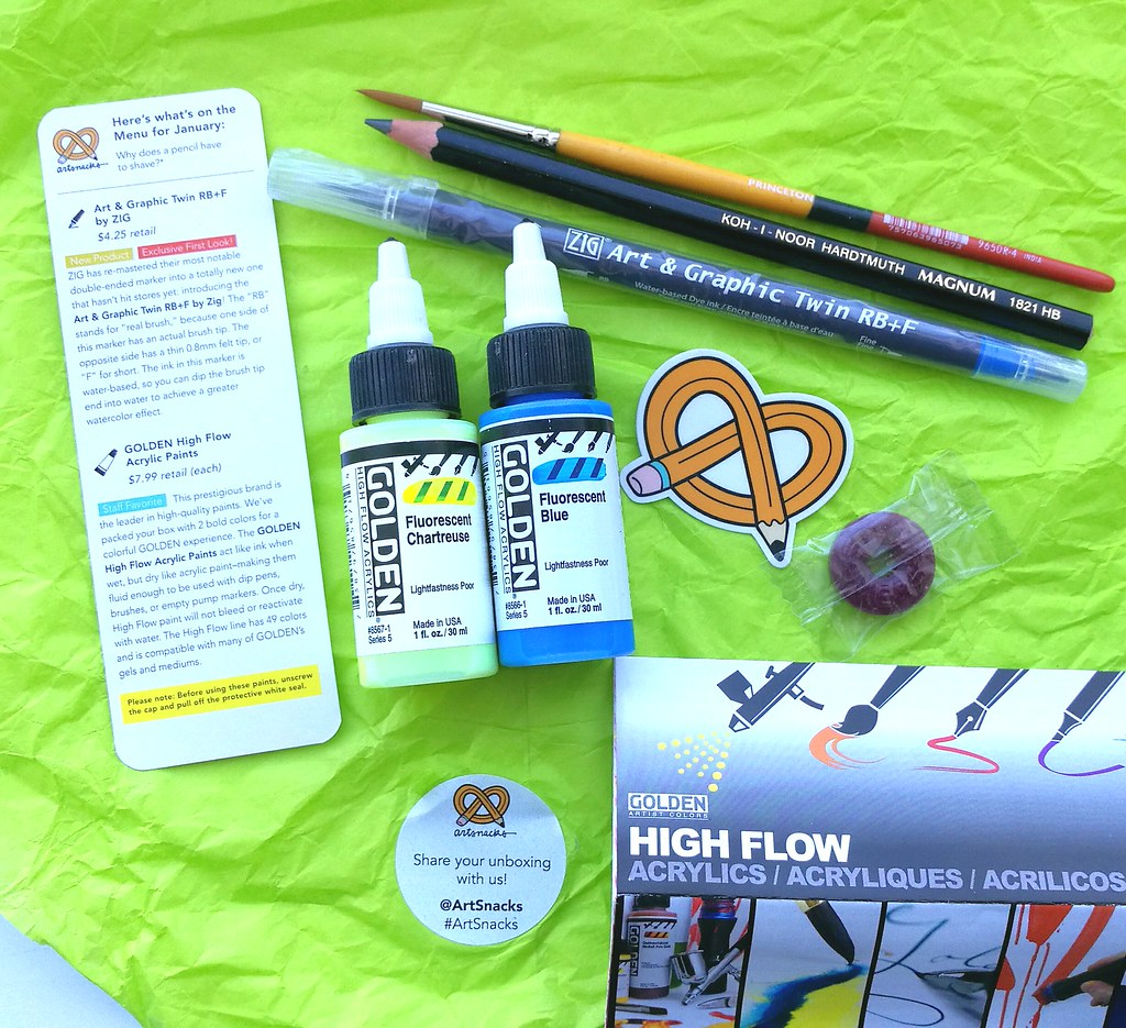
The January 2017 box contained these items: 
Art & Graphic Twin RB+F by ZIG
ZIG has re-mastered their most notable double-ended marker into a totally new one that hasn’t hit stores yet: introducing the Art & Graphic Twin RB+F by Zig! The “RB” stands for “real brush,” because one side of this marker has an actual brush tip. The opposite side has a thin 0.8mm felt tip, or “F” for short. The ink in this marker is water-based, so you can dip the brush tip end into water to achieve a greater watercolor effect.
GOLDEN High Flow Acrylic Paints
This prestigious brand is the leader in high-quality paints. We’ve packed your box with 2 bold colors for a colorful GOLDEN experience. The GOLDEN High Flow Acrylic Paints act like ink when wet, but dry like acrylic paint–making them fluid enough to be used with dip pens, brushes, or empty pump markers. Once dry, High Flow paint will not bleed or reactivate with water. The High Flow line has 49 colors and is compatible with many of GOLDEN’s gels and mediums. Please note: Before using these paints, unscrew the cap and pull off the protective white seal.
Koh-I-Noor Magnum Black Star Pencil
Kick off the New Year with the soft and smooth Koh-I-Noor Magnum Black Star Pencil. Produced in the Czech Republic, this oversized pencil adds some darker tones to your sketches and illustrations. If you’re looking to tune up your shading technique, we recommend practicing with this comfortable, fat-bodied pencil.
Snap! Series Paintbrushes by Princeton Brush
Oh SNAP! (We could say that all day.) We’re excited to have the SNAP! Series Paintbrushes by Princeton Brush in this month’s box. This versatile brush comes in an assortment of sizes and shapes, including round, fan, flat shader, and bright shader. The synthetic hair tip will guide your paint evenly. To clean, use mild soap and water, then reshape the bristles into place. Afterwards, stand it upright on the handle to dry.

I am really excited to work with Golden High Flow acrylics. The fluorescent colors in chartreuse and blue are really fun colors. The princeton brush does snap nicely! I have used it several times for watercolor cards and love that I got a small round brush which a fave to use. The pencil has an interesting shape and size, which you can get nice thick lines with. Another ZIG product in the box. I do like it, the brush is bouncier than the Clean Color one and having a fine tip for detail coloring or underlining lettering is definitely handy.

Artsnacks box content
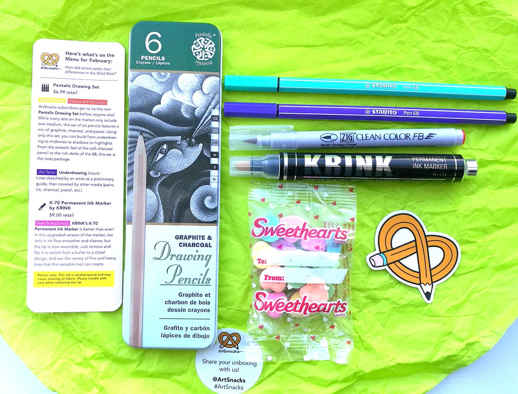
On to February's (2017) box the sweet edition.
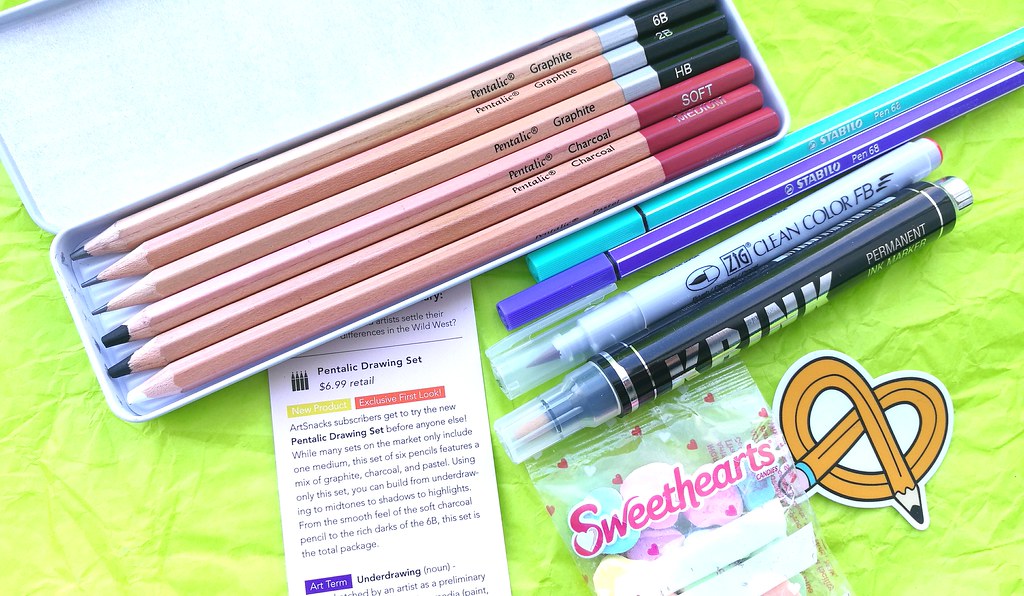
Pentalic Drawing Set
ArtSnacks subscribers get to try the new Pentalic Drawing Set before anyone else! While many sets on the market only include one medium, this set of six pencils features a mix of graphite, charcoal, and pastel. Using only this set, you can build from underdraw- ing to midtones to shadows to highlights. From the smooth feel of the soft charcoal pencil to the rich darks of the 6B, this set is the total package. 
K-70 Permanent Ink Marker by KRINK
KRINK’s K-70 Permanent Ink Marker is better than ever! In this upgraded version of the marker, not only is ink flow smoother and cleaner, but the tip is now reversible. Just remove and flip it to switch from a bullet to a chisel design, and see the variety of fine and heavy lines that this versatile tool can create. 
ZIG Clean Color FB
Similar to the KRINK marker in this month’s box, the ZIG Clean Color FB is a fresh take on a favorite tool. This marker – a new product in the Clean Color family – features the same highly blend-able, water-soluble ink as the Clean Color Real Brush, but it has a new, firmer fiber brush nib (“FB” for short). Try using a watercolor brush to wash and blend this ink on the page to achieve a softer effect. 
Stabilo Pen 68
Another pop of color in your box this month comes from the Stabilo Pen 68. The shape of this pen is similar to your everyday pencil, giving you a comfortable drawing experience.
The premium fiber bullet-tip on the Pen 68 holds odorless, water-based ink and will create a perfectly even ink application on smooth surfaces. 

Well the candies were pretty sweet for sure but was a bit disappointed that there was yet another ZIG and Stabilo items in the box. Though I do have all the brushes in the ZIG line now with help via the box so I can compare them better and see which one has my preference. I should definitely do that in a separate post! The Krink is a great addition to my black paint markers for Mixed Media! And I am quite in love with the Pentalic pencils set.

Artsnacks box content
Everything you need to get started to draw with graphite and charcoal pencils. When I as in high school I used to draw a lot and these got me itching to do so again. I think that is the whole purpose of these boxes, to get you to start something or pick up an old creative habit you have lost along the way. 

So the verdict is that I am still very much enjoying the subscription and will continue! Am very much looking forward to the march box, which is not only their birthday month, but mine as well (on the 14th :) so I am excited what kind of goodies they will have for this month.
Also while I haven't done the review style like I did with the other boxes, I still hope this was still useful to you if you're considering signing up for Art Snacks. If you have also subscribed, let me know what you think of the content.

Thanks for stopping by and have a great day!
2017/02/22

WIP: A wink of sparkle

Sweetpea kitty girl ATC
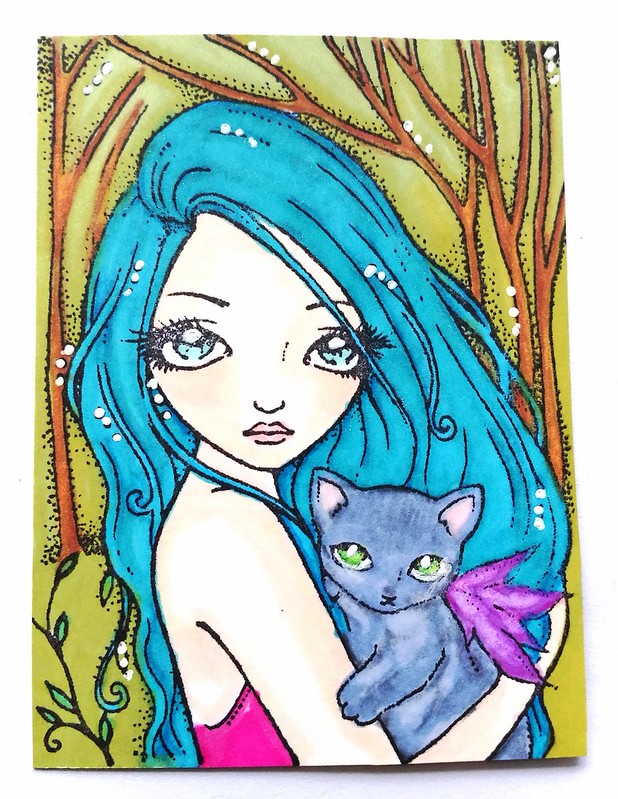
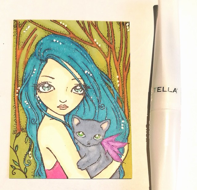
It's always really wonderful to try out new craft supplies and discovering something you really like. A while back I picked up a clear Wink Of Stella brush pen by kuretake at a local retailer and I was curious about the effect it could give to my work. Chose to work with this particular stamp as it's a recent addition. I love this Sweetpea stamp a lot! How cute is this girl, those eyes and the kitty!! It's about ATC size (most of their stamps are) and fit wonderfully in a 9 pocket protector or ATC sleeve. I colored her in with pro markers on neenah classic crest paper. 

A hint of sparkle
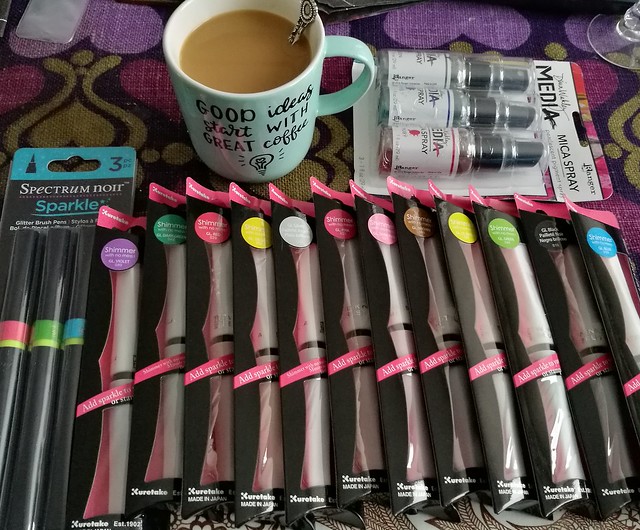
Errr... yeah I might have gone overboard with the purchase (disclosure, these were all 50% off on retail price at a holiday sale at an online store ) but one can not have too much sparkle in one's life, right? I'm also very curious to try out the spectrum noir brush pens and how they compare to wink of stella. I found a very useful review HERE by Sprinkled with Glitter if you are interested in the difference yourself. The Dina Wakely Mica Spray has been on my wishlist for a while, glad to finally have them to play with. 

Sweetpea stamp & letraset colors
So here you see her with the added sparkle. I used it to accentuate some streaks in the girl's hair and eyes and I love it! It's easy to work with and just lightly applied, so much shimmer can come off it. The brush is bouncy and smooth and the sparkle really sparkles! It's a fine glitter and it stays on the page quite well even when dry. I'm a fan! The dots are done with a white gel pen, the one I received in the ArtSnacks October box. Talking about the Artsnacks boxes, I'm like 3 months behind with a show and tell/review. Ugh, so much to do and so little time... Hope to do those eventually!

By the way, I'm sad that the SweetPea Stamp company discontinued to make stamps, so if you find any of them out there which you like, grab them up for sure!

Thanks for stopping by and have a great day!

2016/12/21

A Coloring Adventure: Blackwing Colors Pencils Review

blackwing coloring pencils
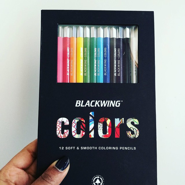
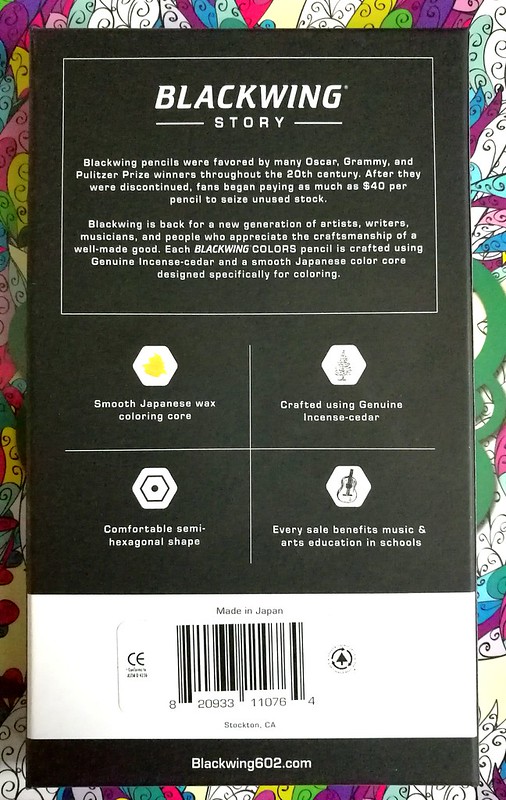
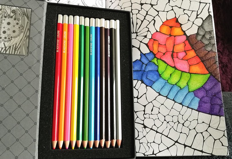
Blackwing is known for their awesome brand of graphite pencils, the Palomino Blackwing, and when I found out they had coloring pencils as well, I definitely wanted to try them. And when Mishka from Bureau Direct kindly offered this set for review I was absolutely thrilled to have that chance! Thank you again! They are absolutely a pleasure to color with. The packaging is very swanky, too.  It's a beautiful sleek and classy design in heavy cardboard,soft matte black finish and a magnetic closure. You can see the pencils through the PVC window which is convenient so you can see which colors are in there.

Blackwing coloring pencils
Next to reading about Blackwing's story, you can read the basic information about the pencils from the back of the box. The Blackwing Colors set (MRSP 30£) consist of 12 smooth coloring pencils made in Japan. Crafted using Genuine Incense-cedar in a comfortable semi-hexagonal shape with a smooth Japanese wax coloring base. Also every sale benefits music & arts education in schools, which is very cool of them to do so. 

Blackwing coloring pencils
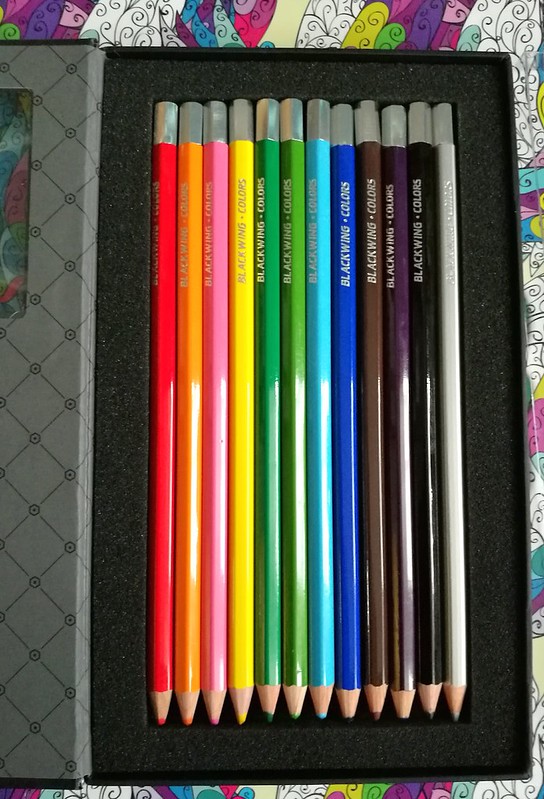
When you open the box, the inside design has an elegant harlequin motive and the pencils are cushioned in soft foam. There is also a protective see through plastic cover placed over the pencils (not pictured), which is easily removable and put back into place to keep your pencils in place (or as an extra barrier) if you choose to carry the box around. I like to foam cushion because it also protects your pencil tips from bumping against the side of the box and thus blunting them if you had just sharpened your pencils. That's a nice eye for detail there!

Blackwing coloring pencils
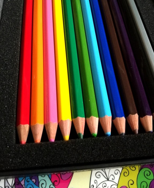
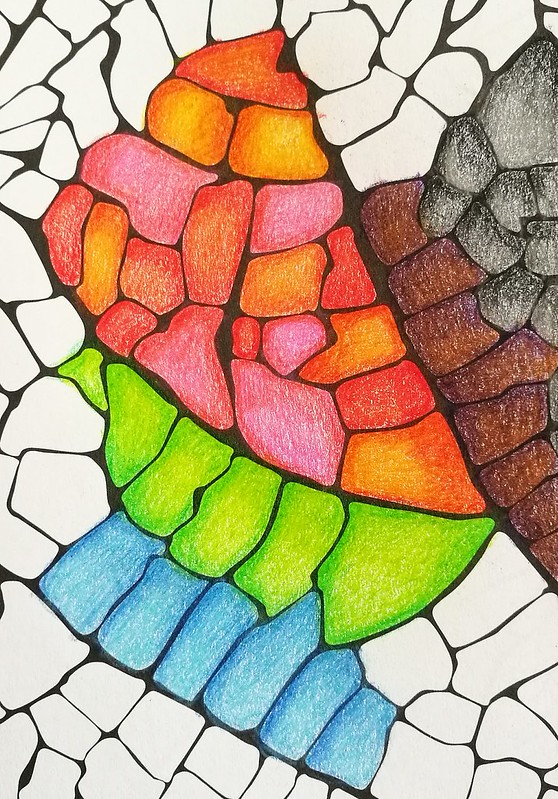
The pencils are solid colors with a silver capped end and the name "blackwing-colors" are engraved in silver as well. The only thing lacking are the names of the colors! You do have your ROYBGIV colors in the set. The colors are red, orange, pink, yellow, dark green, light green, light blue, dark blue, brown, purple, black and a fun silver color, which sets this set apart from other standard 12 pencil color sets which often offer white. If you're coloring in a low lit room, it might be hard to tell apart the darker tones, though. When testing these out one evening on my couch I thought the purple one was a darker brown one for sure and seeing my work the next morning, I discovered the purple and brown do go together nicely as well ;) I tested them in a coloring book.

blackwing colors
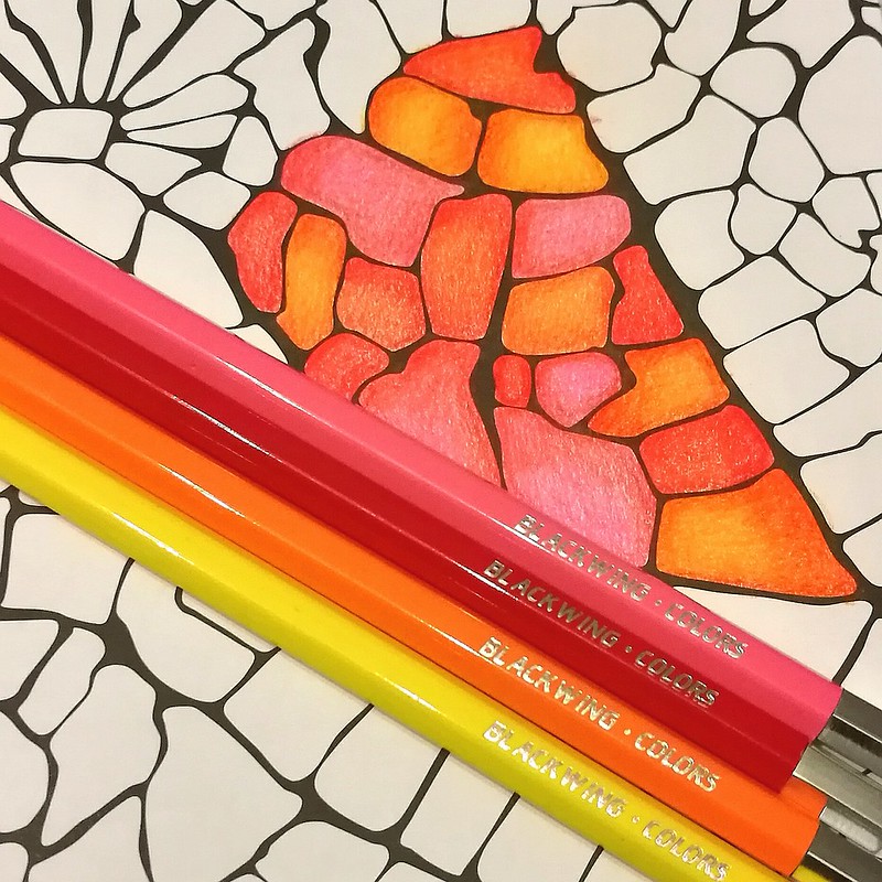
They are quite comfortable in hand. I do prefer the hexagonal shape because it prevents them rolling off my desk like the fully round pencils often do. On the subject of blending, I often use a white pencil or a colorless blender to burnish/smooth out the pencil strokes. But you can also use lighter colors in this set to get that same effect. I've done that with the color hues above. I used the lightest hues to blend the colors together to get a creamy blended effect. You can get awesome shade effects like this too, without dulling down the color which you sometimes can do if you blend with a white pencil. So the colors brightly pop out here!

blackwing colors
The pencils are in performance quite like the Derwent artist pencils, which are also wax based and super soft in use. Though with the Derwents you do have a wider variety of colors to choose from. This is a fixed set and no open stock available but you could use wax based pencils from other brands and intermix them if you would like wider range in colors. 

blackwing colors
The set on its own has a great variety of colors you can easily and smoothly mix them together to create different hues. The unique silver color adds a bit of freshness to the mix, which I quite like! 

With the pricing of 30£ for this set, it's not cheap, but you do get a nice artist grade coloring set of a well known brand in the pencil industry. It has classy packaging and sleek design. You're also supporting the arts education with purchasing this set. What's not to like?  
Also when you sign up for Bureau Direct's newsletter, you will receive a 10% discount code in your inbox every month. Just FYI :)

If you are still shopping for a Christmas gift for that creative friend of yours, this would definitely make a great one!

Thanks for stopping by and have a great day!

namasté

(disclaimer: I got this item free of charge for review purposes and was not monetarily compensated. All opinions stated here are my own and there are no affiliate links.) 

2016/12/07

Inky Goodness: Montblanc Miles Davis Jazz Blue

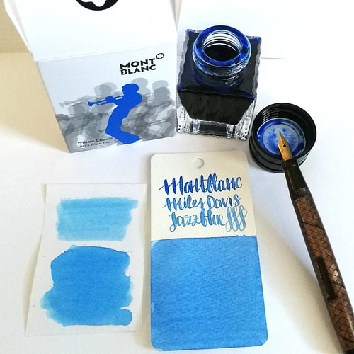
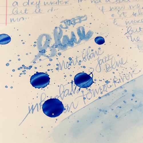
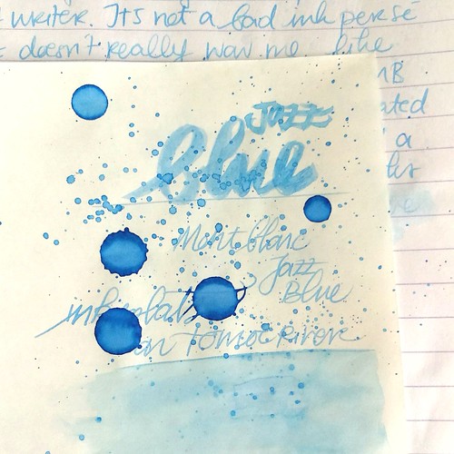
Went to Akkerman in the Hague yesterday and picked up this bottle of Montblanc Miles Davis Jazz Blue ink. First impressions; watery and a light washed out blue = me not really impressed 😒 inkswabs done on Maruman wordcards and herma smooth sticke
On a recent visit to Akkerman in the Hague I noticed the new Montblanc special edition ink on their shelves, Miles Davis Jazz Blue ink. I was super excited to try it out as I love blue inks esp if they lean toward turquoise hues so I bought it. Sadly, this is one of the very few times this ink is not the color for me and am disappointed with the special edition MB has released. Though the color on the ink swab looks like a nice saturated rich blue, it isn't. I had to swab it twice over to get some richness of color showing. The ink has a very watery consistency, almost looks like a diluted turquoise ink. Swabs on the left are done on Herma sticker paper, the top is swabbed with a q-tip once over, here you see the normal saturation and the bottom is heavily saturated. It could look good in writing with a flex nib as my test writing with the Swan flex pen looks nice on the maruman word card. Let's take a closer look at the ink. 

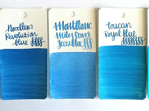
MB jazz blue flanked by Noodlers Revolution Blue which is more saturated and Toucan Royal Blue which has the same watery consistency but is darker in tone.
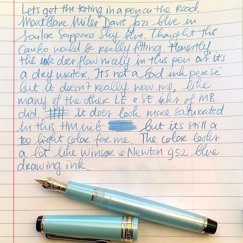
Here Montblanc Jazz Blue is flanked by Noodler's revolution blue on the left and Toucan royal blue on the right to show you similar ranges of blue in the same color tone. Jazz blue is lighter than both but in color tone it leans more toward Revolution blue, but the ink has the same watery consistency as the Toucan inks have. I inked my Sailor Sapporo Haruzora Sky Blue fountain pen with MB Jazz Blue to test how it writes in a medium nib.

Thoughts on MB Jazz Blue ink. Pen Sailor Sapporo Seasons Sky blue with HM nib. Paper Lyreca office.
This pen in particular is a dry writer. I don't often use this pen, in fact this may be the second time I have inked this pen. And even though this pen and ink combo does match nicely, the ink itself does not really "wow" me like say Dandy Turquoise does. In writing the color also looks a lot like Diamine China Blue. Writing is done on 70gms Lyreca office paper.

Testing MB Jazz Blue on tomoe river paper for sheen in this ink, I really doubt is has any. But well this will probably be dry like tomorrow or something before I can tell for sure. I do see potential for some pretty sky blue ink washes though!
I also did some tests on tomoe river paper to see if there is some sheen in this ink. This is the cream colored tomoe river and you can see that the ivory color does dull down the blue color of the ink ever so slightly. The ink is definitely better looking on stark white paper. I suspected this ink doesn't have any sheen and after drying time (this took a looong time to dry!) my suspicions were confirmed.

MB Jazz Blue ink
It does dry up with a nice blue halo, but no signs of redness caused by sheen of any kind. The drops look a bit pastel blue and with heavy saturation it's a high shading ink, but without any sheen. I do see a lot of potential for this ink in artistic endeavors, it definitely looks like a spring sky blue to me. Perhaps this would make a beautiful combination with Montblanc Pink in a sakura sky setting. Looking forward to test that out :)

Hope this was helpful to you, should you consider getting this ink for yourself. Let me know your opinions on this ink should you have tried it, I would love to hear it. 

Thanks for stopping by and have a great day!

namasté

2016/12/02

Art Snacks November 2016 Box

Art Snacks november 2016 box
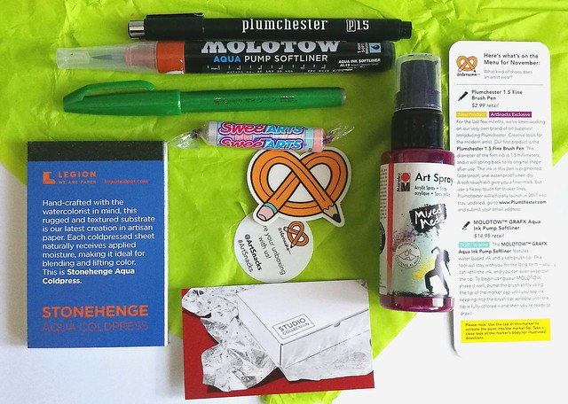
It took a week longer to arrive than the last two boxes and therefore this review is up a bit later because I could not find the proper time to test it until recently. But when I did. wow this month's box  is a great one with a lot of fun items to try out!
Art Snacks november 2016 box
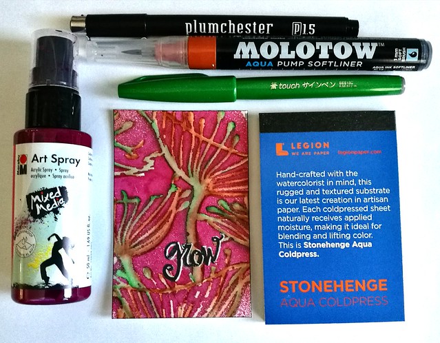
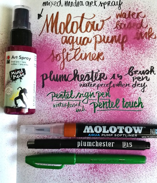
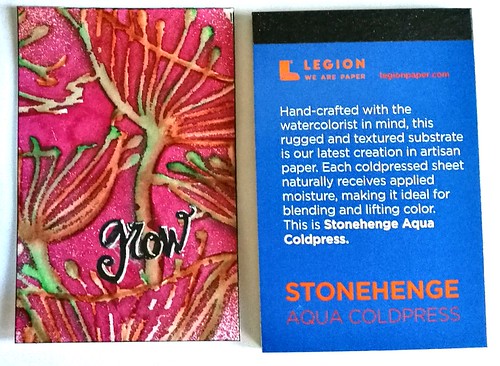
The content of the art snacks box of november contained not 4 but 5 items. The bonus item being the Stonehenge water color paper pad you see on the left, which I am very pleased with. In fact, I am pleased with the whole box! The other items are; plumchester brush pen in black, the Molotown aqua pump softliner in brown, pentel sign pen in green and the mixed media art spray in bordeaux/burgundy. Read more about the products on the artsnacks page HERE.

Art Snacks november 2016 box
My first test was just trying out the pens and spray in my Nuuna test notebook to see the colors and how the pens write. The Molotow is refillable which is nice and it is definitely a soft brush. The plumchester is an Art Snacks exclusive as they are developing their own line of art supplies. I find this brush works best on smoother paper to get even writing from it. The pentel sign pen is an oldie but goodie! I used them back in highschool, which is like ... no let's not go there, but sooo many years ago now. The spray creates a nice spatter effect and dries up a nice bordeaux color. Time to test it out on the Stonehenge paper!

Art Snacks november 2016 box
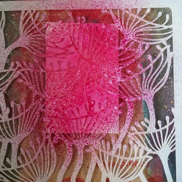
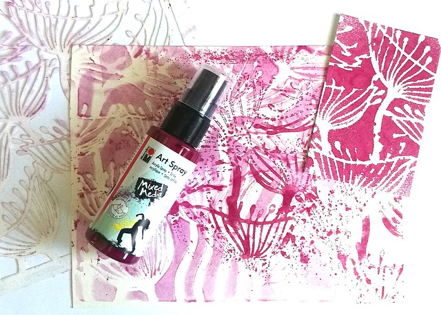
I took one of my fave stencils at the moment, the  seed pods from Clarity, placed it over the paper and sprayed the mixed media ink over it. It's acrylic ink so it dried pretty quickly on the paper.

Art Snacks november 2016 box
But it stayed wet enough on the plastic of the stencil for a negative print and when dried it was easily removed off the stencil with a wet baby wipe.

Art Snacks november 2016 box
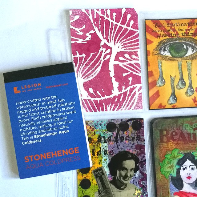
What I like A LOT about this Stonehenge paper size is the fact it's almost the size of an ATC/ACEO (just a bit taller) and can fit in the 9 pocket sleeves (for a pocket letter for instance) and those trading card protection sleeves! What a great size to play around with! The paper is pretty awesome too and I made the below ACEO/ATC with all the products from the november box.

Art Snacks november 2016 box

The spray stays on beautifully and the molotow & pentel brush colors blend nicely together with a waterbrush. I used the white gel pen from last month's box to highlight the word "grow" which I have written with the Plumchester brush pen. 

 A note on the international subscription plan; The box is 34$ including international shipping and what is really considerate of art snacks is that they tick the box as gift so in process you won't have to pay for customs charges upon arrival! They do this without asking as an extra service for their international customers (next to tracking) and is really very thoughtful! I surely do appreciate it :)

Hope this review was useful if you are planning on an art snacks subscription, or any of the products mentioned. The december box shipped already and I am curious what I'll find in there. 

Thanks for stopping by and have a great weekend!

namasté