Showing posts with label de stempelwinkel. Show all posts

2016/10/31

Mailart Monday: a ghostly halloween

Happy Halloween

It's october 31st and that means it's finally Halloween. I made the above postcard for a fun swap, the blue ghost postcard exchange hosted by my friend Amanda at Letter Letter. The objective is to send and receive a handful of postcards to your assigned group of penpals with the message written with blue ghost ink (see a great review of the ink here by S.J Mills). So it's readable with UV light only! It's super fun and I have participated in the last couple of years too.

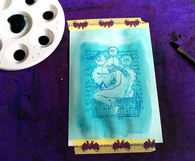
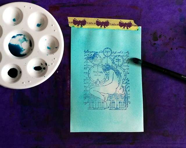
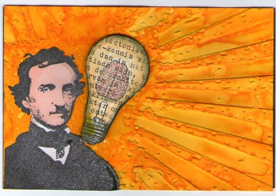
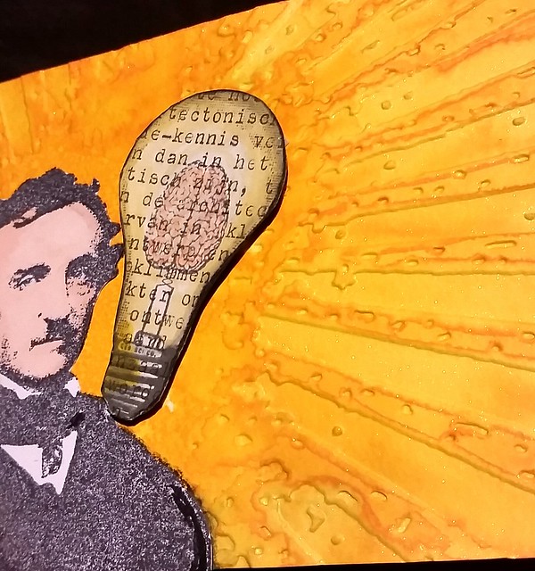
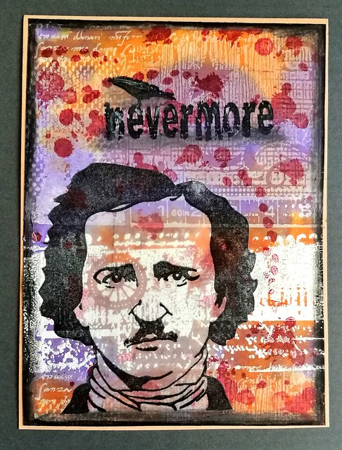
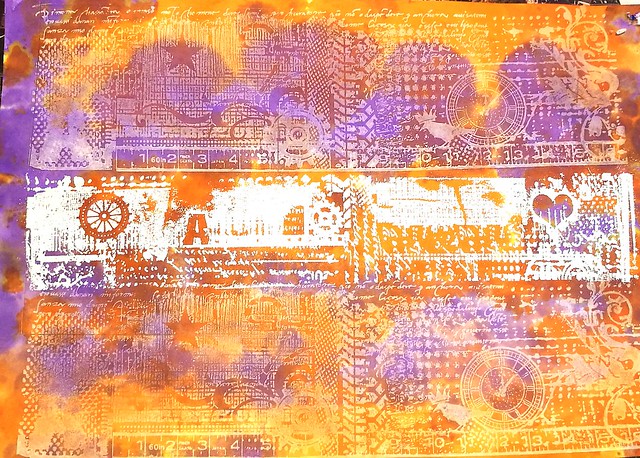
I chose Edgar Allen Poe as focus and made the card with stamps from Lost Coast Designs, Carmen's Veranda and the Stempelwinkel. The background is made with the large grunge border stamps, stamped with opaque white and versamark. I only embossed the middle part and left the rest white. I then got some distress stains in orange and purple on my craft sheet and blotted the ink with the stamped paper.

Happy Halloween
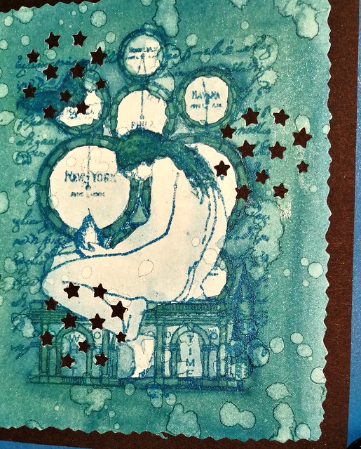
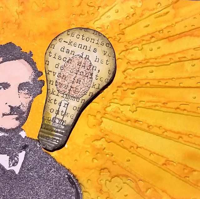
It came out looking like this! I cut the page to size and added the rest of the elements to it and made accents with grey and black distress markers.

Making postcards for the #blueghostexchangenumbathree :) #blueghostexchange #halloween #edgarallanpoe #rubberstamping @letterletter
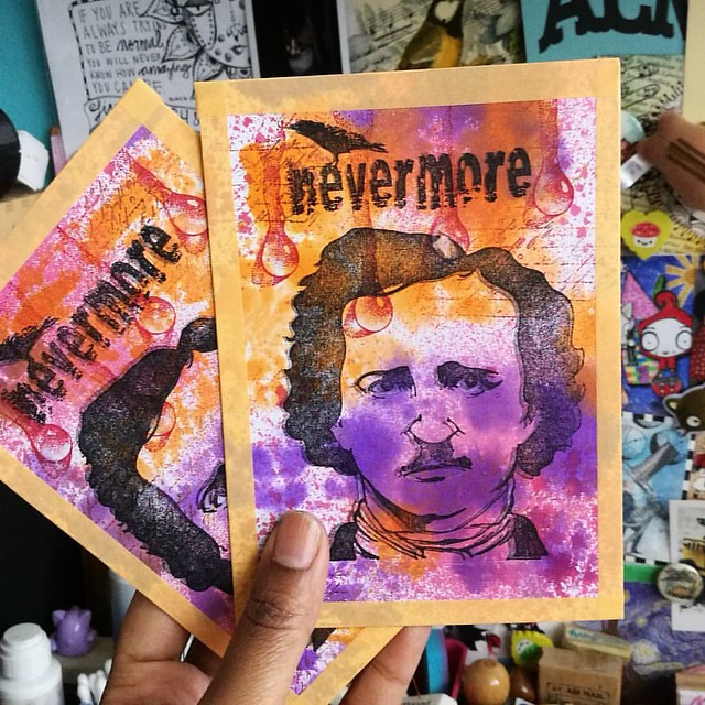
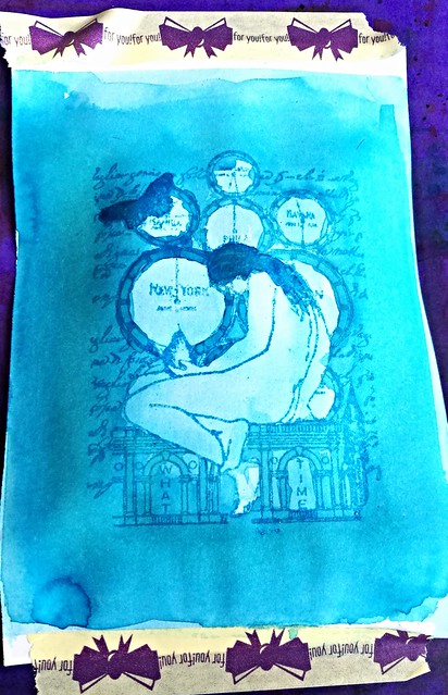
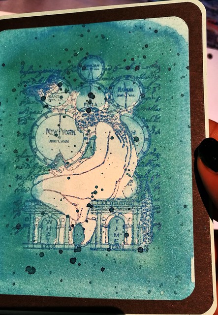
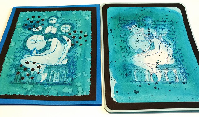
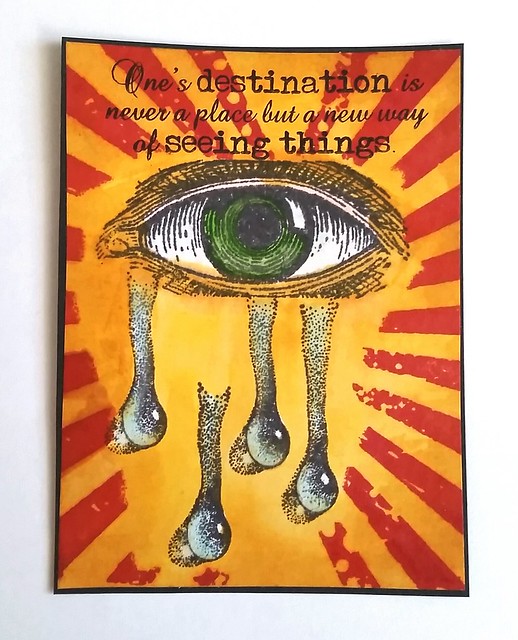
I blotted the rest of the ink off a separate paper and made the postcards above. I sprayed the a bit of red brusho mix and together with the drops from Designs by Ryn they look awesome ghostly (the double print also does the trick of a ghostly image!) I hope my partners will enjoy these postcards and I can't wait to receive mine!

I am entering these cards for the mixed media monthly challenge for october with the Halloween theme
 

Have a wonderful Halloween everyone!

Thanks for stopping by!

2016/06/02

Inky goodness: Nickel Teal Time Wash

In my pens and ink post yesterday I paired this gorgeous combination: the pelikan M805 Vibrant blue with Organics Studio Nickel Teal.
Just love this color! And it's going to be available soon again, yay! @organicsstudio #nickelteal #organicsstudio #bluehues #fpgeeks #FPN #fountainpennetwork #fountainpen #pelikan #pensansink #vibrantblue
This ink will be in the line up of the relaunch Organics Studio will have this month. Recently I have been into ink washes, also thanks to a few great swaps on swapbot and I've made a few fun note cards with a rubber stamp emboss resist technique and the Nickel Teal ink which I want to show you today.

Nickle Teal Time wash
I started with diluting the ink in my tray. I posted a few drops of in in the tray and added drops of water to them, 3, 8, 12 and 17. In the middle I also added a little bit of shimmer in the form of blue Pearl Ex powder. I also made sure I had a bit of 100% non diluted ink in my tray as well. I stamped the image a few times on water color paper and lightly embossed it with Wow lagoon embossing powder. The image is from Non Sequitur plate Time and Space which is available at the Stempelwinkel. 

Nickle Teal Time wash
The way I started off with the wash is from light to dark layering, so I used the most diluted ink first to create an over all light tone and added darker tones to arias I wanted darker. The embossed parts of the stamp resist the ink, so the image doesn't wash away and shows through the ink clearly.

Nickle Teal Time wash
I used a mixture of wet on and wet and dry overlay wash techniques. To get the desired darker effects I waited in between layers to add more color. The less diluted, the more saturated the dried up color is, obviously.

Nickle Teal Time wash
It's fun to test out different kind of washes. Here I made the edges of the image darker and added a spatter effect with the non diluted ink over it when dried. When I was satisfied with the desired effect the wash created, it was time to make some cards out of them!

Nickle Teal Time wash
I measured and cut out both pieces so the image was in the center. With this piece I rounded off the corners with a corner punch, matted on black card stock, also rounded off the corners and then adhered it to a folded note card which I then also rounded off. I love the layered effect this created. 

Nickle Teal Time wash
With this piece I also splattered on some water drops and let that dry. That created the lighter aria's on the card. Then I cut the edges with a figure scissor. I have a fun stars punch from the HEMA which you can reposition on the whole card and I used that on this card. It creates a nice "starry night" effect with the black background. I adhered the piece to a dark blue note card. 

Nickle Teal Time wash
The cards side by side. I love this teal color! It creates such beautiful washes! The cards also have a bit of shimmer to it due to the Pearl Ex Powders which you can see a little bit here:
Nickle Teal Time wash
It's very subtle and you can only see the shimmer when the light hits the card a certain way. I definitely love how these cards turned out :)
Nickle Teal Time wash
The fortnight challenge at the Stempelwinkel stamper's #9 challenge is blue and I'm entering these cards for the challenge. 

Thank you for stopping by and I hope this inspired you to play around with ink washes as well :)

Have a great day!
Namasté

2016/05/19

Kennis is verlichting - Knowledge is enlightenment

Sometimes you have this idea in your head and won't rest until you got it out of your system. Tonight I was inspired to make another entry for De Stempel Winkel's Challenge that ends tomorrow, Challenge 8 sunshine yellow.

kennis is verlichting

I used Diamine Sunshine yellow mixed with gold perfect pearl  powders on maruman watercolor paper. Embossed it with Tim Holtz Grunge rays with my cuttle bug. Then added more water to the embossed rays by using a water brush. The Edgar Allen Poe stamp and Light bulb brain stamp are from the stempel winkel. I stamped EAP on white sticker paper, colored in with promarkers, cut out & adhered to the piece. Then I stamped the light bulb on vintage typewritten text paper, colored it with tombows,  stuck it on a sturdy background, cut outand adhered on the piece with 3d foam stickers. The light bulb piece had "kennis" written on it, which means knowledge in English. Hence the title, which is fitting I think :)

Some detail shots :
Kennis is verlichting

Kennis is verlichting

Kennis is verlichting

The light doesn't show the shimmer, but it glitters quite nicely in daylight.

Will take a better picture when i can but for now, I'm glad I got this out of my head and on to paper :)

I'm also entering this for the Craft Stamper's 'Anything Goes' May Challenge 

Have a great day and thanks for stopping by!

namasté

2016/05/13

Mini Art Journal - A new way of seeing things

Eyedrops ATC

This is an ATC I made a while ago when I wanted to test the drop/tear stamp from Designs by Ryn (from water effects sheet) in combination with an eye stamp (by stampabilities). The other stamps are from Tim Holtz Grunge rays and the travel quote stamp from Technique Tuesday. I thought it made a striking card esp. with the bold colors and the rays coming from the eye. I was super pleased with the outcome, even if it was a first try. So I set it aside on my desk and moved on to other things and then the most annoying thing happened... When I wanted to write down the materials I used for this card and I couldn't find it anymore! I went through my desk and papers over a bunch of different times and could not find it anywhere! What a bummer!! But thankfully I still have the picture of it. Then I thought, wouldn't it be great to have a journal where I could test out my ATC format idea's on without risk of loosing them again? And so, the mini Art Journal was born!

Eyedrops in art journal
I have this moleskine sized journal with sturdy watercolor pages in them which I thought would be great for this project. It's bigger than the ATC format of course, but still small enough for projects on that scale. I stamped the eye and drops first with memento Black and made a mask for them. Stamped the Tim holz Grunge rays with Staz on Black Cherry and the checked stamp with Staz-on Saddle Brown. The background color is Distress stains Wild Honey, diluted with water and adhered with a brush, creating a gradient from top to bottom.

Eyedrops in art journal

Then I took off the mask to work on the eye & drops. As you can see I placed all the drops closer to the eye. It already has a striking result like this due to the bold background! As you can see the mask was not cut tightly around the image (I wanted to avoid bleed through in the image by color seeping in though the sides) but you can easily fix that. I used Tombow light ocher and a water brush to blend the colors in. And then I I got some more Tombow dual brush pens to color and accentuate the eye and drops.

Eyedrops in art journal

And this is the end result. I added more lashes and gave it a bit of 'smudged eyeliner" look. I had found a left over piece of water colored paper and stamped the quote on it with Staz-on Pumpkin. I just love these drop stamps from Designs by Ryn! They are so realistic and very easy to place. Not sure how I feel about starting yet another ART journal though, but I like that I have a place to collect my small scale ideas in.
Hopefully at some point I'll find the original ATC again... Or I'll just make others, now that I have the visual ideas in the journal ;) 

Have you ever lost something you created? 
I think it means that I need to do a bit of spring cleaning on my desk, haha!

Also with this post I am entering the fortnight challenge at De Stempelwinkel's challenge blog for challenge 8 'Sunshine Yellow' - wish me luck :) 

Thanks for stopping by!
Have a creative weekend.

namasté