Showing posts with label inky goodness. Show all posts

2017/06/02

Art Journal: Amazing Diva

Amazing Diva

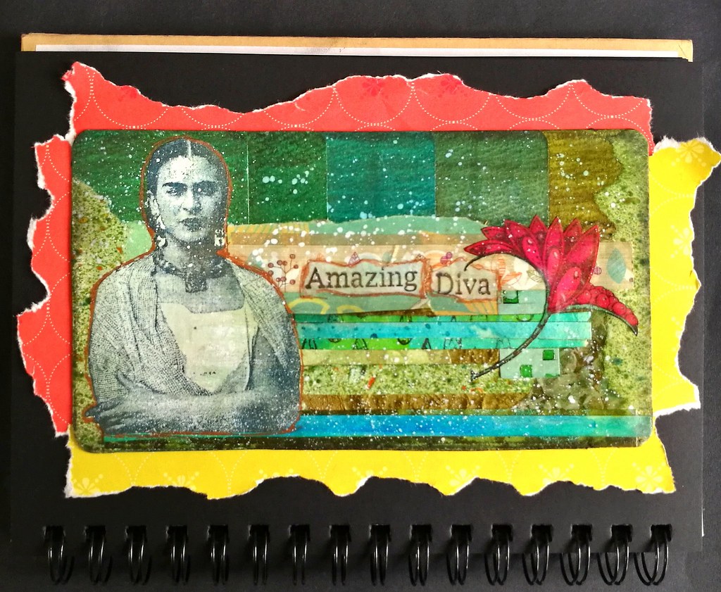
It's such an amazingly fun challenge to create pieces using project left overs aka 'tovers only. This piece was intended to be a postcard but I loved it so much I decided to adhere it to my art journal as I couldn't part with is. I used all sorts of scraps and left over pieces here but what started it off was the top. It's a color coded row of double ink sample swatches! I keep ink samples in trays and have it organized by what I have done already but for some reason I made an oopsie and made swatches of one row twice. Well of course it's too pretty to just throw out and if you see my scrap boxes you will know I have trouble to throw out anything!  I then looked for trims in the same color family to adhere to the page. Instead of vertically like I did with this journal page, I went with horizontal lines to see how that would go. And I absolutely love the outcome here! The Frida image is a left over print from this journal page and is a stamp from Lost Coast Designs - so are the words I used. I felt like I needed a POP of color and in my scraps I found that colored in whimsical seed pod from Viva Las VegaStamps! which I had used from this journal page almost a year ago! So very cathartic to use up all these scraps and seeing how all these elements come together as one :) The "frame" is just ripped out magazine pages from FLOW magazines. Yes, I have had a TON of them due to my 3 year subscription and those are all "free game" now - ripping stuff out feel SO GOOD! LOL! 

I would like to enter this journal page in the following challenges: 


'Flowers and Friends make life a garden' 
The green and seed pod reminds me of a garden... it could be Frida's garden :)

Wow, has it been a year I have been participating? 
I really loved this past year's themes esp. what's your super power and put a stamp on it
I feel like this journal page combines the two :) 

Thanks so much for stopping by and have a wonderful weekend!


2016/12/07

Inky Goodness: Montblanc Miles Davis Jazz Blue

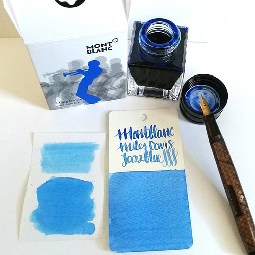
Went to Akkerman in the Hague yesterday and picked up this bottle of Montblanc Miles Davis Jazz Blue ink. First impressions; watery and a light washed out blue = me not really impressed 😒 inkswabs done on Maruman wordcards and herma smooth sticke
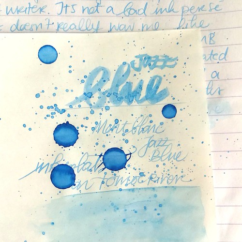
On a recent visit to Akkerman in the Hague I noticed the new Montblanc special edition ink on their shelves, Miles Davis Jazz Blue ink. I was super excited to try it out as I love blue inks esp if they lean toward turquoise hues so I bought it. Sadly, this is one of the very few times this ink is not the color for me and am disappointed with the special edition MB has released. Though the color on the ink swab looks like a nice saturated rich blue, it isn't. I had to swab it twice over to get some richness of color showing. The ink has a very watery consistency, almost looks like a diluted turquoise ink. Swabs on the left are done on Herma sticker paper, the top is swabbed with a q-tip once over, here you see the normal saturation and the bottom is heavily saturated. It could look good in writing with a flex nib as my test writing with the Swan flex pen looks nice on the maruman word card. Let's take a closer look at the ink. 

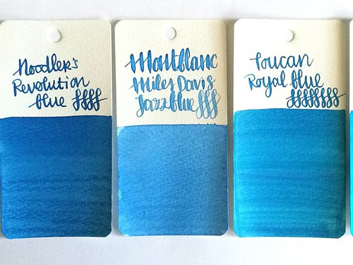
MB jazz blue flanked by Noodlers Revolution Blue which is more saturated and Toucan Royal Blue which has the same watery consistency but is darker in tone.
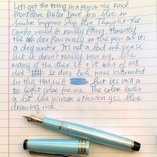
Here Montblanc Jazz Blue is flanked by Noodler's revolution blue on the left and Toucan royal blue on the right to show you similar ranges of blue in the same color tone. Jazz blue is lighter than both but in color tone it leans more toward Revolution blue, but the ink has the same watery consistency as the Toucan inks have. I inked my Sailor Sapporo Haruzora Sky Blue fountain pen with MB Jazz Blue to test how it writes in a medium nib.

Thoughts on MB Jazz Blue ink. Pen Sailor Sapporo Seasons Sky blue with HM nib. Paper Lyreca office.
This pen in particular is a dry writer. I don't often use this pen, in fact this may be the second time I have inked this pen. And even though this pen and ink combo does match nicely, the ink itself does not really "wow" me like say Dandy Turquoise does. In writing the color also looks a lot like Diamine China Blue. Writing is done on 70gms Lyreca office paper.

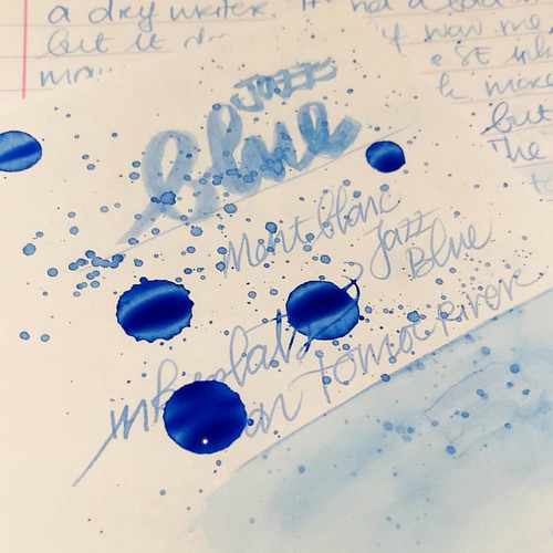
Testing MB Jazz Blue on tomoe river paper for sheen in this ink, I really doubt is has any. But well this will probably be dry like tomorrow or something before I can tell for sure. I do see potential for some pretty sky blue ink washes though!
I also did some tests on tomoe river paper to see if there is some sheen in this ink. This is the cream colored tomoe river and you can see that the ivory color does dull down the blue color of the ink ever so slightly. The ink is definitely better looking on stark white paper. I suspected this ink doesn't have any sheen and after drying time (this took a looong time to dry!) my suspicions were confirmed.

MB Jazz Blue ink
It does dry up with a nice blue halo, but no signs of redness caused by sheen of any kind. The drops look a bit pastel blue and with heavy saturation it's a high shading ink, but without any sheen. I do see a lot of potential for this ink in artistic endeavors, it definitely looks like a spring sky blue to me. Perhaps this would make a beautiful combination with Montblanc Pink in a sakura sky setting. Looking forward to test that out :)

Hope this was helpful to you, should you consider getting this ink for yourself. Let me know your opinions on this ink should you have tried it, I would love to hear it. 

Thanks for stopping by and have a great day!

namasté

2016/07/20

Inky Goodness: the magic of Alt Goldgrün

inky goodness alt goldgrün
Recently I was going through my ink collection to ink up a new pen and I was thinking, man what is an ink I have a love for but not used in ages. Rohrer and Klingner's Alt Goldgrün was the first thought I had and I went with it. And yes, when I used it again I should make a mental note that I really, absolutely should use this ink more! In this ink spotlight I shall show you why :)

alt goldgrün
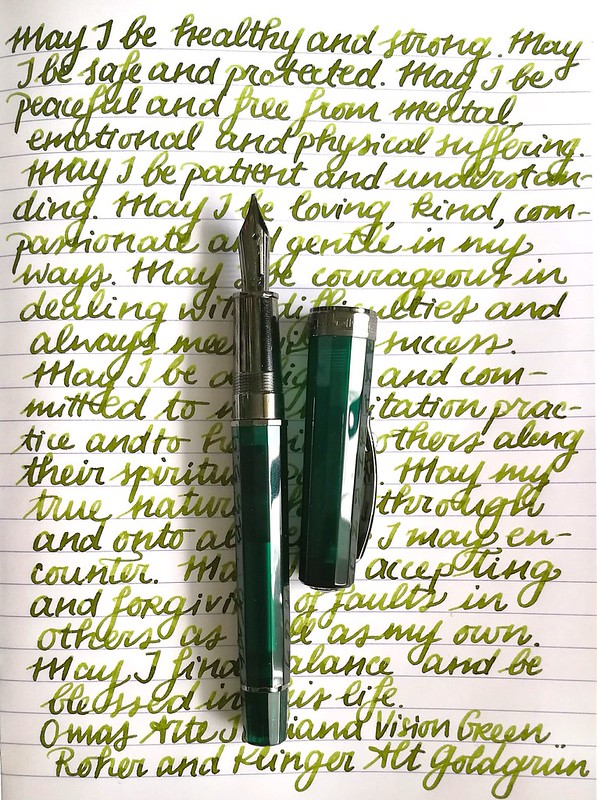
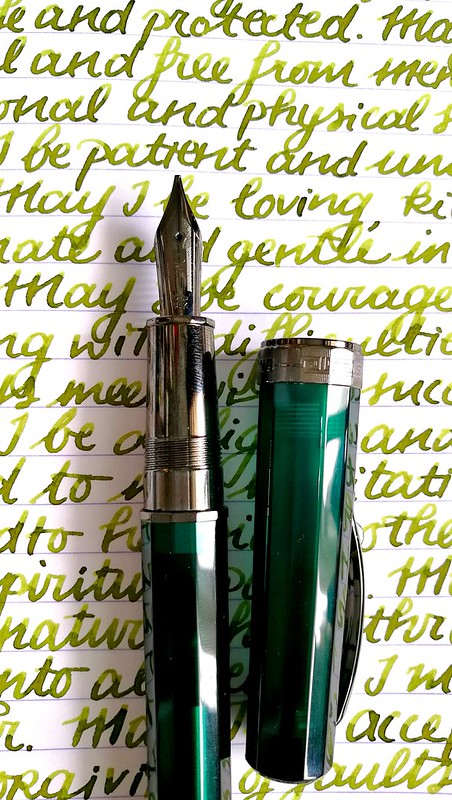
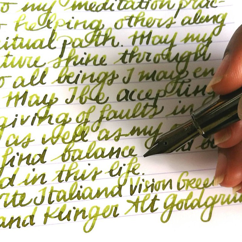
First I chose a pen to pair this ink with and I went with my Omas Arte Italiana Vision in Liquid green. It has a gorgeous juicy B nib which I knew would bring out the shading well. And I wasn't wrong.

alt goldgrün
The magical Alt Goldgrün in my Omas Vision Liquid Green with a juicy B nib for #inkyfridayfun @justvanness #fountainpenfriday #omas #FPN #fpgeeks #mettameditation #writtenmeditation #lovingkindness #loveforanalogue #green #sheeny #sheenyink #sheen #notcha
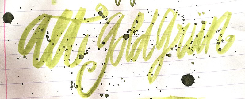
The above pictures are excerpts from my mindfulness metta meditation journal on clairefontaine paper. This ink has some amazing shading! And also some beautiful golden sheen.

inky goodness alt goldgrün
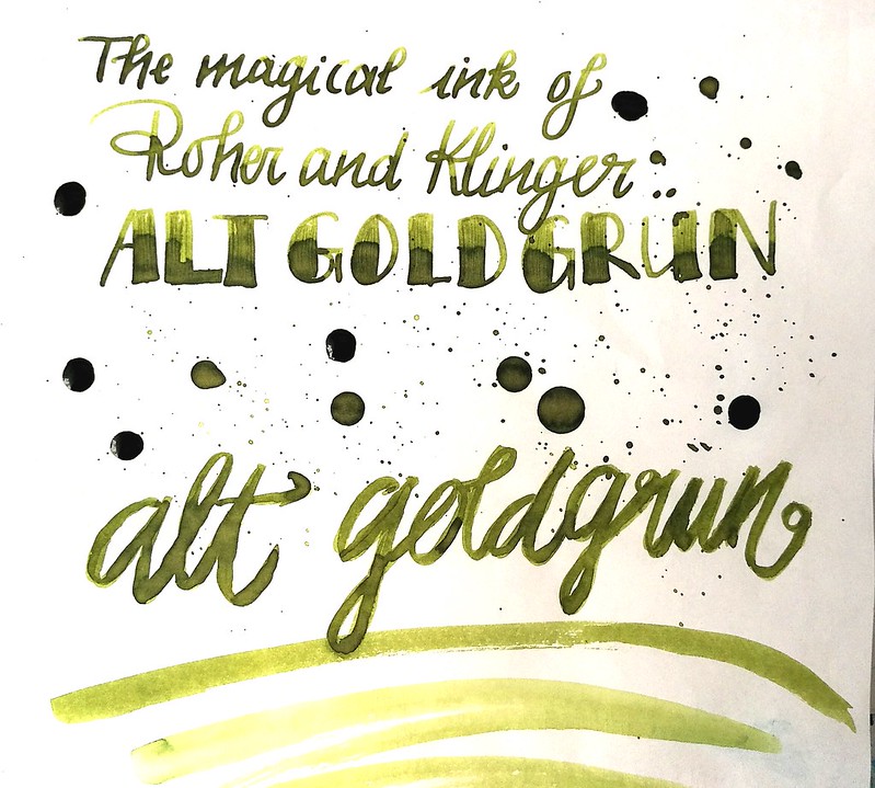
Rohrer and Klingner Alt Goldgrün on Tomoe River paper with an Omas B nib and a faber castell #6 brush.

inky goodness alt goldgrün
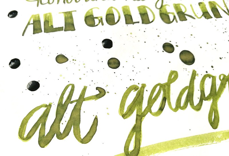
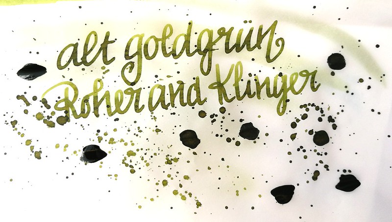
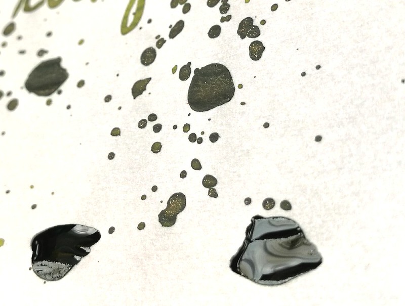
The ink on Canson 80gms tracing paper. Look at the delicious gold flecks in the ink when it dries. So pretty! (ETA: I noticed I have written "Roher and klinger" instead of "Rohrer and klingner" on my test pages, and I realize I always said/wrote it wrong, until now! argh!! oh well, mistakes happen, ink is still pretty and y'all know which company I mean by now, right? )

Of course I also had to make some ink wash art with this ink. I used the same technique as my previous ink washed art work and chose some fitting stamps for the theme.
inky goodness alt goldgrün
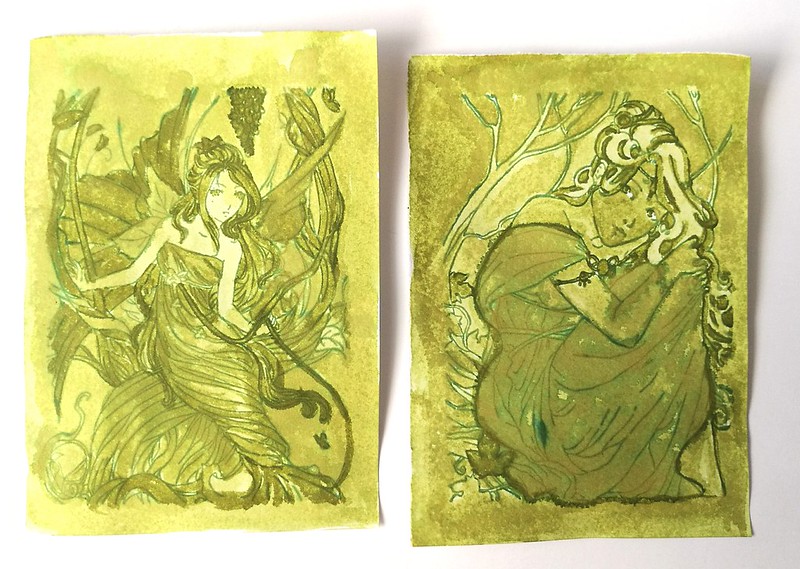
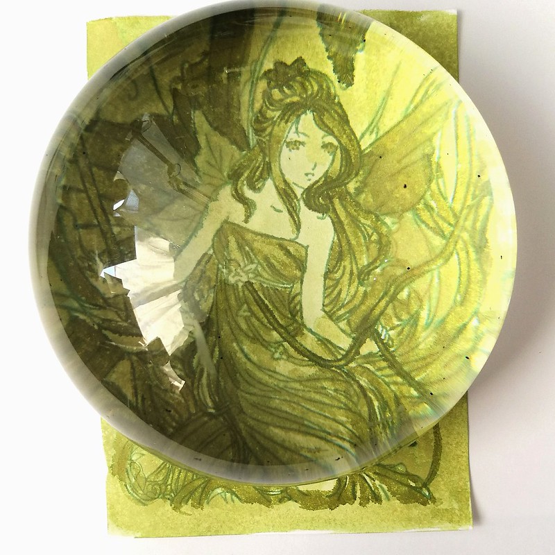
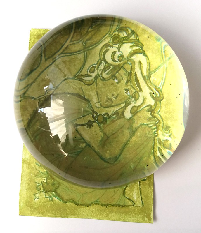
I chose some magical faeries from Sweet Pea stamps (sadly shop went out of business last year :( ) which I stamped with Memento cotton Ivy (which is waterproof) on 130gms smooth stamping paper and a Faber Castell #6 brush. They are ATC sized. The left fairy is done with a "dry on dry" technique and the right one a "wet on wet" technique. A close up with my new loop tool :
inky goodness alt goldgrün
I found this magnificent (excuse the pun ;) presse papiére at an antique market (used for postage stamps, I guess) which enhances the view of the artwork very nicely. With the dry technique I worked from light to dark, letting each layer dry before adding more ink. You can create some awesome shading that add variation to the piece.

inky goodness alt goldgrün
With this piece I kept on laying ink on wet parts and let some dry in between. You can see a lot of the gold sheen coming through in the dress where the ink was put on heavily. I also outlined the girl with non diluted ink so she would "pop out" more. 

I am entering these magical green fairies to the "Anything goes" Challenge over at Craft Stamper's July challenge. 

In conclusion: Rohrer and Klingner Alt Goldgrün definitely does deserve to be in rotation as well as used for my art works more than it has. It's in my top 10 Sheeny-shading inks as well for sure! For more in depth reviews of this ink I'll refer you to PenInkCillin , The Pen Habit for written reviews and artwork at Gouletpens blog for more close up pictures. 

Thanks for stopping by and have a great day!
namasté 

2016/06/08

Inky goodness: J. Herbin 1670 Caroube de Chypre

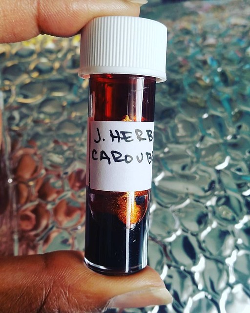
So excited to try this!! Thank you @mishka5050 :) Can't wait for the launch of this ink at @bureaudirect :) #caroubedechypre #jherbin #FPgeeks #FPN #fountainpennetwork #fountainpenink #inksampler
Not a pens and ink post this week, but a focus on just the ink this Wednesday! A little while ago Mishka from Bureau Direct kindly sent me a sample vial of the coming ink in the anniversary line of J. Herbin 1670 Caroube De Chypre, which is due for release on Bastille Day, July 14th. So I'm lucky that I got a sample to try it before the release date and I finally had the time to play around with the shimmery ink a little and showing you some results today. Thanks so much again, Mishka!

j herbin caroube de chypre
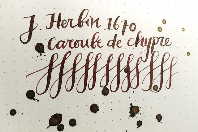
J. Herbin Caroube de Chypre on with a waterman 12 Ideal nib #2 on Muji dot grid notebook paper. The ink performs well on smooth and fountain pen friendly ink paper like the above. I dipped my pen in the vial to write and then added some splatters. There is a lot of shimmery action going on there, which I really like. And the deep chocolate brown base color shows off the gold shimmer well.

j herbin caroube de chypre
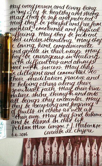
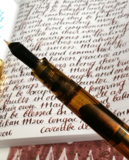
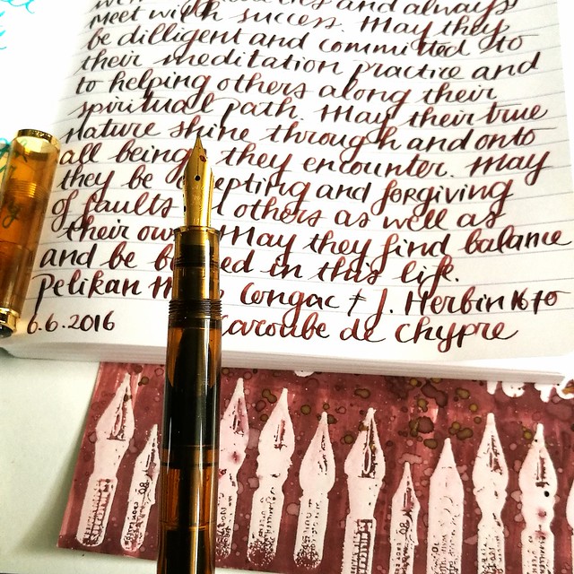
I used my Pelikan 200 Cognac with a M italic ground nib for more writing and testing in my written meditation journal. The ink holds up pretty well on Clairefontaine paper as well. But sadly the shimmer doesn't show through as much as with dipping the pen in the ink vial and writing with it. It showed some shimmer the first few lines when I wrote with it.

j herbin caroube de chypre
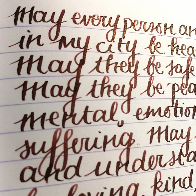
As you can see in the above picture the first few sentences has the gold shimmer, but later on there is little shimmer. I had to shake the pen a few time to get some of the shimmer flowing into the writing again. And it does pick up a little, but not a lot.

j herbin caroube de chypre
You can see that my pelikan does hold a lot of shimmer in the barrel, so it might be that the combo of this pen and ink doesn't allow the shimmer to shine though like it deserves. The feed doesn't have a lot of shimmer on it and I think herein lies the problem.

j herbin caroube de chypre
For the shimmer to really shine though, I think you need a pen with less fins in the feed, like a vintage pen with a smooth feed or a really wet writing pen. I discovered that too with the diamine shimmering inks, though those inks have a lot more shimmer in them than the J. Herbin 1670 series.  I'll be experimenting with this ink in other pens when I get the chance (ie when I get a full bottle, my sample is nearly depleted). But for now I also wanted to show you some ink wash artwork I did. 

j herbin caroube de chypre
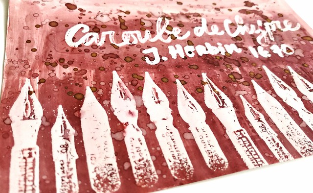
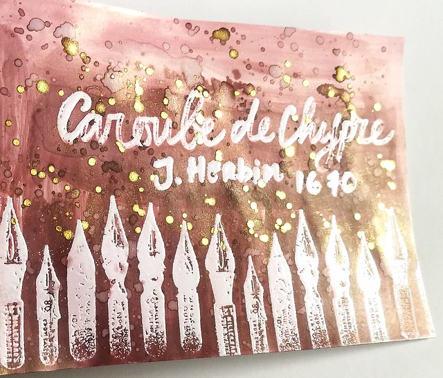
I stamped the dip pen stamp from Viva Las Vegas Stamps with versamark ink on smooth white glossy paper and embossed it with clear embossing powder. Then I wrote Caroube de Chypre, J. Herbin 1670 with a versamark embossing pen and embossed that with clear embossing too. I took a small paint brush and a little bit of water and started to wash the ink from top to bottom over the embossed parts. 

j herbin caroube de chypre
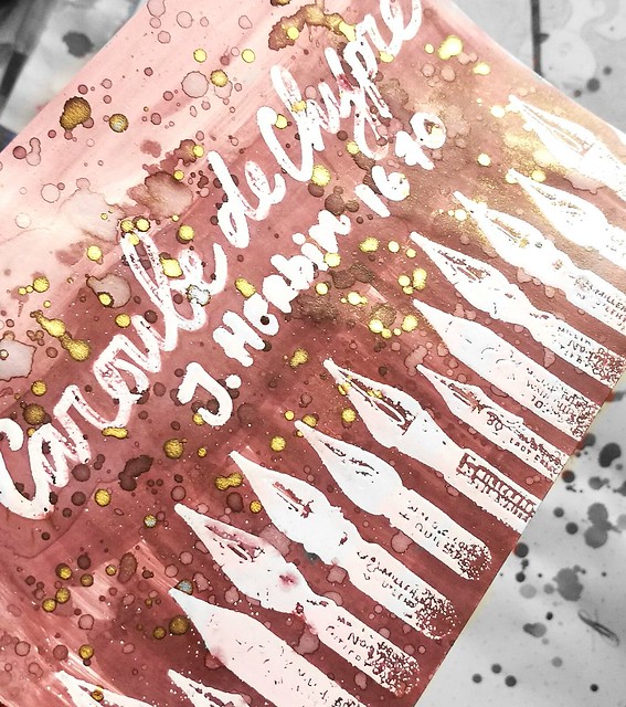
The embossed parts work as a resist, so the image shows up through clearly and you can wipe excess drops of ink on the embossed parts away. When the image was dry I took my brush, dipped it in the water a bit and spattered over it. I let that dry and then I dipped the brush in the ink vial and spattered non diluted ink over it.

j herbin caroube de chypre
This is the end result, a beautiful chocolate brown shimmery gold speckled ink wash! I'm going to do some experimentation on watercolor paper like I did with the Diamine shimmery inks, but I definitely love the smooth glossy look this paper has. I'm also loving this embossing ink resist technique a lot and will incorporate them more in inky goodness posts :) 

More reviews with lush pictures on Caroube de Chypre can be found at The Clumsypenman and Gourmetpens. And if you do not want to miss out on this ink when this gets released in July, why not subscribe yourself to Stationery Wednesday newsletter and blog from Bureau Direct for more info and a 10% discount code being distributed weekly!

Disclaimer: this sample was sent to me free of charge for review purposes. All opinions are my own and there are no affiliate links. 

Thanks for stopping by and have a great day!

namasté

2016/06/02

Inky goodness: Nickel Teal Time Wash

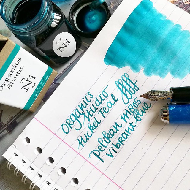
In my pens and ink post yesterday I paired this gorgeous combination: the pelikan M805 Vibrant blue with Organics Studio Nickel Teal.
Just love this color! And it's going to be available soon again, yay! @organicsstudio #nickelteal #organicsstudio #bluehues #fpgeeks #FPN #fountainpennetwork #fountainpen #pelikan #pensansink #vibrantblue
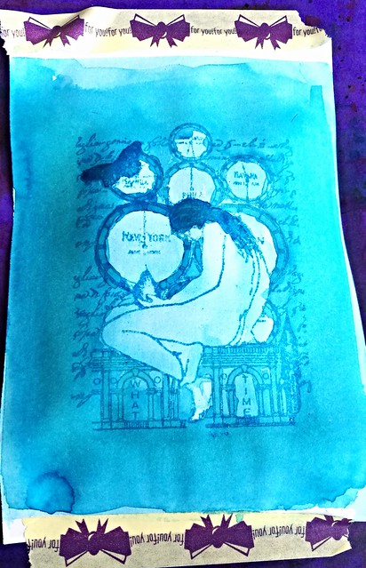
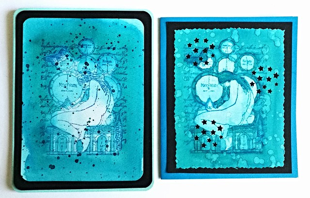
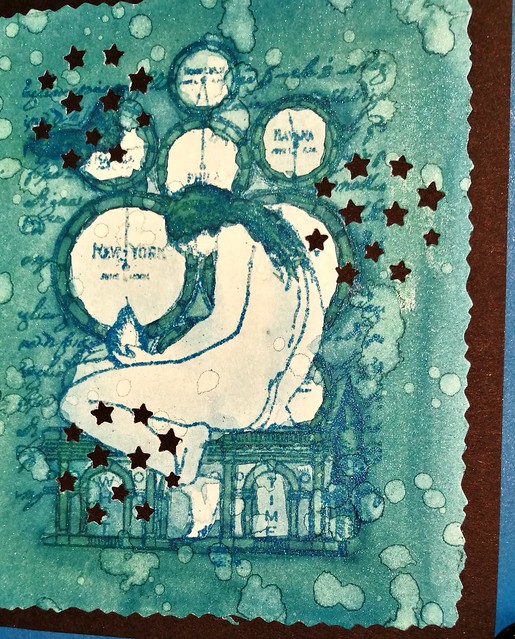
This ink will be in the line up of the relaunch Organics Studio will have this month. Recently I have been into ink washes, also thanks to a few great swaps on swapbot and I've made a few fun note cards with a rubber stamp emboss resist technique and the Nickel Teal ink which I want to show you today.

Nickle Teal Time wash
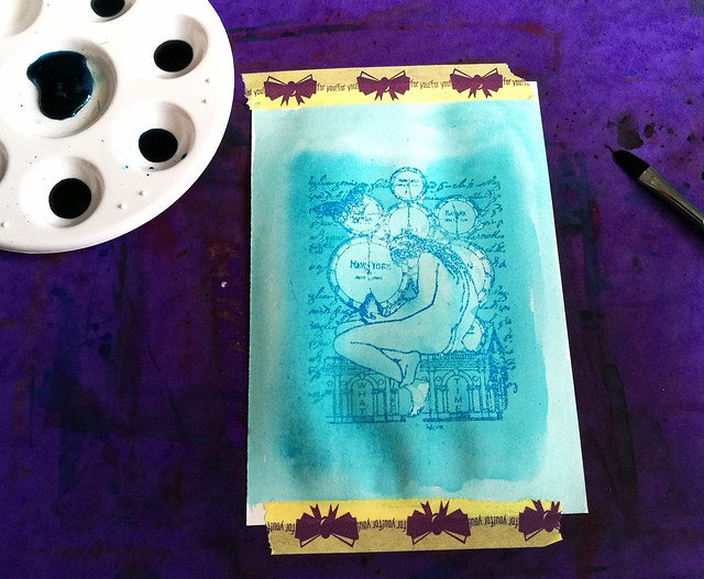
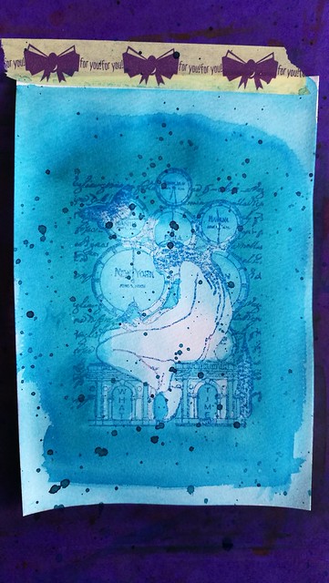
I started with diluting the ink in my tray. I posted a few drops of in in the tray and added drops of water to them, 3, 8, 12 and 17. In the middle I also added a little bit of shimmer in the form of blue Pearl Ex powder. I also made sure I had a bit of 100% non diluted ink in my tray as well. I stamped the image a few times on water color paper and lightly embossed it with Wow lagoon embossing powder. The image is from Non Sequitur plate Time and Space which is available at the Stempelwinkel. 

Nickle Teal Time wash
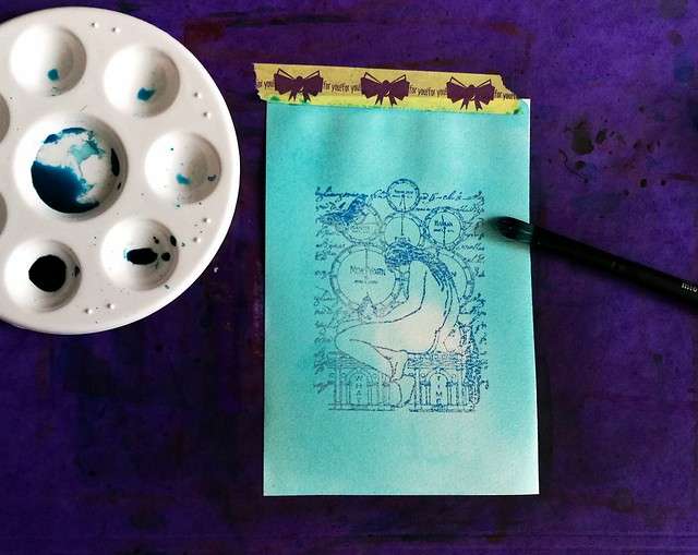
The way I started off with the wash is from light to dark layering, so I used the most diluted ink first to create an over all light tone and added darker tones to arias I wanted darker. The embossed parts of the stamp resist the ink, so the image doesn't wash away and shows through the ink clearly.

Nickle Teal Time wash
I used a mixture of wet on and wet and dry overlay wash techniques. To get the desired darker effects I waited in between layers to add more color. The less diluted, the more saturated the dried up color is, obviously.

Nickle Teal Time wash
It's fun to test out different kind of washes. Here I made the edges of the image darker and added a spatter effect with the non diluted ink over it when dried. When I was satisfied with the desired effect the wash created, it was time to make some cards out of them!

Nickle Teal Time wash
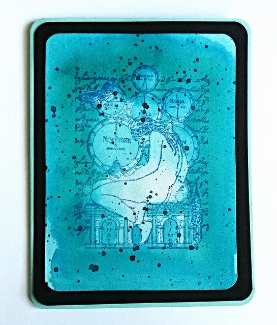
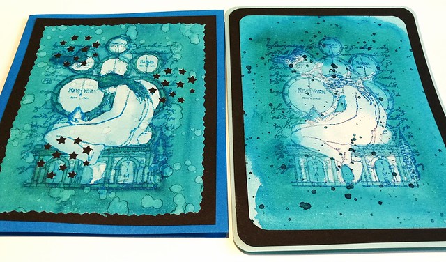
I measured and cut out both pieces so the image was in the center. With this piece I rounded off the corners with a corner punch, matted on black card stock, also rounded off the corners and then adhered it to a folded note card which I then also rounded off. I love the layered effect this created. 

Nickle Teal Time wash
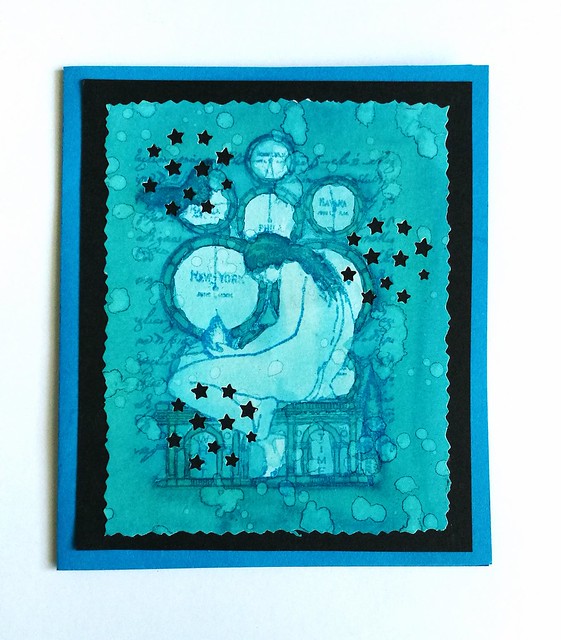
With this piece I also splattered on some water drops and let that dry. That created the lighter aria's on the card. Then I cut the edges with a figure scissor. I have a fun stars punch from the HEMA which you can reposition on the whole card and I used that on this card. It creates a nice "starry night" effect with the black background. I adhered the piece to a dark blue note card. 

Nickle Teal Time wash
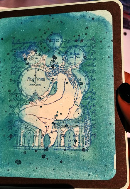
The cards side by side. I love this teal color! It creates such beautiful washes! The cards also have a bit of shimmer to it due to the Pearl Ex Powders which you can see a little bit here:
Nickle Teal Time wash
It's very subtle and you can only see the shimmer when the light hits the card a certain way. I definitely love how these cards turned out :)
Nickle Teal Time wash
The fortnight challenge at the Stempelwinkel stamper's #9 challenge is blue and I'm entering these cards for the challenge. 

Thank you for stopping by and I hope this inspired you to play around with ink washes as well :)

Have a great day!
Namasté

2016/02/19

Inky Goodness: The life of an inkophile...

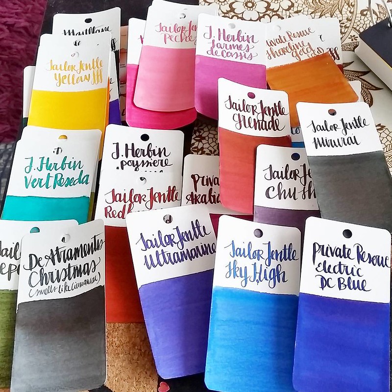
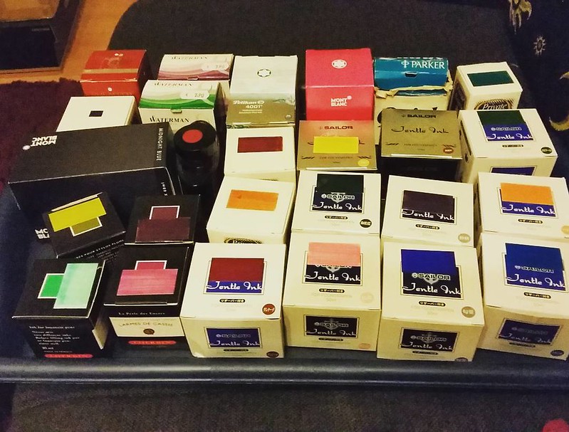
This is what my coffee table set up looks like on a random sunday evening:

Getting ready to swab these on maruman mnemosyne word cards #inkophile #Fpgeeks #FPN #fountainpennetwork #fountainpeninks #montblanc #sailorjentle #parker #waterman #jherbin #privatereserve #pelikan #pilotiroshizuku

On the couch next to me a tray of inks waiting to be swabbed on Maruman Mnemosyne wordcards. The tray included lot of older Sailor inks which are discontinued now. 

Results of last night's color swatching #inkophile #Fpgeeks #FPN #fountainpennetwork #maruman #wordcards #inkswabs #privatereserve #sailorjentle #waterman #jherbin #sheafferskrip

Swabbing away while binge watching "Being Human" episodes. Used a waterman 12 to write the make and color of the ink. Lots of pretty and saturated colors in this swab round! Such a shame those bright, happy Sailor Jentle colors are no longer regularly available!
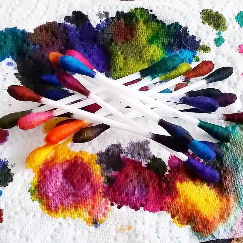
Q-typical abstract art #qtips #inkophile #inksampler #colorcoordination #inkspill #inksperiment #fountainpeninks #Fpgeeks #FPN #fountainpennetwork #ink #inked #inkygoodness

The Q-tips after one swabbing session leaves a pretty "Q-typical abstract art" and it's such a fun sight to see!

I still have about 3 full trays to swab and 3 more seasons of Being Human to watch... and a few new inks are coming my way soon too... so much to look forward to! 

What are your ink swabbing habits? 

Thanks for stopping by!

namasté 

2015/10/25

Mailart Sunday: Having some fun with diamine shimmeritastic inks!

Not a drop wasted #shimmertastic #shimmeringink #inkymess #inkygoodness #Fpgeeks #mailartists #mailart #inksperiment #inkspiration #inkspatter #diamine #goldensands
In my last post I showed you the writing examples with Diamine Shimmertastic ink samples, Mishka from Bureau Direct so graciously provided and today I wanted to show you some mail art I made with the remaining drops that were in the sample vials. No drop was wasted! [This post is going to be image heavy]
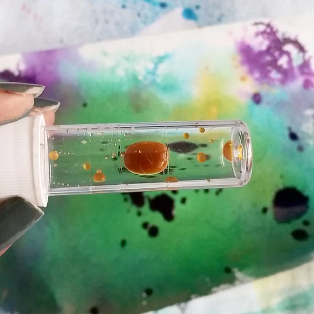
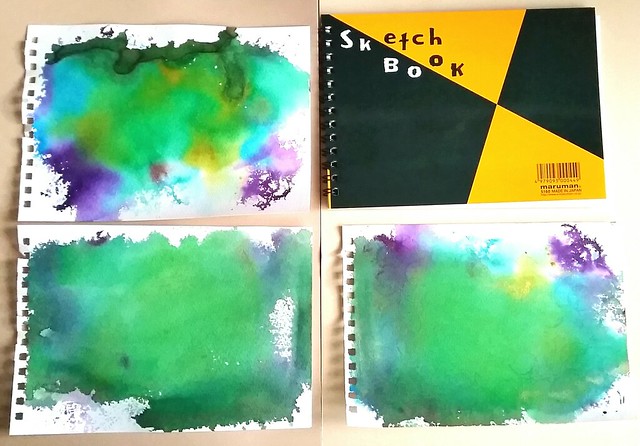
Mail art with diamine shimmertastic inks and Maruman water color sketchbook
I started off with making my base back grounds first. I drizzled some drops with a pipette and tapped the inks strait from the vials on the page and sprayed water all over the pages with a mini mister, so that the colors would blend over. Then I dried the pages with my heat tool.

Mail art with diamine shimmertastic inks and Maruman water color sketchbook
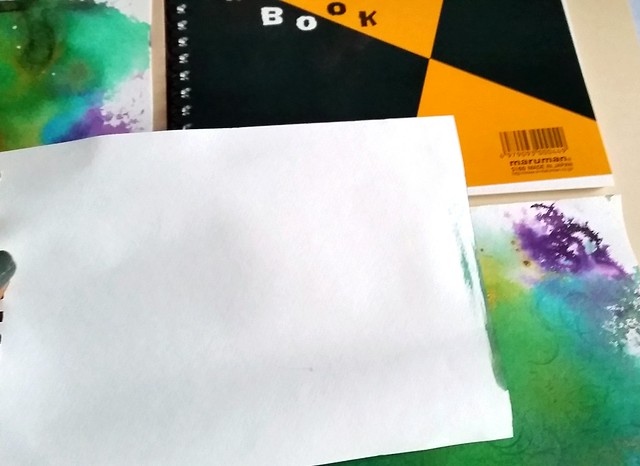
It's important that you use good absorbent yet sturdy (watercolor)paper for this. The paper I used is the Maruman Zuan B5 sketchbook which I got at my recent Pen Store haul. It's 126.5 grams of great quality water color paper and with the inks and water spillage I have doled out, it hold up pretty well! No bleed through on the other side as you can see above (the smudges on the right side is from excess water that pooled over) And warping of the page after drying is minimal.
Mail art with diamine shimmertastic inks and Maruman water color sketchbook

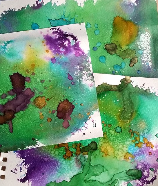
When the sheets were properly dry, I added some more shimmery ink drops on them by using a syringe to create random spatter patterns. I also diluted the ink a little bit in the ink vial to get more 'mileage' out of the last few drops. This way you also create some color variation, a light ombre in the color scheme. When I was satisfied with the amount of droplets, I dried the pages with my heat tool again. This time, when dried completely as shown in the picture above, the added drops are much brighter and the shimmer is more pronounced. Now to turn these pieces into mail art!

Mail art with diamine shimmertastic inks on Maruman watercolor paper

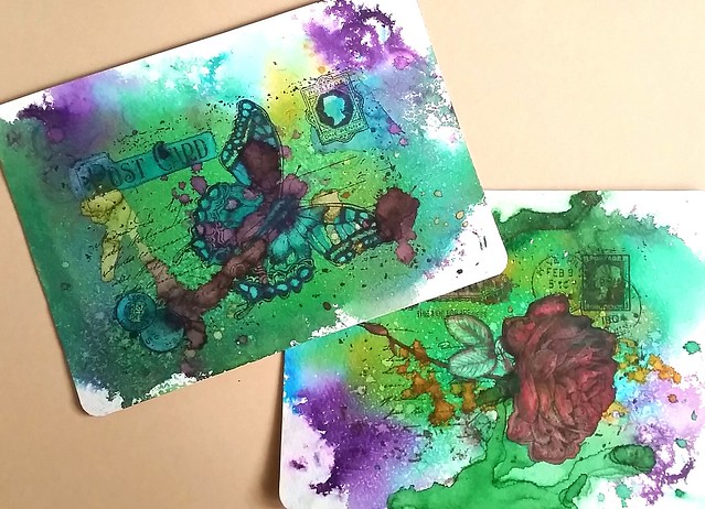
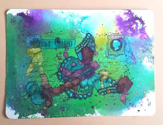
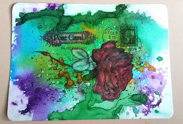
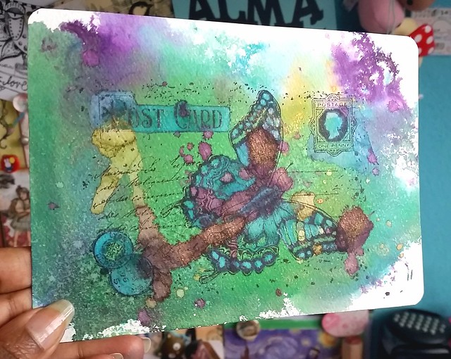
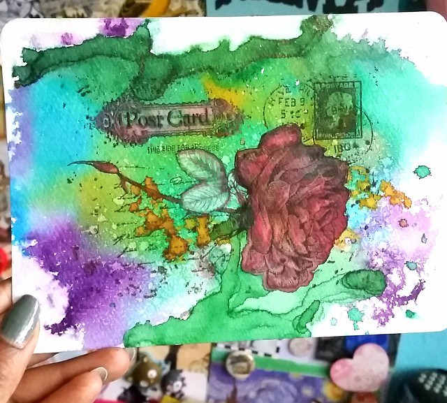
I took 2 of the background pieces I liked most and stamped Joy Crafts Old Letter Rose 2 and Old Letter Butterfly (by Noor design) on them. By this time I had run out of Shimmering inks but a good friend of mine gave me a full set of these in sample bottles so I could play with them more.  I colored some accents in the rubber stamp image, like the rose, butterfly, postage stamp etc. by using a pentel color water brush to make the image pop out more.

Mail art with diamine shimmertastic inks on Maruman watercolor paper

I used blue lightning to accentuate pieces in the rubber stamp, wings of the butterfly, postcard header, cancellation stamps and the postage stamp.

Mail art with diamine shimmertastic inks and Maruman water color sketchbook

With the rose I used red luster to accentuate the petals of the rose a edges of the leafs and corners of the 'post card' header. I also diluted the Magic Forest color in the leafs to accentuate that part more.

Mail art with diamine shimmertastic inks and Maruman water color sketchbook

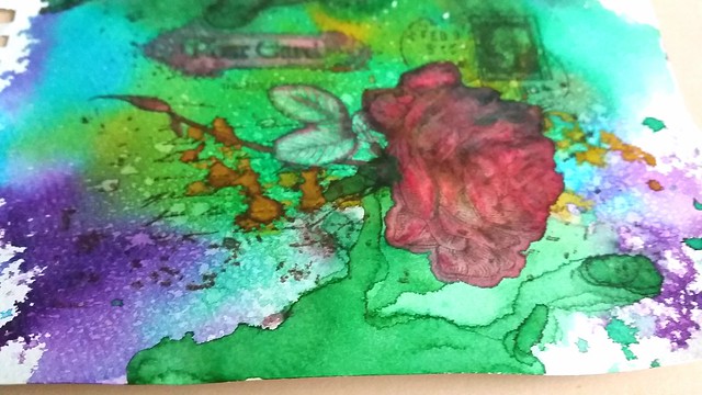
I also used the water color brush to create depth in the Rose petals. Make sure you use a water proof rubber stamp ink, I used memento rich cacao and tuxedo black, because your image can wash away if you don't. You can stamp over the dried image again to give the image its crispness back.

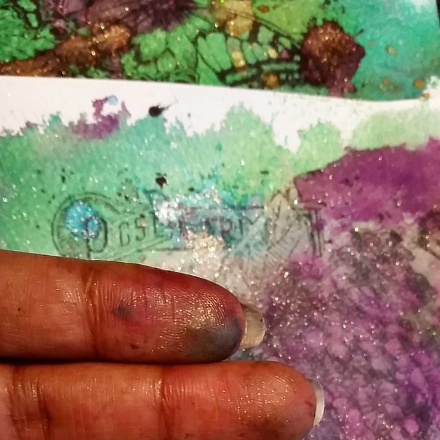
A couple of close ups of the pieces so you can see the shimmering accent better.

Mail art with diamine shimmertastic inks on Maruman watercolor paper

Mail art with diamine shimmertastic inks and Maruman water color sketchbook

The last step was to glue the pages to card stock and I rounded off the corners with a punch.

And there you have it! I hope this inspired you to mess around with shimmery inks and rubber stamped images too :) And in the end your fingers will probably look like this

Having fun with a bit of shimmer #shimmeringink #shimmertastic #diamine #joycrafts #rubberstamps #inkymess #mailartists #mailart #craftiness

And you will find glitter EVERYWHERE! But that is part of the fun ;)

Thanks for stopping by!

Namaste