Showing posts with label journnal. Show all posts

2017/12/06

WIP: Nightly watercolor practice still going strong

My current favorite watercolor palettes :) ____ #watercolorpaint #watercolorpractice #watercolor #watercolorart #watercolourart #watercolour #aquarelle #sennelier #schmincke #pfeifferartsupply #princetonbrush #artsupplies #artistsofinstagram #createeveryd
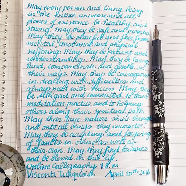
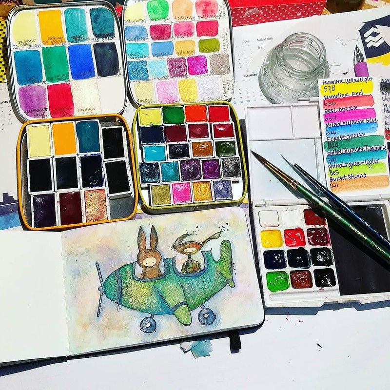
Working in my moleskine pocket book at night ...

As you might have read on how Exhaustipated I get during winters (esp. when you're home sick with a strange type of flue which is going around it would seem!) I also wanted to share what helps me through these dark days. And that is color therapy in the form of doing water color practices at night. By now I have a little collection of different water colors tins filled with paint handmade by lovely artisans and the familiar brands like sennelier and schmincke. In the Black Friday Sale from a few weeks ago I've also purchased a few tins from Prima marketing series: Shimmering Lights and Decadent Pies.

Excited to have these #primamarketing #shimmeringlights #watercolors to play with ๐Ÿ’– I knew I needed to have them seeing @khourianya using them for her gorgous works. Got another prima set, decandent pies in a twofer-deal! Yay black friday
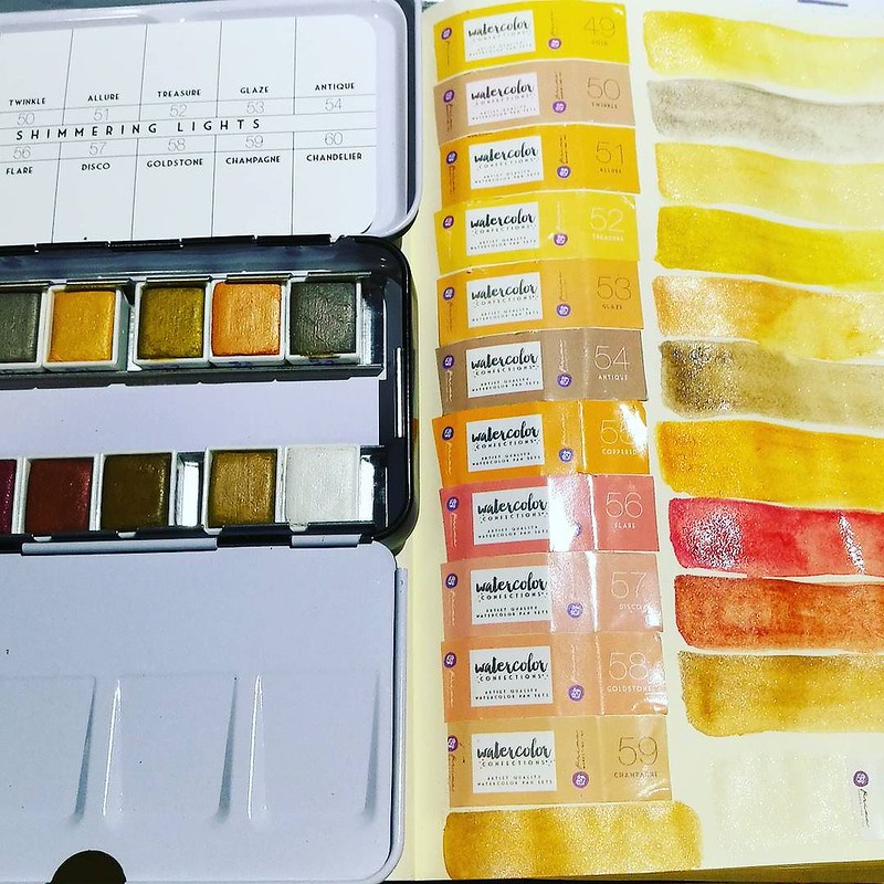
Prima marketing Shimmering Lights color swabs

The Shimmering lights are beautiful golden/orangey tones with a slight shimmer. They also are quite strongly pigmented so they can be used for glazing over colors as well as being used on their own. They are labeld as artist grade paints and I'm very excited about this set. The Decadent Pies however, not as much...

Having some coloring fun with @prima_watercolor Decadent Pies. The image is a stamp designed by @karen.hayselden for #StampotiqueOriginals #watercolorpractice #watercolorpaint #watercolorsupplies #primamarketing #decadentpies #watercolorsupplies #watercol
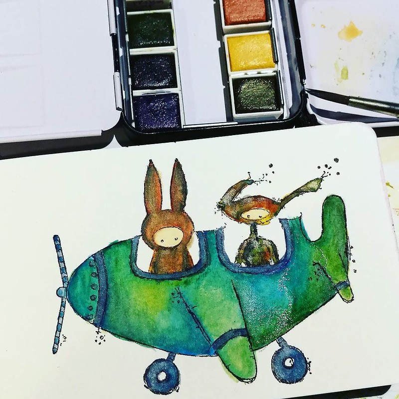
Stamp by Stampotique Originals, first layer of color with Prima Marketing Decadent Pies

There are some fun colors in the decadent pie set, but even though it says "artist grade" on the wrapping labels (not on the tin like on the shimmering lights!) it behaves more like student grade watercolors. Like the KOI Water Color set I had before I ripped those out of the plastic pans and filled with sennelier colors. OK, to be fair these do behave better and are more saturated in color than those KOI ones but still did not like the set as much as all the other sets I have. The set also have 4 shimmering colored pans, but no doubles from Shimmering lights. Didn't mean for this post to turn out like a mini water color review, but there you have it.

Absolutely in love with my new detail brush! Poppies are stamps from @carabellestudio #watercolorpaint #watercolorpractice #watercolor #watercolourart #watercolour #aquarelle #davincibrushes #poppies #moleskineart #practice #paintepicshit
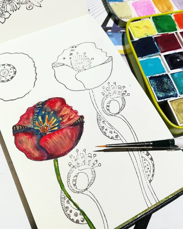
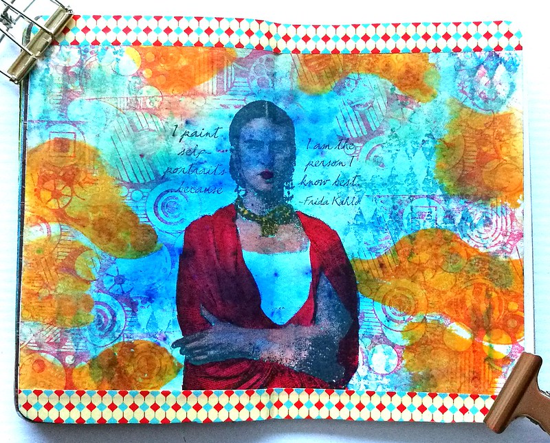
Stamps by Carabelle Studio's, DaVinci detailler brush size "2/0"

At any rate, I'm really enjoying the self-created "water color Therapy at night" routine (next to my writing meditations) which help me through these days where I am in much of need of sunshine. It's like I said to a friend "Color is like Vitamin C and works like an energy boost in dark times" and wouldn't you agree?

Sharing these watercolory desk shots over at my desky friends at Julia's blog for WOW 444 (such a magic number!) 

Thanks for stopping by and have a lovely week!


2017/01/13

Art Journal: the Frida Blues

Art journal Frida

Last weekend I found some time to play around with my Lost Coast Designs stamps again and created this page in my pocket art journal. I feel like I really need some bright bursts of colors in my journals/life right now because it's so cold and winter is in full swing now (and to counterpart my SAD blues). For the background I used Brusho Ultramarine on watercolor paper. The effects are always mesmerizing and fun. I stamped the Frida Image directly onto the paper and colored her in with tombow markers. Chose the diamonds, circles and circle border stamps for the background. Lastly I added bright yellow tombow markers to contrast in color to the blue brusho. I stamped the circles with Memento Ladybug red and adhered it to my pocket journal. Added strips of color coordinated washi tape to the top and bottom and called it done.

Art journal Frida
This page is so different than the one I did before and I love how you can use the same stamps and yet create such a different style with them :)

Stamps used from Lost Coast Designs
Others: 
Maruman Zuan Watercolor paper 
Brusho Ultramarine 
Memento inks Ladybug, mango, danube blue
Stazon midnight blue
Various colors Tombow markers
Washi tape

The " #32 Anything Goes challenge"at Loast Coast Portal ofCcreativity, is still running until the 25th, so why not take a stab at it :) I am entering this one as well (you can enter multiple projects!). It's not even required to use LCD or CV stamps but would be fun if you do!

Thanks so much for stopping by and have a great weekend!


2016/11/02

Pens and Ink: Pelikan M1000 with Robert Oster Purple Rock

Starting off the day with a bit of #writtenmeditation in my Rhodiarama journal. Got some spatters of Purple Rock on it and you can really see that purple lavender hue on it :) Have a great day everyone ๐Ÿ’œ
Not too long ago I had the amazing opportunity to buy a Pelikan M1000 in black with gold trim in a clearance sale for a great price. Something I could not resist even though I was wondering if I would use it enough because it came with a fine nib and is such a large pen. Well, inked with this spectacular ink Purple Rock by Robert Oster, it definitely became one of my fave writers in no time!

Something I have learned in spades last year, listen to my body and keep my energy balance in check. Always good to remind yourself of what you have learned and keep it in practice. Inked my M1000 with Robert Oster Purple Rock and the M1000 nib grade is o
The nib on the M1000 is nothing but spectacular! It's quite a large pen (see a review of the M1000 here by SBRE Brown and here by Brad Dowdy on the Pen Addict) and the nib has some wonderful spring to it. It's one of the rare fines I truly enjoy writing with.

The first bottles I got of @robertostersignature Itvhad to be Bondi Blue beacuse turquoise and sheen?! I need that!! And am curious of the Purple Rock because I wanted a purple black. Hope it's as good as @attilasultis's swabs made it look :) Oh and it is
I bought the Purple Rock in my order at Sakura Fountain Pen Gallery together with the Bondi Blue. At first I thought it was more of a black with a light hint of purple, but it's a deep dark grey with a gorgeous purple hue to it. It's subtle in a fine nib though, but it's definitely more visible in broader pens or in an ink splatter like the top picture. A beautiful work safe pen and ink combo I would say. See some awesome ink tests on Robert Oster inks here by Nick Stewart at Inks and Bleach.

purple hues
Here you have Purple Rock flanked by Diamine Damson and Caran d'Ache Storm, It's definitely a lot darker than the other two dusky purples for sure, though you can see the purple hue purple rock has very clearly in less saturated parts in the writing below and the splatter.

Pelikan M1000 with Purple Rock
Purple Rock is a great match for this gorgeous M1000 and also a fun "safe for work" color.

Next week I'll show one of the other purples in another Pelikan. 
Thanks for stopping by and have a great day!

2016/10/26

Pens and Ink: Pelikan M620 Grand Place with KWZ Monarch

Pelikan Grand Place with KWZ Monarch
Today's I'm sharing a wonderful autumn inspired combination: the Pelikan M620 Grand Place inked with KWZ Monarch ink.

Tilburg Penshow Spoils
About the ink: I bought a bottle at the Tilburg Penshow in september and it's a Fontoplumo exclusive. It's made by KWZ and it's made to fit their gorgeous Limited Edition Conid Bulkfiller fountain pen. Well, I have not won the lottery yet, so the pen was not something I could obtain, but the ink definitely came home with me. It's a gorgeous warm orange color, perfect for this time of year.

pelikan
The pen I chose to try the ink in is this gorgeous Special Edition by Pelikan, the M620 Grand Place from the city series. It's a beautiful coppery brown color with dark blue swirls in it. I got really lucky obtaining this pen because it's a LE from a few years ago but a collector was selling his pen a while ago and I jumped on the chance. It is fitted with a b nib, so I figured it would be perfect to show off the great shading of the KWZ ink.

Pelikan Grand Place with KWZ Monarch
It definitely does the ink justice! It has some great shading and reminds me a lot of Diamine Autumn Oak and Noodler's Habanero (ink shot reviews by the lovely Gourmet Pens). Though Monarch is a bit browner and has a wonderful vanilla small to it! Makes writing with it a lot more fun (I kept sniffing the nib!)

orange comparisons
Comparing the inks side by side. As you can see Monarch definitely has a browner and darker tone to it. It's a subdued copper red orange ink but with writing you definitely can see some lighter tones. 

Pelikan Grand Place with KWZ Monarch
I am very much enjoying this pairing and happy to have these two special editions in my collection.

Thanks for stopping by and have a wonderful day!

namastรฉ

2016/05/15

Paper goods: Papelote Notebook Cover & Clairefointaine 1951 vintage notebook

It's wonderful "journaling on the beach" weather! Papelote notebook cover from @bureaudirect is super handy!  #bureaudirect #stationeryaddict #stationerywednesday #journaling #journalonthego #papelote #notebookcover #brushpens #artjournal #lovingkindness
It was a beautiful day out and we decided to make good use of it and go to the beach. The perfect opportunity to test out the great Papelote A5 Notebook Cover outdoors! This notebook cover, together with the Clairefontaine 1951 retro cloth bound notebook was so kindly sent to me by Mishka from Bureau Direct for review purposes! Thank you so much Mishka!!

Journaling on the go

The papelote notebook cover is made with soft cotton cloth and comes in various designs. I was sent the red and white striped with blue inseam cover. A lovely combination! The cover has an elastic strap attached to it, which can hold 5 writing utensils. It comes with a pencil to get you started. You can see the array of items I've chosen to carry with it; a few fine Steadtler fine liners, a faber castell brush marker, sakura gelly roll pen and a water brush pen. The size I have here is the A5 size, which can fit any A5 size notebooks like the Leuchtturm 1917 and Rhodia notebooks. I chose the Clairefontaine 1951 vintage style notebooks, because of the fact it has fountain pen friendly paper and well just look at it.

Clairefontaine retro 1951 notebooks
It's pretty and it's turquoise! They come in 3 different sizes, the pocket sizeA5 exercise and A5 clothbound books. I got to test them all and they fit in very nicely in the notebook cover.  

Starting off the day with a little writing in my journal. Papelote notebook cover and claire fontaine retro notebooks from @bureaudirect #dailywriting #journal #papelote #clairefontaine #bureaudirect #writing #mindfulwriting #gratitutejournal #stationerya
 Also I used some fun journal rubber stamps to categorize my notebooks :) 

A fun turquoise set: clairefontaine vintage 1951 pocket book, J. Herbin rollerball with Blue Pervence ink cartridges. Thanks @bureaudirect @mishka5050 ๐Ÿ˜Š
Fun fact, Bureau Direct also offers the pocket books in a fun compilation with the J. Herbin rollerball pen and ink cartridges. The turquoise set comes with J. Herbin Bleu Pervence turquoise ink cartridges. They also have the bottled ink here. A scrumptious set for a turquoise fanatic like me :D

Anyhow, back to the notebook cover! You can carry a lot of tools inside the cover besides just the notebook due to the flexibility of the soft cotton cloth cover!

Journaling on the go
Look at that! Doesn't that look scrumptious?? Yes, the brownie was really yummy as well ;) So what did I take with me in my notebook cover? Take a look below:

Journaling on the go
I tucked in a pack of water color pencils, a pocket size coloring book, the Lamy Safari Dark Lilac (see my pens and ink post about it here), a pocket sketchbook and...

Did you know you can also tuck in an A5 clipholder in the back of the papelote notebook cover?! It gives more "body" to the cover and you can just sit anywhere and write :) you can get all the items pictured at @bureaudirect for your own "on the go" journ
An A5 Clipboard! The cover has a seem opening on the back where you can tuck this baby in! I found this discovery brilliant as you can add sturdiness to the cover which allows you to sit down anywhere and write, draw, color or whatever on the go! I already had this one, but Bureau Direct are selling these clipboards by Penco as well. So what do I use my clairefontaine journal for? I use it as my Daily Gratitude and Loving Kindness journal. You have seen shots of the pages in my Pens and Ink post, surely. Every morning (or at least I try to) I write down the loving kindness meditation to set the tone for Compassion for the day. I will write another post about this type of journaling at a later point, but let me show you a page as a reminder.

Starting off the morning with some #lovingkindness #mettameditation #writtenmeditation Tools of choice: FP: Online Calligraphy 1.8m Ink: visconti turquoise cartridge Paper: Clairefontaine - #Fpgeeks #FPN #fountainpennetwork #calligraphy #shittycalligraphy
As I said before, the paper in clairefontaine books hold fountain pen inks really well. It's definitely one of my preferred notebooks for journalling as I love the line spacing (7mm) for my handwriting and the smoothness of the paper lets the nibs just glide over the paper. 

In conclusion: The combination of the Papelote Notebook Cover with these Clairefontaine 1951 notebooks is a wonderful thing! I thoroughly enjoyed using cover. A major plus point being the flexibility of it. Also a great thing about the fact that it's a cloth cover is that you can wash them quite easily if you spill any (non permanent) ink on it! The straps are mighty handy too! It works best if you have something sturdy in the cover like a clipboard or a hard cover notebook, though. If you are looking for only the notebook straps, Papelote also makes them separately which Bureau Direct also sells. Those work best on hard cover notebooks. 

Thanks again Mishka/ Bureau Direct, I've really improved on my daily writing sessions by having such a wonderful set up for it :) By the way, if you're looking into journalling yourself, and looking for something that might work for you, why don't you check out Stationery Wednesday as this month's spotlight falls on  the Bullet Journal. And while you're there, don't forget to subscribe to the newsletter if you haven't already. Next to fun news, specials and competitions, it also contains a weekly discount code for 10% off your purchase at Bureau Direct shop! That's not something you'd want to miss out on!

Hopefully this review was useful to you and inspired you to go out and journal in the wide open :) 
Thanks for stopping by & have a great sunday!

namastรฉ

(disclaimer: I got these items free of charge for review purposes and was not monetarily compensated. All opinions stated here are my own and there are no affiliate links.) 

2016/05/04

Pens and Ink: Omas Blue Paragons with Sea Blues

Omas paragons

At the Tilburg penshow last year I found one of my grail pens, an Omas Vintage Paragon with BB nib stubbed by Mottishaw. Such a beautiful pen body with a great nib! A few months later I had the opportunity to buy some vintage LE Omas pens from a collector and one of them was the one on the right, the blue marbled paragon with a b nib. So happy to have these in my collection! They both write really wonderful and I have paired them with turquoise inks.

Omas paragons

The Omas with the BB nib has Omas Turquoise ink (I finally got a bottle through Akkerman in the Hague, but now they are all sold out everywhere it seems :( ) and I inked the Omas Paragon with the b nib with Roher and Klinger Blu Mare. Both are gorgeous turquoise inks. But I have to say that my fave pairing is this one:

Omas paragons
Such a beautiful and unique nib - esp. since it's hard to get a pen worked on by a nibmeister esp. in Europe. So I am really glad that I got this one through Sarj Minhas at the penshow last year!

What a beautiful morning! Set the tone for Compassion and the day can't get any better ๐Ÿ˜Š Tools of choice:  Pen: Omas Blue Marble Paragon with BB Mottishaw stubbed nib (thanks to @sarjminhas)  Ink : Omas Turquoise (thanks to Akkerman The Hague) Paper
I try to write my daily loving kindness metta meditation to get a good feel with the pen and ink combo. I came to the conclusion that I need to have this pen in rotation more (and write more letters to use the ink up). And of course keep practicing my written meditations in my loving kindness journal. With that a more personal note...

Last sunday I had the opportunity to attend a workshop about compassion and yesterday there was a book reading both by Thupten Jinpa, the author of a Fearless Heart. It was definitely insightful and very helpful with my own mindfulness and compassion practices and trainings. He said so many things that struck a chord, it would be a very long post if I recited it all. But if I could choose of the things that really struck with me and which I want to share with you, is that when you set the "tone" in the morning for the day and reminding yourself of that intention you set, it will keep you connected and grounded with yourself. We often loose touch with ourself during the busy course of the day, and while you can always return to your breath to stay grounded in the moment, reminding yourself of the intention you have set from within your heart, helps to reconnect with your inner core and cultivates compassion. Compassion is a core value we all have, but it's also a choice to act on it or not. We just need to cultivate it more so it extends beyond a reactive setting and becomes more active and natural in our daily lives. So when you are dealing with difficulties/obstacles through the day and catch yourself thinking unkind thoughts towards another, try to turn it around. This is where Jinpa said to add "just like me" to your thoughts/intentions toward others. So for example instead of thinking "that bastard cut me off" and whatever profanities may come next, while in traffic, think "This person wants to be someplace, just like me. May they arrive safely to their destination, just like me." etc... This way we can connect to humanity, in compassion and kindness. And we also "set the tone" of the world around us and especially within us. 
Luckily I don't drive, but daily irritations towards your fellow human being, can be found anywhere!
It takes courage to be actively kind and compassionate (hence the "fearless"heart) but it's a choice none the less. Every morning I will try to set the tone from my inner core and consciously make the choice to engage and act with kindness and compassion. 

Tonight we will remember the fallen in WWII and we'll have a collective national silence at 8pm to remember the deceased. And tomorrow we'll celebrate liberation and life in freedom. It's a good moment to be reflective and think about what life in freedom means to oneself. And to me, life in freedom means to always have a choice, at every moment. 
And I hope we will choose to act with kindness and compassion towards one another. 

Thank you for stopping by and have a wonderful week (...just like me :) )

Namastรฉ

2015/11/16

Monthly planning with sakuralala's 365 stamps in Traveler's Notebook

A while back I entered a giveaway on instagram for the cute Fall 365 stamp sets by sakuralala and I could not believe my luck that I was actually one of the winners!! These babies arrived in the last week of october and they are just fantastic in real life!

They are here! Thanks so much for this awesome giveaway @_sakuralala_ I love these stamps so much and I can't wait to use them! Mahalo ๐Ÿ˜Š #sakuralala #365 #rubberstamps #plannerlove #plannerlife #planneraddict
The Fall Collection consist of clear stamps sets: alphabet Fukuro, Frame, School, Aki and Daily. The little stampers are just perfect sized for planners! I decided to give the monthly planner thing a go to properly use these stamps. I already have a dated weekly planner for work stuff in my Passport Traveler's Notebook so I decided to try the open monthly planner refill 017 for fun stuff in my new Blue Edition Traveler's Notebook which my husband gifted to me (he knows me so well!)  
NB: they are sold out every where but Misc Store still has a few of them left!