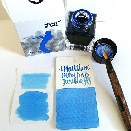
On a recent visit to Akkerman in the Hague I noticed the new Montblanc special edition ink on their shelves, Miles Davis Jazz Blue ink. I was super excited to try it out as I love blue inks esp if they lean toward turquoise hues so I bought it. Sadly, this is one of the very few times this ink is not the color for me and am disappointed with the special edition MB has released. Though the color on the ink swab looks like a nice saturated rich blue, it isn't. I had to swab it twice over to get some richness of color showing. The ink has a very watery consistency, almost looks like a diluted turquoise ink. Swabs on the left are done on Herma sticker paper, the top is swabbed with a q-tip once over, here you see the normal saturation and the bottom is heavily saturated. It could look good in writing with a flex nib as my test writing with the Swan flex pen looks nice on the maruman word card. Let's take a closer look at the ink.
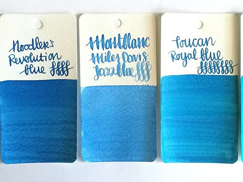
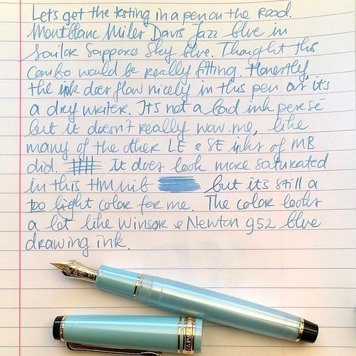
Here Montblanc Jazz Blue is flanked by Noodler's revolution blue on the left and Toucan royal blue on the right to show you similar ranges of blue in the same color tone. Jazz blue is lighter than both but in color tone it leans more toward Revolution blue, but the ink has the same watery consistency as the Toucan inks have. I inked my Sailor Sapporo Haruzora Sky Blue fountain pen with MB Jazz Blue to test how it writes in a medium nib.
This pen in particular is a dry writer. I don't often use this pen, in fact this may be the second time I have inked this pen. And even though this pen and ink combo does match nicely, the ink itself does not really "wow" me like say Dandy Turquoise does. In writing the color also looks a lot like Diamine China Blue. Writing is done on 70gms Lyreca office paper.
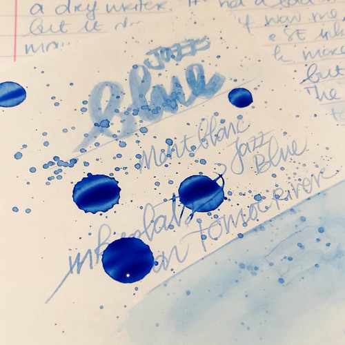
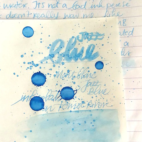
I also did some tests on tomoe river paper to see if there is some sheen in this ink. This is the cream colored tomoe river and you can see that the ivory color does dull down the blue color of the ink ever so slightly. The ink is definitely better looking on stark white paper. I suspected this ink doesn't have any sheen and after drying time (this took a looong time to dry!) my suspicions were confirmed.
It does dry up with a nice blue halo, but no signs of redness caused by sheen of any kind. The drops look a bit pastel blue and with heavy saturation it's a high shading ink, but without any sheen. I do see a lot of potential for this ink in artistic endeavors, it definitely looks like a spring sky blue to me. Perhaps this would make a beautiful combination with Montblanc Pink in a sakura sky setting. Looking forward to test that out :)
Hope this was helpful to you, should you consider getting this ink for yourself. Let me know your opinions on this ink should you have tried it, I would love to hear it.
Thanks for stopping by and have a great day!
namasté
No comments:
Post a Comment
Thank you for leaving a comment! I read them all and they are very much appreciated ❤
GDPR law EU disclaimer: please be aware that if you leave a comment on any post on this blog that your name and blog link will visible (if you have set it on public) to all who visit this blog.
By publishing the comment, you agree that you publish own personal details on this blog and are in consent of sharing that publicly.