Showing posts with label ink. Show all posts

2016/12/14

Pen and Ink: Pelikan M405 Stresemann with De Atramentis Christmas Black

Pelikan M405 Stresseman with DA Christmas

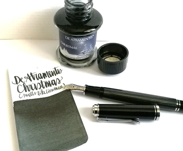
A couple of weeks ago I had the pleasure to pick up this pen; the special edition Pelikan M405 Stresemann with a broad nib. I inked it with De Atramentis Christmas Black. Thought this pair would be not only fitting in color combo, but also in the holiday spirit.
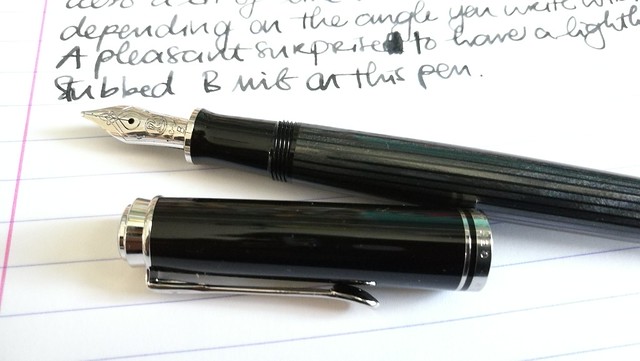
Pelikan M405 Stresemann with DA Christmas
The stresemann finish is a very classy, business like looking pen. I had admired the M805 when it came out, but that size is just a tad bit too big for me as I prefer the M400-600 suze better. So I was thrilled when Pelikan announced this special release in the M405 size. And with thanks to Filippo from the Fountain Pen Group Buy FB group, it was very reasonably priced. 
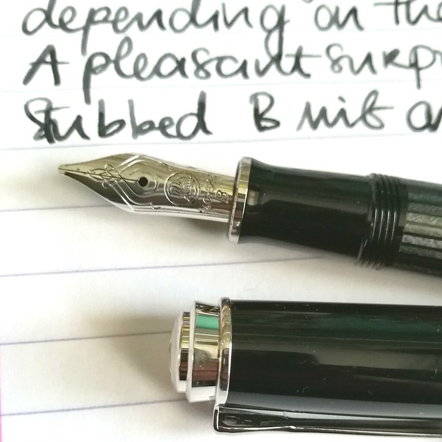
Pelikan M405 Stresemann with DA Christmas

Close up of the nib.  chose a broad nib and it writes like it's slightly stubbed as it gives a very nice line variation when you write with it in a slanted angle. Maybe I got lucky, because I have not seen this in any other B nibs of pelikan before as of yet. Either way, it was a very pleasant surprise :)Read more about the pen here at the Pelikan's Perch.
De Atramentis Christmas
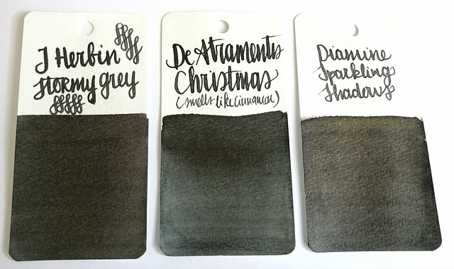
About the ink, I found it at an office supply store up in the north of NL and while I usually do not like black inks, this one definitely spoke to me. It has a very cute label AND smells like cinnamon! Also upon further investigation, this was a limited edition DA christmas ink release in 2012 and no longer available. It does look more like a dark grey in writing and on the swab cards. Except for the smell, it's not an ultra special ink. In color it comes close to J. Herbin Stormy Grey and Diamine Sparkling Shadows base color. Those other two colors would also go really well in the Stresemann as well and either of these would add a nice little scent or sparkle to your christmas cards. I better should get cracking on my cards for this year!

Thanks for stopping by and have a great day!

namasté

2016/12/07

Inky Goodness: Montblanc Miles Davis Jazz Blue

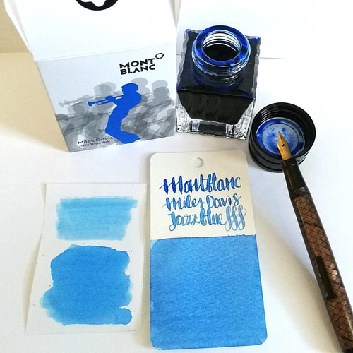
Went to Akkerman in the Hague yesterday and picked up this bottle of Montblanc Miles Davis Jazz Blue ink. First impressions; watery and a light washed out blue = me not really impressed 😒 inkswabs done on Maruman wordcards and herma smooth sticke
On a recent visit to Akkerman in the Hague I noticed the new Montblanc special edition ink on their shelves, Miles Davis Jazz Blue ink. I was super excited to try it out as I love blue inks esp if they lean toward turquoise hues so I bought it. Sadly, this is one of the very few times this ink is not the color for me and am disappointed with the special edition MB has released. Though the color on the ink swab looks like a nice saturated rich blue, it isn't. I had to swab it twice over to get some richness of color showing. The ink has a very watery consistency, almost looks like a diluted turquoise ink. Swabs on the left are done on Herma sticker paper, the top is swabbed with a q-tip once over, here you see the normal saturation and the bottom is heavily saturated. It could look good in writing with a flex nib as my test writing with the Swan flex pen looks nice on the maruman word card. Let's take a closer look at the ink. 

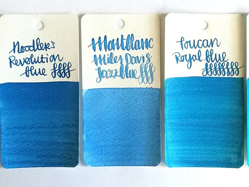
MB jazz blue flanked by Noodlers Revolution Blue which is more saturated and Toucan Royal Blue which has the same watery consistency but is darker in tone.
Here Montblanc Jazz Blue is flanked by Noodler's revolution blue on the left and Toucan royal blue on the right to show you similar ranges of blue in the same color tone. Jazz blue is lighter than both but in color tone it leans more toward Revolution blue, but the ink has the same watery consistency as the Toucan inks have. I inked my Sailor Sapporo Haruzora Sky Blue fountain pen with MB Jazz Blue to test how it writes in a medium nib.

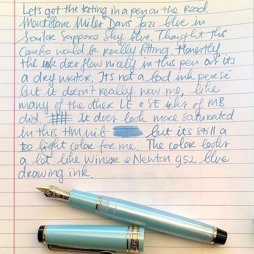
Thoughts on MB Jazz Blue ink. Pen Sailor Sapporo Seasons Sky blue with HM nib. Paper Lyreca office.
This pen in particular is a dry writer. I don't often use this pen, in fact this may be the second time I have inked this pen. And even though this pen and ink combo does match nicely, the ink itself does not really "wow" me like say Dandy Turquoise does. In writing the color also looks a lot like Diamine China Blue. Writing is done on 70gms Lyreca office paper.

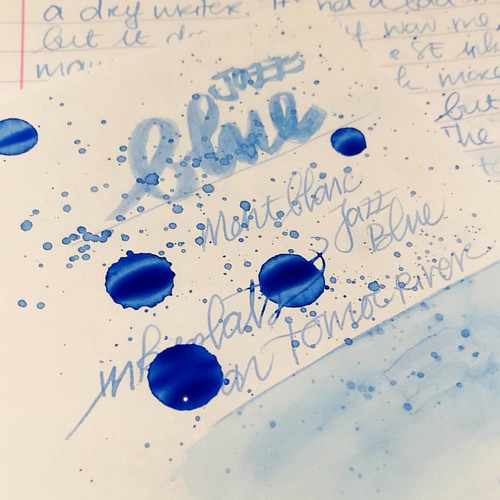
Testing MB Jazz Blue on tomoe river paper for sheen in this ink, I really doubt is has any. But well this will probably be dry like tomorrow or something before I can tell for sure. I do see potential for some pretty sky blue ink washes though!
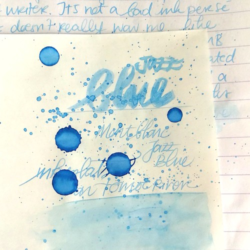
I also did some tests on tomoe river paper to see if there is some sheen in this ink. This is the cream colored tomoe river and you can see that the ivory color does dull down the blue color of the ink ever so slightly. The ink is definitely better looking on stark white paper. I suspected this ink doesn't have any sheen and after drying time (this took a looong time to dry!) my suspicions were confirmed.

MB Jazz Blue ink
It does dry up with a nice blue halo, but no signs of redness caused by sheen of any kind. The drops look a bit pastel blue and with heavy saturation it's a high shading ink, but without any sheen. I do see a lot of potential for this ink in artistic endeavors, it definitely looks like a spring sky blue to me. Perhaps this would make a beautiful combination with Montblanc Pink in a sakura sky setting. Looking forward to test that out :)

Hope this was helpful to you, should you consider getting this ink for yourself. Let me know your opinions on this ink should you have tried it, I would love to hear it. 

Thanks for stopping by and have a great day!

namasté
2016/02/24

Pens and Ink: Pelikan M620 Shanghai and CDA Sunset

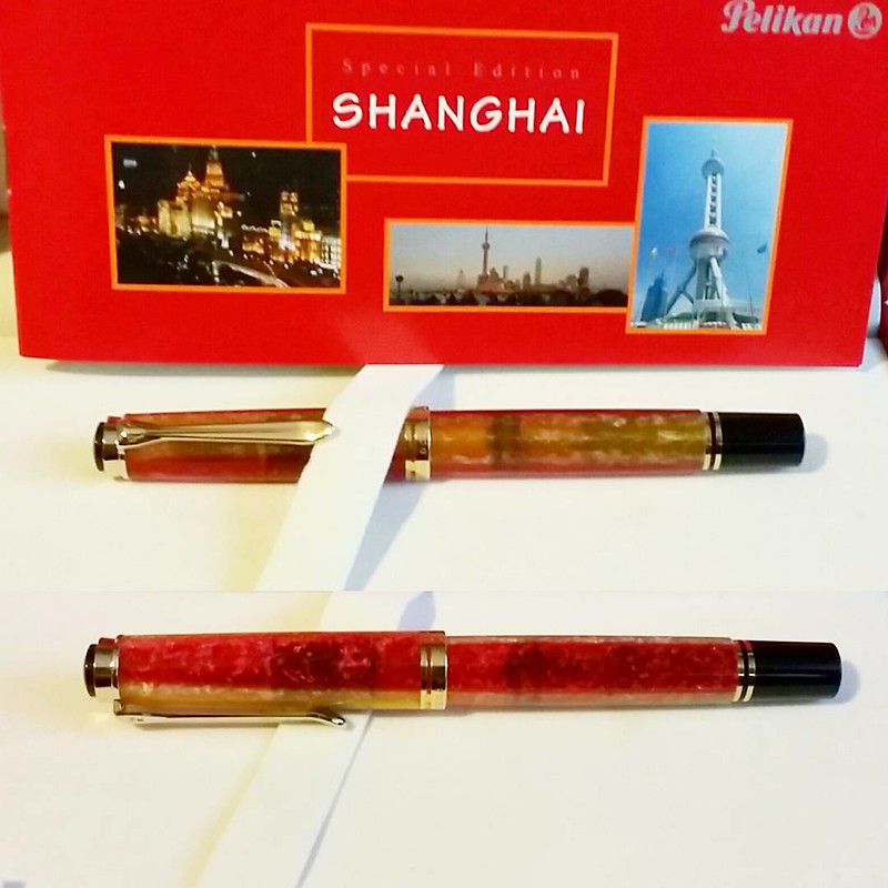
Another one added to the flock. @pelikan_international #beingpelikan #pelikansouverän #pelikan #shanghai #specialedition #fountainpen #Fpgeeks #fpn #fountainpennetwork #funtainpen #myprecious

This pen has been high on my wishlist even since I have been researching the Pelikan M620 City series collection and bought the Athens. Last year an opportunity arose to buy this gorgeous pen from another collector and I jumped on it! It did cost me a pretty penny, but oh, so worth it! I am so smitten with it! Look at that gorgeous two tone barrel!


I paired it with a gorgeous ink color, Caran d'Ache Colors of the Earth Sunset. Sadly this line has been discontinued so it's not widely available anymore. If you're lucky to find it at a brick and mortar store (like I did) grab your chance and get it when you can!

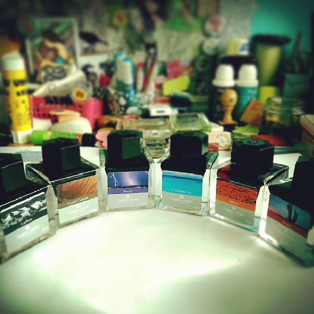
Got these CDA inks at a dept store which sold it for a discounted price. Scooped up what they had left.
These are the Caran d'Ache Colors of the Earth ink bottles. From left to right: Carbon, Grad Canyon, Storm, Caribbean Sea, Saffron and Sunset. (not pictured in this line is blue sky, blue night and amazon) For a great comparison of the old Earth ink and new Chromatic ink of CdA with other inks, see this blogpost from Goulet Pens.

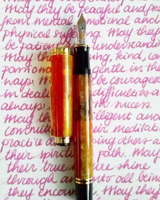
Pelikan M620 Shanghai with Caran d'Ache sunset #Fpgeeks #FPN #fountainpennetwork #fountainpen #funtainpen #gratefulness #gratitutejournal #mindfulness #writtenmeditation #writing #handwriting #handwritten

The pen has a nice wet writing Broad nib and the shading really comes out great with it.  It's not too saturated and behaves rather well in my Loving Kindness written meditation journal which has pretty absorbent paper. It shows off lovely pink tones a nice sunset can have.

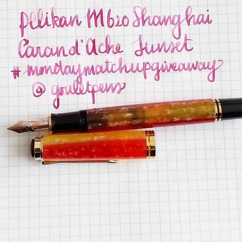
Pelikan M620 Shanghai with caran d'ache sunset #mondaymatchup #mondaymatchupgiveaway #gouletpens @gouletpens
This is what the shading looks like on smoother paper. Oh and see that ink sloshing in that pen body! So pretty!!!

By the way, Gouletpens has a fun giveaway going on Instagram on Mondays. And when you post your fave ink pairing of the week, you are in the running to win their pen and ink match-up of the week. Check out their #mondaymatchupgiveaway for more info!

I'm also curious what your fave pen and ink match up of the week is. Let me know in the comments :) 

Thanks for stopping by!

namasté

2016/02/17

Pens and Ink: Pelikan M620 Athens and PE Amethyst

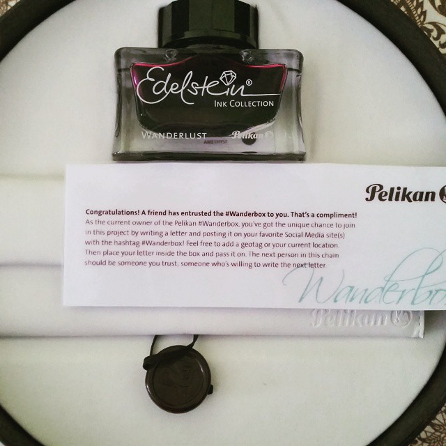
Ink in the #wanderbox is this year's LE Amethyst #wanderlust #pelikan #pelikanedelstein #beingpelikan #fpgeeks #funtainpen #fountainpen
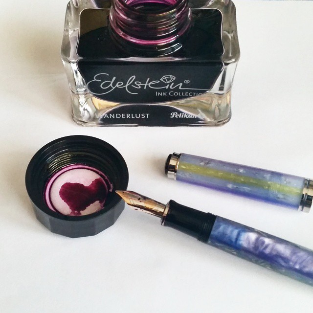
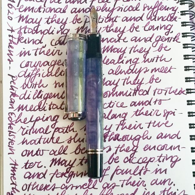
Last year I got to participate in the Pelikan Wanderlust/box and had a chance to sample the LE ink of that year, Pelikan Edelstein Amethyst. I paired it up with my Pelikan M620 Athens.

Perfect ink for my M620 Athens #wanderbox #wanderlust #pelikanedelstein #beingpelikan #fpgeeks #amethyst #funtainpen #fountainpen

I love the "wanderlust" sign on the bottle! I think they have repurposed their bottles from their last project ;) So the idea was to write a letter on why you love/use fountain pens and stick it back in the box and send it on to a fellow enthusiast.

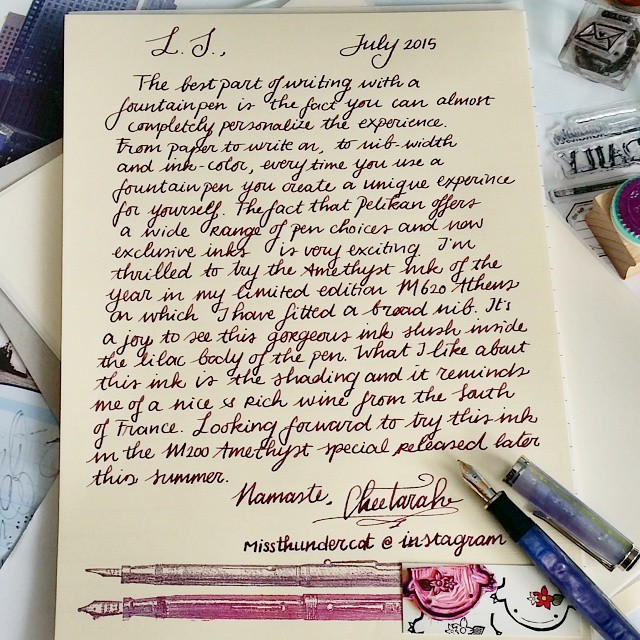
A wonderful personalized writing experience is what writing with a fountainpen offers you. My letter for the #wanderbox #wanderlust #beingpelikan #pelikansouverän #m620 #athens #pelikanedelstein #amethyst #letter #writing #letterwriter #laidpaper #station
Hmmm... I have not purchased the M200 Amethyst yet... maybe I should get on that.

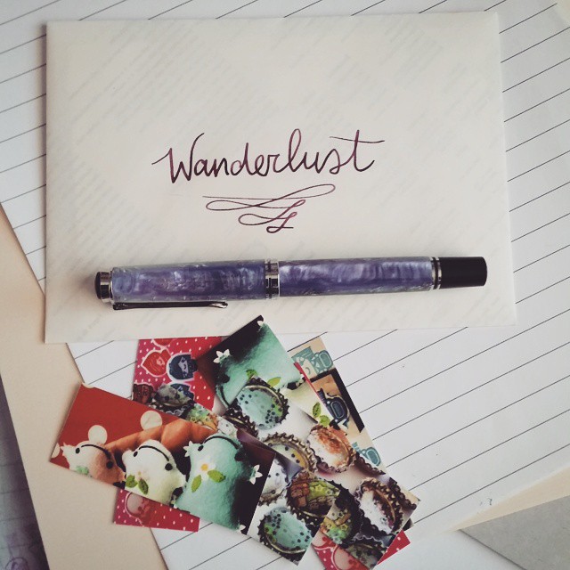
Finally got to write a letter for this project #wanderbox #wanderlust #pelikansouverän #beingpelikan #pelikan #fountainpen #funtainpen #fpgeeks #m620 #athens
The ink is a nice lavender color and looks good on ivory paper. The shading looks better on white paper though.

My #mondaymatchup on tuesday ;) Pelikan Athens m620 inked with Pelikan Edelstein Amethyst #gouletpens #mondaymatchupgiveaway @gouletpens #writinginstruments #fountainpenporn #funtainpen #fpgeeks #beingpelikan #fountainpen #writtenmeditation #mindfulwritin
An excerpt from my mindfulness meta-meditation journal (a.k.a the loving kindness meditation). You can also see the pretty translucency the pen has. 

So the wanderboxes are still out there (I passed this one on to my friend Tania a while ago) and I am curious to see the end results like in the Wanderlust experiment Pelikan had put out there. 

Thanks for stopping by!

namasté

2016/01/22

Three times a poppy!

As you can probably tell from my blog back ground, I like poppies. I like them a lot. Ever since I saw the poppy fields in the Wizard of OZ. They are such beautiful flowers and I love the symbolism of them. Recently I found a wonderful clear stamp by Joy Crafts Silhouette Poppies and I was so inspired I created a few cards with them right away.

Three times a poppy WIP

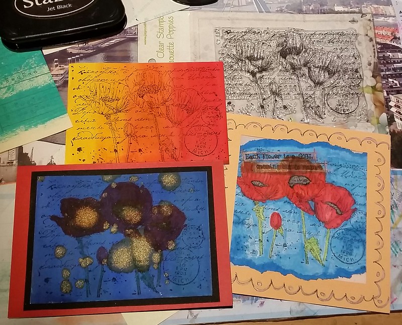
The poppies stamp you can see on the top right corner. I stamped it first on a white background (actually on the envelope it came with) to see the details and then on water colored backgrounds I made.A few close ups of the end results.

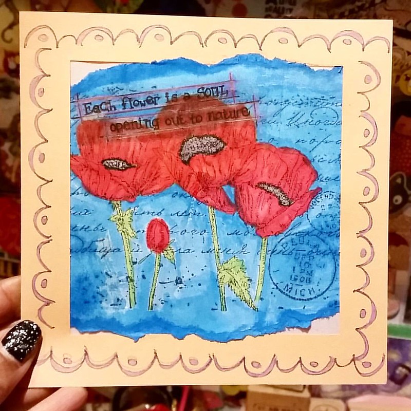
A card I made recently using Joy Crafts Poppies silhouette stamp. #joycrafts #poppies #notecard #handmade #rubberstamped #rubberstampart #cardmaking #promarkers #colorcoordination #poppyred
This was stamped on the envelope to test. I colored the poppies in with pro markers and used blue fountain pen ink to color the background (diluted Iroshizuku Kon Peki ink). The saying 'Each flower is a soul opening up to nature" is from the flower rubber stamp set I got from The Octopode Factory a long while ago. Seemed like a good fit for this card. I had bought a bunch of 'frame note cards' in a sale lot and I just ripped the colored image off the envelope, placed it the way I liked it in the frame and sealed the back of the image with some thicker tracing paper. The border stamp is from Dylusions and I accentuated it with a copper metallic gell pen.

Three times a poppy WIP

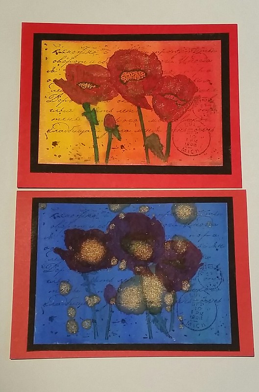
These two are 'day and night' cards. The background is Maruman watercolor paper from Zuan B5 Sketchbook and I used Pelikan aquarell watercolors to paint on them. The paper holds up REALLY well, no bleed through or warping! The 'day' card I used diamine shimmertastic inks to color the flowers with and on the 'night' card I splattered some of that shimmertastic ink after I colored the flowers with promarkers. I like the effect it gives on both cards. I matted the cards on black card stock and then fixed them onto a red double sided note card. 

It's definitely a fun and versatile rubber stamp image to play around with. I used a few other joy craft stamps in my watercolor cards in combination with Diamine shimmertastic inks before. Definitely a fan of that flower/letters series. I will send these cards to people who can use a 'pick me up' .

Hope this inspires you to create some cards this weekend :)
Thanks for stopping by! 

namaste

2015/11/12

Thriftfinds Thursday - Inky goodness from across the border

On a recent impromptu trip to Antwerp for my wedding anniversary last weekend, we came across a few fun pen stores: Penworld, Kockx and Pen and Pencil. They are definitely worth the visit! I found a few vintage fountain pen ink gems I want to share with you here.

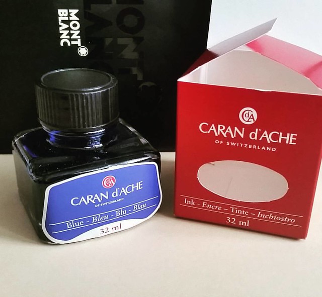
Vintage ink finds: caran d'ache blue in J Herbin bottle #carandache #Fpgeeks #FPN #fountainpennetwork #fountainpeninks #ink #fountainpen #vintage #luckyfind

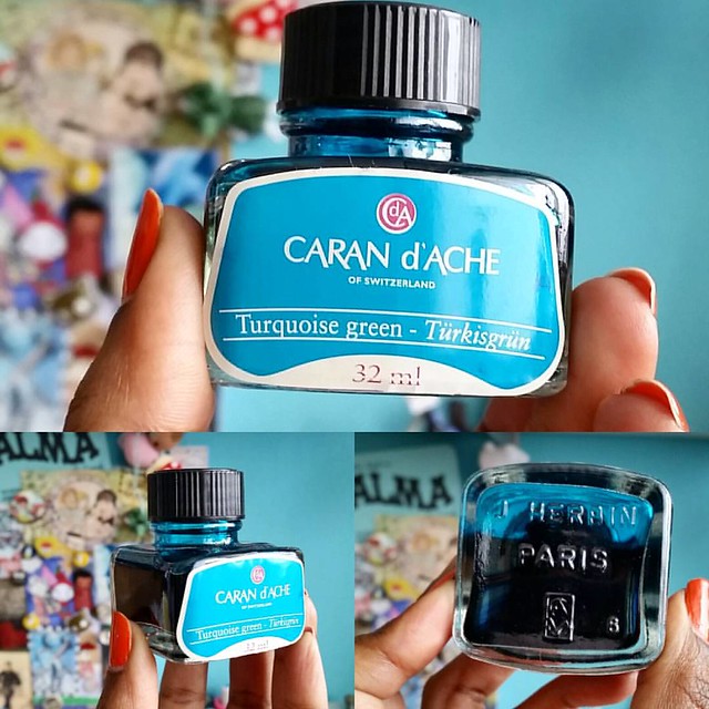
At Penworld I found the Caran d'Ache blue in a J. Herbin bottle. They are pre Colors of the earth series and I was lucky enough to find a turquoise bottle not too long ago at de Roos in Heemstede, NL. 

An amazing find! An older bottle of Caran d'ache turkisgrün ink which was manufactured by J. Herbin. #carandache #inkbottle #fpgeeks #fountainpennetwork #fountainpenink #ink #turquoise

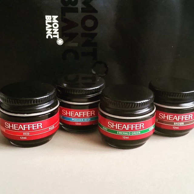
Also at the same store, in a little corner tucked away, I found these super cute mini baby bottles of sheaffer skrip inks. 
Vintage ink finds: mini sheaffer inks red, peacock blue, emerald green, brown #sheaffer #skrip #vintage #ink #fountainpennetwork #FPN #fountainpenink #Fpgeeks #inks

They are the size of those tiny baby bell cheeses, super cute! I do love cheese, but I rather have these inks than those baby bells though. Just saying in case you were wondering ;)

Vintage ink score: montblanc violet #vintage #montblanc #Fpgeeks #FPN #fountainpennetwork #fountainpenink #violet

Then over at Kockx which is the oldest fountain pen store in Antwerp (and also has a lot of exclusive and expensive pens) I found the montblanc violet ink. I am very curious how this compares to the lavender purple. 

I can't wait to swab these on my Maruman Mnemosyne word card tabs. 

What is your latest lucky vintage find?

Thanks for stopping by!

namasté

2015/05/14

Thriftfinds Thursdays - Waterman Patrician Purple Ink


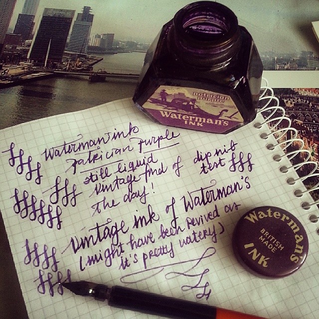
Waterman's Patrician Purple ink - vintage find of the day! #fountainpen #ink #inkbottle #waterman #purple #sheen #vintage #fpgeeks #irongall


A few things I mostly look for at flea markets or thrift shops are fountain pens and ink. This Gem I found at a local market last summer. This old ink bottle is an vintage Waterman 'patrician purple' ink. I love the look of the bottle and the ink is still usable. It has a nice velvety lilac color.

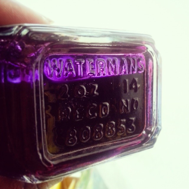
Bottom of the bottle #waterman #patrician #purple #ink #vintage #fountainpen #inkbottle #fpgeeks #luckyfind #pretty


The bottom of the bottle contains such nice details too. And you can see that the bottle is still quite full with ink! If you want to know more about the vintage ink range of waterman, I recommend you read this post by Toaster Pastry on Fountainpen Network. A very detailed and comprehensive review, worth the read. That tropic green is definitely one I will keep my eye out for!

Thanks for stopping by :)

namaste