Showing posts with label water color. Show all posts

2018/09/26

WCW: We're all different & eventually everything mixes

EEM watercolors
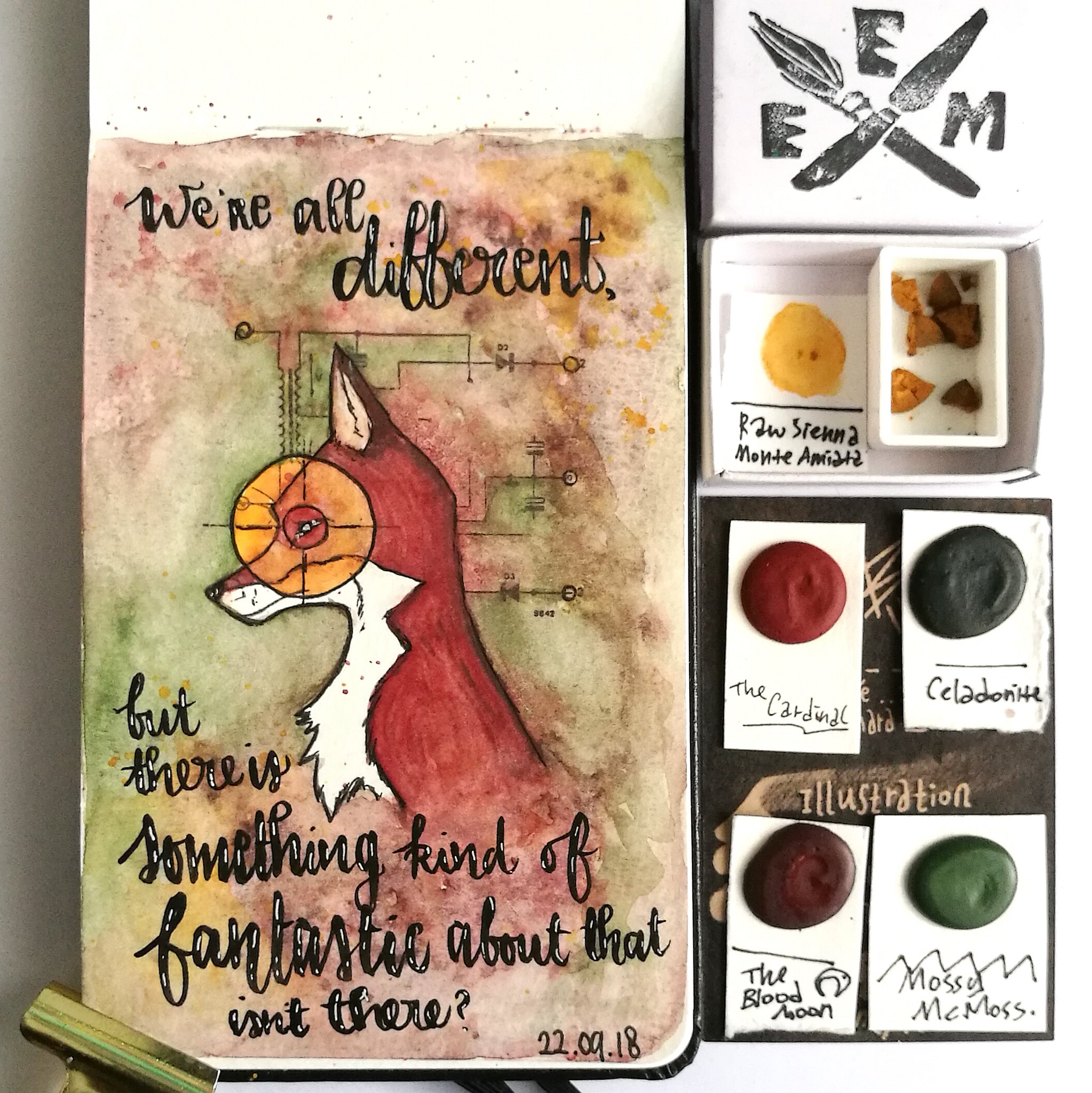
"We're all different, but there is something kind of fantastic about that isn't there?"
- the Fantastic Mr. Fox 

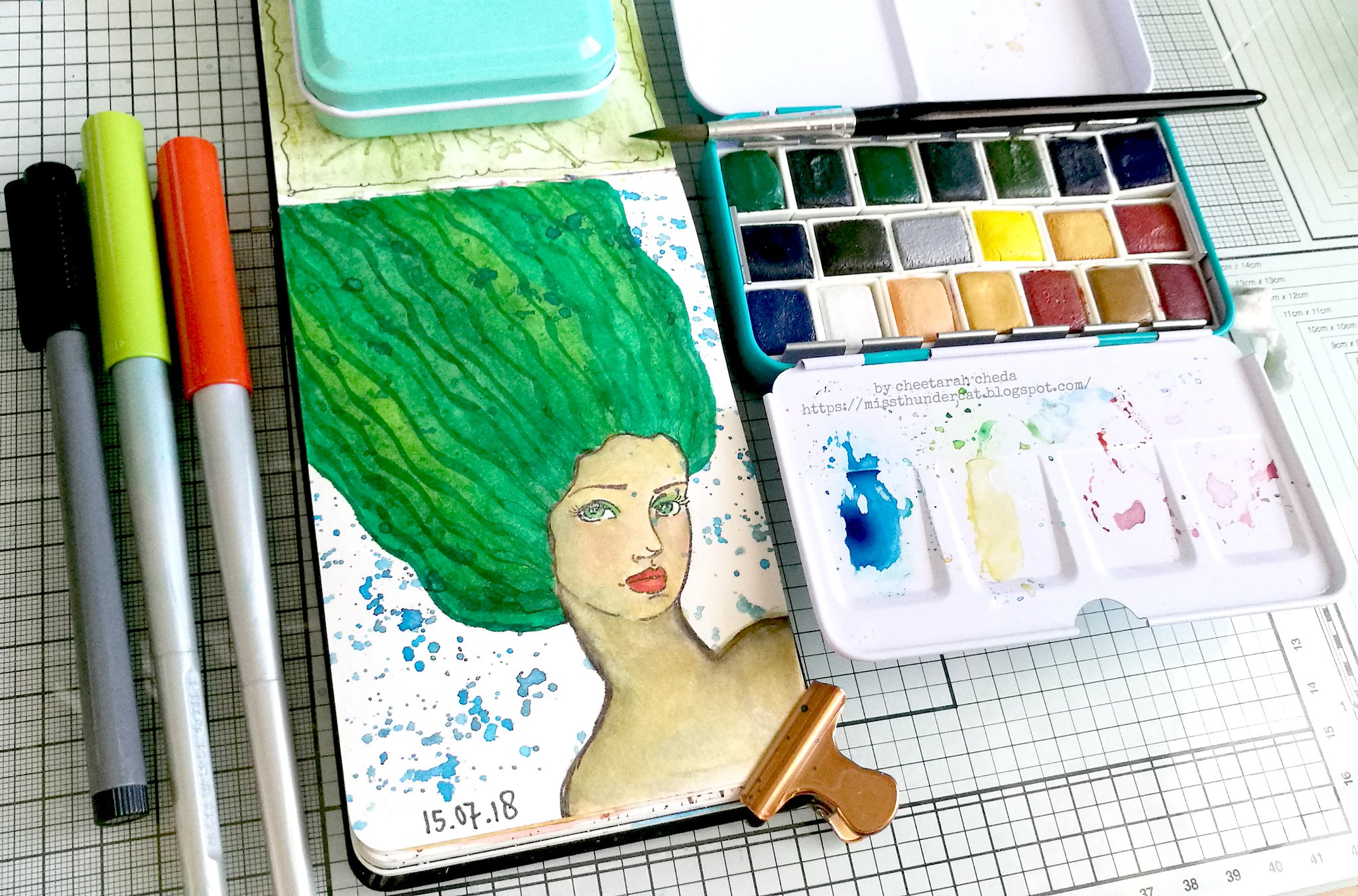
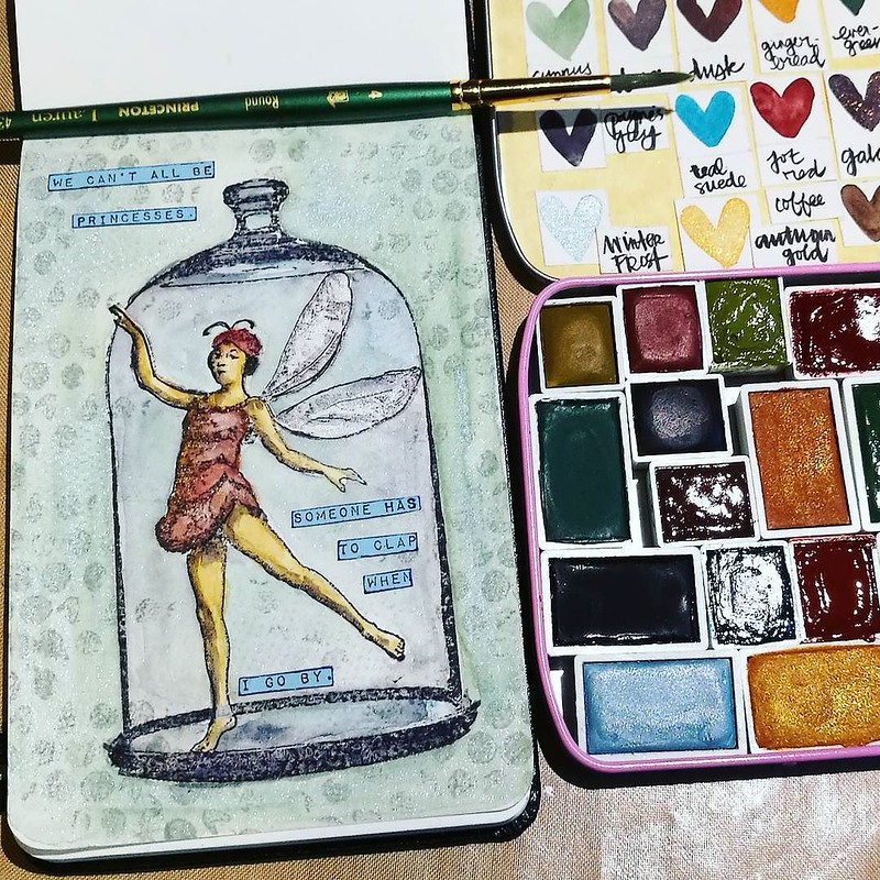
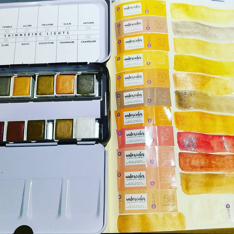
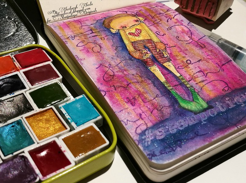
A couple of weeks ago I got my amazing watercolor order in the mail which are made by Amé from Eventually Everything Mixes which is based in Berlin, Germany. She makes "handmade, cruelty free watercolour paints" (as her websites states and I wholeheartedly support!)  and with my order she kindly sent a few of her colors in dot samples which works so amazingly well together & form a beautiful fall palette.

EEM watercolors
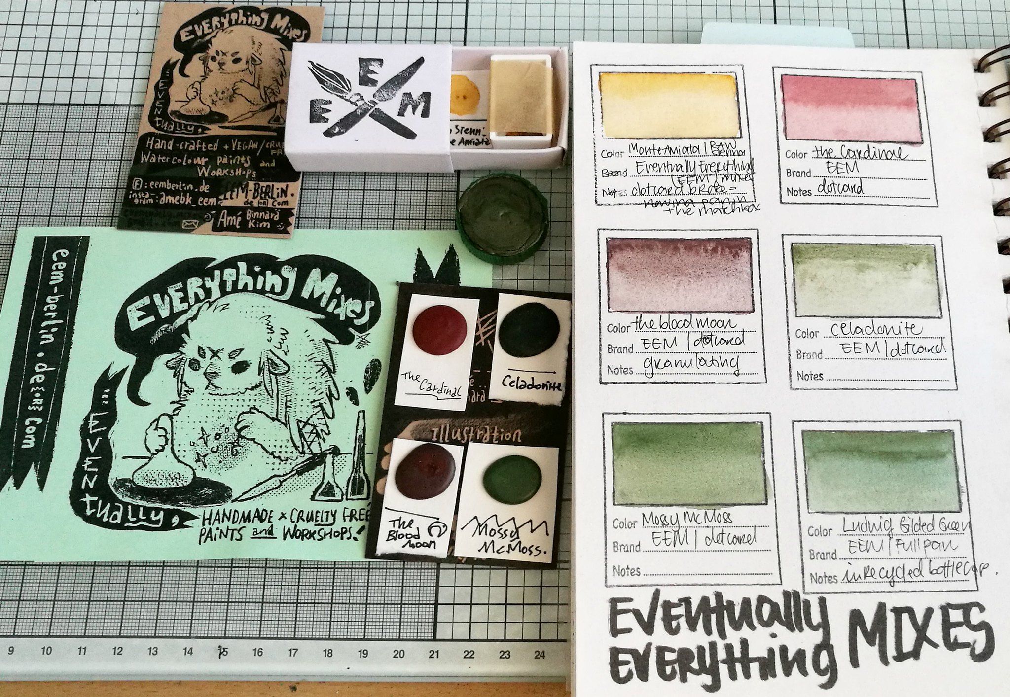
The order came in the lovely matchbox and I decided to stick the dots on the business card which then can be placed in an ATC pocket holder for storage. I ordered Ludwig in the "full pan" which Amé uses recycled bottle caps for, which is wonderful! Oh sadly a little dot broke off, but I had some empty pans and could manage to get the most of the pieces in there, so no loss there. Plus this way I also get to use that sweet little matchbox! The sizes of the dots cards are super generous and they will last you quite a while, depending on the size of paintings you do of course! 

EEM watercolors
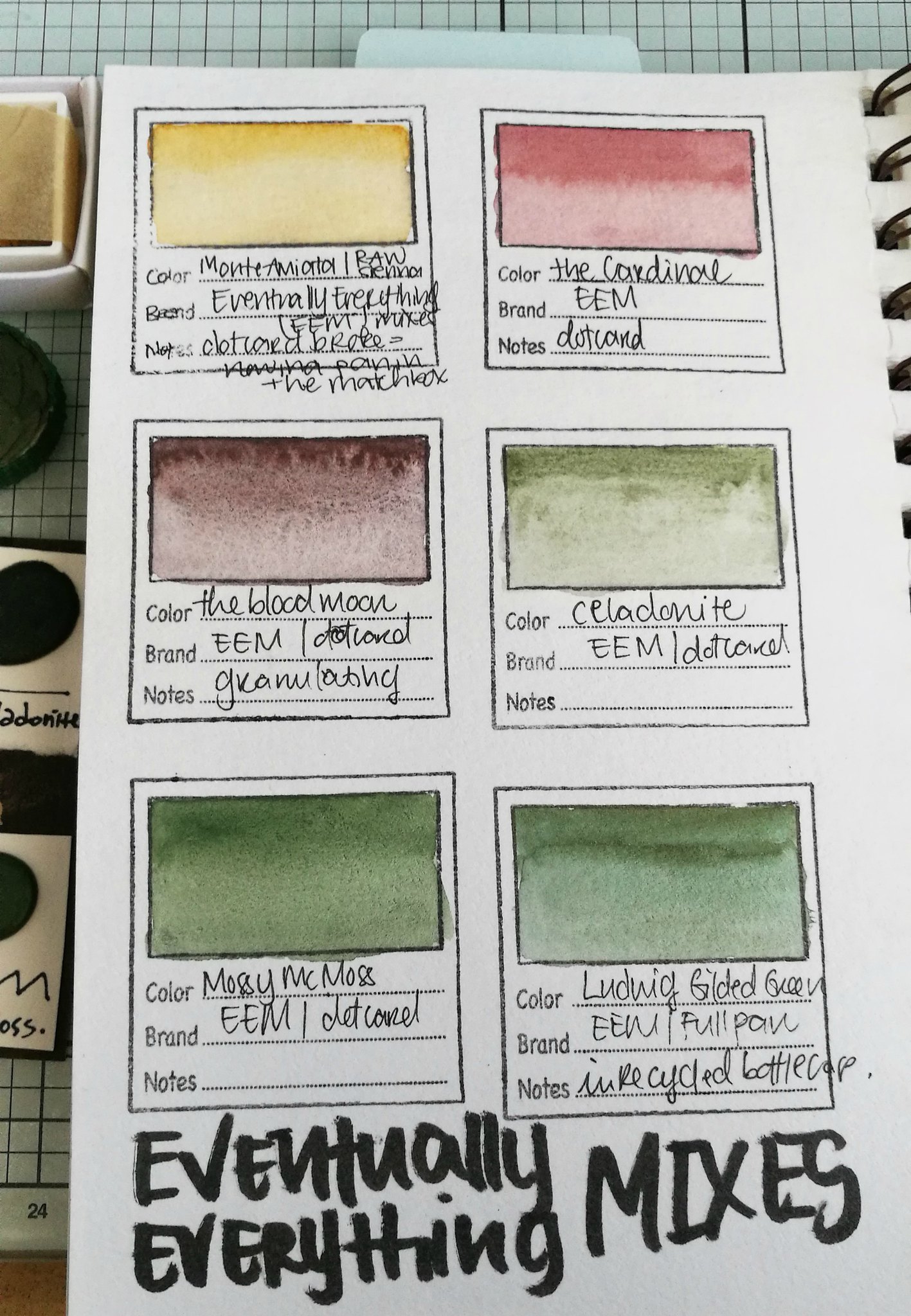
These are swatches of the colors: Monte Amiata/Raw Sienna , The cardinal from the ritual set, The Bloodmoon, Celadonite from her Earthy Trio set, Mossy McMoss & Ludwig (which has a beautiful golden sheen/mica in the paint). I absolutely adore these colors together, some are granulating and have a great dispersion pattern.  Some of these colors are from sets, but eventually she might release them individually as she did with the Berlin set, but that is still unsure at this point. As her paints are hand mulled they are subject to limited stock, so as always it's best to stay updated via Instagram to see when the new update will be online at her shop.

EEM watercolors

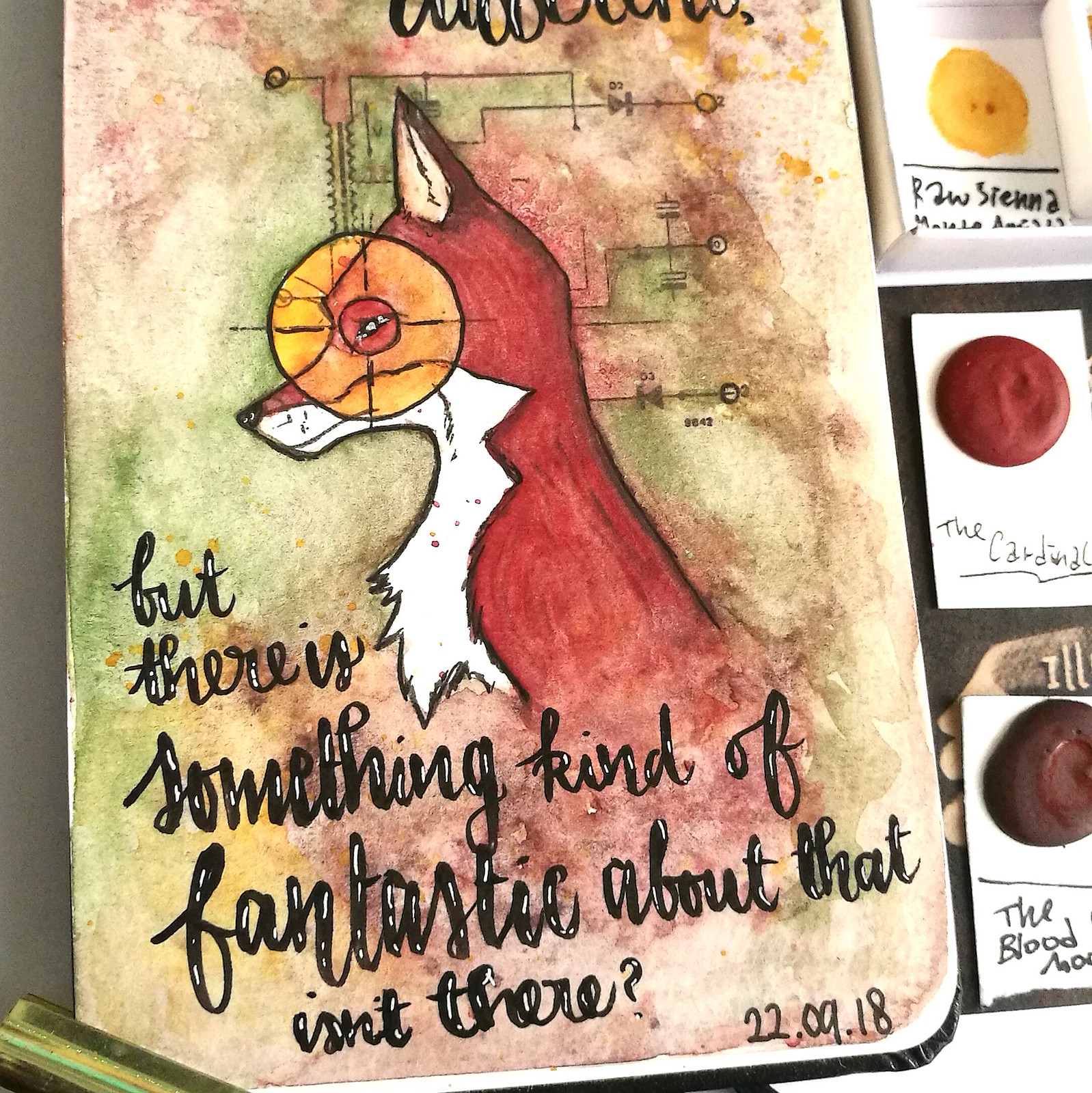
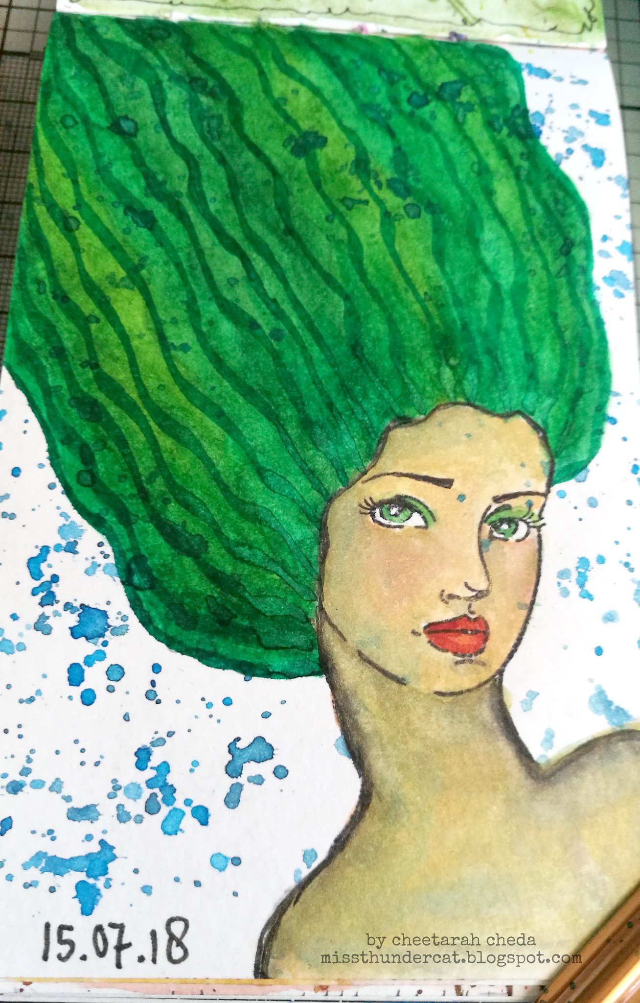
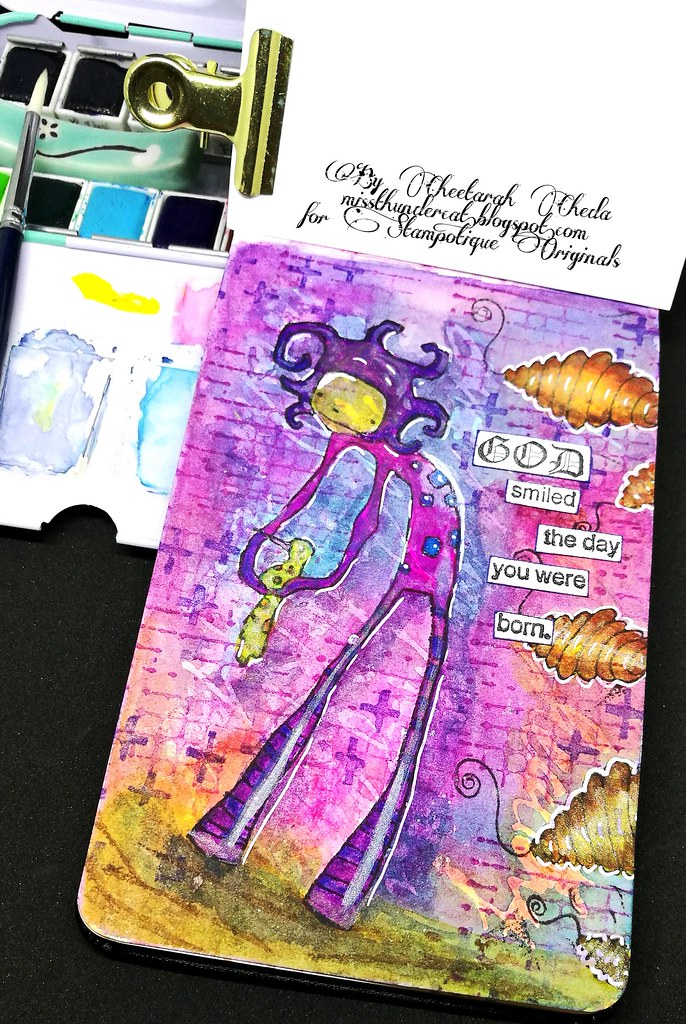
I wanted to see if I could use the dots card colors for a project for fall and I decided to use this great fox stamp designed by Olga Helwein for ALL&Create, which really suited the "mood" I wanted to convey. These colors just play SO nicely together! I LOVE the granulation the Blood moon has, the soft earthy green tones of Celadonite and Mossy McMoss are beautiful for the colors of foliage and gives a nice counterweight to the red brown tones. A pop of the raw sienna as an eye catcher (literally, LOL!) and spatters to blend in the background as a finishing touch to the coloring.

EEM watercolors
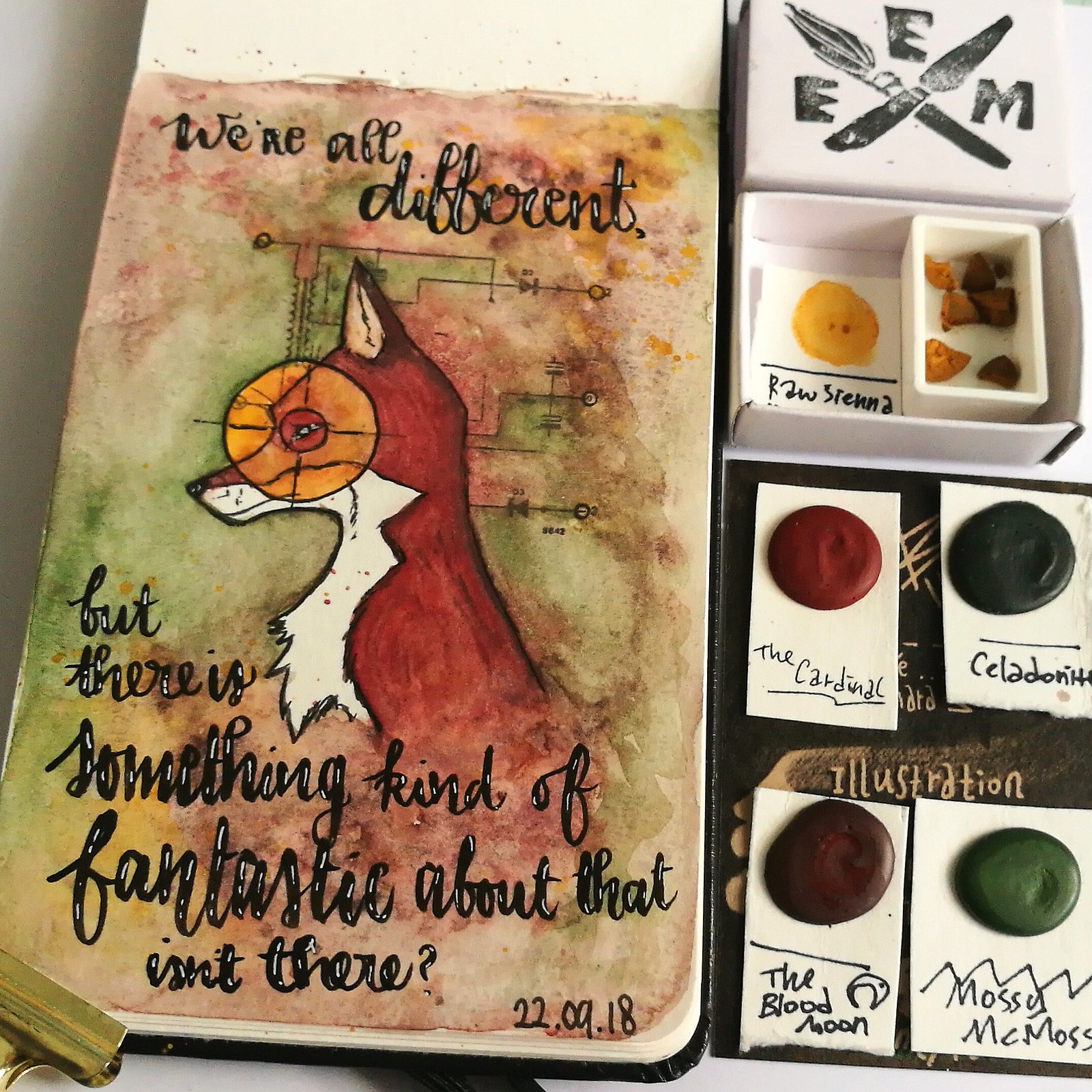
The quote is written with Tombow Fudenosuke and highlighted with a sakura gel pen. This was such a wonderful water color play session and I am super delighted to have found a handmade watercolor brand/shop based in Europe :) I'm super excited to see her next newest releases as I do believe she has an awesome unique color range offered at her shop. I mean, check out warlock & Pluto

Adding this art journal page to Art Journal Journey theme of Fantasy - because of the fantastic mr. Fox quote - such a great movie which i highly recommend if you haven't seen it yet :)

Hope you found this week's WCW show and tell useful and hope you have a great rest of the week!

2018/07/18

WCW: Mermaid Hair practice (with video tutorial)

Mermaid Hair with Jane Davenport products

Its been a little quiet on my blog, I know. Summer is here, and with the wonderful weather, I rather be outside than inside on my days off. So it means less PC time = not many blog posts. I am sorry about that, though if you are curious what I am making be sure to check out my Instagram page as I share there almost daily. Mostly they are watercolor related as I've decided to practice my watercolor techniques in my moleskine pocket book for world watercolor month. 

Mermaid Hair with Jane Davenport products
Here I used Jane Davenport face stamp and Glitz Sea watercolors (with added in colors from the neutrals set) and Pilot Parallel pens filled with Rohrer and Klingner Sketch ink. 

Also instagram came out with a new feature, like last month (yeah I'm always so slow with updates on phone apps) which is called IGTV and I just decided, you know what, let's jump right in! So I've added some video tutorials there, one specifically shot  vertically for IGTV (they only accept vertical video's) and then altered for my YT channel.

So I'll be linking the YT version below, but since the angle is different, if you prefer the original IGTV vertical angle, you can watch it HERE


If you have watch the process video, I'm curious because I kinda like the angle of the IGTV better for this type of tutorial. The lager art journals definitely have to be shot from a birds eye view to get everything in the film. So I'm still figuring out if I should upload to both channels (means extra work!) or just choose the right type of video host and then just link. You can't embed the video link from IGTV yet, so watching directly from the blog is also difficult. So there are pro's and cons for both formats... 

Oh so many new things to try out! Have you tried out IGTV for your tutorials? If so let me know what you think :) 

Linking this to Art Journal Journey - Art for Art's sake July theme - great theme and art can be always a practice to get better at certain skills, right? Messing around with new materials and see what you can create with them, is also just part of the fun :)

Thanks so much for stopping by and have an awesome week!

2018/06/27

WCW: Alis Volat Propriis

WCW: Alis Volat Propriis

The past weeks I have been inspired to work in my Moleskine watercolor pocket book more and decided it would be fun to share those pages in a new segment called WaterColorWednesday. This page was done with all VLVS! stamps and Daniel Smith watercolors and handmade colors by Designs by Rachel Beth.

Today is new watercolor testing day ✨ Loving these new watercolors from @designsbyrachelbeth which I used with a few @danielsmithartistsmaterials watercolors on this @vivalasvegastamps image in my @moleskine watercolor pocket book. #watercolorpla

The under layers started with the blending a few greens of the Irish Luck set by DbRB as a test page. I found the pot of gold, which is only glitter with binding, very difficult to work with sadly. Maybe I just need to get the hang of it, but when it dried, you can easily rub off that glitter from the page. The rest of the set is amazing and the two extra colors are spiced mimosa and berry cake. Berry cake I used a little bit on her dress but found it doesn't really work with the color scheme I had in mind. The red on her dress is from DS and I continued working with the dot cards I have of the brand.

WCW: Alis Volat Propriis
It's amazing how much you can use from those little dots in the 66 colors try it set! I cut the sheet up so that it would fit easily in the back pocket of the moleskine watercolor pocket book. I added more layers of color, then some shimmer glazing and white gelpen for highlights. Stamed some mixed media stamps to give the background more interest. I thought the page was done, but then added the sentiment and a border around it with a fineliner.

Sharing my Watercolory desk shots with my friends over at WOYWW this week - it's been a while, hope you all been well. Looking forward to catch up with you :) 

WCW: Alis Volat Propriis
I hope you can see the shimmering effect the watercolor has, it's so lovely to see in the light! With my watercolor experiments I am completely falling inlove with this medium and how it works and the pure whimsy of it.

By the way I used the following VLVS!

I also would love to enter this page in the following challenges:

There is still time to play along, you have until the end of the month to link up!

Thanks for stopping by and have a wonderful day!

2018/01/25

Someone has to clap when I go by

watercolor fairy

It's been a busy week and I have been trying to fit in some creative time in between studies, work and other responsibilities. I do often grab for my WaterColoringBook when I want some color therapy and this is one of the pages I made recently.

watercolor fairy

The composition is made with stamps from VLVS! and I have used a lot of watercolors from Wanderlust Watercolors by my friend Kata. She does small batch updates and I bought a few LE sets from her last last year and am excited to be finally using them! This is the first layer of color and excuse the lighting, these were taken under the harsh desk light, but you can see some sparkle of one of my fave colors Winter Frost. I mixed it lightly with Cypruss green for outside the bell jar. I really love the shimmer!

These @wanderlustwc watercolors are wonderful 💖 Used Cyprus green, Winter Frost, Samhain, Jot Red, Teal Suede, Paynes Grey and Autumn Gold. Stamps from @vivalasvegastamps __________ #watercolorpainting #watercolorplay #watercolors #moleski
To finish the page I added the text "We all can't be princesses, someone has to clap when I go by." and added some texture with the bubble wrap stamp. I really love how the page turned out and I lve the fact I can'just grab my watercolor pocket book and pocket tins and just color when I really need it. 

Stamps used from VLVS! are: 

Playing along with January's challenge at VLVS! Isn't this mood board just gorgeous? 
And you still have time to join the fun as well :)  

Also entering:

Try it on Tuesday - Fire and Ice (love this theme!!) 


Thanks so much for stopping by and have a wonderful day!


2018/01/04

Tree Swing (Stampotique new release january 2018)

new releases january 2018

Today I have another fun new release from Stampotique Originals to show you and that is this wonderful design by Jill Penney called Tree Swing. Isn't he adorable? I've also used another quote from this great new Quote stamp block as well as my fave texture stamp from Kate Crane and the gorgeous Hive Flowers by Arwen McCullen.

new releases january 2018
I have to say that I really enjoy working in my home made "watercoloring" book! The Moleskine pocket water color book is such a wonderful size for a daily "coloring fix" and the paper is quite forgiving too! Here I experimented on a page I have already worked on as a test with masking fluid, which failed sadly, but I worked over it with more color and it gave the background a nice texture. Without warping or damaging the paper. So it can really take a lot of wet medium! 
I also absolutely LOVE how pigmented Jane Davenport Brights set are (which I mainly used for this and added accents with Prima Shimmering Lights) and how boldly they pop off the page! Glad a got the sets last year :) 

Anyhow, check out the new releases this month HERE, our new challenge is online HERE and you can link up for that HERE (please do read the rules before linking up!) 

Thanks for stopping by and have a wonderful day!


2018/01/02

Friends are like stars (Stampotique New releases January 2018)

new releases january 2018

First of all wishing you all a wonderful creative and fantastic 2018! Hope you all had a fantastic NYE celebration! Made this above card for the Stampotique Originals Facebook Group and thought I'd share it here too :) January 1st also means new release day at Stampotique and I've got a fun project to share with you with a few of the new release stamps.

new releases january 2018

I've created a galaxy night sky with my watercolors in my watercoloring book with these super fun Cactus row stamp by Kira Nichols. And the quote is a wonderful one too which is from this quote #2 stamps set.

new releases january 2018

"Good friends are like stars, you might not always see them, but you know they are always there. " 

That is absolutely true, wouldn't you agree? Check out more of Stampotique's new releases this month HERE and visit our Designer's Challenge blog tomorrow where a new challenge will be announced! 

I'll be showcasing more new release stamps this week, so stay tuned for that! 

As always, thanks for stopping by and have a wonderful start of the new year!


2017/12/06

WIP: Nightly watercolor practice still going strong

My current favorite watercolor palettes :) ____ #watercolorpaint #watercolorpractice #watercolor #watercolorart #watercolourart #watercolour #aquarelle #sennelier #schmincke #pfeifferartsupply #princetonbrush #artsupplies #artistsofinstagram #createeveryd
Working in my moleskine pocket book at night ...

As you might have read on how Exhaustipated I get during winters (esp. when you're home sick with a strange type of flue which is going around it would seem!) I also wanted to share what helps me through these dark days. And that is color therapy in the form of doing water color practices at night. By now I have a little collection of different water colors tins filled with paint handmade by lovely artisans and the familiar brands like sennelier and schmincke. In the Black Friday Sale from a few weeks ago I've also purchased a few tins from Prima marketing series: Shimmering Lights and Decadent Pies.

Excited to have these #primamarketing #shimmeringlights #watercolors to play with 💖 I knew I needed to have them seeing @khourianya using them for her gorgous works. Got another prima set, decandent pies in a twofer-deal! Yay black friday
Prima marketing Shimmering Lights color swabs

The Shimmering lights are beautiful golden/orangey tones with a slight shimmer. They also are quite strongly pigmented so they can be used for glazing over colors as well as being used on their own. They are labeld as artist grade paints and I'm very excited about this set. The Decadent Pies however, not as much...

Having some coloring fun with @prima_watercolor Decadent Pies. The image is a stamp designed by @karen.hayselden for #StampotiqueOriginals #watercolorpractice #watercolorpaint #watercolorsupplies #primamarketing #decadentpies #watercolorsupplies #watercol
Stamp by Stampotique Originals, first layer of color with Prima Marketing Decadent Pies

There are some fun colors in the decadent pie set, but even though it says "artist grade" on the wrapping labels (not on the tin like on the shimmering lights!) it behaves more like student grade watercolors. Like the KOI Water Color set I had before I ripped those out of the plastic pans and filled with sennelier colors. OK, to be fair these do behave better and are more saturated in color than those KOI ones but still did not like the set as much as all the other sets I have. The set also have 4 shimmering colored pans, but no doubles from Shimmering lights. Didn't mean for this post to turn out like a mini water color review, but there you have it.

Absolutely in love with my new detail brush! Poppies are stamps from @carabellestudio #watercolorpaint #watercolorpractice #watercolor #watercolourart #watercolour #aquarelle #davincibrushes #poppies #moleskineart #practice #paintepicshit
Stamps by Carabelle Studio's, DaVinci detailler brush size "2/0"

At any rate, I'm really enjoying the self-created "water color Therapy at night" routine (next to my writing meditations) which help me through these days where I am in much of need of sunshine. It's like I said to a friend "Color is like Vitamin C and works like an energy boost in dark times" and wouldn't you agree?

Sharing these watercolory desk shots over at my desky friends at Julia's blog for WOW 444 (such a magic number!) 

Thanks for stopping by and have a lovely week!


2017/11/15

WIP: Watercolor Practice

Work in progress, autumnal fairy girl with #janedavenport #watercolorpaint in a @moleskine_world watercolor pocket book.

The past weekend I have been working with my water colors again and sharing some work in progress today.  I took out my Jane Davenports Neutrals and Brights sets and went to work in my Watercoloringbook (A pocket moleskine I stamped some fun rubber stamp images in) This cute little fairy is from Sweetpea designs and I wanted her to have a fun autumnal look. I really loved working on the hair and stripey socks on this one :)

More #watercolorpractice on scrap papers.
On a scrap piece I colored this fairy from VLVS! and used a lot of glittery watercolors from Cloves and Honey. You can see the finished art journal page HERE.

On my desk, watercolor practice = a happy relaxed saturday 😄 What are you working on to today? __________ #mailart #mailartist #mixedmediaart #mixedmedia #mixedmediaartist #artistsofinstagram #ATC #creativejourney #createeveryday #rubberstampart #ru
And another fun VLVS! design and she has an ATC format. A little sneak peek to a future post where I turn this into a little inspiration ATC card.

I absolutely LOVe working with my water colors and I have found that coloring my rubber stamped images with them really brings so much joy :) Sharing these desk shots over at Julia for WOYWW today. Looking forward to catch up with you all. 

Thanks for stopping by and hope you all are having a wonderful day. 


2017/11/01

Art Journal: Soar (Stampotique New Releases November 2017)

Soar SODT nov new release

It's the first of the month so that means there are more new releases at Stampotique Originals! I'm sharing an art journal page here made with a few of the new released stamps.
The cute little Nina's Heart, pearls from the Treasure cube and I've made the word "soar" with a new alphabet designed by Terri Richardson! I have also used Kate's texture cube and Daniel's lovely wings to make little Nina and her heart soar up high. I've made this on watercolor paper and used my fave palette with watercolors again :)

Soar SODT nov new release
The Cloves and Honey colors has shimmer to them so I had to turn on the spotlight to capture the shimmer in this piece. But still doesn't quite show the true bling on this piece.

SODT nov releases
So I made a little video for you to see the shimmer and shine :D 

I'll be showcasing more of the new releases later on this week, so stay tuned for that. Do check out the Stampotique Designer's Challenge blog for this week's challenge and how you can participate to win some fun rubber stamps! 

Thank you for stopping by and have a wonderful day!

2017/10/18

SDC284 - Anything goes

SDC 284 - Stampotique Watercolor pocket book

It's wednesday and that means for the Stampotique Designer's Challenge is live with the second week of the Anything Goes challenge. I've recently bought a moleskine Watercolor pocket book and decided to make a little water coloring book out of it. I have stamped several rubber stamp images in it and this is the first page. I quite like how it turned out!

SDC 284  Stampotique Watercolor pocket book

The quality of the pocket book is great I must say! Minimal warping and buckling, doesn't bleed through and a great pocket size! I have used watercolors from different manufacturers to create this pallet. I esp. enjoy using the shimmery colors from Cloves and Honey.  
By the way I embossed the #stampotique so that acted as a resist. The rest was stamped with Memento dew drop inks, and they are water proof. Everything was colored with the pentel waterbrush. This page was really great to practice my shading and have an image pop out to the front.

SDC 284 Stampotique Watercolor pocket book

Here you can see the amazing shimmery goodness as I turned on the over head light to take this picture. Hope you like the idea of making your own pocket water coloring book :) 

Come and join the challenge and link your project with us HERE and for a chance to win some rubber stamps :) 

Stamps used: 

Thanks for stopping by and have a wonderful day!


2017/09/04

Heartfelt watercolor note cards (Stampotique New Release september 2017)

simple and sincere notecards

Today I am sharing a few watercolor cards made with some of the newly released Stampotique Originals rubber stamps. There are two beautiful flower bouquets you can make some heartfelt note cards with like I have shown above. What I did with both was emboss the flowers on watercolor paper, then make the background and color in the flowers. die cut the sentiments and piece them together. These watercolors cards are just super fun to make and didn't cost much time at all! You just let the colors work its magic. The watercolors I have worked with here is from Cloves and Honey shimmering watercolors. They just SPARKLE in real life!

september releases stampotique 7
This bouquet is designed by Terri Richardson and I love the delicate flowers together. I chose one color for the flowers to make them pop from the background. The HUGS sentiment is a die cut from Technique Tuesday. And the accolades are from an alphabet sticker set I have.

september releases stampotique 11
This bouquet, called Flos,  is designed by Kassa Hayselden and she drew them in the same style as the popular "kassa's bloom" stamp. I really love this style and also like it has the word beautiful in it. It's a whimsical design with dots and scribbles and just super fun! I paired it with an XOXO die cut from Stamplorations "cutplorations" die. First on black then inlaid the vellum cut out. The accolades are from the same set. The watercolors are just super fantastic in real life!


Don't forget to check our newest Stampotique Designer's Challenge as well. Hope this inspired you to work with watercolors and these gorgeous new flower stamps from Stampotique originals! 

Thanks for stopping by and have a wonderful day :)