Showing posts with label inkophile. Show all posts

2017/07/19

WIP: the ongoing struggle of an inkophile

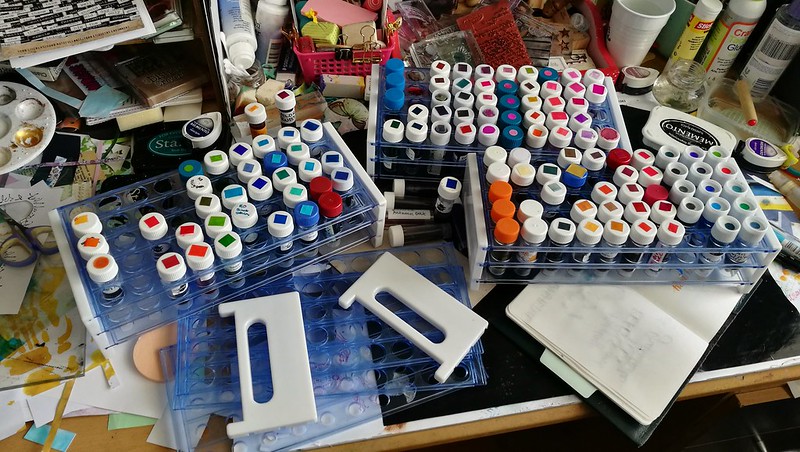
Inksample palooza - managed to cut down to 3 trays, yay!

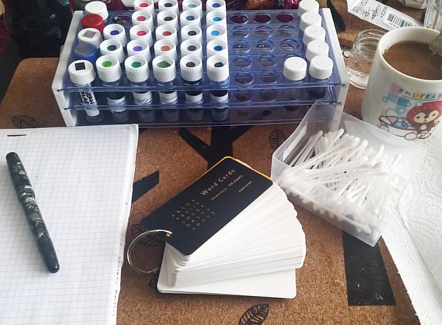
Yes friends, take a good look at my desk in all its messy glory. To some this might be a nightmare, but for me it's a victory. First let me explain what you see here, though for fountain pen people visiting my blog, this is a familiar sight. These are test tube vials filled with fountain pen ink. Samples of ink which were either bought at various pen sites (the main one being Goulet Pens Co.) or swapped/given to me by friends. Yes, there are thousands different ink colors of there by hundreds of different brands. It can get overwhelming, to choose a color to buy a full bottle in. Where to begin and where to stop? Having a sample of an ink you are interested in does help. You can swatch them out, see if it is the shade of color you like, if it has sheen or if it's waterproof... but even a small vial of 2-3 ml of ink (times 50 per tray) has proven to be hard to fully use up. And for a hoarder like me, it's a tough challenge. But I am slowly getting there, with the help of Konmari this year.  From 6 full trays a few years ago and to now 3 is a victory! Let me tell you, it felt soooo goood to decommission that ink tray, I had to photograph and share this momentous occasion with my fellow deskers at WOYWW this week :) So plan is to keep using up those ink vials either in my art work or in my fountain pens, of course. For instance the ink below was sent to me years ago by a dear friend.
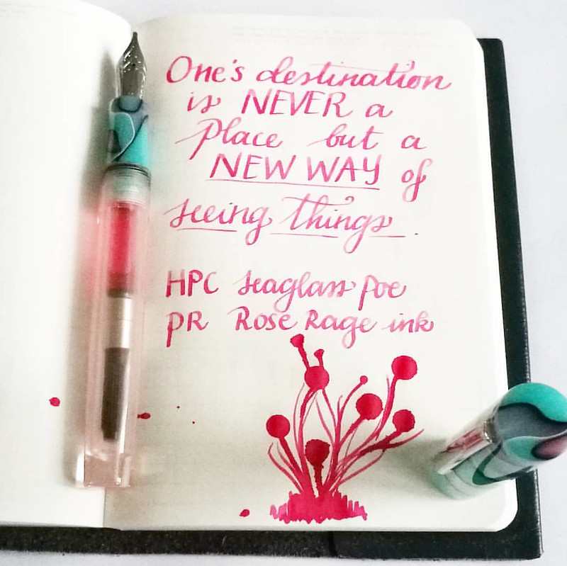
A new way of seeing things... This pink though, you need ๐Ÿ˜Ž as it's so bright!  #mindfulmusings #quoteoftheday #FPN #FPGeeks #fountainpennetwork #seaglass #neonpink #privatereserve #roserage #handwritten #handwriting #dailywriting #dailyinspirat

Last week I made an art journal with this quote from a stamp and I had to write it down in my Stalogy B6 which I use for quotes. I hardly ever buy pink inks, but they are fun to enjoy once in a while. This Rose rage is a super powerful shade of pink and fun to use in my new pen from Herbert Pen Company. I know I won't be buying a full bottle of this ink but it's an on going struggle of an inkophile, not to continuously buy more and not use what you have. I am trying to be better at that. 
By the way, the work aria of my desk now is cleared of the trays 

What are you struggling to use up in your stash?

Thanks for stopping by and check out more desk stories at Julia's blog this week and play along if you want :) 

Have a great day!  


2017/06/02

Art Journal: Amazing Diva

Amazing Diva

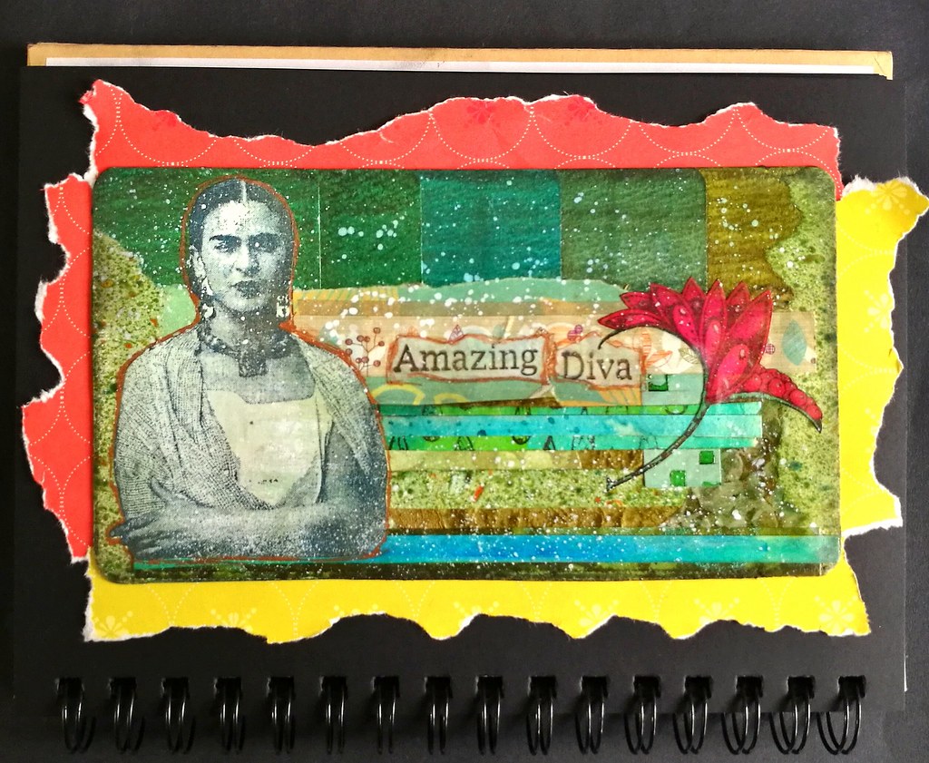
It's such an amazingly fun challenge to create pieces using project left overs aka 'tovers only. This piece was intended to be a postcard but I loved it so much I decided to adhere it to my art journal as I couldn't part with is. I used all sorts of scraps and left over pieces here but what started it off was the top. It's a color coded row of double ink sample swatches! I keep ink samples in trays and have it organized by what I have done already but for some reason I made an oopsie and made swatches of one row twice. Well of course it's too pretty to just throw out and if you see my scrap boxes you will know I have trouble to throw out anything!  I then looked for trims in the same color family to adhere to the page. Instead of vertically like I did with this journal page, I went with horizontal lines to see how that would go. And I absolutely love the outcome here! The Frida image is a left over print from this journal page and is a stamp from Lost Coast Designs - so are the words I used. I felt like I needed a POP of color and in my scraps I found that colored in whimsical seed pod from Viva Las VegaStamps! which I had used from this journal page almost a year ago! So very cathartic to use up all these scraps and seeing how all these elements come together as one :) The "frame" is just ripped out magazine pages from FLOW magazines. Yes, I have had a TON of them due to my 3 year subscription and those are all "free game" now - ripping stuff out feel SO GOOD! LOL! 

I would like to enter this journal page in the following challenges: 


'Flowers and Friends make life a garden' 
The green and seed pod reminds me of a garden... it could be Frida's garden :)

Wow, has it been a year I have been participating? 
I really loved this past year's themes esp. what's your super power and put a stamp on it
I feel like this journal page combines the two :) 

Thanks so much for stopping by and have a wonderful weekend!


2016/12/07

Inky Goodness: Montblanc Miles Davis Jazz Blue

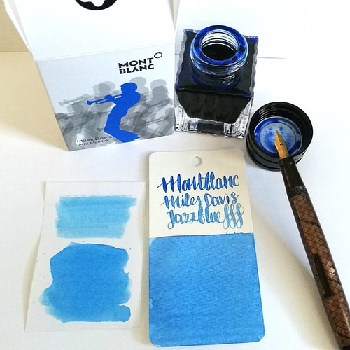
Went to Akkerman in the Hague yesterday and picked up this bottle of Montblanc Miles Davis Jazz Blue ink. First impressions; watery and a light washed out blue = me not really impressed ๐Ÿ˜’ inkswabs done on Maruman wordcards and herma smooth sticke
On a recent visit to Akkerman in the Hague I noticed the new Montblanc special edition ink on their shelves, Miles Davis Jazz Blue ink. I was super excited to try it out as I love blue inks esp if they lean toward turquoise hues so I bought it. Sadly, this is one of the very few times this ink is not the color for me and am disappointed with the special edition MB has released. Though the color on the ink swab looks like a nice saturated rich blue, it isn't. I had to swab it twice over to get some richness of color showing. The ink has a very watery consistency, almost looks like a diluted turquoise ink. Swabs on the left are done on Herma sticker paper, the top is swabbed with a q-tip once over, here you see the normal saturation and the bottom is heavily saturated. It could look good in writing with a flex nib as my test writing with the Swan flex pen looks nice on the maruman word card. Let's take a closer look at the ink. 

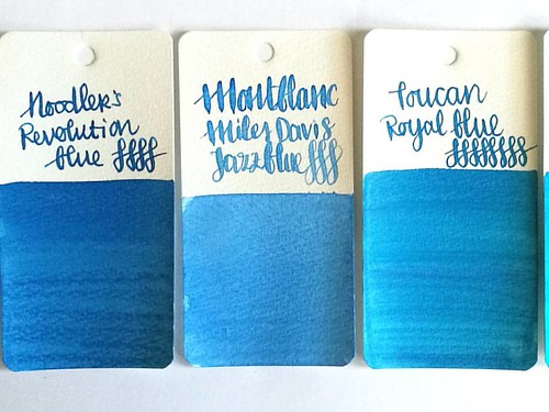
MB jazz blue flanked by Noodlers Revolution Blue which is more saturated and Toucan Royal Blue which has the same watery consistency but is darker in tone.
Here Montblanc Jazz Blue is flanked by Noodler's revolution blue on the left and Toucan royal blue on the right to show you similar ranges of blue in the same color tone. Jazz blue is lighter than both but in color tone it leans more toward Revolution blue, but the ink has the same watery consistency as the Toucan inks have. I inked my Sailor Sapporo Haruzora Sky Blue fountain pen with MB Jazz Blue to test how it writes in a medium nib.

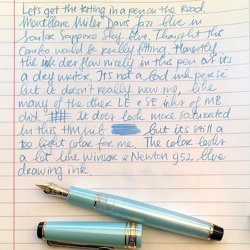
Thoughts on MB Jazz Blue ink. Pen Sailor Sapporo Seasons Sky blue with HM nib. Paper Lyreca office.
This pen in particular is a dry writer. I don't often use this pen, in fact this may be the second time I have inked this pen. And even though this pen and ink combo does match nicely, the ink itself does not really "wow" me like say Dandy Turquoise does. In writing the color also looks a lot like Diamine China Blue. Writing is done on 70gms Lyreca office paper.

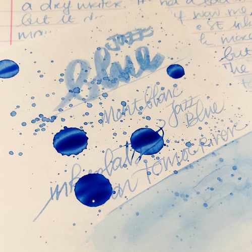
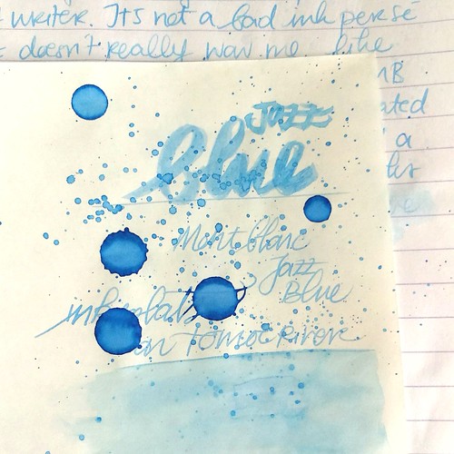
Testing MB Jazz Blue on tomoe river paper for sheen in this ink, I really doubt is has any. But well this will probably be dry like tomorrow or something before I can tell for sure. I do see potential for some pretty sky blue ink washes though!
I also did some tests on tomoe river paper to see if there is some sheen in this ink. This is the cream colored tomoe river and you can see that the ivory color does dull down the blue color of the ink ever so slightly. The ink is definitely better looking on stark white paper. I suspected this ink doesn't have any sheen and after drying time (this took a looong time to dry!) my suspicions were confirmed.

MB Jazz Blue ink
It does dry up with a nice blue halo, but no signs of redness caused by sheen of any kind. The drops look a bit pastel blue and with heavy saturation it's a high shading ink, but without any sheen. I do see a lot of potential for this ink in artistic endeavors, it definitely looks like a spring sky blue to me. Perhaps this would make a beautiful combination with Montblanc Pink in a sakura sky setting. Looking forward to test that out :)

Hope this was helpful to you, should you consider getting this ink for yourself. Let me know your opinions on this ink should you have tried it, I would love to hear it. 

Thanks for stopping by and have a great day!
namastรฉ

2016/02/19

Inky Goodness: The life of an inkophile...

This is what my coffee table set up looks like on a random sunday evening:

Getting ready to swab these on maruman mnemosyne word cards #inkophile #Fpgeeks #FPN #fountainpennetwork #fountainpeninks #montblanc #sailorjentle #parker #waterman #jherbin #privatereserve #pelikan #pilotiroshizuku

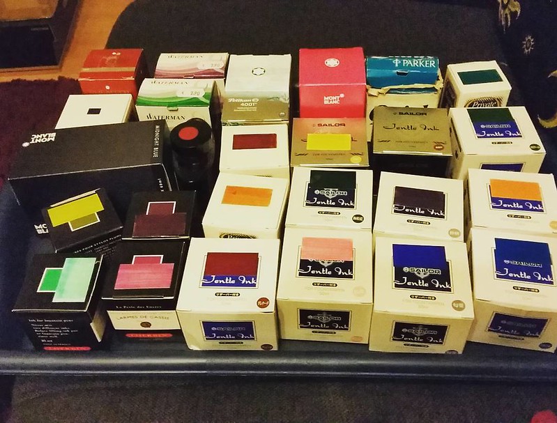
On the couch next to me a tray of inks waiting to be swabbed on Maruman Mnemosyne wordcards. The tray included lot of older Sailor inks which are discontinued now. 

Results of last night's color swatching #inkophile #Fpgeeks #FPN #fountainpennetwork #maruman #wordcards #inkswabs #privatereserve #sailorjentle #waterman #jherbin #sheafferskrip

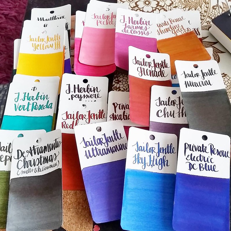
Swabbing away while binge watching "Being Human" episodes. Used a waterman 12 to write the make and color of the ink. Lots of pretty and saturated colors in this swab round! Such a shame those bright, happy Sailor Jentle colors are no longer regularly available!

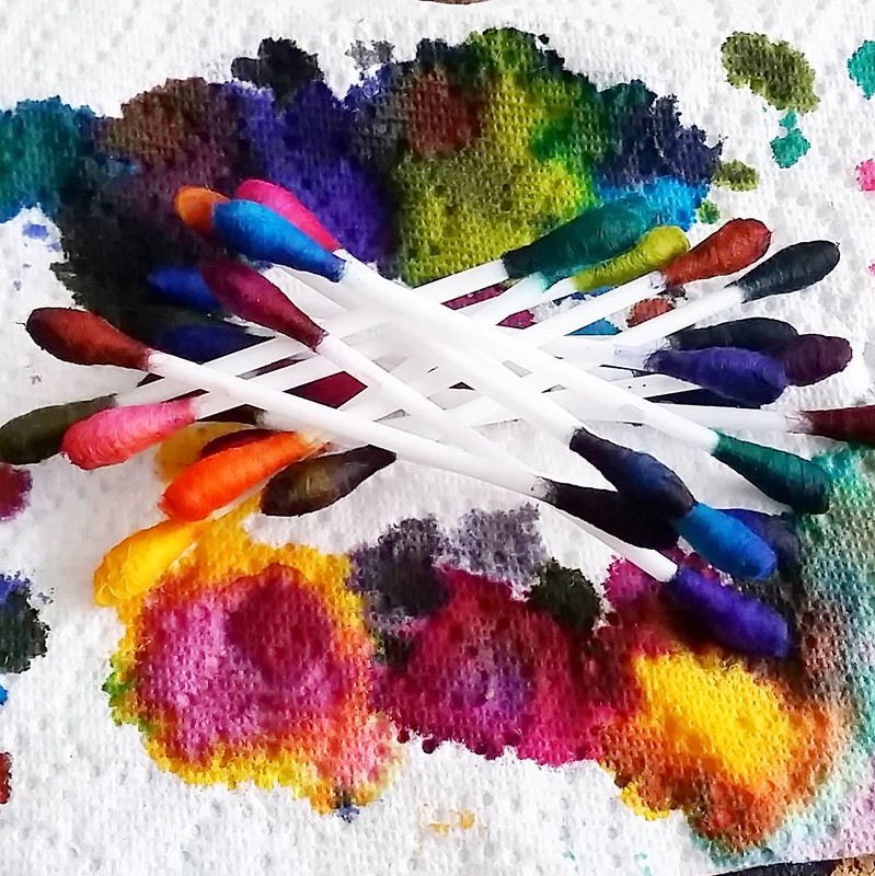
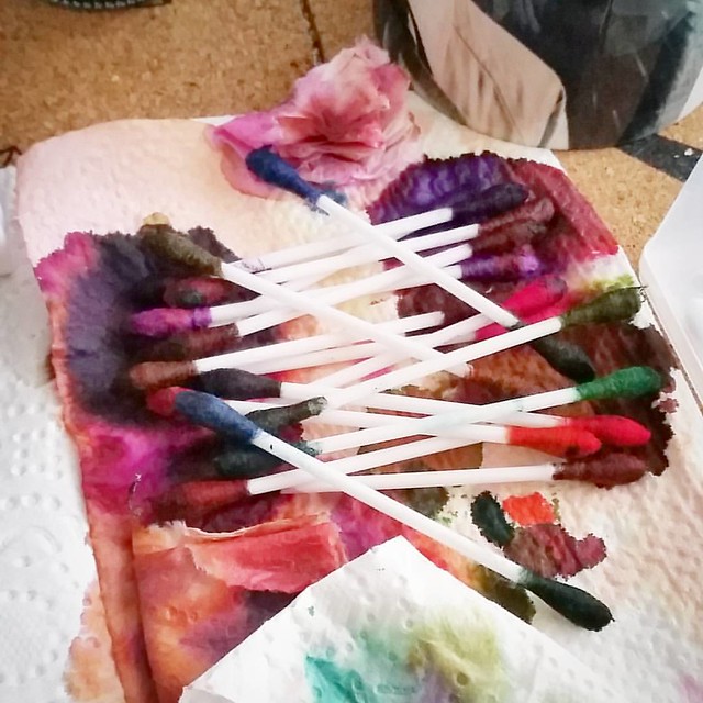
Q-typical abstract art #qtips #inkophile #inksampler #colorcoordination #inkspill #inksperiment #fountainpeninks #Fpgeeks #FPN #fountainpennetwork #ink #inked #inkygoodness

The Q-tips after one swabbing session leaves a pretty "Q-typical abstract art" and it's such a fun sight to see!

I still have about 3 full trays to swab and 3 more seasons of Being Human to watch... and a few new inks are coming my way soon too... so much to look forward to! 

What are your ink swabbing habits? 

Thanks for stopping by!

namastรฉ 

2016/02/03

Pens and Ink: Waterman 52 with PR Naples Blue

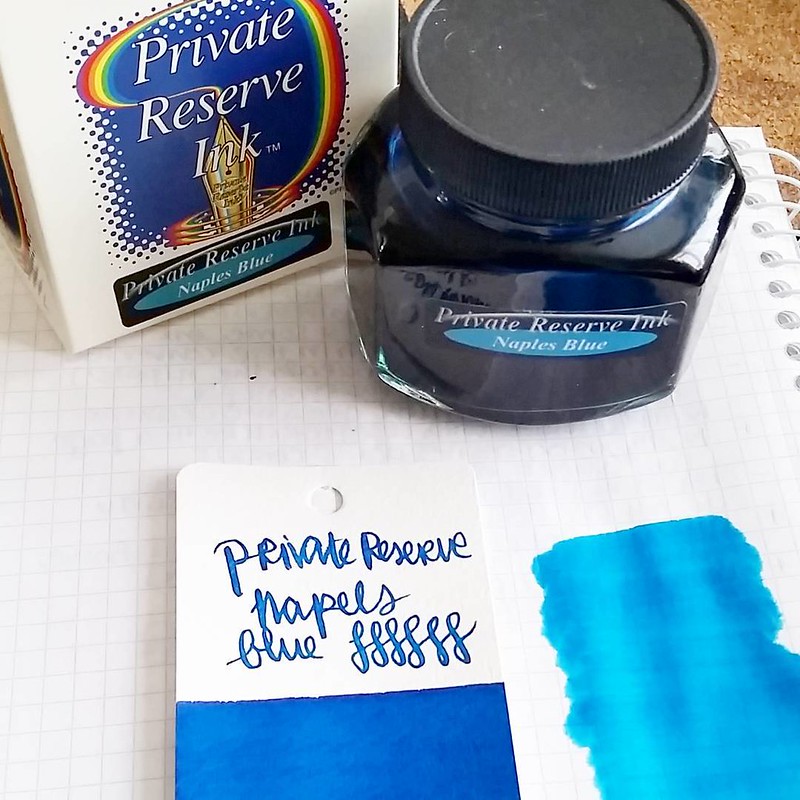
As you may or may not know (it's hard to miss really!) I really like blue inks, esp. turquoise and teal blue. In a recent visit to Akkerman in the Hague I found this gorgeous blue ink color which I did not have yet. I corrected that mistake immediately!

That is s pretty nice blue! Also large bottle score! #privatereserve #naplesblue #Fpgeeks #FPN #fountainpennetwork #fountainpeninks #turquoise #bluehues

It's Private Reserve Naples Blue (yes, yes I know I made a spelling boo-boo on my sample card, But to my defence that's how you spell Naples in Dutch ;) and by luck they had a large bottle of it and it was on sale! Double score!! The samples above are done with a Q-tip and on Maruman Mnymosyne wordscards cardstock and the wash out next to it on 80gsm Office Supply grid paper. The maruman card shows the deep saturation and man it has some gorgeous sheen to it! It's best seen in wet writers and flex pens like below.

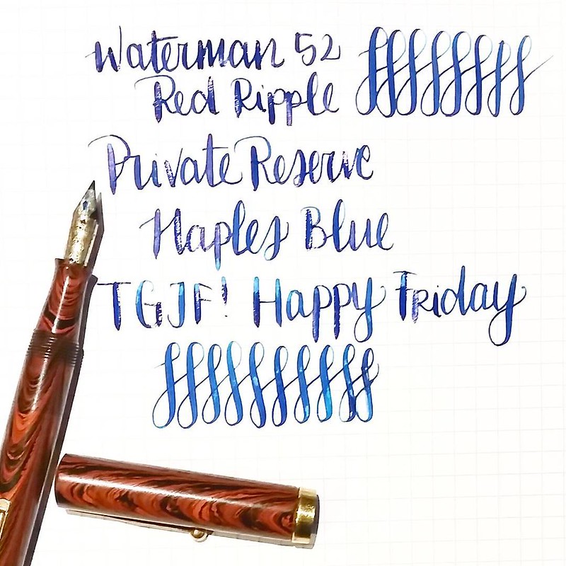
TGIF! Happy #flexnibfriday #waterman #52 #redripple #fountainpen #Fpgeeks #FPN #fountainpennetwork #funtainpen #flexnib #flexywriting #privatereserve #naplesblue #TGIF

This was for a flexnib friday post on Instagram and it's written with my Waterman 52 with Ideal nib #2 which has a really nice flexibility to it. The glare on the writing is wet ink, and it dried up with an amazing sheen!

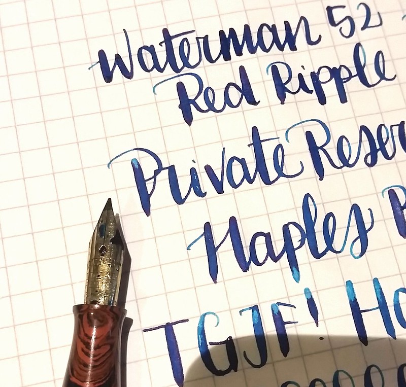
The sheen of PR Naples Blue

Check out that red sheen! Nice deep saturated blue color with amazing sheen and and even some shading... Private Reserve really made a gorgeous color here!

What is your current fave pen and ink combination?
Thanks for stopping by!

namastรฉ

2015/11/12

Thriftfinds Thursday - Inky goodness from across the border

On a recent impromptu trip to Antwerp for my wedding anniversary last weekend, we came across a few fun pen stores: Penworld, Kockx and Pen and Pencil. They are definitely worth the visit! I found a few vintage fountain pen ink gems I want to share with you here.

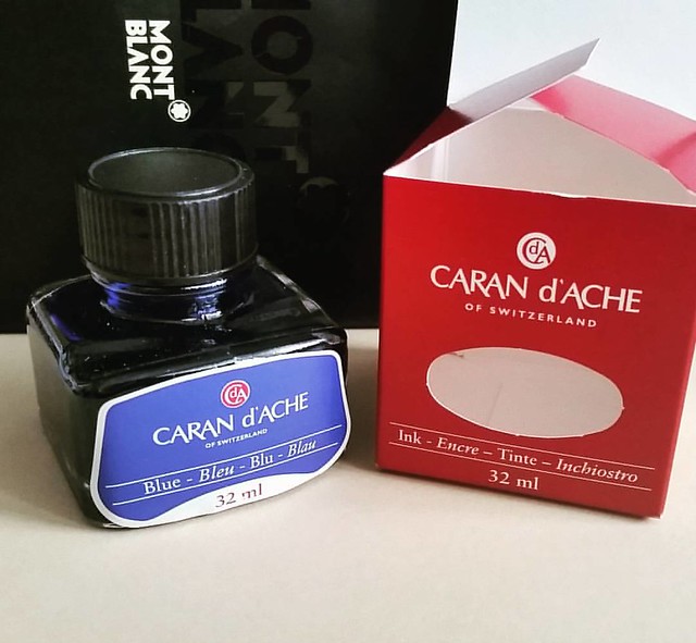
Vintage ink finds: caran d'ache blue in J Herbin bottle #carandache #Fpgeeks #FPN #fountainpennetwork #fountainpeninks #ink #fountainpen #vintage #luckyfind

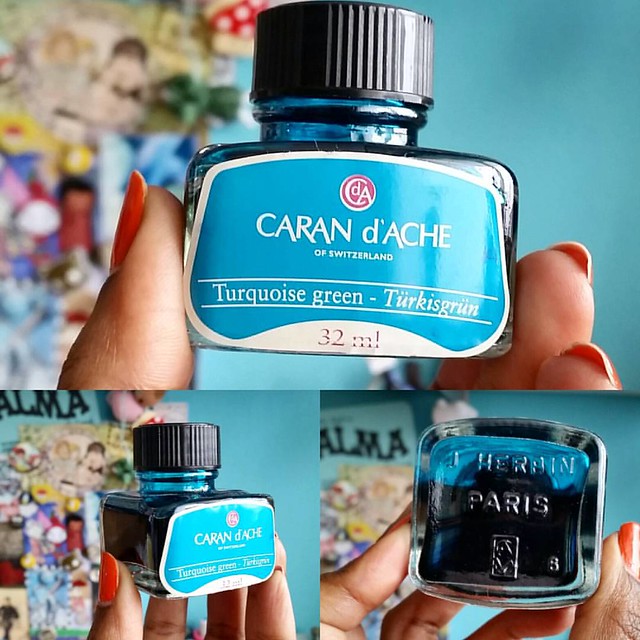
At Penworld I found the Caran d'Ache blue in a J. Herbin bottle. They are pre Colors of the earth series and I was lucky enough to find a turquoise bottle not too long ago at de Roos in Heemstede, NL. 

An amazing find! An older bottle of Caran d'ache turkisgrรผn ink which was manufactured by J. Herbin. #carandache #inkbottle #fpgeeks #fountainpennetwork #fountainpenink #ink #turquoise

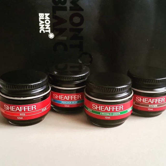
Also at the same store, in a little corner tucked away, I found these super cute mini baby bottles of sheaffer skrip inks. 
Vintage ink finds: mini sheaffer inks red, peacock blue, emerald green, brown #sheaffer #skrip #vintage #ink #fountainpennetwork #FPN #fountainpenink #Fpgeeks #inks

They are the size of those tiny baby bell cheeses, super cute! I do love cheese, but I rather have these inks than those baby bells though. Just saying in case you were wondering ;)

Vintage ink score: montblanc violet #vintage #montblanc #Fpgeeks #FPN #fountainpennetwork #fountainpenink #violet

Then over at Kockx which is the oldest fountain pen store in Antwerp (and also has a lot of exclusive and expensive pens) I found the montblanc violet ink. I am very curious how this compares to the lavender purple. 

I can't wait to swab these on my Maruman Mnemosyne word card tabs. 

What is your latest lucky vintage find?

Thanks for stopping by!

namastรฉ

2015/10/20

Paper Goods: Maruman Mnemosyne Word Cards

Last week I got ill with a really unpleasant flue type thing and was stuck at home for a good while. So I thought I'd spend my time doing what I like to do best, organizing and cataloging stuff. Yeah it was almost like being at work ;) I wanted to make a better and more comprehensive chart of all the inks I have in samples and bottles. The color chart wheels I made with Le Typographe ticket books are fun, but limited to the set of pages in those booklets. When I heard about the Mnemosyne Word Cards on the Goulet Q and A while back, I knew these would be perfect for what I had in mind.

It's swabbing time! Going to re-swab every ink on the Mnemosyne word cards. #inkswabs #inkswabbing #fountainpenink #fpgeeks #inksampler #FPN #fountainpennetwork #inksamples #colorcoordination #colorcoding
This was my set up: In front of the telly, while watching some Graham Norton episodes on you tube... And then it was swabbing time! 
A colorful mess... remnants of an ink swabbing session #inkswabs #inkygoodness #inks #Fpgeeks #qtips #fpn #fountainpennetwork #fountainpeninks #colorcoordination #inkymess
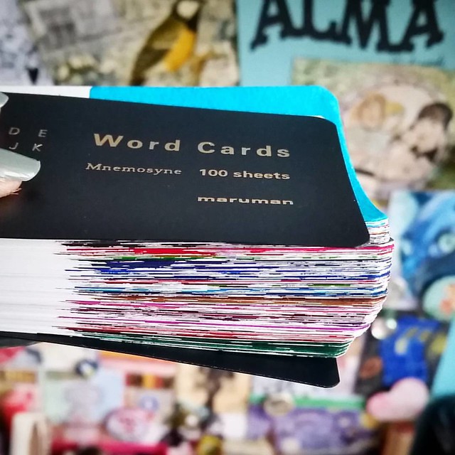
These maruman wordcards are so good to use for ink swabs! I just discovered them and then to find out they are being discontinued is really sad! #maruman #mnemosyne #wordcards #inkswabs #Fpgeeks #inkygoodness #inkyproblems #inkymess #swabbingtime #FPN #fo


The cards hold up ink really well, great drying time, no bleed through and minimal feathering!
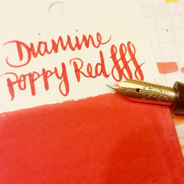
The pen I use in writing samples on swabs. Onoto de La Rue. #inkswabs #inksampler #Fpgeeks #diamine #poppyred #ink #fountainpeninks #FPN #fountainpennetwork #swabbingtime
Q-tips are great for swabs, and I made sure I hit the edges of the cards and used a vintage semi flex pen, by Onoto de La Rue to dip and write the brand and ink name.

100 swabs done and I might be only 1/2 way through... #inkygoodness #inkyproblems #Fpgeeks #maruman #mnemosyne #inkswabbing #FPN #fountainpennetwork #
The booklet has 100 sheets with 156 grams of water color like paper. Because there is no bleed through, you can also opt to use the back of the cards. I will use it to write information on the type of ink on (ie if I have just tried a sample or a bottle) 
And three ink sample trays in, I already filled one of these booklets! I am currently busy with booklet number 2 and the sad news is that I heard these word cards are being discontinued, so I stacked up on them to make sure I can still use them for future swabs.

Hope this gave you some idea's on how to make your own ink swabs.

Thanks for stopping by!

namaste

2015/05/20

Color Chart Wheels

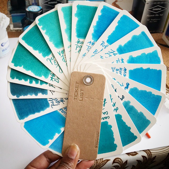
Made a pallet of the turquoise/teal inks I have by using the ticket booklet by #letypographe which I got at @misc_store_ams
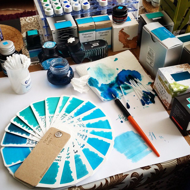
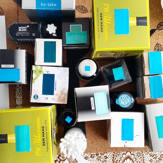
A little while back in my post on Misc Store Amsterdam I mentioned I had a great idea how to use the Ticket List booklets (the biotop sable 58.07) from Le Typograph. Well, they make an Inkophile's life so much easier as you can make these Color Chart Wheels with them. I started off with my fave color. Guess what that is?

Sample swabbing turquoise inks #inkygoodness #inkswab #inksampler #turquoise #fpgeeks #inks #akkerman #sailor #montblanc #privatereserve #diamine #takemetothebeachwithturquoise
Join in with this hashtag on instagram if it's your fave color too #takemetothebeachwithturquoise

The process:

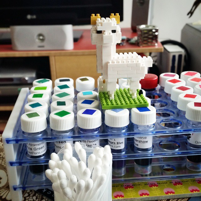
Little nano alpaca is helping with the sampling #inksampler #inkygoodness #fountainpenink #inkventory #fpgeeks #nanoblock #alpaca #inkswab
Little nano-alpaca is carefully helping me choose the color gradient.

It's swabbing time #inksampler #inkswab #inkygoodness #inkjournal #dipnibs #dippen #turquoise #fpgeeks #takemetothebeachwithturquoise
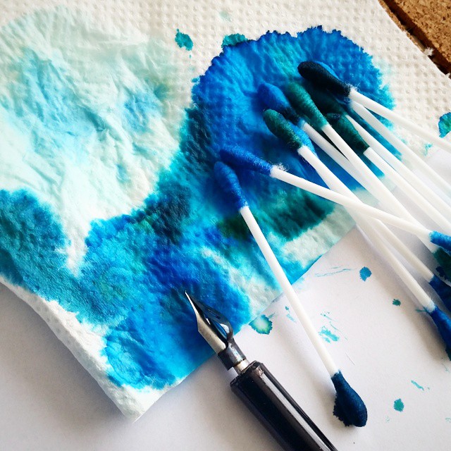
Then it's swabbing time! Q-tips are used well in this house hold!

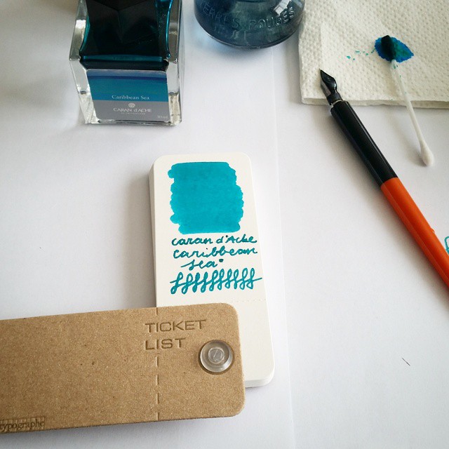
This is definitely my fave turquoise ink (still weep that it is discontinued!) #carandache #caribbeansea #ticketlist #letypographe #fountainpenink #dippen #fpgeeks @misc_store_ams #miscstore #miscellaneous
I write down the manufacturer and color of ink underneath each swab. And some 'figure eights' for fun.

The end result:

The turquoise 'ink sample wheel' I made by using #letypographe 's ticket list booket (got at @misc_store_ams) Going to do a whole rainbow color palet wheels of this. The paper is really sturdy and you van use the backsides of the stubs too!
I love how you can fan these out as wheels! The plastic ring is holds the stubs together very well. The paper is really sturdy and you could use the backsides of the ticket stubs as well.  

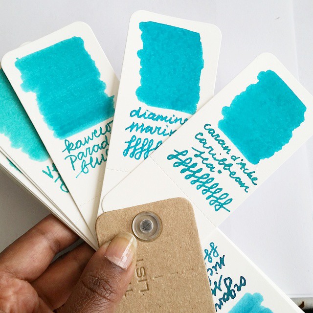
Such a close match to old Caran d'ache Caribbean Sea = Diamine Marine. It is a little bluer than CS. If you want a bit more green hue, Kaweco Paradise Blue would hit that mark. Still all three want me to take a holiday to the Caribbean shore ๐Ÿ˜‰
The use of these Color Chart Wheels is awesome. You can discover which inks matches to each other and with that also find a good replacement for an ink that is discontinued. Like Caran d'Ache Caribbean Sea for instance. Very close match to Diamine Marine.

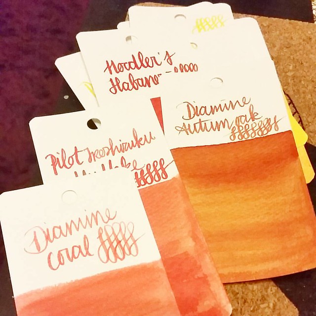
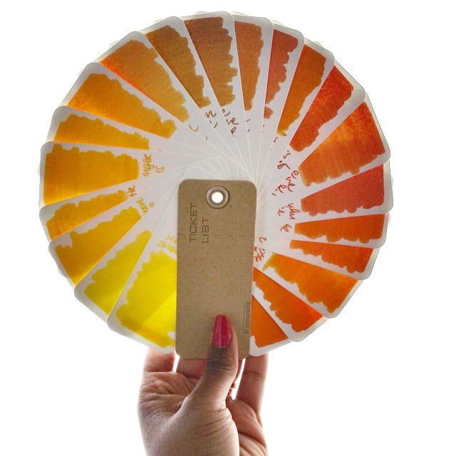
 I have made a yellow/orange one as well and my plan is to make a rainbow out of these chart wheels.

If the rays of the sun won't come to me, I shall make my own! #colorcharted #colorcoordination #inkophile #ticketlist #letypographe #yellow #orange #colorsofthesun #colorcartwheel #sunset #sunrise #fpgeeks #colorcharted_yellow #sunshine

This one will be on display at the Misc Store soon :)

 Meanwhile I hope this inspires you to make a few of your own. If you do, I would love to see it :)

Thanks for stopping by!

Namaste