Showing posts with label shimmering inks. Show all posts

2018/12/21

Art Journal: SisStars Do small things with great love - AALL & Create


Hi and happy winter Solstice! With the holidays and new year nearly upon us, it's time to spend with friends and family to deepen the bond we have with them during this time of festivities and renewal. I have an art journal page to share with you which I have dedicated to my sisters, or as I like to call them, my SisSTARS because they definitely have a bright shining spot in my heart. I've used AALL & Create products for this and I'll share the process of making the journal spread with you now. 

 
So in my project last week I showed you how I used the numerical circles from set #110 to make a season themed card. Since I only used a portion of the stamp, I also cut out circles and leafs with punches to use in this project. I also cut out the fern, but alas that didn't fit into the journal spread this time. Good to have for another project :) 

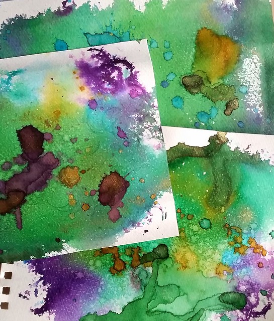
I started with gluing the circular and leaf pattern down randomly on the pages in my junk journal with matte medium. Some aria's have been embossed with copper embossing powder so that will have some extra texture. 

I applied some gesso over it and then raked the edge of a plastic knife through the gesso for some interesting texture. When that dried I applied modeling paste through the Lotz of Dotz stencil #39 over some empty spots. The teeny tiny dot pattern also remind me of stars. Now to add some color. 

I took my small foam brayer and a few cool blue colors, ranging from light to dark to add depth and contrast on the pages. Then to add color under the stenciled aria's I used some home made shimmer sprays from Cosmic Shimmer and Lindy's Gang.
 
I used some darker grey colors like pewter (cosmic shimmer) and black forest (Lindy's gang) and made sure that the most of the white was saturated with color. To get more of the contrast back I traced the patterns with a blue Stabilo all pencil & activated them with water to get the shading going. I also stamped the grungy flower of set 123 randomly over the page. I left it to rest and took

The next day I added a deeper layer of color over the page and some scribbles & sayings like Pinky Swear, Keep your promises always, stay grounded in gratitude and a few others to signify the sisterly bond. The word stars is a die cut from DieNamics and cut out of starry scrap book paper. I used black forest ink to darken the background and white to highlight the word. The image of the sisters are from Tim Holtz vintage people pack. To ground them I added hemp twine and a skelleton leaf. The text stamp is from set 123 as well and I stamped it on a contrasting color to make it pop out more. 

I definitely love how this turned out as an hommage to my lovely SisStars. 

These are the products I used: 


This is also my last project as Guest Designer for AALL& Create. Thanks to Autour de Mwa for inviting  me on board these past months, I really appreciate it and enjoyed working with the products. You can find the stockist HERE and be sure to check out the newly released collection of December for another array of great designs :)

Thank you all for stopping by today. I really appreciate the support you all have given me here and over at my other social channels over the year. Thank you, you're all STARS for sure! Wishing you all a wonderful holiday season and transition to the new year. May you spend it with the people you hold dear.

See you in the new year!

2017/06/06

Pens and Ink: Woodshed PenCo "Creme Brulee" with Diamine Golden Sands

We're in halfway through 2017 and I have realized I have not been sharing my pens and ink pairings  on the blog like I have planned to do. My art is now the main focus of this blog, but Fountain pens and ink are still a very big hobby of mine. I have been sharing them on my FP centered IG Pensandpolish and while I have entertained the idea of creating a separate blog for my Fountain Pen endeavors, it's just way too time consuming for me to do. So I will continue to share some of my favorite pairings on the blog here, esp. ones that are made by independent manufacturer/pen makers. Starting off with this gorgeous handmade pen from the up and coming pen manufacturer/maker Mike Allen from  Woodshed PenCo.

Woodshed penco creme brulee

I've purchased this beautiful yellow golden colored swirly pen from Mike Allen at his sale on Instagram. He doesn't name his pens, but I dubbed this one "Créme Brûlée" because it looks like that beautifully burnt sugary caramel top of my fave dessert. The nib wasn't provided in this sale, but it takes the #6 size nibs I had a spare 1.1 nib from Franklin Christoph which fitted  beautifully on this pen. As for the ink I went with Diamine Shimmertastic Golden Sands, the color just matches the pen body perfectly. I've written on a Muji dot grid notebook on which the nib just glides and the ink shades and shimmers beautifully! 
My absolute fave of the first line from the Diamine Shimmertastic series. 

Photographing pens like they are sexy super models. Work that nib, yeah! 😂 Pen: @woodshedpenco 'creme brulee' swirl Nib: @franklinchristoph 1.1 stubbalicious Ink: Diamine Shimmering Golden Sands Paper: Muji dotgrid notebook . . . #FPN #fpgeeks #founta
A little more about The Woodshed PenCo - Mike is an US Air Force veteran whom got into making fountain pens not too long ago. He shares his process on his Instagram and has set up a Kickstarter campaign. I was lucky enough to have bought from him through a sale he was having on his IG and he has sold his pens through Etsy as well.

Woodshed penco creme brulee
He just has one type of model so far, but more could be in the works. The pens he has for sale are really well made. The model is a bit cigar shaped and the cap does not post. I do like posting pens (so I won't loose the cap) so it was a little getting used to, but now I know to hold it in my left hand when I write. The section is tapered and fits very elegantly in hand.


My new fave summer pen from @woodshedpenco 🌞 It's also got a cute hand knitted pen pouch!
With every pen purchase you also get a hand knitted pen pouch/sleeve which is super fun! Not only does it protects the pen, but it also adds to the handmade feel for the pen :) I got a super yellow one with my pen which is awesome :)


This beauty is made by the very talented @woodshedpenco The caramel swirly acrylic reminds me of 'creme brulee'  Fitted with a 1.1 nib from @franklinchristoph and inked with golden sands shimmering inks by Diamine it's the perfect sunny summery fountain p
If you're interested in one of Mike's pens, do follow his instagram and keep a watch out on his kick starter campaign. I am in no way affiliated with him, just a very happy customer and glad to support a small business. I am looking forward to a second pen coming my way and perhaps 3rd of his make will be added to my collection soon :)

 Oh by the way, if you want to have more updates on my fountain pen adventures, please have a follow on my Instagram account PensandPolish where I also try my very best to color coordinate nail polish to the pen and ink of choice. And if you post a color coordinated pictures in IG yourself with the hashtag #pensandpolish I'll feature you on my IG as well :) 

Thanks so much for stopping by and have a great day!


2016/06/08

Inky goodness: J. Herbin 1670 Caroube de Chypre

So excited to try this!! Thank you @mishka5050 :) Can't wait for the launch of this ink at @bureaudirect :) #caroubedechypre #jherbin #FPgeeks #FPN #fountainpennetwork #fountainpenink #inksampler
Not a pens and ink post this week, but a focus on just the ink this Wednesday! A little while ago Mishka from Bureau Direct kindly sent me a sample vial of the coming ink in the anniversary line of J. Herbin 1670 Caroube De Chypre, which is due for release on Bastille Day, July 14th. So I'm lucky that I got a sample to try it before the release date and I finally had the time to play around with the shimmery ink a little and showing you some results today. Thanks so much again, Mishka!

j herbin caroube de chypre
J. Herbin Caroube de Chypre on with a waterman 12 Ideal nib #2 on Muji dot grid notebook paper. The ink performs well on smooth and fountain pen friendly ink paper like the above. I dipped my pen in the vial to write and then added some splatters. There is a lot of shimmery action going on there, which I really like. And the deep chocolate brown base color shows off the gold shimmer well.

j herbin caroube de chypre
I used my Pelikan 200 Cognac with a M italic ground nib for more writing and testing in my written meditation journal. The ink holds up pretty well on Clairefontaine paper as well. But sadly the shimmer doesn't show through as much as with dipping the pen in the ink vial and writing with it. It showed some shimmer the first few lines when I wrote with it.

j herbin caroube de chypre
As you can see in the above picture the first few sentences has the gold shimmer, but later on there is little shimmer. I had to shake the pen a few time to get some of the shimmer flowing into the writing again. And it does pick up a little, but not a lot.

j herbin caroube de chypre
You can see that my pelikan does hold a lot of shimmer in the barrel, so it might be that the combo of this pen and ink doesn't allow the shimmer to shine though like it deserves. The feed doesn't have a lot of shimmer on it and I think herein lies the problem.

j herbin caroube de chypre
For the shimmer to really shine though, I think you need a pen with less fins in the feed, like a vintage pen with a smooth feed or a really wet writing pen. I discovered that too with the diamine shimmering inks, though those inks have a lot more shimmer in them than the J. Herbin 1670 series.  I'll be experimenting with this ink in other pens when I get the chance (ie when I get a full bottle, my sample is nearly depleted). But for now I also wanted to show you some ink wash artwork I did. 

j herbin caroube de chypre
I stamped the dip pen stamp from Viva Las Vegas Stamps with versamark ink on smooth white glossy paper and embossed it with clear embossing powder. Then I wrote Caroube de Chypre, J. Herbin 1670 with a versamark embossing pen and embossed that with clear embossing too. I took a small paint brush and a little bit of water and started to wash the ink from top to bottom over the embossed parts. 

j herbin caroube de chypre
The embossed parts work as a resist, so the image shows up through clearly and you can wipe excess drops of ink on the embossed parts away. When the image was dry I took my brush, dipped it in the water a bit and spattered over it. I let that dry and then I dipped the brush in the ink vial and spattered non diluted ink over it.

j herbin caroube de chypre
This is the end result, a beautiful chocolate brown shimmery gold speckled ink wash! I'm going to do some experimentation on watercolor paper like I did with the Diamine shimmery inks, but I definitely love the smooth glossy look this paper has. I'm also loving this embossing ink resist technique a lot and will incorporate them more in inky goodness posts :) 

More reviews with lush pictures on Caroube de Chypre can be found at The Clumsypenman and Gourmetpens. And if you do not want to miss out on this ink when this gets released in July, why not subscribe yourself to Stationery Wednesday newsletter and blog from Bureau Direct for more info and a 10% discount code being distributed weekly!

Disclaimer: this sample was sent to me free of charge for review purposes. All opinions are my own and there are no affiliate links. 

Thanks for stopping by and have a great day!

namasté

2016/01/27

Pens and Ink: Pilot Retro Pop and Diamine Blue Pearl

I have been seeing this pen in use by a few people on my Instagram and since it's turquoise and not that expensive,  I was at Akkerman I let myself get seduced and got one.

My views on the Pilot MR Metropolitan Retro Pop. #writtenreview #pilotmetropolitan #retropop #turquoise #plumix #cursive #italic #diamine #shimmertastic #bluepearl #Fpgeeks #FPN #pilotMR #review

As you can see from the written review, I have mixed feelings about it. It's pretty, but the writing experience was so-so. but after I changed the standard m nib with a plumix nib (cursive italic) it writes a whole lot nicer! The European version, which is called the Pilot MR, takes standard international cartridges, BUT you have to be careful which converter you put in there and not push it in too hard.

And to show you that you definitely should not push your international converter too hard into the pilot MR European version. It's a delicate fit. #Fpgeeks #FPN #fountainpennetwork

If you do, you might get unlucky and split the converter nipple which will cause serious leakage. This is a standard international converter and it was a tight fit, but I pushed too far and it broke. Fortunately the pen nipple is still intact. At the moment I'm actually using a jinhaox750 converter and that works fine (that has a bit sturdier plastic on the top, but the piston operator part is crap...)

Pilot MR retro pop EU and Pilot Metropolitan Asia with the difference in converters. #Fpgeeks #pilotnamiki #metropolitan #retropop #pilotMR #FPN #fountainpennetwork

To show you the difference in converters: Pilot MR EU version top now fitted with a jinhaoX750 converter and the Pilot Metropolitan Asia version with the Pilot Namiki Con 20 old style squeeze converter. It's too bad they made the difference because you can get more ink in the namiki cartridges/converters. And not to mention that you have to be careful using the SI converter in your MR. But if you use cartridges only you should not have a problem. 

In my review there are more pros than cons and in the end it's a nice inexpensive daily writer. I esp. like that you can swap nibs with the pilot plumix and 78G pens to make the writing experience more interesting. 

Hope this was useful if you have or planning on getting a Pilot MR. 
Thanks for stopping by!

namasté 

2015/10/25

Mailart Sunday: Having some fun with diamine shimmeritastic inks!

Not a drop wasted #shimmertastic #shimmeringink #inkymess #inkygoodness #Fpgeeks #mailartists #mailart #inksperiment #inkspiration #inkspatter #diamine #goldensands
In my last post I showed you the writing examples with Diamine Shimmertastic ink samples, Mishka from Bureau Direct so graciously provided and today I wanted to show you some mail art I made with the remaining drops that were in the sample vials. No drop was wasted! [This post is going to be image heavy]

Mail art with diamine shimmertastic inks and Maruman water color sketchbook
I started off with making my base back grounds first. I drizzled some drops with a pipette and tapped the inks strait from the vials on the page and sprayed water all over the pages with a mini mister, so that the colors would blend over. Then I dried the pages with my heat tool.

Mail art with diamine shimmertastic inks and Maruman water color sketchbook
It's important that you use good absorbent yet sturdy (watercolor)paper for this. The paper I used is the Maruman Zuan B5 sketchbook which I got at my recent Pen Store haul. It's 126.5 grams of great quality water color paper and with the inks and water spillage I have doled out, it hold up pretty well! No bleed through on the other side as you can see above (the smudges on the right side is from excess water that pooled over) And warping of the page after drying is minimal.

Mail art with diamine shimmertastic inks and Maruman water color sketchbook

When the sheets were properly dry, I added some more shimmery ink drops on them by using a syringe to create random spatter patterns. I also diluted the ink a little bit in the ink vial to get more 'mileage' out of the last few drops. This way you also create some color variation, a light ombre in the color scheme. When I was satisfied with the amount of droplets, I dried the pages with my heat tool again. This time, when dried completely as shown in the picture above, the added drops are much brighter and the shimmer is more pronounced. Now to turn these pieces into mail art!

Mail art with diamine shimmertastic inks on Maruman watercolor paper

I took 2 of the background pieces I liked most and stamped Joy Crafts Old Letter Rose 2 and Old Letter Butterfly (by Noor design) on them. By this time I had run out of Shimmering inks but a good friend of mine gave me a full set of these in sample bottles so I could play with them more.  I colored some accents in the rubber stamp image, like the rose, butterfly, postage stamp etc. by using a pentel color water brush to make the image pop out more.

Mail art with diamine shimmertastic inks on Maruman watercolor paper

I used blue lightning to accentuate pieces in the rubber stamp, wings of the butterfly, postcard header, cancellation stamps and the postage stamp.

Mail art with diamine shimmertastic inks and Maruman water color sketchbook

With the rose I used red luster to accentuate the petals of the rose a edges of the leafs and corners of the 'post card' header. I also diluted the Magic Forest color in the leafs to accentuate that part more.

Mail art with diamine shimmertastic inks and Maruman water color sketchbook

I also used the water color brush to create depth in the Rose petals. Make sure you use a water proof rubber stamp ink, I used memento rich cacao and tuxedo black, because your image can wash away if you don't. You can stamp over the dried image again to give the image its crispness back.

A couple of close ups of the pieces so you can see the shimmering accent better.

Mail art with diamine shimmertastic inks on Maruman watercolor paper

Mail art with diamine shimmertastic inks and Maruman water color sketchbook

The last step was to glue the pages to card stock and I rounded off the corners with a punch.

And there you have it! I hope this inspired you to mess around with shimmery inks and rubber stamped images too :) And in the end your fingers will probably look like this

Having fun with a bit of shimmer #shimmeringink #shimmertastic #diamine #joycrafts #rubberstamps #inkymess #mailartists #mailart #craftiness

And you will find glitter EVERYWHERE! But that is part of the fun ;)

Thanks for stopping by!

Namaste

2015/10/22

Inky Goodness: Diamine Shimmering Inks

Shimmering inks: purple pazzazz, golden sands, blue lightning and magical forest. So shiny!! @bureaudirect @mishka5050 #diamine #shimmertastic #shimmeringink #fpgeeks #fountainpenink #FPN #fountainpennetwork
Due to the generosity of Mishka from Bureau Direct, I received a few samples of the new Diamine shimmering inks in samples to try out. And wow, these are really great inks! I had the chance to pick colors I like and I picked the above ones. FYI: all the samples have been written with a vintage Waterman 12 and flexible Ideal #2 nib on Muji dotted notebook paper which is similar to Midori MD paper.

Pazzazz! #diamine #shimmertastic #shimmeringink #purplepazzazz #purple #fpgeeks #FPN #fountainpennetwork #fountainpenink @bureaudirect @mishka5050
Purple Pazzazz is a lovely deep violet color with a golden shimmer to it. The ink color reminds me a bit of Montblanc's lavender purple (old formula) that also had a hint of gold sheen to it when the inks pools up. I had a bit of trouble getting this color washed out of the feed of my pen, because the color is so rich and saturated. But eventually it does washes out completely.

This is freaking spectacular! @bureaudirect @mishka5050 #shimmeringink #diamine #shimmertastic #bluelightning #fountainpenink #fpgeeks #FPN #fountainpennetwork
Blue Lightning is the one I was so excited to try out! Turquoise and a silver shimmer?! Well the ink gods (aka Diamine) have been very good to me with producing this one! I developed an instant crush! I do wonder what base color diamine chose for this though, since it has similarities to Montblanc's Honoré de Balzac Dandy Turquoise... but that one has more red sheen to it.

Golden sands a new shimmering ink by Diamine. This is just SO beautiful! Shading and shimmer. Super nice! @bureaudirect @mishka5050 #diamine #shimmertastic #shimmeringink #goldensands #fpgeeks #FPN #fountainpennetwork
Golden Sands is definitely the underdog in the line up, but I think this one will appeal to many. It does remind me of beautiful desert in like Dubai or something... Gorgeous golden brown color with a golden shimmer. This ink also shades really well and I love how it looks in italic nibs like I have in my Pelikan M205 congac.

Need some sparkle on this grey saturday, so how about starting a new hashtag #shimmeringsaturday And my current fave combo is the Pelikan M200 Congac with Diamine golden sands. Show me some shimmer #Fpgeeks :)
The shading and shimmer pool together really well.
 

Wow, this green with a pearly shimmer to it is definitely magical! @bureaudirect @mishka5050 #magicalforest #diamine #shimmertastic #shimmeringink #fpgeeks #fountainpenink #FPN #fountainpennetwork #shimmer #allthatshimmers
Magical forest... I gotta hand it to Diamine, they sure know how to name their inks! This one is very aptly named as well. This was a surprise ink thrown in by Mishka and I was very pleasantly surprised! A gorgeous shade of emerald and the shimmer in there is also green. A very pretty pearly combination. This would look good in my TWSBI Diamond 580 green edition with 1.1 nib... oh yeah!

So I will definitely get some bottles of these and am very curious how the other colors look IRL. If you want to see a more in depth review of these inks, check out Gourmetpens review on these! Also if you are feeling bold, Leigh Reyes has made an excellent post on how to Shimmerfy your own inks!

I have made some mail art with the ink samples I received and in the next Mailart Sunday post, I will show you  how those turned out. 

Thanks for stopping by!

namaste