Showing posts with label inkadinkadutchies. Show all posts

2016/11/18

Mini Art Journal: Kiss

Last week I showed you some work in progress pieces of my experimentation's with The Crafter's Workshop Gold Gesso and I've taken the Klimt image to work on for an Art journal spread.

the kiss

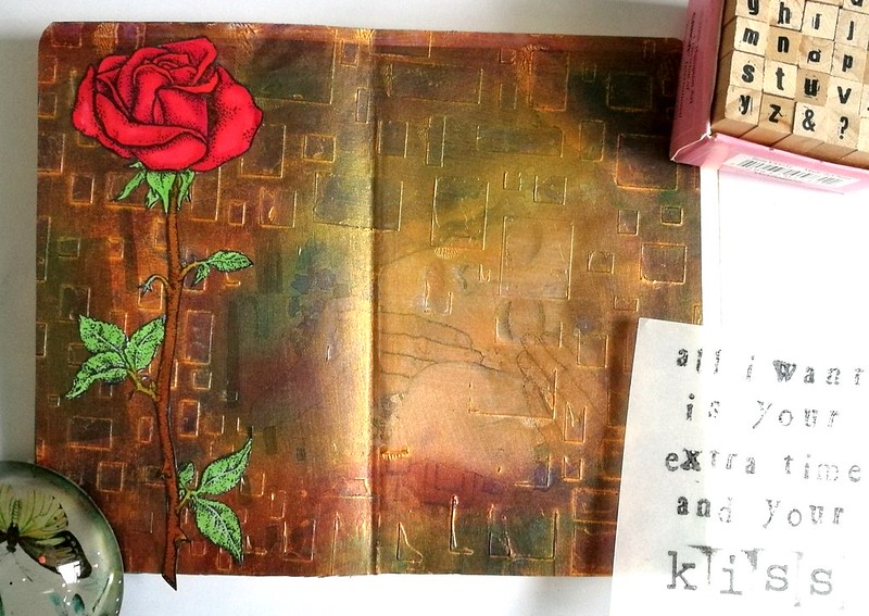
The Gold Gesso was a base on the Klimt print on which I have applied some metallic rub-ons with my fingers. The gesso provides a smooth surface on which the metallic paste just glides over. I have used some purple, green and red colors. The gold outline of the rectangles are still clearly visible and that gives it a fun effect. The Open Rose is a rubberstamp from Carmen's Veranda, which I stamped with memento black on sticker paper, colored with Letraset Pro markers and cut out.
the kiss

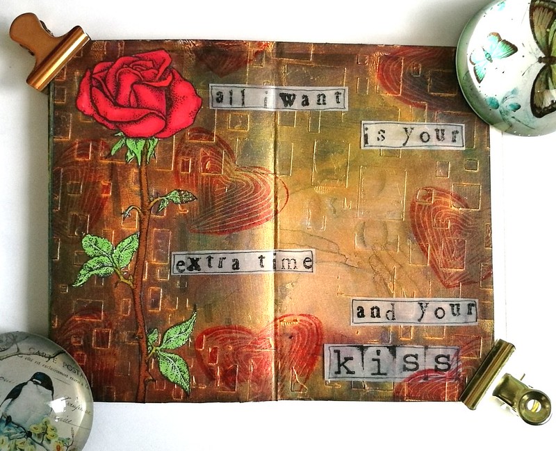
I cut the page to size and glued it to my art journal and added the rose to it. Then got some vellum and stamped some lyrics from a Prince song this image reminded me of; "All I want is your extra time and your.....KISS"
(eta: yeah I know it's "I just" instead of "all I" but I glued it in before I realized the mistake... oh well, it's all part of the process ;)
the kiss

I stamped the hand carved heart stamp a few times for the fun of it and cut and outlined the lyrics and this is what the finished spread looks like :) It's something fun and different and I definitely liked how the rub-ons work on gold gesso. Definitely going to experiment with that more. Also Carmen's Veranda has a this Klimt Kiss as a stamp and see what I made with that over here

And to ring in the weekend fun, let's all sing along to  - Kiss - from Prince :) 

Thank you for stopping by and have a great weekend :)

namasté

2016/10/17

Mailart Monday: The Traveler In You

The traveler in you

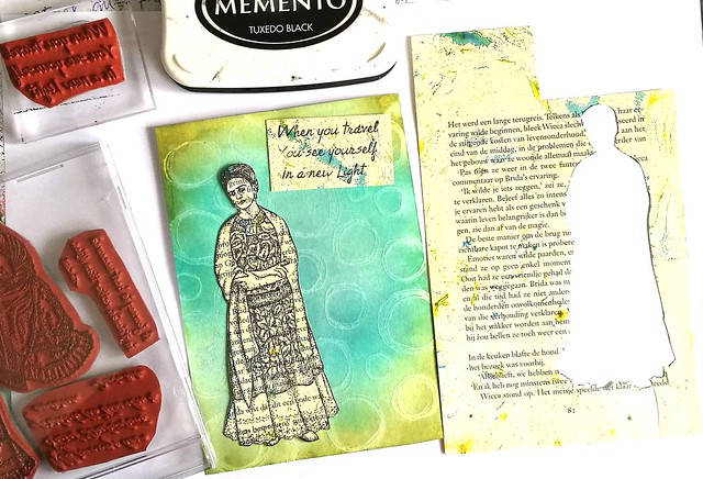
In a few weeks I'll be traveling abroad and I have the "travel bug" in me, counting the days until we hop on the plane and fly off to our destination. In this mailart monday I have made a card combining the Travel Quotes from Lost Coast Designs and that beautiful image of Frida Kahlo from Carmen's Veranda. I stamped those on a marbled bookpage with memento tuxedo black and cut them out. The base of the card is made with stamping the doodle circles background stamp with white pigmented ink from dovecraft on white Neenah Classic Crest paper and heat setting it. Then I took my blending tool and peacock feathers, tumbled glass and peeled paint distress ink pads colored the background. The heat setting of the white pigment ink acted as a resist and the circle doodles showed through nicely.

The traveler in you
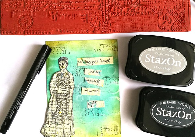
The background needed a bit more interest, so I took one of the grunge border stamps from Loast Coast Designs and stamped a part of the text with StazOn dove grey and stone grey. I cut the text into strips and then decided on the placement.

The traveler in you
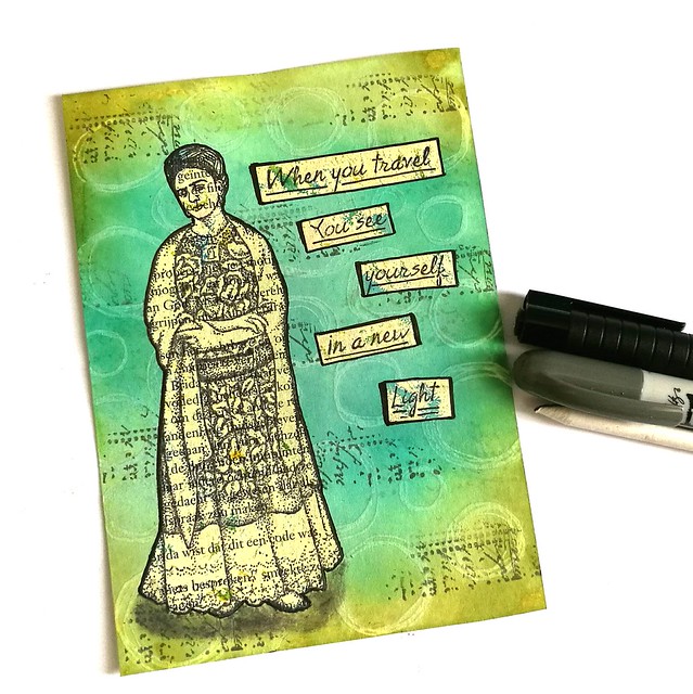
I adhered the text and Frida image to the background and outlined it with the faber castell pitt marker. With the grey distress crayon I made some shadows on the bottom near her feet and blended it, so she looks more grounded to the card.

The traveler in you
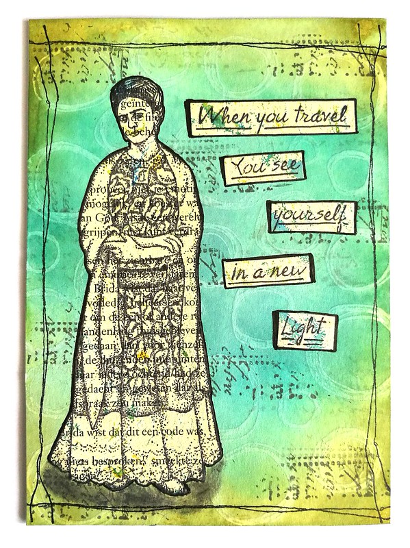
Lastly I created a border with the stitching lines from VLV and adhered the piece to a double sided card and is ready to be mailed out. I can't wait for my next travels to unveil a new light within me :)

Have a great day and thank you for stopping by!

namasté

2016/10/10

Mailart Monday: A Growing Wish

A Growing Wish

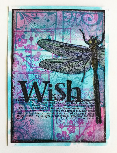
At the facebook group Inkadinkaduchies we have a monthly ATC swap made with stamps mainly from Lost Coast Designs and Carmen's Veranda. I recently received this gorgeous Dragonfly stamp from the More Bugz set and made the above ATC for the swap. I just LOVE dragonflies and wondered why it took me so long to get this stampset to begin with! The theme of this month's swap was "use squares" so it was a great excuse to use my inchie stamps from Inkaddinkadoo for the background. The color combination I chose is aqua/pink and I have used Memento Rosebud and Distress ink Broken China to match. The dragonfly was masked when I made the background with a blending tool and the inchie stamps. When I took off the mask I colored the dragonfly with tombows and blended with a versamarker pen. Then embossed the image with clear embossing so the colors stay bright and the wings look "stained glass" like, to imitate the wings of a real dragonfly. It needed a word, I felt, so went though the Dictionary word stamps  to find a suitable word and settled on "wish". Stamped it with memento black and put some accents on with a sakura stardust gelly roll pen. To finish off I took the black distress crayon and messily outlined the card and matted it on white cardstock which I had put on some broken china distress inks splatters for effect.

A Growing Wish
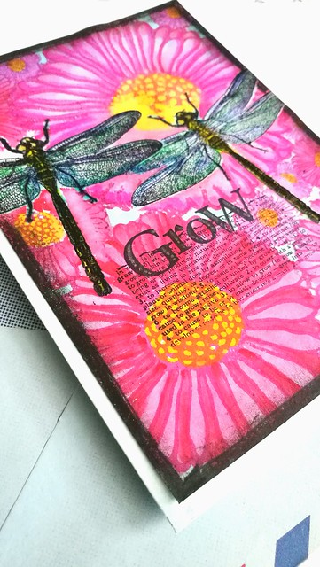
I also wanted to make a note card to go with the ATC. The techniques for this card is the same as with the ATC except for the background I used a larger background stamp, the Doodle Flowers one. Colored those flower petals with tombow markers and my new Zig Clean Color light Carmine which I got from the Artsnacks September Box. The two water based markers blend surprisingly well together. I found the word "grow" from the dictionary stamps very fitting on this card.

A Growing Wish
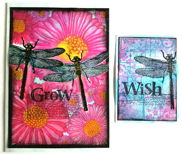
And I must say, the two of them together like this, make a lovely set. I am happy to report my partner found this pleasing to receive as well :) 

Wishing you all a wonderful day!
Thanks for stopping by.

Namasté

2016/09/30

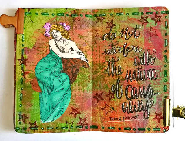
Mini Art Journal: The Nature of Causality

Pocket Art Journal - the nature of causality

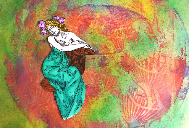
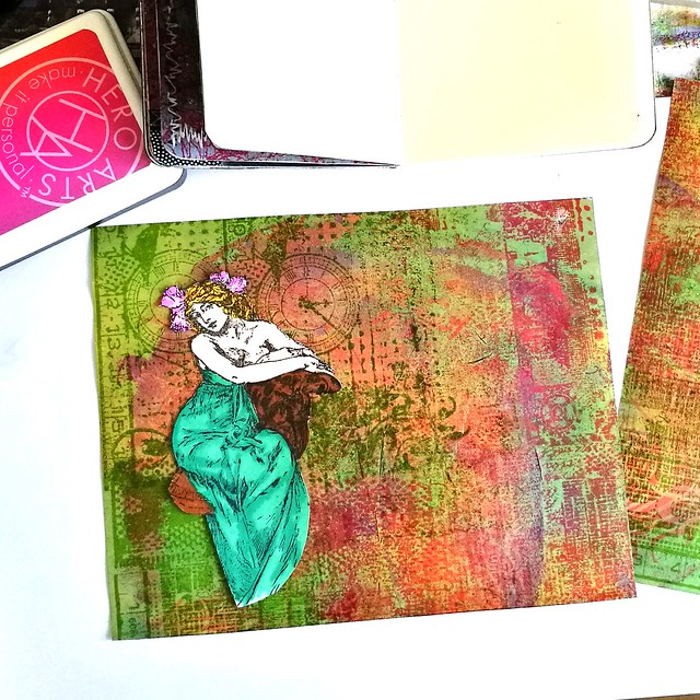
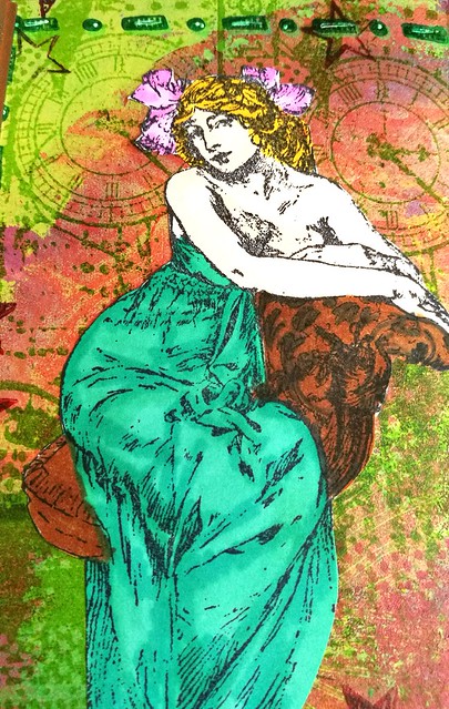
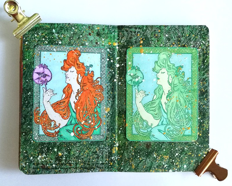
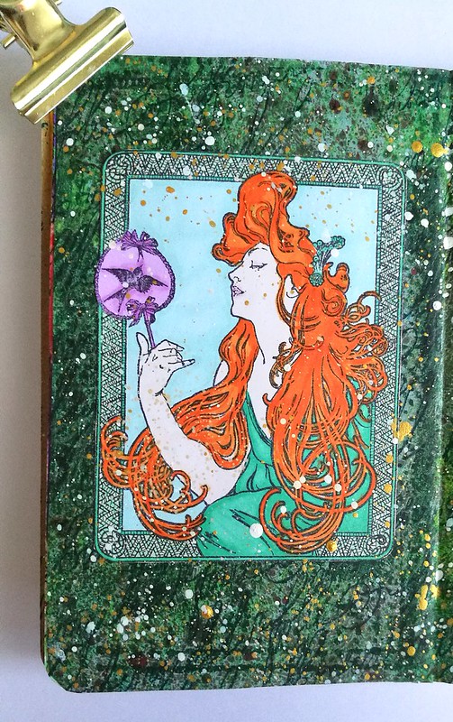
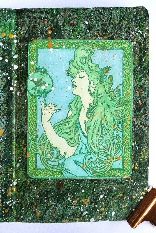
Last week I showed you some results of my gelli printing session using some fun stencils. I have used one in my pocket journal as a base in combination with a wonderful Mucha woman stamp from Lost Coast Designs. I stamped her on sticker paper and colored her in with letraset promarkers.

Pocket Art Journal - the nature of causality
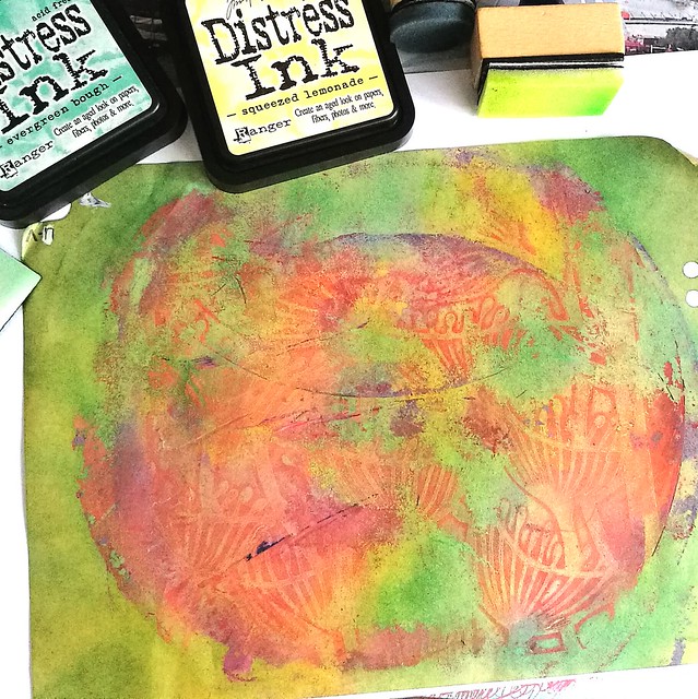
The print I took was the "clean up /dirty print" and I started with adding more color to the page with dabbing distress inks squezed lemonade and evergreen bough on the page with a blending tool. It created a really nice bright background to work on.

Pocket Art Journal - the nature of causality
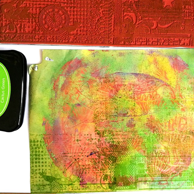
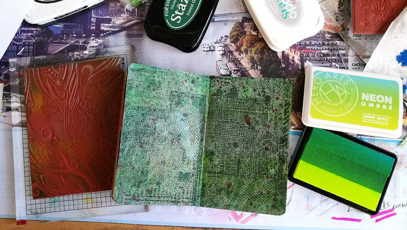
Then I got out the yummy large grunge border stamps to create some texture on the page. I used staz on cactus and forest green and the hero neon ombre sets in green and pinks.

Pocket Art Journal - the nature of causality
I stamped the whole page with both grunge border stamps in alternating colors and when it came to cutting the page to size for my journal, I flipped the page because I liked the look of the clocks right above her head.

Pocket Art Journal - the nature of causality
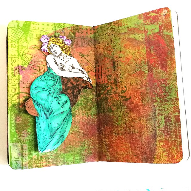
I definitely love how the texture of the background came together. The green aria on the left sort of does look like a couch and I decided to place the lady there.

Pocket Art Journal - the nature of causality
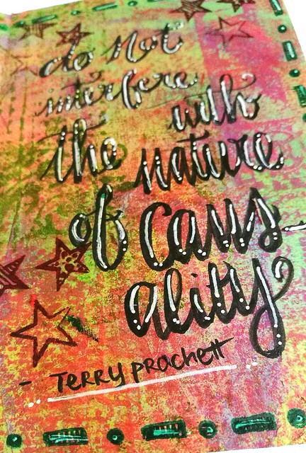
A quote from Terry Pratchett Discworld was added to the right "Do not interfere with the nature of causality" and I found this very fitting with the artistic process.  I had a hard time letting go of the fact that the flower imprint is not distinctly visible anymore as it did in the very first picture of the post. But I still could create a page I was happy with. Sometimes things just happen while you are working on something and it's better to work with it,and not against it. The quote is written with Kuretake Fudenosuke brush soft pen and accentuated with a pentel white gel pen. The border stamp is from Dylusions and the star stamps from studio light.

Pocket Art Journal - the nature of causality
I love promarkers because you can create some lovely shading.

Pocket Art Journal - the nature of causality
Terry Prachett is a wise man!

Have a great weekend and thanks for stopping by.

namasté

2016/09/16

Mini Art Journal: Fortune Teller

Mini Art Journal Fortune Teller
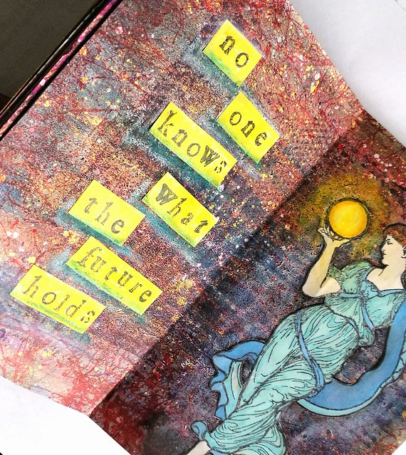
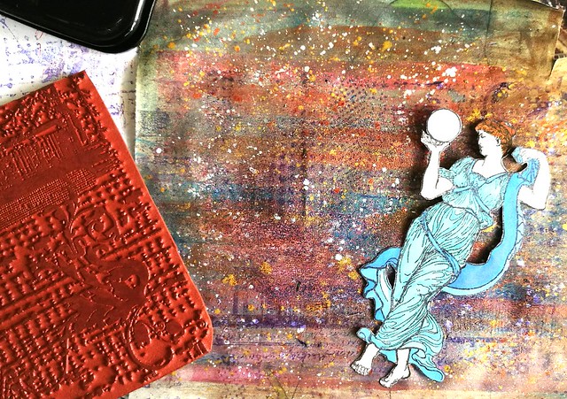
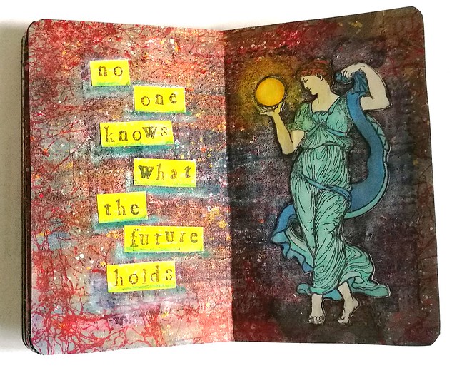
This week in my pocket size art journal, I created another spread using stamps from Lost Coast Designs and I chose this beautiful Mucha woman with Globe image as focal point and depicted her as a fortune teller.

Mini Art Journal Fortune Teller
I stamped her on sticker paper, colored her in with Letraset promarkers and cut her out with tiny sharp scissors. The background is made with different acrylic & metallic paints on which I stamped the Grunge background stamp on with Staz On Violet. 

Mini Art Journal Fortune Teller
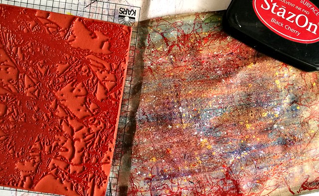
The I took Spray Webbing background stamp and stamped it on the sides with Staz On Cherry black.

Mini Art Journal Fortune Teller
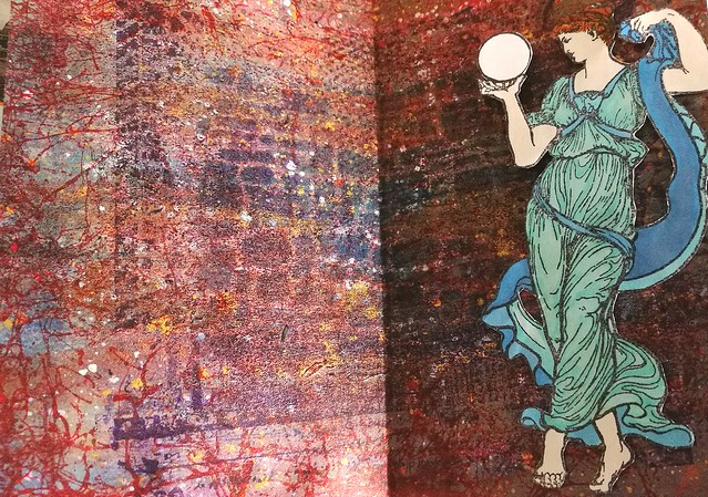
I wanted to have more texture in the middle part so I stamped the grunge background again this time with Staz On dark royal purple which gave a better impression on the paper. I took a brick stencil and Distress ink chipped Sapphire and sponged the ink with a blending tool through the stencil. I liked the effect and cut the background to size and adhered to the journal. I stuck the woman to the right side of the spread as I wanted her to face the left side. 

Mini Art Journal Fortune Teller
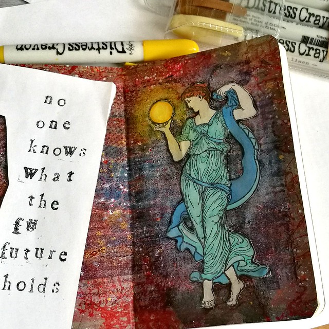
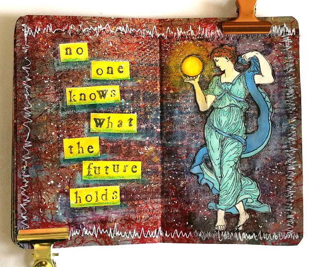
With my distress crayons I made the aria around the woman lighter and near her feet a bit darker. In and around the globe I used yellow tones, to depict a glowing orb. Then I got to work on the left side and stamped "no one knows what the future holds" on sticker paper and cut it into strips.
Mini Art Journal Fortune Teller
Before I adhered it to the page I colored the strips yellow with the distress markers. After I stuck them in I took a blue and white distress marker to underline the words. 

Mini Art Journal Fortune Teller
To finish off the spread I took a black marker and doodled around the edges but that fell flat and I wanted it to pop more. So I got a white gel pen and doodled over the black and though it does pop now I think I made it a bit too busy with the zigzag edges. I did zigzag because i wanted to doodle completely over the black lines, but next time I do it less "fanatically" haha! Anyhow, art journalling is all bout the process and you learn stuff all the time while making things and that is what I love about it.
 This is also my 3rd and final entry for this month's Craft Stamper's September Take it, Make It challenge :)

Thanks for stopping by and hope you will have a fun creative weekend.

namasté

2016/09/09

Mini Art Journal: Imagine

Imagine Art Journal
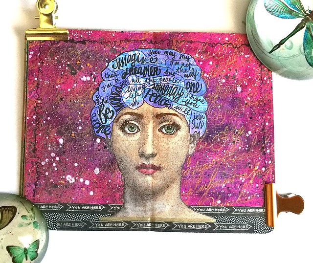
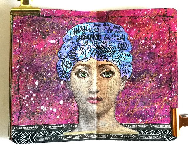
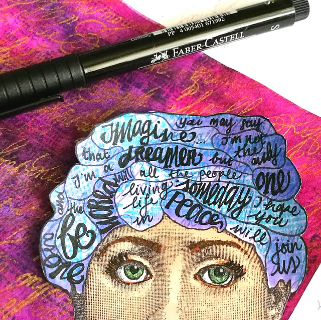
Working in my mini art journal is very gratifying and this week I've made another spread using this wonderful "Franco Face" from Lost Coast Designs as focal point. I had John Lennon's Imagine in my head and created the same thing as what I did with the Walk the Moon song in my large art journal. It did help me get the song out of my head and onto a colorful spread :) More pictures are below to show you the process.

Imagine Art Journal
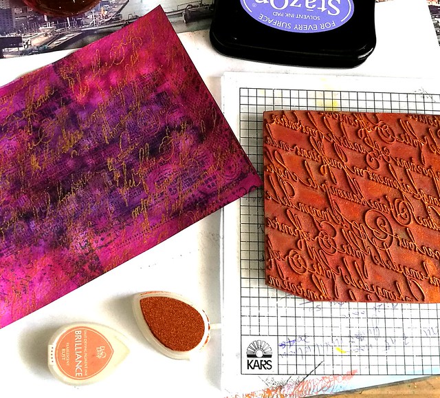
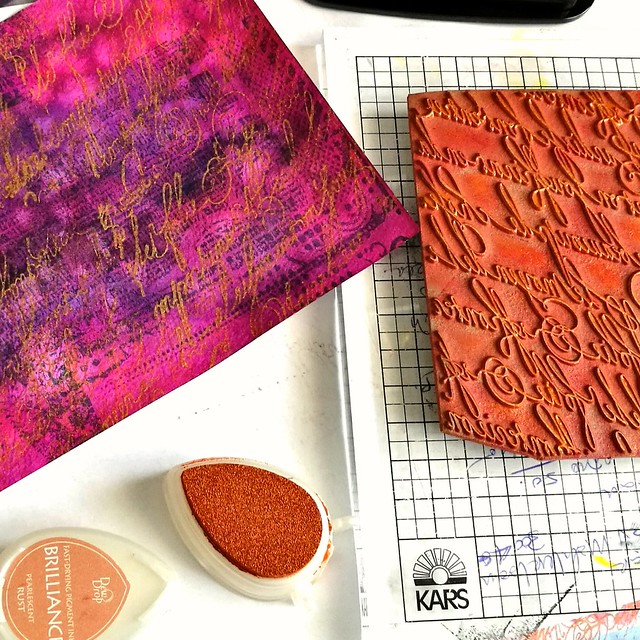
I took an aquarel paper colored with pinks and purples and stamped loopy calligraphy and grunge back ground stamps using memento, staz on and brilliant inks until I was satisfied with the results.
imagine art journal
I love the texture the brilliance rust ink has created on the page.

Imagine Art Journal
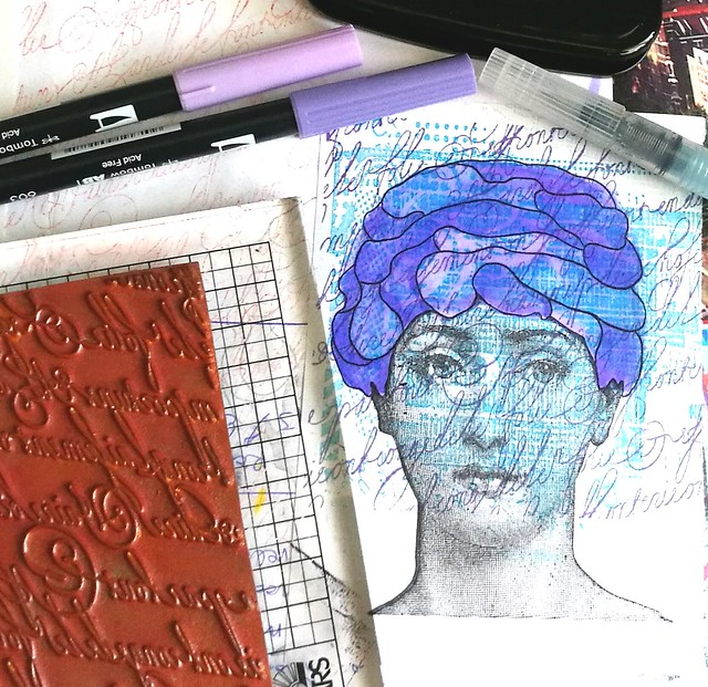
Then I went on to stamp the face on sticker paper, twice. From one I cut off the face part and masked it on the other. Stamped the head with grunge and loopy calligraphy stamps again and colored it in with tombows.

Imagine Art Journal
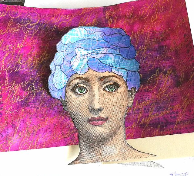
Then I took off the mask and colored the face with promarkers cut her out and decided on the placing in the journal.

Imagine Art Journal
I also made the eyes more expressive by outlining it with the faber castell pitt marker and also used that to write the lyrics with.

Imagine Art Journal
I decided that the background needed some  liquitex Ink spatters and I grounded the face with some washitape. Literally "grounded" with the "you are here" sentiment :)  Made some doodles around the edges and called it done.

I'm also entering this one in this month's Craft Stamper's September Take it, Make it Challenge :) 

Thanks for stopping by and hope you'll have a fun and creative weekend.

namasté

2016/09/03

Mini Art Journal: Frida's Self Portrait

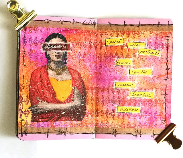
Frida Kahlo art journal

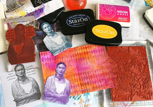
Today I played around with this beautiful Frida Kahlo stamp from Lost Coast Designs in my mini art journal. It's number 3 on the page and it's my personal fave of the bunch. Also because of the quote:

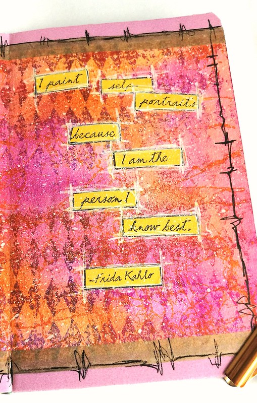
"I paint self portrait's because I am the person I know best"

A beautiful sentiment, because we should all strive to know ourselves better so you can be the best person you can be, right? Well, enough philosophical pondering, let me show you how I made the above spread in my mini art journal.

Frida Kahlo art journal
My desk was a wonderful mess this afternoon. I started off with an already colored piece of aquarel paper in orange and purple/pink tones and stamped on some fun background stamps. I stamped the large diamonds with Hero Neon Ombre in pink/reds and the spray webbing stamp with Staz-on Mustard on the page. It created some nice effects on the page and I went on to choose the right color for the Frida stamp.

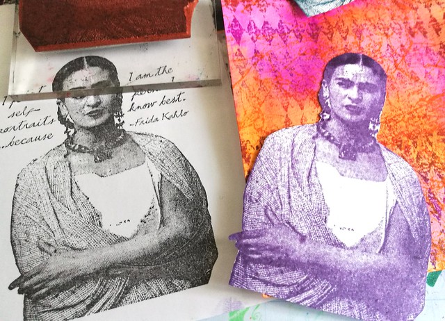
Frida Kahlo art journal
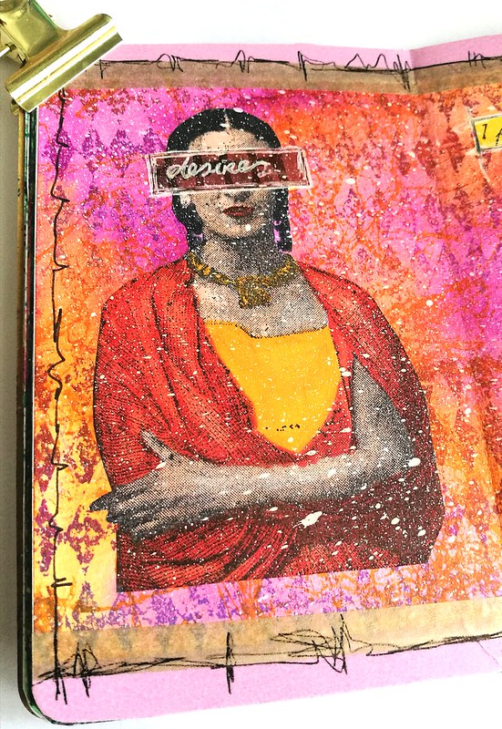
I was thinking about using the one stamped with Staz-on Royal purple, but I went with the memento black one instead because I wanted to color her inwith promarkers.

Frida Kahlo art journal
After coloring her in I cut her out and adhered her to the page (I used sticker paper so no glue needed). I covered her eyes with a left over scrap piece and wrote "desires" on it with a white gel pen. I outlined the scrap first with Faber Castell Pitt artist pen in black and then with the white gel gelpen. I did the same with the quote on the right page.

Frida mini art journal
I didn't do it neatly as you can see, but I thought that gives it some fun interest. Then I got some white Liquitex INK! fluid acrylic paint and a toothbrush andsparrted some paint on the page. 

Frida Kahlo art journal
Since the page was smaller than the pocket journal, I added some washi tape on top and bottom and doodled around the edges to finish it off. I love how the colors just pop out from the page. 

With this page I am entering the Craft Stamper's September Challenge, Take it, make it Anything goes. 

Thanks for stopping by and have a great weekend.

namasté 

2016/08/20

Mini Art Journal - Poison Ivy

poison ivy mini art journal

After weeks of feeling crappy and not having the energy to do much creatively, I finally made an effort today to make something in my mini art journal. I sorta had to as this is my day to post an inspiration page on the Inkadinkadutchies FB page with stamps from Lost Coast Designs. I got inspired by "Fan Girl" which is the main image I used for my spread. I love the art deco swirls and wanted to depict her like the comic character Poison Ivy. I did two takes on her, stamped her on 160gms white stamping paper first with memento black and the second with cotton ivy green. I colored her in with Letraset Tria Promarkers as with the detailler tip you can really get into the swirls of the hair. Some close up pictures:

poison ivy mini art journal

Poison Ivy originally has red hair. But in some versions she is also completely green. Like the depiction below.

poison ivy mini art journal

I cut the images out and adhered then to the background made out of lot of different layers: marbled page on which I stamped the Grunge, loopy calligraphy and fruit pods background stamps in various colors of green and dark blue. I also love my new OMBRE stamp pad from HeroArts.

poison ivy mini art journal

In the end I also spattered some liquid acrylics from Liquitex INKS! in white and gold to give the page more interest. I'm really happy how it turned out :) How wonderful it was to spend some time in my art room again!

Thanks for stopping by and have a great weekend!

Namasté

PS: Also don't forget my Masterboard Mailart Giveway ends tomorrow! Just leave a comment at the blogpost to be entered for the giveaway :)

2016/05/16

Mailart Monday - Fly and Float Intuitively

Mail Art 031-2016
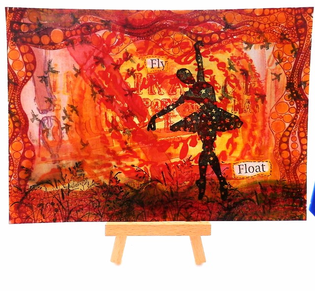
This mail art piece is made with a test page for stencils and rubber stamps. This is what you can call 'intuitive mail art'; just take something you have lying as a test piece and see where your mind takes you to make of it. 
I used this test page for a few stencilgirl stencils in my art journal, the Carmen's Veranda background flying birds for my Film Noir series, the Lost Coast Designs ATC Shrubbery background for the Day ATC and the bubbles border for the Circle ATC swap, but in the end I decided to use a different circle border instead. I began with stamping the border on all the sides to make a frame. Then I added color to the background, diluted Sailor Jentle Apricot fountainpen ink to the center circle and within the circle border (not diluted). Interesting fact, the ink mixed with part of the shrubbery stamp on the bottom and turned into a greenish color. Due to the border stamp it looks like a rolling hill. I stamped the shrubbery piece through out the bottom to accentuate the hilly look and then I thought "I have the perfect stamp to place on that hill!" The gorgeous Ballerina with stars silhouette stamp came to mind. I stamped her with Staz-on black, it looks like she is floating on the hill. The awesome new Miscl. word set from LCD actually contain the words "fly"and "float" - I stamped the large words piece on tracing paper, ripped out these words, adhered it, colored the edges with the apricot color and doodles a border around it with a black steadtler fineliner and called this piece done :) I really love the airy feel this piece has. And this was definitely fun to do!

By the way, if you are in the EU, the LCD and CV stamps are available through Inkadinkadutchies. Just send them a note through the contact page if they are not listed on the website.

Thanks for stopping by and have a great day :)

namasté
2016/05/09

Mailart Monday - Film Noir

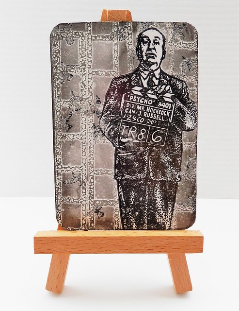
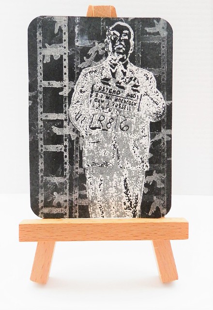
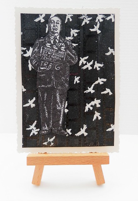
The theme for our monthly ATC swap at Inkadinkadutchies was black and white this month. As you know, I really love color so it was quite a challenge for me. But I had an idea and have the perfect stamps from Lost Coast Designs and Carmen's Veranda to execute this. I made a series of 2 ATC's and a note card called "Film Noir"

Mail Art 034-2016
The first ATC I made on photo paper. I stamped Hitchcock with staz-on black, masked it, stamped the birds and film strip with versamark and embossed it with WOW white embossing powder. Then I used black pear luster to give some shadow and definition. Rounded off the corners with a corner punch and that's it.

Mail Art 035-2016
For the second ATC I used black paper and staz-on opaque and Brilliance white to stamp the stamps on. I embossed a few accents on Hitchcock with the white embossing powder and used white pearl luster for accents on the back ground. Then also rounded off the corners with the punch.

Mail Art 036-2016
I made a card to accompany the set. Using black background and stamped the film border with versamark and embossed it with clear embossing powder. Then I stamped the birds stamp over it with versamark and embossed it with white powder.  The Hitchcock  I stamped on a separate piece of paper with memento black and cut out and adhered on top. Matted the piece on white glossy card stock and cut the edges with a figure scissor. The white specs in the background are from embossing powder that clung to the paper and got embossed too. I think it gives it a nice distressed effect :)

Quite pleased how these all turned out! With just a few stamps you can make such different things and you don't even need color! It was definitely a fun challenge for me. 

The stamps I used are Lost Coast Designs Filmstrip Border, Carmen's Veranda Flying Birds background and Carmen's Veranda Standing Alfred Hitchcock.

Our next ATC swap at Inkadinkadutchies is "put a word on it" and you can sign up by joining the swap on the events page. You can use any stamps from Lost Coast Designs and/or Carmen's Veranda in your project (a minimal of one). If you live in the EU you can order them through Inkadinkadutchies webshop, if there are stamps not on the site they can be special ordered for you. Just use their contact form
Hope you'll join us at the next swap :)
Thanks for stopping by!
namasté  
2016/04/25

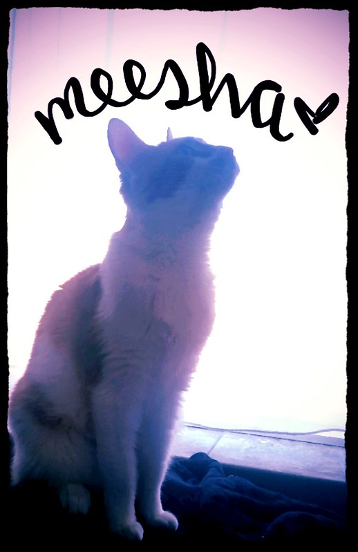
Meesha Mailart Monday - the birthday edition

Meesha

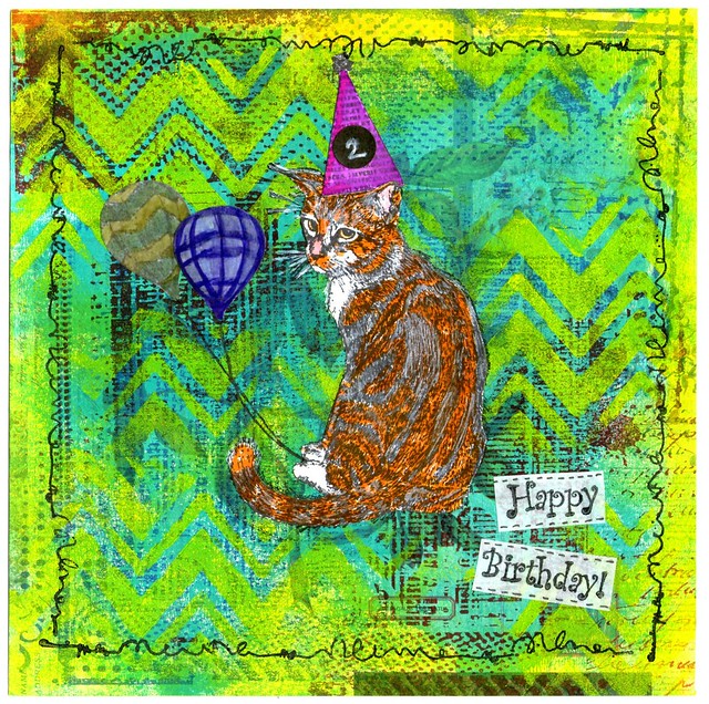
A little over 2 months ago this little cutie came into our lives. From the get go she was a sweet and curious kitty and we are grateful to have her in our lives. Today she turns 2 years old and we are celebrating that with a Meesha Mailart Monday post today :) 

meesha birthday card
I started out on applying amsterdam aqua paint on scrapbook paper with help from a brayer. It gave the page a lovely base color and images from the paper shows through slightly which makes it more interesting. Then I stamped Carmen's Veranda's Grunge Back Ground stamp in parts on each of the corners alternating with Hydregena blue and Cherry red ink from Staz-On. I placed a zig-zag stencil over it and dabbed on yellow Amsterdam paint through it. I also smudged the edges with yellow paint. The Lost Coast Designs cat stamp and other elements I stamped on a separate paper and I colored with Tombow markers and cut out. I also stamped the cat in the middle of the page to get the furry part and whiskers on. Adhered the cut out pieces over it and added some white with a gel pen over whiskers and the black parts of the fur. The hat is from party hat set, I stuck on a sticker over the 1 and added 2 with a white gel pen. The balloons are from"balloons over Alberquerque" stamp and doodled the strings with a black marker. Stamped the sentiment Happy Birthday from "Party Words" on white paper with staz-on black, cut out, adhered to the page and doodled on the edges. To finish it off I stamped a doodle boarder stamp on the edges of the piece.
If you are in the EU, the LCD and CV stamps are available through Inkadinkadutchies. Just send them a note through the contact page if they are not listed on the website. 
 
I love how this piece came together and the kitty sorta does resemble Messha a bit :)

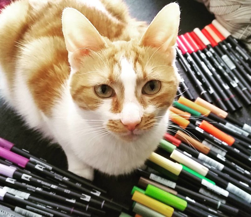
When I was organizing my Tombow dual brushpens the other day Messha was a sweetie and helped me out :)

My cute little helper 😻 #meeshathecat #meesha #colorcoordination #tombowmarkers #tombow #tombowusa #tombowbrushpen #craftyendeavors #craftmaterials #craftygirl
And more cute kitty picture below!

2016/04/11

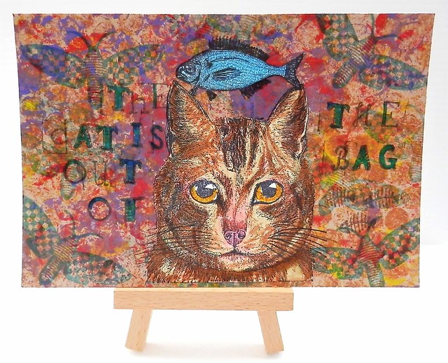
Mailart Monday - the cat is out of the bag

Mail Art 020-2016
A cat themed mail art postcard for this week's mailart monday. This was sent to my partner at Swapbot for the 'put a Cat on it' swap at Handmade Postcards Club. The background is a craft paper bag cut out and I stamped on it with acrylic paints and a piece of bubble wrap. Then I stamped a moth stamp by Paper Artsy hotpicks on it a few times with Staz-on Teal. The cat stamp is from Lost Coast Designs and I stamped it on a separate piece of paper. It has a bird on its head it but I cut that away. I colored it in by using fountain pen inks, I used pelikan brown and Pilot Iroshisuku Ina-Ho for the lighter parts of the cat face. Sailor Apricot for the eyes and a bit of Pilot red (diluted) for the nose. I adhered the image to the background and then drew some more whiskers on her with a fineliner (steadtler micron pens). Also added some shading around the ears. The fish above the cat head is also from Lost Coast Designs. It's a snail mail stamp "sealed with a FISH" but I obviously only used the fish part. The letter stamps are from Hema, which I colored with a turquoise sharpie. I found small a herringbone stamp which I didn't know I have (no idea which company, sorry!) and that just completed the image.

These LCD stamps you can also order through Inkadinkadutchies if you are in the EU. Just use their contact page is it's not listed on the website.
See more great postcards sent from the group members at this flickr photo page. Some awesome mail art is being displayed there!

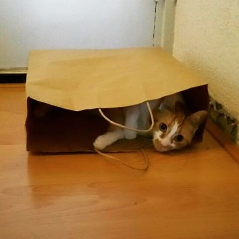
And I leave you with a cute picture of Meesha, the cat in the bag ;)
Playing hide and seek #meeshathecat #meesha #cutenessoverload #catsofinstagram #catshatemondays #thecatisoutofthebag #thecatisinthebag #hideandseek #kitty #cats

Thanks for stopping by!
Have a great week!
namasté