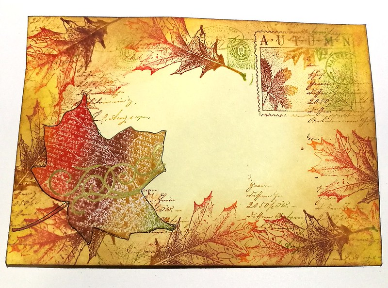
Not sure if you have noticed but my Mail Art Monday section has been quiet lately but today I finally had some mojo back to decorate an envelope as I also finally was getting some snail mail ready for a friend. So I thought I would share it right away as well, seeing the last days of autumn are nearing...it's getting colder and slowly the grey tones are taking over from these lovely amber tones. The base is an ivory envelope and I took a few autumn leaf stamps with a script stamp and just build from there.
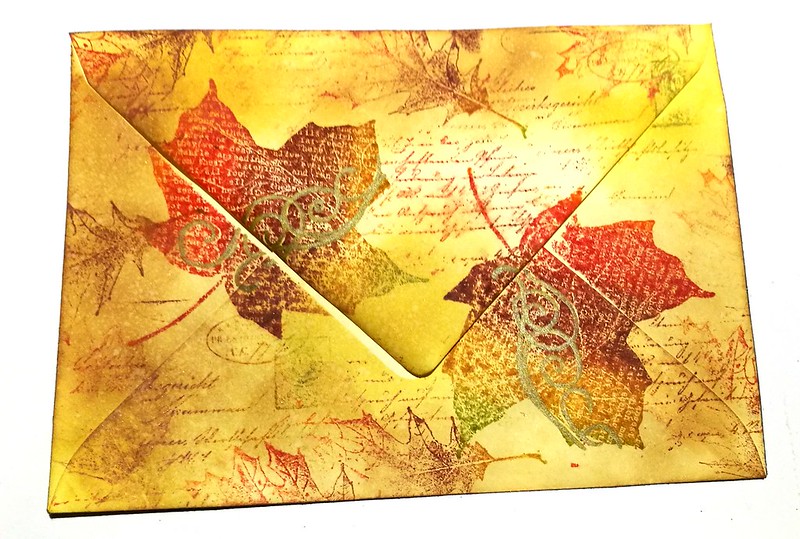
And this is the back of the envelope. I used a few distress oxides to blend inwards and added come accents with a gold marker. I edged the envelope with memento cocoa ink and called it done. It took under 15 minutes to make, a nice and quick envie to get my mail art juices flowing again.
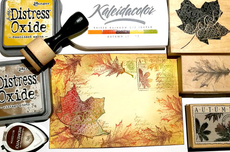
These are stamps and tools I used. Only think missing is the script stamp from Paper Artsy. From top to bottom the stamps are from Impression Obsession, Inkadinkadoo and Hero Arts.
Thanks for stopping by and hope you all are enjoying the last days of autumn as well.
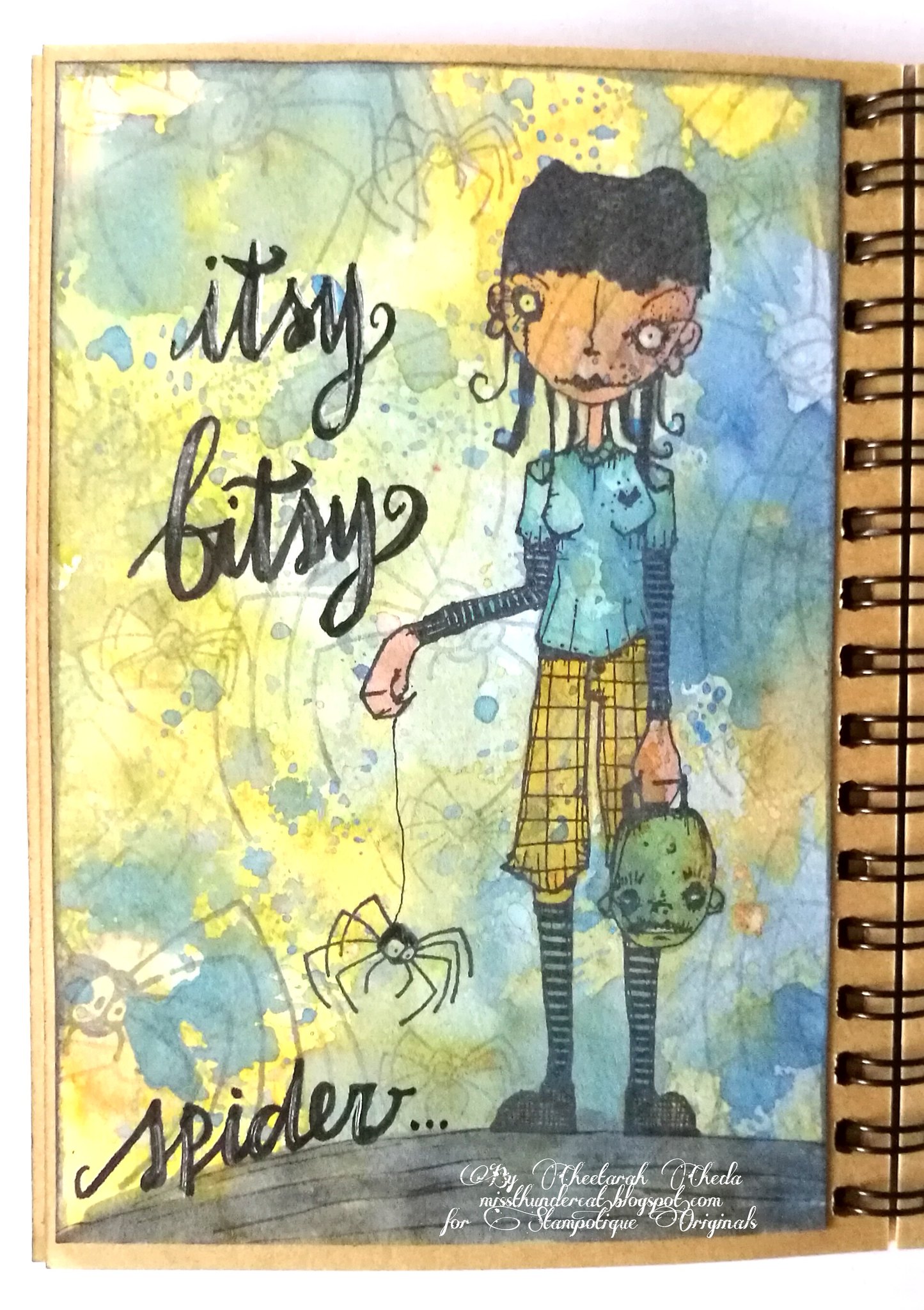
This pocket art journal page has a distress Oxide base. I still love making colorful backgrounds with those inks! It's another one layer page in which I have used this fun Spider stamp and as it has a smaller one on the side, I made Linda hold that one from her hand. The larger one is stamped on the background for some fun effect. The coloring is done with alcohol and faber castell pitt markers and the lettering with a Tombow Fudenosuke brush pen (with white gel pen accents)
It's the second week of our Anything but a card Challenge and you are invited to play along. You can link your project on the blog HERE or on our FB group album HERE.
IMPORTANT REMINDER:
Please read ALL RULES on the linkz page before linking your creation.
Remember - you can enter our challenge twice, as long as your using two different projects. :)
Twice the chance to win too.
In case you wanted to order stamps directly from Stampotique the following notice is up:
CLOSURE NOTICE: Stampotique will be closed for a few weeks beginning October 6th, 2017. In order to assure that your order will be shipped before we leave, the order must be received by September 6th 2017..... Any orders after that date will be processed when we return. Thank you for your understanding.
Thanks for stopping by and have a wonderful weekend!
Hey you all, it's my turn at the VLVS! blog today and I'm sharing a tutorial for this mail art envelope I have made, based on out inspiration challenge photo. We want to inspire you with fall colors and themes this month. So hop on over to my blog post, to see the steps on how to make this cute foxy envelope for your snail mail friends :)
Thank you for stopping by and have a wonderful day!
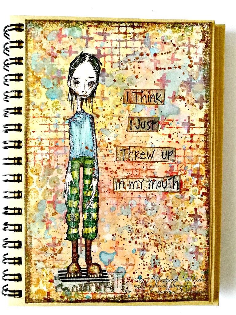
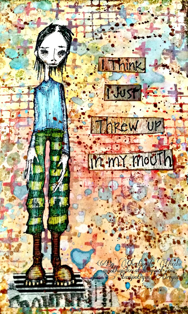
It's the 1st of the new month and that means it's New Release day at Stampotique Originals!! There are 6 new images out and I'll be showcasing them for you this coming week. I'm starting off with a design by Daniel Torrente and he is called Blackeyed. I think he's wonderfully morose looking and I have paired him up with a phrase from Terri Ridchardson from last month's release. I just love the sarcasm and witty humor the cube phrases have. Normally this phrase would be used in a negative setting, ie when someone dislikes something, but I used it in another way, like how excited are you for the new stamp releases? Yep, so excited I think I just threw up in my mouth ;)
Blackeyed was colored with alcohol letraset markers and fussy cut and adhered to the background. Which I made on a Distress Oxide base and stamped on with Kate's Texture Cube with my Kalaeida colors ink pad in fall colors. By the way, you can read here how I made the backgrounds with Distress Oxides.
Hope you are excited for the new releases as we are :) Come check out our facebook page where we share more images of the new releases and also check out our challenges at the Challenge blog. This fortnight's challenge is "backgrounds" and next week I'll share an inspiration for that too (but hopefully this also inspired you to make some fun backgrounds with our fun textures stamps and oxides :)
Thanks for stopping by and have a wonderful weekend!
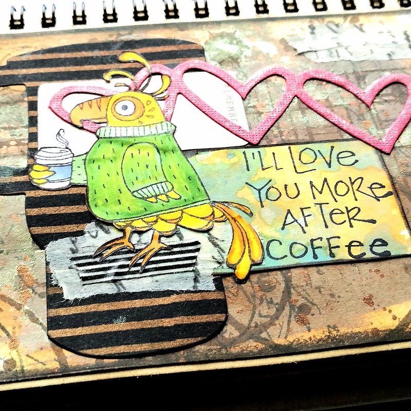
Today I wanted to share a fun page I created in my spiral pocket art journal. I incorporated a bunch of different elements and experimenting with a little scrapbook lay-out style. Most of the elements I used are combined from different projects out of my "lefTOVERS-scrap box".
The background is made with Distress Oxide, I still have so many left from my very first play session with them, and stamped on it Indigo Blu Ledger, Tim Holz Coffee Rings and splatters, Large VLVS! Coffee rings and Joy Crafts script stamp. All stamped with Java dye ink from Ranger. Then I sprayed some Kiwi perfect pearl mist over it. IRL it does shine a lot more.
Then I built up the layers using die cuts, the coffee mug is from Stamplorations and one I cut from this project, some left over hearts from this project and used some left over papers from yesterday's project to stamp the sentiment on. Which is, as well as the bird, from Stampotique Originals.
I put in a little "remember" tag before the sentiment to make it a sentence. The bird is colored with letraset promarkers on sticker paper and fussy cut out.
I grounded Cocoa Bird on some washi tape and tape a little bit on the right top corner for some balance. Gave the hearts some shimmer with a wink of stella marker and called it done. I really love this page as I imagined the bird being a parrot, echoing this to people who want to talk to me before I had my morning coffee :D
Entering this journal page in the following challenges:
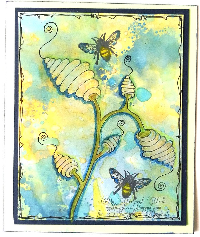
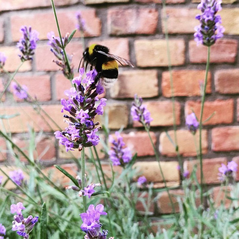
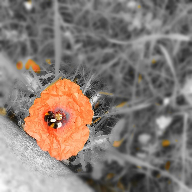
It's hard to choose a favorite among the august new releases as they are all super fun to work with, but the Hive Flower by Arwen McCullen would be my fave. Here I made a little note card and stamped it on a piece of Distress Oxidized backgroud. This was a combination of blue and green inks and I just love how these inks work so well together. I colored the flower with my Caran d'ache Pablo's and stamped the little bees on it which I then colored with Wink of stella markers for some shimmer. The edges are doodled with a Faber Castell Pitt marker. I just LOVE the combination of the bees and the hive flower! I also have been spotting bees back in the city again which is great! These little creatures do have a hard time and I am happy to see them in unexpected places.
In a small little lavender garden along the side walk...
and in poppies at the side of the tram/bus stop. I've read our country is making an effort to plant more flowers near the highway (the Honey Highway initiative) and are now initiatives in the city (like in Amsterdam) to plant flowers near tram stops to attract more honey bees to do their work. It's a beautiful effort which I hope will spread to other cities as well.
So an ode to the honey bee here for our SDC279 challenge in which you are invited to use animals/insects etc in your designs. There is also some exciting news which are going to be implemented from now on for the challenge;
People have been asking SODC to let them join our challenges on our Facebook group. Well, we are listening!! You can now join in our challenges on our Facebook group. We will be creating a photo album for each challenge, all you need to do is add your project to the proper photo album in order to join. We do encourage you to add your creations here on the blog but if you don't have a blog or don't know how to upload your photos to this blog, you can now join on Facebook.
So now there are two ways to join in and I hope you will join this fortnight's challenge as well :)
Hi everyone! I have a post over at Viva Las VegaStamps! blog as a bit of inspiration for our July challenge. I have made the above ICAD (index card a day is a challenge that runs every summer in June and July) and while I am not participating this year, our challenge inspiration prompt is summer and the ICAD is always a summer activity so I thought it would be fitting to make one :)
I have also filmed the process, so be sure to check out that video as well to see how I created this piece.
Thanks so much for stopping by and hope you have an awesome day!
Hey everyone! A little something special for this weeks Mail Art Monday! I'm over at Viva las VegaStamps! blog with a tutorial on these mail art envies I made.
And it's not just a tutorial, it's a video tutorial where you can see exactly how I created these envies :) So hop on over my VLVS! blogpost to check it out and to read which lush VLVS! rubber stamps I used.
In other good news, I've got a 4 page article in the new "musings" section on my Mail Art published in the June/July issue of MixedUpMag, which I am super excited about! It's a digital magazine and available for you to read on any multimedia format via pocketmags. I've showcased some work, talked about how i got started and also listed some tips on how you van get started in Mail Art as well, so be sure to check that out :) Here's a little sneaky for you what is in issue 7:
If you've read my article/seen the video, let me know what you think :)
Thanks again for stopping by and your support means a lot to me!
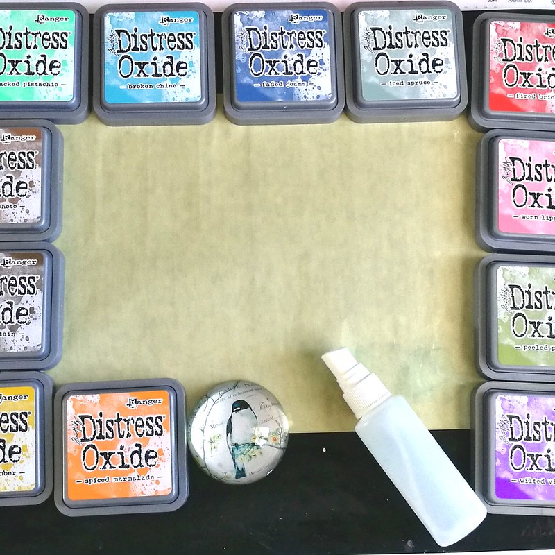
A couple of weeks ago I finally had some time to play with my Oxides inks which I got at Hobby Compleet de Duif at Art Specially earlier this month. I may be late to the party and I'm sure you by now have heard all about these products so no in depth review from me, just a few things I have noticed while playing about with them. So I got my craft sheet, oxides, water spritzer and heat tool ready to play!
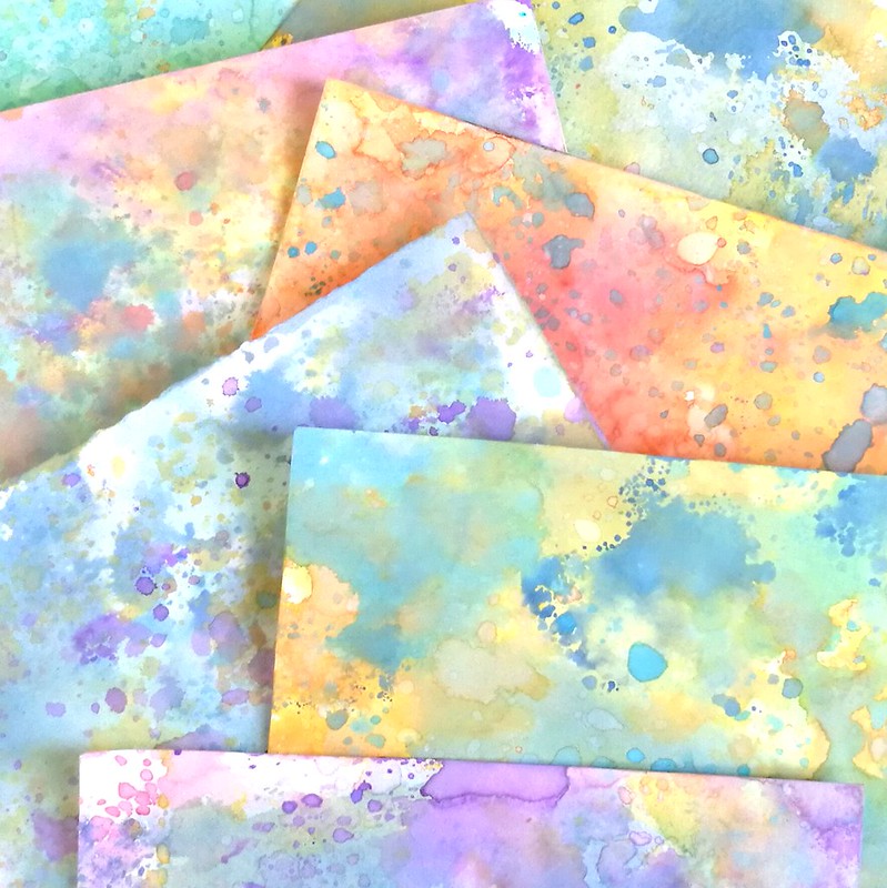
These are the background I have made after just one play session and I can say that I am absolutely in love with these. You can make amazingly colorful back grounds with wonderful layered colors. The inks do not get muddy as they would with regular distress inks when you're layering. The colors stay crisp and have an interesting effect. Some papers work better than others and I found using water color paper you'll get a crisper look than if you would on regular card stock, but both have a fun effect. The effect changes with the amount of water you use but they all finish with a soft suede like feel to it. For more info on the inks and on how to layer them, see this great video on how Tim Holtz does it at CHA. It's super fun just to lay on color and De-stress and play!
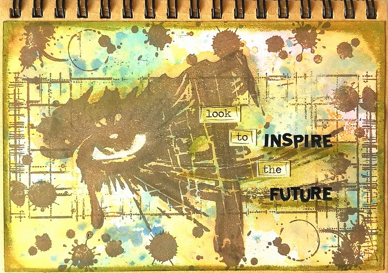
I took a few backgrounds and stamped these indigo blu stamps on them, with ranger dye ink java brown and it already has a stunning effect like this.
I finished a couple of pages for my journal with these tests and the above page I only added white gel pen and accents with peeled paint distress crayon. Some chit chat stickers and letter stickers to form "look to inspire the future" .
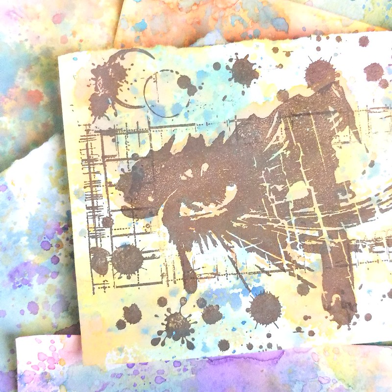
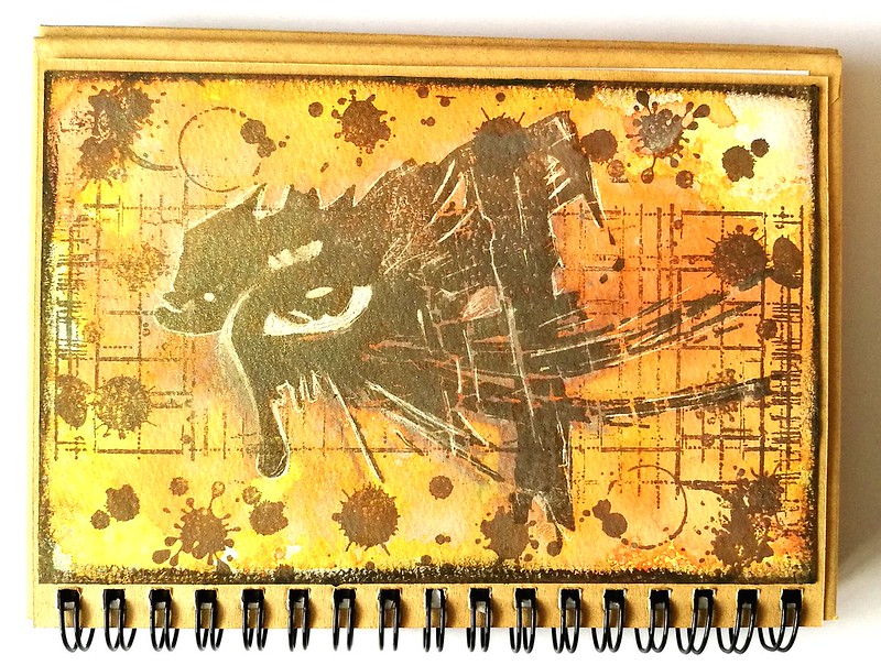
The second experiment was stamping the eye stamp with Walnut Stain oxide directly onto water color paper and spritz water all over it. That sort of dissolved the image into a blurry mess BUT the spiced marmelade orange background, remained bright and orange. I dried the page and stamped the image again with the ranger Java dye ink and accentuated with walnut stain distress crayon and a white gel pen.
Definitely loving these effects and there are so many more ways to use them too. Jennifer McGuire has a very useful blogpost and video about it here. I loved seeing how she creates some stunning cards with these inks! Looking forward to use these inks in my upcoming projects!
Well as I hinted last Friday, last weekend was spent at the wonderful Art Specially event in Nijkerk. My lovely husband came with me (both days) to share in the crazy fun and also to make sure I didn't spend too much. Well the latter spectacularly failed, haha! But we definitely had crazy fun!
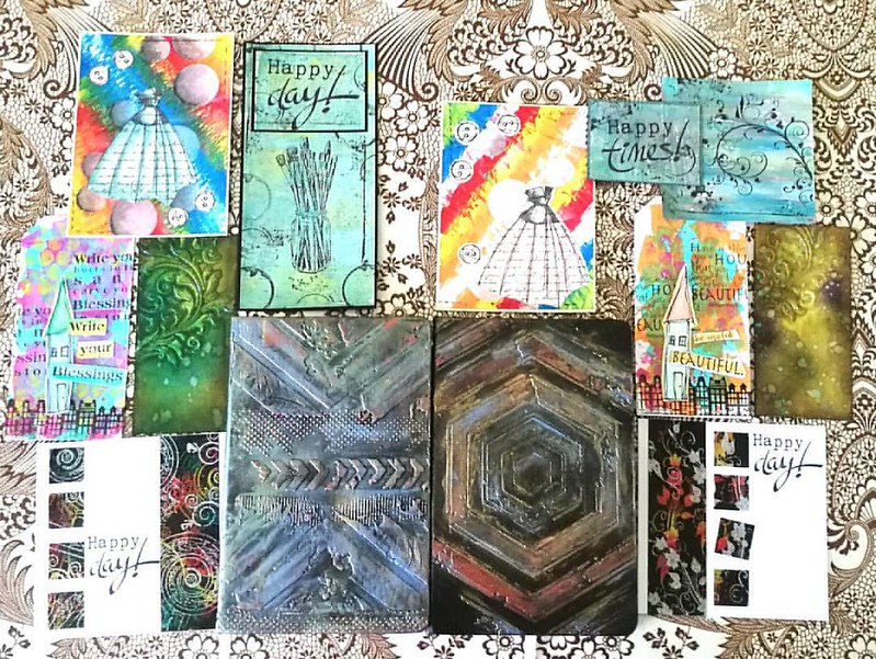
There were a lot of workshops/make and takes were offered this year again but we only had time for a selection. Also there were lines for the very popular workshops, like the notebook decoration by Papillon Hobby. We sat in line for 1 1/2 hours for that one. It's good to have a buddy with you so you can take turns in waiting. It was well worth the wait and fun to use a new to me product; Cadence brands wax, stencils and media. We also had workshops with Dylusions paints (dress card), paper artsy and infusions powders on gelli plate (the Happy cards), Dina Wakley paints (the house tags), Distress ink layering (swirl tag) and dual emboss resist technique (the happy day card).
On the left works I made and on the right the works my husband made. He got a lot of fun comments on being one of the few guys there attending the workshops :) I learned a lot these two days and I can't wait to implement some of these fun techniques in my own works. And I learned a great way to customize my Rhodia/Leuchtturm notebook!
The trends/pushed products on the event this year were: Distress Oxides, Cadence products (seriously almost every stand was pushing this new brand!), Pan Pastel, alcohol ink on yupo and gilding wax/faux metallic effects. I managed to resist buying a few of these pushed products, like the gilding wax, but also came home with a great deal of other things.
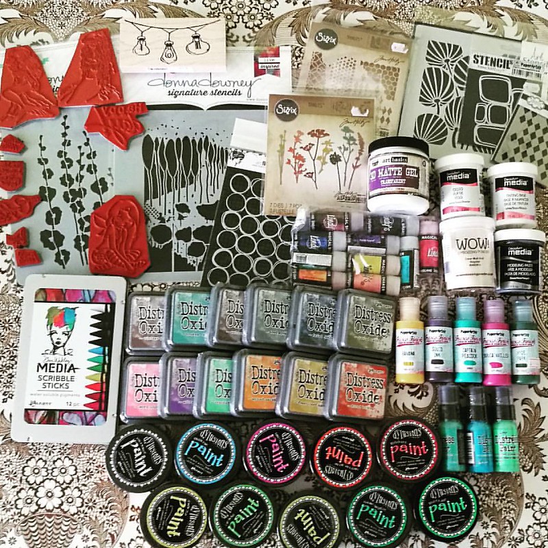
Well... like I said, not spending too much has spectacularly failed this year! So happy this is just a yearly event! I had pre-ordered the Distress Oxides and saw Corrie Herriman live doing a demo with them at Hobby Compleet de Duif stand. I'm really excited to give them a whirl! I also pre-ordered the Lindy's magical shakers and am very happy to have found the Scribble Sticks. I'll to a comparison of both those products with similar products because I am curious on the differences between them. Will of course share my findings with you. All the paints and deco arts media were on sale and well since I love a good sale and wanted to have the dylusions paints for a while, so I went for it! A bit light on the stamps this year around, but that´s because I had my eye on different media to try out. You gotta make choices somewhere right? ;)
My husband also made some purchases and went for a set of ZIG's Clean color brush set