Showing posts with label donna downey. Show all posts

2018/07/27

Art Journal: The 8th Chakra

The 8th chakra - completed

This Art Journal page emerged organically from an intuitive art session. And while creating it I also had no idea that the 8th chakra was actually a thing but doing some research after I created this page, apparently it is something I have been working on the past 3 years without realizing I was doing so.
 I played with different materials to explore a resist technique and then wanted to use the symbol 8 from a stencil and add a face to it and she just naturally came into being. Truly amazing!

See more of the process ...

2017/06/23

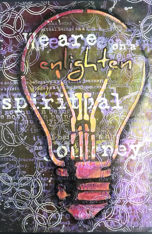
Art Journal: Enlighten we are on a spiritual journey

Art journal: spiritual journey

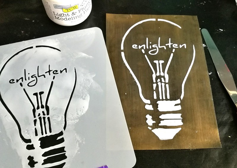
Today I would like to show you an experiment in my art journal using heat embossing over modeling paste. I've used the enlighten stencil from Donna Downey Studio's as my focal point in combination with this amazing Journey Collage stamp from Stampotique Originals.

Enlighten

I started off by prepping an A5 page with black and gold gesso from The Crafter's Workshop. Then I took my pallet knife and scraped some light and fluffy modeling paste (also from TCW)  through the stencil. I let this dry really well.

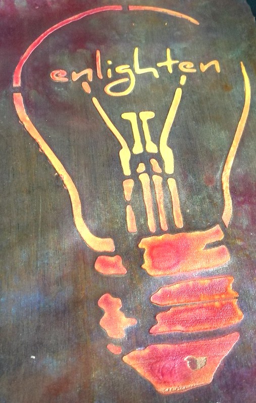
Enlighten
To add some color I sprayed some Dylusions sprays in yellow and red over it and some perfect pearl glimmer mist too. It gives the gesso's background also a really beautiful shimmery shine.

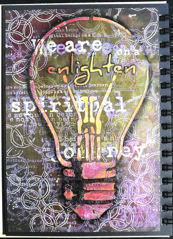
Art journal: spiritual journey
Sadly I don't have a in between photo of the embossed parts, because I had to work quickly but patiently not to over heat anything. I first stamped Carabelle Studio effervescence stamp and the Journey Collage stamp by Stampotique Originals with versamark and interference violet  WOW embossing powder over it. I heat set everything with my heating tool in parts making sure things didn't bubble up.  Then I took the effervescence stamp and stamped with versamark again on the corners and embossed with Opaque white embossing powder. I did the same thing with the words "we are on a spiritual journey" to emphasize that sentiment. When everything was heat set I spayed more sunshine yellow dylusions spray on the bulb and added neocolor in back for outline and shading. The word enlighten is outlines with a black posca marker. It's a gorgeous shimmery page in real life and I just love this mindful art journal page. 

I would love to enter this art journal page in the following challenges: 


Combining #32 and #36 of this past year's challenges


Thanks so much for stopping by and have a wonderful weekend!


2017/05/09

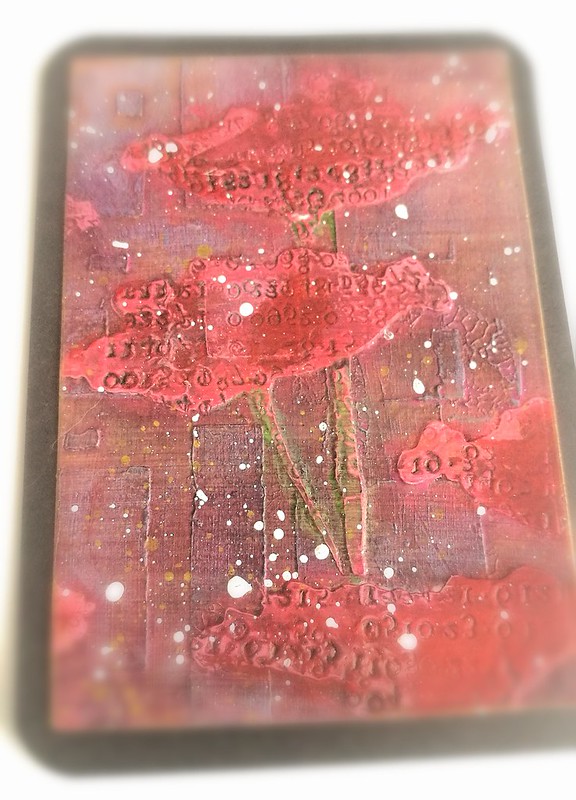
ATC: Poppy Fields

poppy fields ATC

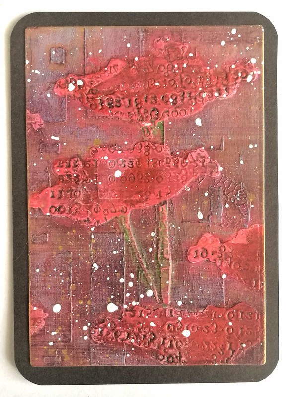
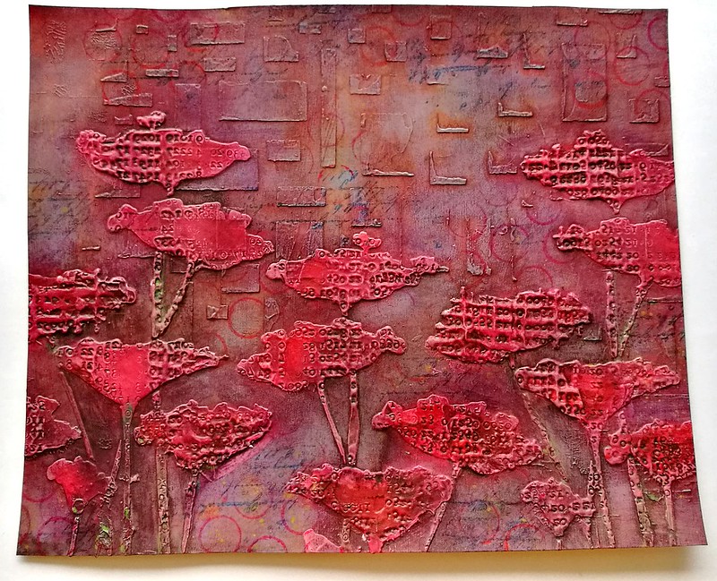
April showers and May brings flowers... at least that is the theory, because it still showers in this part of the world! Well, there are a lot of flower ATC's going on on Swap-Bot and this is the one I sent to my partner for a Mixed Media flower swap. I sorta cheated... or well, made creative use of what I had, because.... doesn't the above image look familiar to you?

poppy fields ATC

Maybe now it does... It's a piece from my processing poppies experiment I did a while back. A part of it became this journal page and I still had a piece left over. I ran in through my cuttle bug with an ATC die, some white splatters over it and matted on black card stock and it's done. Creating ATC's from left over Art Journal pages like that is great way to use up your left overs, isn't it?

I'd like to enter this ATC in the following challenges:

Creative Artiste Mixed Media Challenge #26 - Anything goes
Time out Challenge #82- Flowers with optional kissing technique
Mixed Media World #24 - Anything Mixed Media goes with optional watercolors
Simon Says Stamp Wednesday Challenge - Hint of Pink
Make My Monday #45 - May Flowers

Thanks for stopping by and have a wonderful day!

2017/04/26

It's time to focus - SDC#272 Guest post

One layer - Stampotique Originals guest post April

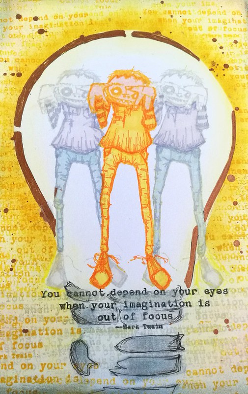
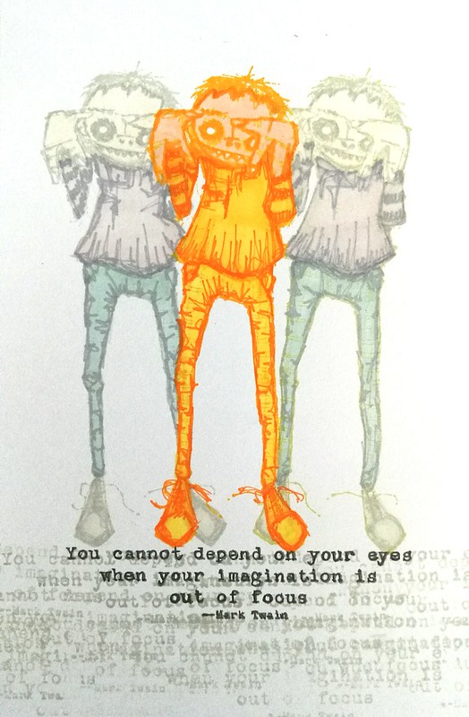
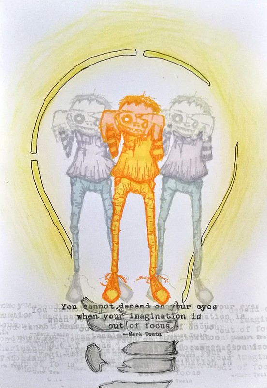
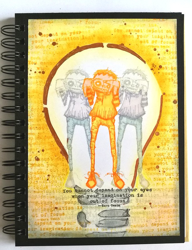
It's my last week over at Stampotique Designer's Challenge blog as guest designer and wow this month just flew by! Today I am sharing the project I made for this fortnight's challenge; One Layer. One of the most common techniques to achieve a one layer image is to use masks. I've done that with this journal page and only used 2 stamps, Topher and You cannot depend quote stamps and the Enlighten Stencil from Donna Downey.

One layer - Stampotique Originals guest post April
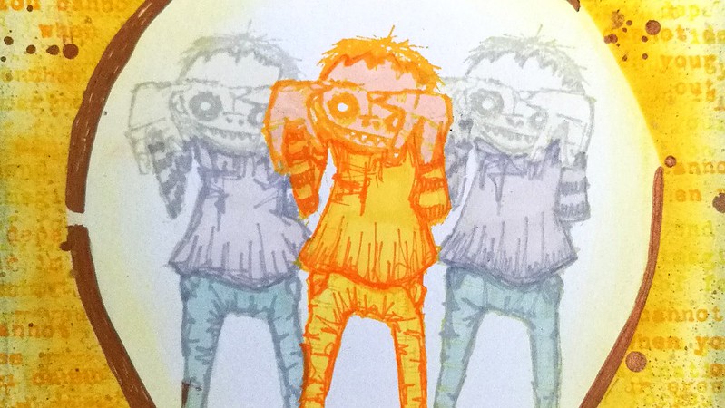
First off I have stamped Topher in the middle, then masked and stamped on either side. I used Staz On mustard yellow and dove grey to stamp because I wanted to do a no line coloring in them (a coloring technique where you won't see the stamped lines). I used my stamping ruler to get the placement right. I measured the quote so that it would fall on that line width and not beyond. When I had my Tophers set, I stamped the quote in memento black and a few times with dove grey. I colored the guys in with Letraset Promarkers. Now the advantage of stamping with a lighter ink pad is that you do not have to follow the lines of the stamp! I gave them different lines in the pants section as i wanted similar lines as the shirt. And the middle one is yellow/orange because he's the bright light of the bunch, ha! I do LOVE how topher and the quote really match!

One layer - Stampotique Originals guest post April

Next up I placed the light bulb stencil over the image and traced with a faber castel pitt pen. I then colored it in with chalks and colored pencil, but thought it was too light. So I made a mask for the lightbulb and used my distress ink in yellow with a blending tool to get a bright yellow beam of light around the bulb.

One layer - Stampotique Originals guest post April
I stamped the quote several times on the outside of the bulb and used a copper paint pen for accents and spatters. Made some shadows and accents with chalks and called it done.

One layer - Stampotique Originals guest post April
A close up of the page where you can see the chalky accents in the bulb. 

As Topher is trying to do, I'm getting my imagination into focus and I hope this inspired you to play along with this fortnights theme over at Stampotque Challenge blog!

I wanted to thank Stampotique team again for having me over for a visit this month, I really had fun! And I hope you have enjoyed the projects I made their stamps this month as well :) 

Thanks for stopping by and have a wonderful day!


2017/04/07

Shopping Highlight: Art Specially 2017

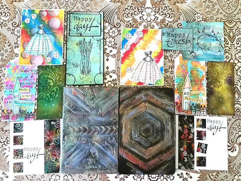
Well as I hinted last Friday, last weekend was spent at the wonderful Art Specially event in Nijkerk. My lovely husband came with me (both days) to share in the crazy fun and also to make sure I didn't spend too much. Well the latter spectacularly failed, haha! But we definitely had crazy fun!

There were a lot of workshops/make and takes were offered this year again but we only had time for a selection. Also there were lines for the very popular workshops, like the notebook decoration by Papillon Hobby. We sat in line for 1 1/2 hours for that one. It's good to have a buddy with you so you can take turns in waiting. It was well worth the wait and fun to use a new to me product; Cadence brands wax, stencils and media. We also had workshops with Dylusions paints (dress card), paper artsy and infusions powders on gelli plate (the Happy cards), Dina Wakley paints (the house tags), Distress ink layering (swirl tag) and dual emboss resist technique (the happy day card). 
Result of 2 days workshopping at ArtSpecially 2017. Left side my works and right side works made by @cornelius.grayl Was great fun and am totally exhausted!! #artspecially2017 #artspecially #workshopresult #showyourwork #showyourart #mixedmediaartist #mix
On the left works I made and on the right the works my husband made. He got a lot of fun comments on being one of the few guys there attending the workshops :) I learned a lot these two days and I can't wait to implement some of these fun techniques in my own works. And I learned a great way to customize my Rhodia/Leuchtturm notebook!

The trends/pushed products on the event this year were: Distress Oxides, Cadence products (seriously almost every stand was pushing this new brand!), Pan Pastel, alcohol ink on yupo and gilding wax/faux metallic effects. I managed to resist buying a few of these pushed products, like the gilding wax, but also came home with a great deal of other things. 

The loot from Art Specially this weekend. gosh, I am glad it's only once a year! #crafthaul #craftyendeavors #craftsupplies #artsupplies #theloot #spoils
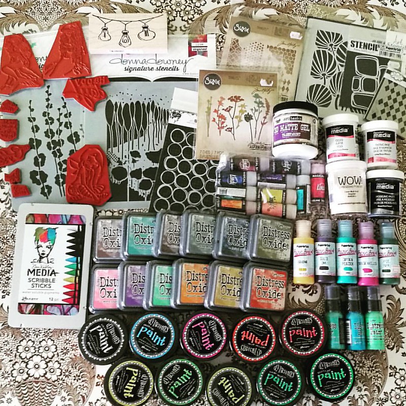
Well... like I said, not spending too much has spectacularly failed this year! So happy this is just a yearly event! I had pre-ordered the Distress Oxides and saw Corrie Herriman live doing a demo with them at Hobby Compleet de Duif stand. I'm really excited to give them a whirl! I also pre-ordered the Lindy's magical shakers and am very happy to have found the Scribble Sticks. I'll to a comparison of both those products with similar products because I am curious on the differences between them. Will of course share my findings with you. All the paints and deco arts media were on sale and well since I love a good sale and wanted to have the dylusions paints for a while, so I went for it! A bit light on the stamps this year around, but that´s because I had my eye on different media to try out. You gotta make choices somewhere right? ;)

My husband also made some purchases and went for a set of ZIG's Clean color brush set

and I love that he is trying out this new to him medium :)

I am looking forward to use my goodies this weekend.
Have a great one you all and thanks for stopping by :)


2017/02/03

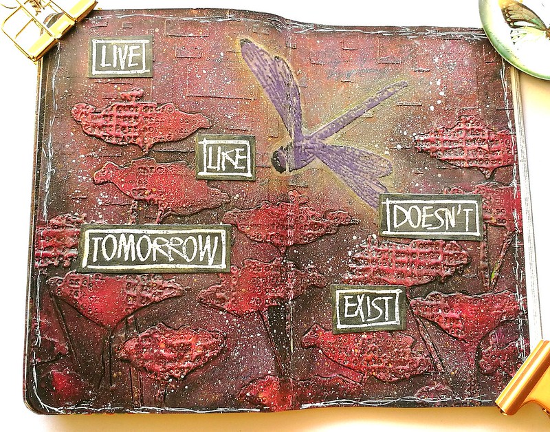
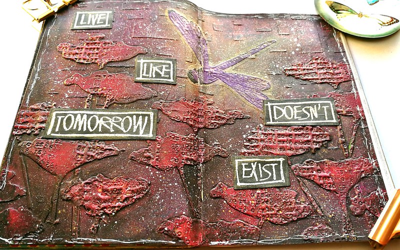
Art Journal: Live Like Tomorrow Doesn't Exist

Yesterday I showed you the process of the poppies and now it's time to show you the journal spread I made with them.

Live like tomorrow doesn't exist
This journal page is inspired by this month's Our Mixed Media Mood board created by Dee Dee Catron and Jenn Engle. Glad to be participating in the challenge this month.

 
This is the mood board. So many beautiful imagery to get inspired from, but what inspired me most is the red/orange color on the top left, the flowers and cascading rectangles. In the journal page I also added the element of wings by choosing the Dragonfly designed  by Jo Capper-Sandon for Stampotique. It's one of my absolute faves of Stampotique Originals, so I'm also entering this in the #SCD265 Your fave stamp challenge as well. On a holiday in Sweden I had two dragonfly friends that came by and they were just pure magic to watch. I tried to capture a bit of the magic in this journal spread.

Live like tomorrow doesn't exist
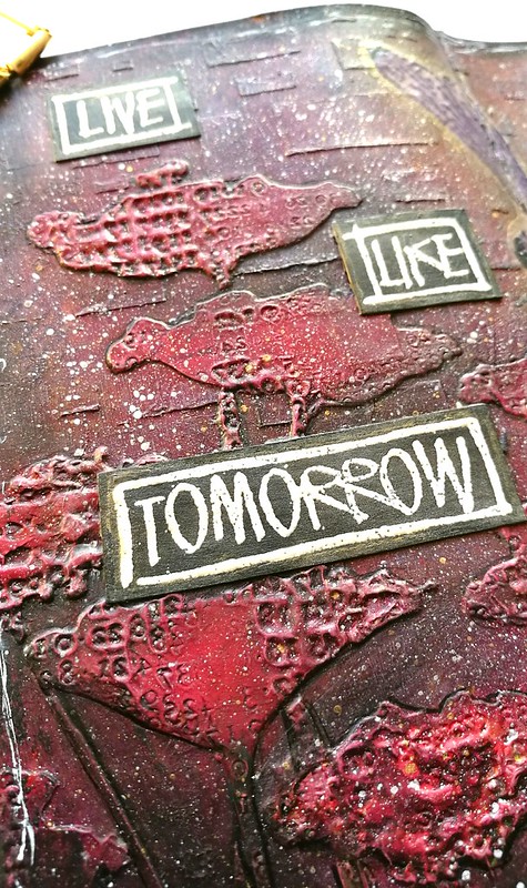
To accentuate the poppies I used a muji brush pen and a water brush to create some shading. I spattered some Liquitex Inks! in black, white and gold over the overall image.

Live like tomorrow doesn't exist
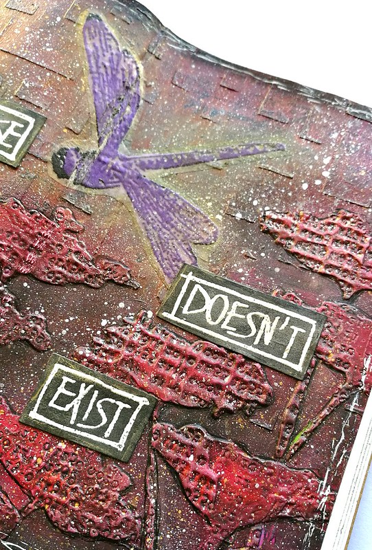
The Dragonfly was stamped on light weight tracing paper, Embossed with black and violet interference WOW embossing powder and adhered with Art Basics soft matte gel medium. I then accentuated it with wink of stella yellow. There is a bit of crackle due to the fold in the journal. Which kind of also works for the crackle image on the top right in the mood board :) 

Live like tomorrow doesn't exist
The sentiment "live like tomorrow doesn't exist" is from visible image and stamped on black card stock and embossed with white WOW embossing powder. I thought it would be fitting to the page as I tried to convey a Mayfly, because for them, tomorrow doesn't exist. So enjoy life and smell the roses (poppies) when you can :)

I'm also entering this journal spread in The Craft Stamper's February "take it, make it" Challenge. 

Materials used: 
Basic Grey Scrap book paper 
Crafter's Workshop Gold Gesso; modeling paste 
Finnabair Soft matte Gel medium
Amsterdam heavy matte Gel Medium; red paint 
Crafter's workshop Oblong stencil 
Donna Doney Poppy Forest Stencil 
Distress stains: fired brick, worn lipstick, barn door, twisted citrus, mowed lawn 
Liquitex INKS! white, black, gold 
Aileen's Paper glaze
WOW embossing powder black, interference violet, white
Dragonfly stamp by Stampotique Originals
Wink of stella yellow 
Muji black brush pen 
Water brush 
Stamper Anonymous Tim Holtz numbers reflections stamps 
Visible image Live like tomorrow doesn't exist sentiment stamp

Thanks for stopping by and have a wonderful weekend!


2017/02/02

WIP: Processing Poppies

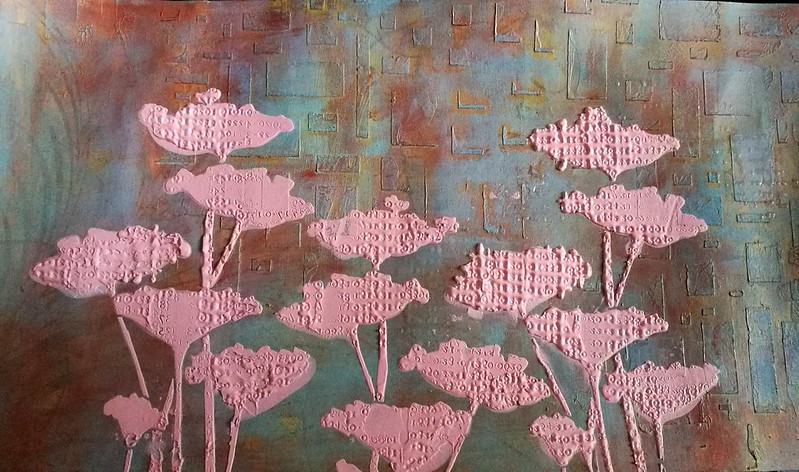
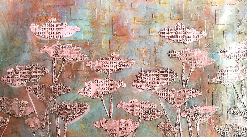
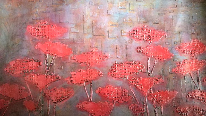
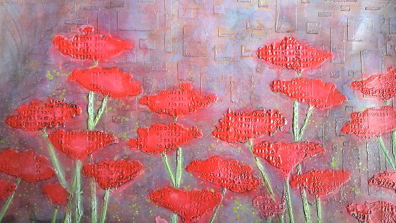
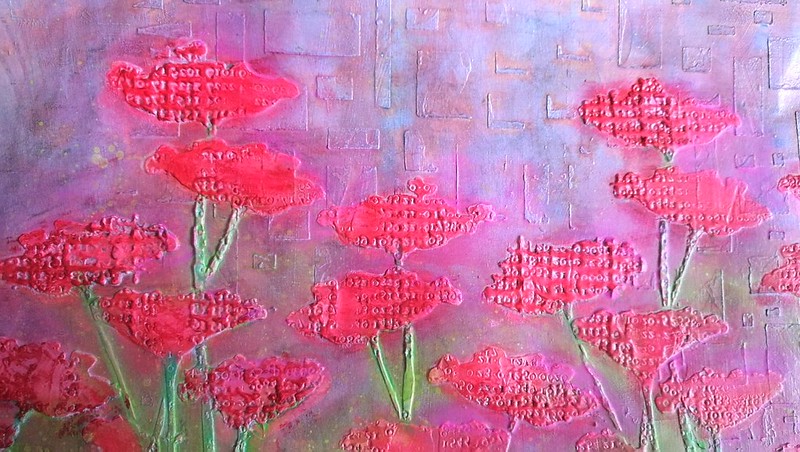
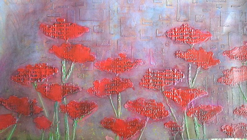
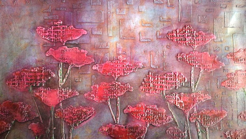
Recently I have joined this amazing facebook group, Our Mixed Media Moods, to get inspired for doing some more mixed media work. The group is run by these talented ladies Dee Dee Catron & Jenn Engle and they share a mood board every 20th of each month to inspire people to create/dabble more in Mixed Media. The current mood board really inspired me to try and participate. The gorgeous wine color, flowers and cascading squares/rectangles inspired me most. I made a journal page for it, but before I share that, I wanted to share the process up to that page with you first. It's mostly picture heavy to show you the evolution of the process of these wonderful poppies which I made using Donna Downey's Poppy Forest stencil.

processing poppies
I started off with a piece of scrap book paper prepped with gold gesso. It already had some cascading rectangles on it so it was a perfect place to start on. I brayered on a couple of different paints (fresco and distress paints) and wiped/rubbed places with a wet wipe. Then got my poppy stencil, mixed some modeling paste with a dab of red paint and stamped into the paste when it was semi dry.

processing poppies
I wanted the numbers from the Tim Holtz stamp stand out more and I saw this video by Dee Dee in how she made the black glaze and I gave it a go myself. I used liquitex INK! in black and paper glaze.

processing poppies
Wanted to add more color to the poppies and finger painted the flowers with red distress stains.

processing poppies
Added color to the stems the same way with green distress inks.

processing poppies
Then added some color on the background with pearl rubs in pink and green. But the more I did this the more I started to hate it. The black accents were also gone and the colors were just too bright. So I got a wet wipe and started to wipe some background color away.

processing poppies
Then I got more black glaze and dry brushed it in the stamped parts of the stencil to get the darker accents back. It was still too bright so I wanted to tone the colors down a bit.

processing poppies
I poured the black glaze fluid over the piece and wiped it out. Now this was getting to where I wanted it to go, finally...

processing poppies
Trimmed a piece for my pocket journal, stamped on it with a script stamp and some open rounds and it was ready for the next stage in my art journal.

processing poppiesprocessing poppies

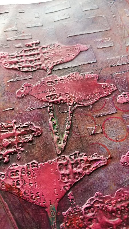
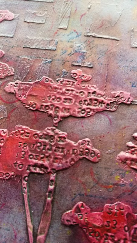
A couple of detail shots of the poppies in this end stage. Stamping in modeling paste is so much fun and I will definitely do this technique again. 

Tomorrow I will share the finished journal page, hope you will stop by to see the final stage. Thanks for stopping by and have a great day!