Showing posts with label lindy's magical shakers. Show all posts

2018/11/24

Art Journal: Be happy - AALL & Create


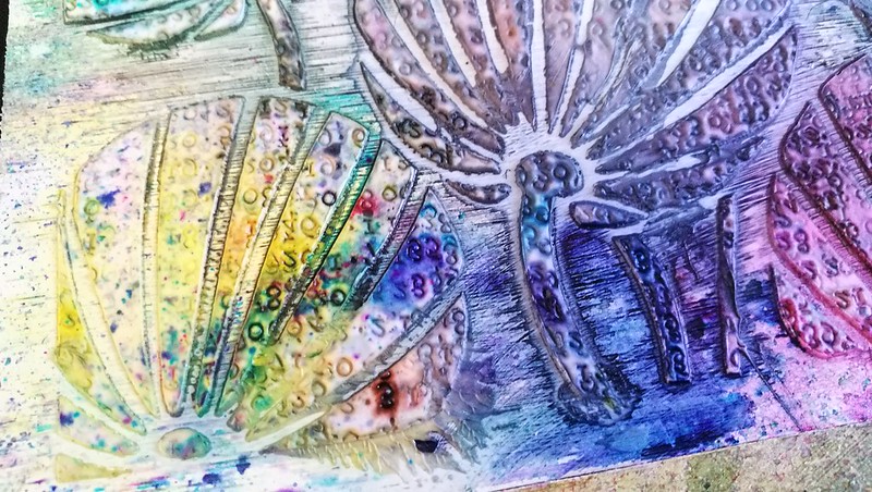
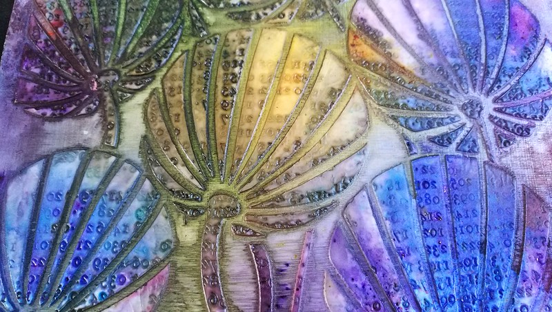
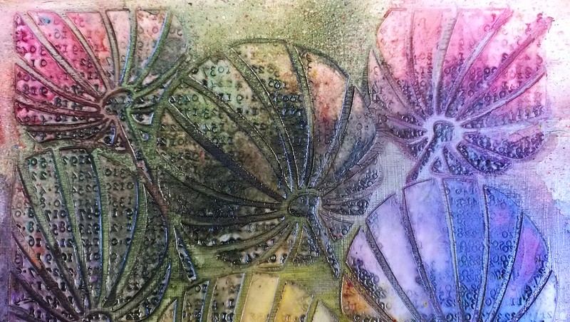
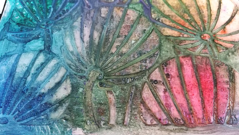
Hi Everyone, another week has flown by and winter season is breaking through here. As the cold is arriving more fully (as well as my Seasonal Affect Disorder) , I thought I'd share a HAPPY and Bright art journal page made with AALL & Create stamps and Lindy's Magical Shakers for some visual warmness.

First I created some watercolors with Lindy's Magical Shakers the 2017 set by sprinkling the powder on my mixing palette and adding water to it. I then stirred the colors thoroughly with the brush to get the pigment & shimmer dissolved in the water. They are such bright and beautiful shimmery colors! Really amazing! 


Now on to the coloring part. I stamped part of Tracy's large stamp from set 109 with Memento Tuxedo Black ink on watercolor paper. Made sure that the imprint was dry completely before I added color to avoid bleeding. And then I started to add the lush color onto the image until I felt it was done.

Which was around this point. I added different colors in the petals to have a nice mix from blue to purple going and greens in the bottom. Adding a bit of Black Forest Black at the bottom and stem you'll get a beautiful subtle grey mix that grounds the image. Tip: when you add spatters if your page isn't completely dry, you'll get some soft blending of the colors as you see here in the background.

Then it was time for some doodling and more stamping. I took a white sakura get pen and doodled in the flower petals & defined the core & stem a bit more. In my collection of AALL & Create stamps I have set 23 from Bipasha Bk which has some lovely text texture stamps and I have used in the background here. From Tracy's set 123 from the recent release I have used the sentiment Be happy and stamped it on the bottom a few times. And in the heart of the flower I just stamped Happy.


After trimming it down I added a border with gelato's and adhered it to my art journal page. These bright and beautiful colors sure do make me very happy!!

Hope you liked seeing this project with gorgeous AALL & Create stamps. Please visit their boutique to shop online or to see where you can get these stamps from their many stockists world wide. 
Products used:

Thanks so much for stopping by and have a wonderful weekend!
 

2017/05/24

WIP: Pigment Powder Comparisons

pigment powders comparisons

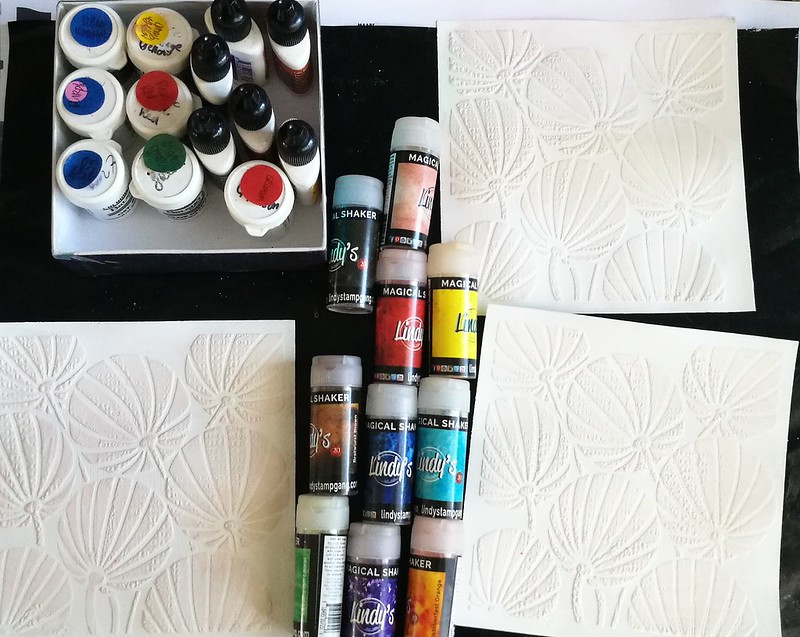
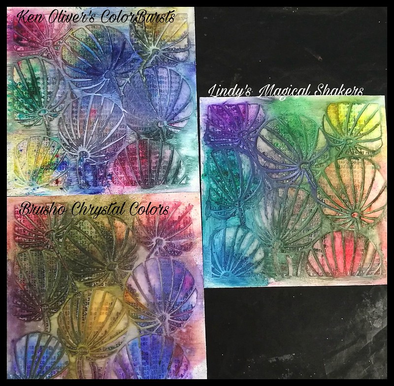
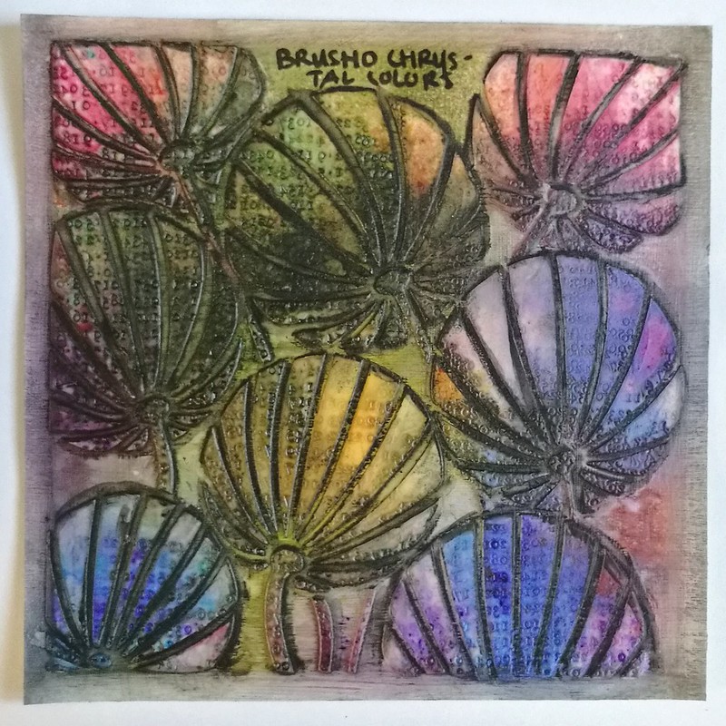
Today I wanted to share an experiment I did a little while ago. I've had brusho's for a while and got a set of Ken Oliver's color bursts last year and this year I was completely tempted by Lindy's Magical Shaker so got a set of those too. I wanted to see what they looked like side by side and how they react differently, so made a color swatch on all pigment powders on a 6x6 gessoed paper on which I had put a stencil of clarity and stamped in the paste. This is my base for all the pigment powders. Do note that it's a non porous surface and they act differently on porous surfaces.

Pigment powders comparison
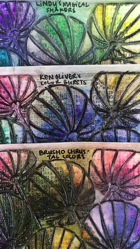
So after some powder puffing and spritzing of water,  here is the result! They all act in the same way, ie. you just tap some powder on the page and spritz some water over it to see the magic happening. But the result do differ slightly from each powder.

pigment powders comparisons
They all really look quite lovely and each product has their individual glow.

pigment powders comparisons
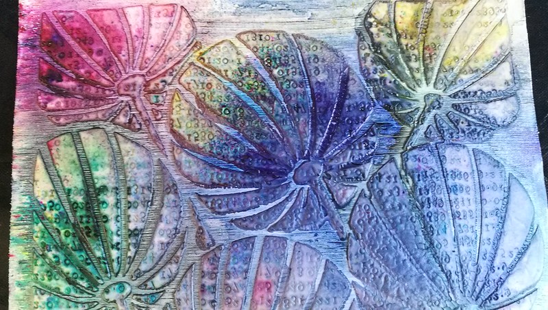
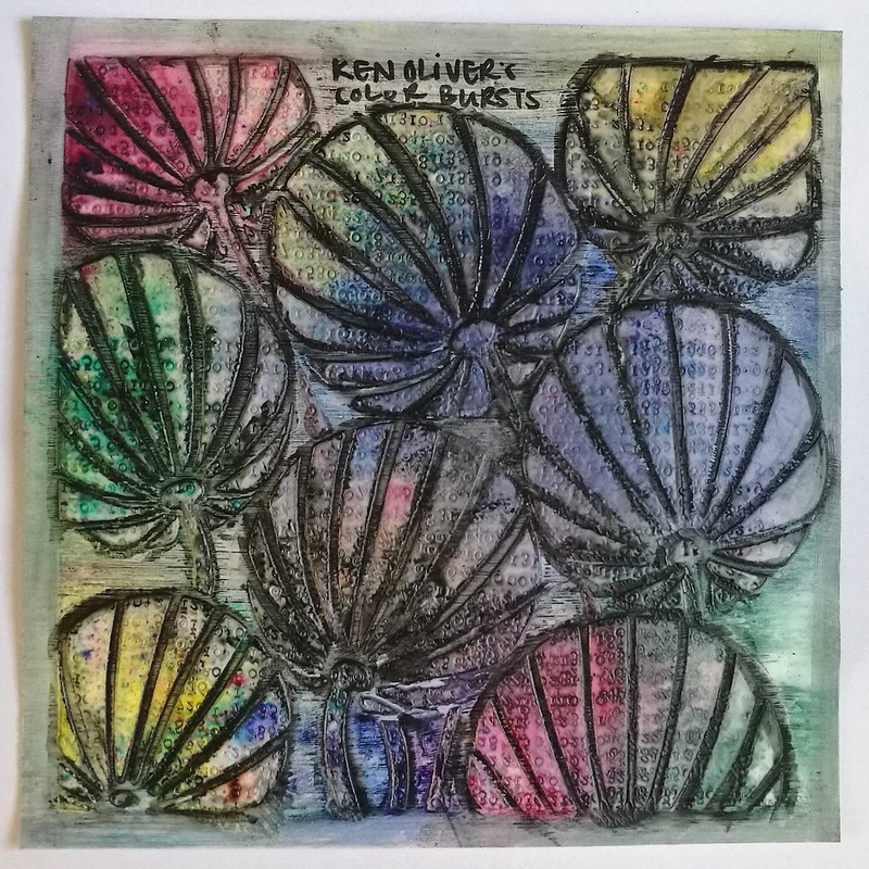
These are the Ken Oliver Colorburst powders. So pretty! Love the little specs of color on the bottom! I used all the colors in the Earth Tone set; merlot, indigo, yellow ochre, terre verte, sepia and burnt orange

pigment powders comparisons
These are the Brusho chrystal colors - very luminous and saturated colors.  I used the colors gambodge, olive green, rose, crimson, violet and Indigo. Very pretty and luminous colors! Love the color nuances and it's still vibrant after drying with the heat tool. I added some shadowing in the shallow edges with a stabilo marks all to make the design pop a bit more.

pigment powders comparisons
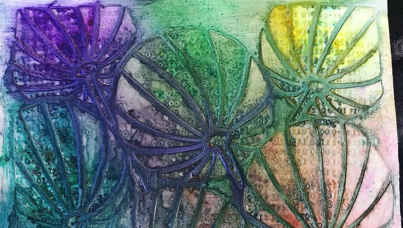
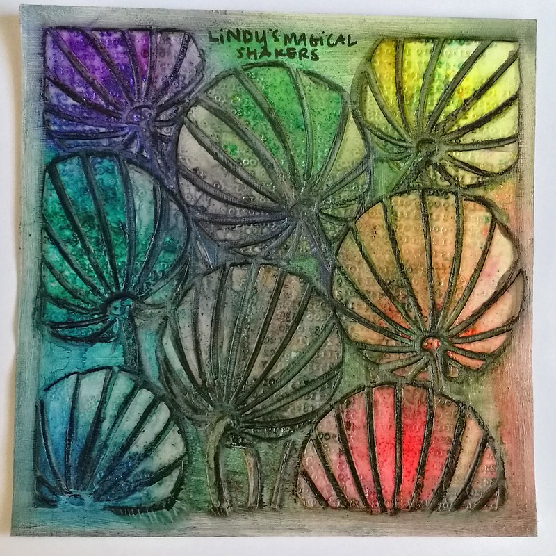
And lastly the Lindy's Magical Shaker's - these are soooo pretty and there is a slight shimmer to it which is magical indeed! I only used 6 colors and not the full 10 set, leaving out the black and brown colors. So the colors used are Bavarian Blue, Cuckoo Clock Cardinal, Guten Tag Teal, Lederhosen Laurel, Oktoberfest Orange, Oom Pah Pah Pink, Polka Purple and Yodeling Yellow. I REALLY love the names they gave!

pigment powder comparison

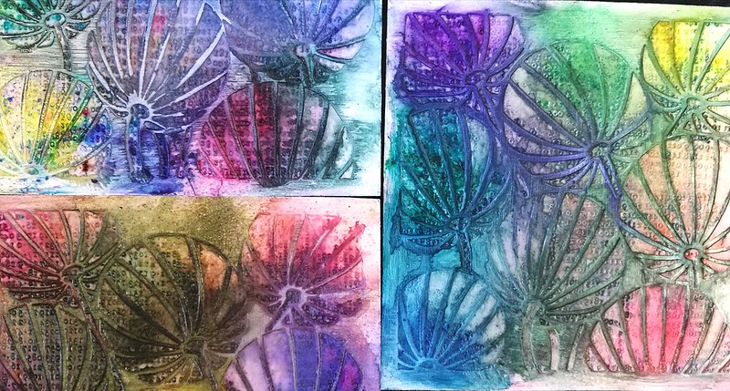
To see how they would react if you worked upon them more I added some shadows with a Stabilo black marks all pencil and a water brush when the swatches were dried completely. 

pigment powder comparison
Lindy's magical Shakers - still shimmery and does retain a good amount of color even when worked upon with a water brush. I'd say they are fairly water resistant when dry.

pigment powder comparison
Ken Oliver's Color Bursts - I found that these still were water reactive, more so than the other two, which lead to dilution of the colors when I added the shadows. Something to consider when you are working on non porous surfaces.

pigment powder comparison
The Brusho Chrystal Colors - these retain their luminous colors and are more water resistant then the other two. They are advertised as permanent when dry, but I think it's more water resistant than water proof because I did get some color bleed when working with the water brush. They could be water resistant on non porous surfaces, though!

In conclusion; although they react similar, the look is definitely different. They all have their pro's and cons and it's up to the final look you want as to which products to use. A helpful video on pigment powders I found was this one by Maremi Small Art. Though instead of Ken Oliver's Starburst she uses Magicals by Lindy's in her comparison. 

 I'm glad I made these swatches as a reference for me and I hope this helps you out as well either in their use, or when you are considering to buy the products. 

I am curious to know: 
Which ones of these pigment powders do you have and is your preference to use? 
Let me know in the comments :) 

Thank you for stopping by and have a wonderful day!


2017/04/11

You stand in your own light, make it shine

you stand in your own light, make it shine

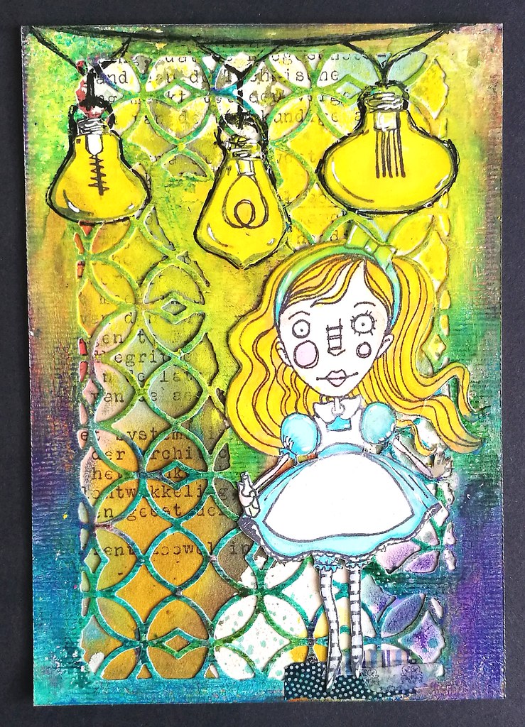
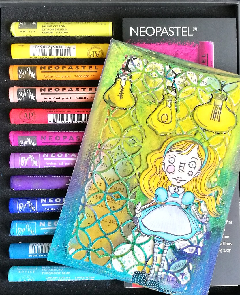
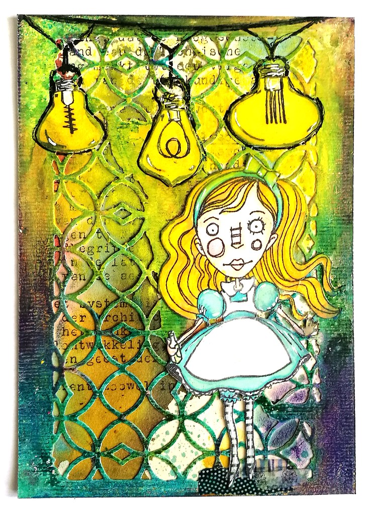
Yesterday I took out some my new supplies from my Art Specially haul this year and made the above card. I used my Lindy's magical shaker's on the text background (vintage typewriter text), Tim Holtz Alterations dies, Patio Lights and Alice from Stampotique Originals. I also used some fabulous caran d'ache Neopastels which I got at La Couronne du Comte and I absolutely LOVE working with them on my projects!

you stand in your own light, make it shine
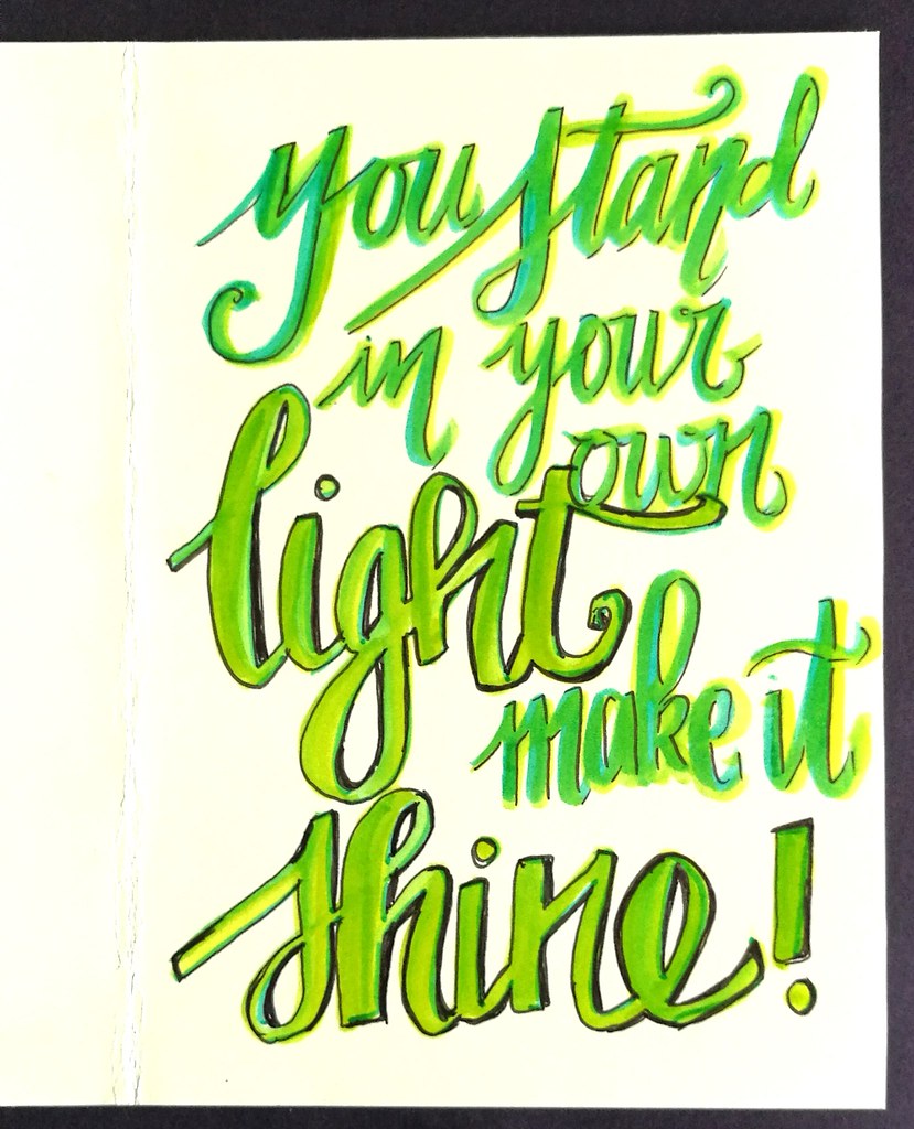
They are so bright and colorful to work with! I used the die from the TH mixed media set on heavy 200gms card stock, applied a good amount of white gesso and when that was dry, I rubbed all the oil pastels over the edges of the design. The colors really pop! The images were stamped on neenah classic white cardstock and colored with Letraset promarkers. I fussy cut them out and adhered with ZIG 2way glue pen. I applied a heavy amount of yellow pastel's around the lights so it looked like they shines brightly. Then outlined the sires and bulbs with a black uni posca marker. on the inside, I added a quote;

you stand in your own light, make it shine
It's a quote I got in a fortune cookies once and it's been in my wallet ever since. A reminder to let your light shine brightly! The lettering is done with tombow markers and outlined with faber castell pitt marker.

you stand in your own light, make it shine
Wanted to show you how the card looks on a white background, but the lights really shine on the black background in the first picture above :)  The Stampotique text background challenge is still on until tomorrow, so do link up your projects :)

I also would like to enter this card in the following other challenges:
Try it on Tuesday - use a quote 


Mixed Media Monthly Challenge - What's your super power?

With this post I hope to convey my power to use and blend color in various mediums and have it POP! 

Thanks for stopping by and hope you'll come by tomorrow to see what I've made for the new challenge theme for Stampotique which goes live then :)

Have an awesome day!

2017/04/07

Shopping Highlight: Art Specially 2017

Well as I hinted last Friday, last weekend was spent at the wonderful Art Specially event in Nijkerk. My lovely husband came with me (both days) to share in the crazy fun and also to make sure I didn't spend too much. Well the latter spectacularly failed, haha! But we definitely had crazy fun!

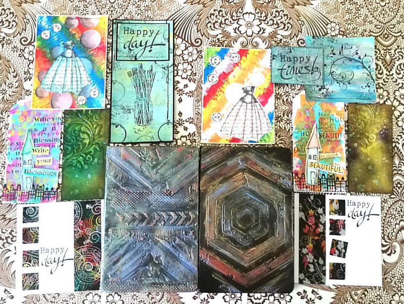
There were a lot of workshops/make and takes were offered this year again but we only had time for a selection. Also there were lines for the very popular workshops, like the notebook decoration by Papillon Hobby. We sat in line for 1 1/2 hours for that one. It's good to have a buddy with you so you can take turns in waiting. It was well worth the wait and fun to use a new to me product; Cadence brands wax, stencils and media. We also had workshops with Dylusions paints (dress card), paper artsy and infusions powders on gelli plate (the Happy cards), Dina Wakley paints (the house tags), Distress ink layering (swirl tag) and dual emboss resist technique (the happy day card). 
Result of 2 days workshopping at ArtSpecially 2017. Left side my works and right side works made by @cornelius.grayl Was great fun and am totally exhausted!! #artspecially2017 #artspecially #workshopresult #showyourwork #showyourart #mixedmediaartist #mix
On the left works I made and on the right the works my husband made. He got a lot of fun comments on being one of the few guys there attending the workshops :) I learned a lot these two days and I can't wait to implement some of these fun techniques in my own works. And I learned a great way to customize my Rhodia/Leuchtturm notebook!

The trends/pushed products on the event this year were: Distress Oxides, Cadence products (seriously almost every stand was pushing this new brand!), Pan Pastel, alcohol ink on yupo and gilding wax/faux metallic effects. I managed to resist buying a few of these pushed products, like the gilding wax, but also came home with a great deal of other things. 

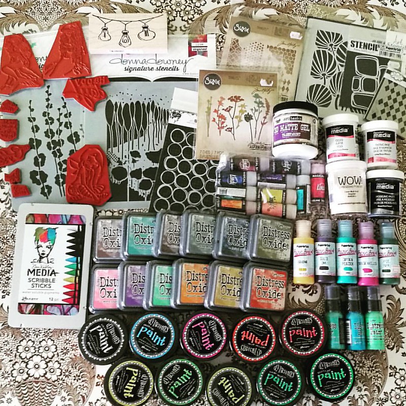
The loot from Art Specially this weekend. gosh, I am glad it's only once a year! #crafthaul #craftyendeavors #craftsupplies #artsupplies #theloot #spoils
Well... like I said, not spending too much has spectacularly failed this year! So happy this is just a yearly event! I had pre-ordered the Distress Oxides and saw Corrie Herriman live doing a demo with them at Hobby Compleet de Duif stand. I'm really excited to give them a whirl! I also pre-ordered the Lindy's magical shakers and am very happy to have found the Scribble Sticks. I'll to a comparison of both those products with similar products because I am curious on the differences between them. Will of course share my findings with you. All the paints and deco arts media were on sale and well since I love a good sale and wanted to have the dylusions paints for a while, so I went for it! A bit light on the stamps this year around, but that´s because I had my eye on different media to try out. You gotta make choices somewhere right? ;)

My husband also made some purchases and went for a set of ZIG's Clean color brush set

and I love that he is trying out this new to him medium :)

I am looking forward to use my goodies this weekend.
Have a great one you all and thanks for stopping by :)