Showing posts with label SODC. Show all posts

2018/02/08

Art Journal: Be Mine Valentine

Be my Valentine

It is the second week of the HEARTS challenge at Stampotique Designer's Challenge blog this week and I've made this little art journal page to share with you for inspiration. You can still join the challenge until next week Tuesday, so don't forget to link up your heart related projects HERE :) 

I started off on a piece of scrapbook paper on which I rolled on some muted pink and black paint from liquitex, stamped Daniel's hearts and clear embossed them before dry brushing some black paint over it. Created the border with black distress marker and spatters with liquitex INKS in white. 
Queenie and "Be Mine" from the valentine quote stamp cube were colored with promarkers, highlighted with a white gel pen then fussy cut and adhered to the page. The hearts radiating from Queenie is from a die cut and I used a little shimmery water colored piece for this. 

Entering this piece in the following challenges: 

Thanks so much for stopping by and have a wonderful day. 


2017/08/02

Bee Hive - SDC279 Only Animals

Stampotique DT work

It's hard to choose a favorite among the august new releases as they are all super fun to work with, but the Hive Flower by Arwen McCullen would be my fave. Here I made a little note card and stamped it on a piece of Distress Oxidized backgroud.  This was a combination of blue and green inks and I just love how these inks work so well together. I colored the flower with my Caran d'ache Pablo's and stamped the little bees on it which I then colored with Wink of stella markers for some shimmer. The edges are doodled with a Faber Castell Pitt marker. I just LOVE the combination of the bees and the hive flower!  I also have been spotting bees back in the city again which is great! These little creatures do have a hard time and I am happy to see them in unexpected places.

So good to see these little guys flying about 💕 #saveourbees #bees #beelove #summertime #summerlove #amsterdam #bee #honeybee

In a small little lavender garden along the side walk...

Beauty can be found in unexpected places. It takes awareness to see that in every day life.
and in poppies at the side of the tram/bus stop. I've read our country is making an effort to plant more flowers near the highway (the Honey Highway initiative) and are now initiatives in the city (like in Amsterdam) to plant flowers near tram stops to attract more honey bees to do their work. It's a beautiful effort which I hope will spread to other cities as well. 

So an ode to the honey bee here for our SDC279 challenge in which you are invited to use animals/insects etc in your designs. There is also some exciting news which are going to be implemented from now on for the challenge;
People have been asking SODC to let them join our challenges on our Facebook group. Well, we are listening!! You can now join in our challenges on our Facebook group. We will be creating a photo album for each challenge, all you need to do is add your project to the proper photo album in order to join. We do encourage you to add your creations here on the blog but if you don't have a blog or don't know how to upload your photos to this blog, you can now join on Facebook.
So now there are two ways to join in and I hope you will join this fortnight's challenge as well :) 

Thanks for stopping by and have a wonderful day!
 

2017/04/12

Take note when your heart speaks


This week at Stampotique Designer's Challenge blog the theme is Bling it On and it's encouraged that you use a lot of bling aka glitter/sparkles in your work. It's honestly a difficult challenge for me as I don't use much glitter at all in my work. But I have made the page above in my mini black spiral journal and used LOTS of glitter and I hope I did the theme justice!

Bling it on week 1 - Stampotique Originals guest post April

I used Art Basics soft matte gel to adhere sparkly see through foil on the background, added another later of gel medium and poured the glitter and stars over it. Made sure that dried before adhering Stitch, small bee and the When Heart Speaks sentiment (which I cut out and rearranged). The images are colored with promarkers and scribbled around the edges with a glitter Sakura Gelly Roll.

Bling it on week 1 - Stampotique Originals guest post April 
Close up of all the glitter and stars. 

Bling it on week 1 - Stampotique Originals guest post April
By the way, I used the petal in this flower cube to create wings for Stitch. And those are colored with ZIG wink of Stella sparkle brush pens. Obviously I adhered those first before the other image elements. 

While it was a HUGE step out of my comfort zone I'm quite pleased with the result. Hope this inspires you to play along with this fortnight's challenge. Be sure to link up your project to the LinkzIn Page for a change on the monthly prize to win some SO rubber stamps! This month Stampotique have teamed up with Lindy's Stamp Gang and it's the perfect theme to combine challenges! Be sure to check the rules when entering in each challenge :)

I would also like to enter this piece in the following challenges
Try it on tuesday - add a quote

STAMPlorations - things with wings 


Thanks for stopping by and have a sparkly day!


2017/04/10

MailART Monday: Venturing Out

venturing out

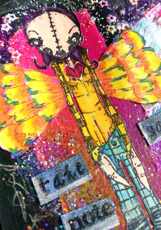
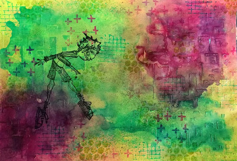
Freidrich of Stampotique Originals is fast becoming a fave stamp to use in my works. Last week I used him on the text background postcard and this week I'm sharing this MailART envelope I made. Because you can place him in various ways it's a really fun stamp. I like to place him on objects he precariously balances on.

venturing out
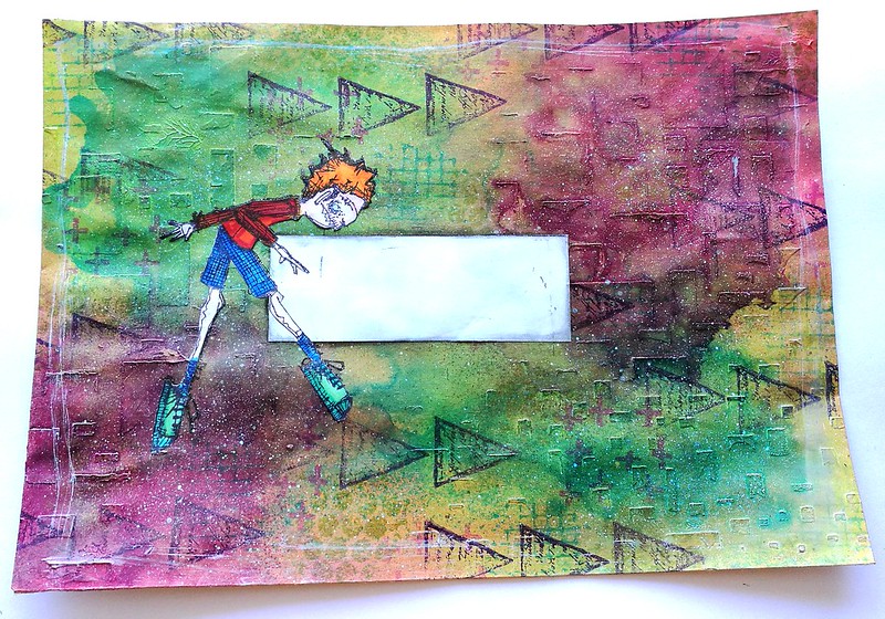
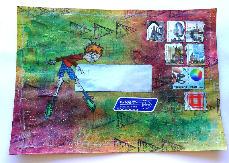
The envelope I used this time is an A5 size and it was already somewhat decorated, but I eventually didn't like the look of it in the end. So I covered it with opaque paints from Deco Arts in the Traditions line, Red Violet, Phthalo green blue and light green. I used mostly my fingers to apply the paints from light to dark (letting the bottom layer of light green dry completely) and then spritzed some water to get some movement going and dabbing some paint away for texture. The envelope already had some texture on it, from a stencil and heavy matte gel medium. The texture showed through the paints nicely while being covered with color. I then added some more texture with Kate Crane's texture cube and coordinating staz-on inks. Lastly I stamped Freidrich on with staz-on jet black where I wanted him on the envelope.

venturing out
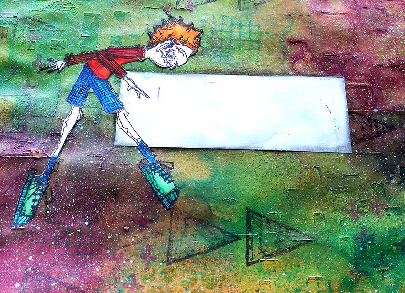
I adhered an address label before I stuck on the colored (with promarkers) and fuzzy cut image of Freidrich. I wanted him to balance on something and I found the perfect stamp in VLVS! the Writing Triangles which stamped flipped on the side look like arrow heads. I love how he looks so very concentrated balancing on that particular point!

venturing out
Lastly I spattered some liquitex inks! in silver over some spots, swiped some around the edges and adhered some vintage stamps. It's now ready to mailed off :)

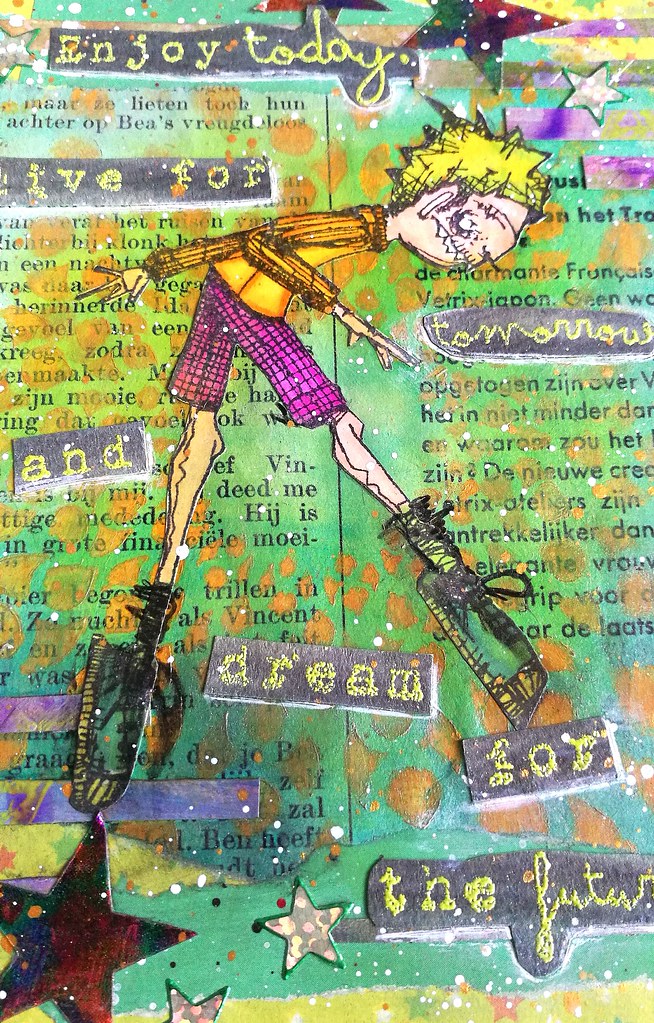
This envelope contained the card I sent for publishing in Crafter's Magazine May 2017 issue. And I'm excited to announce that I have a card published in it :) Look out for a card I designed for the New beginnings theme in ready set stamp section in the magazine below:


And a close up of the card that is published :)

I'll post a tutorial on how to make this card on my blog sometime later this month :)

I would like to enter the mail art envelope in the following challenge:
Art Journal Journey - Magical Mystery Tour
It's not a journal page, but I still thing it fits the theme ;)

Thanks for stopping by and have a wonderful day!

2017/04/05

Enjoy today! Stampotique Guest Designer for April

Some great news to share with you! For the month of April I'll be the guest designer over at Stampotique Originals Designer's Challenge blog :) I was absolutely over the moon when I was contacted to guest design for this amazing stamp company along side such creative talent :) Today I'm sharing the make for week 2 of the challenge "text background".
So last week I showed you the sneak peek of the card background. Using book/magazine pages for your background is super fun and easy to have some textual background.
I colored in Freidrich with promarkers on sticker paper, cut out and adhered him to the page with matte medium. The medium made the sharp image of the stencil a bit blurry and mixed with the blue to a nice green. I was a little miffed at first but the softer background does make Freidrich pop more. So I don't mind it as much.

  Text on background - Stampotique Originals guest post April
I flipped his stance a bit and placed his ballet feet on a star and a part of the "enjoy today" text sentiment. The sentiment is stamped on aquarelle paper which I have colored grey with J. Herbin Stormy Grey fountain pen ink and is embossed with Zig Leaf Green embossing powder. 

Text on background - Stampotique Originals guest post April
I underlined the text with a white pentel gel pen, spattered some liquitex INKS in gold and white over it and called it done. 

Hope this inspired you to come play along with SCD270 - Text background this week. When you link up your project you're in the draw for the monthly 30$ gift certificate to spend at Stampotique Originals shop and I can tell you from experience that winning it, is totally amazing! Just FYI: Do read all the rules before linking up to avoid being deleted if you haven't followed them. 

Thanks for stopping by and enjoy today!