2016/10/31

Mailart Monday: a ghostly halloween

Happy Halloween

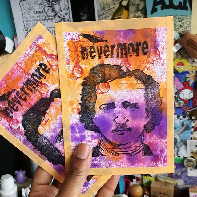
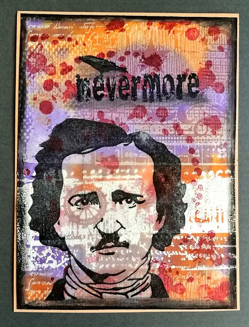
It's october 31st and that means it's finally Halloween. I made the above postcard for a fun swap, the blue ghost postcard exchange hosted by my friend Amanda at Letter Letter. The objective is to send and receive a handful of postcards to your assigned group of penpals with the message written with blue ghost ink (see a great review of the ink here by S.J Mills). So it's readable with UV light only! It's super fun and I have participated in the last couple of years too.

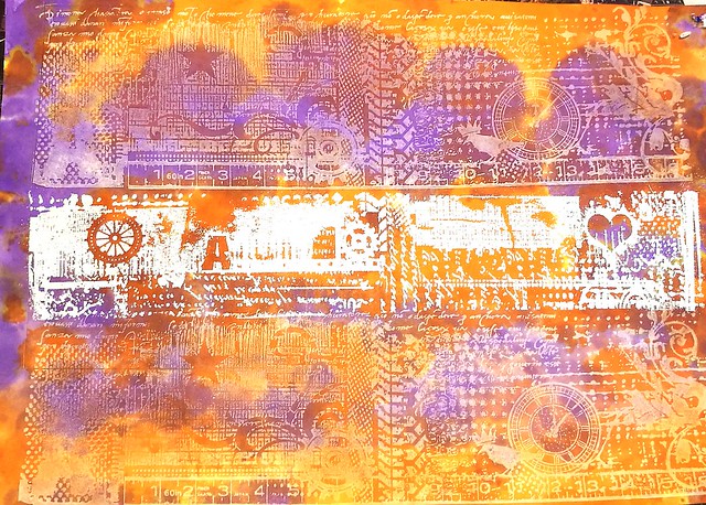
I chose Edgar Allen Poe as focus and made the card with stamps from Lost Coast Designs, Carmen's Veranda and the Stempelwinkel. The background is made with the large grunge border stamps, stamped with opaque white and versamark. I only embossed the middle part and left the rest white. I then got some distress stains in orange and purple on my craft sheet and blotted the ink with the stamped paper.

Happy Halloween
It came out looking like this! I cut the page to size and added the rest of the elements to it and made accents with grey and black distress markers.

Making postcards for the #blueghostexchangenumbathree :) #blueghostexchange #halloween #edgarallanpoe #rubberstamping @letterletter
I blotted the rest of the ink off a separate paper and made the postcards above. I sprayed the a bit of red brusho mix and together with the drops from Designs by Ryn they look awesome ghostly (the double print also does the trick of a ghostly image!) I hope my partners will enjoy these postcards and I can't wait to receive mine!

I am entering these cards for the mixed media monthly challenge for october with the Halloween theme
 

Have a wonderful Halloween everyone!

Thanks for stopping by!

2016/10/28

Mini Art Journal: An Ocean of Drops

mini art journal a multitude of drops

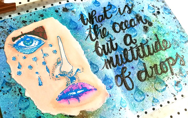
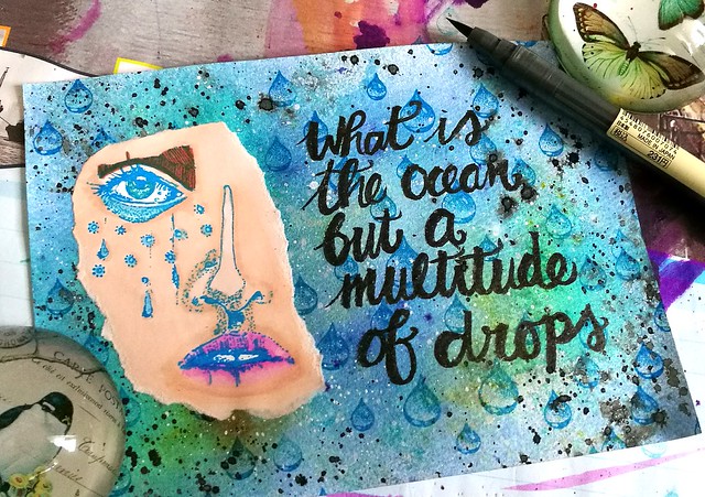
Today I am sharing an spread in my art journal inspired by a quote from Cloud Atlas, which fits beautifully with the stamps from Viva Las Vegastamps and Designs by Ryn.

mini art journal a multitude of drops
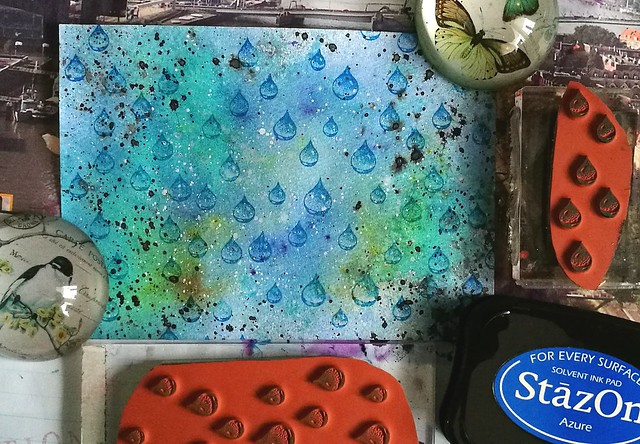
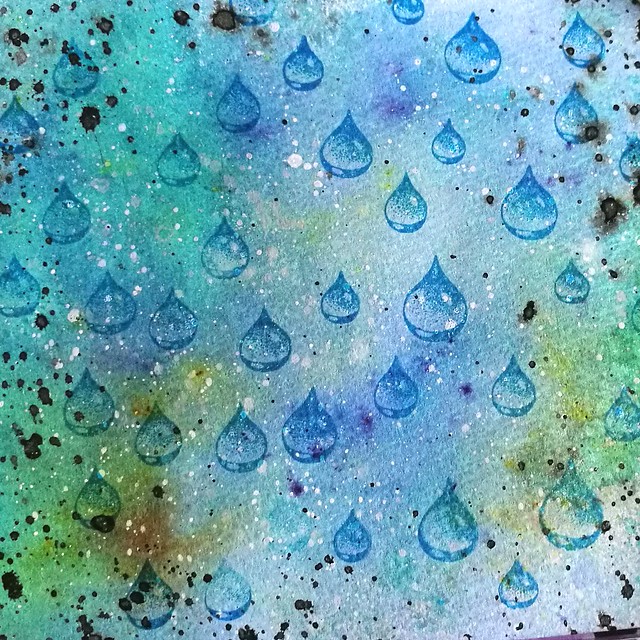
The background is made on Maruman Zuan watercolor paper on which I used different Dylusions spray inks, brusho crystals in blues and teals and spattered liquitex acrylic inks in black and white. The brusho ceated some fun effects with the spray inks. When it dried I then stamped on the drops from Designs by Ryn with Staz on Azure. 

mini art journal a multitude of drops
A close up of the background, a multitude of drops effect. The greens are from the brusho crystals which gave a fun unexpected effect. And these drops stamps from Designs by Ryn are just amazing!

mini art journal a multitude of drops
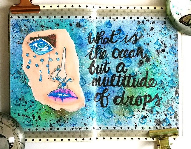
I colored the half face with tears from VLVs with letraset promarkers and ripped it out and adhered to the page. The lettering of the quote I have done with a black brush calligraphy pen from Muji store which I forgot I had ;) It was a good test to see how it works on watercolor paper. I had to trace it a couple of times to get the deep black I wanted. It would probably work better on smoother paper. 

mini art journal a multitude of drops
The I adhered the page to my journal and added some washi on the top and bottom of the page to cover up some empty strips. I traced the quote with a sakura stardust pen to give it some sparkle. 

"What is the ocean but a multitude of drops?"

I'm entering this journal page in the october customer creation challenge at the Designs by Ryn blog. Wish me luck :)

Have a great weekend and thanks for stopping by!

namasté

2016/10/26

Pens and Ink: Pelikan M620 Grand Place with KWZ Monarch

Pelikan Grand Place with KWZ Monarch
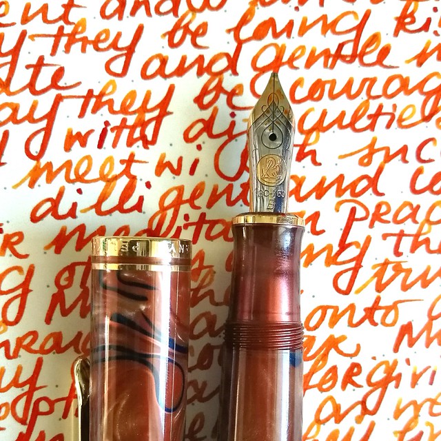
Today's I'm sharing a wonderful autumn inspired combination: the Pelikan M620 Grand Place inked with KWZ Monarch ink.

Tilburg Penshow Spoils
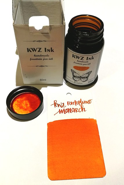
About the ink: I bought a bottle at the Tilburg Penshow in september and it's a Fontoplumo exclusive. It's made by KWZ and it's made to fit their gorgeous Limited Edition Conid Bulkfiller fountain pen. Well, I have not won the lottery yet, so the pen was not something I could obtain, but the ink definitely came home with me. It's a gorgeous warm orange color, perfect for this time of year.

pelikan
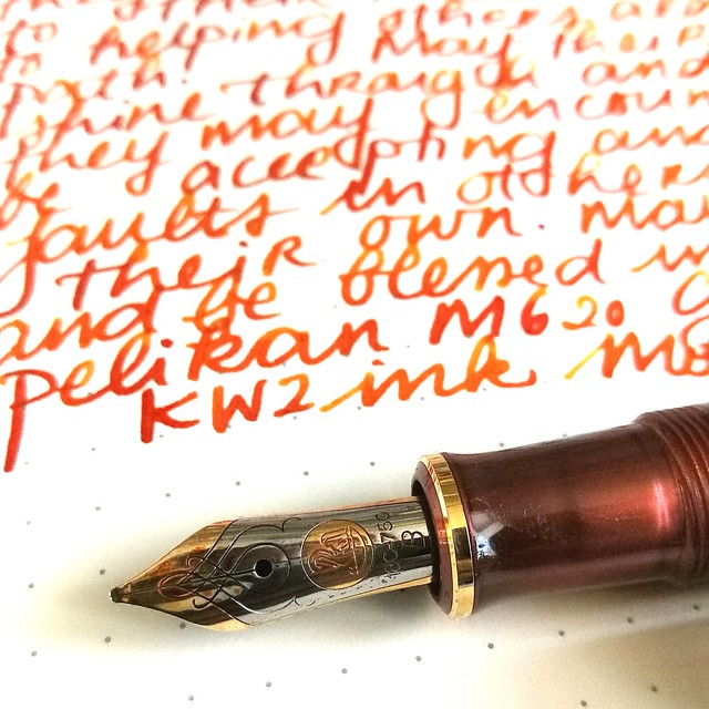
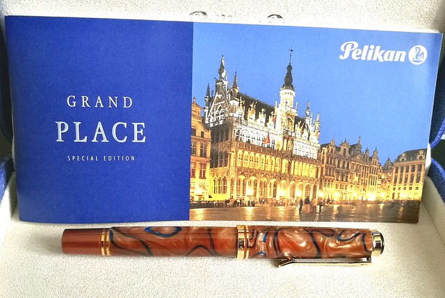
The pen I chose to try the ink in is this gorgeous Special Edition by Pelikan, the M620 Grand Place from the city series. It's a beautiful coppery brown color with dark blue swirls in it. I got really lucky obtaining this pen because it's a LE from a few years ago but a collector was selling his pen a while ago and I jumped on the chance. It is fitted with a b nib, so I figured it would be perfect to show off the great shading of the KWZ ink.

Pelikan Grand Place with KWZ Monarch
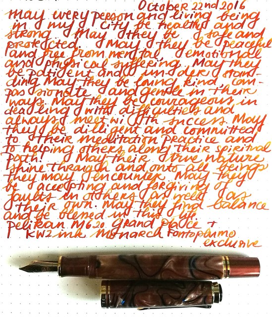
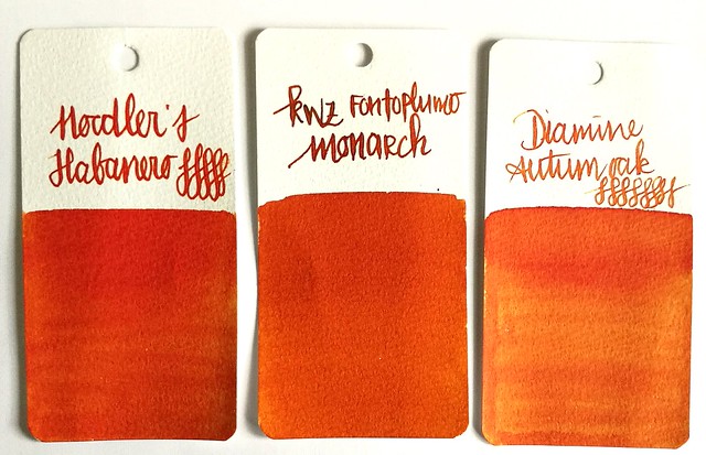
It definitely does the ink justice! It has some great shading and reminds me a lot of Diamine Autumn Oak and Noodler's Habanero (ink shot reviews by the lovely Gourmet Pens). Though Monarch is a bit browner and has a wonderful vanilla small to it! Makes writing with it a lot more fun (I kept sniffing the nib!)

orange comparisons
Comparing the inks side by side. As you can see Monarch definitely has a browner and darker tone to it. It's a subdued copper red orange ink but with writing you definitely can see some lighter tones. 

Pelikan Grand Place with KWZ Monarch
I am very much enjoying this pairing and happy to have these two special editions in my collection.

Thanks for stopping by and have a wonderful day!

namasté

2016/10/24

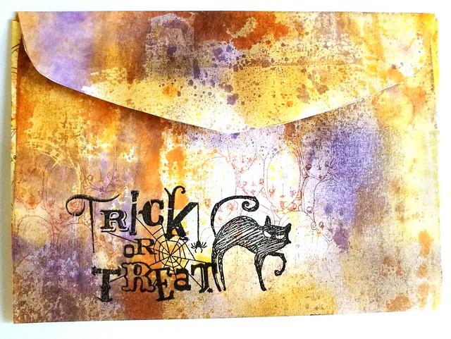
Mailart Monday: Trick or Treat?

trick or treat

Seeing the time is nearly there, I thought it would be fun to do a little Halloween Mail Art tutorial for this week's Mailart Monday.

trick or treat
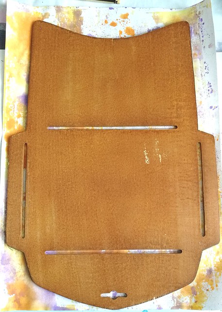
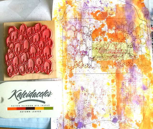
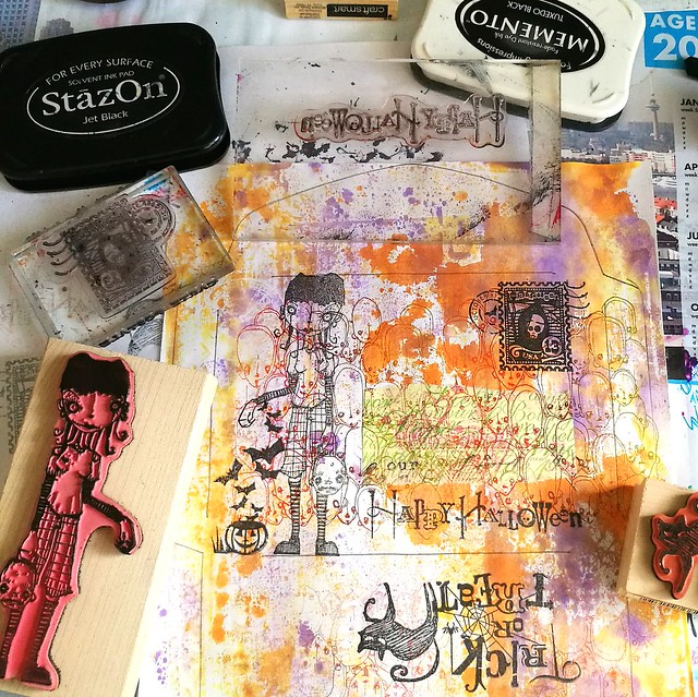
I started off by using a piece of 100gms white A4 paper and used it to blot off some excess orange and violet ink for another project I was working on. Purple and orange are in my eyes the best color combo for this time of year! I have a few envelope templates and I used this wooden one from a Japanese brand which makes the 6x4 inch envelop when folded.

trick or treat
After I traced the template with a pencil, I took the heads stamp from Stampotique Originals and stamped it on the page a few times inked with Kaleidacolor Autumn Leaves. I made sure I stamped the reverse on the lower part seeing that is going to be the back side folded up. Oh and I used a bit of post it tape to mask the part where the address is going to be before I went stamping :)

trick or treat
The I took a couple of more stamps which fit the theme, from Inkadinkadoo and the focal point was going to be Linda by Daniel Torrente.  She is naturally spooky and fit well with the Trick or Treat theme.

trick or treat
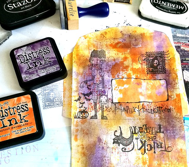
I then cut out the envelope and added more color to it by using the blending tool and dusty concord and spiced marmalade distress inks. Took away the mask and doodled around the space to mark off that address border.

trick or treat
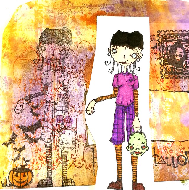
The I stamped Linda again on a piece of sticker paper, colored her in with complementary colors in Letraset Promarkers and adhered her to her spot on the envelope after cutting her out. Then folded the envelope and glued the flaps in place and called it done!.

trick or treat
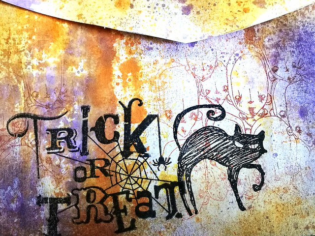
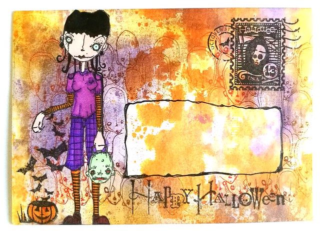
The end result: this is the front. Linda pops out and the address block is definitely light enough for writing but also distinct with that splash of color in it.

trick or treat
And the back; I kept it simple and mysterious by just adding a few stamps and making sure the heads were visible through the lighter spots. When the address is written on I am planning on applying some varnish to seal it so it travels safely to its destination. 

The creative people at the Stampotique Desigener's Challenge have a lot more examples for fun Halloween mail projects and I am entering this for their fun Halloween fortnight challenge.

Also entering this one for the Mixed Media Monthly Challenge for October with the Halloween theme

Next week monday it is actually Halloween, do you have anything special planned? Either way, hope you have a fantastic week and thanks for stopping by!

Namasté

2016/10/21

ART Snacks October 2016 Box

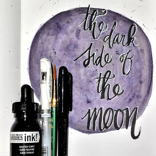
The above image of the super moon is made with the contents of the Artsnacks October Box (a subscription box I have joined last month after listening to the Art Supply Posse rave about it on their podcasts) and I am actually really happy with all of the products that were in this box. Yes, even after being a bit underwhelmed that the ink I got in the box was grey! But look at it, the grey has some amazing shades to it when you work with it! Let's take a closer look at all the items in the box of the month October:
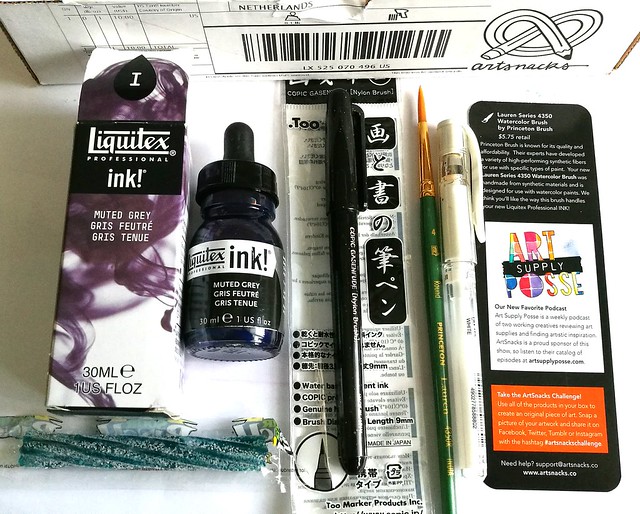
My box arrived within 2 weeks after shipping, the same as last time, so not too shabby! Hopefully that means I can keep anticipating my boxes to arrive around the 14th of each month :) The star of this box, was the anticipated Liquitex Ink! from the muted collection line which was a hint from the teaser email earlier last month. I was really hoping to get a turquoise color in the box, which, as you might have guessed, is is my fave color. Alas! Would that it were so simple as you can't really know which color you are going to get and with the luck of the draw, I got the grey one instead. BUT it did suit the other items in the box quite nicely! These were the products from the October box (blurb on the products taken from the artsnacks website)

Special Release Muted Collection: Liquitex Professional INK!
Liquitex is only releasing a limited supply of its Special Release Muted Collection: Liquitex Professional INK!, and as an ArtSnacks subscriber, you’re one of the first to get it. This water-resistant ink is extremely fluid, so it’s easy to use with both brushes and dip pens. It’s also fast-drying, so it won’t slow you down when you want to try layering techniques. There are five colors in this exclusive collection. Which one did you get? 

Uni-Ball Signo White Gel Pen
The Uni-Ball Signo White Gel Pen provides a silky flow of highly opaque ink. This pen will perform especially well on tinted or black paper. Try layering it over other inks, once they have dried. You’ll find that this ink does not fade as it dries, so you won’t be drawing over and over on the same lines to get a strong white highlight. 

Copic Gasenfude Brush Pen
The Copic Gasenfude Brush Pen was created with Sumi-e (East Asian brush painting) artists in mind. It’s also great for calligraphy and cartooning. Filled with water-based pigment ink, this pen features a super-fine point that makes this tool even more flexible. If you have Copic markers in your collection, you can use this brush pen with them – the ink is compatible, so the colors will not bleed. 

Lauren Series 4350 Watercolor Brush by Princeton Brush
Princeton Brush is known for its quality and affordability. Their experts have developed a variety of high-performing synthetic fibers for use with specific types of paint. Your new Lauren Series 4350 Watercolor Brush was handmade from synthetic materials and is designed for use with watercolor paints. We think you’ll like the way this brush handles your new Liquitex Professional INK!

I honestly did LOVE how the Lauren brush worked with the Liquitex INK! It held the ink and water mixture (I watered down the ink a bit in a mixing tray) really well, bounced back into shape quickly and dispersed the liquid well on the page. I also like how the Copic Brush and Uniball white gel pen look so well together. I hand lettered the quote and then drew the moon over it with the liquitex ink. The water based pigment ink in the copic marker dries water resistant on the page. The gel pen however does fade a bit when you use a liquid ink over it though, so I did have to trace the outer white lining again. Maybe I didn't wait long enough for the gel pen to dry, but in my test, it did fade and I had to reapply to get the strong highlight. Hmm... maybe it means in the blurb that you just have to apply it once after you've done all your inking, then you get a solid white line which stands out. Because that is indeed true. I've worked with pentel and sakura white gel pens, but the uni ball has by far the strongest/brightest while line. See more on white gel pen comparison here on the Jet pens blog. Working with the Liquitex muted grey ink got me curious about the other colors in the series, so when I was in the neighborhood of Van Der Linde I picked them up.
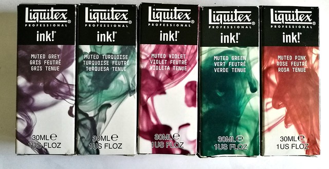
Sigh... thanks for enabling Art Snacks! The Van Der Linde store still has a few of these in stock (not on their website unfortunately) and when your order is over 35€ in the store, you will get a 20% discount on your total which is basically a free INK! as they retail for 7,05€! Yeah, you're welcome - just paying the enabling game forward ;) Looking forward to play with these INKS! over the weekend. 

The october box is still available in the Artsnacks shop. Still no international shipping options at this time, sadly :( Though the subscription still has an international plan.
Hope this review was useful for you. Thanks for stopping by and have a wonderful weekend!

namasté
2016/10/19

Pens and Ink: Omas Bologna with Montblanc Dandy Turquoise

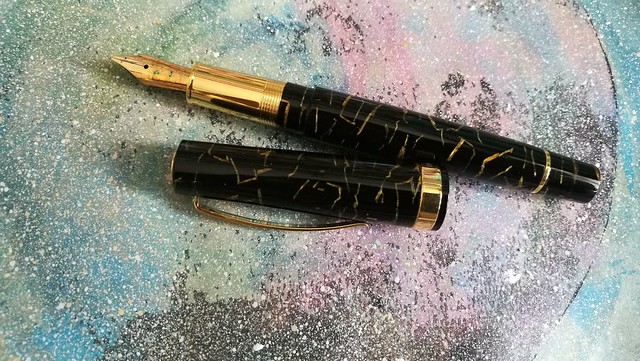
Omas Bologna black and gold celluloid

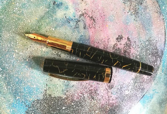
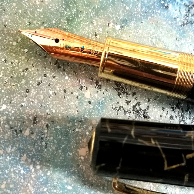
This post is going to be an appreciation post of this pen, which is the Omas Bologna in Black and Gold Celluloid finish. I was lucky enough to find this one for sale at a local boutique and since the Omas pens are not readily available anymore, I jumped at the chance and got this gorgeous writing instrument.

Omas Bologna black and gold celluloid
Look at that stunning celluloid finish! I bet you could not resist this beauty when you've seen it up close!

Omas Bologna black and gold celluloid
It's fitted with a 14k fine "colonnade" nib. Not my preferable nib grade, but you can't be too choosy with pens that are hard to come by. Thankfully the Omas nibs are somewhat springy so it does offer a nice line variation in writing.

Omas Bologna black and gold celluloid
I've paired this pen with my fave turquoise ink, Montblanc Honoré de Balzac Dandy Turquoise, a special edition ink from last year. I love this color and have a few bottles of it, but only use it sparingly because what if I run out of it?? That is the perpetual fear of owning LE inks Isn't it? I decided this pen is definitely worth that special ink though! It's got some great shading and sheen, which even a fine nibbed pen like this Omas can bring out quite well.

Omas Bologna black and gold celluloid
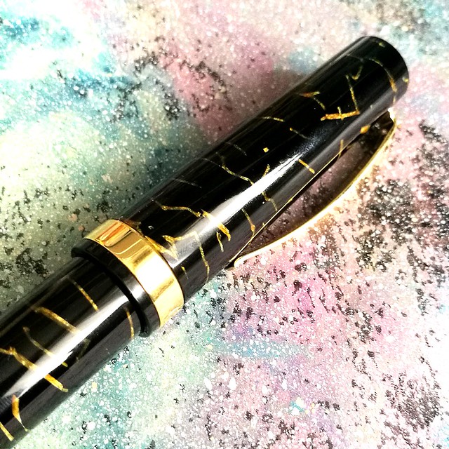
I am definitely loving this pairing a lot. And this pen is just so shiny!

Omas Bologna Black and Gold Celluloid
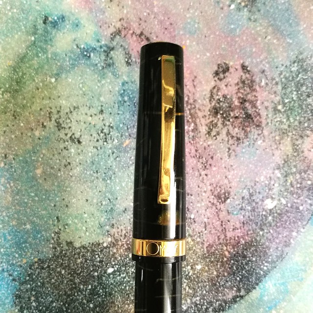
What I also like about this pen is that it has a lovely detail on the finnial, the "O" gives it a nice finishing touch.

Omas Bologna black and gold celluloid
The clip on the pen is a bit different than their usual clips with the little wheel on the end. It's also a bit more springy than those clips. Certainly fits the overall look of the pen.

Preparing some posts for my #pensandink section on my blog. A real beauty coming up soon. #omasfountainpen #omas #fountainpen #mindfulwriting #writtenmeditation #journal #lovingkindness #turquoise #fpgeeks #fpn #fountainpennetwork
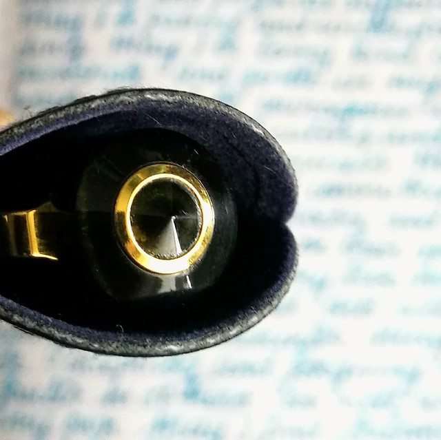
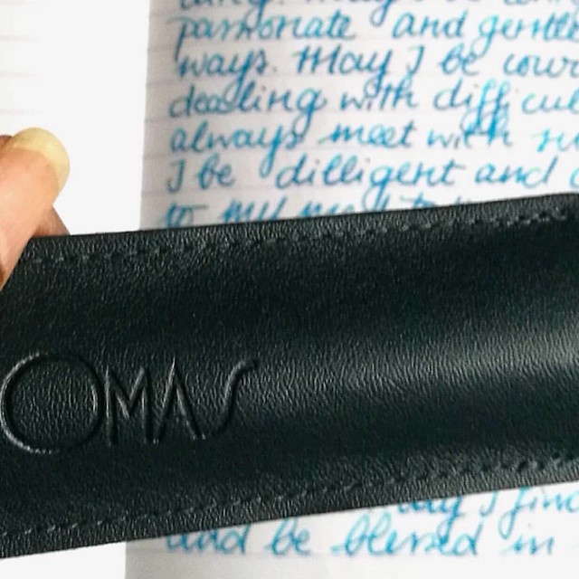
It also came in this leather pen sleeve, one that came with older Omas pens. Love the deep blue color it has and I prefer it more than the felt pen sleeves that came with the resin ogiva's for example. This has a classier feel to it. My Omas Bologna in red celluloid also has this same pen sleeve, So it think it only came with certain special edition or older pens.

Omas Bologna black and gold celluloid
I got this Bologna for a great deal at a local boutique because of a clearance sale and I still can't believe the luck I had with that! It's definitely a stunner of which I am proud to have in my fountain pen collection. If you ever have the chance of picking one of these up, definitely don't hesitate! 

Thanks for stopping by and hope you have a great day. 

namasté

2016/10/17

Mailart Monday: The Traveler In You

The traveler in you

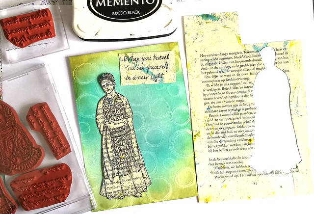
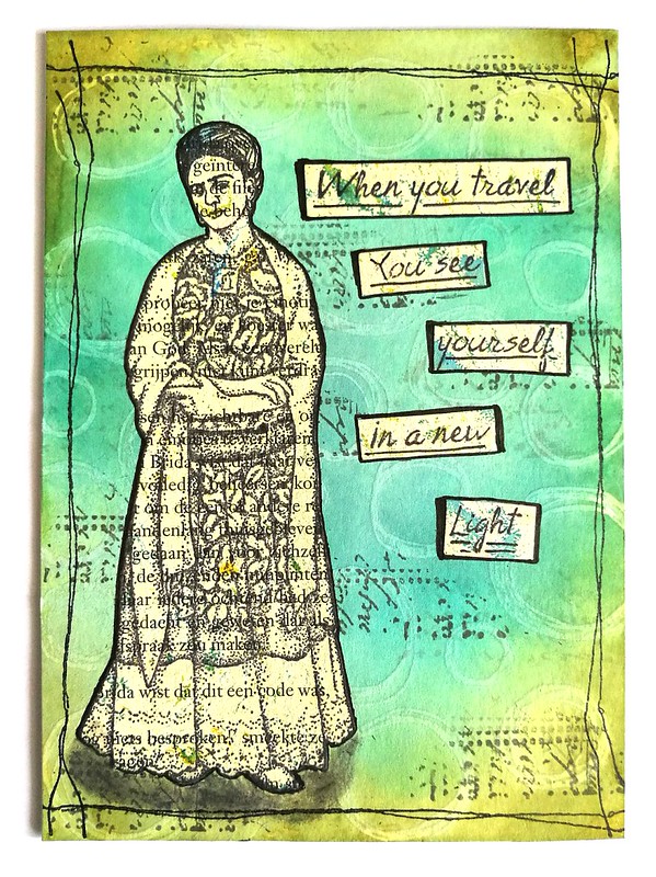
In a few weeks I'll be traveling abroad and I have the "travel bug" in me, counting the days until we hop on the plane and fly off to our destination. In this mailart monday I have made a card combining the Travel Quotes from Lost Coast Designs and that beautiful image of Frida Kahlo from Carmen's Veranda. I stamped those on a marbled bookpage with memento tuxedo black and cut them out. The base of the card is made with stamping the doodle circles background stamp with white pigmented ink from dovecraft on white Neenah Classic Crest paper and heat setting it. Then I took my blending tool and peacock feathers, tumbled glass and peeled paint distress ink pads colored the background. The heat setting of the white pigment ink acted as a resist and the circle doodles showed through nicely.

The traveler in you
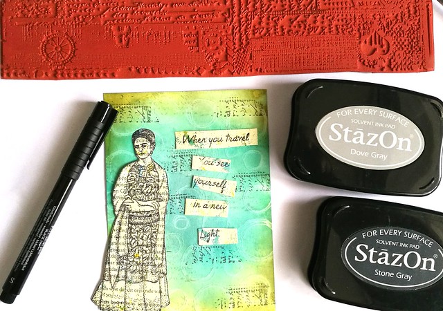
The background needed a bit more interest, so I took one of the grunge border stamps from Loast Coast Designs and stamped a part of the text with StazOn dove grey and stone grey. I cut the text into strips and then decided on the placement.

The traveler in you
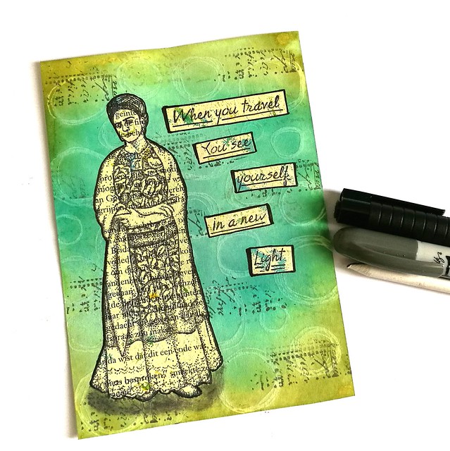
I adhered the text and Frida image to the background and outlined it with the faber castell pitt marker. With the grey distress crayon I made some shadows on the bottom near her feet and blended it, so she looks more grounded to the card.

The traveler in you
Lastly I created a border with the stitching lines from VLV and adhered the piece to a double sided card and is ready to be mailed out. I can't wait for my next travels to unveil a new light within me :)

Have a great day and thank you for stopping by!

namasté
2016/10/14

Monthly Planning MTN: September 2016 update

MTN september 2016 update
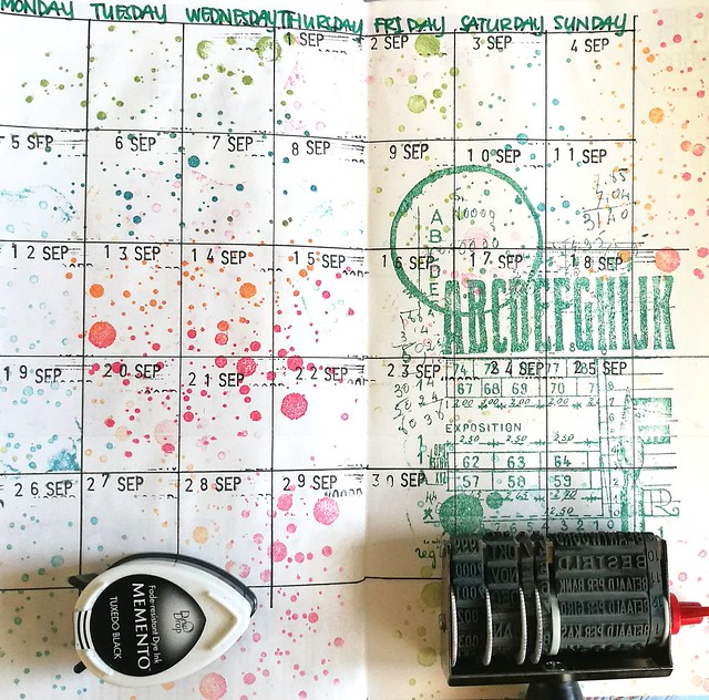
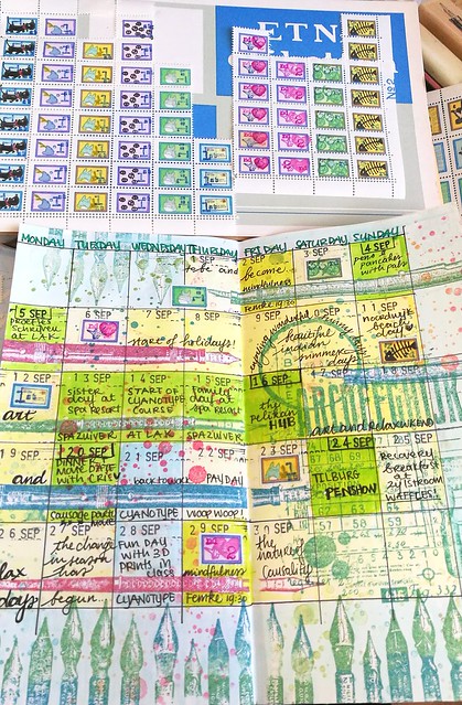
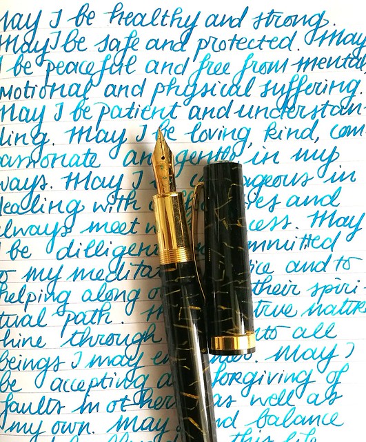
After a bit of an underwhelming August, the month of september was filled with bright and colorful days!  I was excited to start on this spread because a lot of cool things happened and I wanted to use a fun combination of rubber stamps to set this month's theme which was "Ink, pens and writing". But before I got started I had to lay some ground work.

MTN september 2016 update
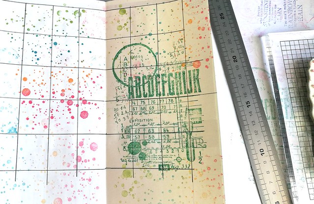
I really enjoyed the use of Carabelle stamps and Tombows in my spread of last month, but it bled through a bit on the back. A while back a friend gave me an A5 pad of cream colored Tomoe River paper and I used a couple of pages to cover the next pages I would be working on. The paper is really thin but sturdy and holds up ink like a trooper, so it was a good choice to add that as an extra barrier. I drew the month's grid with Faber Castell Pitt pen and stamped the carabelle ink spatters and journal stamp on it with various memento ink colors. Then I used the date stamper from the top picture to mark the days.

MTN september 2016 update
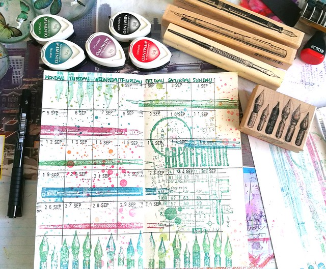
The page needed some images on pens on them and this was a great excuse to use the fountain pen and nibs rubber stamps from Impression obsession (calligraphy 1 and calligraphy 2) and Viva Las Vegastamps (fountain pen and nibs). Definitely liked the way how it all came together. Now it's time to fill up the month!

MTN september 2016 update
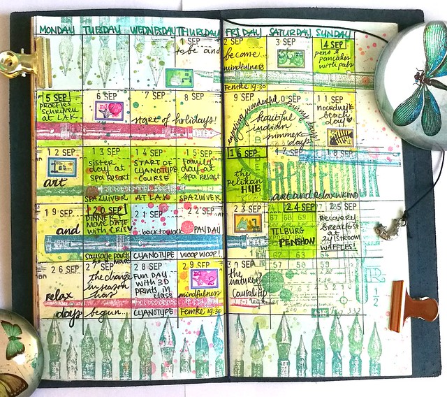
I wrote it all down with my Faber Castell Pitt artist pen because it's water proof. I colored the grids with different colors Tombows and highlighted the best days in green. For some more decoration I added a couple of my home made arti-stamps! Yes, I know I still need to do a post on how I made those!!

MTN september 2016 update
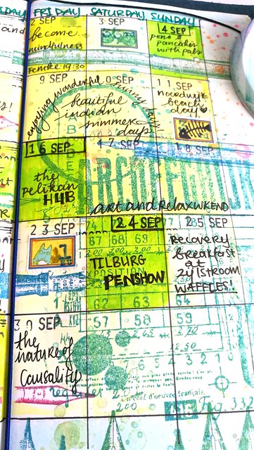
The best days definitely happened on the weekend. The first ever Pelikan Hub on Friday the 16th and a week later on saturday, the 28th edition of the Tilburg Penshow were definitely highlights of the whole year! And the fact I had a nice 2 week holiday in which I enjoyed wonderful " Indian summer days" at a spa resort with my sisters :)

MTN september 2016 update
The completed spread in full color! I thought about adding a quote like I have done in most spreads, but I felt it didn't need one. This might be my fave spread so far! I am excited to work on October's spread because I am going to use a stencil in combination with stamps. And maybe try a bit mixed media. Having experimented covering the pages with Tomoe River to counteract bleed through on the back pages, opens up exciting possibilities!

Thanks for stopping by and have a wonderful weekend.

namasté
2016/10/12

Pens and Ink: Conway Stewart 15 with Robert Oster Bondi Blue

Conway Stewart with Bondi Blue

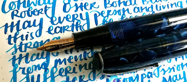
On today's pen and ink another one of my Tilburg Penshow spoils (which I bought from Sarj's) the blue marble vintage Conway Stewart 15 (here's a review by Grandmia Pens on you tube) I chose to pair it with Robert Oster Bondi Blue ink which I got from the Sakura Fountain Pen Gallery recently. So happy to have found a stockist at the Benelux that ships for free to NL (above a certain amount though, so I got a lot more ink in my first order there). 

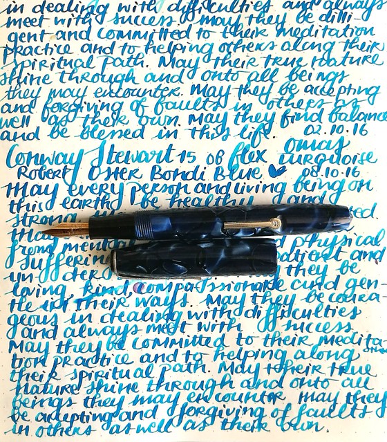
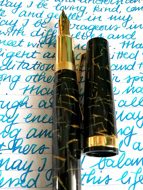
A slightly left obelique (yes, you were right @mrericorozco 😊) stub nib with flex on this gorgeous Conway Stewart 15 which I purchased from @sarjminhas at the Tilburg Penshow. It's a beautiful writer!
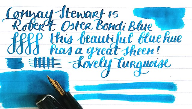
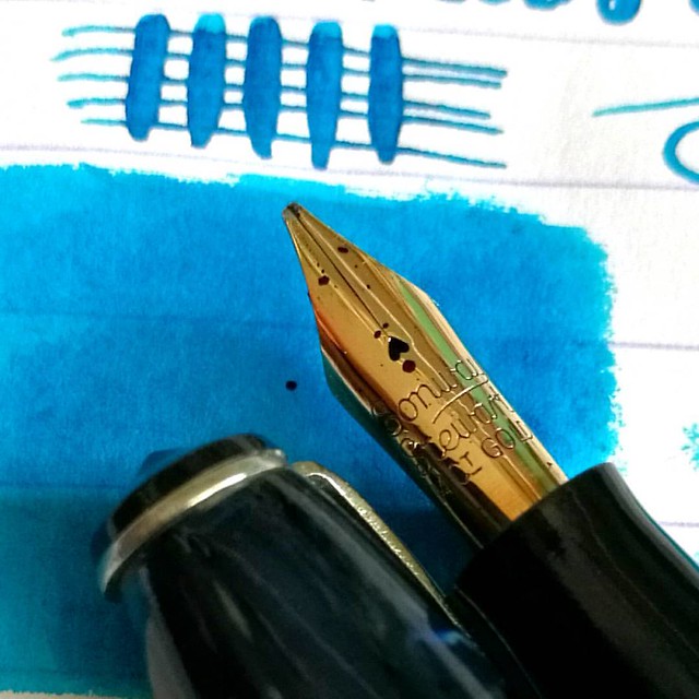
A close up of the nib. This pen has a beautiful, slightly left oblique stub nib that has some flex and is an absolute pleasure to write with. It has wonderful line variation and lays down a nice wet and broad line which shows off the shading and sheen of the gorgeous Bondi Blue ink.

Conway Stewart with Bondi Blue
A page from my loving kindness metta meditation journal. I had Omas turquoise in it before Bondi Blue, that is the writing seven sentences from the top. They definitely look alike in writing, but the Bondi Blue has more sheen.

blue hues
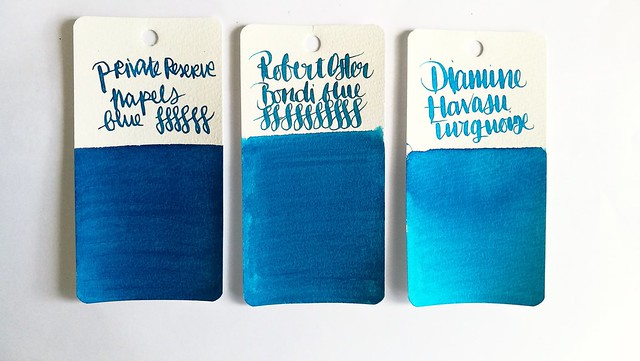
To put the color in the spectrum of blue hues, it's a bit lighter than Private Reserve Naples Blue (which has a lot of sheen) and a shade darker than Diamine Havasu Turquoise (which also show sheen and also a nice shading). Robert Oster's Bondi bBue is a great blue hue with accents of green and a gorgeous shading on paper like Rhodia, Clairefontaine and Tomoe River. But even on absorbent paper it shows some sheen and a lot of shading.

Robert Oster Bondi Blue
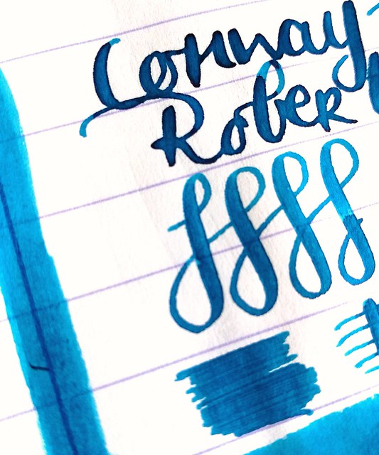
A close up of the ink on 80gms Lyreca office paper which is quite absorbent but also really great for fountain pen inks.

Conway Stewart with Bondi Blue
I definitely like this pairing and am curious about trying more Robert Oster inks (the Purple Rock being next in line :)

Thanks for stopping by and have a great day.

namasté