Showing posts with label letraset markers. Show all posts

2017/04/11

You stand in your own light, make it shine

you stand in your own light, make it shine

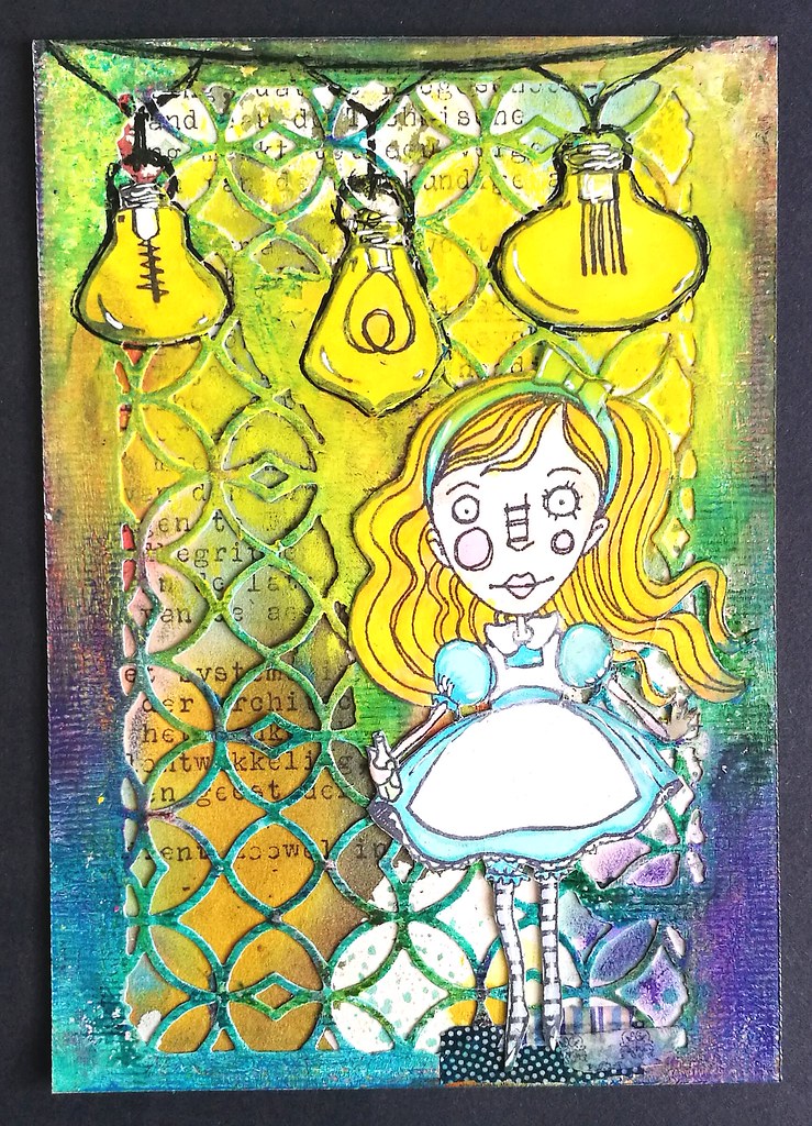
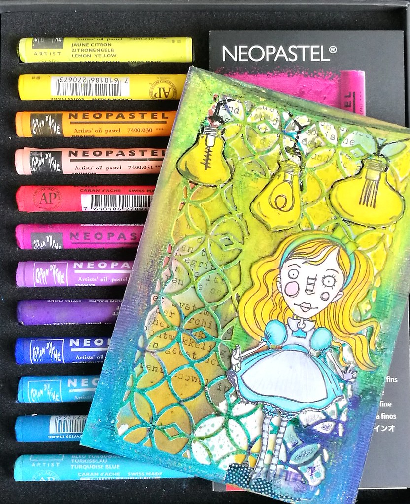
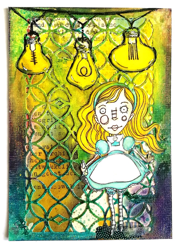
Yesterday I took out some my new supplies from my Art Specially haul this year and made the above card. I used my Lindy's magical shaker's on the text background (vintage typewriter text), Tim Holtz Alterations dies, Patio Lights and Alice from Stampotique Originals. I also used some fabulous caran d'ache Neopastels which I got at La Couronne du Comte and I absolutely LOVE working with them on my projects!
you stand in your own light, make it shine
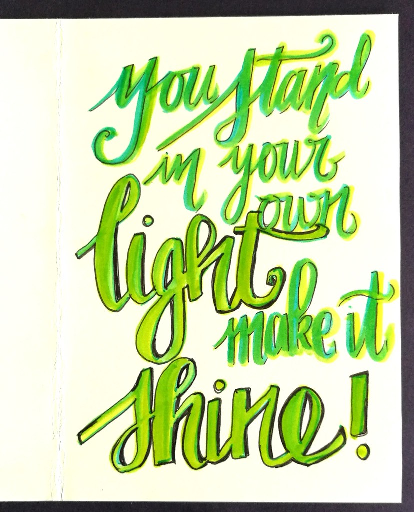
They are so bright and colorful to work with! I used the die from the TH mixed media set on heavy 200gms card stock, applied a good amount of white gesso and when that was dry, I rubbed all the oil pastels over the edges of the design. The colors really pop! The images were stamped on neenah classic white cardstock and colored with Letraset promarkers. I fussy cut them out and adhered with ZIG 2way glue pen. I applied a heavy amount of yellow pastel's around the lights so it looked like they shines brightly. Then outlined the sires and bulbs with a black uni posca marker. on the inside, I added a quote;
you stand in your own light, make it shine
It's a quote I got in a fortune cookies once and it's been in my wallet ever since. A reminder to let your light shine brightly! The lettering is done with tombow markers and outlined with faber castell pitt marker.
you stand in your own light, make it shine
Wanted to show you how the card looks on a white background, but the lights really shine on the black background in the first picture above :)  The Stampotique text background challenge is still on until tomorrow, so do link up your projects :)

I also would like to enter this card in the following other challenges:
Try it on Tuesday - use a quote 


Mixed Media Monthly Challenge - What's your super power?

With this post I hope to convey my power to use and blend color in various mediums and have it POP! 

Thanks for stopping by and hope you'll come by tomorrow to see what I've made for the new challenge theme for Stampotique which goes live then :)

Have an awesome day!

2017/01/16

MailArt Monday: Pigtales Grew Wings

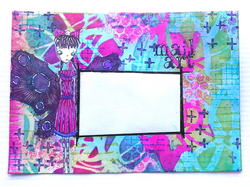
When I was cleaning my art room over my Christmas break, I found a stack of white standard C6 envelopes and I thought it would be fun to show you some more arted up envelopes in my weekly MailART Monday posts. butterfly mailart

I created the envie above with some of my fave Stampotique stamps and a new stencil by Brett Weldele. A colorful burst in cold winter times :) The whole thing is one layer and done with masking the main image and a part for the address off with some sticker paper.
Pigtails Butterfly mail art
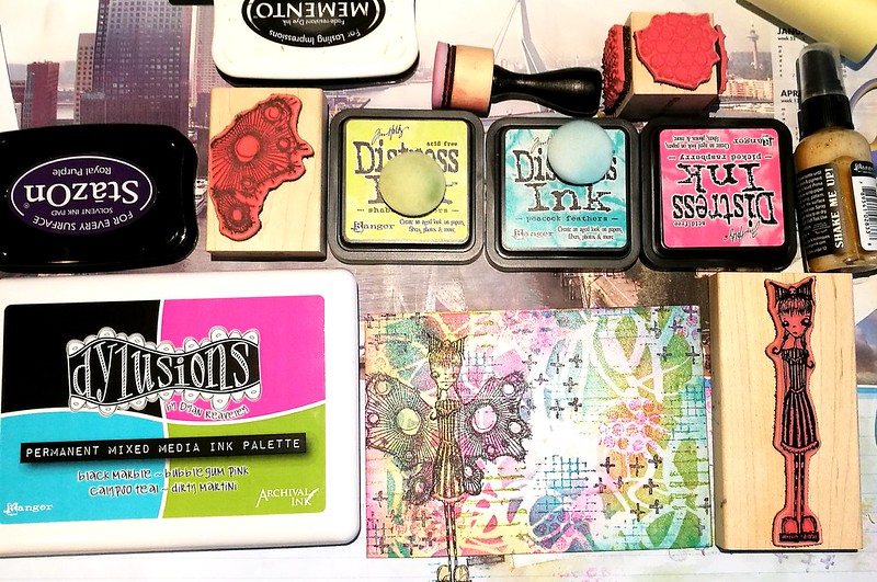
You can see most of the materials I used here. The Dylusions mixed media palette has such lovely bright colors! I chose some according distress inks to layer over the stencil, which is "scribbles" from Brett Weldele. When I took the stencil away I stamped some texture on it with the fun Textures cube from Kate Crane. And added more color first with distress inks and blender tool.

Pigtails Butterfly mail art
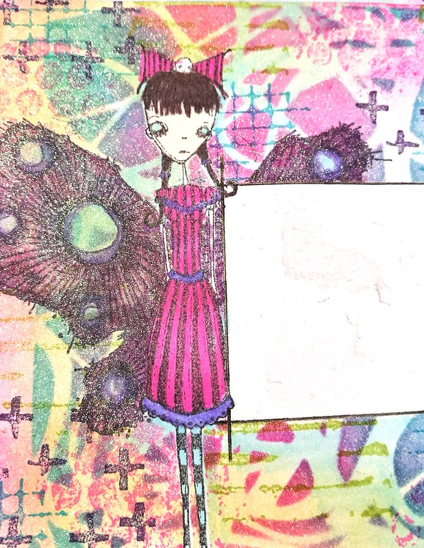
Before I took the mask away I also sprayed some shimmer, Perfect pearl kiwi to be exact. Then I colored little miss Pigtales and the lovely wings design by Daniel Torrente in with alcohol makers. I was contemplating leaving the wings like that, but I wanted brighter colors, so I went over it again with promarkers and copics (alcohol based markers) to brighten things up.

butterfly mailart
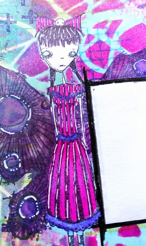
She definitely looks a lot brighter here and to make her pop out even more I used a white gel pen (from pentel) for some accents. 

It's the second week of the Anything Goes challenge at Stampotique, which I am entering this envelope in. You can play along until Wednesday when the new challenge theme is announced :)

Thanks for stopping by and have a great day!


2016/11/18

Mini Art Journal: Kiss

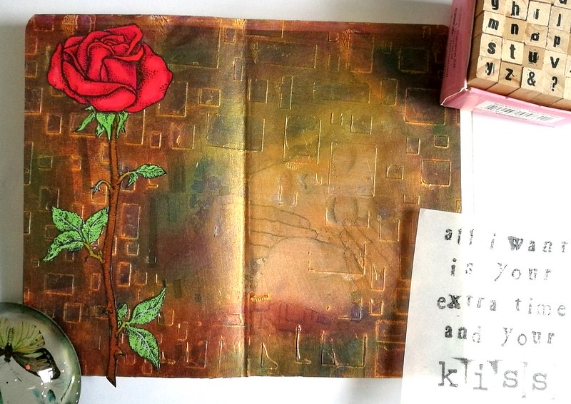
Last week I showed you some work in progress pieces of my experimentation's with The Crafter's Workshop Gold Gesso and I've taken the Klimt image to work on for an Art journal spread.

the kiss

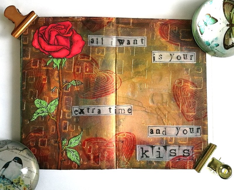
The Gold Gesso was a base on the Klimt print on which I have applied some metallic rub-ons with my fingers. The gesso provides a smooth surface on which the metallic paste just glides over. I have used some purple, green and red colors. The gold outline of the rectangles are still clearly visible and that gives it a fun effect. The Open Rose is a rubberstamp from Carmen's Veranda, which I stamped with memento black on sticker paper, colored with Letraset Pro markers and cut out.

the kiss

I cut the page to size and glued it to my art journal and added the rose to it. Then got some vellum and stamped some lyrics from a Prince song this image reminded me of; "All I want is your extra time and your.....KISS"
(eta: yeah I know it's "I just" instead of "all I" but I glued it in before I realized the mistake... oh well, it's all part of the process ;)

the kiss

I stamped the hand carved heart stamp a few times for the fun of it and cut and outlined the lyrics and this is what the finished spread looks like :) It's something fun and different and I definitely liked how the rub-ons work on gold gesso. Definitely going to experiment with that more. Also Carmen's Veranda has a this Klimt Kiss as a stamp and see what I made with that over here. 

And to ring in the weekend fun, let's all sing along to  - Kiss - from Prince :) 

Thank you for stopping by and have a great weekend :)

namasté

2016/10/24

Mailart Monday: Trick or Treat?

trick or treat

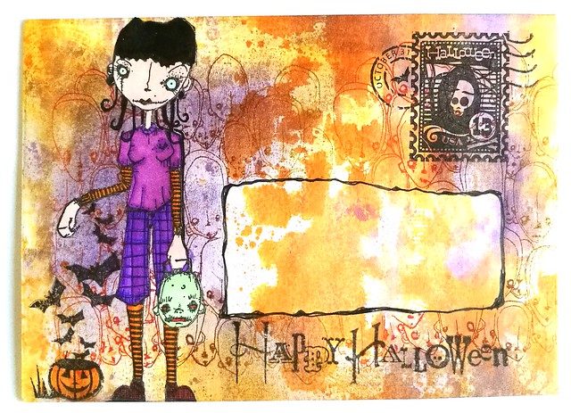
Seeing the time is nearly there, I thought it would be fun to do a little Halloween Mail Art tutorial for this week's Mailart Monday.

trick or treat
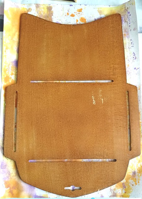
I started off by using a piece of 100gms white A4 paper and used it to blot off some excess orange and violet ink for another project I was working on. Purple and orange are in my eyes the best color combo for this time of year! I have a few envelope templates and I used this wooden one from a Japanese brand which makes the 6x4 inch envelop when folded.

trick or treat
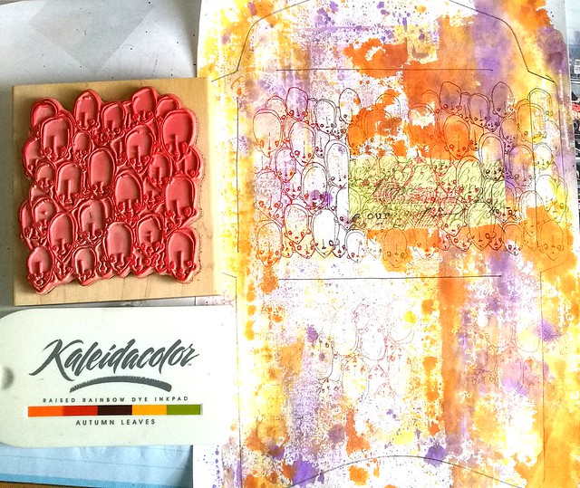
After I traced the template with a pencil, I took the heads stamp from Stampotique Originals and stamped it on the page a few times inked with Kaleidacolor Autumn Leaves. I made sure I stamped the reverse on the lower part seeing that is going to be the back side folded up. Oh and I used a bit of post it tape to mask the part where the address is going to be before I went stamping :)

trick or treat
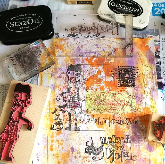
The I took a couple of more stamps which fit the theme, from Inkadinkadoo and the focal point was going to be Linda by Daniel Torrente.  She is naturally spooky and fit well with the Trick or Treat theme.

trick or treat
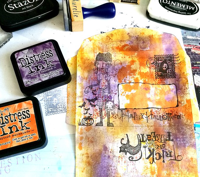
I then cut out the envelope and added more color to it by using the blending tool and dusty concord and spiced marmalade distress inks. Took away the mask and doodled around the space to mark off that address border.

trick or treat
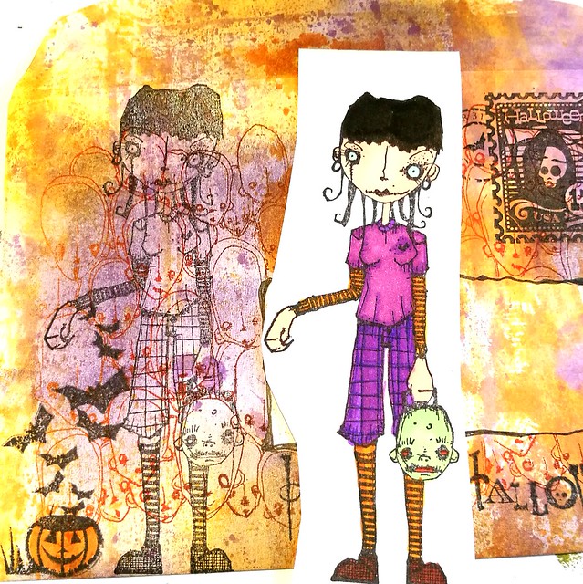
The I stamped Linda again on a piece of sticker paper, colored her in with complementary colors in Letraset Promarkers and adhered her to her spot on the envelope after cutting her out. Then folded the envelope and glued the flaps in place and called it done!.

trick or treat
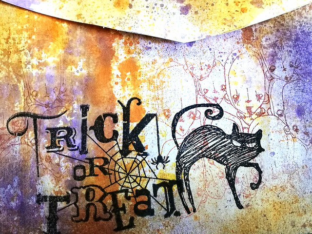
The end result: this is the front. Linda pops out and the address block is definitely light enough for writing but also distinct with that splash of color in it.

trick or treat
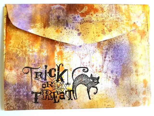
And the back; I kept it simple and mysterious by just adding a few stamps and making sure the heads were visible through the lighter spots. When the address is written on I am planning on applying some varnish to seal it so it travels safely to its destination. 

The creative people at the Stampotique Desigener's Challenge have a lot more examples for fun Halloween mail projects and I am entering this for their fun Halloween fortnight challenge.

Also entering this one for the Mixed Media Monthly Challenge for October with the Halloween theme

Next week monday it is actually Halloween, do you have anything special planned? Either way, hope you have a fantastic week and thanks for stopping by!

Namasté

2016/09/30

Mini Art Journal: The Nature of Causality

Pocket Art Journal - the nature of causality

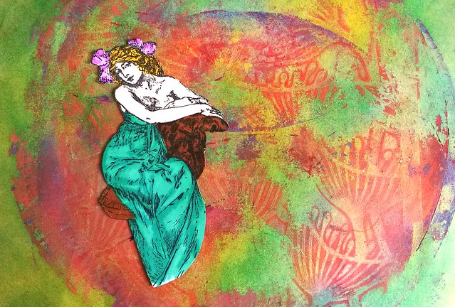
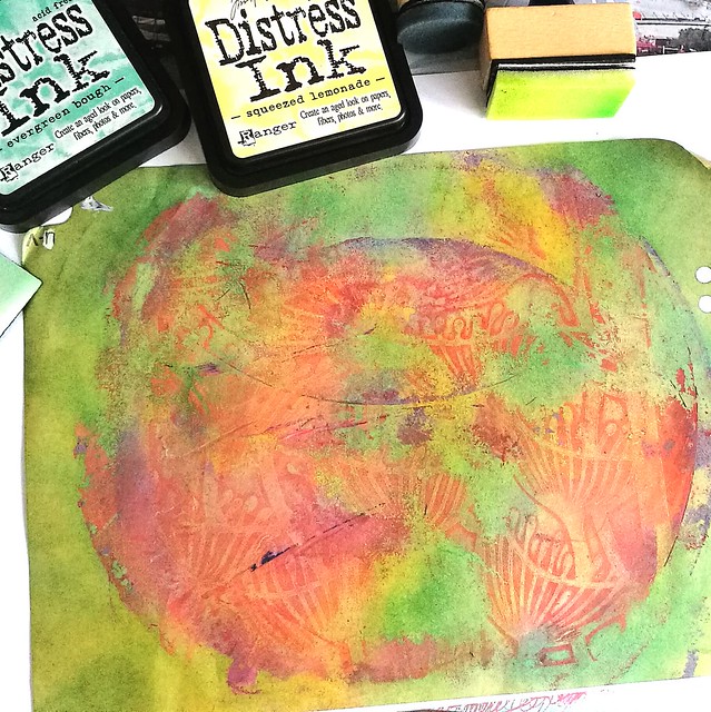
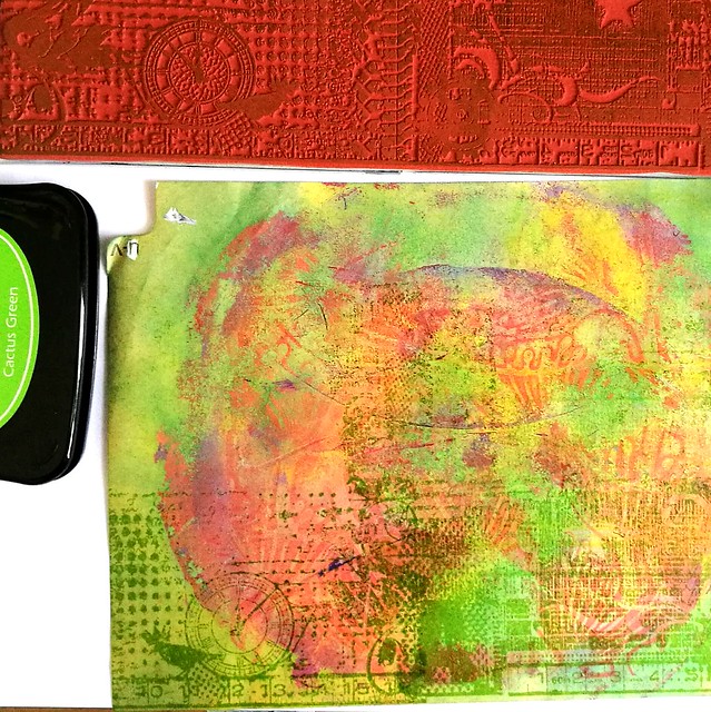
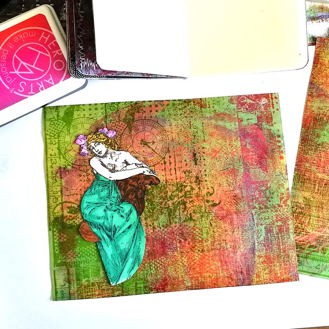
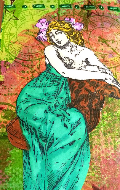
Last week I showed you some results of my gelli printing session using some fun stencils. I have used one in my pocket journal as a base in combination with a wonderful Mucha woman stamp from Lost Coast Designs. I stamped her on sticker paper and colored her in with letraset promarkers.

Pocket Art Journal - the nature of causality
The print I took was the "clean up /dirty print" and I started with adding more color to the page with dabbing distress inks squezed lemonade and evergreen bough on the page with a blending tool. It created a really nice bright background to work on.

Pocket Art Journal - the nature of causality
Then I got out the yummy large grunge border stamps to create some texture on the page. I used staz on cactus and forest green and the hero neon ombre sets in green and pinks.

Pocket Art Journal - the nature of causality
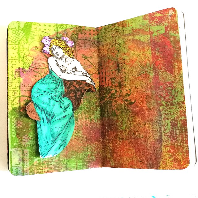
I stamped the whole page with both grunge border stamps in alternating colors and when it came to cutting the page to size for my journal, I flipped the page because I liked the look of the clocks right above her head.

Pocket Art Journal - the nature of causality
I definitely love how the texture of the background came together. The green aria on the left sort of does look like a couch and I decided to place the lady there.

Pocket Art Journal - the nature of causality
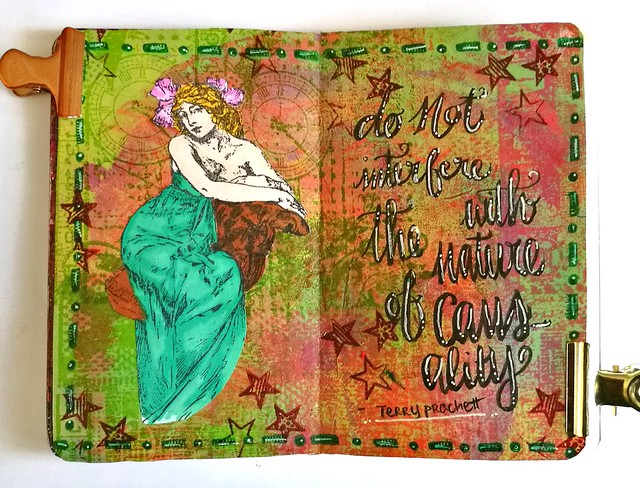
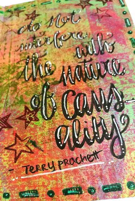
A quote from Terry Pratchett Discworld was added to the right "Do not interfere with the nature of causality" and I found this very fitting with the artistic process.  I had a hard time letting go of the fact that the flower imprint is not distinctly visible anymore as it did in the very first picture of the post. But I still could create a page I was happy with. Sometimes things just happen while you are working on something and it's better to work with it,and not against it. The quote is written with Kuretake Fudenosuke brush soft pen and accentuated with a pentel white gel pen. The border stamp is from Dylusions and the star stamps from studio light.

Pocket Art Journal - the nature of causality
I love promarkers because you can create some lovely shading.

Pocket Art Journal - the nature of causality
Terry Prachett is a wise man!

Have a great weekend and thanks for stopping by.

namasté

2016/09/12

Mailart Monday: A High Tea Party

(high) tea party - mailart

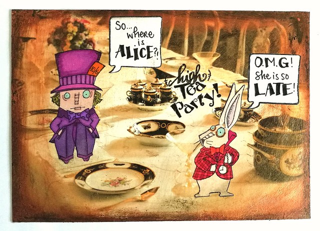
It's the second week of the mail art challenge at Stampotique and I was so pleasantly surprised I got chosen by Tera in her top 3 faves picks of last week :) Thanks so much dear! And it inspired me to make another mail art card for the challenge this week using these fun Alice in Wonderland stamps. I used the Mad Hatter and the Rabbit by Janet Klein. I love them so much and hopefully I will get the rest of the Alice series soon. 

I started by stamping them on sticker paper with memento black and coloring them in with letraset promarkers. The background is in fact a promotional card from a museum with an 18th century interior and I used that as the base of my High Tea Party card because it's so fitting! Altering postcards is a fun way to create some quick mail art as well! Because the card was too glossy I put on some clear gesso over it and added Modge Podge golden sheer and a bit of acrylic bronze paint around the edges and fading inwards to create a vintage effect. The speech bubble is a stamp from 7gypsies and I also stamped that on sticker paper. Wrote down the sentences with faber castell pitt markers (I am REALLY loving this pen! It is a lot more effective and black than my steadtler microns!) Then I cut everything out and stuck to the card. I sealed it off with a layer of medium gloss finish and it's ready to mail!

If you want to play along with the mail art theme you can until this Wednesday when the new challenge comes online. Looking forward to see what the next stampotique challenge is :)

Thanks for stopping by and have a great day!
namasté

2016/02/29

Mail Art Monday: Dorothy Rose

Mail Art 2015-031

The mail delivery of this one had a bit of a hick-up, but it finally arrived so I can share it with you here. I sent this to my friend Tera a.k.a. the Crafty Sugar Addict for a personal mail art swap. She posts amazing Mail Art tutorials on her blog as well as on the Viva Las Vegas Stamps DT blog. I was in love with the Northeren Lights Mail Art she made for MAM and it is more stunning in person.

Fantastic mail art received from @kattera22 😀 Thank you dear I love it! #mailartists #received #mailin #IUOMA #mailart #rubberstamped #rubberstampart #northerenlights #VLV

This is what I received from her. Look at the color tones and the card is fantastic too :) I love it!

Listening to Adele and making some mailart on this lovely monday #mailartists #mailartmonday #octopodefactory #roses #dorothy #wizardofoz #stencils #IUOMA #mailart #snailmailing #snailmailrevival #colorcoordination #promarkers

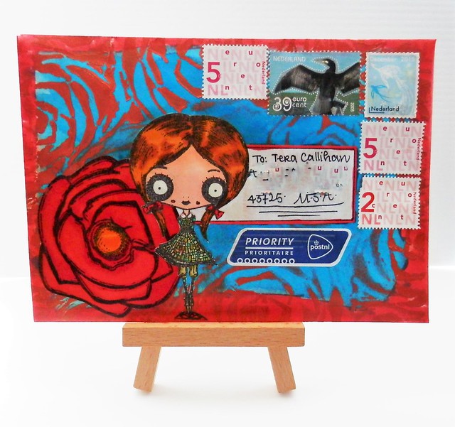
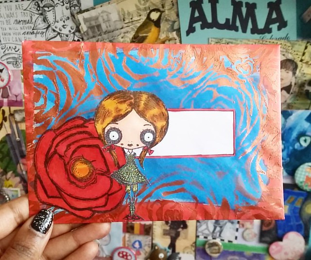
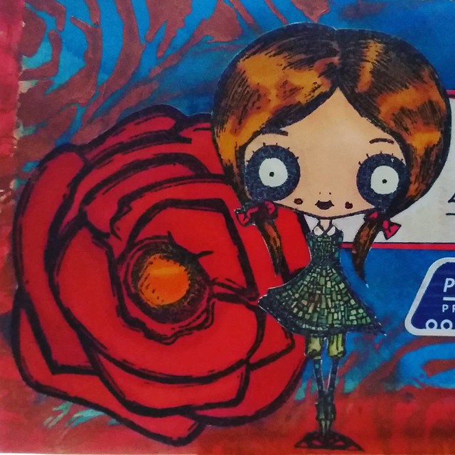
I am glad she was happy to receive the envie I made for her too (even though it took quite some time to arrive...) This is how it looked pre-addressing. How I made it: I used Pilot Iroshizuku Kon Peki fountain pen ink to color the envelope blue (I added a few drops with a pipette on the envie then sprayed with water and dried it with my heat tool). Then placed Succulents Stencil from Stencil Girl Products over the envie and dabbed some copper paint with a round brush on the sides, fading out to the middle. Placed an address sticker a little to the right off the middle and colored the edges of the lable and the envelope with a Red Promarker. The Dorothy and Rose stamp are from the Octopode Factory (founded by late lily Chilvers). I stamped them on separate papers, colored them with promarkers and cut them with a small scissors then adhered them to the envelope.

I just love how bold the colors turned out on this piece #mailartists #mailart #snailmailing #snailmail #mailartmonday #octopodefactory #dorothy #roses #rubberstamped #rubberstampart #envelope #mailout
I enjoyed coloring these images. The dress has so much detail and with the Letraset Tria Promarker super Fine tip, you can color in details like this without much trouble. I prefer those markers most when it comes to detail work. 

When I was done with the envie I sealed it with a bit of matte Modge Podge so the colors would hopefully not bleed through during transit. 

I definitely love doing Mail Art swaps and if you would like to do a swap with me you can find me on Swap-Bot (my preferred swap place). Or you can contact me through my Facebook page or just leave a comment on this blog post. 

Hope this inspires you to create some mail art :) Thanks for stopping by!

Namasté

2015/09/07

Inkadinkadutchies Challenge - September One Layer

InkadinkaDutchies is a Dutch based webstore where rubberstamps from brands Lost Coast Designs and Carmen's Veranda are being sold so there is better European access to these stamps. I am happy to say that I am part of their design team :)

Today we start our monthly challenges on Inkadinkadutchies. We hope you are just as excited as we are! There is also going to be a bi-monthly ATC swap that will start up later this month. So stay tuned for that! 

First of all, here is the topic for this month's challenge: Make a “one layer project”. That means just use rubberstamps and ink. No embellishments, layers or model paste etc.
To inspire you here is my example I made for this challenge

Davinci's Muse

This is how I imagine Leonardo DaVinci's Muse must have looked like...

I used "back view woman" stamp from Carmen's Veranda and "steam punk fly girl" wings from Lost Coast Designs. For the background I used semi-glossy paper. First I stamped the woman with Memento Rich Cocoa and then just inked up the wings part of the Steampunk girl with Staz-On Jetblack to give her wings. It took me a few tries to get the placing right on her shoulders. Then I took a q-tip and dabbed it with stazon cleaner and gently rubbed away parts of the steampunk girl that I didn't want to have in the over-all look. The image is colored with Letraset Promarkers and Copic markers. The background is colored with a waterbrush and distilled peeled paint & fired brink and spatters with distilled dusty concord distress stains. I matted the piece on purple cardboard to give it a finishing touch. 

If you found your muse and feel inspired to play along with the challenge,
this is how you enter: 
We have created an album on the Facebook page. Click on 'photo's' and put the photo of your project in the album called “Challenge September 2015”. Last entry dateis Wednesday the 23rd of September. State your name and let us know what materials you used to make the project. 

The winner will be announced on the last Friday of the month, in this case on the 25th of September. Inkadinkadutchies will give 10 Euros on rubberstamps, as a prize, to the winner whom will be chosen by the Design Team. 

The Challenge topics are the same as on the official Lost Coast Designs blog so you can also enter your project there and have two chances to win. (The more people participating, the bigger the prize). Just make sure to read the Challenge rules at the LCD Designs blog. 

Good luck everyone and have fun :)

Namaste