Showing posts with label 50 shades of green. Show all posts

2016/07/20

Inky Goodness: the magic of Alt Goldgrün

inky goodness alt goldgrün
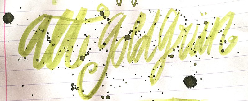
Recently I was going through my ink collection to ink up a new pen and I was thinking, man what is an ink I have a love for but not used in ages. Rohrer and Klingner's Alt Goldgrün was the first thought I had and I went with it. And yes, when I used it again I should make a mental note that I really, absolutely should use this ink more! In this ink spotlight I shall show you why :)

alt goldgrün
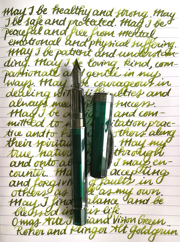
First I chose a pen to pair this ink with and I went with my Omas Arte Italiana Vision in Liquid green. It has a gorgeous juicy B nib which I knew would bring out the shading well. And I wasn't wrong.

alt goldgrün
The magical Alt Goldgrün in my Omas Vision Liquid Green with a juicy B nib for #inkyfridayfun @justvanness #fountainpenfriday #omas #FPN #fpgeeks #mettameditation #writtenmeditation #lovingkindness #loveforanalogue #green #sheeny #sheenyink #sheen #notcha
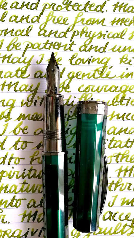
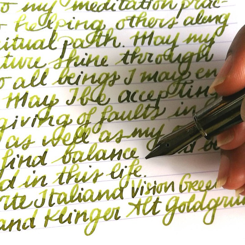
The above pictures are excerpts from my mindfulness metta meditation journal on clairefontaine paper. This ink has some amazing shading! And also some beautiful golden sheen.

inky goodness alt goldgrün
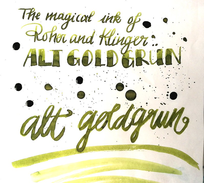
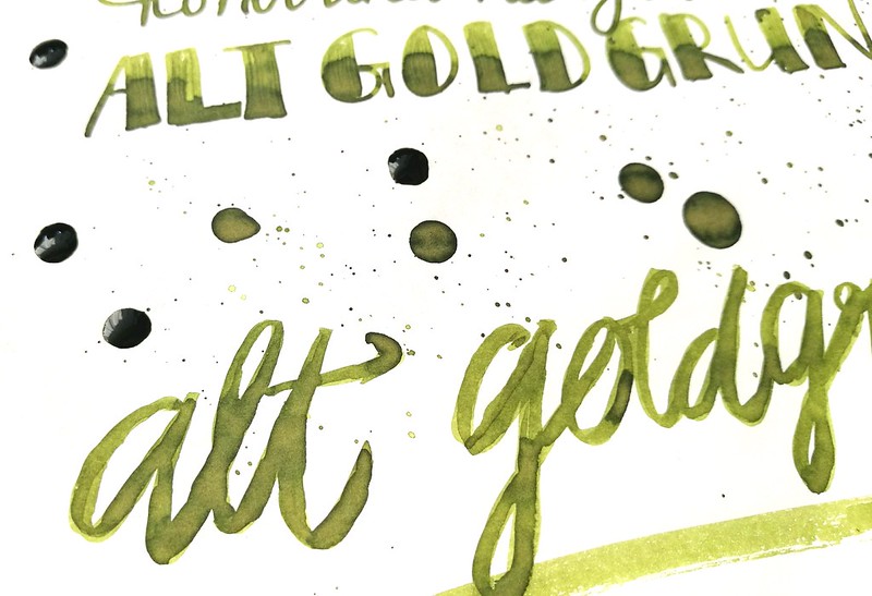
Rohrer and Klingner Alt Goldgrün on Tomoe River paper with an Omas B nib and a faber castell #6 brush.

inky goodness alt goldgrün
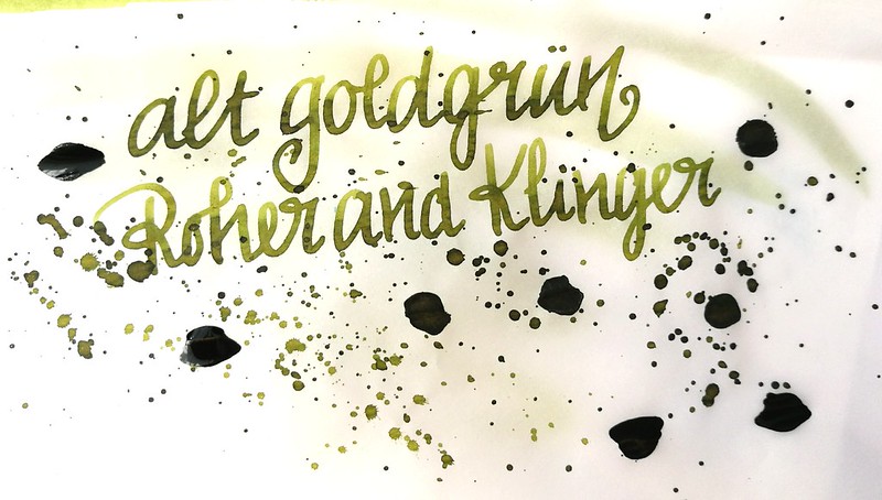
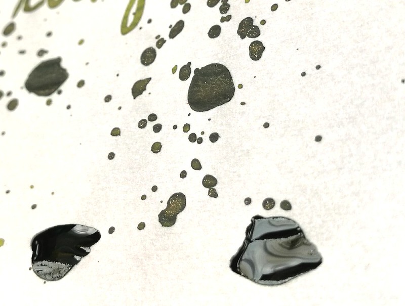
The ink on Canson 80gms tracing paper. Look at the delicious gold flecks in the ink when it dries. So pretty! (ETA: I noticed I have written "Roher and klinger" instead of "Rohrer and klingner" on my test pages, and I realize I always said/wrote it wrong, until now! argh!! oh well, mistakes happen, ink is still pretty and y'all know which company I mean by now, right? )

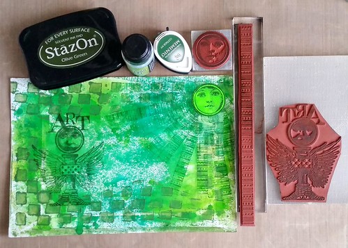
Of course I also had to make some ink wash art with this ink. I used the same technique as my previous ink washed art work and chose some fitting stamps for the theme.
inky goodness alt goldgrün
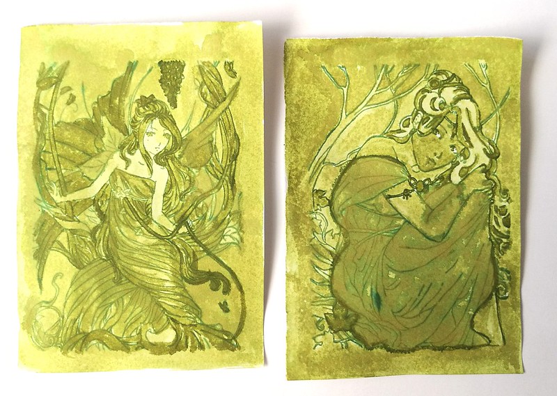
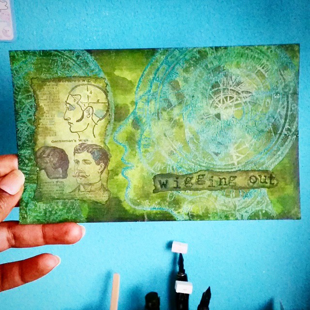
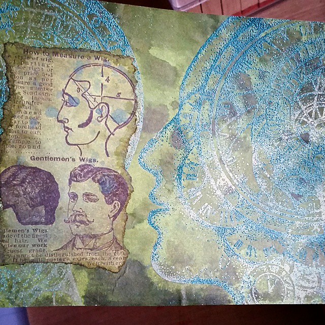
I chose some magical faeries from Sweet Pea stamps (sadly shop went out of business last year :( ) which I stamped with Memento cotton Ivy (which is waterproof) on 130gms smooth stamping paper and a Faber Castell #6 brush. They are ATC sized. The left fairy is done with a "dry on dry" technique and the right one a "wet on wet" technique. A close up with my new loop tool :
inky goodness alt goldgrün
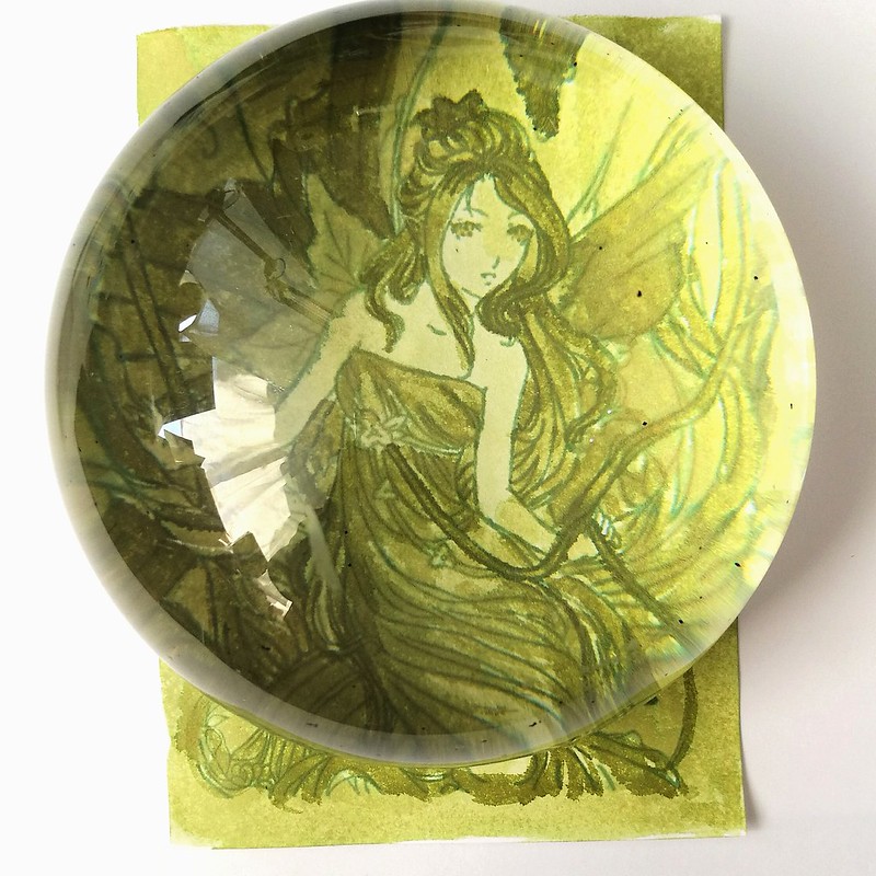
I found this magnificent (excuse the pun ;) presse papiére at an antique market (used for postage stamps, I guess) which enhances the view of the artwork very nicely. With the dry technique I worked from light to dark, letting each layer dry before adding more ink. You can create some awesome shading that add variation to the piece.

inky goodness alt goldgrün
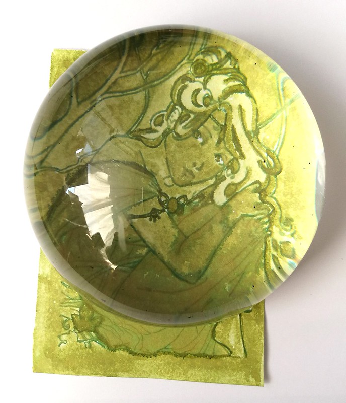
With this piece I kept on laying ink on wet parts and let some dry in between. You can see a lot of the gold sheen coming through in the dress where the ink was put on heavily. I also outlined the girl with non diluted ink so she would "pop out" more. 

I am entering these magical green fairies to the "Anything goes" Challenge over at Craft Stamper's July challenge. 

In conclusion: Rohrer and Klingner Alt Goldgrün definitely does deserve to be in rotation as well as used for my art works more than it has. It's in my top 10 Sheeny-shading inks as well for sure! For more in depth reviews of this ink I'll refer you to PenInkCillin , The Pen Habit for written reviews and artwork at Gouletpens blog for more close up pictures. 

Thanks for stopping by and have a great day!
namasté 

2015/06/07

Mailart Sunday - Wigging out


One of the 'Warm up's' for the Craftorij Zomer Challenge 2015 was 'use only green' and this is what I made. The background is made on a green paper bag and splattered Peeled paint and Moss Green Distress Stains on it. The large stamp is Steampunk Profile Head by Carmen's Veranda. I stamped it with versamark and added a bit of green patina perfect pearl and embossed other parts with Mint Green WOW embossing powder. The text on the left is about how to fit a mens wig is a copy from a vintage text book, ripped and colored with distress stains. As I like word puns, I stamped 'wigging out' with my fave typewriter alphabet font rubberstamps with memento green ivy and tuxedo black on some green cardstock and colored it similarly as the text paper to complete the piece.

With a little more light and offset back ground you can see the details of this piece a bit better.

Close up of the mix of perfect pearls and embossing powder. I really like the end result and effect is has on the whole image.

Thanks for stopping by!

Namaste
Tarah

2015/04/03

A Game of Bingo - a Lost Coast Design blogpost

My first blogpost on Lost Coaster's review is on. Would love it if you take a look :)


From march 11th to 30th we had a 50 shades of green bloghop at Lost Coaster's review. It was a lot of fun and a lot of great entries were submitted. Check out the winner!!! I had a lot of fun digging out all my green supplies for this project and make that mail art piece I showed a few weeks earlier. I ended up making the above mail art piece as well, and because it technically wasn't all green I didn't submit it to the bloghop. But I wanted to share with you how I made this piece of mail art anyhow. So hop on over to my 'A game of bingo' blog on Lost Coaster's review (which is my first contribution to the blog) to read what elements I used to make this mail art piece.

Thanks for stopping by :) 

namaste

2015/03/11

Lost Coast Designs - Challenge 50 shades of GREEN

For this color challenge I brought out my pallet of green to the foreground and used some of my fave LCD rubber stamps for some Mail Art inspired pieces.
LCD 50 shades of green 3
An array of inks by brands Memento, Kaleidacolor, distressink, ancient page and staz-on. The rubber stamps by LCD: art angel, chess king and chess queen.
50 shades of green
I did some ink testing prior to making my project below. Kaleidacolors is one of my fave brands for multicolor ink pads.
LCD 50 shades of green 2
I ended up choosing the Art doll, the squiggles border and the small doll face rubber stamps. The background is made with dylusions cut grass spray and ranger distress ink/stains (shabby shutters and peeled paint). Then used brick stencils with green paint to create some texture. Stamped the Art doll with olive green Staz-On on the envelope. I used Memento cottage ivy to stamp the squiggle border like sun rays in the top right corner. The small doll face I stamped on a 1 1/2 inch neon green sticker and used that face as a sun. Left some space for an address to send out as mail art :)
I hope this inspires you to play along with the challenge. You can win a 20$ gift certificate to spend on Lost Coast Designs rubber stamps.

Click the picture to go the blogpost for more info on how you can join in.

 50 shades of green bloghop