2016/04/29

A strong case of duality

There are a lot of brush pens out there, but these Tombow dual brush pens have been around for a long time. I had tried them last year december at a workshop given by Miranda Degenaars in Posthumus Store in Amsterdam (where you can also buy them). It was great working with them, esp. since they blend nicely with water. I was trying to find an alternative for coloring to my Letraset and copic markers, which are not water soluble. I finally decided to get a few (ehrm... maybe a "few" is an understatement...) and did a couple projects with them already which wanted to share them with you here.

Working out some ideas for a new project #handlettering #tombowmarkers #tombow #lettering #craftyendeavors #craftiness #posthumus #brushletter #handwriting #writing #tombowlettering

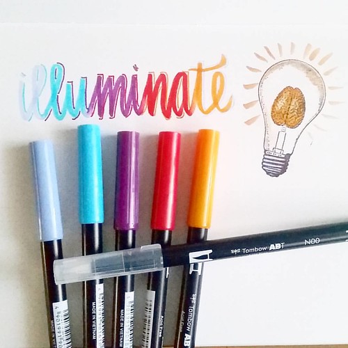
So I have been noticing the hand/brush lettering rage on the social media networks. There are a lot of tutorials on you tube on how to use these tombows for hand lettering projects. I watched a lot of them and found them very useful and illuminating! Thanks to everyone whom has taken the time to do videos and uploading them, they are very helpful! I found the blog ByDawnNicole very useful! Tombow also have their own channel and blog with tips and tricks on how to use the pens. Traditionally they are used to color with and you can create a lot of fun background and lettering effects with the blending tool and some water. By the way, the light bulb brain stamp is from The Stempelwinkel and it's one of my favorites :) 

The following projects I used a resist technique. 

Letting project
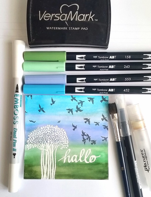
On white card stock I stamped the tree image with versamark ink and wrote 'hallo' with the embossing dual pen. I used Wow Bright white embossing powder and heat set it. The embossed parts will resist the inks. You can see the colors I used on top of the card. I used the brush tip to color directly on the paper, used water and a flat brush to create smooth, non streaky layers. Then with the blending brush I blended the transitions in colors, also added some more color and water here and there until I was satisfied with the result. I wiped away any residual ink that was left on the embossed parts with a paper towel. Then I masked the tree and word and stamped the Carmen's Veranda birds in flight stamp on the sky with Staz -on Stone Grey. Beautiful simple and effective result!

Letting project
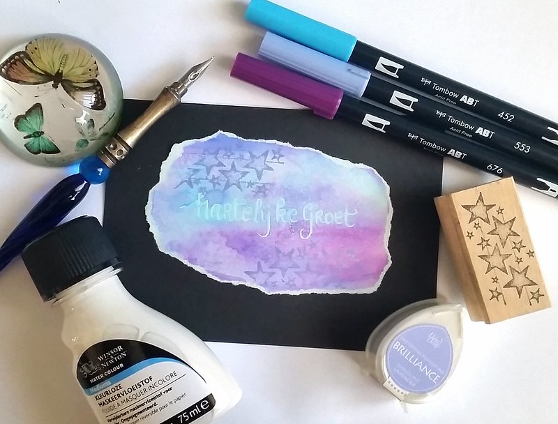
At Art specially I also bought some Winsor and Newton Masking Fluid which I always wanted to try out. The base is a light blue card stock and I used a dip pen to write down "hartelijke groet" (translated "with kind regards" in English) on it. It dried up clear and then I colored the around and over the words. Spritzed it with water and used a flat brush to blend the colors a bit. I dried it with my heat tool, stamped the star stamp with Brilliance lavender on top and bottom of the words. I rubbed off the masking fluid, and the light blue words are showing clearly through the colored background. It surprised me that it stuck so well to the paper! Such a fun effect! I ripped the edges off and matted it on a black note card which make the colors pop out even more.

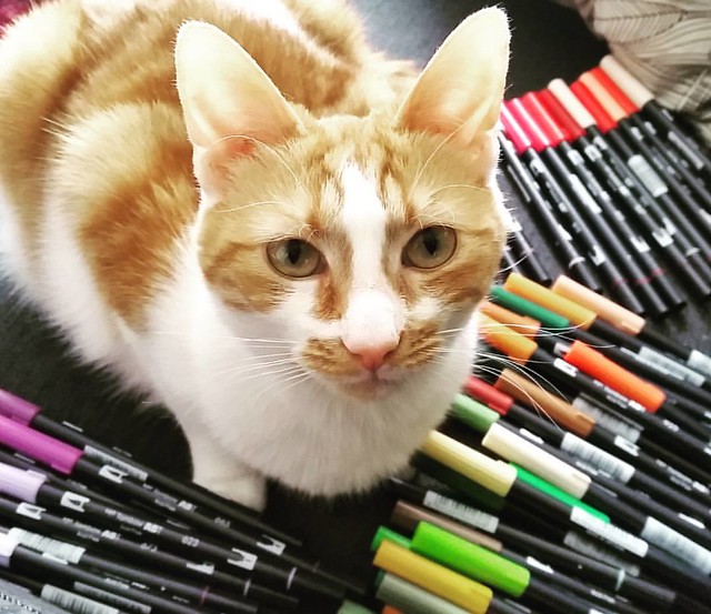
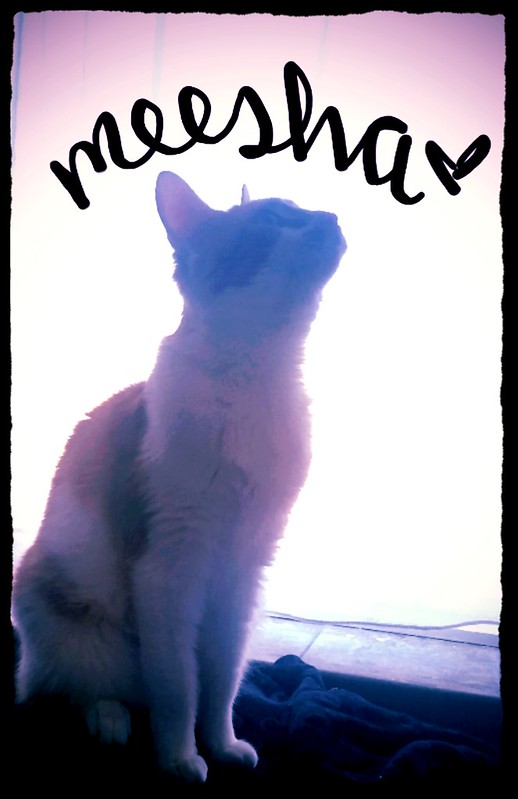
My cute little helper 😻 #meeshathecat #meesha #colorcoordination #tombowmarkers #tombow #tombowusa #tombowbrushpen #craftyendeavors #craftmaterials #craftygirl
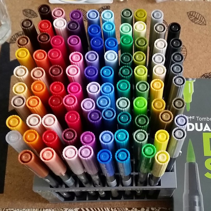
I am completely loving these brush pens and eventually (after long internal debate) got the full set of 96 colors (found a great deal on the set through Marktplaats otherwise yeah they are pretty costly to get!) with the desk stand. My little Meesha was helping me organize the colors in the numerical range which I then placed in the desk stand. 

Tombow full set dual brush pens
They definitely do look awesome standing all together, don't you think? I'm looking forward to use these in more projects which I'll definitely be sharing with you here.
I have them standing on my desk now, which would, I hope, prompt me to use them often.  

What are favorite pens to color with? 
Have you tried these brush pens? 

Oh and If you don't follow me on instagram yet, you might like to know I am hosting a giveaway for a calligraphy pen

You can still enter until tomorrow :) 
Thanks for stopping by!

Have a wonderful creative weekend.

namasté

2016/04/27

Pens and Ink: The copper orange edition + mini Q&A

A little intermission from my Omas pens and ink postings this week as it's Kingsday in the Netherlands! Since the nation is being clad in orange today, I thought it would be a fun idea to have this week's pens and ink post to color coordinate accordingly.

Seeing I don't own many orange pens, but I know someone in particular who does like them and even customized one, I asked him to help me out this week. I've also asked him some questions on how he uses his fountain pens which also fits this months theme on Stationery Wednesday at Bureau direct"Everything you wanted to know about fountain pens, but were to afraid to ask" So thank you, my husband Cris, for indulging me and answering a few fountain pen related questions  :)

How did you get (re)acquainted with fountain pens?

My first fountain pens I used in school, which meant a lot of inky fingers and a lot of collecting of the little agitator balls that are left in standard cartridges. But stopped using fountain pens the day I left primary school behind.
I got reacquainted with fountain pens because my wife, the wonderful Miss Thundercat, started using them. While she was using more and more elaborate pens (eyedroppers, piston fillers etc) my interest was mostly just technical. The construction, the use, the techniques the idea's. When I finally got around to buying my first fountain pen, I was quite happy with the way it could be handled, wrote and the choice of inks.


What was your first fountain pen purchase?

My first fountain pen was the Lamy Al-star Black, a gorgeous, matte black, "stealth" looking pen. I thought that it was a really cool pen even though the cap look a bit "chunky" but fitting as as Al-stars are robust pens. I was sold on fountain pens ever since.


Do you have a favorite nib size?

I have a spidery cursive handwriting, so to keep it legible, I go for extra fine or fine points. I also enjoy them for art projects. I have experimented with broader nibs and trying to change my handwriting, but nothing consistent has come out of this so far.


What do you use your fountain pens for mostly?

I use it for writing projects or (small) notes and planning of RPG's mostly. I like to use hard back notebooks like Leuchtturm 1917 A5 size in dot grid. I also enjoy creating map drawings with them and different sizes nibs and ink color choices are really useful.


How did you get the idea to customize your Lamy Copper Orange?

So I started with Lamy with the Matte Black Al-star, which had all black parts and love the looks of that. I really love the deep color of the Copper Orange pen body, so I got the pen when it came out. But the chrome clip and nib just seemed "off", they didn't add to the pen and just seemed to disappear against the really outspoken color of the body. For a while the pen kinda languished on my desk, being merely "okay".
After witnessing the breaking of a really old Safari cap I had done a some research to fix it and eventually got enough to understand how they worked.
I ended up buying a Lamy Safari Charcoal to strip for parts (I didn't know I could just get the spare parts from Bureau Direct back then) and assembled the clip on the Copper Orange. My pen went from merely okay to really shining. The black clip and nib adds something to the pen. Black and orange just go really well together. After people saw this transformation on my Instagram, I got requests to customize the Copper Orange for other people. Fun to see it was a hit with others as well.

What ink do you like to pair it with?

The Terracotta from the Diamine 150 anniversary ink line goes really well with the color of the pen. It's deep and rich with enough "bite" to complement the orange of the pen.

Een foto die is geplaatst door Blaze8t88 (@cornelius.grayl) op


And I have to agree, the pen and ink combo looks wonderful... even with a fine nib! Within a year Cris's collection has grown quite a bit. To see more of his pens and map drawings, you can follow him on his Instagram.


Een foto die is geplaatst door Blaze8t88 (@cornelius.grayl) op


Thanks for stopping by!

namasté

2016/04/25

Meesha Mailart Monday - the birthday edition

Meesha

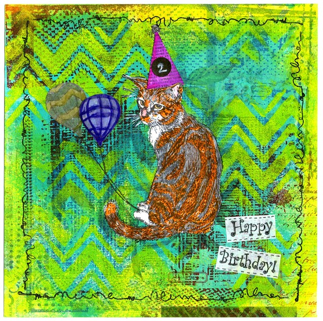
A little over 2 months ago this little cutie came into our lives. From the get go she was a sweet and curious kitty and we are grateful to have her in our lives. Today she turns 2 years old and we are celebrating that with a Meesha Mailart Monday post today :) 

meesha birthday card
I started out on applying amsterdam aqua paint on scrapbook paper with help from a brayer. It gave the page a lovely base color and images from the paper shows through slightly which makes it more interesting. Then I stamped Carmen's Veranda's Grunge Back Ground stamp in parts on each of the corners alternating with Hydregena blue and Cherry red ink from Staz-On. I placed a zig-zag stencil over it and dabbed on yellow Amsterdam paint through it. I also smudged the edges with yellow paint. The Lost Coast Designs cat stamp and other elements I stamped on a separate paper and I colored with Tombow markers and cut out. I also stamped the cat in the middle of the page to get the furry part and whiskers on. Adhered the cut out pieces over it and added some white with a gel pen over whiskers and the black parts of the fur. The hat is from party hat set, I stuck on a sticker over the 1 and added 2 with a white gel pen. The balloons are from"balloons over Alberquerque" stamp and doodled the strings with a black marker. Stamped the sentiment Happy Birthday from "Party Words" on white paper with staz-on black, cut out, adhered to the page and doodled on the edges. To finish it off I stamped a doodle boarder stamp on the edges of the piece.
If you are in the EU, the LCD and CV stamps are available through Inkadinkadutchies. Just send them a note through the contact page if they are not listed on the website. 
 
I love how this piece came together and the kitty sorta does resemble Messha a bit :)

When I was organizing my Tombow dual brushpens the other day Messha was a sweetie and helped me out :)

My cute little helper 😻 #meeshathecat #meesha #colorcoordination #tombowmarkers #tombow #tombowusa #tombowbrushpen #craftyendeavors #craftmaterials #craftygirl
And more cute kitty picture below!

2016/04/22

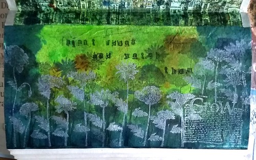
Art Journal - Plant ideas and watch them grow

I have not shared pages from my art journal in a while, that is because I didn't have any inspiration to make any pages. But that all changed after visiting the ART Specially event in Nijkerk on April 9th... like every year, it was a breath of creative air! So the days after I was inspired to create some more pages in my art journal.

Art journal pages
These are the pages I did the days after the show.

Art journal pages

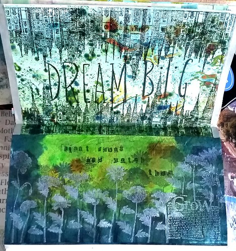
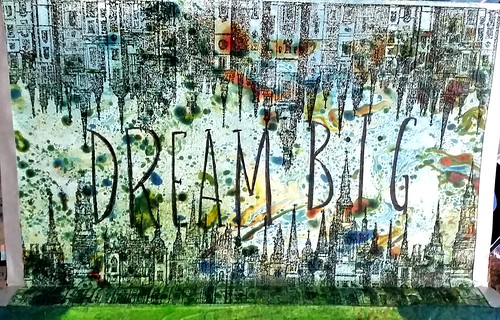
The Dream Big marbled and rubber stamped page, I did a while back for a mail art project and used it as a tip-in for the journal. The Cityscape stamp is from Lost Coast Designs, I have used the large version. A tip-in is a good way to start again, for me anyway, it gives a nice prompt for the next few pages. I had so many ideas and I just started to work with color on the pages (direct to the paper) to see what would come of it.

Art journal pages

The items I used to color the page are distress stains, dylusions sprays and glimmer chalk mist. I used the silhouette flower stamps from joy crafts and Lost Coast Designs dictionary word "grow" - alphabet stamps used are from Image tree. Stamped with Staz-on stone grey and hydrangea blue and Brilliant Lavender on front to make it pop. 

The sentiment "plant ideas and watch them grow" rings true - I have so many ideas for fun creative stuff, I just need to set away some time to work at them. So hopefully once I just plant these ideas onto my journal pages, I will be able to share more with you here :)

Have a wonderful creative weekend!
Thank you for stopping by! 

namasté

2016/04/20

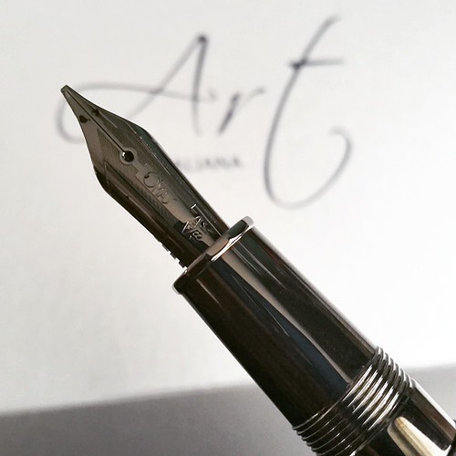
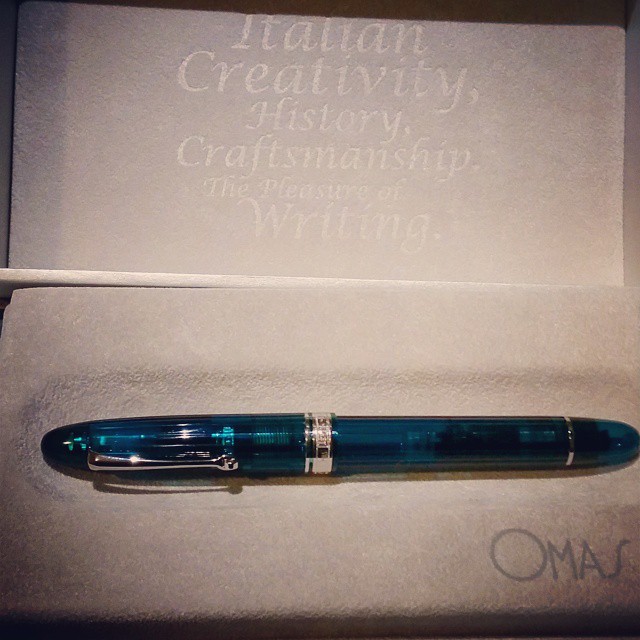
Pens and Ink: Omas AIV Liquid green with Akkerman Groenmarkt Smaragd

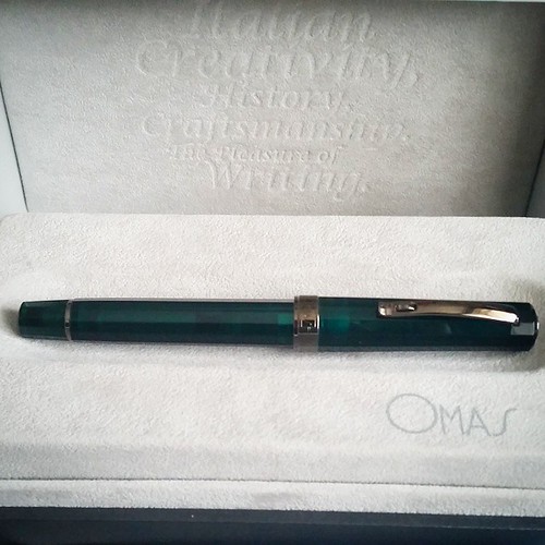
Time to wake up this sleeping beauty #omas #arteitaliana #vision #limitededition #fountainpen #fpgeeks #fountainpenporn #funtainpen
This is where I decided I wholeheartedly loved Omas - the first time I held the Omas Arte Italiana Vision in my hands.  The beautiful design of the pen in a gorgeous liquid green color = indeed ART. I imagine OZ having buildings with this material in the Emerald city. Or it being some kind of kryptonite ... it has that dangerous magnetic pull. At any rate I could not stop thinking about it and went back to Akkerman at the end of the day and got it home with me. 

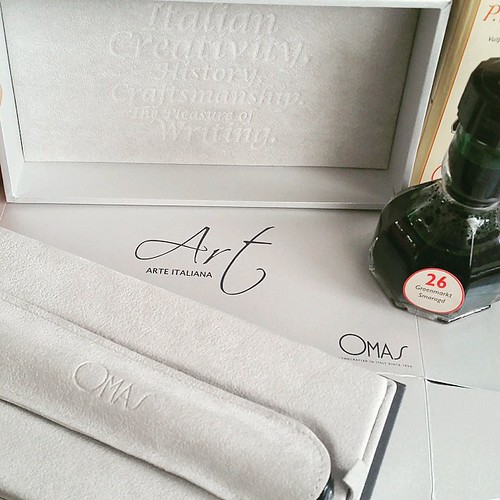
Really love the elegant packaging of #Omas #fountainpens And by the ink of choice you might have guessed which one of the two colors I went for... #fpgeeks #fountainpenporn #akkerman #arteitaliana #vision #limitededition #funtainpen #unboxing
I got a bottle of Akkerman Groenmarkt Smaragd with it, which compliments the pen perfectly.

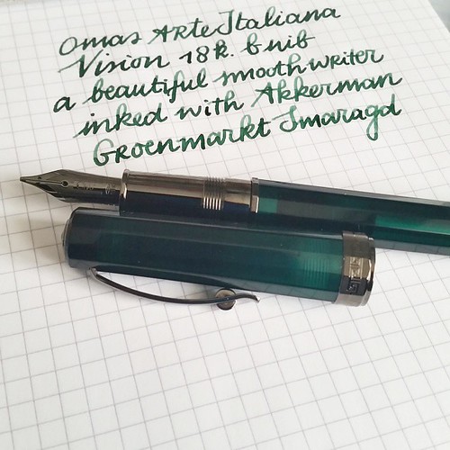
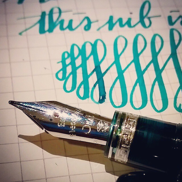
And this is how she writes. The B nib writes like it's slightly stubben and I love it! Also the shading of groenmarkt  smaragd ink is just lovely! #omas #arteitaliana #vision #akkerman #groenmarktsmaragd #fountainpenporn #fountainpenink #funtainpen #fpgee
The nib is a B that writes more like an 0.8 stub. A very smooth and wet writer.

This pen is definitely a piece of art! #omas #arteitaliana #fountainpen #fountainpenporn #funtainpen #fpgeeks #stubnibsunday
Love the accents on the pen and grip section. Even though it's metal, it does not feel slippery at all in long writing sessions.

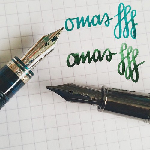
Nib width comparison extra flessible medium to 18k b - I dare not to flex the extra flessible too much because it's really, really soft. The 18b has a little spring to it. #omas #fountainpen #fpgeeks #ogivaalba #arteitaliana #vision #liquidgreen #akkerman
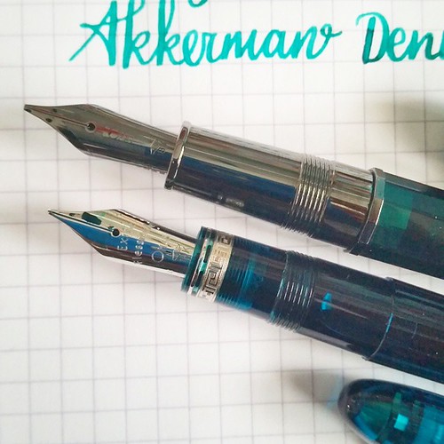
Section comparison to the #Omas #arteitaliana and #ogivaalba - I have to say the metal section looks stunning but the cotton resin section feels better in hand in a prolonged writing session. #fpgeeks #funtainpen #fountainpen #fountainpenporn #comparison
Comparing the Ogiva medium extra flessible with the B 18k nib and sections. Both really gorgeous pens with their own personalities.

Suppose there is no surprise what my #mondaymatchup is for @gouletpens #mondaymatchupgiveaway this week 😉 Since it's the anniversary, I tried to do something special 😊 #stencildrawing #edroth #akkerman #groenmarktsmaragd #omas #arteitaliana #vi
Stencil doodles work brilliantly as well! By the way "smaragd" = Emerald in dutch & groenmarkt is an aria in The Hague. 

Next week a couple of vintage Omas pens.

Thanks for stopping by!

namasté


2016/04/18

Mailart Monday - Art Specially inspiration


Every year I look forward to this event, the Art Specially weekend, and this year it was on April 9th-10th. We went on saturday and it was fantastic! So much to see (and buy) and to do!!
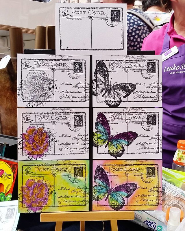
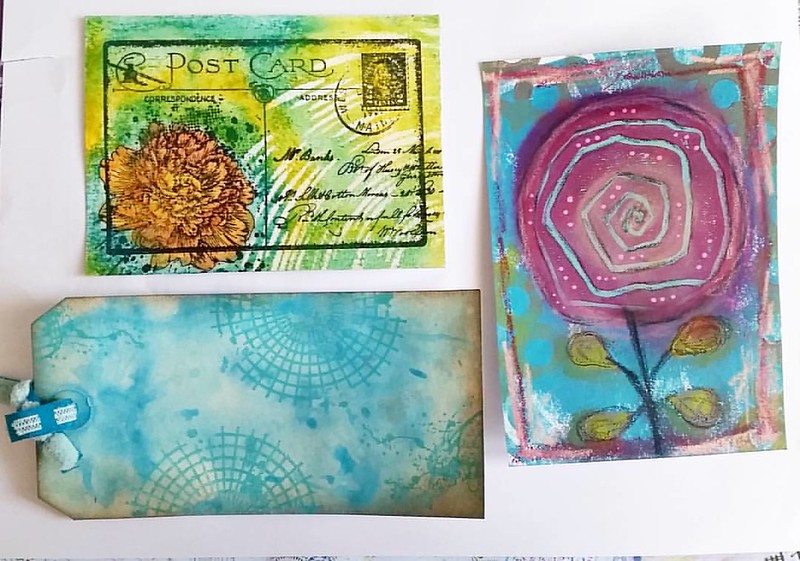
I didn't have time for a lot of make and takes, but this one given by the people at "leuke stempels" booth was a lot of fun and inspiring. A very easy step by step tutorial was given and very easy to make.

A very fun and easy make and take at Art Specially - Leuke Stempels booth. Darkroom door and indigo blu stamps colored with the new distress crayons! #artspecially2016 #leukestempels #rubberstamps #tutorial #mailart #timholtz #distresscrayons #darkroomdoo

Stamps used here are from Darkroom Door postcard and and Indigo Blu peony and Butterfly. After stamping with staz-on the flower/butterfly was colored with distress crayons. Then matted with gel medium to protect the color. The rest of the color was also added with the crayon and because the surface is smooth after the gel medium layer, you can dip your fingers in a baby wipe cloth and blend the colors together more smoothly.

Art Specially event 2016 was really inspiring! Had only time for these 3 make and takes. Learned fun new tchniques with new materials. Can't wait for next year! #artspecially2016 #demo #makeandtake #workshop #artfoamies #distresscrayons #unitystampco #dar
You can see the card I made on the top left. After blending the crayons together I overlayed a stencil and added some color off with a babywipe. Definitely creates a fun effect. I will be making some more to send out to my mail art friends!

The other two make and takes were at the Craftorij stand, on the right Art Foamies with mexed media by Marieke Blokland (blokenote) and the Tag on the bottom by Marleen whom designed some new stamps at Unity. These were all so fun to make! I especially loved the mixed media art flower piece, learned a lot on how to combine certain products like oil pastels over paint. Very useful!

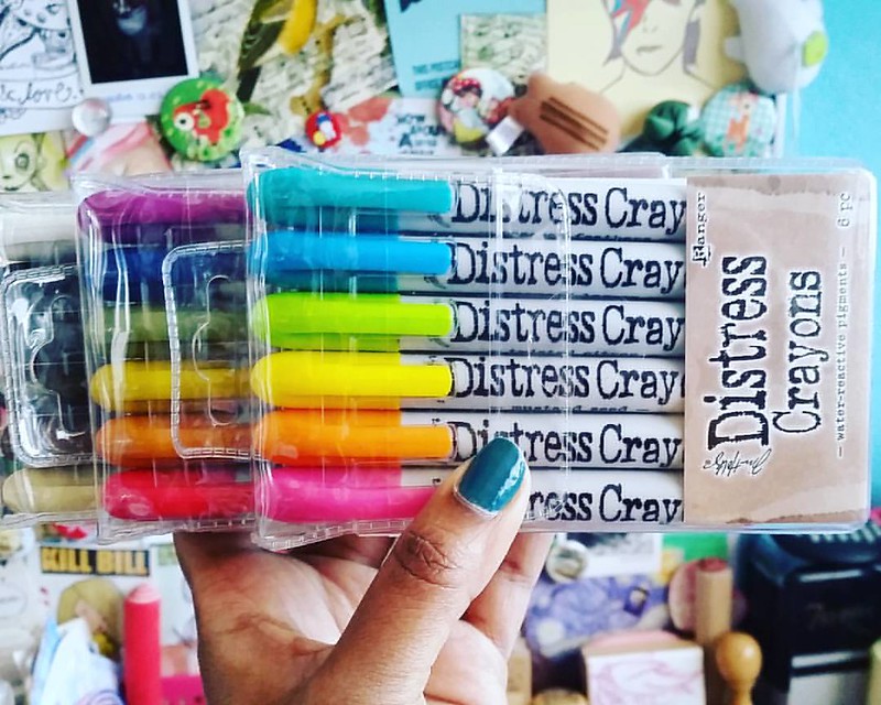
The day left me inspired to create and I definitely got a whole lot of supplies to play with! I got these distress crayons at Leuke Stempels booth
So I went a bit of Cray Cray yesterday at the #artspecially2016 event yesterday. This is part of the loot. And yes had to get the full set. #distresscrayons #timholtz #artsupplies #craftygoodness #colorful #craftygirl #craftyendeavors
Beautiful bright colors, in the color line as all the other distress products, they are so fun to work with!

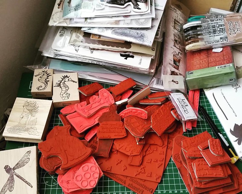
And this is the loot I brought home:
The loot #artspecially2016 #rubberstamps #stampinup #lostcoastdesigns #carabelle #carmensveranda #stampotique #dylusions #timholtz #katzelkraft #graphic45 #vivadecor #craftsupplies #craftyendeavors #craftygoodness #craftygirl
Stamps from so many companies, but definitely from my favorites Lost Coast Designs, Carmen's Veranda, Katzelkraft, Stampotique, Tim Holtz, Dylusions, Image tree... Looking forward to use these in future projects!

Have a wonderful and creative week!
Thanks for stopping by!

namasté

2016/04/15

Monthly Planning MTN: March 2016 overview

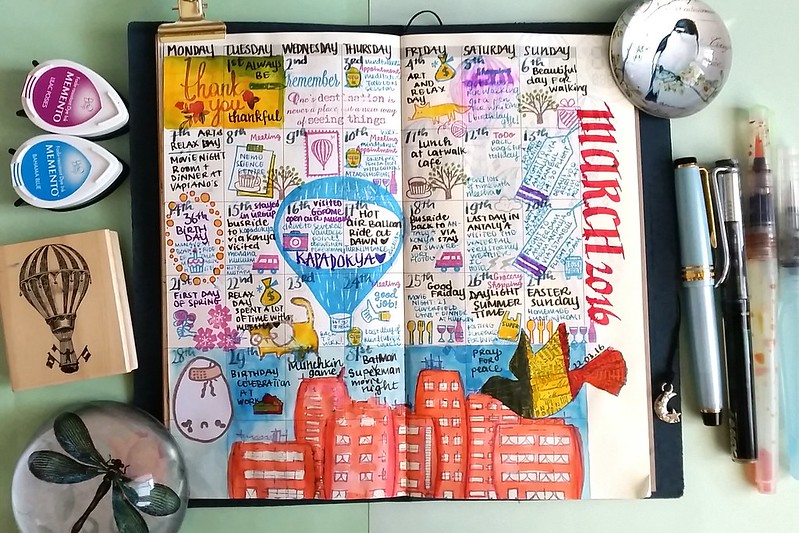
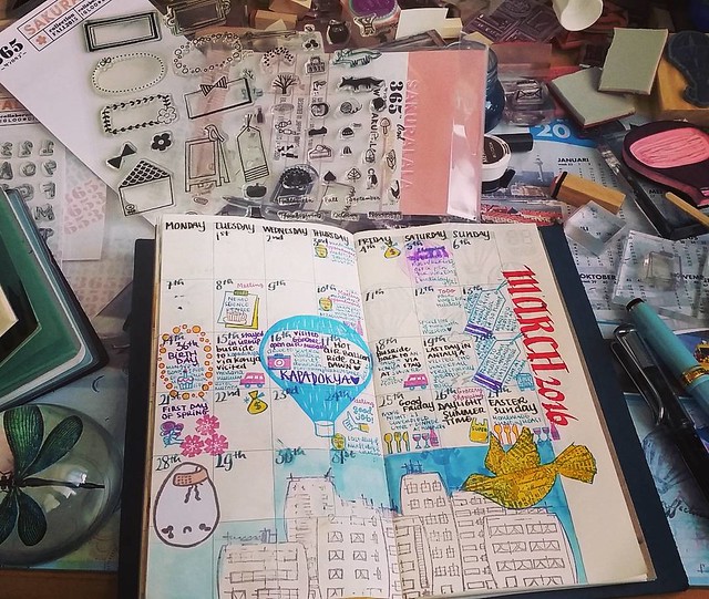
MTN march 2016 update

It's halfway through April, so high time for March Monthly update in my Midori Travellers Notebook. A lot of fun stuff happened last month, but also some tragedy's.
It's very cathartic to take the time and process it all. 

Updating my monthly midori planner for March #whatsonmydesk #midori #midoritravelersnotebook #plannerlife #planneraddict #monthlyplanning #sakuralala #rubberstamps #illustrated #journal #writing #stationeryaddict
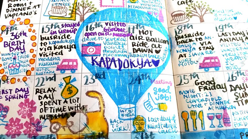
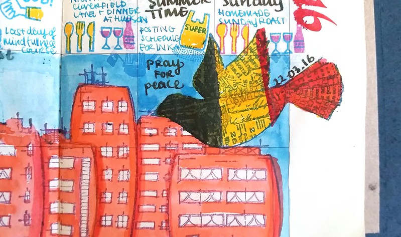
 On the creative side: I've used some more illustrative rubber stamps and color combinations this time. The sakuralala 365 stamps being the base as usual. The large hot air balloon and cracked egg are hand carved stamps. The Bird stamp is from Oxford Impressions and The city stamp from Stampothique. Fountain pens and inks used: Sailor Sapporo LE seasons Sky with Montblanc Turquoise. Lamy Vista 1.1 nib Eyedroppered with Sailor Tokiwa Matsu. Pilot Parallel with Pilot Red. Franklin Christoph 66 with 1.1 nib and Faber Castell Deep Sea Green for the numbers and days. See them on my currently inked page op March 27th.

MTN march 2016 update

On the fun stuff: I had my 36th birthday on the 14th and this year we took a trip to Turkey visiting Kapadokya (Cappadocia) for a week. We went on a Hot Air Balloon ride, saw some beautiful sights and well... pictures tell more than a thousand words...

My birthday trip this year was filled with amazing sites and experiences. I completely fell inlove with Cappadocia 💙 #cappadocia #vacation #holiday #turkey #mountains #landscape #nature #hotairballoon #99luftballons #kappadokya #unesco
It was amazing. So beautiful and serene.
If you ever have the chance to go there, you definitely should!

MTN march 2016 update

And there were some tragic days as well. In the time I spent in Turkey there were three bombings: two in Ankara and one in Istanbul. They did not have a lot of media coverage, but that doesn't make them any less tragic. There were more bombings occurring in Turkey and before we left my father in law asked us if it was a good idea to visit a country that is in such turmoil and can be really unsafe to be. I told him that "being safe" is a relative concept these days, seeing with what happened in Paris and Brussels last year. But of course we would not visit the capital and the borders as those were marked as "unsafe to travel" zones. On 22 March the bombings in Brussels showed us again that "being safe" is a relative concept. That sadly in these times, there is no place that is really safe from psychopaths with bombs.
 I share the grief and loss. 
They are attacks on humanity which transcends borders, race and religious beliefs. 
I do not want to end this post on such a tragic note.  
However I hope that by sharing with you what I do when these feelings of powerlessness arise and overwhelm me, could provide a positive outlet for you as well.
 I pray for peace and well being for all of us living on this earth every time I write down my Mindfulness Metta Meditations in my journals. 
This month in my Mindfulness Compassion in Connectivity training's I learned the practice of Tonglen which I find healing to do in these strange and unsettling times. 
In tonglen practice, when we see or feel suffering, we breathe in with the notion of completely feeling it, accepting it, and owning it. Then we breathe out, radiating compassion, lovingkindness, freshness; anything that encourages relaxation and openness.- Quote from Pema Chodron from When Things Fall Apart:Heart Advice for Difficult Times (more here) 
 We can change the karma of this world. 
With one heartfelt, compassionate breath at a time.  

Thank you for stopping by.

namasté
2016/04/13

Pens and Ink: Omas Bologna with Diamine Syrah

Omas pens are a thing of beauty! #omas #bologna #Fpgeeks #FPN #fountainpennetwork #fountainpen #funtainpen #italiancraftsmanship #writinginstruments #saveomas #tribute
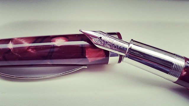
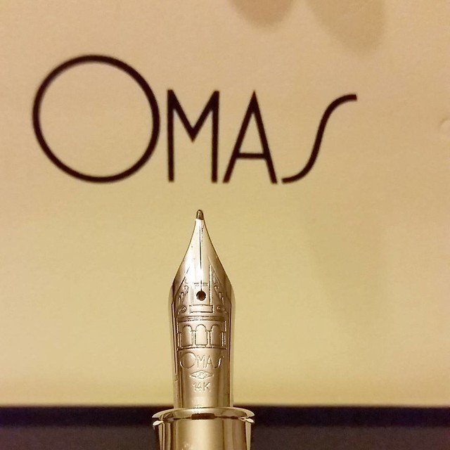
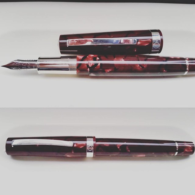
When I saw this Omas Bologna pen I really had to have it. With help from my sweetie I got this pen for my birthday. I'm completely inlove with it.   I'm very fortunate that I was able to find one of these pens as they sold out pretty quickly everywhere.

Nib shot of my newest #omas #Fpgeeks #FPN #fountainpennetwork #saveomas #funtainpen #bologna

The nib design is gorgeous and the pen material is stunning too. 
A beautiful wine red celluloid.

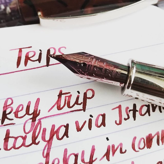
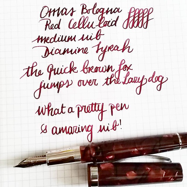
This nib is an absolute joy to write with #omas #bologna #saveomas #Fpgeeks #FPN #fountainpennetwork #fountainpen #funtainpen #diamine #syrah #italiancraftsmanship #stationeryaddict #writinginstruments #travellog #journal #dailywriting
The wine red of Diamine syrah has a beautiful shade. Matches this pen body material perfectly.

Such a beautiful pen 😍 #omas #saveomas #bologna #Fpgeeks #FPN #fountainpennetwork #fountainpen #funtainpen #writinginstruments #stationeryaddict
Such a beautiful pen body. The celluloid has so much depth. 


Omas Bologna with Diamine Syrah #omas #bologna #saveomas #Fpgeeks #FPN #fountainpennetwork #fountainpen #diamine #syrah #extraflessible #winered #celluloid #currentlyinked
The nib is outstanding to write with, just the hint of flex that adds the nice flourish to my every day writing.

If you find one of these in the wild, definitely get one while you still can!

Thanks for stopping by.

namasté
2016/04/11

Mailart Monday - the cat is out of the bag

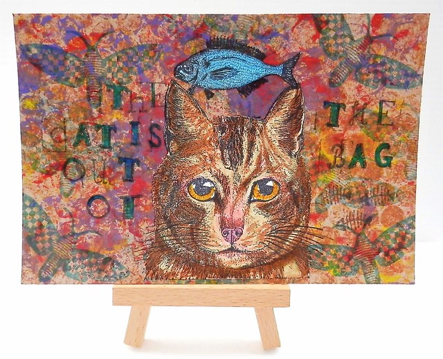
Mail Art 020-2016
A cat themed mail art postcard for this week's mailart monday. This was sent to my partner at Swapbot for the 'put a Cat on it' swap at Handmade Postcards Club. The background is a craft paper bag cut out and I stamped on it with acrylic paints and a piece of bubble wrap. Then I stamped a moth stamp by Paper Artsy hotpicks on it a few times with Staz-on Teal. The cat stamp is from Lost Coast Designs and I stamped it on a separate piece of paper. It has a bird on its head it but I cut that away. I colored it in by using fountain pen inks, I used pelikan brown and Pilot Iroshisuku Ina-Ho for the lighter parts of the cat face. Sailor Apricot for the eyes and a bit of Pilot red (diluted) for the nose. I adhered the image to the background and then drew some more whiskers on her with a fineliner (steadtler micron pens). Also added some shading around the ears. The fish above the cat head is also from Lost Coast Designs. It's a snail mail stamp "sealed with a FISH" but I obviously only used the fish part. The letter stamps are from Hema, which I colored with a turquoise sharpie. I found small a herringbone stamp which I didn't know I have (no idea which company, sorry!) and that just completed the image.

These LCD stamps you can also order through Inkadinkadutchies if you are in the EU. Just use their contact page is it's not listed on the website.
See more great postcards sent from the group members at this flickr photo page. Some awesome mail art is being displayed there!

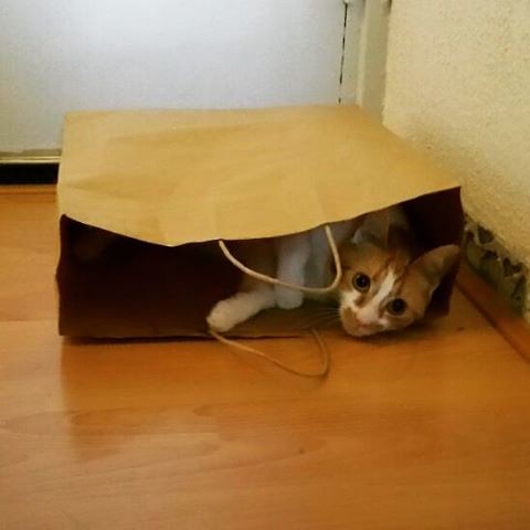
And I leave you with a cute picture of Meesha, the cat in the bag ;)
Playing hide and seek #meeshathecat #meesha #cutenessoverload #catsofinstagram #catshatemondays #thecatisoutofthebag #thecatisinthebag #hideandseek #kitty #cats

Thanks for stopping by!
Have a great week!
namasté
2016/04/08

Day and Night ATC

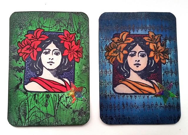
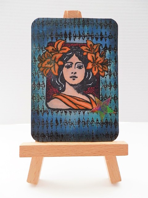
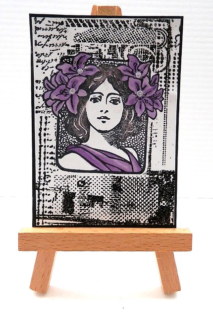
Last week I showed you a fun and simple ATC technique to POP one color in the over all image. I made 3 ATC's base then, but with 2 of them I did something different.

Day and night ATC

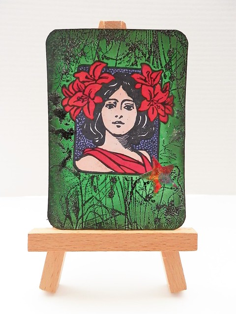
In my pop a color post you can see how I made the base of these ATC's. In short I stamped the woman with archival black and embossed the ATC background with black embossing powder.
I colored the woman with letraset procolor markers, masked them and then colored the background with fountain pen ink. Green is Platinim Mix free green and the blue is Pilot iroshizuku Kon Peki. I wanted contrasting colors to the dresses and from each other as well. I used a bit of pearl rub ons to accentuate the edges and then rounded off the corners with a paper punch. I placed a holographic star sticker on the right side on both of the ATC's to finish it off.

Mail Art 024-2016Mail Art 025-2016


Mail Art 021-2016

I love how different these ATC's look from each other, 
even with the base of the image and technique being the same. 
Also I only used 4 stamps in total! 

All the stamps I used are from Lost Coast Designs. I used Art Nouveau Woman's face and different ATC background stampsIf you are in the EU you can order them from Inkadinkadutchies. If they are not listed in the webstore you can specially order 
them via the contact page.

I hope this inspires you to play around with a few stamps and create several different things with them.

Have a creative weekend It's the Art Specially yearly event! Am very much looking forward to it! Maybe I'll see you there :)

namasté
2016/04/06

Pens and Ink: Omas Ogiva Alba Green with Diamine Tropical Green

I can't stop staring... 😍 #omas #ogiva #alba #fountainpen #fpgeeks #pen #pretty #collectibles
When I saw this color pen in the Omas Ogiva Alba line when it came out, I immediately wanted it! I got it for myself as a Sinterklaas present a few years ago.

Beauty of an Omas nib #flexnibfriday #flexpen #fpgeeks #fountainpen #ogiva #alba #green #pretty #collectibles #pelikanedelstein #jade
I chose a medium Extra Flessible nib. It has beautiful line variation. This ink is Pelikan Edelstein Jade, which does have a nice shade of emerald green.

This nib is bannanas! 😍 #fountainpen #fpgeeks #omas #ogiva #alba #green #pelikanedelstein #jade #teal #pen #collection #collectibles #flexnibfriday #flessible #extraflessible #flexpen #flexnib

I do love this ink, but it wasn't a complete match with this pen. A bit of a darker green is what I was looking for.

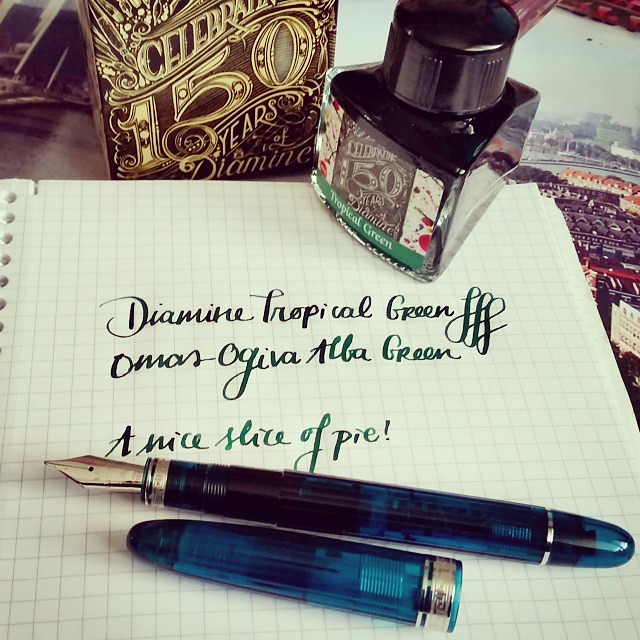
A nice slice of pie! #fpgeeks #fountainpen #fountainpenink #diamine #ogiva #alba #omas #tropicalgreen #limitededition #collection #collectorsitem #flessible #flexnib #inkbottle #penmanship #green
And a trip to Akkerman in the Hague provided again... Diamine tropical green in their 50th year anniversary bottle is a beautiful match for this pen.

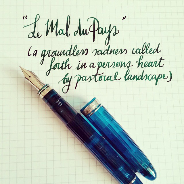
La Mal du Pays - a quote from a book I am reading at the moment. Points for you if you can guess which book that is 😉 #flexnib #flexnibfriday #omas #fountainpen #fpgeeks #teal #bluegreen
One of my fave quotes from one of my fave writers in one my fave books.

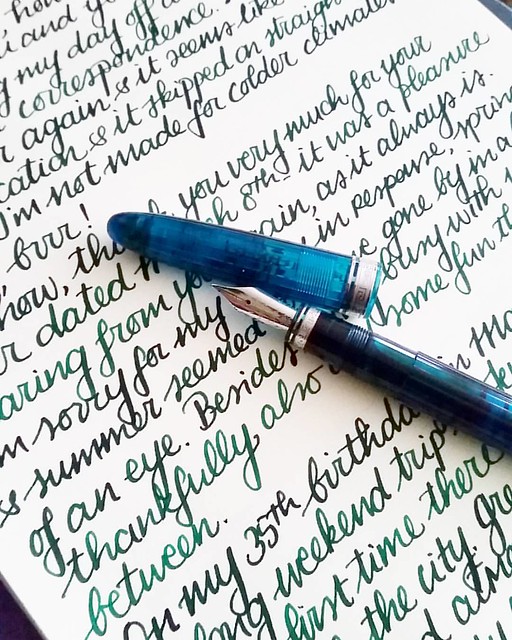
Catching up in correspondence on this cold and grey monday #omas #ogivaalba #Fpgeeks #fountainpen #pelikanedelstein #aventurine #penpal #letterwriter #correspondence #FPN #penmanship #handwriting #handwritten #shittycalligraphy #emeraldgreen
This pen and ink is a fantastic combination, it shows off shading and some sheen really well on paper. The paper I used here is Crown Mill laid paper. 

I definitely need to ink this pen up soon again, seeing I talked about my 35th birthday here... and I already gotten a year older in the mean time ;) Next week I'll show you when I received from my sweetheart for my birthday this year. Yes, it's Omas themed ;)

Thanks for stopping by!

namasté