Showing posts with label hand lettering. Show all posts

2017/04/11

You stand in your own light, make it shine

you stand in your own light, make it shine

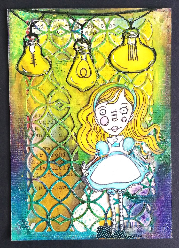
Yesterday I took out some my new supplies from my Art Specially haul this year and made the above card. I used my Lindy's magical shaker's on the text background (vintage typewriter text), Tim Holtz Alterations dies, Patio Lights and Alice from Stampotique Originals. I also used some fabulous caran d'ache Neopastels which I got at La Couronne du Comte and I absolutely LOVE working with them on my projects!

you stand in your own light, make it shine
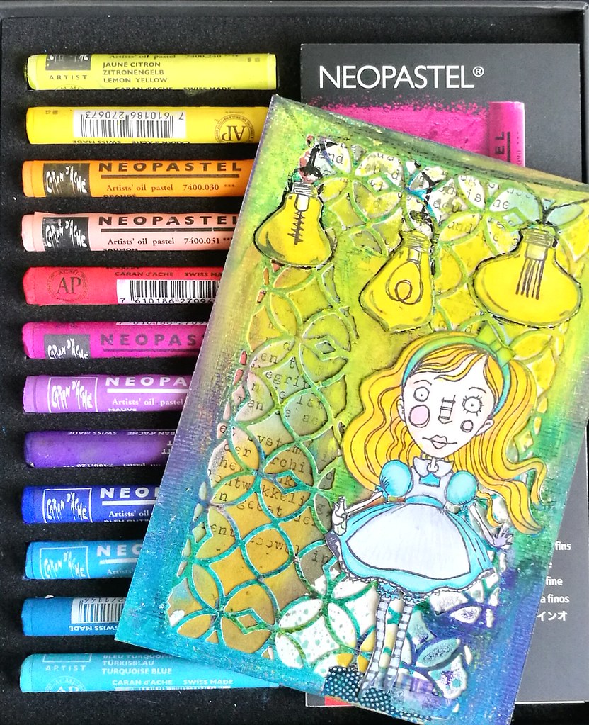
They are so bright and colorful to work with! I used the die from the TH mixed media set on heavy 200gms card stock, applied a good amount of white gesso and when that was dry, I rubbed all the oil pastels over the edges of the design. The colors really pop! The images were stamped on neenah classic white cardstock and colored with Letraset promarkers. I fussy cut them out and adhered with ZIG 2way glue pen. I applied a heavy amount of yellow pastel's around the lights so it looked like they shines brightly. Then outlined the sires and bulbs with a black uni posca marker. on the inside, I added a quote;

you stand in your own light, make it shine
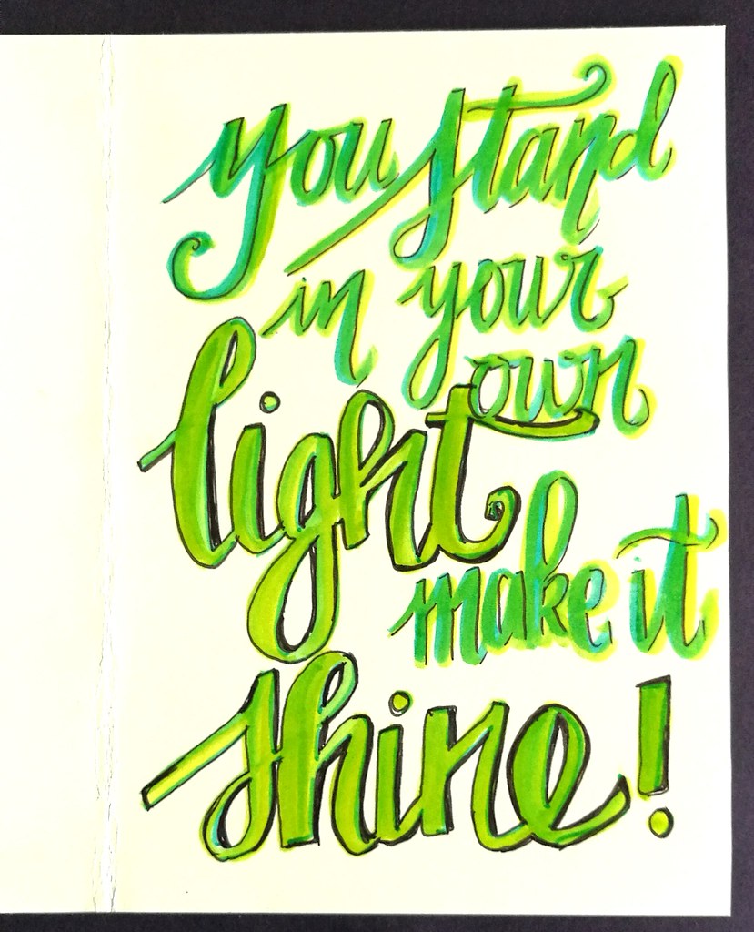
It's a quote I got in a fortune cookies once and it's been in my wallet ever since. A reminder to let your light shine brightly! The lettering is done with tombow markers and outlined with faber castell pitt marker.

you stand in your own light, make it shine
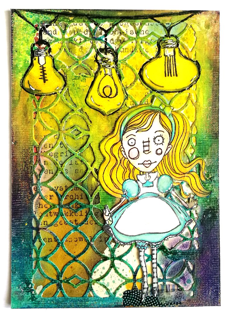
Wanted to show you how the card looks on a white background, but the lights really shine on the black background in the first picture above :)  The Stampotique text background challenge is still on until tomorrow, so do link up your projects :)

I also would like to enter this card in the following other challenges:
Try it on Tuesday - use a quote 


Mixed Media Monthly Challenge - What's your super power?

With this post I hope to convey my power to use and blend color in various mediums and have it POP! 

Thanks for stopping by and hope you'll come by tomorrow to see what I've made for the new challenge theme for Stampotique which goes live then :)

Have an awesome day!

2016/08/21

Monthly Planning MTN: July 2016 overview

When I was recovering from a nasty bronchitis this month, I hardly had any creative energy but I still wanted to do my monthly update in my Midori Traveler's Notebook. Because I wasn't feeling super creative, but still wanted a pretty colorful page, I thought of a "cheat" and adhered one of my gelli prints I had done on tracing paper to the midori notebook.
MTN update July
It instantly created an interesting page to work on! I traced the squares with Faber Castell Pitt Artist pen black in S and wrote the days, date and month with the Tombow Fudenosuke soft brush pen. And the outline was done! I love the color scheme, blue and purple and decided to ink up my Pilot Kaküno fountain pen with Namiki Black to fill in this month's events.

MTN update July
And this is the result. I only added a few extra art stickers here and there, outlined the month, days and dates with a white gelpen to create some interest and that is it! Simple, quick and effective! I might use this method more often in the future. The canson tracing paper holds up fountian pen and other inks really well!

Some close up shots:
MTN update July
At the end of the month I had a ton of work to do on an assignment I wasn't to pleased with, so I just wanted that week to move along quickly! I had that sticker with artwork from Annette Mangseth a while now and am pleased I was able to finally use it :)

MTN update July
Last month I also bought some amazing artwork by Sarah Jane Mills, as I am a fan of her AstroGirl. She does this awesome "quote Monday" thing on her blog where she draws Astro girl (most of the time) and pairs it with a fun quote. So this bit of the page is sort of an hommage to her. The sticker was in the art pack I bought and thought the quote " And so being young and dipped in folly, I fell inlove with Melancholy" by Edgar Allan Poe captured the mood of this particular pose of Astrogirl.

Awsome art by @ivory_ocean in the mail today :) Love it all and Thanks for the surprise ACEO too Jane! #artistsofinstagram #supportindieartist #art #illustration #zine #astrogirl #awesomeness #snailmaillove #snailmailrevolution #echtepostiszoveelleuker
This is the full art pack I bought from Sarah Jane's Big Cartel shop: sticker packs, Sehnsucht zine (so wondefully melancholic!) and a surprise pack or prints. I esp love the one on the top right corner. Sarah was so sweet to include an original ACEO of Astrogirl, which I swooned over!! If you like her style, I urge you to check out her blog and store :) 

In little over a week, august will be over and this month has been pretty un eventful so far. BUT I am SO looking forward to the last weekend as the Amsterdam Comic Con will be held then! We already got our tickets and I'm excited to see James Marsters and Julie Benz in the flesh :) I have been a long time Buffy and Angel fan, so I'm geeking out! So  might I possibly have a fun update for august after all? I definitely do hope so :)

Thanks for stopping by and have a great day!

namasté

2016/07/08

Monthly Planning MTN: June 2016 overview

The year is now officially halfway through and like always I am thinking "how the hell did that happen?!" Also it's supposed to be summer, but it really didn't seem like it for the most part of June. I spent days longing for sunshine, but grateful for the days that were actually sunny and I had time to enjoy it. This time I didn't forget to take pictures of the process and I found a fun attribute to help me with numbering the days in the planner :)

monthly update June
Recently I have cleaned up some drawers in my room and found a lovely date stamp you can see on the right. I must have found it at a thrift market/yard sale at some point and forgotten I had it. But it's getting some great use now!

monthly update June
A closer look of the dates. It's a bit finicky to get a good clean print, as it's a pretty old and very used date stamp, but I suppose it's part of the charm. I chose memento Cottage Ivy stamp ink for the dates and I wrote the days of the week with my Pelikan M250 with Akkerman Bezuidenwoud Groen, And I was so pleasantly surprised the ink held up pretty well on the midori page, as it's a pretty wet writer! No feathering, just a bit longer drying time and that I forgot to take in account when I wrote the month and year on the side of the sections.
MTN process june
So yeah I smeared the date a bit on the right and tried to "salvage it" by using a water brush to take away the smear, but well, it got a watercolor-y effect and I just left it like that. Shit happens, right? Anyhow, I took out my fun planner stamps from Sakuralala again (it's a gift that keeps on giving really!) and yay, I had an excuse to use that cute little tooth from the Daily set because of my dentist appointment! I never been so happy to mark a dentist appointment before, ever! But still glad it's not "daily", heh! As you can see, I kept the green theme going and chose a few more Memento inks that fit that theme.

monthly update June
I also used my new TWSBI ECO with Akkerman Zuiderpark Blauw-Groen (which I decided I kinda do want a bottle of... sigh) to note events. This ink dries a lot faster on the page and is less prone to smearing. It's a better combo for this paper. I also added bits and pieces here and there that I felt fit the "theme". At pipoos I found Eline's Handlettering sets Bold and Light on sale and used that to note the CZC challenge and the KAVAN conference (=work related but was a lot of fun!) in the planner. 

monthly update June
As I jotted down the events, I noticed I had a lot of "blank space" left... due to the fact I didn't jot down all my appointments and events in my pocket midori and I could not remember them at the time I made the update... Ehm, yeah, well at least the most important and fun events are on there and more space for some fun images/stamps. I found the dragonfly stickers in my stash somewhere and found the combination of green and orange pretty fun, so went further with that.

monthly update June
And this is the result of the full spread. I added more dragonfly elements and splashes of orange through out the page. I like the balance between the green and orange, it looks really fun this way. The square stickers I used, which I ordered through moo years ago, show my own work. I should make a sticker pack with my recent work as well :) And I also made the "YOLO" Faux postage stamps on vintage postage labels with rubber stamps from Chronicle books. I will do a tutorial and perhaps a giveaway on those in a future post, so be on the look out. "Oh, how I wish it was SUMMER time" resonates my feelings for this month. Hopefully July will be filled with more days spent at the beach :)

Thanks for stopping by and have a great weekend!

Namasté 

2016/06/14

Monthly Planning MTN: May 2016 overview (and some hand lettering)

MTN may 2016
The quote "A fearless heart is a brave heart" is from Thupten Jinpa and was uttered at his book reading in the Amstelkerk in Amsterdam last month.  And that actually set the theme, for the month of May was filled with compassion, a few sunny days at the beach and I attempted to see things in another way. With this months' lay out I kept things simple but I actually forgot to take pictures of the process of this month, though I do have a shot of all the materials I used.

MTN may 2016
The color scheme of the layout is blue, pink and purple., the colors I used most this month. I used the 365 stamps from sakuralala, memento dew drops, tombow markers, faux postage stamp rubber stamps and a few fountain pens: parker 45 blue with Private Reserve Daphne blue, Franklin Christoph Pocket 66 with Sailir Kingdom Note Pasanius Versicolor (I wrote most of the page with that pen) and the delta dolce vita undersize with a custom orange mix.

Looking at the layout and my activities in My, I see that I forgot to blog about my hand lettering workshop I did at Lola Luid.
Lola Luid handlettering workshop
A fun fact: the location is situated at my old high school, the Mondriaan Lyceum. The old school building is now being housed by various artistic people selling their wares, or just using the space (class room) as their work space. So fun! A lot more fun then when I went to school there for sure! Some more fun pictures of that day:

Lola Luid handlettering workshop
The entrance of the old school building. So much green, I like it!

Lola Luid handlettering workshop
Entrance hall with a lunch/open work space location.

Lola Luid handlettering workshop
Map of all the classrooms and people/small companies in them.

Lola Luid handlettering workshop
Some fun drawings on a wall in a class room.

Lola Luid handlettering workshop
There was a flea market going on in the hallways when I was there. This saturday the 18th there is going to be another edition.

Lola Luid handlettering workshop
The workshop was given by Handletters.nl and it was held in my old physics class room :)

2016-06-13_11-08-29
Results of the grocery list hand lettering of the workshop attendees. Mine is the third one from the top, seen from left to right.

What I did today: followed a super fun #handlettering workshhop by @handletters.nl at my old highschool 😁 It's now a pop up Store and creative workspace @lolaluid :)
And while it was a tad bit weird being in class in my old high school again, it definitely was a super fun day :)

I've done some more hand lettering this month (June) and I will write about that in another post (before the month is over, hopefully). 

Thanks for stopping by and have a great day.

namasté

2016/04/29

A strong case of duality

There are a lot of brush pens out there, but these Tombow dual brush pens have been around for a long time. I had tried them last year december at a workshop given by Miranda Degenaars in Posthumus Store in Amsterdam (where you can also buy them). It was great working with them, esp. since they blend nicely with water. I was trying to find an alternative for coloring to my Letraset and copic markers, which are not water soluble. I finally decided to get a few (ehrm... maybe a "few" is an understatement...) and did a couple projects with them already which wanted to share them with you here.

Working out some ideas for a new project #handlettering #tombowmarkers #tombow #lettering #craftyendeavors #craftiness #posthumus #brushletter #handwriting #writing #tombowlettering

So I have been noticing the hand/brush lettering rage on the social media networks. There are a lot of tutorials on you tube on how to use these tombows for hand lettering projects. I watched a lot of them and found them very useful and illuminating! Thanks to everyone whom has taken the time to do videos and uploading them, they are very helpful! I found the blog ByDawnNicole very useful! Tombow also have their own channel and blog with tips and tricks on how to use the pens. Traditionally they are used to color with and you can create a lot of fun background and lettering effects with the blending tool and some water. By the way, the light bulb brain stamp is from The Stempelwinkel and it's one of my favorites :) 

The following projects I used a resist technique. 

Letting project
On white card stock I stamped the tree image with versamark ink and wrote 'hallo' with the embossing dual pen. I used Wow Bright white embossing powder and heat set it. The embossed parts will resist the inks. You can see the colors I used on top of the card. I used the brush tip to color directly on the paper, used water and a flat brush to create smooth, non streaky layers. Then with the blending brush I blended the transitions in colors, also added some more color and water here and there until I was satisfied with the result. I wiped away any residual ink that was left on the embossed parts with a paper towel. Then I masked the tree and word and stamped the Carmen's Veranda birds in flight stamp on the sky with Staz -on Stone Grey. Beautiful simple and effective result!

Letting project
At Art specially I also bought some Winsor and Newton Masking Fluid which I always wanted to try out. The base is a light blue card stock and I used a dip pen to write down "hartelijke groet" (translated "with kind regards" in English) on it. It dried up clear and then I colored the around and over the words. Spritzed it with water and used a flat brush to blend the colors a bit. I dried it with my heat tool, stamped the star stamp with Brilliance lavender on top and bottom of the words. I rubbed off the masking fluid, and the light blue words are showing clearly through the colored background. It surprised me that it stuck so well to the paper! Such a fun effect! I ripped the edges off and matted it on a black note card which make the colors pop out even more.

My cute little helper 😻 #meeshathecat #meesha #colorcoordination #tombowmarkers #tombow #tombowusa #tombowbrushpen #craftyendeavors #craftmaterials #craftygirl
I am completely loving these brush pens and eventually (after long internal debate) got the full set of 96 colors (found a great deal on the set through Marktplaats otherwise yeah they are pretty costly to get!) with the desk stand. My little Meesha was helping me organize the colors in the numerical range which I then placed in the desk stand. 

Tombow full set dual brush pens
They definitely do look awesome standing all together, don't you think? I'm looking forward to use these in more projects which I'll definitely be sharing with you here.
I have them standing on my desk now, which would, I hope, prompt me to use them often.  

What are favorite pens to color with? 
Have you tried these brush pens? 

Oh and If you don't follow me on instagram yet, you might like to know I am hosting a giveaway for a calligraphy pen

You can still enter until tomorrow :) 
Thanks for stopping by!

Have a wonderful creative weekend.

namasté


2015/04/23

Seinfestijn and Hand lettering workshop

Last Sunday we went to a great little festival at the Seinfestijn (which was held at the SeinWezen in Haarlem, a very cool old building from the train station now re-purposed for creative and fun stuff like this!) where there was a mini crafty market and the Papier Atelier with mini-workshops organized by Monique from the Happy Makers Blog. Yes everything was mini, but I totally loved it, it had such an intimate and crafty vibe. Was busy as hell though!
I saw on the HMB she was organizing the papier Atelier with a hand lettering workshop given by Poppy Red Design and to get my creativity flowing again I really wanted to join in. Though the workshop in the afternoon was fully booked, I was really happy they added an extra workshop for 12:30 -13:45 so I jumped right on it and signed both me and my hubs up for the mini workshop. It was sooo much fun! It was great to practice with different fonts and techniques.

The idea was to write/draw a quote on A5 sturdy water color paper, fist pencil it in and then out-lining, filling out with a dip pen and India ink. My quote is from a part of a poem by Emily Dickinson 'Forever is composed of nows' 
(co-incidentally it's Poetry month this month!)
Well the 1,5 hours just flew by as by the end of the workshop I had only penciled the quote in. Erasing and realigning, I'm such a nit pick when it comes to layout.

Workshop handlettering @seinfestijn @happymakersblog by @poppyred was really fun! Just need to outline everything in black when I get home. #handlettering #workinprogress #workshop #calligraphy
But this was the product I took home. And I finished it off as I fortunately have dip nibs and India Ink at home.

Finishing the quote I made at the handlettering workshop by @poppyredontwerp with india ink and a dipnib. #handlettering #quote #indiaink #drawing #steadyhands #outlining #calligraphy
You really need a steady hand to create such sharp outlines!

This is the finished product all set in black ink. I added Emily's name on the bottom and then let it dry for a few hours. The scariest thing was to erase all the penciled in lines. But thankfully that went well.


The piece on the right is made by my husband, he used 'Don't panic' from 'The Hitchhiker's Guide to the Galaxy'. He has a few more things he penciled in to outline but I really love how we chose 2 very different styles of lettering. When he is finished with his piece I'll show the end result.

So thanks again Monique and Birgit for the super fun workshop!

Thanks for stopping by!

namaste