2017/04/10

MailART Monday: Venturing Out

venturing out

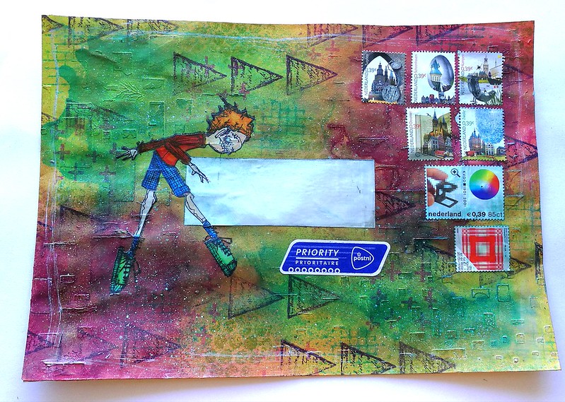
Freidrich of Stampotique Originals is fast becoming a fave stamp to use in my works. Last week I used him on the text background postcard and this week I'm sharing this MailART envelope I made. Because you can place him in various ways it's a really fun stamp. I like to place him on objects he precariously balances on.
venturing out
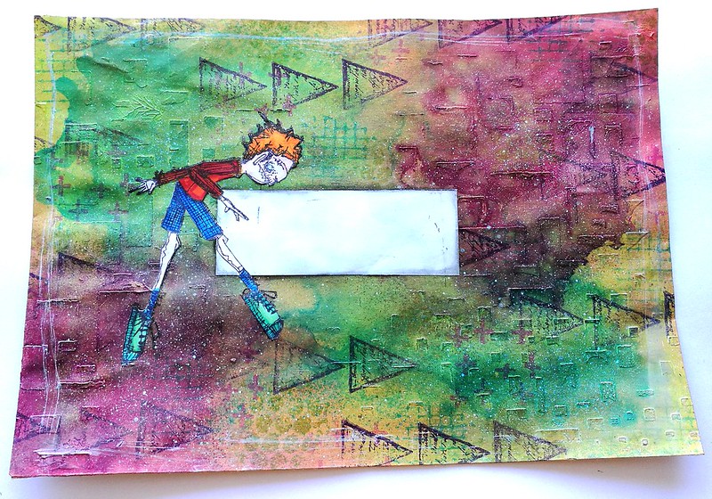
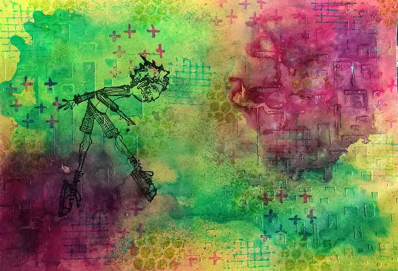
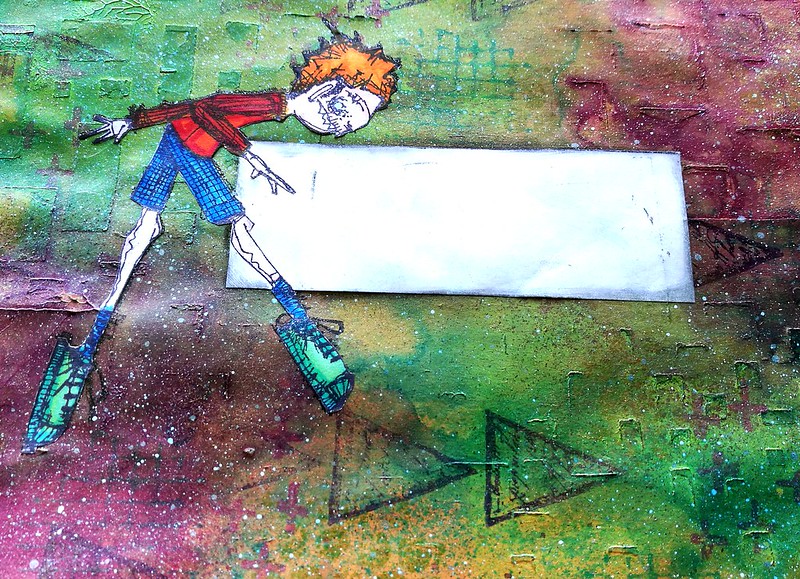
The envelope I used this time is an A5 size and it was already somewhat decorated, but I eventually didn't like the look of it in the end. So I covered it with opaque paints from Deco Arts in the Traditions line, Red Violet, Phthalo green blue and light green. I used mostly my fingers to apply the paints from light to dark (letting the bottom layer of light green dry completely) and then spritzed some water to get some movement going and dabbing some paint away for texture. The envelope already had some texture on it, from a stencil and heavy matte gel medium. The texture showed through the paints nicely while being covered with color. I then added some more texture with Kate Crane's texture cube and coordinating staz-on inks. Lastly I stamped Freidrich on with staz-on jet black where I wanted him on the envelope.
venturing out
I adhered an address label before I stuck on the colored (with promarkers) and fuzzy cut image of Freidrich. I wanted him to balance on something and I found the perfect stamp in VLVS! the Writing Triangles which stamped flipped on the side look like arrow heads. I love how he looks so very concentrated balancing on that particular point!
venturing out
Lastly I spattered some liquitex inks! in silver over some spots, swiped some around the edges and adhered some vintage stamps. It's now ready to mailed off :)

This envelope contained the card I sent for publishing in Crafter's Magazine May 2017 issue. And I'm excited to announce that I have a card published in it :) Look out for a card I designed for the New beginnings theme in ready set stamp section in the magazine below:


And a close up of the card that is published :)

I'll post a tutorial on how to make this card on my blog sometime later this month :)

I would like to enter the mail art envelope in the following challenge:
Art Journal Journey - Magical Mystery Tour
It's not a journal page, but I still thing it fits the theme ;)

Thanks for stopping by and have a wonderful day!

2017/04/07

Shopping Highlight: Art Specially 2017

Well as I hinted last Friday, last weekend was spent at the wonderful Art Specially event in Nijkerk. My lovely husband came with me (both days) to share in the crazy fun and also to make sure I didn't spend too much. Well the latter spectacularly failed, haha! But we definitely had crazy fun!

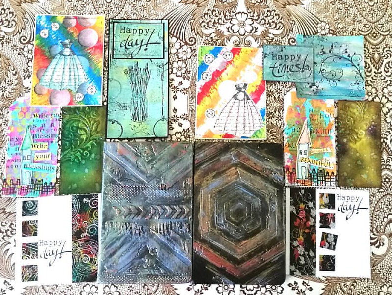
There were a lot of workshops/make and takes were offered this year again but we only had time for a selection. Also there were lines for the very popular workshops, like the notebook decoration by Papillon Hobby. We sat in line for 1 1/2 hours for that one. It's good to have a buddy with you so you can take turns in waiting. It was well worth the wait and fun to use a new to me product; Cadence brands wax, stencils and media. We also had workshops with Dylusions paints (dress card), paper artsy and infusions powders on gelli plate (the Happy cards), Dina Wakley paints (the house tags), Distress ink layering (swirl tag) and dual emboss resist technique (the happy day card). 
Result of 2 days workshopping at ArtSpecially 2017. Left side my works and right side works made by @cornelius.grayl Was great fun and am totally exhausted!! #artspecially2017 #artspecially #workshopresult #showyourwork #showyourart #mixedmediaartist #mix
On the left works I made and on the right the works my husband made. He got a lot of fun comments on being one of the few guys there attending the workshops :) I learned a lot these two days and I can't wait to implement some of these fun techniques in my own works. And I learned a great way to customize my Rhodia/Leuchtturm notebook!

The trends/pushed products on the event this year were: Distress Oxides, Cadence products (seriously almost every stand was pushing this new brand!), Pan Pastel, alcohol ink on yupo and gilding wax/faux metallic effects. I managed to resist buying a few of these pushed products, like the gilding wax, but also came home with a great deal of other things. 

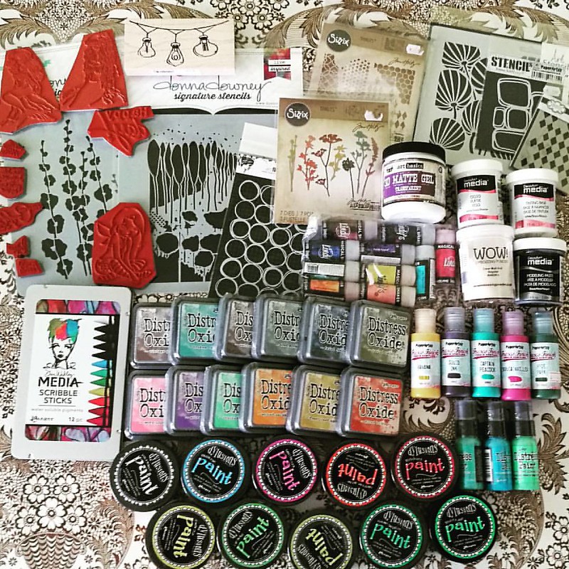
The loot from Art Specially this weekend. gosh, I am glad it's only once a year! #crafthaul #craftyendeavors #craftsupplies #artsupplies #theloot #spoils
Well... like I said, not spending too much has spectacularly failed this year! So happy this is just a yearly event! I had pre-ordered the Distress Oxides and saw Corrie Herriman live doing a demo with them at Hobby Compleet de Duif stand. I'm really excited to give them a whirl! I also pre-ordered the Lindy's magical shakers and am very happy to have found the Scribble Sticks. I'll to a comparison of both those products with similar products because I am curious on the differences between them. Will of course share my findings with you. All the paints and deco arts media were on sale and well since I love a good sale and wanted to have the dylusions paints for a while, so I went for it! A bit light on the stamps this year around, but that´s because I had my eye on different media to try out. You gotta make choices somewhere right? ;)

My husband also made some purchases and went for a set of ZIG's Clean color brush set

and I love that he is trying out this new to him medium :)

I am looking forward to use my goodies this weekend.
Have a great one you all and thanks for stopping by :)


2017/04/06

Art Journal: Be true, be you - VLVS!


It's my turn over at VLVS! blog today and I'm sharing an art journal page made with lush Viva las VegaStamps! and bright colors! In lieu of what I posted for MailART Monday, it's an affirming message, to encourage yourself to be true to yourself, always. To see the whole page, process description and which stamps/materials I used I invite you to hop over to my blog post over at VLVS!

Thanks so much for stopping by and have a wonderful day!


2017/04/05

Enjoy today! Stampotique Guest Designer for April

Some great news to share with you! For the month of April I'll be the guest designer over at Stampotique Originals Designer's Challenge blog :) I was absolutely over the moon when I was contacted to guest design for this amazing stamp company along side such creative talent :) Today I'm sharing the make for week 2 of the challenge "text background".
So last week I showed you the sneak peek of the card background. Using book/magazine pages for your background is super fun and easy to have some textual background.
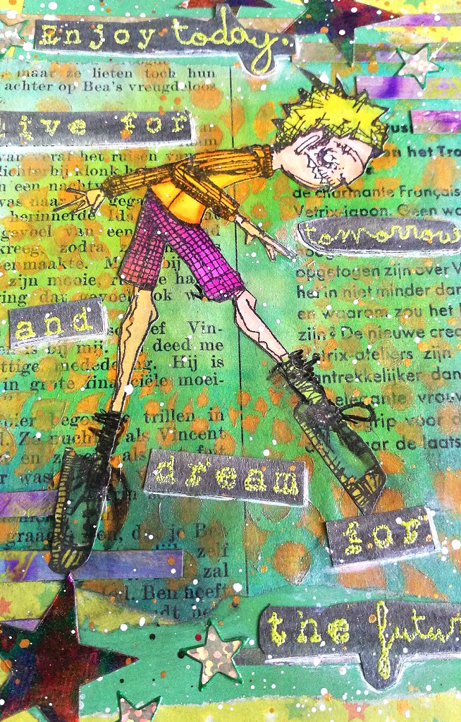
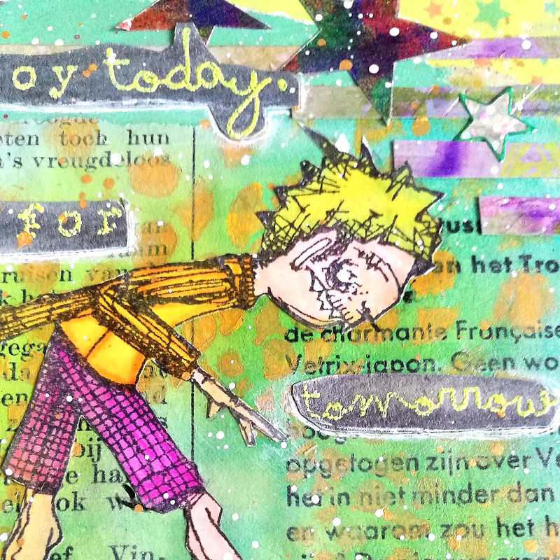
I colored in Freidrich with promarkers on sticker paper, cut out and adhered him to the page with matte medium. The medium made the sharp image of the stencil a bit blurry and mixed with the blue to a nice green. I was a little miffed at first but the softer background does make Freidrich pop more. So I don't mind it as much.

  Text on background - Stampotique Originals guest post April
I flipped his stance a bit and placed his ballet feet on a star and a part of the "enjoy today" text sentiment. The sentiment is stamped on aquarelle paper which I have colored grey with J. Herbin Stormy Grey fountain pen ink and is embossed with Zig Leaf Green embossing powder. 

Text on background - Stampotique Originals guest post April
I underlined the text with a white pentel gel pen, spattered some liquitex INKS in gold and white over it and called it done. 

Hope this inspired you to come play along with SCD270 - Text background this week. When you link up your project you're in the draw for the monthly 30$ gift certificate to spend at Stampotique Originals shop and I can tell you from experience that winning it, is totally amazing! Just FYI: Do read all the rules before linking up to avoid being deleted if you haven't followed them. 

Thanks for stopping by and enjoy today!


2017/04/03

MailART Monday: Every day, be true. Be you.

Be true, be you

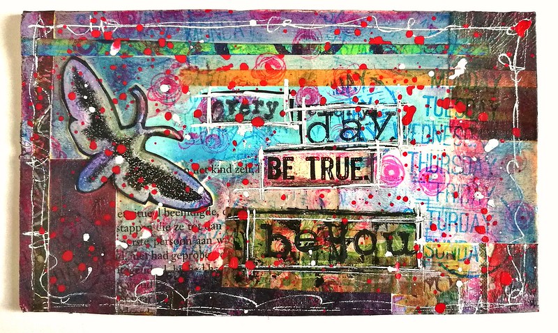
Slowly but surely I am working on that huge stack of postcards I showed you last a few weeks ago in WIP wednesday. This is the first card I finished from the pile and hopefully I can show you finished cards here on a weekly basis. This message that came about spontaneously has a special ring to my heart. Every day, be courageous and be true to yourself. I absolutely love how this turned out and I am hoping my partner for a swapbot swap whom I sent it to will appreciate it as well. 

About the materials I used: the moth is from Paper Artsy, the days stamps is from Carabelle studios, Be true sentiment is from VLVS! The rest I filled in with a Hema typewriter font alphabetbet stamp. Spatters are done with Liquitex and Daler and Rowney INKS and a Uniposca white paint marker.

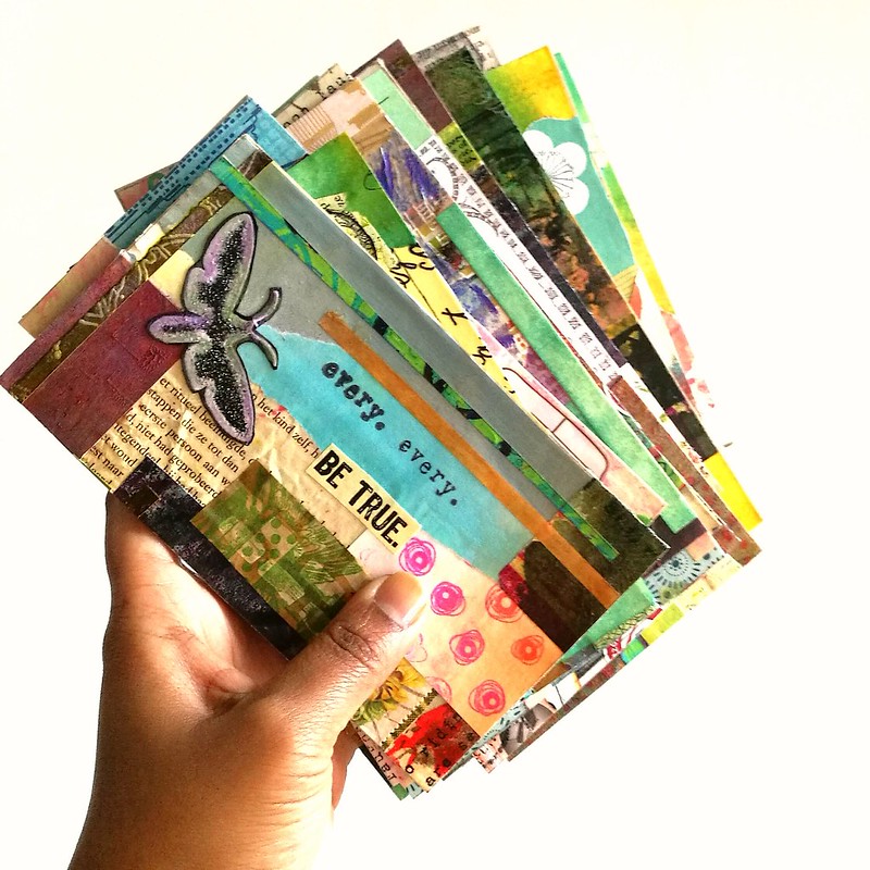
By the way this is what it looked like cut from the masterboard
Collage PC's cut from giant A2size collage


Thank you for stopping by and have a wonderful day!