Showing posts with label art nouveau. Show all posts

2016/09/16

Mini Art Journal: Fortune Teller

Mini Art Journal Fortune Teller
This week in my pocket size art journal, I created another spread using stamps from Lost Coast Designs and I chose this beautiful Mucha woman with Globe image as focal point and depicted her as a fortune teller.
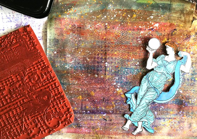
Mini Art Journal Fortune Teller
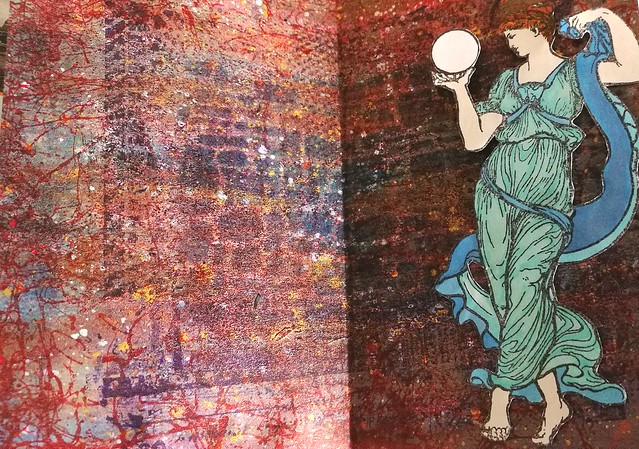
I stamped her on sticker paper, colored her in with Letraset promarkers and cut her out with tiny sharp scissors. The background is made with different acrylic & metallic paints on which I stamped the Grunge background stamp on with Staz On Violet. 
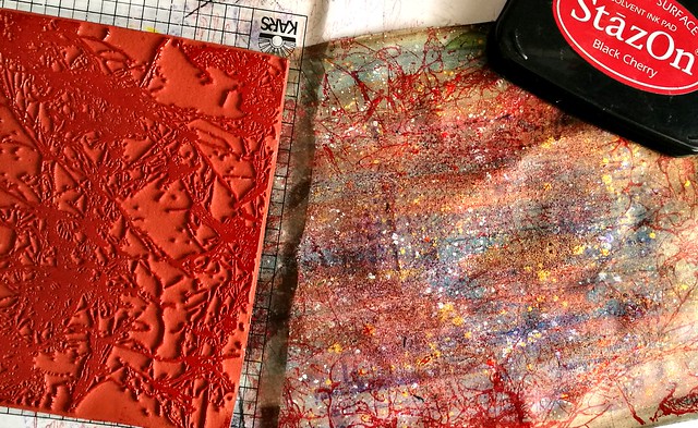
Mini Art Journal Fortune Teller
The I took Spray Webbing background stamp and stamped it on the sides with Staz On Cherry black.
Mini Art Journal Fortune Teller
I wanted to have more texture in the middle part so I stamped the grunge background again this time with Staz On dark royal purple which gave a better impression on the paper. I took a brick stencil and Distress ink chipped Sapphire and sponged the ink with a blending tool through the stencil. I liked the effect and cut the background to size and adhered to the journal. I stuck the woman to the right side of the spread as I wanted her to face the left side. 
Mini Art Journal Fortune Teller
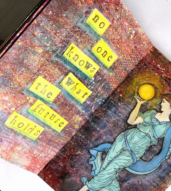
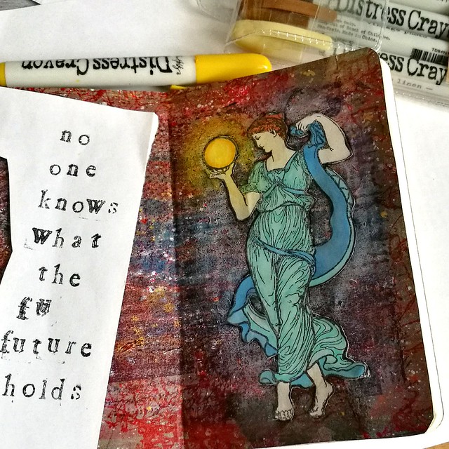
With my distress crayons I made the aria around the woman lighter and near her feet a bit darker. In and around the globe I used yellow tones, to depict a glowing orb. Then I got to work on the left side and stamped "no one knows what the future holds" on sticker paper and cut it into strips.
Mini Art Journal Fortune Teller
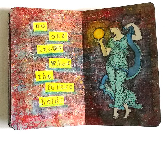
Before I adhered it to the page I colored the strips yellow with the distress markers. After I stuck them in I took a blue and white distress marker to underline the words. 
Mini Art Journal Fortune Teller
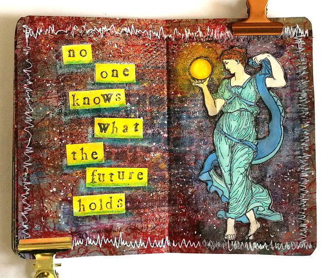
To finish off the spread I took a black marker and doodled around the edges but that fell flat and I wanted it to pop more. So I got a white gel pen and doodled over the black and though it does pop now I think I made it a bit too busy with the zigzag edges. I did zigzag because i wanted to doodle completely over the black lines, but next time I do it less "fanatically" haha! Anyhow, art journalling is all bout the process and you learn stuff all the time while making things and that is what I love about it.
 This is also my 3rd and final entry for this month's Craft Stamper's September Take it, Make It challenge :)

Thanks for stopping by and hope you will have a fun creative weekend.

namasté

2016/08/20

Mini Art Journal - Poison Ivy

poison ivy mini art journal

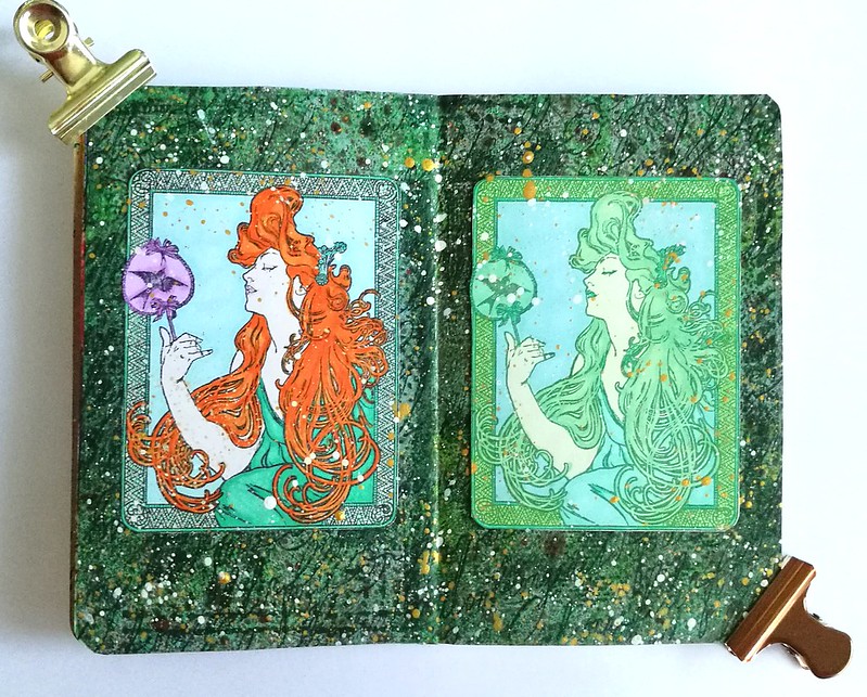
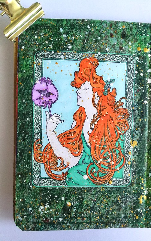
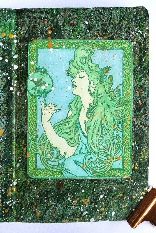
After weeks of feeling crappy and not having the energy to do much creatively, I finally made an effort today to make something in my mini art journal. I sorta had to as this is my day to post an inspiration page on the Inkadinkadutchies FB page with stamps from Lost Coast Designs. I got inspired by "Fan Girl" which is the main image I used for my spread. I love the art deco swirls and wanted to depict her like the comic character Poison Ivy. I did two takes on her, stamped her on 160gms white stamping paper first with memento black and the second with cotton ivy green. I colored her in with Letraset Tria Promarkers as with the detailler tip you can really get into the swirls of the hair. Some close up pictures:

poison ivy mini art journal

Poison Ivy originally has red hair. But in some versions she is also completely green. Like the depiction below.

poison ivy mini art journal

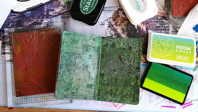
I cut the images out and adhered then to the background made out of lot of different layers: marbled page on which I stamped the Grunge, loopy calligraphy and fruit pods background stamps in various colors of green and dark blue. I also love my new OMBRE stamp pad from HeroArts.

poison ivy mini art journal

In the end I also spattered some liquid acrylics from Liquitex INKS! in white and gold to give the page more interest. I'm really happy how it turned out :) How wonderful it was to spend some time in my art room again!

Thanks for stopping by and have a great weekend!

Namasté

PS: Also don't forget my Masterboard Mailart Giveway ends tomorrow! Just leave a comment at the blogpost to be entered for the giveaway :)

2016/04/01

Pop a Color Technique ATC

Besides really great Mail Art swaps you can do via Swap-Bot, you can also do a whole bunch of ATC swaps there. At the group All Bout ATC's you can swap, well the title says it, ATC's mainly :) They often host fun technique swaps there and this one is for the "pop a color" series. The main design needs to be black and white with a dash of the mentioned color in the swap. For this swap, the color was Lavender. I'll show you how you can make a couple of these ATC's very easily in one go. All the stamps I used are from Lost Coast Designs. If you are in the EU you can order them from Inkadinkadutchies

Pop a color ATC's

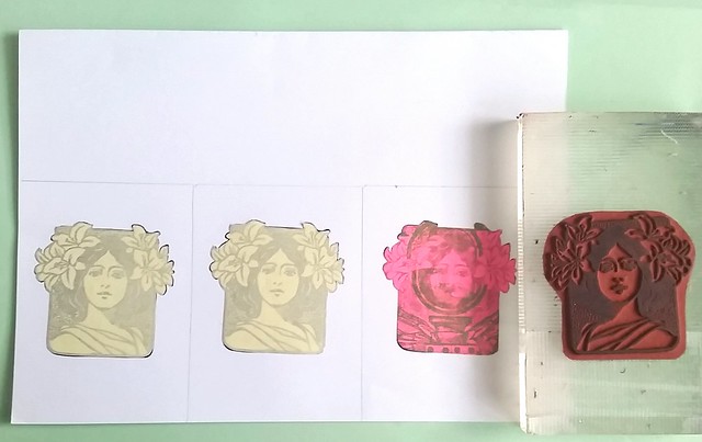
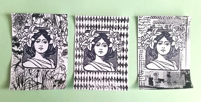
I took a sturdy piece of white paper and roughly measured the ATC size on it, three times. Stamped the Art Nouveau Woman's face with Archival black ink and then made a mask for them.

Pop a color ATC's
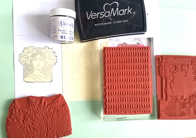
Then I chose a couple of fun ATC background stamps, got my versamark pad and black embossing powder. I cover the images next to it with the roll on post-its (also the material I used to make my masks with).

Pop a color ATC's
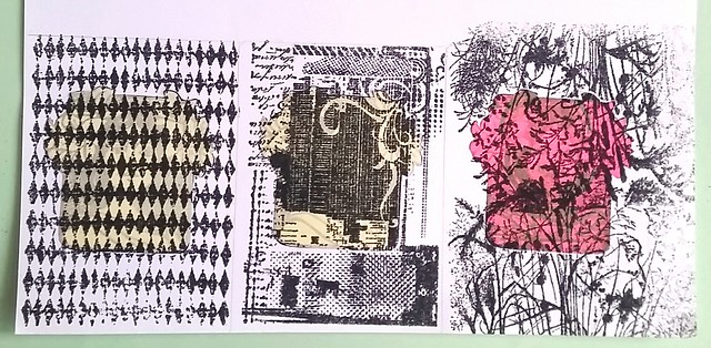
I stamped each section with a different back ground stamp using versamark and then put embossing powder on them and heat set with my heat tool.

Pop a color ATC's
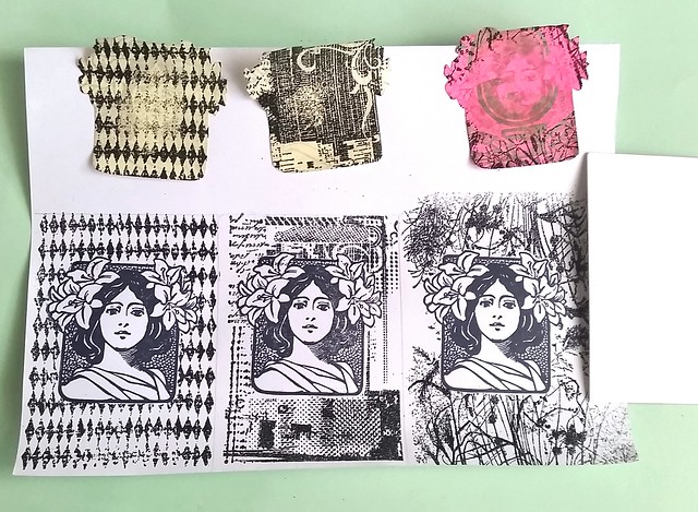
The reveal (taking off the masks) is always a fun moment. I was quite happy with the results and took an ATC size card to cut the 3 pieces out on the right size.

Pop a color ATC's
When you have done that, you can easily make corrections to the piece if you're not totally satisfied with the looks. I added a bit more leafs to the design on the left to make it look "fuller". Out of these three, I chose the right to use for this color project.

Pop a color ATC's
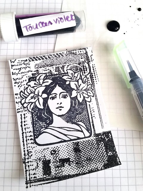
As you might know by now, I also like to use fountain pen ink to color my work. I found a nice color that would do for this swap, Toucan Violet, and honestly it does look a bit more like a lavender to me. I placed a drop on water resistent paper and got to coloring. 

Pop a color ATC's
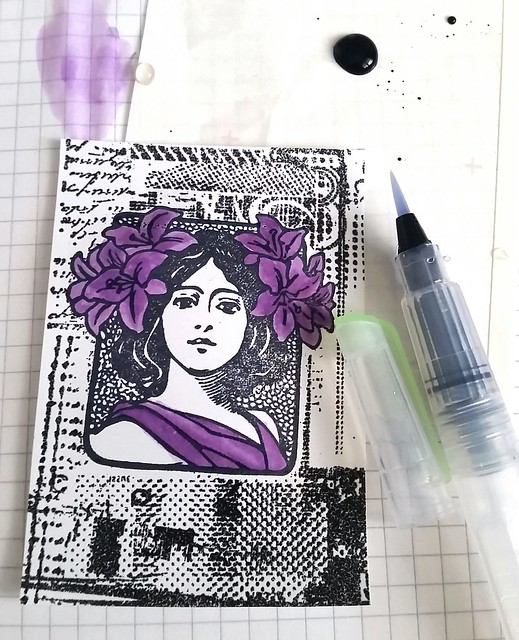
I took my Kuratake water Brush and proceeded to color the flowers and her robe with this color. Making this lighter with water and if I wanted more shade, I just picked up more of the ink.

Pop a color ATC's
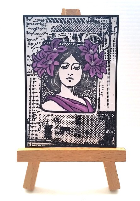
And this is the end result. I matted the piece on black card stock so it has a bit of a frame. I also added some pearl accents to the flowers and in her hair to give the ATC more of a shimmer. You can make these quite fast and easy. These did not take me longer than 30 minutes to make. 

I did something different to the other two ATC's though which I will show you next week.
Hope this inspires you to "pop a color" on your projects :)

Thanks for stopping by!
namasté

2016/03/25

A coloring adventure - La Plume (Mucha)

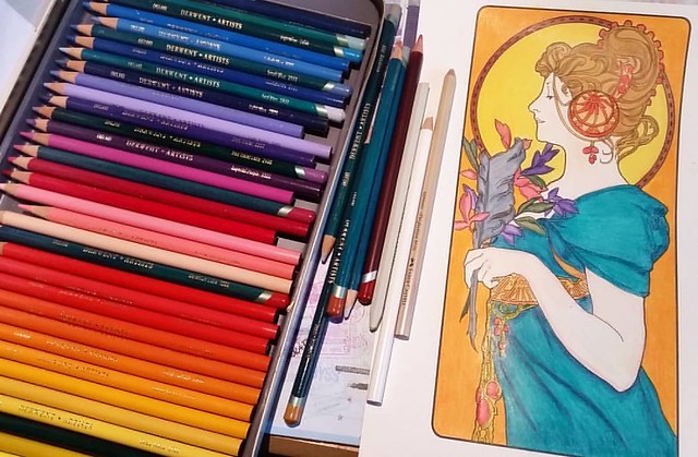
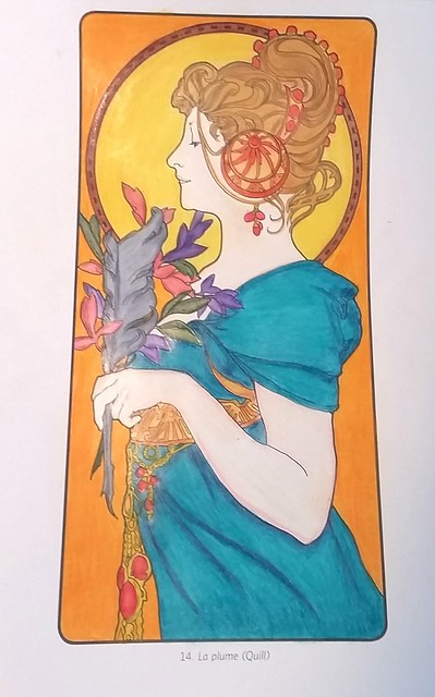
At the American Book Center in Amsterdam I came across this Alphonse Mucha Coloring book by Pomegranate Publishing. And of course I just had to have it. But since I didn't want to color in the pages in the book, I bought some heavy duty printer paper at Van der Linde in Amsterdam (the Fabriano Academia paperpack 160gms suitable for inkjet printers) and printed a page which I scanned from the book, La Plume.
Finished page and the pencils I used for it. Derwent artist pencils and a caran d'ache colorless blender. That gets the smooth transitional colortotange done.
I used Derwent Artist Pencils, a caran d'ache blender and a faber castell pencil eraser for this project. I love these Derwent pencils, they have such beautiful and smudge proof leds. And with the blender the colors just pop and look creamy. Definitely love how the page turned out.

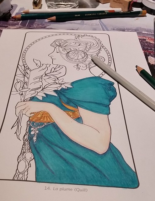
La Plume coloring process

I actually started with it last year and gradually added color to the page when I had time for it. Showing you the process is a lot better than talking about it, so here is a slideshow:
La Plume coloring process

See a behind the scenes for this coloring book on the Pomegranate blog which contains a free download from the book.

And check out my Pinterest with a few Mucha Coloring book pages I found via google search (La Plume is also on there) 

Thanks for stopping by!
Have a colorful weekend.

namasté

2016/03/21

Mailart Monday - A Loving Kiss & Love Letters

A loving Kiss


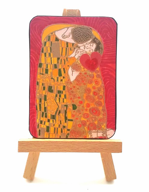
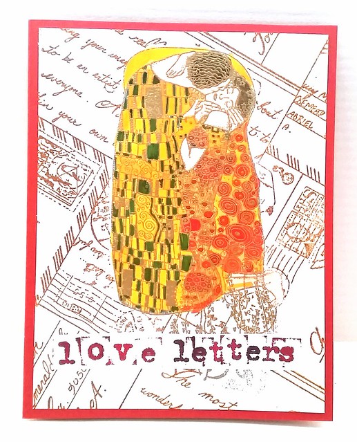
The theme for the february ATC swap at Inkadinkadutchies facebook group was love. This is what I made for the swap. I used Carmen's Veranda's Klimt Kiss rubber stamp. The background stamp is a heart which I carved myself. First I stamped the Kiss with versamark and then embossed it with gold embossing powder. I made a mask and covered the image and stamped the back ground with Staz-On Cherry Red. Then I colored it in by using fountain pen ink and a kuratake brush pen (sailor apricot for the image and pilot red for the back ground). When that was dry I used my Letraset promarkers to color in the details of the image. I cut a heart out of a round sticker and placed that under the woman's face. To accompany this ATC I made a card.

A loving Kiss - Love Letters
I used the same coloring method and masking technique for the Klimt image. The background image is also from Carmen's Veranda (postcards) and I stamped it with Versafine Vintage Sepia. I just love the contrast between the colorful image and the sepia background color. I stamped the phrase 'love letters' with a typewriter alphabet font on sticker paper with Staz-On Cherry black (some letters with Staz-On black) and placed it below the image. I adhered the whole piece to an A5 sized note card to finish it off. 

I received this wonderful ATC from Grytsje
 
 
Our next ATC swap at Inkadinkadutchies is "Let's Party" and you can sign up by joining the events page. You can use any stamps from Lost Coast Designs and/or Carmen's Veranda in your project (a minimal of one). If you live in the EU you can order them through Inkadinkadutchies webshop, if there are stamps not on the site they can be special ordered for you. Just use their contact form

Hope you'll join us at the next swap :)

Thanks for stopping by!
namasté  

2015/05/04

The goddess of the Stars ATC - Lost Coast Designs monthly challenge

goddess of the stars
This month at Lost Coaster's Reviewers the challenge is to make an ATC using Lost Coast Designs and/or Carmen's Veranda rubber stamps.
I made this ATC by using the stamp 'profile with stars'. It is one of my favorites of the Art Nouveau range at LCD. It was a pretty challenging one to make and when I started I did not know it would turn out like this. Am very pleased with the end result though!
This is how I made it:
The background is made with distress stain Aqua Lagoon and spun sugar on a light green paper base. I stamped the circle of the stamp with versamark on the background and embossed with stampin' up stardust embossing powder to give it that starry night effect. Another back ground made with distress stains wild honey, fired brick and vintage photo on green paper. Stamped profile with stars on it with Staz-on rustic brown. Used a versa-marker on some elements I wanted to emboss with Top Boss Honey Gold. Then accentuated with a copic too tone marker in brown. The inner circle I removed with a tiny 3D Card scissors. To finish it off I added a bit of black soot rub on pearl at the edges of the ATC.
textures close up 
a close up of the textures
 
Hope this inspired you to join us in this month's challenge at Lost Coasters Reviewers
 Use the inlinkz at the challenge post to share your project with us.
Thanks for stopping by.

Namaste.