2017/01/30

MailART Monday: Bee Happy

Bee Happy

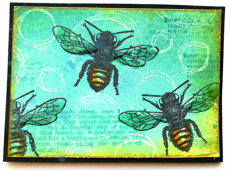
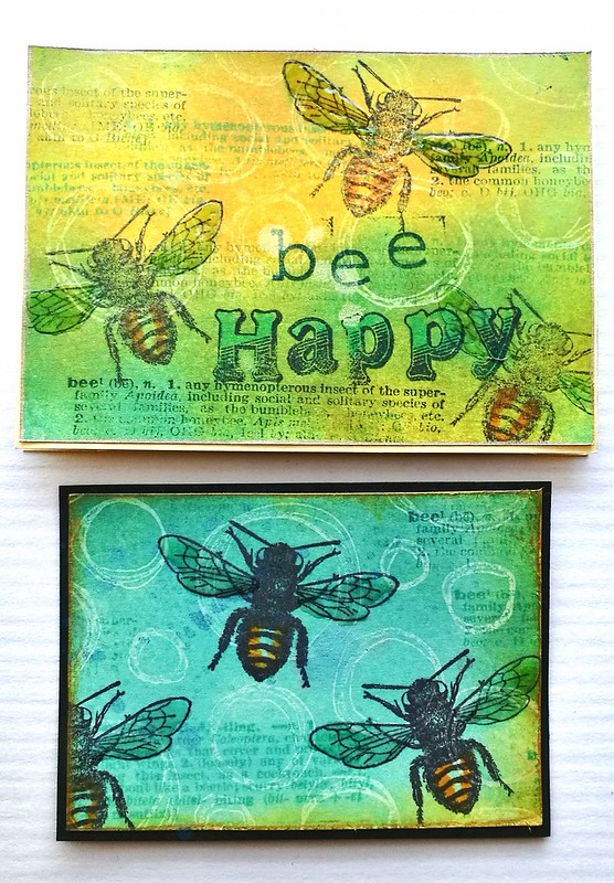
A little ode to the bees on today's MailART Monday with stamps all from Lost Coast Designs. I made a little notecard and ATC for a swap over at Art Chicks Studio facebook group.

Bee Happy
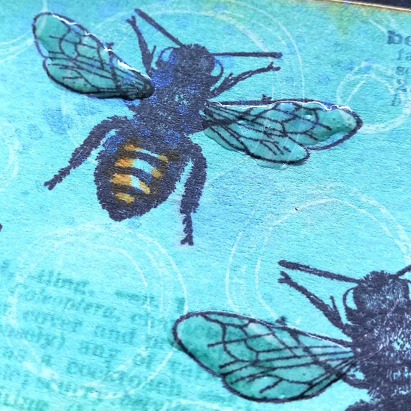
The ATC swap was centered on a resist technique and I stamped the doodles circle in opaque white colorbox ink, heat set and colored the card with distress ink and a blending tool. A classic resist technique. The bees are stamped over the card, wings glazed with crystal lacquer and added some color to the body. Stamped the dictionary words on it randomly and sprayed some mica sprays over it. The outline is tarnishes brass distress stains and matted on black card stock. Simple yet very effective :)

Bee Happy
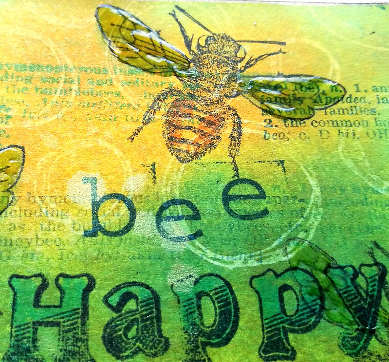
The little card was done the same way with addition to "Bee Happy" letter stamping.

Bee Happy
The yellow and blue colors make me very happy! A hint of spring time to come :)

Stamps used from LCD:
the bee and dictionary is from Bugz set

Other materials:
Technique tuesday broadway alphabet set
Hema alphabet set
Distress inks mustard yellow, peacock feathers and tumbled glass
tombow markers
colorbox white ink
crystal glaze
distress stain tarnished brass
Ranger mica spray lapis, honey and corn flower

Thanks for stopping by and have a great day!


2017/01/27

Art Journal: The perseverance of possibility

The perseverance of possibility

So I might have mentioned that last week I was pretty much ill with the flue and bronchitis infection the whole week. I was super tired and could not do anything but sleep the whole day, but in the evening when I felt a bit better I got to work in my pocket size art journal. So I worked on it for a couple of days and practiced my layering techniques and patience :) It was hard for me to work on things slowly, usually I work in a high pace producing 2-4 pieces when I have the whole day to create. But sometimes, when you can't work on a high pace, you just need to step back and let it be to come back at it at some other point. It all came together pretty gradually and I'm quite in love with the end result.

Potential
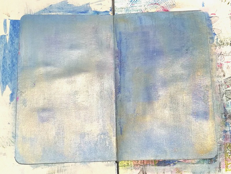
I started off with a spread which already had paint on it and I covered that up with a mixture of Paper Artsy fresco paints hint of mint, southern skies and a bit of Distress paint faded jeans. When the paint was still wet I mixed in a thin layer of CW Gold Gesso. When that dried I applied some Light and Fluffy Modeling paste with a palette knife and let that dry a bit.

Potential
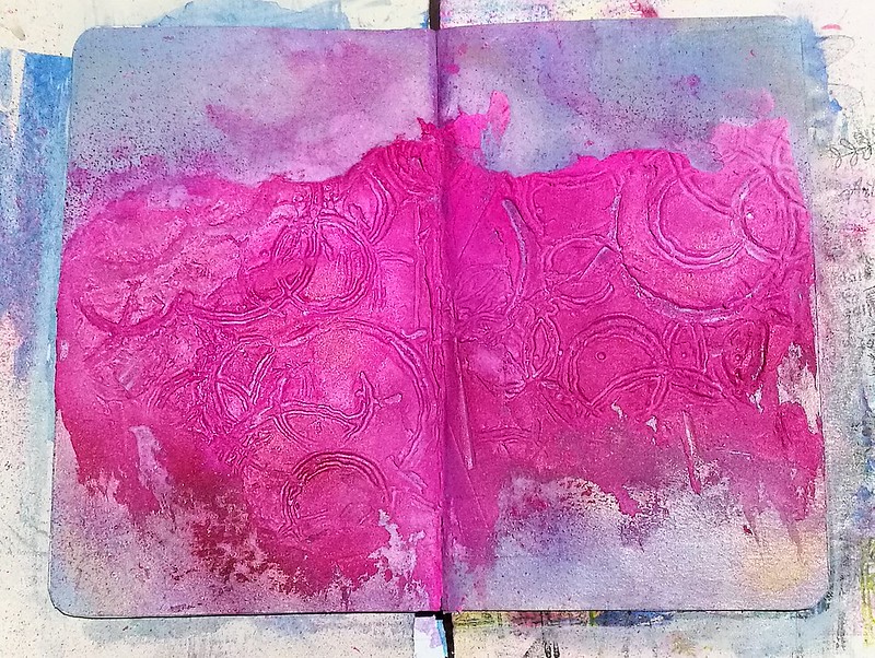
In the modeling paste I pressed the  Effervescence by Ana Bondu Carabelle stamp in various places. First the paste wasn't dry enough so I had splotches of paste that came off. Started again and again until the consistency was just right so I could get some good imprints that didn't stick to the stamp. Trial and error and a fun technique I definitely want to explore more. When I was satisfied with the imprints I made I let it dry and cleaned my stamp thoroughly. Came back to the page and spritzed some fuchsia dylusions ink mixed with burgundy mixed media spray from the november artsnacks box. Spritzed some water over it to mix and let it run everywhere and wiped the excess away. Repeated process until I was satisfied with the color.

Potential

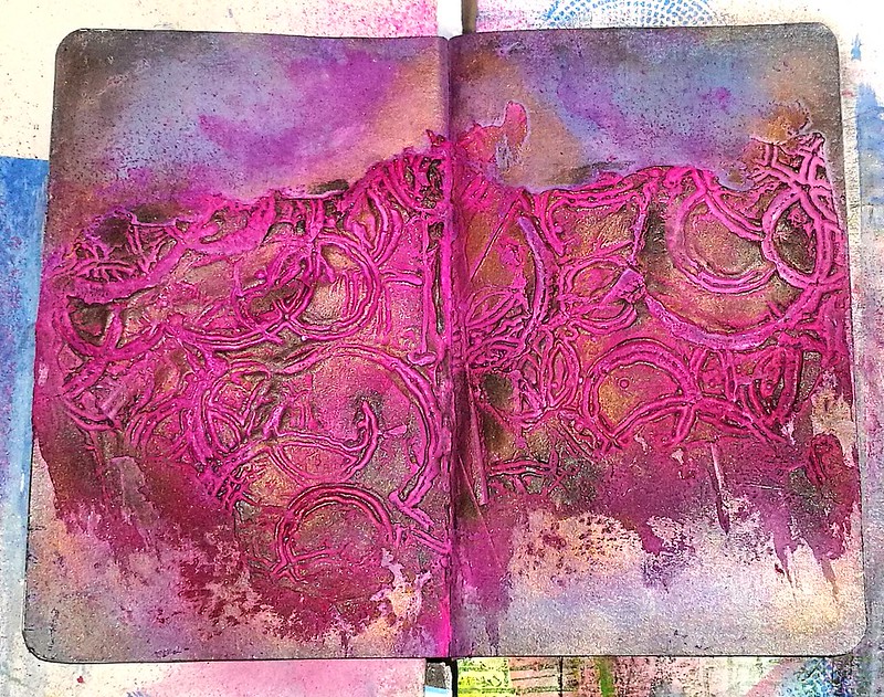
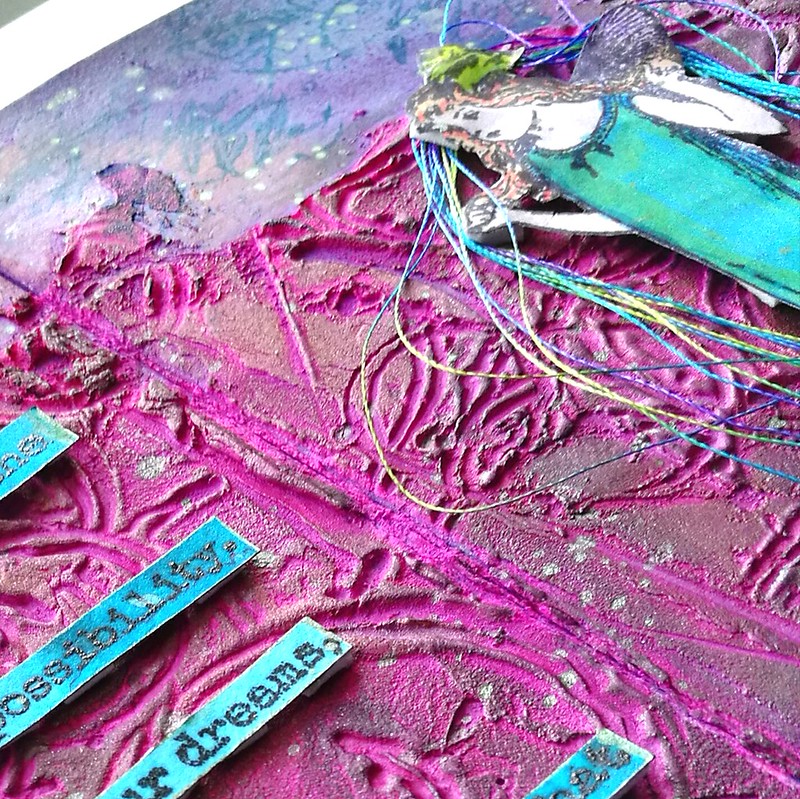
To get the structure back I took my pearl rub ons and highlighted some aria's with bronze, gold, pearl and black metallic shimmer. Also added shimmer to the outlines of the paste and the page. I considered leaving the page like this in my journal as it's super pretty to look at.
potential
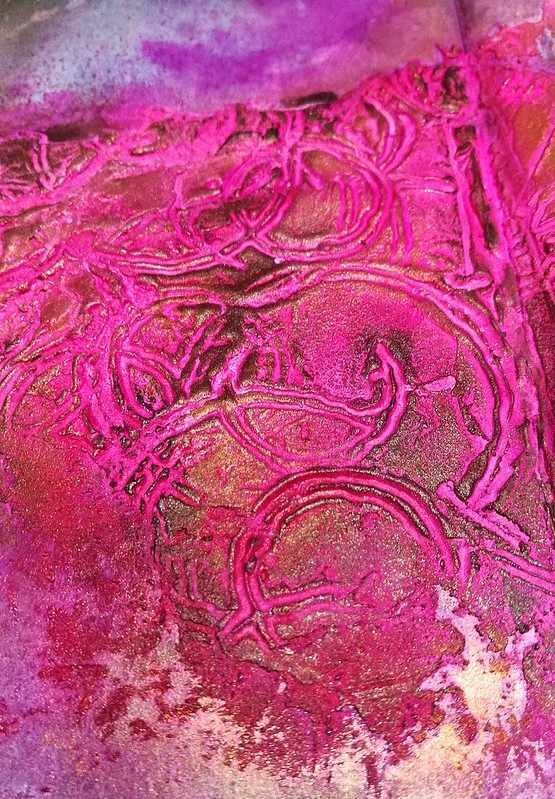
Detail shot of the structure.

But my gut said it still wasn't finished. So I went on to see which stamps I could use to this layout. Of course VLVS! has so many that spoke to my heart I went to check out those first.
The perseverance of possibility
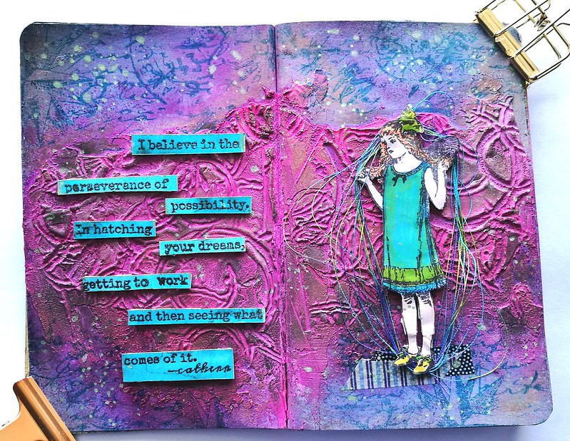
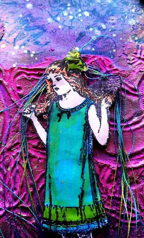
I chose this cute little fairy girl by Cat Kerr which I colored with letraset promarkers and adhered with pop up squares. I remembered I had some rainbow thread somewhere and added that around her. The colors of the thread matched her outfit colors really well.

The perseverance of possibility
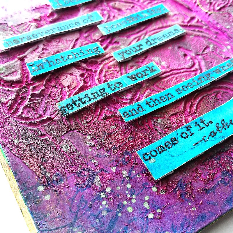
I love the quote stamps from Cat Kerr, and I believe in is one of my favorites. But I deconstructed the quote a little and left the armor bit away so it says "I believe in the perseverance of possibility. In hatching your dreams, getting to work and then seeing what comes of it." It was stamped on aquarelle paper on which I already had Sailor Jentle Yama dori fountain pen ink with pearl mint shimmer wash over it. It flowed out to such a beautiful teal blue! And I love the contrast of teal and pink. The quote stamp was embossed with black embossing powder. They were also adhered with pop up squares. On the edges I stamped a bit of text and nautical star from Artemio vintage travel collage with staz on teal. The spatters are from Wink of Luna light green diluted with water. I added some more black pearl rub on some edges and called it done.

The perseverance of possibility
I really enjoyed doing this page and it was a first for me in many ways: patience in layering, stamping in texture paste, adding thread ... I also learned a lot by doing all this and went to check out some you tube channels for some tips and tricks on what to do better next time. One thing I have learned is I definitely need to cover the creases of the pages next time, either with masking tape or gesso (or both..) because the ink stained some of the other pages through the cracks. not a lot, and thankfully most pages were glued in so didn't stain my other work too bad, but yeah, it won't hurt to secure it better next time. Also need to leave more allowance for folding, bits and pieces of the modeling paste in the middle broke off when I folded it and there is a crack running through it. So I have to plan and place my paste better next time. It's all about the love of process :) 

I hope you enjoyed reading along this process with me. 
Thanks so much for stopping by and have a great weekend!


2017/01/26

Incowrimo giveaway winners!


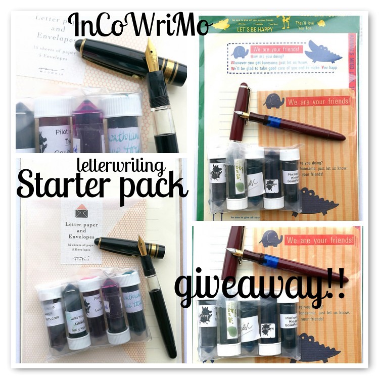
After reading all those comments (in total over 200 combined comments!) I was so heart warmed and overwhelmed by the enthusiastic responses! I really wish I could send all of you something, but sadly there can only be two winners and they are as announced on the picture above : Janine on instagram and Nikki on my blog. Please email me your addresses to miss.thundercat (at) gmail.com so I can ship out the packages to you asap :)

Just 5 more days to get yourself ready for the snail mail bonanza which is InCoWriMo! You can still join the now over 400 registered people and send some snail mail for 28 days straight.  I will do some weekly round ups of sent mail starting next week. If you want to be on my mailing list please feel free to add your address to my POSTABLE address book. You can add your address here as well for other participants to ffind you. Also be sure to enter this awesome and hilarious giveaway that is happening over at the InCoWriMo blog/instagram!! Yes, use your pens and stationery everyone! 

Thanks for stopping by & hope to see you in my mailbox soon! 


2017/01/23

MailART Monday: Winter Elf

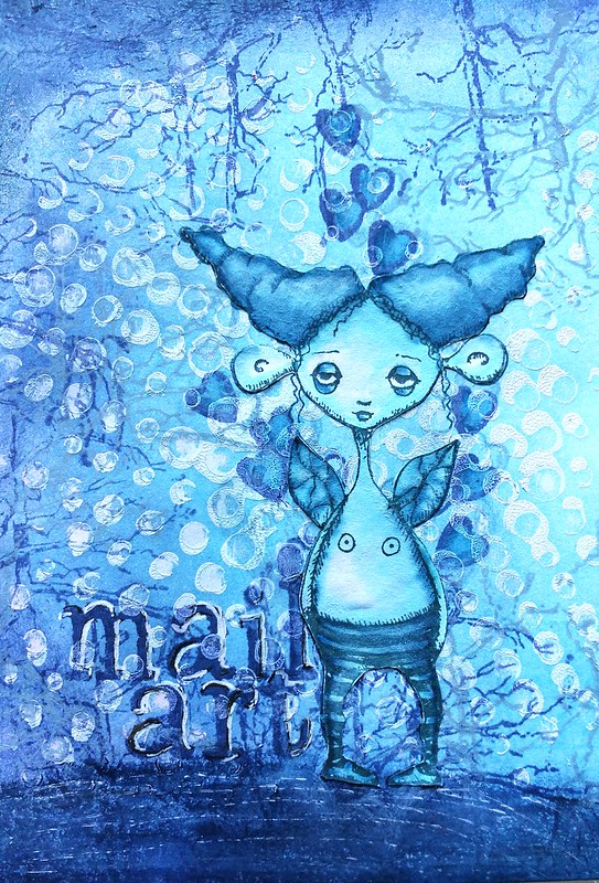
Winter Elf Mail Art

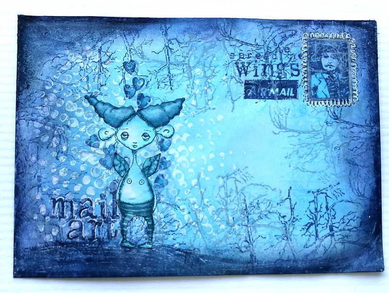
On this week's Mail Art Monday I have a fun little project to share with you. I am continuing with my envelopes this week and created a "Winter Elf" mail art envelope you see above using stamps from Viva Las VegaStamps! and a blue winter color scheme only. The color scheme was inspired by this color challenge on the Leuke Stempels blog to use the colors inspired from the picture below.


And products sold at their shop only. So a nice combination of wintery blues and greys. The use of black and white were also allowed. Well you know I like a good challenge so I went for it. I'm quite pleased with the results. Sadly I haven't got any process pictures for this one, though. But below are a couple of detailed pictures for you instead.

Winter Elf Mail Art

I stared off with wiping off some excess modeling paste from a Carabelle Studio's stencil with a baby wipe to get that subtle polka dot print on the back. Next I used distress inks (tumbled glass, faded jeans and chipped sapphire) and a blending tool to color the envelope, using the darkest tone as last to frame the envelope. The dots resisted the ink at some parts nicely. and others parts it seeped through. Gives a nice playful effect. Next I took distress paint faded jeans and my brayer to stamp on the branches of the tree in the lighter grey blue color. Then used distress paint Blueprint for the darker blue branches.  This cute little forest Critter designed by Lesley Wood for VLVS! is the focal point. She was stamped on sticker paper and colored in with water soluble markers and fussy cut. I stamped some hearts underneath her first and colored those in as well. The hill she is standing on is made with a distress crayon (also in chipped sapphire) and highlighted with a white gel pen. The "Mail Art" stamp comes from plate 1477.

Winter Elf Mail Art
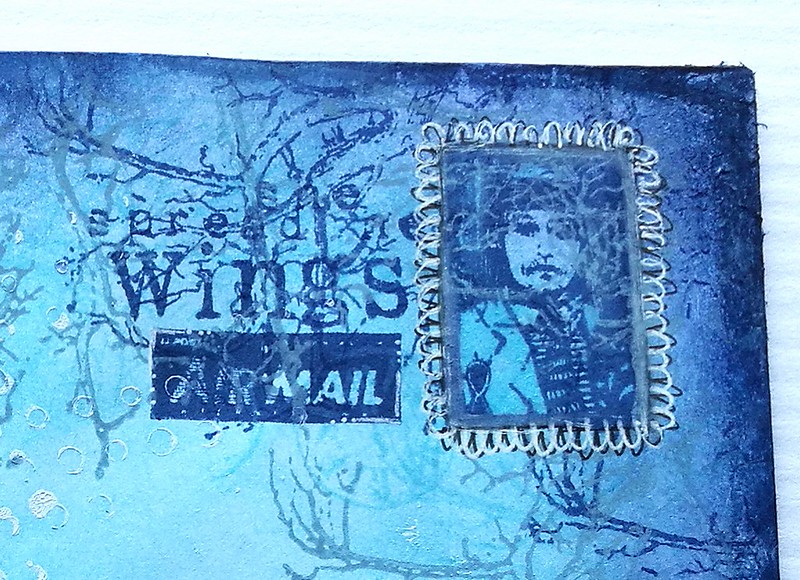
On the top right I used the Whimsical Postage Stamp op the top right corner and drew in a scalloped border with a black fine liner and then white gel pen over it. The little airmail stamp is of course needed for mail art and thought the "she spread her wings" sentiment would also be appropriate. Lastly I outlined the whole envelope with distress crayon shipped sapphire, sealed it with a fixative spray and called it done.

Winter Elf Mail Art
This is definitely my fave part of the envelope as I love how the hearts come from underneath her wings :) 

Stamps from VLVS! used:
Forest Critter by Leslie Wood 

Others:
Carabelle Studio rounds stencil
Crafter's workshop light and fluffy modeling paste
Distress inks (tumbled glass, faded jeans, chipped sapphire)
Distress paints (faded jeans, chipped sapphire)
Tombow markers
Distress crayon in chipped sapphire 
Faber Castell Artist Pitt fine liner
Uniball white gelpen

For more mail art inspiration check out VLVS! blog for their mail art monday posts as well. And I hope to see you again here next week for another installment of my own Mail Art Monday posts here :) 

Thanks for stopping by and have a great day!


2017/01/21

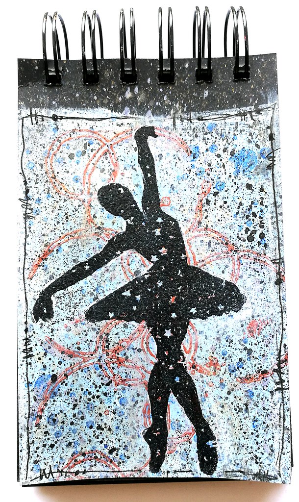
Art Journal: Prima Ballerina

Prima Ballerina

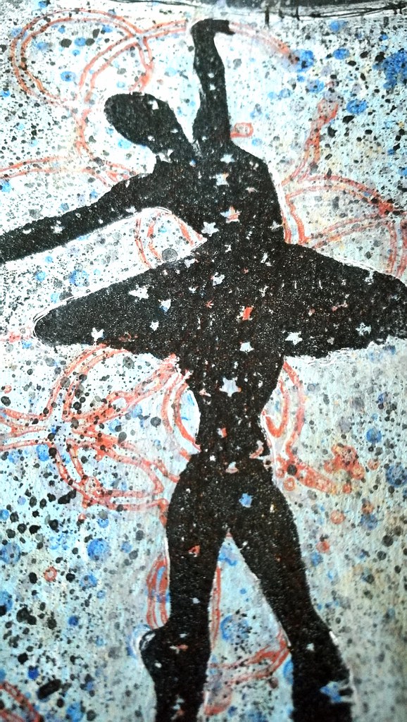
Wanted to show you a quick page in my new black spiral art journal today. I prepped the page with my new paperartsy fresco finish paints, southeren skies mixed with a hint of mint. Stamped carabelle studio Effervescence by Ana Bondu stamp with a bronze metallic ink, spattered some blue and black paint and then stamped the ballerina with stars (from Lost Coast Designs) with versamark which I then embossed in black. The placing of the stamps are all done randomly, but I love it when coincidence come together like this. Both of the ballerina's hands are in excellent placing on the circle stamps. The one in an opening and the top even looks like she is holding a circle. Perhaps, she might be a circus performer ballerina using all these hoops :)

Prima Ballerina
Detail shot of her holding the hoop. Creating art from the heart can bring wonderful coincidences like this together :) 

Thanks for stopping by and have a wonderful weekend!


2017/01/20

Coco wanna cocoa?

Coco wanna cocoa?

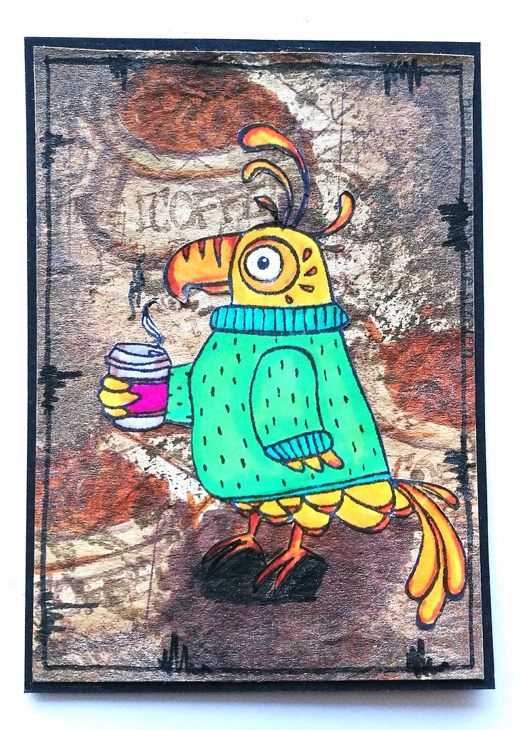
Over at Stampotique designer's challenge blog the theme this fortnight is "your favorite stamp" and OH BOY what a hard challenge that is! It's like asking me to choose my fave pasta dish or something, as they are all YUMMY! Well, it was a real challenge for me to choose one so I went with what is a favorite at the moment for me. I have not been feeling well since last week, down with the flue and trying to get over a bronchitis infection (again, sigh...) so I've been dressing up warmly, drinking hot drinks and feeling bemused and tired all week. So a bemused bird, dressed warmly with a hot drink in her hand, cocoa bird by Kira Nichols definitely fits that bill, right? haha! I made this ATC featuring that bird. 
As always the image is stamped on sticker paper colored with promarkers and fuzzy cut. The background is a coffee stained piece of paper on which I stamped coffee blue print stamps by Tim Holtz on. Colored with tombows and distressed with distress inks. A bit of doodling with the faber castell pitt marker around the edges to finish it off. 

Going to drink some more hot tea and netflix New Girl. Hope you all have a wonderful weekend! Thanks for stopping by today :) 


2017/01/19

Dandelion Breeze - VLVS! January Inspiration


 I'm back on the VLVS! inspiration blog this week with a card I wanted to share based on our challenge this month.

This is the mood board for our january challenge. Nice vintage looking style and colors. 

And inspiration words like foliage, flowers, weeds, nature, bugs, moths, butterflies, wings, numbers, script, invoice, background stamps, vintage, tan, black, white, brown, distressed, grungy,... made me dig up some great VLVS! images to work with. A full list of stamps and other items I used are listed below.
 

I worked on thick vellum paper on which I used a circle stencil and light and fluffy modeling paste. Then went on to distress it with brownish Distress inks to get that vintage look going. The vellum is nice and smooth so you can get a great transition into colors. The main image I used for this card is Blowing Dandelion and Extra Seed by Susan M. Brown which I stamped twice. First with Staz-On timbre brown and then with versamark ink to emboss it in a golden honey pearl color. The timber brown stamped image gives a nice shadow effect under the embossed image. Then I used Postcards ATC size and other fun stamps for more interest. The sentiment "she flies with her own wings" is a part of this stamp by Cat Kerr which I thought would be fitting to add here. I also stamped this sentiment twice to get a shadow effect. 

After I matted the card on cream paper and adhered onto a black card (which I used Miracle Tape for!)
 I also embossed the dandelion and sentiment on the envelope, which is also in a honey pearl cream color.

They make a classy pair, the card and envelope and is ready to be written on and mailed out!


Stamps used: 
Blowing Dandelion and Extra Seed by Susan M. Brown 
Postcards ATC size 
"she flies with her own wings" is a part of this stamp by Cat KerrWriting
Circles background
Smear/Smudge
Stitching Lines 1

Others:
Miracle Tape
Thick vellum paper
Cream pearlized envelope
The Crafter's Workshop Light and Fluffy Modeling paste
Carabelle studio circle stencil
Distress inks: Old paper, vintage photo and ground espresso
Staz-On inks: Jet Black, Timber Brown, Saddle brown
Top Boss Honey Pearl embossing powder

Hope this inspired you to play along with our challenge this month.
Thanks so much for stopping by!


2017/01/18

Giveaway: InCoWriMo letter writing starter packs! (open until january 24th!)

Incowrimo starter packs giveaway

The month of February is slowly but surely approaching and that means that InCoWriMo is nearly upon us! To celebrate this fact, I am doing a little letter writing starter pack giveaway for my followers here and on Instagram :)

First, what is InCoWriMo? The International Correspondence Writing Month, for short Incowrimo is a phenomenon that started in 2013 and the goal is to connect with people through, as they call it "vintage social media" - ie writing a letter, postcard, note etc the old fashioned way and mail it to that person. And the pledge is to do this for 28 days, so the whole month of February! Yep, 28 letter/mailings in 28 days! See more on how to participate on the official site. It's all about using your stationery, pens and inks more and of course connecting with people the old fashioned way!

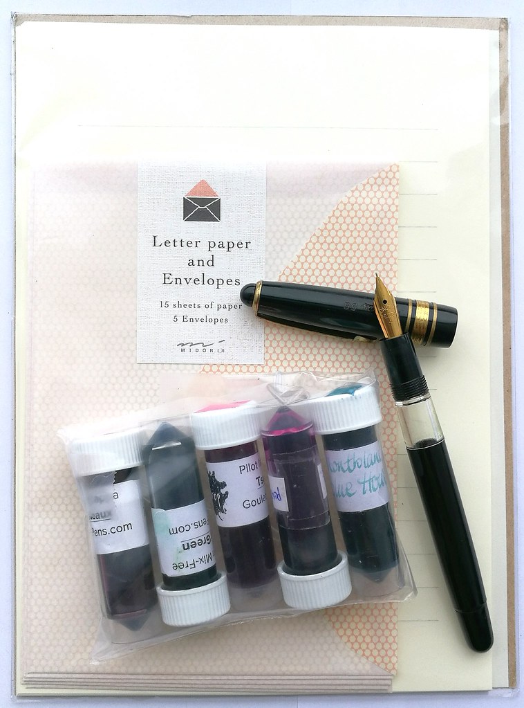
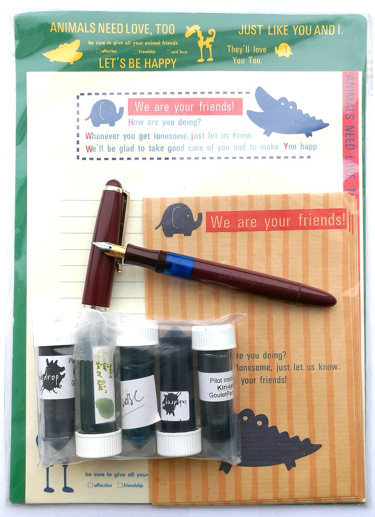
Seeing I have waaaay too much stationery I will ever use up in my lifetime, I wanted to share some with my followers here and on IG. I have compiled, not one, but two starter packs to giveaway! That's right, two lucky people will receive a starter pack from me so you can participate along with so many others (including myself :) The starter packs contain one letter set with sheets of paper and envelopes, a vintage fountain pen (a piston filler) and 5 different ink samples.

Incowrimo starter giveaway packs
Set one consists of midori letter set, Herma 56 piston filler vintage fountain pen and ink samples: Montegrappa bordeaux, Platinum mix leaf green, Pilot Iroshizuku Tsustuji, Pelikan Edelstein Amethyst and Montblanc Blue Hour.

Incowrimo starter giveaway packs
Set two consists of kamio Engrish letterset, Liberty piston filler vintage fountain pen and ink samples: Pilot Iroshizuku Kiri Same, Organics Studio Join or Die, Omas Turquoise, Platinum Mix free earth brown and Diamine Grape.

What you have to do to win one of these packs: 
Set one will be given away to one of my blog readers and all you have to do is comment on this post and let me know who you would write a letter to and why. That is it! Set two will be given away ion my instagram and you can also enter there (same question) if you want to try to win that set. Just look for the giveaway picture on my instagram and answer there. 

RULES of the giveaway:
Open internationally, Only one entry per person per set (so once on instagram and once here) and the giveaway closes on January 24th at midnight CET, I will announce the winners (which will be chosen at random) shortly after in the following day or two so they can get the starter pack just before International Correspondence Writing Month starts. 

So what are you waiting for? Leave me a comment and tell me who you'd write to :) 

Also if you'd like to be on my InCoWriMo mailing list; leave your address here at my POSTABLE. (disclaimer: While I will do my best to send mail to people on my list, which is now half full, but if there is a high demand I might not be able to respond to everyone's request.)

Thanks for stopping by and looking forward to read your answers below :)  Have a great day!


2017/01/16

MailArt Monday: Pigtales Grew Wings

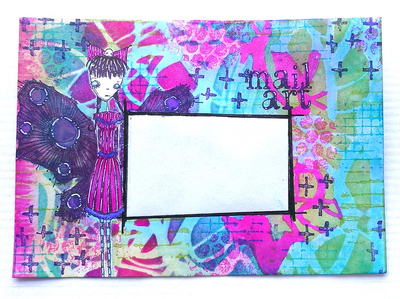
When I was cleaning my art room over my Christmas break, I found a stack of white standard C6 envelopes and I thought it would be fun to show you some more arted up envelopes in my weekly MailART Monday posts. butterfly mailart

I created the envie above with some of my fave Stampotique stamps and a new stencil by Brett Weldele. A colorful burst in cold winter times :) The whole thing is one layer and done with masking the main image and a part for the address off with some sticker paper.
Pigtails Butterfly mail art
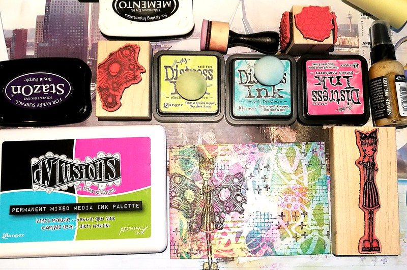
You can see most of the materials I used here. The Dylusions mixed media palette has such lovely bright colors! I chose some according distress inks to layer over the stencil, which is "scribbles" from Brett Weldele. When I took the stencil away I stamped some texture on it with the fun Textures cube from Kate Crane. And added more color first with distress inks and blender tool.

Pigtails Butterfly mail art
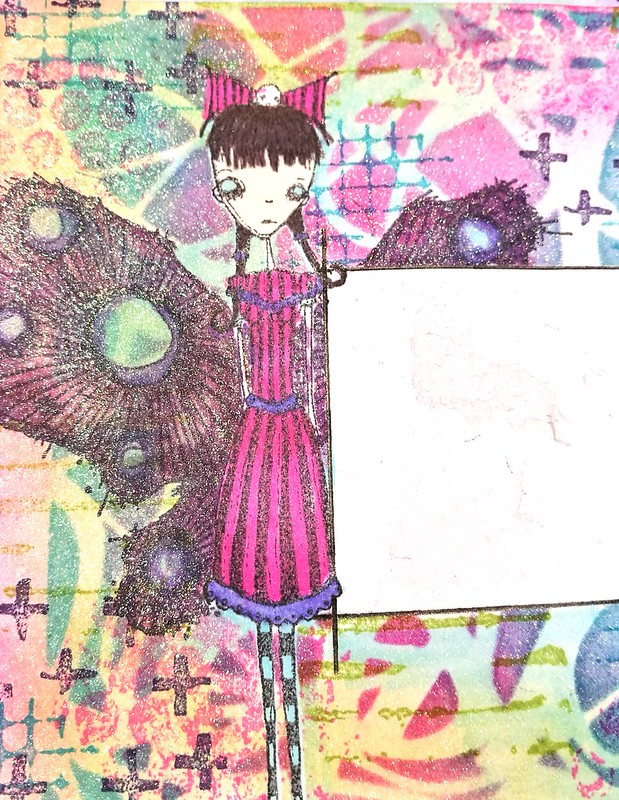
Before I took the mask away I also sprayed some shimmer, Perfect pearl kiwi to be exact. Then I colored little miss Pigtales and the lovely wings design by Daniel Torrente in with alcohol makers. I was contemplating leaving the wings like that, but I wanted brighter colors, so I went over it again with promarkers and copics (alcohol based markers) to brighten things up.

butterfly mailart
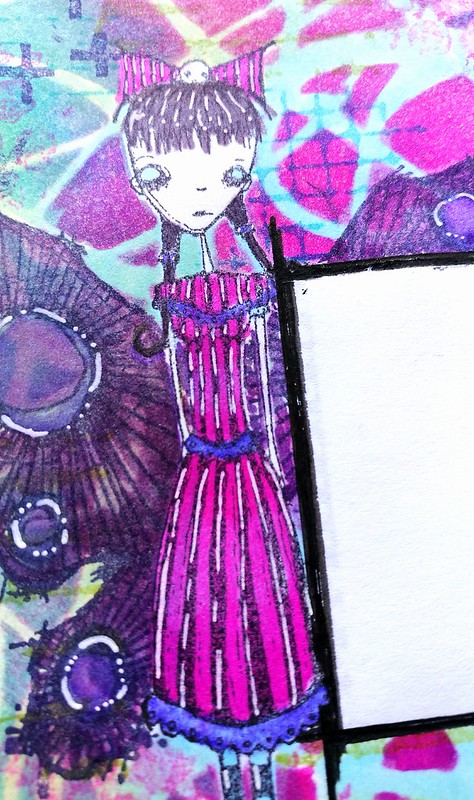
She definitely looks a lot brighter here and to make her pop out even more I used a white gel pen (from pentel) for some accents. 

It's the second week of the Anything Goes challenge at Stampotique, which I am entering this envelope in. You can play along until Wednesday when the new challenge theme is announced :)

Thanks for stopping by and have a great day!


2017/01/13

Art Journal: the Frida Blues

Art journal Frida

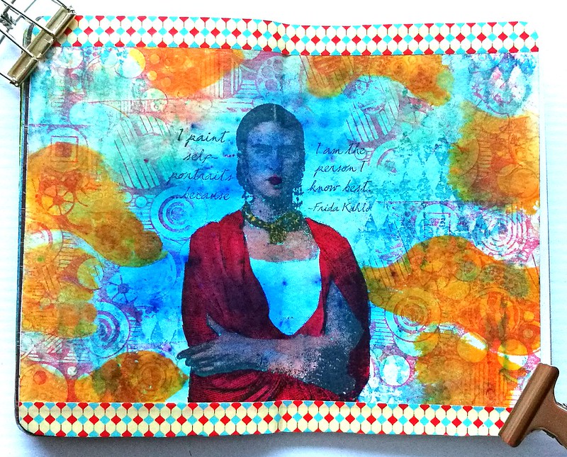
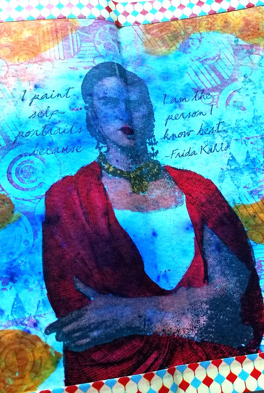
Last weekend I found some time to play around with my Lost Coast Designs stamps again and created this page in my pocket art journal. I feel like I really need some bright bursts of colors in my journals/life right now because it's so cold and winter is in full swing now (and to counterpart my SAD blues). For the background I used Brusho Ultramarine on watercolor paper. The effects are always mesmerizing and fun. I stamped the Frida Image directly onto the paper and colored her in with tombow markers. Chose the diamonds, circles and circle border stamps for the background. Lastly I added bright yellow tombow markers to contrast in color to the blue brusho. I stamped the circles with Memento Ladybug red and adhered it to my pocket journal. Added strips of color coordinated washi tape to the top and bottom and called it done.

Art journal Frida
This page is so different than the one I did before and I love how you can use the same stamps and yet create such a different style with them :)

Stamps used from Lost Coast Designs
Others: 
Maruman Zuan Watercolor paper 
Brusho Ultramarine 
Memento inks Ladybug, mango, danube blue
Stazon midnight blue
Various colors Tombow markers
Washi tape

The " #32 Anything Goes challenge"at Loast Coast Portal ofCcreativity, is still running until the 25th, so why not take a stab at it :) I am entering this one as well (you can enter multiple projects!). It's not even required to use LCD or CV stamps but would be fun if you do!

Thanks so much for stopping by and have a great weekend!


2017/01/12

Art Journal: Inhale the future

Last week I shared some really great news with you all and today is my first post over at the VLVS! DT inspiration blog, yay! I created a mindful journal page to ring in the new year with warmth, a hopeful message and a resolution of some sort. 


Feed your Soul. 

Inhale the future, exhale the past. 

Enlighten! 

Do all things with LOVE. 

This page was created during the first couple of days of the new year and the process was really meditative. The steps of the process you can see below and I used stamps from VLVS! plate 1475 which has wonderful stamps to incorporate in mindful, meditative art journal pages. 


I trimmed the page to fit in my new spiral bound journal with black pages. I often do very colorful work so I like the fact that the journal automatically matted the adhered page.

For a detailed descriptive process/tutorial and more pictures, please visit my post at the VLVS!DT inspiration blog

The materials used:Stamps from Viva Las Vega Stamps!Feed your soul 

Stencils:
Crealies sunburst straight 
Crafter's workshop Balzer Zia Sun mask 
Donna Downey Enlighten

Inks/spray/paint:
Distress inks: squeezed lemonade, mustard seed, spiced marmelade, fired brick
Memento tuxedo black
Stazon: jet black, black cherry, rusty brown, timber brown, mustard yellow
Ranger perfect pearl spray Kiwi, dina wakely mica sprays, dylusions lemon zest
Faber castell Pitt markers
Spectrum Noir Red Sparkle brush pen
Perfect Pearl metallic Rub on paste in gold and red

Mediums/glue:
Crafter's workshop Gold Gesso
Crafter's workshop fluffy modeling paste

Thanks so much for stopping by and have a great day!


2017/01/11

An ode to Franklin Christoph Model 45's

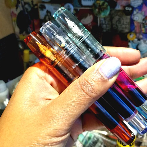
Pocket 45s #franklinchristoph #franklinchristophfanclub #pocket45 #demonstrator #fountainpen #funtainpen #fpgeeks #FPN #fountainpennetwork #stationeryaddict #penaddict #pens #toolsofthetrade #pen #writinginstruments
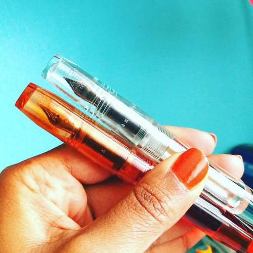
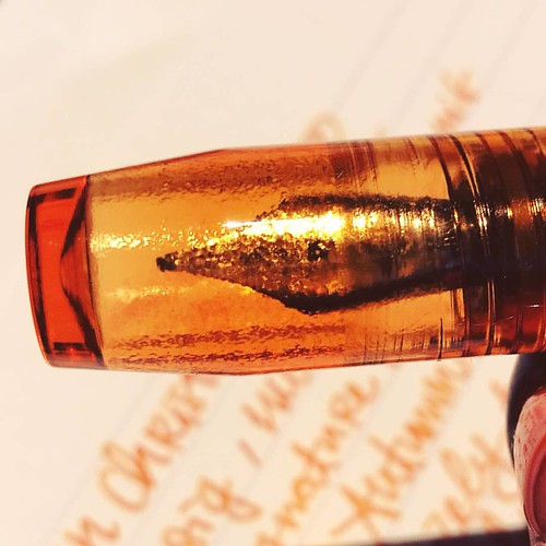
Model 45 in Amber and Antique Glass finish.

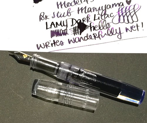
As I am planning on more pen and ink posts (which will be on a bi-weekly basis from next month on) I didn't want to deprive you all from some great fountain pens in the mean time. So I am sharing an ode to stunning Franklin Christoph model 45 fountain pens in picture format today. Enjoy :)

Franklin Christoph Model 45
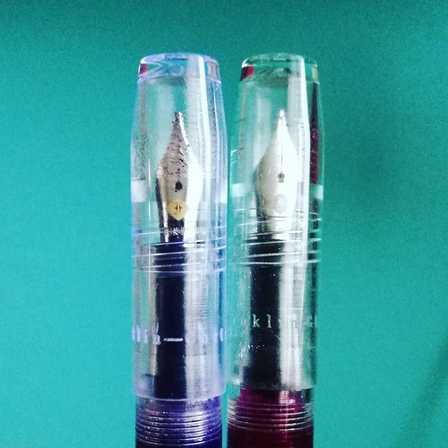
Model 45 in Italian Ice and Antique Glass - there is clearly a difference. (See what I did there ;)


Franklin Christoph model 45
The 18k broad stub nib on the italian ice writes like a dream! Shows off the Lamy Dark Lilac ink really well.

Amber #franklinchristoph #franklinchristophfanclub #pocket45 #fpgeeks #FPN #fountainpenfriday #freefountainpenfriday #Fountainpen #fountainpennetwork #SIG #seriousnibbage #diamine #autumn #autumnoak
Model 45 in Amber finish, close up shot of the barrel. Beautiful craftsmanship!

Franklin Christoph model 45
They multiply like crazy! The cherry ice finish is on my wishlist. And I hope they will do a blue ice or myan blue finish in this model as well.

Thanks for stopping by and have a great day!