2016/09/19

Mailart Monday: Nature's Beauty

gelli plate printing session
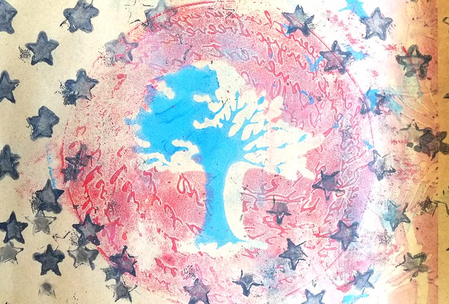
For a swap on Swap-Bot I got out my Gelli Plate and stencils to play around with. This swap hosted was by Gina Visione at The Print Shop group and called "Nature's Beauty".  The goal was to "Send a Gelli-printed, hand-stenciled (or nature-stenciled :D!), hand carved Rubber stamp or Linocut mail art postcard representing something beautiful in nature." 

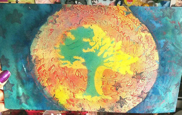
So I took one of my new nature themed stencils, Birds and tree by Clarity combined with encouraging scribbles from Stencilgirl Products and Stars from the 101 stencils by Ed Roth and made the above print with help of my Gelli plate. I printed it on vintage index paper which has a beige undertone and it's a great way to reuse some old papers I saved from the trash at work! It needed some more colors so I took out some fountain pen inks and added more color to the print.
TPS expressions of nature
I used some contrasting colors: yellow for the inner circle (Toucan Gold) and a teal/twilight color (Iroshizuku Tsuki-yo) for the outer edge of the print to give it a night sky feeling. I love how the tree just pops out from the print. I love how it turned out and am glad that my partner liked this print as well,

Looking forward to use more of my gelli printed pages in mail art and in my art journal :)

Thanks for stopping by and have a great day!

namasté

2016/09/16

Mini Art Journal: Fortune Teller

Mini Art Journal Fortune Teller
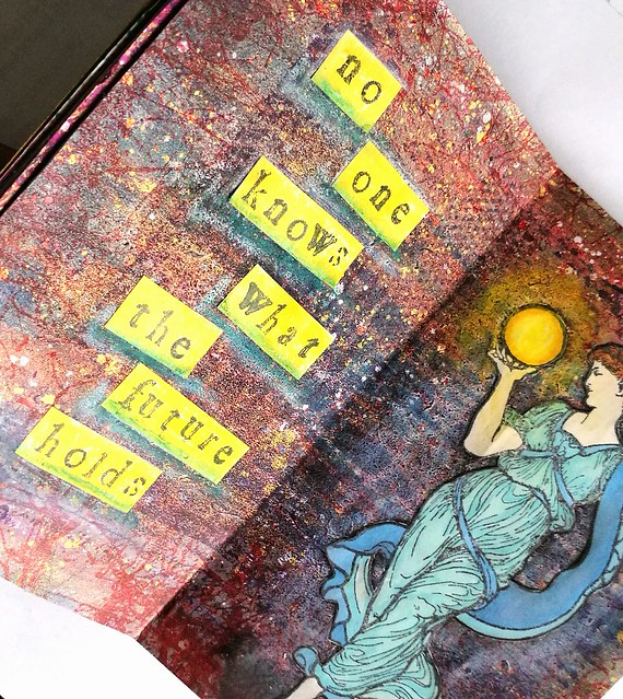
This week in my pocket size art journal, I created another spread using stamps from Lost Coast Designs and I chose this beautiful Mucha woman with Globe image as focal point and depicted her as a fortune teller.

Mini Art Journal Fortune Teller
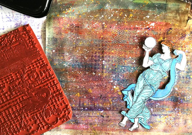
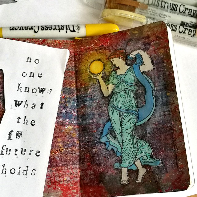
I stamped her on sticker paper, colored her in with Letraset promarkers and cut her out with tiny sharp scissors. The background is made with different acrylic & metallic paints on which I stamped the Grunge background stamp on with Staz On Violet. 

Mini Art Journal Fortune Teller
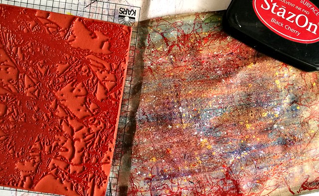
The I took Spray Webbing background stamp and stamped it on the sides with Staz On Cherry black.

Mini Art Journal Fortune Teller
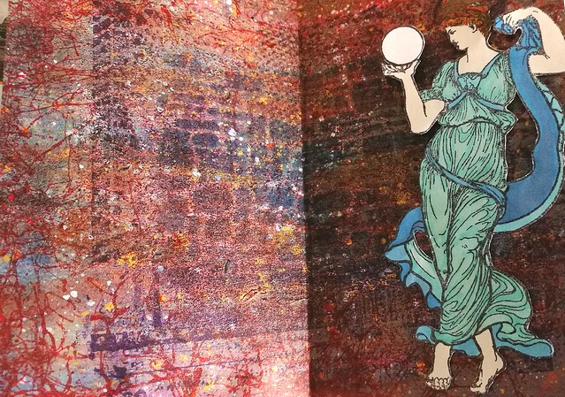
I wanted to have more texture in the middle part so I stamped the grunge background again this time with Staz On dark royal purple which gave a better impression on the paper. I took a brick stencil and Distress ink chipped Sapphire and sponged the ink with a blending tool through the stencil. I liked the effect and cut the background to size and adhered to the journal. I stuck the woman to the right side of the spread as I wanted her to face the left side. 

Mini Art Journal Fortune Teller
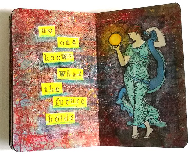
With my distress crayons I made the aria around the woman lighter and near her feet a bit darker. In and around the globe I used yellow tones, to depict a glowing orb. Then I got to work on the left side and stamped "no one knows what the future holds" on sticker paper and cut it into strips.
Mini Art Journal Fortune Teller
Before I adhered it to the page I colored the strips yellow with the distress markers. After I stuck them in I took a blue and white distress marker to underline the words. 

Mini Art Journal Fortune Teller
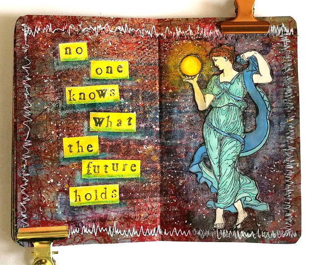
To finish off the spread I took a black marker and doodled around the edges but that fell flat and I wanted it to pop more. So I got a white gel pen and doodled over the black and though it does pop now I think I made it a bit too busy with the zigzag edges. I did zigzag because i wanted to doodle completely over the black lines, but next time I do it less "fanatically" haha! Anyhow, art journalling is all bout the process and you learn stuff all the time while making things and that is what I love about it.
 This is also my 3rd and final entry for this month's Craft Stamper's September Take it, Make It challenge :)

Thanks for stopping by and hope you will have a fun creative weekend.

namasté

2016/09/14

Pens And Ink: Pelikan Ductus P3110 with Diamine Salamander

Pelikan Ductus P3110

As the Pelikan Hub is on this friday (there is one going to be in Amsterdam too this year which I will be attending, yay!) I thought it would be fitting to highlight a recent acquisition I made from this brand. And it's a pen I thought I would never buy, until I read this great review by Joshua of the Pelikan's Perch a while back about the Pelikan Ductus. By chance I came across one locally where the price was right and I was sold! Or well, the kind people at the office supply store sold the pen to me :)
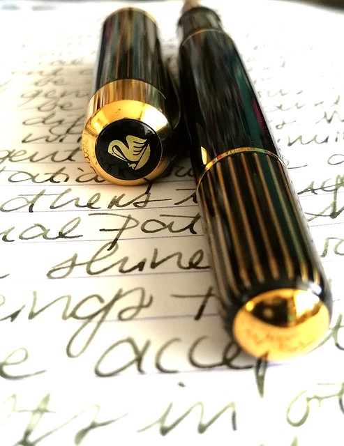
Pelikan Ductus P3110
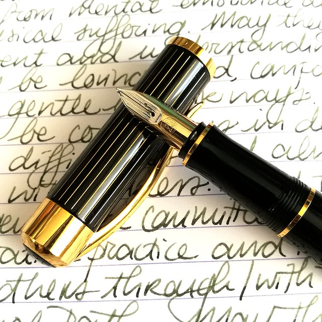
Joshua reviews the P3100 version, which has silver accents on the pen body and cap, but I purchased the P3110 version which has gold accents. And I must say, it has a very attractive finish. The brass body is coated with a black lacquer and then buffed to a shiny finish. The gold stripe accents on the cap and piston knob really make the pen pop and it reminds me of a raden finish, but without the "bling". It's a very classy looking pen. And that's why I like it, it's a very nice every day carry for the office!
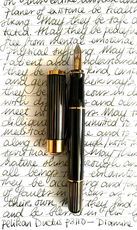
Pelikan Ductus P3110
When I was thinking of an ink to pair it with, I wanted a dark green ink with some shading but also needed to be fast drying to be able to take quick notes in the office. So obviously it also need to be a safe for work kind of color. What I came up with was Diamine Salamander, a darker version of Rohrer and Klingner's Alt Goldgrün. It doesn't remind me of a salamander al all, but hey I don't come across many of those myself, so I can't really compare the green hues on that little critter. See a review of this ink by Ed Jelley here, but I don't agree with him describing this as a mucky, garbage water color though, ha! To me the color resembles a darker olive green with a hint of brown and black which you can see in the shading. A very interesting color for a very interesting and unique pen. 

The pen is a cartridge filler only (which is a bit limiting), it takes 2 short or 1 long standard international cartridges and I refilled an empty one by using a syringe. This way you can still use other (bottled) inks. At first I thought the pen would be too heavy or big and uncomfortable in my hand but having written with it for several pages, it's got quite a nice balance to it, un-posted. I do not post this pen as it does become ridiculously long and then top heavy for me.
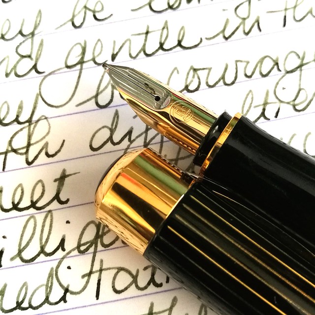
Pelikan Ductus P3110
Let's talk about the nib as that is what most people seem to have issues with on this pen. Not on performance, no, but on looks. You can see right away why, it looks nothing like the fancy nibs on the Souverän series, at all. My pen is fitted with a 18k rhodium plated medium nib which in writing show a little line variation which is nice. I have no problem with how the nib looks and the performance of it is really nice, after I had tuned it a bit with on a maylar with high micron grid sheet. It was just a tad scratchy and now it writes smooth and glides over paper. The nib can be unscrewed from the section just like most of the Pelikan pens (I have personally tested it with my pen) so this way it's very easy to clean.
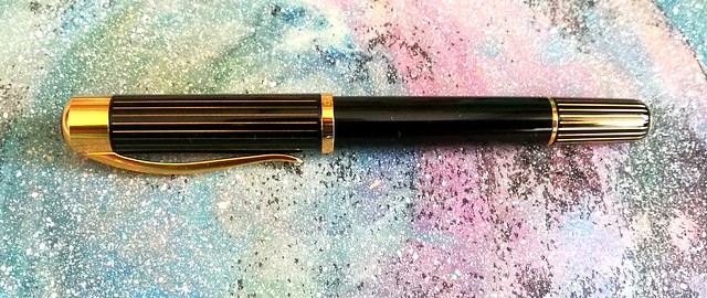
Pelikan Ductus P3110
It's a shame that this beautiful pen is considered the "ugly ducking" of the higher end in the Pelikan range. To me it's a very eye catching pen and though the nib does look different, the performance is stellar. The clip also has a nice spring to it so you can easily wear it in your shirt pocket (which I never do, I don't think I even own shirts with pockets) and also remove it without struggle from your pen pouch if you slide the clip over the pen slot, like I usually do. The only downside it has is the filling system, which I can overlook because you can at least put a long cartridge in there and fill with a syringe from a bottle. This odd little ducking is definitely unique and while it's not love at first sight it can definitely grow on you with each writing experience. 

I'm going to bring this pen to the Hub meet on Friday and am in the process of picking out a few others I am bringing along. Very excited to see what other people will bring and I will definitely share how the hub gathering went. Follow me on my Instagram if you want to see some picture updates on the day. 

Thanks for stopping by and have a great day!

namasté
2016/09/12

Mailart Monday: A High Tea Party

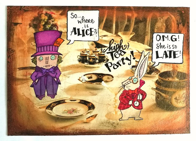
(high) tea party - mailart

It's the second week of the mail art challenge at Stampotique and I was so pleasantly surprised I got chosen by Tera in her top 3 faves picks of last week :) Thanks so much dear! And it inspired me to make another mail art card for the challenge this week using these fun Alice in Wonderland stamps. I used the Mad Hatter and the Rabbit by Janet Klein. I love them so much and hopefully I will get the rest of the Alice series soon. 

I started by stamping them on sticker paper with memento black and coloring them in with letraset promarkers. The background is in fact a promotional card from a museum with an 18th century interior and I used that as the base of my High Tea Party card because it's so fitting! Altering postcards is a fun way to create some quick mail art as well! Because the card was too glossy I put on some clear gesso over it and added Modge Podge golden sheer and a bit of acrylic bronze paint around the edges and fading inwards to create a vintage effect. The speech bubble is a stamp from 7gypsies and I also stamped that on sticker paper. Wrote down the sentences with faber castell pitt markers (I am REALLY loving this pen! It is a lot more effective and black than my steadtler microns!) Then I cut everything out and stuck to the card. I sealed it off with a layer of medium gloss finish and it's ready to mail!

If you want to play along with the mail art theme you can until this Wednesday when the new challenge comes online. Looking forward to see what the next stampotique challenge is :)

Thanks for stopping by and have a great day!
namasté
2016/09/09

Mini Art Journal: Imagine

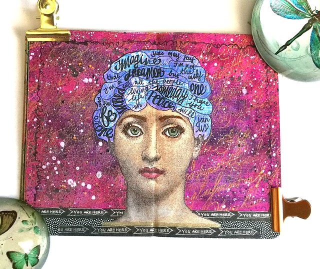
Imagine Art Journal
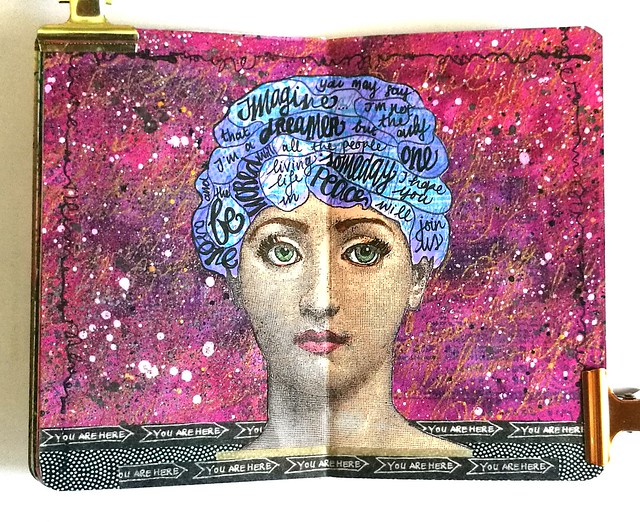
Working in my mini art journal is very gratifying and this week I've made another spread using this wonderful "Franco Face" from Lost Coast Designs as focal point. I had John Lennon's Imagine in my head and created the same thing as what I did with the Walk the Moon song in my large art journal. It did help me get the song out of my head and onto a colorful spread :) More pictures are below to show you the process.

Imagine Art Journal
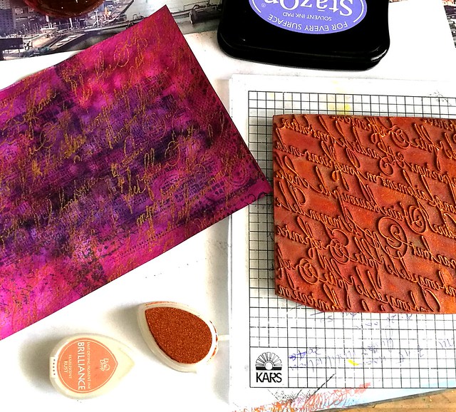
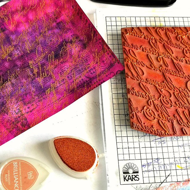
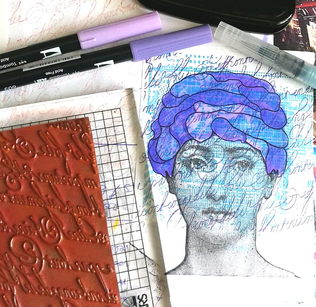
I took an aquarel paper colored with pinks and purples and stamped loopy calligraphy and grunge back ground stamps using memento, staz on and brilliant inks until I was satisfied with the results.
imagine art journal
I love the texture the brilliance rust ink has created on the page.

Imagine Art Journal
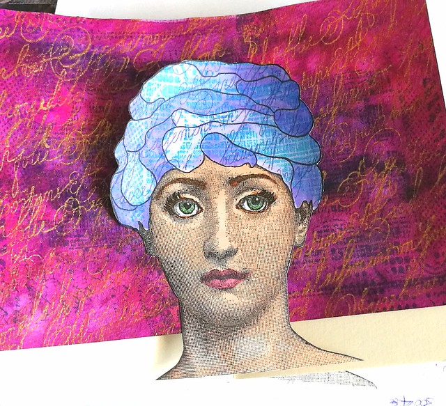
Then I went on to stamp the face on sticker paper, twice. From one I cut off the face part and masked it on the other. Stamped the head with grunge and loopy calligraphy stamps again and colored it in with tombows.

Imagine Art Journal
Then I took off the mask and colored the face with promarkers cut her out and decided on the placing in the journal.

Imagine Art Journal
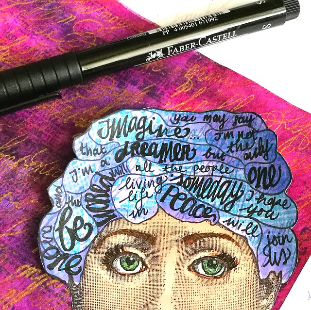
I also made the eyes more expressive by outlining it with the faber castell pitt marker and also used that to write the lyrics with.

Imagine Art Journal
I decided that the background needed some  liquitex Ink spatters and I grounded the face with some washitape. Literally "grounded" with the "you are here" sentiment :)  Made some doodles around the edges and called it done.

I'm also entering this one in this month's Craft Stamper's September Take it, Make it Challenge :) 

Thanks for stopping by and hope you'll have a fun and creative weekend.

namasté