2016/12/21

A Coloring Adventure: Blackwing Colors Pencils Review

blackwing coloring pencils
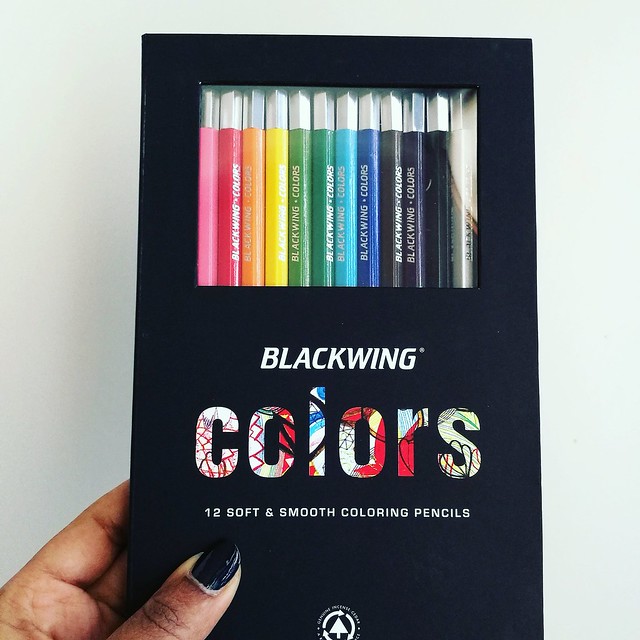
Blackwing is known for their awesome brand of graphite pencils, the Palomino Blackwing, and when I found out they had coloring pencils as well, I definitely wanted to try them. And when Mishka from Bureau Direct kindly offered this set for review I was absolutely thrilled to have that chance! Thank you again! They are absolutely a pleasure to color with. The packaging is very swanky, too.  It's a beautiful sleek and classy design in heavy cardboard,soft matte black finish and a magnetic closure. You can see the pencils through the PVC window which is convenient so you can see which colors are in there.
Blackwing coloring pencils
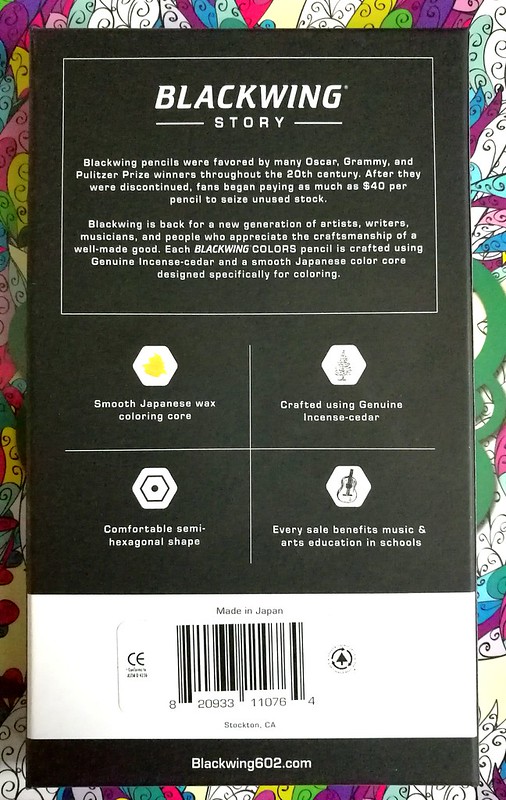
Next to reading about Blackwing's story, you can read the basic information about the pencils from the back of the box. The Blackwing Colors set (MRSP 30£) consist of 12 smooth coloring pencils made in Japan. Crafted using Genuine Incense-cedar in a comfortable semi-hexagonal shape with a smooth Japanese wax coloring base. Also every sale benefits music & arts education in schools, which is very cool of them to do so. 
Blackwing coloring pencils
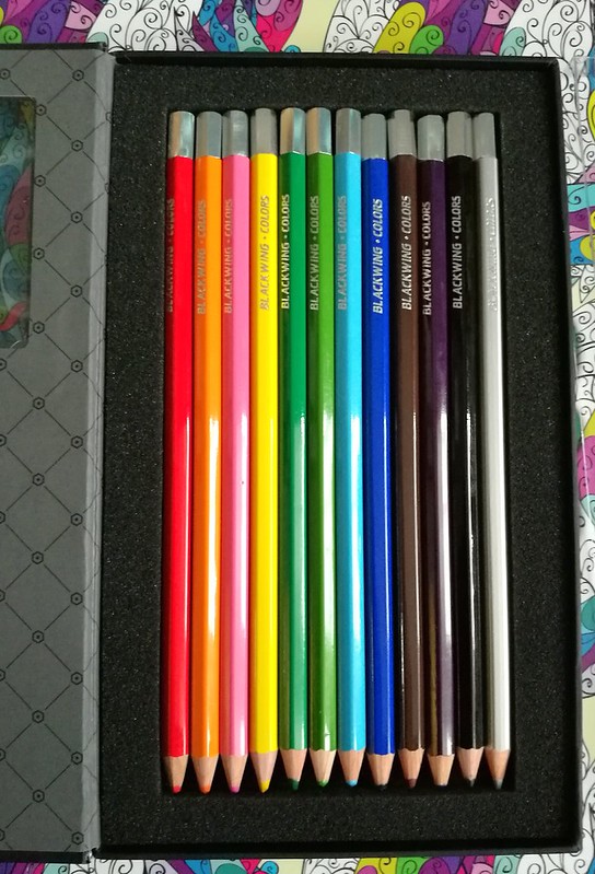
When you open the box, the inside design has an elegant harlequin motive and the pencils are cushioned in soft foam. There is also a protective see through plastic cover placed over the pencils (not pictured), which is easily removable and put back into place to keep your pencils in place (or as an extra barrier) if you choose to carry the box around. I like to foam cushion because it also protects your pencil tips from bumping against the side of the box and thus blunting them if you had just sharpened your pencils. That's a nice eye for detail there!
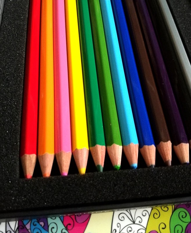
Blackwing coloring pencils
The pencils are solid colors with a silver capped end and the name "blackwing-colors" are engraved in silver as well. The only thing lacking are the names of the colors! You do have your ROYBGIV colors in the set. The colors are red, orange, pink, yellow, dark green, light green, light blue, dark blue, brown, purple, black and a fun silver color, which sets this set apart from other standard 12 pencil color sets which often offer white. If you're coloring in a low lit room, it might be hard to tell apart the darker tones, though. When testing these out one evening on my couch I thought the purple one was a darker brown one for sure and seeing my work the next morning, I discovered the purple and brown do go together nicely as well ;) I tested them in a coloring book.
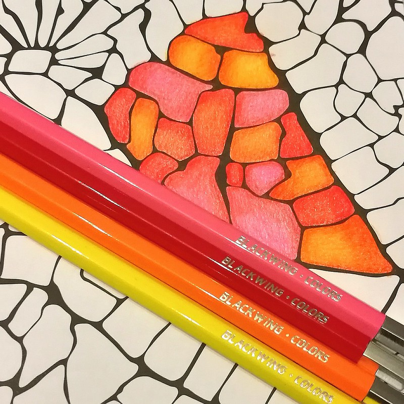
blackwing colors
They are quite comfortable in hand. I do prefer the hexagonal shape because it prevents them rolling off my desk like the fully round pencils often do. On the subject of blending, I often use a white pencil or a colorless blender to burnish/smooth out the pencil strokes. But you can also use lighter colors in this set to get that same effect. I've done that with the color hues above. I used the lightest hues to blend the colors together to get a creamy blended effect. You can get awesome shade effects like this too, without dulling down the color which you sometimes can do if you blend with a white pencil. So the colors brightly pop out here!
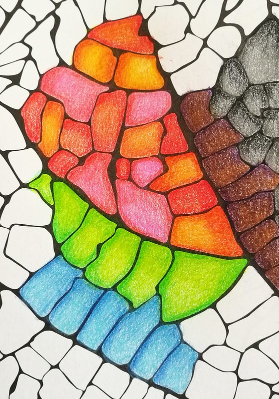
blackwing colors
The pencils are in performance quite like the Derwent artist pencils, which are also wax based and super soft in use. Though with the Derwents you do have a wider variety of colors to choose from. This is a fixed set and no open stock available but you could use wax based pencils from other brands and intermix them if you would like wider range in colors. 
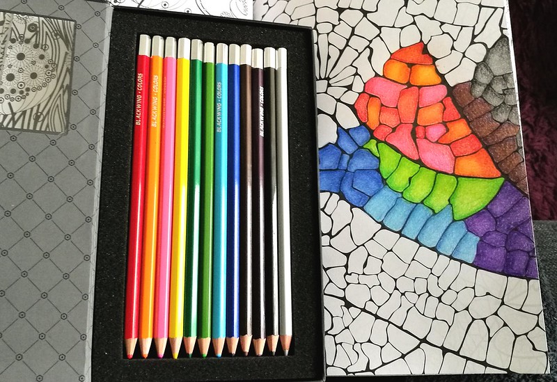
blackwing colors
The set on its own has a great variety of colors you can easily and smoothly mix them together to create different hues. The unique silver color adds a bit of freshness to the mix, which I quite like! 

With the pricing of 30£ for this set, it's not cheap, but you do get a nice artist grade coloring set of a well known brand in the pencil industry. It has classy packaging and sleek design. You're also supporting the arts education with purchasing this set. What's not to like?  
Also when you sign up for Bureau Direct's newsletter, you will receive a 10% discount code in your inbox every month. Just FYI :)

If you are still shopping for a Christmas gift for that creative friend of yours, this would definitely make a great one!

Thanks for stopping by and have a great day!

namasté

(disclaimer: I got this item free of charge for review purposes and was not monetarily compensated. All opinions stated here are my own and there are no affiliate links.) 

2016/12/19

Mailart Monday: Happy Holidays!

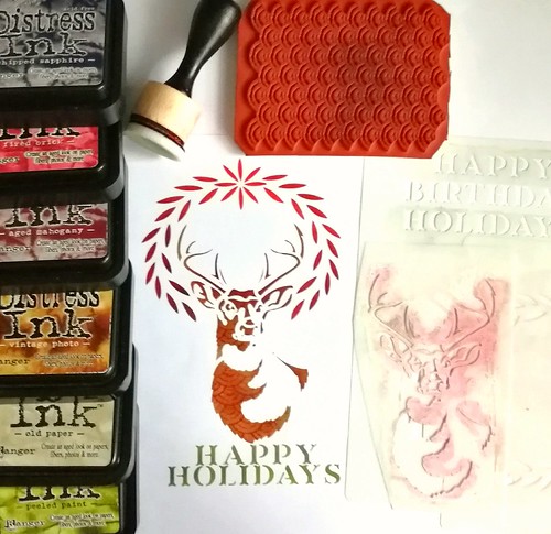
Holiday cards design 2016

The season is nearly upon us! We've decorated our apartment in the holiday spirit and I've also made some cards to send out. Well, I've made one card, scanned it and sent off to the printer because that was the best and fastest way to do it. Sadly the prints have not arrived yet, grumble, but I can show you the card design. I've used stencils 101 by Ed Roth, a lot of distress inks with a blending tool and designs by Ryn texture stamp. I've used the stag stencil first and blotted ink through the stencil with my blending tool. When I was satisfied with the look, I took the texture stamp and stamped it through the stencil to give it some more interest. Then I went on with the wreath and blended the colors until I was satisfied with the look of it. Same as with the "Happy Holidays" sign under it. I made sure to mask off all parts of the stencil and the aria around it with low tack masking tape to get a clean and simple design. I'm quite happy with how it looks :) I am curious what the prints will look like and hopefully they will arrive any day now so they can get sent out this week, to hopefully arrive on time for the holidays. Here is the slightly altered digital version:


 I digitally altered the card to add a border and a watermark. Feel free to use the above image for your holiday cards as well (you can just download the image by right click saving). 
A little holiday gift from me to you as a thank you for your support with my blog and journey this year :)

Have you made your own holidays cards this year? 
If so, leave a link below I would love to see them :)

Thanks for stopping by and have a great day!

namasté

2016/12/16

When life gives you lemons...

When life gives you lemons male lemonade

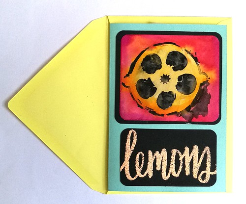
I made this notecard a while back and sent it to someone recently. The lemon was made with a stencil, india ink and ecoline, while the word was written with a versa marker and then embossed. Things have been a bit tough lately, but I'm trying to put all things in perspective. There is a lot to be thankful for and when things aren't going the way you'd hoped or expect, I'm trying to remember the following

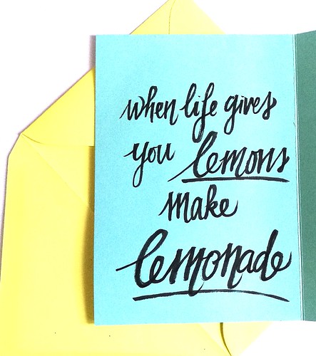
When life gives you lemons make lemonade

When life gives you lemons, make lemonade!

Wishing you all a wonderful weekend and thanks for stopping by!

namasté

2016/12/14

Pen and Ink: Pelikan M405 Stresemann with De Atramentis Christmas Black

Pelikan M405 Stresseman with DA Christmas

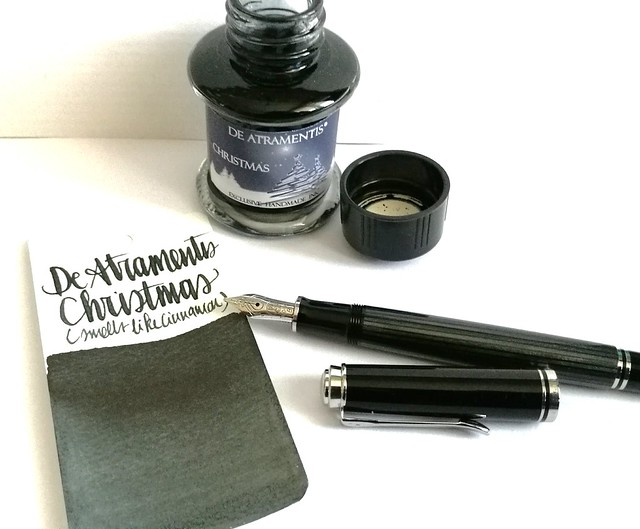
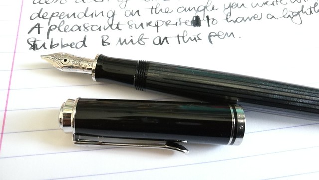
A couple of weeks ago I had the pleasure to pick up this pen; the special edition Pelikan M405 Stresemann with a broad nib. I inked it with De Atramentis Christmas Black. Thought this pair would be not only fitting in color combo, but also in the holiday spirit.

Pelikan M405 Stresemann with DA Christmas
The stresemann finish is a very classy, business like looking pen. I had admired the M805 when it came out, but that size is just a tad bit too big for me as I prefer the M400-600 suze better. So I was thrilled when Pelikan announced this special release in the M405 size. And with thanks to Filippo from the Fountain Pen Group Buy FB group, it was very reasonably priced. 

Pelikan M405 Stresemann with DA Christmas

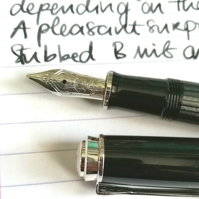
Close up of the nib.  chose a broad nib and it writes like it's slightly stubbed as it gives a very nice line variation when you write with it in a slanted angle. Maybe I got lucky, because I have not seen this in any other B nibs of pelikan before as of yet. Either way, it was a very pleasant surprise :)Read more about the pen here at the Pelikan's Perch.

De Atramentis Christmas
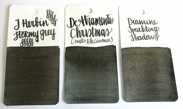
About the ink, I found it at an office supply store up in the north of NL and while I usually do not like black inks, this one definitely spoke to me. It has a very cute label AND smells like cinnamon! Also upon further investigation, this was a limited edition DA christmas ink release in 2012 and no longer available. It does look more like a dark grey in writing and on the swab cards. Except for the smell, it's not an ultra special ink. In color it comes close to J. Herbin Stormy Grey and Diamine Sparkling Shadows base color. Those other two colors would also go really well in the Stresemann as well and either of these would add a nice little scent or sparkle to your christmas cards. I better should get cracking on my cards for this year!

Thanks for stopping by and have a great day!

namasté

2016/12/12

Mailart Monday: an ode to coffee

coffee ATC's

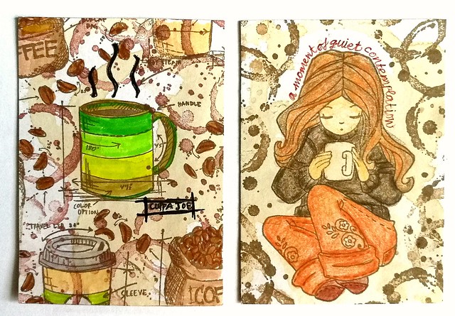
Coffee, for me, is a necessity esp. in the mornings. I can't seem to function without it. I just love everything about it, the smell, taste, the heft of a good cuppa Joe in hand. These two ATC's are an ode to that delicious beverage. They were made for a coffee themed swap over at Swapbot this summer. I used real coffee to stain the backgrounds and stamped over it with Tim Holtz Freshly Brewed stamps and coffee ring stamp from Stampers Anonymous. I colored them in with tombows. The girl on the right is from Unity Stamps (I think... ) and I colored her in with derwent artist pencils. These were really fun to make and I received equally fun ATC's in return.

something I need every morning to function properly. received this great piece of coffee art from a swap #coffee #atc #coffeebean #coffeering #swap #swapbot #received
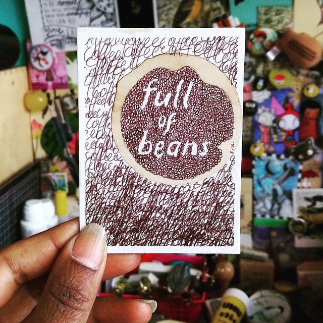
Full of beans... coffee beans!
The maker of the brilliant ATC above is SuMay on swapbot and I just totally love it. She also has an awesome flickr page of her mail art. 
an ode coffee
A good idea definitely starts with great coffee! I'm getting some now ;) 

Have a great day and thanks for stopping by!

namasté