2016/11/11

WIP: Messing with some Gold Gesso

Gold gesso experiments
A few months ago I've bought the Gold Gesso from The Crafter's Workshop. When Bianca's Toko had a sale going on, I bought the jar at 50% discount and I experimented with it a bit. I had some scrapbook sheets and print outs I had worked on with some various mediums and wanted to see how the Gold Gesso would react on it.
Gold gesso experiments
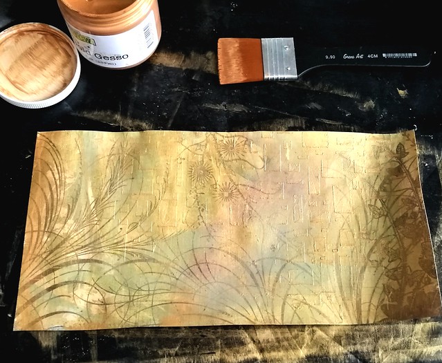
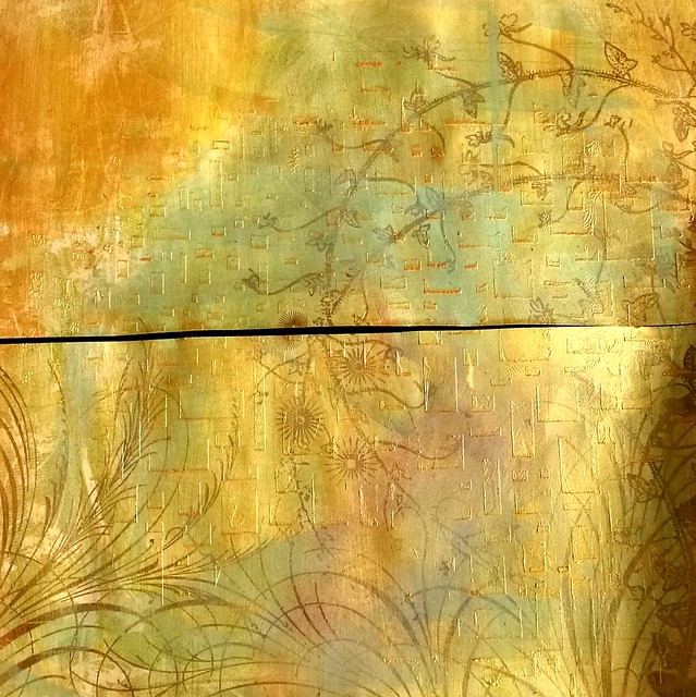
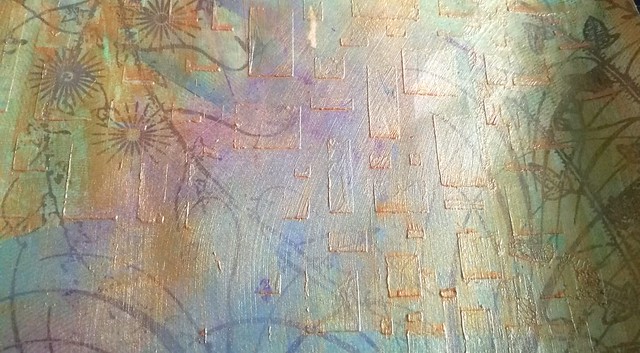
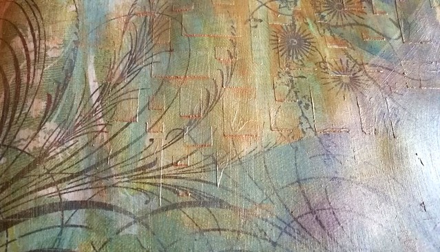
This is a large scrap book page which I cut in 2 pieces to make it more workable on the table.  It has layers of acrylic paint, oil pastels and gel medium through a stencil and I have applied the Golden Gesso over it.
Gold gesso experiments
I applied it lightly over the pages and you can see it dried a bit sheer and you can clearly see the colors and layers under it. This looks really fun and exciting. The gesso protects the bottom layer and it won't be effected when adding other layers on top!
Gold gesso experiments
You can see the fun structure the matte gel medium created as well. I'm excited to work with this further!
Gold gesso experiments
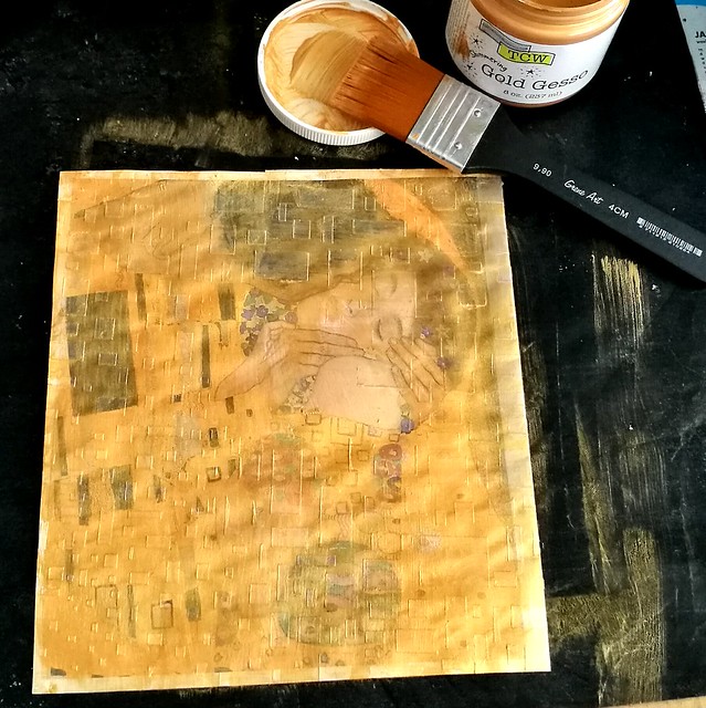
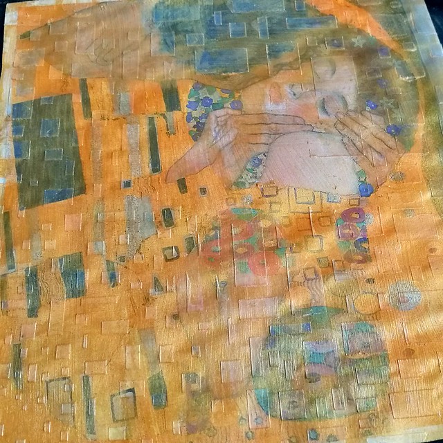
I took the same stencil and applied some gel medium through it on a Klimt print. When it dried I added a thin golden Gesso layer.
Gold gesso experiments
I love the fact that it dries really sheer and you can see the underlying print clearly. It has such a beautiful effect! This weekend I'm going to mess about with these gesso'd up prints some more and hope to show you the results next week!

Thanks for stopping by and have a great weekend!

namasté

2016/11/09

Pens and Ink: Pelikan M200 Taupe with Caran d'ache Storm

Pelikan Taupe with CDA storm
Keeping up with the Pelikan and purple hues theme, I got another great pairing for you today.
The Pelikan M205 Taupe (special edition release in 2012, more info here at the Pelikan's Perch) with Caran d'Ache colors of the earth Storm (which is discontinued with the release of the Chromatic Inks, More info about that on Gouletpens blog here).

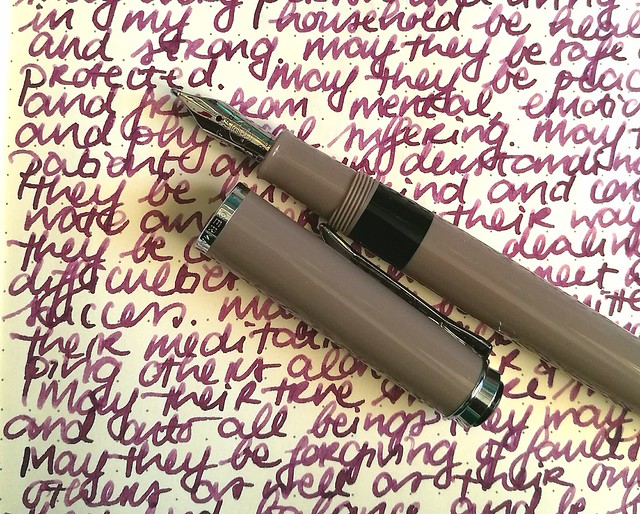
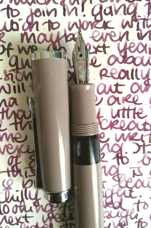
Pelikan M205 Taupe inked with Caran d'ache Storm - highlights the warm subtle purple in the pen.
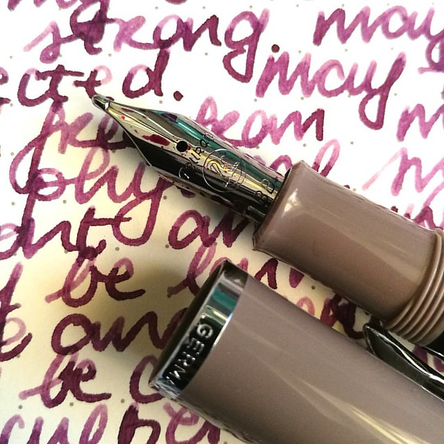
This pen was a special release in 2012, but I found it not too long ago at Akkerman in the Hague. They still had a couple of them for sale and when asking to see one up close, they provided me one which had a BB nib fitted in it. Really hard to resist that beauty! And look at that tipping! It puts down a wet and juicy extra broad line.

Pelikan Taupe with CDA storm
The color of this pen is "taupe" upon googling which hue that actually means I came across this on Wikipedia

"Taupe is a word that is used to denote any of a variety of colors. The colors it denotes fall into a range from dark tan to grayish brown or brownish gray. The word derives from the French noun taupe, which in turn is from the Latin talpa, both meaning "mole" (the mammal)." 

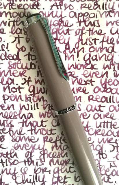
So it's a greyish-brown or a brownish-grey, which when you look at it, yeah I can see that. But you have a whole set of color tones that falls into the "taupe" aria and to me this pen looks more like a Mauve Taupe, the purple tone in the taupe spectrum. And because of this I thought a dusky warm purple would perfectly suit this pen. 
purple hues

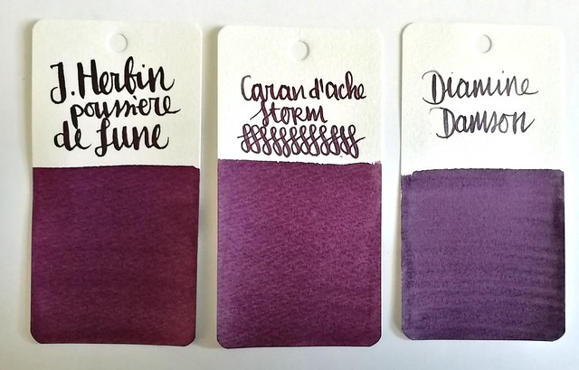
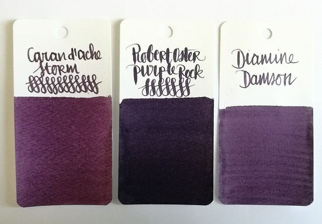
Comparisons of some dusky purples: J. Herbin Poussiére de Lune, Caran d'Ache Storm and Diamine Damson. I chose to ink the pen with CdA Storm because of the warmth this color has and came close to Mauve Taupe. And I should use the LE inks more instead of hoarding it, right?

Pelikan Taupe with CDA storm
The BB nib in this pen shows off the shading in the ink very nicely and the ink highlights the warm tones in the pen body too. A winning combination and a joy to write with on these colder near winter days.

Thanks for stopping by and have a great day!

namasté

2016/11/07

Meesha Monday: Autumn Edition

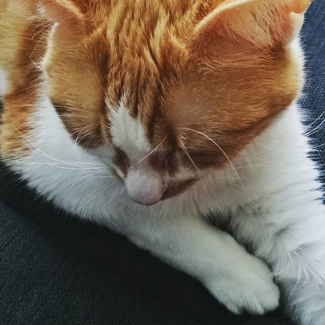
Missed snuggling on the couch with this cutie 😻 #meeshaisawesome #meeshaantics #meeshathecat #meesha #catsoninstagram #catsofig #catsofinstagram #catsareawesome

It's high time for an update on my little Meesha and seeing I am on holiday this week a good intermission in my mail art monday posts. She has been a bit sick, but thankfully she is doing a lot better now. Some cute kitty pictures galore, enjoy!

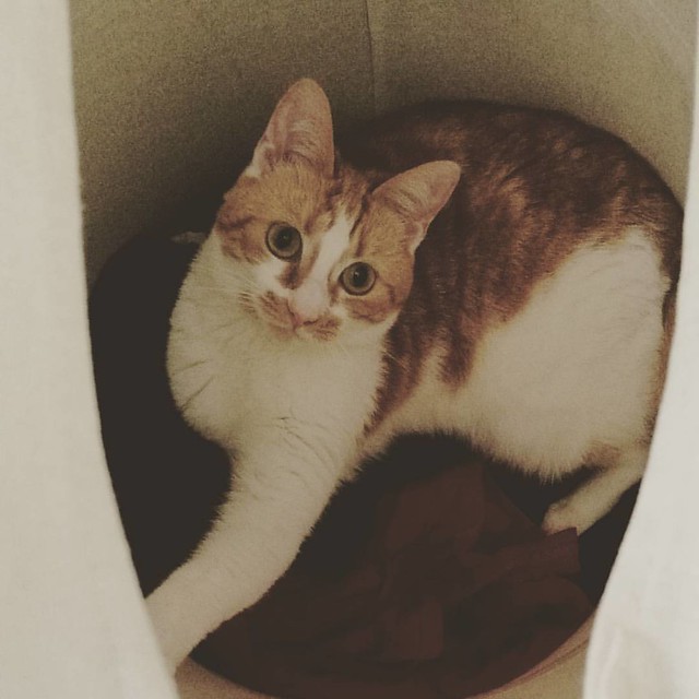
Whenever we don't see Meesha for a while, we know she is in her fave hiding place, our laundry basket 😂 Happy #caturday #meesha #meeshaisawesome #meeshaantics #meeshathecat #catsofig #catsofinstagram #catsoninstagram #cats #cutenessoverload
Her fave hiding spot is in the wash basket.


A cute little video of finding her there made by my husband.

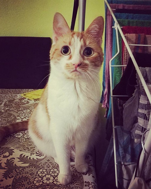
No, I don't care if you're doing housework, play with me! Our little Meesha being a cheeky little kitty this weekend. #meeshaisawesome #meeshaantics #meeshathecat #catsoninstagram #catsofig #catsofinstagram #meesha #catstagram #catsruleeverythingaroundme
Always wants to play at the most inconvenient times, like when we go to bed or doing chores.

My little purrfict feline companion #meeshaisawesome #meeshaantics #meesha #meeshathecat #catsoninstagram #catsofinstagram #catsofig #kittycuddles #cutenessoverload #kittycat #purrfectfelines #purrpurr #catsruleeverythingaroundme
Look at that face!

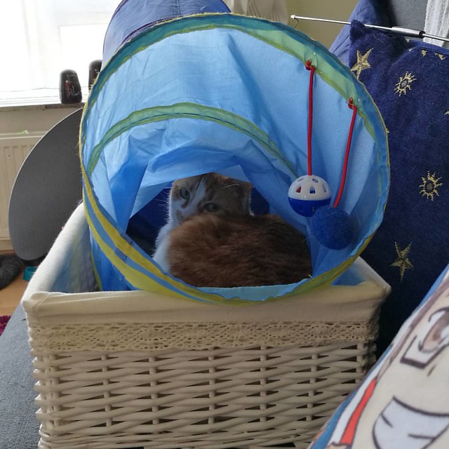
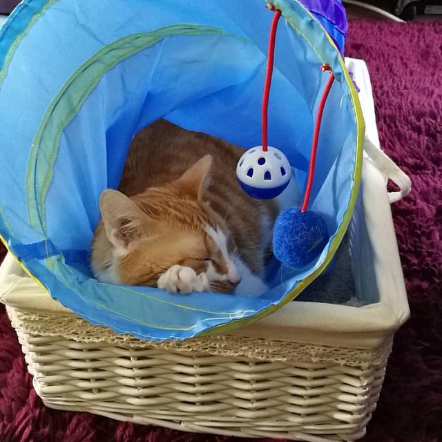
I had put Meesha's basket and play tunnel on the couch so I could vacuum around the floor. Forgot to put them back and when I was done with other chores I came back to the living room and found this cute picture 😻
I had basket and play tunnel on the couch so I could vacuum around the floor. Forgot to put them back and when I was done with other chores I came back to the living room and found this cute picture :)

That is one content kitty 😻

She obviously really loves this set up :)

Totally miss her cute little face and purr purrs. Can't want to cuddle up next to her again and watch some Dawson's Creek (I know, it's terrible like junk food, but it's one of my guilty pleasures. The show, not junk food ;) 

Thanks for stopping by and have a great day!

namasté

2016/11/04

Mini Art Journal: No More Questioning

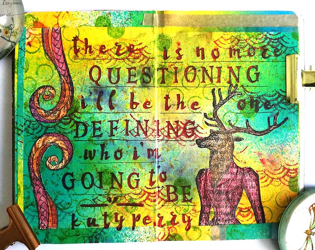
It's Sunday and raining and feel a bit "meh" but working in my art journal. But I'm a bit stuck with this page. Is it done? Does it need a quote? I just don't know... what do you think? #artistsofinstagram #artjournal #katzelkraft #brusho #derwent #artist
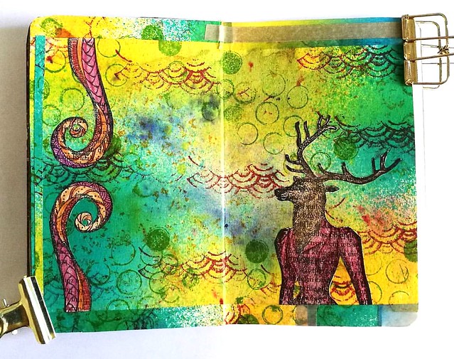
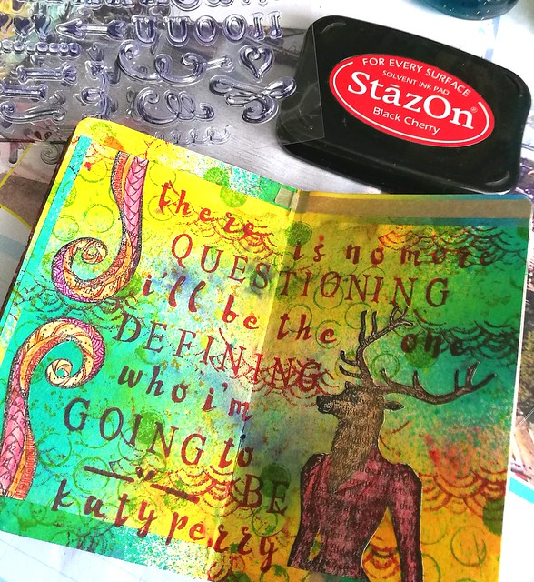
A while back I made the above page in my mini art journal with some gorgeous stamps from Katzelkraft and I thought it was done like this. The empty space of the background, which is made with Brusho crystals and dylusions sprays, would leave room for suggestion. But after staring at the page for a while and having made this spread on the next pages (excess baggage) it inspired me to get my letter stamps set from Eline's Hand lettering line out again and stamp in a quote that felt right.

Mini art Journal: No more questioning
When I am in my art room creating stuff, I love to listen to music while doing so. And Katy Perry's tunes are among my fave to listen to (this Peacock mailart piece was also inspired by her music) and the lyrics from the song "Love Me" inspired me to add the following quote to the page.  

Mini art Journal: No more questioning
"There is no more questioning, I'll be the one defining who I'm going to be" 

Sometimes it's hard, to pave your own path, with opinions and comparisons clouding your view of yourself. It's good to remind yourself that it's OK to be you. Wherever you are, on whatever path you are on, you're in charge of your own life. And it's OK to just BE YOU and not what everyone else expects you to be or think you should be. I feel like I have grown and learned so much about myself over the past year and a half. It still fills me with so much gratitude thinking about the moment I've decided to just stop and BE ME. So I hope this weekend you will take a moment, to stop, breathe and appreciate who you are. Embrace yourself with all your complexities and troubles and tell yourself, it's OK, you're you and it's all OK. Like Dr. Seuss said "Today you are you! That is truer than true! There is no one alive who is you-er than you!" ... Hmm, that's a good quote for another spread I think :) 

Have a great weekend and thanks for stopping by!

namasté

2016/11/02

Pens and Ink: Pelikan M1000 with Robert Oster Purple Rock

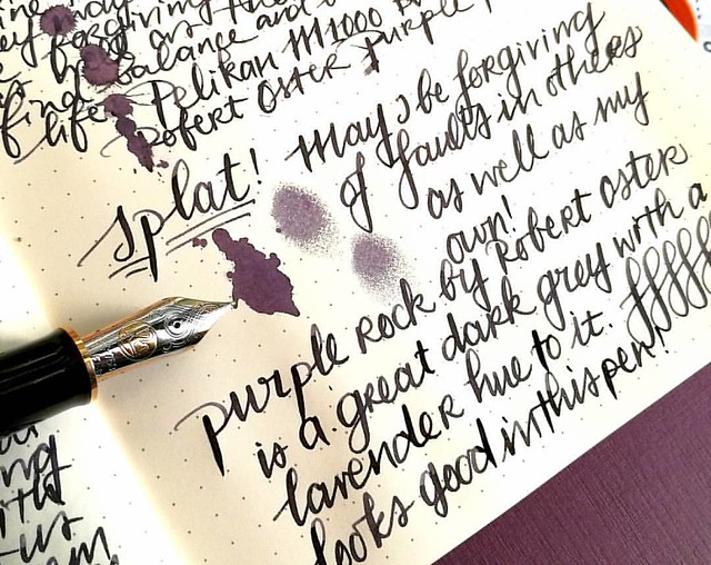
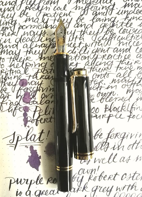
Starting off the day with a bit of #writtenmeditation in my Rhodiarama journal. Got some spatters of Purple Rock on it and you can really see that purple lavender hue on it :) Have a great day everyone 💜
Not too long ago I had the amazing opportunity to buy a Pelikan M1000 in black with gold trim in a clearance sale for a great price. Something I could not resist even though I was wondering if I would use it enough because it came with a fine nib and is such a large pen. Well, inked with this spectacular ink Purple Rock by Robert Oster, it definitely became one of my fave writers in no time!

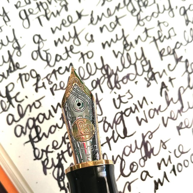
Something I have learned in spades last year, listen to my body and keep my energy balance in check. Always good to remind yourself of what you have learned and keep it in practice. Inked my M1000 with Robert Oster Purple Rock and the M1000 nib grade is o
The nib on the M1000 is nothing but spectacular! It's quite a large pen (see a review of the M1000 here by SBRE Brown and here by Brad Dowdy on the Pen Addict) and the nib has some wonderful spring to it. It's one of the rare fines I truly enjoy writing with.

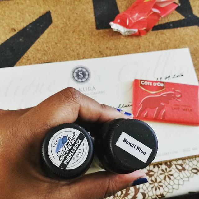
The first bottles I got of @robertostersignature Itvhad to be Bondi Blue beacuse turquoise and sheen?! I need that!! And am curious of the Purple Rock because I wanted a purple black. Hope it's as good as @attilasultis's swabs made it look :) Oh and it is
I bought the Purple Rock in my order at Sakura Fountain Pen Gallery together with the Bondi Blue. At first I thought it was more of a black with a light hint of purple, but it's a deep dark grey with a gorgeous purple hue to it. It's subtle in a fine nib though, but it's definitely more visible in broader pens or in an ink splatter like the top picture. A beautiful work safe pen and ink combo I would say. See some awesome ink tests on Robert Oster inks here by Nick Stewart at Inks and Bleach.

purple hues
Here you have Purple Rock flanked by Diamine Damson and Caran d'Ache Storm, It's definitely a lot darker than the other two dusky purples for sure, though you can see the purple hue purple rock has very clearly in less saturated parts in the writing below and the splatter.

Pelikan M1000 with Purple Rock
Purple Rock is a great match for this gorgeous M1000 and also a fun "safe for work" color.

Next week I'll show one of the other purples in another Pelikan. 
Thanks for stopping by and have a great day!