2016/12/09

Shopping Highlight: Papeleria Ferrer in Seville

A bit behind schedule, but I didn't want to keep this gem, which I found in my travels in Seville, from you any longer. A true paradise for fountain pen lovers alike, Papeleria Ferrer in Seville.
Papeleria Ferrer
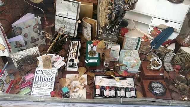
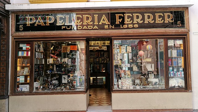
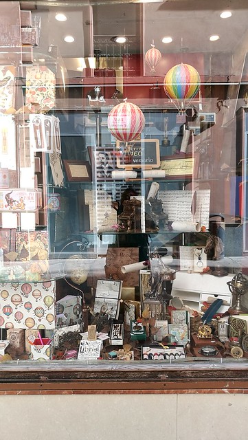
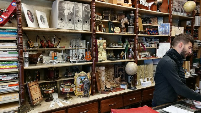
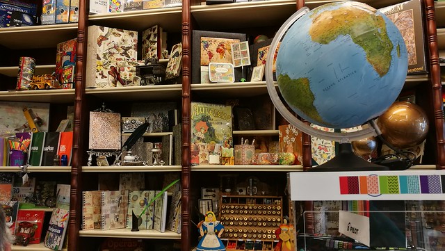
They are located on the Calle Sierpes #5 and it's really hard to miss with this gorgeous storefront. It's a small-ish store but packed full with fountain pens, craft supplies, notebooks and other fun stationery types. Pictures say more than words, so here follows a visual impression of the store.
Papeleria Ferrer
Papeleria Ferrer
Papeleria Ferrer
Papeleria Ferrer
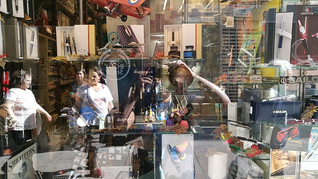
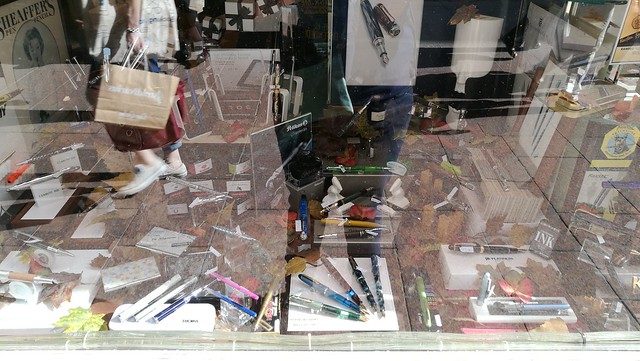
And a glaring selfie. Yes, I'm wearing my doctor who shirt, one of many, actually. It was super bright when we came past it so all the window front pictures have a glare. Nothing can be done about that, but I do apologize for the lack of better quality pics of the storefront. Hopefully you can make out that it´s a well packed store and has very diverse stationery goods. There is a lot more to see on the inside too!
Papeleria Ferrer
Papeleria Ferrer
A variety of stationery and other fun goods
Papeleria Ferrer
Papeleria Ferrer
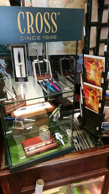
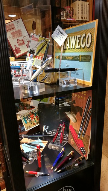
Kaweco and Cross display cases.

Papeleria Ferrer
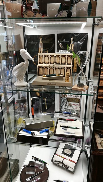
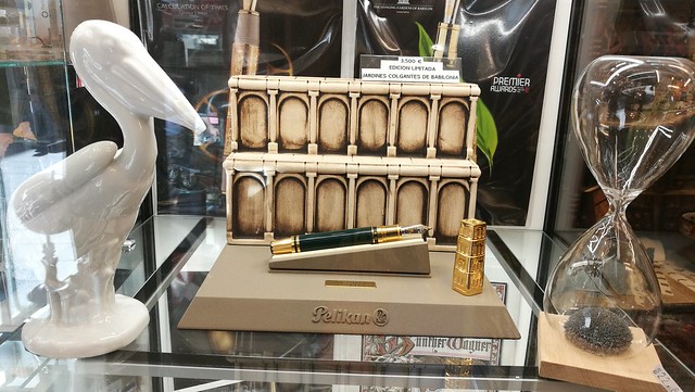
The Pelikan display case gave me pause...
Papeleria Ferrer
I gaped upon this gorgeous LE Pelikan, The hanging gardens of Babylon, and it was impressive to see it in person. At 3500€ well it's definitely one for the serious collector.

After you´re done shopping, head out to the right side where you will find La Campana for some delicious pastries.
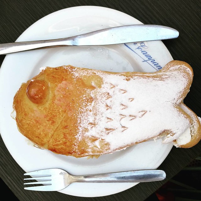
So Seville is known for its amazing seafood 😋 #lacampana #pastries #andalucia #seville #seefood
My husband just could not resist this cream filled puffed pastry... it looked a bit fishy to me ;)

Papeleria Ferrer also has a facebook page where they update the new arrivals and when you´re in Seville it´s definitely worth a visit. 

Thanks for stopping by and have a great day!

namasté

2016/12/08

Miss "freaky deaky" Snottie

Freaky little thing ATC

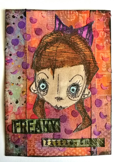
Another fun little project I wanted to share and inspired by Stampotique's fornight's challenge "naughty or nice". I decided to go a bit "naughty" and paired this lovely Miss Snottie stamp from stampotique originals with a part of VLVS "she was a freaky little thing". I also used some of my fave products at the moment, the crafter's workshop gold gesso and fluffy modeling paste. Together they make a perfect finish on the background. I colored the modeling past with distress stains, it picks up the color quite well. 
Miss Snottie seems like a freaky deaky little thing, don't you think? She was stamped and colored on sticker paper and adhered on a mixed media collage background made with leftover collage pieces. "Freaky little thing" was also stamped on a left over project piece and I love how it all came together. 

Thanks for stopping by and have a great day!
namasté
2016/12/07

Inky Goodness: Montblanc Miles Davis Jazz Blue

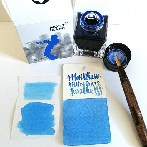
Went to Akkerman in the Hague yesterday and picked up this bottle of Montblanc Miles Davis Jazz Blue ink. First impressions; watery and a light washed out blue = me not really impressed 😒 inkswabs done on Maruman wordcards and herma smooth sticke
On a recent visit to Akkerman in the Hague I noticed the new Montblanc special edition ink on their shelves, Miles Davis Jazz Blue ink. I was super excited to try it out as I love blue inks esp if they lean toward turquoise hues so I bought it. Sadly, this is one of the very few times this ink is not the color for me and am disappointed with the special edition MB has released. Though the color on the ink swab looks like a nice saturated rich blue, it isn't. I had to swab it twice over to get some richness of color showing. The ink has a very watery consistency, almost looks like a diluted turquoise ink. Swabs on the left are done on Herma sticker paper, the top is swabbed with a q-tip once over, here you see the normal saturation and the bottom is heavily saturated. It could look good in writing with a flex nib as my test writing with the Swan flex pen looks nice on the maruman word card. Let's take a closer look at the ink. 

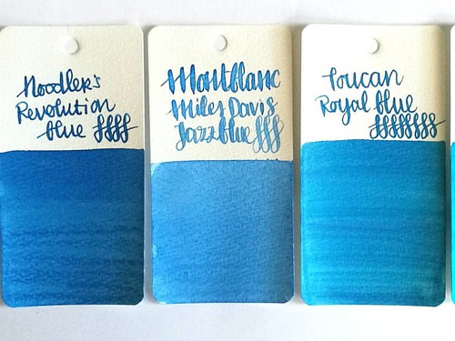
MB jazz blue flanked by Noodlers Revolution Blue which is more saturated and Toucan Royal Blue which has the same watery consistency but is darker in tone.
Here Montblanc Jazz Blue is flanked by Noodler's revolution blue on the left and Toucan royal blue on the right to show you similar ranges of blue in the same color tone. Jazz blue is lighter than both but in color tone it leans more toward Revolution blue, but the ink has the same watery consistency as the Toucan inks have. I inked my Sailor Sapporo Haruzora Sky Blue fountain pen with MB Jazz Blue to test how it writes in a medium nib.

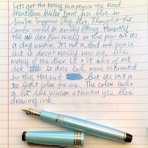
Thoughts on MB Jazz Blue ink. Pen Sailor Sapporo Seasons Sky blue with HM nib. Paper Lyreca office.
This pen in particular is a dry writer. I don't often use this pen, in fact this may be the second time I have inked this pen. And even though this pen and ink combo does match nicely, the ink itself does not really "wow" me like say Dandy Turquoise does. In writing the color also looks a lot like Diamine China Blue. Writing is done on 70gms Lyreca office paper.

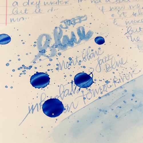
Testing MB Jazz Blue on tomoe river paper for sheen in this ink, I really doubt is has any. But well this will probably be dry like tomorrow or something before I can tell for sure. I do see potential for some pretty sky blue ink washes though!
I also did some tests on tomoe river paper to see if there is some sheen in this ink. This is the cream colored tomoe river and you can see that the ivory color does dull down the blue color of the ink ever so slightly. The ink is definitely better looking on stark white paper. I suspected this ink doesn't have any sheen and after drying time (this took a looong time to dry!) my suspicions were confirmed.

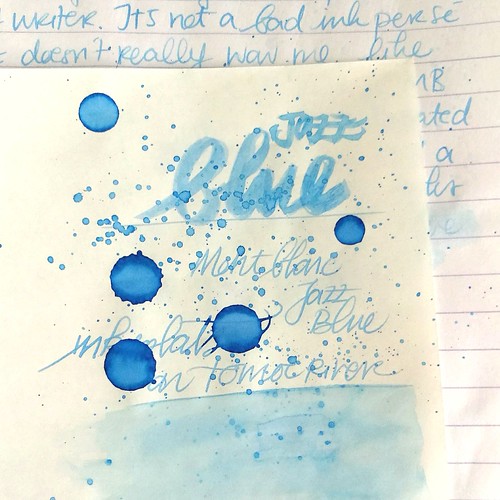
MB Jazz Blue ink
It does dry up with a nice blue halo, but no signs of redness caused by sheen of any kind. The drops look a bit pastel blue and with heavy saturation it's a high shading ink, but without any sheen. I do see a lot of potential for this ink in artistic endeavors, it definitely looks like a spring sky blue to me. Perhaps this would make a beautiful combination with Montblanc Pink in a sakura sky setting. Looking forward to test that out :)

Hope this was helpful to you, should you consider getting this ink for yourself. Let me know your opinions on this ink should you have tried it, I would love to hear it. 

Thanks for stopping by and have a great day!

namasté
2016/12/05

Mailart Monday: Dream Brightly

Making mail art, just like working in my art journal, is definitely a way to visualize my emotions and try to express them. I have been dealing with SAD and every time when winter rolls around, it's hard for me to be active, engaging or express my creativity when feeling all the ranges of darker blues inside you. But that doesn't stop me from trying though, it just takes a lot more time and energy than at brighter times. I am less prolific in winter than I am in spring/summer and creations that come out of these dark blue hues often have a tinge of sadness/melancholy in them. Like the cards I made below.
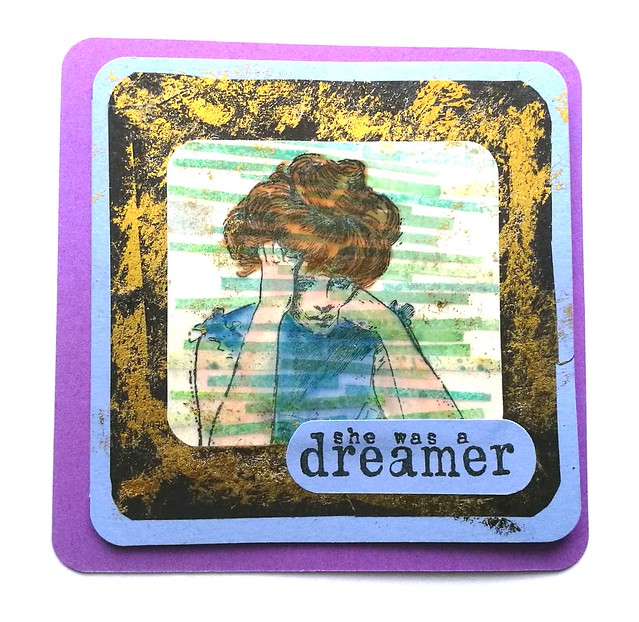
She was a dreamer card
This Vintage Lady stamp from Viva Las VegaStamps resonates how I am feeling, tired, exhausted but head still full with idea's. I stamped her on transparency paper, colored her in with Letraset markers and adhered her ontop of a piece I was saving for a while to use at the best moment. They are trims from ATC's in blue green colors. I adhered them all on one piece as a tumbling building block or a rainfall of thoughts/dreams as they represent now. The "she was a dreamer"stamp came from the same plate (1459) and totally fits this mood. I used lilac and violet colored card stock as base. I worked with gold foil on the black card stock for some shimmery warm effect.
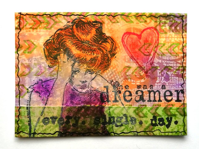
She was a dreamer ATC
I made this ATC to accompany the card. The background is from left over project pieces, same way I did this ATC. With distress crayons I colored the lady and added more accents to the card with the scribble heart from the same plate. The row of open chevrons is from plate 1471. The warm colors of this ATC is a nice contrast to the cooler colors of the note card. A reminder that it's important to dream warm and bright in these dark blue days. 

Thanks for stopping by and have a great day.

namasté

2016/12/02

Art Snacks November 2016 Box

Art Snacks november 2016 box
It took a week longer to arrive than the last two boxes and therefore this review is up a bit later because I could not find the proper time to test it until recently. But when I did. wow this month's box  is a great one with a lot of fun items to try out!

Art Snacks november 2016 box
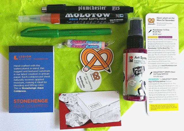
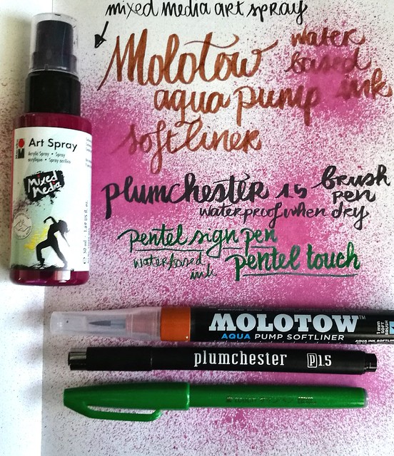
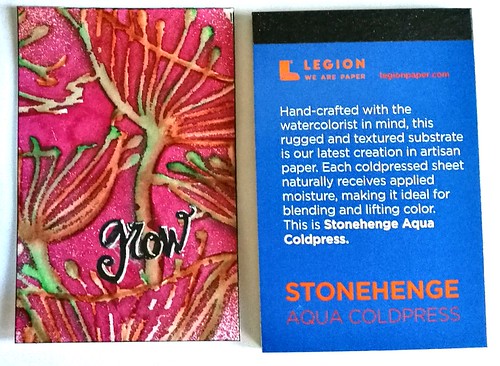
The content of the art snacks box of november contained not 4 but 5 items. The bonus item being the Stonehenge water color paper pad you see on the left, which I am very pleased with. In fact, I am pleased with the whole box! The other items are; plumchester brush pen in black, the Molotown aqua pump softliner in brown, pentel sign pen in green and the mixed media art spray in bordeaux/burgundy. Read more about the products on the artsnacks page HERE.

Art Snacks november 2016 box
My first test was just trying out the pens and spray in my Nuuna test notebook to see the colors and how the pens write. The Molotow is refillable which is nice and it is definitely a soft brush. The plumchester is an Art Snacks exclusive as they are developing their own line of art supplies. I find this brush works best on smoother paper to get even writing from it. The pentel sign pen is an oldie but goodie! I used them back in highschool, which is like ... no let's not go there, but sooo many years ago now. The spray creates a nice spatter effect and dries up a nice bordeaux color. Time to test it out on the Stonehenge paper!

Art Snacks november 2016 box
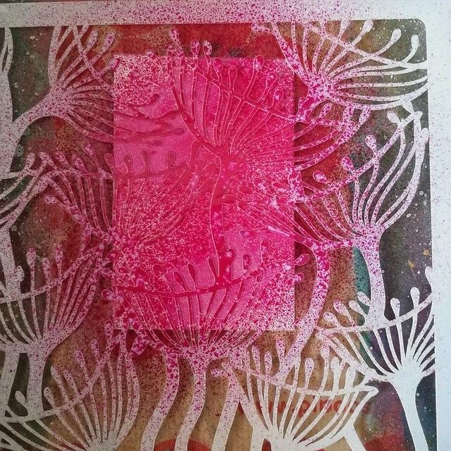
I took one of my fave stencils at the moment, the  seed pods from Clarity, placed it over the paper and sprayed the mixed media ink over it. It's acrylic ink so it dried pretty quickly on the paper.

Art Snacks november 2016 box
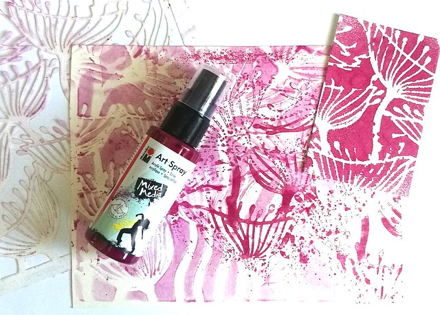
But it stayed wet enough on the plastic of the stencil for a negative print and when dried it was easily removed off the stencil with a wet baby wipe.

Art Snacks november 2016 box
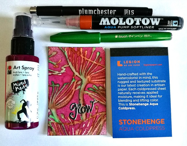
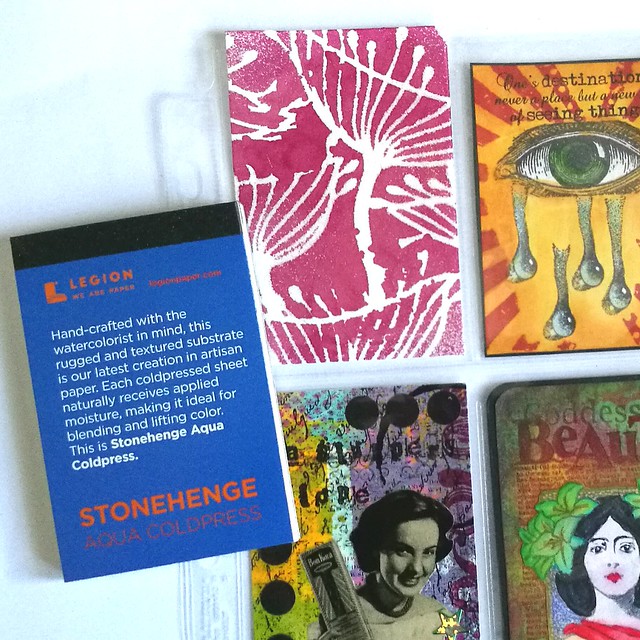
What I like A LOT about this Stonehenge paper size is the fact it's almost the size of an ATC/ACEO (just a bit taller) and can fit in the 9 pocket sleeves (for a pocket letter for instance) and those trading card protection sleeves! What a great size to play around with! The paper is pretty awesome too and I made the below ACEO/ATC with all the products from the november box.

Art Snacks november 2016 box

The spray stays on beautifully and the molotow & pentel brush colors blend nicely together with a waterbrush. I used the white gel pen from last month's box to highlight the word "grow" which I have written with the Plumchester brush pen. 

 A note on the international subscription plan; The box is 34$ including international shipping and what is really considerate of art snacks is that they tick the box as gift so in process you won't have to pay for customs charges upon arrival! They do this without asking as an extra service for their international customers (next to tracking) and is really very thoughtful! I surely do appreciate it :)

Hope this review was useful if you are planning on an art snacks subscription, or any of the products mentioned. The december box shipped already and I am curious what I'll find in there. 

Thanks for stopping by and have a great weekend!

namasté