2016/07/20

Inky Goodness: the magic of Alt Goldgrün

inky goodness alt goldgrün
Recently I was going through my ink collection to ink up a new pen and I was thinking, man what is an ink I have a love for but not used in ages. Rohrer and Klingner's Alt Goldgrün was the first thought I had and I went with it. And yes, when I used it again I should make a mental note that I really, absolutely should use this ink more! In this ink spotlight I shall show you why :)
alt goldgrün
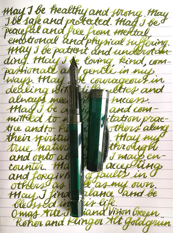
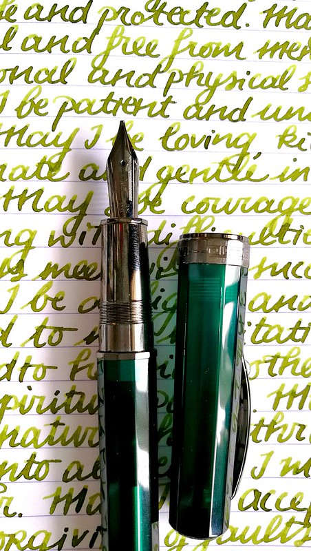
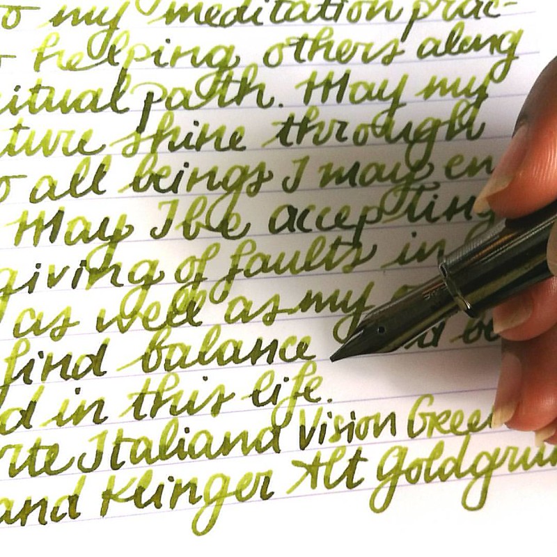
First I chose a pen to pair this ink with and I went with my Omas Arte Italiana Vision in Liquid green. It has a gorgeous juicy B nib which I knew would bring out the shading well. And I wasn't wrong.
alt goldgrün
The magical Alt Goldgrün in my Omas Vision Liquid Green with a juicy B nib for #inkyfridayfun @justvanness #fountainpenfriday #omas #FPN #fpgeeks #mettameditation #writtenmeditation #lovingkindness #loveforanalogue #green #sheeny #sheenyink #sheen #notcha
The above pictures are excerpts from my mindfulness metta meditation journal on clairefontaine paper. This ink has some amazing shading! And also some beautiful golden sheen.
inky goodness alt goldgrün
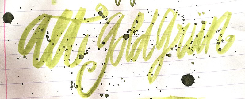
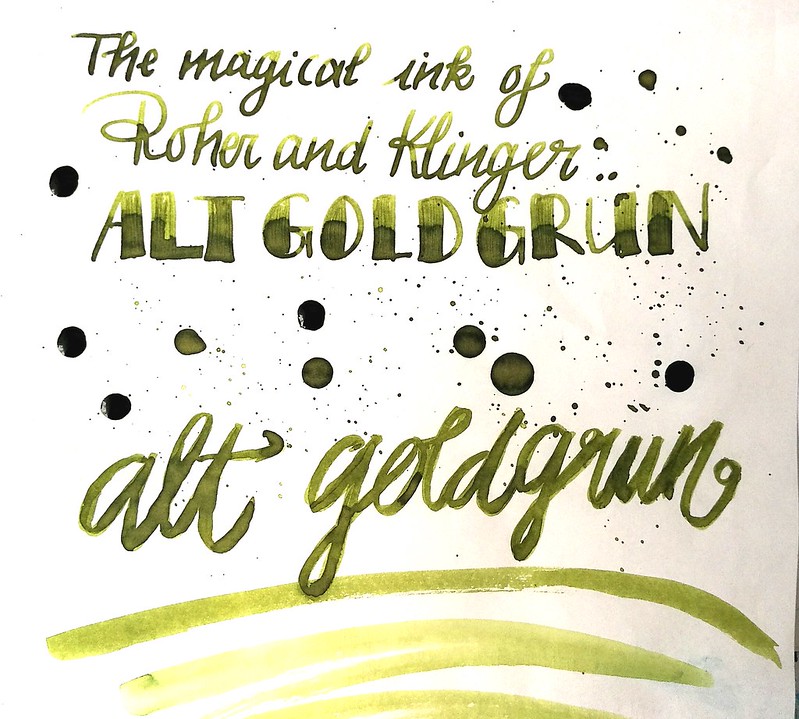
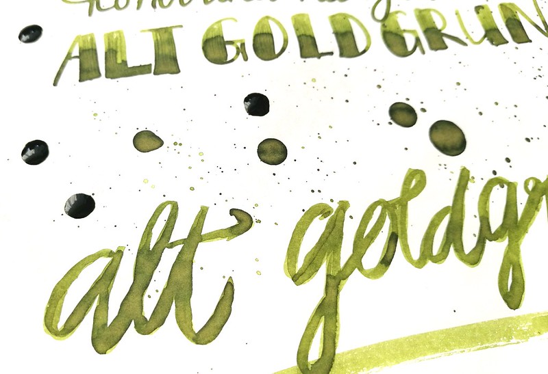
Rohrer and Klingner Alt Goldgrün on Tomoe River paper with an Omas B nib and a faber castell #6 brush.
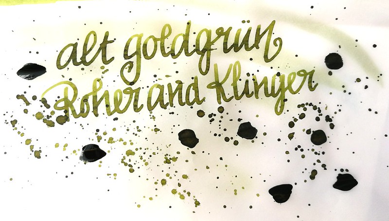
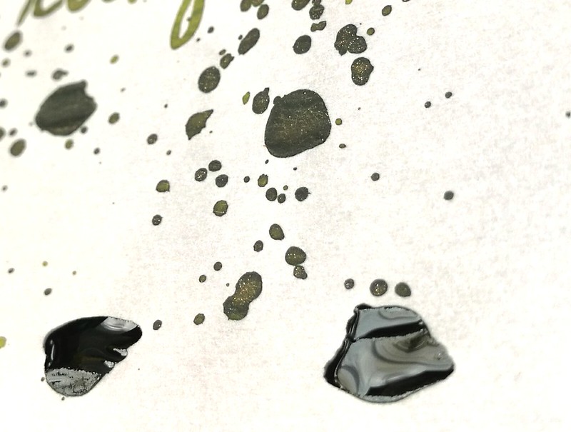
inky goodness alt goldgrün
The ink on Canson 80gms tracing paper. Look at the delicious gold flecks in the ink when it dries. So pretty! (ETA: I noticed I have written "Roher and klinger" instead of "Rohrer and klingner" on my test pages, and I realize I always said/wrote it wrong, until now! argh!! oh well, mistakes happen, ink is still pretty and y'all know which company I mean by now, right? )

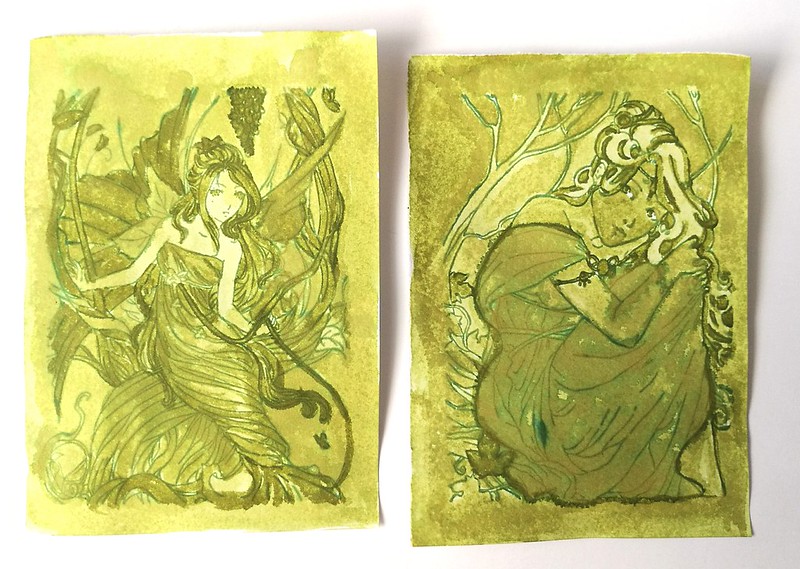
Of course I also had to make some ink wash art with this ink. I used the same technique as my previous ink washed art work and chose some fitting stamps for the theme.
inky goodness alt goldgrün
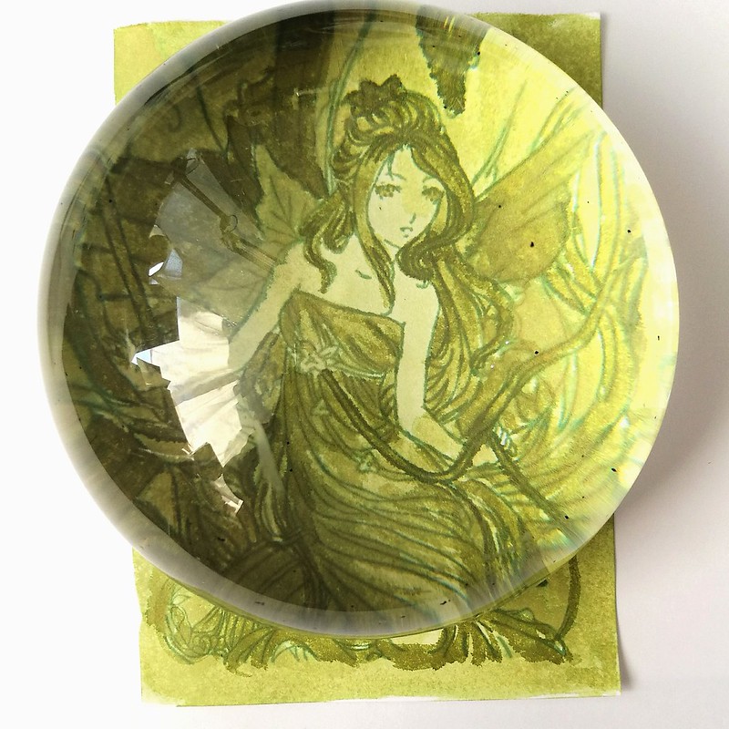
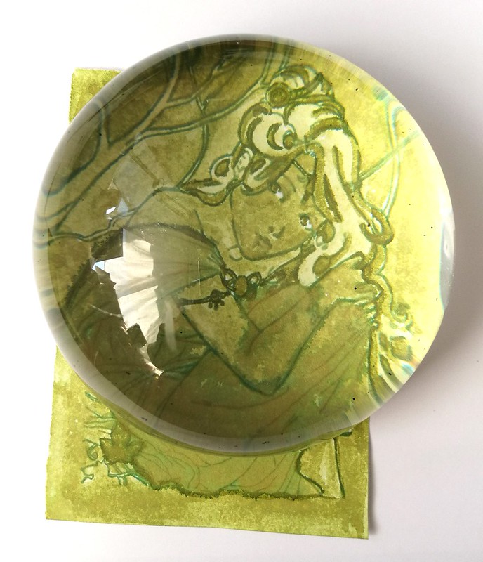
I chose some magical faeries from Sweet Pea stamps (sadly shop went out of business last year :( ) which I stamped with Memento cotton Ivy (which is waterproof) on 130gms smooth stamping paper and a Faber Castell #6 brush. They are ATC sized. The left fairy is done with a "dry on dry" technique and the right one a "wet on wet" technique. A close up with my new loop tool :
inky goodness alt goldgrün
I found this magnificent (excuse the pun ;) presse papiére at an antique market (used for postage stamps, I guess) which enhances the view of the artwork very nicely. With the dry technique I worked from light to dark, letting each layer dry before adding more ink. You can create some awesome shading that add variation to the piece.
inky goodness alt goldgrün
With this piece I kept on laying ink on wet parts and let some dry in between. You can see a lot of the gold sheen coming through in the dress where the ink was put on heavily. I also outlined the girl with non diluted ink so she would "pop out" more. 

I am entering these magical green fairies to the "Anything goes" Challenge over at Craft Stamper's July challenge. 

In conclusion: Rohrer and Klingner Alt Goldgrün definitely does deserve to be in rotation as well as used for my art works more than it has. It's in my top 10 Sheeny-shading inks as well for sure! For more in depth reviews of this ink I'll refer you to PenInkCillin , The Pen Habit for written reviews and artwork at Gouletpens blog for more close up pictures. 

Thanks for stopping by and have a great day!
namasté 

2016/07/18

Mailart Monday - Each day is a new opportunity

mail art - a new oppurtunity

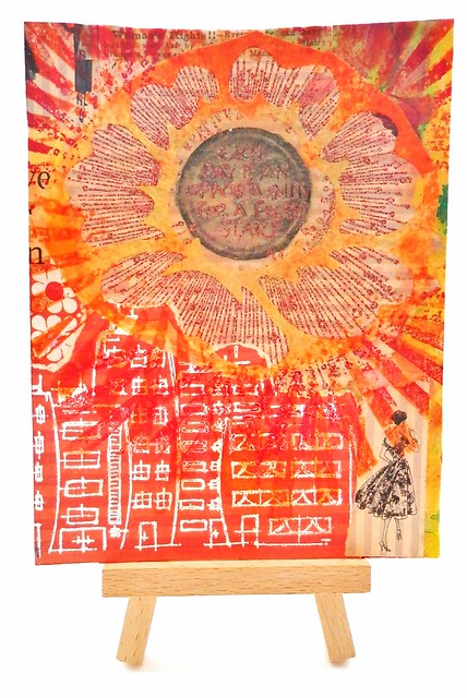
Mail Art 060-2016
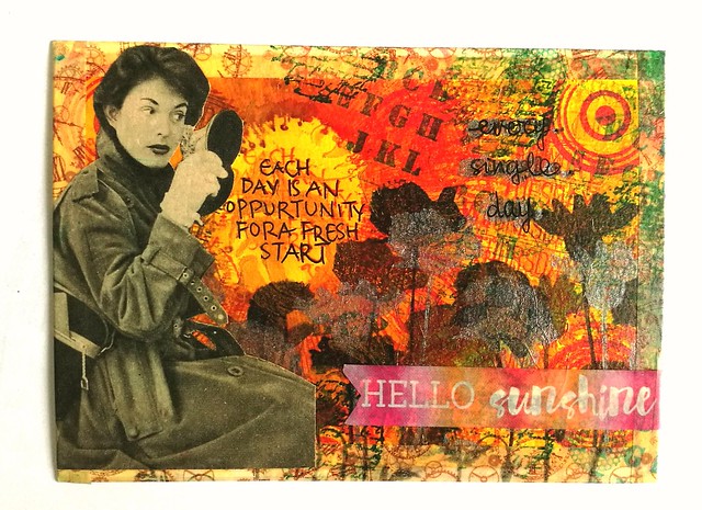
This rubber stamp from Zenspirations designed by Joanne Fink which I found at Posthumus store in Amsterdam have such wonderful positive affirmation that inspire me in making my mail art. The pieces above are a few examples I made for swaps on Swap-Bot
The top piece: The background is made with acrylic paint and stencils. Then added that sentiment rubber stamps from Zenspirations, the silhouette flowers from joy crafts and the circle stamps from indigo blu. I found a great picture in a vintage dutch magazine that fit the mood of the washi tape sentiment "hello shunshine" and the zenspirations stamp. 
The bottom piece is a collage made with various left over papers from my "junk paper box", stampotique and Tim Holtz stamps, and the flower overlay I made with my Making Memories slice machine. I'm loging for sunshine and this piece sorta depicts that. 
I love how these cards came together. 

Each day does bring the opportunity for a fresh start, hope you will find yours today :)

Thank you for stopping by and have a great day!

namasté
2016/07/15

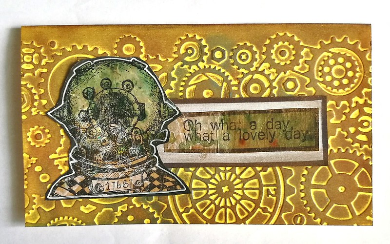
Oh what a day, what a lovely day!

Over at Viva Las VegaStamps blog a new monthly challenge has begun. This time they are also pairing it with a swap hosted through their facebook group on their events page. I love trading ATC's so I definitely signed up for this one. The theme is STEAMPUNK and I let myself be inspired by words from their inspiration post like rusty, steampunk, mail art, pipes,vintage, metal,copper, gold, bronze, nickel, handles, diving, divers and more! The pictures below of the items I made is the result of the inspiration.

VLV stamps steampunk swap
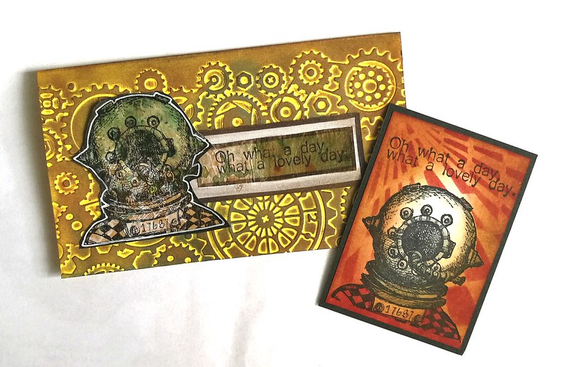
Stamps used Whimsical Diver from plate 1436 and the phrase "Oh what a day, what a lovely day" (from Mad Max) from plate 1473. Some really awesome stamps are all on the plate, but I wanted to put the focus on these two in my designs.
VLV stamps steampunk swap
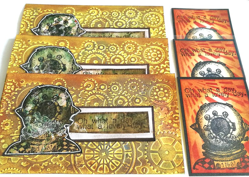
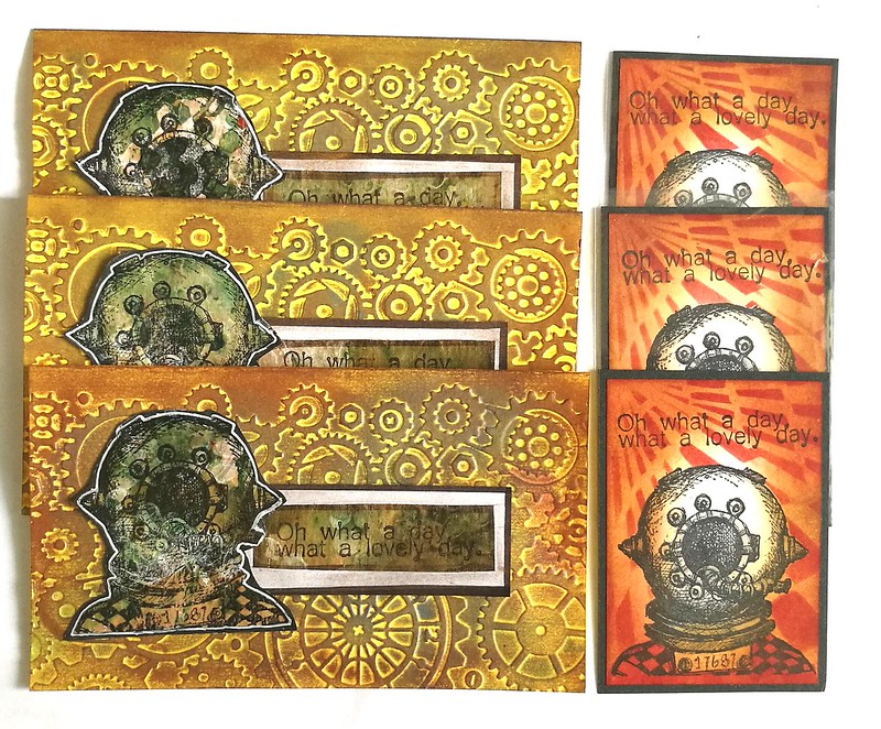
Each of my partners (and Dee from VLV store) will get a set like this.

VLV stamps steampunk swap

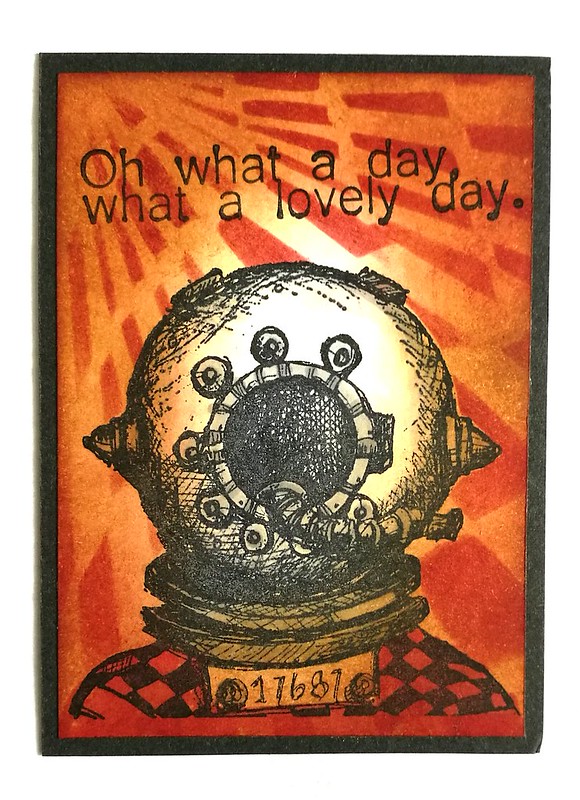
Close up of the ATC: The background is made with distress inks Old paper, vintage photo and aged mahogany with a blending tool. Then I took this stencil from Dylusions and dabbed some more aged mahogany through it. I have masked the diver while doing this. Stamped the sentiment with Memento tuxedo black. The diver is then colored with promarkers and the piece matted on black card stock.

VLV stamps steampunk swap
I then made a notecard with the same stamps. Background (yellow notecards) went through my cuttlebug with a gears and cogs embossing folder. Fter that I rubbed bronze, silver and copper pearl metallic rubs over the raised embossed parts to make it looked aged. The diver as well as the sentiment is stamped on gessoed and brusho'd kraft paper. Matted and lined with a black marker and outlined with a white gel pen. Then adhered it all with tape runners to the cards. 

VLV stamps steampunk swap
I am pretty pleased with the end result! I think I might make another one to keep for myself, but hopefully my partners will like receiving this steampunk inspired set :) 

Needless to say that I am entering these for this month's challenge at VLVs Blog, so wish me luck :) You can still enter until the end of the month, so play along if you want to.

Hope this inspired you to get your steampunk hat on :)

ETA: It's totally amazing! I've been chosen as one of the July winners with this piece, huzzah!

Thanks for stopping by and have a great weekend!
namasté

2016/07/13

Pens and Ink: Vintage Lamy Studio with Kaweco Paradise Blue

Lamy mustard studio

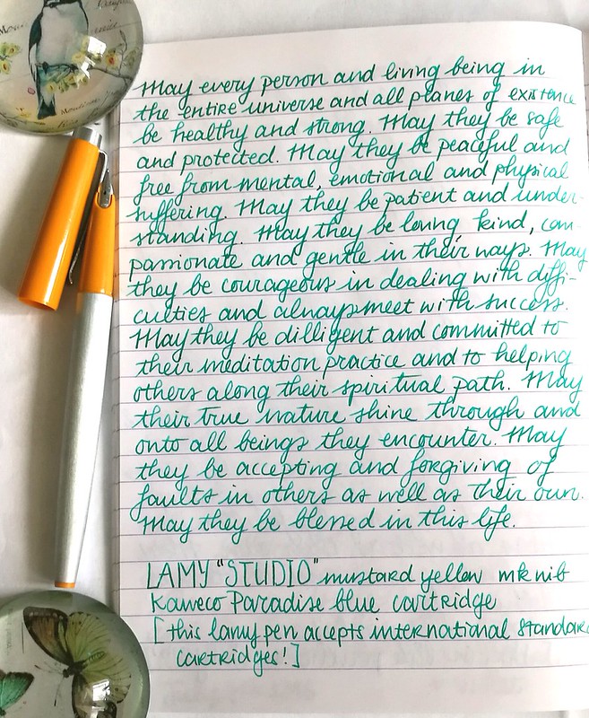
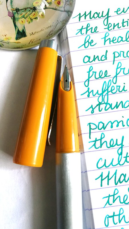
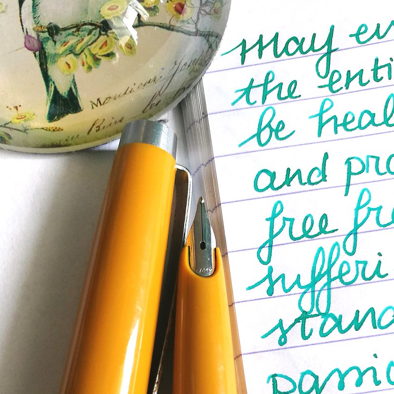
Last year I shared a post on finding these vintage Lamy fountain pens named Lamy STUDIO on the barrel. And I finally got around using one of them, The mustard yellow one has an MK nib which stands for "medium kugel" which, to my pleasant surprise, writes really well! What is also a bonus is that it  takes "standard international cartridges" (it also fits a SI converter) and I put in one of my Kaweco Paradise Blue cartridges.

Lamy mustard studio
The steel nib writes wonderfully smooth for a 1970s/1980s school pen and has a nice wetness to it. It shows off the shading of the Kaweco Paradise Blue ink really well. It could be an excellent daily writer and with the possibility of using non proprietary Lamy cartridges makes this a very interesting pen. Note that Lamy cartridges or converters do NOT fit this pen. 

Apparently this vintage pen from Lamy can be found in two different "names" while the pen looks exactly the same. I got this info from a thread on FPN on Lamy Studio/P25 from user "dib"
"The studio was the name of the series, 25 P the article number. It is like the 27: 27 is the name, e.g. 30 / 31 or 32 the article number.
Later the 25 and 26 are called design, the 80,81 and so on profil.
I guess only the first 25 are named studio on the cap. The article number 25 P was used from the beginning, april 1969."
Lamy mustard studio

That is very interesting to know! More info on the Lamy P25 on FPN here and here. Also in one of the pictures there you can clearly see the P25 imprint on the barrel, while mine says studio. These are not very commonly fond anymore, so I got really lucky with that score. I have a Pink one for sale, should anyone be interested. A lot of other pens I'm letting go of are also listed there (prices are updated and I'm also accepting offers!). Thanks for having a look. 


Have a great day!

namasté 
2016/07/12

Craftorij Summer Challenge week 5

Still going strong with the CZC/index card a day challenge! It's half way through and I'm really enjoying this year's prompts a lot :)

CZC29
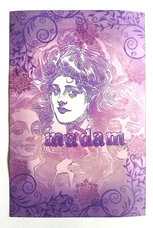
CZC 29 - Use an ambigram (word you can also read upside down) or palindrome (word which reads the same backward and forward)
I chose to depict the palindrome "madame" for this one. Made it with a large Gibson Women background stamp from Lost Coast Designs. The flourishes, flower and font stamps are from Technique Tuesday "Start me up Broadway" font set. I used distress and memento inks in various purple tones and a round blending tool.

CZC30
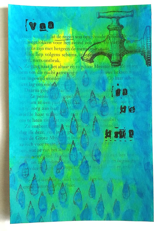
CZC 30 - paint with your fingers

Used paint (yes with my fingers!) on a book page and combined stamps from carabelle The bookpage have  the words "de regen"on them and made that the focus for this piece. "Van de regen in de drup" is a Dutch saying means the same as the English saying "Out of the frying pan, into the fire". Funny how one langues uses the water analogy and the other a fire one for the same meaning!

CZC31
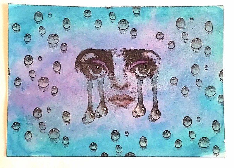
CZC 31 - use water drops
I made the previous card (30) with water drops without knowing the theme for this day's challenge! But this is a good excuse to use Designs by Rynn waterdrops in combination with eye stamps from Hampton arts. The moth and nose is also from Hampton but has a border around it which I didn't ink. The back ground is made with Tombow markers and the blending tool mister. I also added some glaze accents on the drops. The eyes and moth is also colored with tombows.
CZC 32

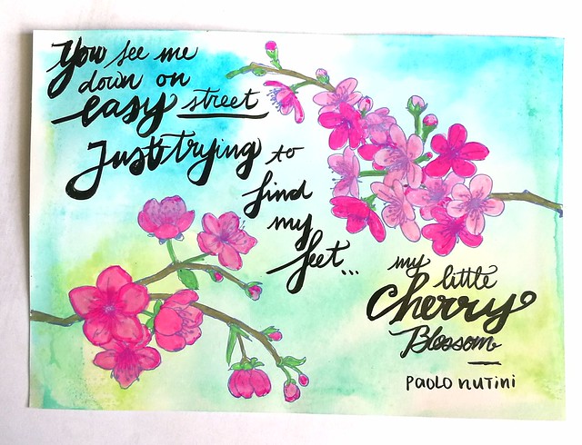
CZC 32 is Lyrics themed and I used the Star Man collage  from Mailart Monday of last week for. But I also made another card because I got inspired by the Cherry Blossom stamp set I recently got. Colored (including the back ground) with Tombow markers. Lyrics are from the song Cherry Blossom by Paolo Nutini.
CZC 33
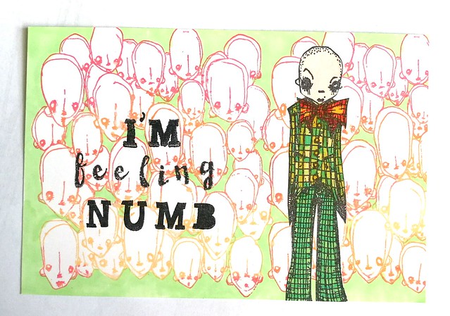
CZC 33 - emoticons
Well I am really not a fan of those standard round emoticons (as many whom are partaking in this challenge with me) but I thought I would use the word 'emote' as vocal point for this theme. This background stamp with faces from Stampotique surely does emote a numb state of being. The dude with the Bowtie is also from that line of stamps. I used memento ans staz-on ink pads. Everything is colored with Letraset Promarkers. (yeah it could also be considered for the Lyrics assignment as it's a U2 song :)

CZC34

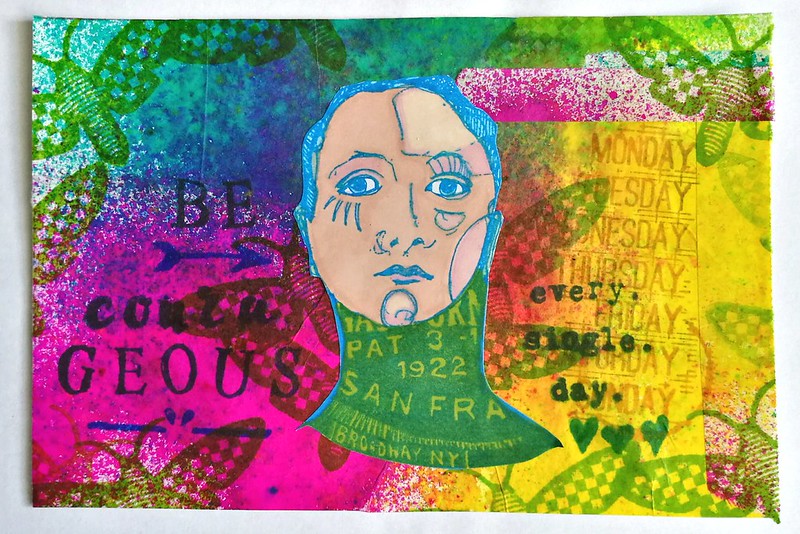
CZC 34 - use everything except black
Seeing I love color, this one was not a hard challenge for me. This was a really FUN challenge :) I sprayed a white glassine gift bag with 4 colors of dylusions ink and that was my base. Cut and pasted it to the index card and stamped the moth from paper Artsy Hot Picks on it. Colored the woman from Viva Las VegaStamps on sticker paper and combined Eline's handlettering stamps with Carabelle daily stamps. A reminder to myself to be courageous every single day.

And with this I am concluding this weeks' CZC update.
Thanks for stopping by and have a wonderful (courageous) day!

Namasté