2016/07/11

Mailart Monday: Transparency Layers

mail art

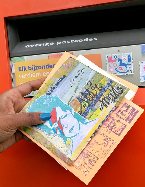
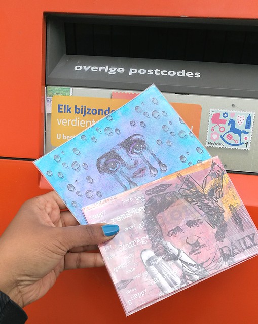
Above is a shot of my recent sent mail art. The PC on the bottom is a postcard I made for the Transparency Layers Mail Art swap over at Super Mail Artists group on Swap-Bot. I like swaps like these, that challenge me to work outside my comfort zone and see what I can come up with. Let's take a closer look at it.
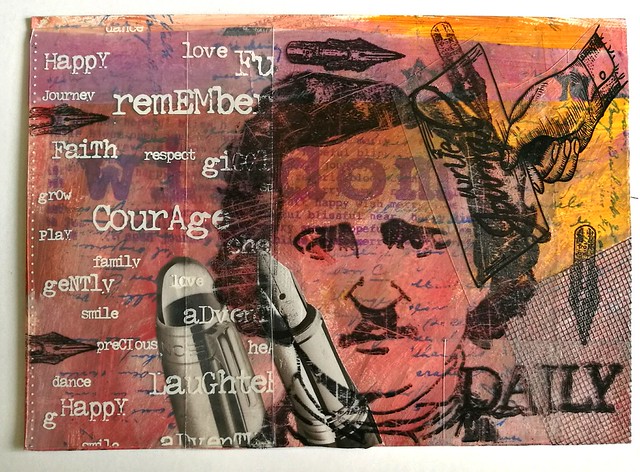
The idea of the swap was to have 3 transparent layers overlapping and ideally telling a story. I hardly ever use transparencies in my work, so this was definitely a fun challenge. The base is 1/4 of an A4 on which i used acrylic paints on, which I mounted on card stock. I added mesh, a strip of gelli print on tracing paper, rubber stamps, the fountain pen image from a Montblanc catalog and then came the transparencies. The Edgar Allen Poe image from Carmen's Veranda was stamped, as well as the word Daily and the hand holding the paper, on a transparency sheet and cut out and glued on with permanent glue strip roller from Pritt. The sheet on the left side with all the words came in last. I love the black and white contrast of the transparency layers used and the way the bright colors shines through them. I continued with the transparency theme on the back.
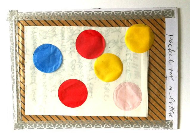
mail art
And added a pocket for a letter to my partner and included some fun confetti rounds for some cheerful color. I secured the pocket with glue on the back and masking tape around it. 
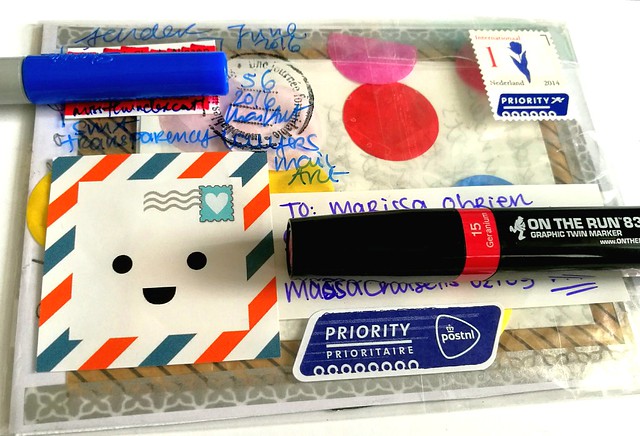
mail art
Then I inserted everything into a see through cellophane bag as an "envelope" to add an extra layer over the back with stickers and writing. Transparency layered to the max!! I was happy to hear my partner enjoyed receiving this in the mail!

Since this was such a fun thing to do, I might incorporate this to other pieces in my mail art as well :) 

Hope this inspired you to work with transparencies in your own work :) 
Thanks for stopping by and have a wonderful day!

namasté

2016/07/08

Monthly Planning MTN: June 2016 overview

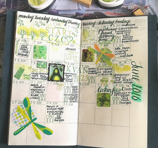
The year is now officially halfway through and like always I am thinking "how the hell did that happen?!" Also it's supposed to be summer, but it really didn't seem like it for the most part of June. I spent days longing for sunshine, but grateful for the days that were actually sunny and I had time to enjoy it. This time I didn't forget to take pictures of the process and I found a fun attribute to help me with numbering the days in the planner :)

monthly update June
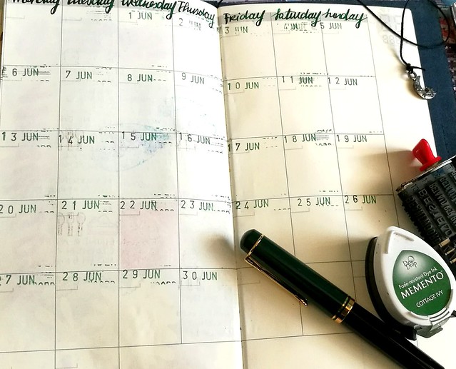
Recently I have cleaned up some drawers in my room and found a lovely date stamp you can see on the right. I must have found it at a thrift market/yard sale at some point and forgotten I had it. But it's getting some great use now!

monthly update June
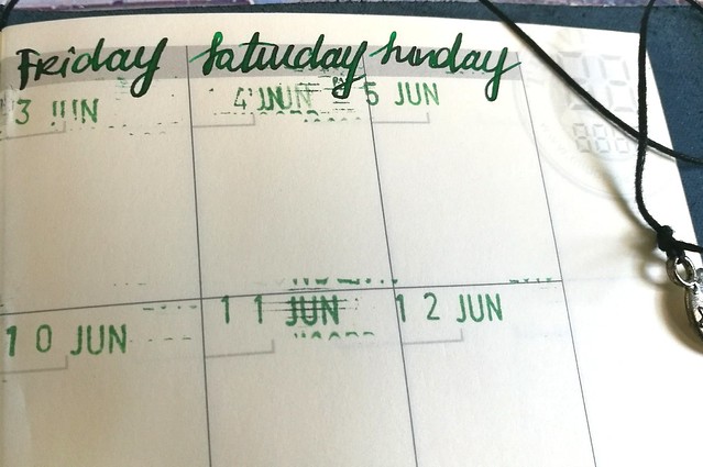
A closer look of the dates. It's a bit finicky to get a good clean print, as it's a pretty old and very used date stamp, but I suppose it's part of the charm. I chose memento Cottage Ivy stamp ink for the dates and I wrote the days of the week with my Pelikan M250 with Akkerman Bezuidenwoud Groen, And I was so pleasantly surprised the ink held up pretty well on the midori page, as it's a pretty wet writer! No feathering, just a bit longer drying time and that I forgot to take in account when I wrote the month and year on the side of the sections.
MTN process june
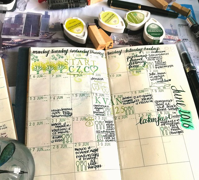
So yeah I smeared the date a bit on the right and tried to "salvage it" by using a water brush to take away the smear, but well, it got a watercolor-y effect and I just left it like that. Shit happens, right? Anyhow, I took out my fun planner stamps from Sakuralala again (it's a gift that keeps on giving really!) and yay, I had an excuse to use that cute little tooth from the Daily set because of my dentist appointment! I never been so happy to mark a dentist appointment before, ever! But still glad it's not "daily", heh! As you can see, I kept the green theme going and chose a few more Memento inks that fit that theme.

monthly update June
I also used my new TWSBI ECO with Akkerman Zuiderpark Blauw-Groen (which I decided I kinda do want a bottle of... sigh) to note events. This ink dries a lot faster on the page and is less prone to smearing. It's a better combo for this paper. I also added bits and pieces here and there that I felt fit the "theme". At pipoos I found Eline's Handlettering sets Bold and Light on sale and used that to note the CZC challenge and the KAVAN conference (=work related but was a lot of fun!) in the planner. 

monthly update June
As I jotted down the events, I noticed I had a lot of "blank space" left... due to the fact I didn't jot down all my appointments and events in my pocket midori and I could not remember them at the time I made the update... Ehm, yeah, well at least the most important and fun events are on there and more space for some fun images/stamps. I found the dragonfly stickers in my stash somewhere and found the combination of green and orange pretty fun, so went further with that.

monthly update June
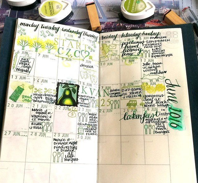
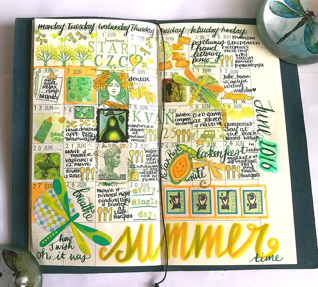
And this is the result of the full spread. I added more dragonfly elements and splashes of orange through out the page. I like the balance between the green and orange, it looks really fun this way. The square stickers I used, which I ordered through moo years ago, show my own work. I should make a sticker pack with my recent work as well :) And I also made the "YOLO" Faux postage stamps on vintage postage labels with rubber stamps from Chronicle books. I will do a tutorial and perhaps a giveaway on those in a future post, so be on the look out. "Oh, how I wish it was SUMMER time" resonates my feelings for this month. Hopefully July will be filled with more days spent at the beach :)

Thanks for stopping by and have a great weekend!

Namasté 

2016/07/06

Pens and Ink: It's clearly TWSBI and Teal today!

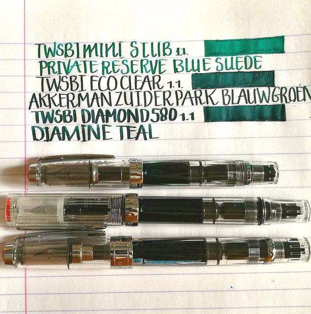
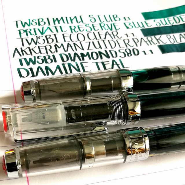
Last week in the Hague I stopped at one of my fave stores again and you don't have to be a genius to guess that it's Akkerman! I was finally going to get my long awaited TWSBI ECO clear model with the 1.1 stub nib and it did not disappoint! I definitely love the look and feel to it. And it looks GREAT in between my Diamond 580 and Mini demonstrator models as well. I just love seeing ink slosh in clear pens, it's so pretty!
twsbi 3 of a kind
I'm really happy I decided to keep my mini because it does make a pretty collection this way :) The kind lady at the store asked me if I wanted my Eco filled with ink (from the Akkerman line) and I took the opportunity to take one I haven't gotten round to testing yet; Zuiderpark Blauw-Groen. It's a gorgeous teal color. I bought another bottle of Private Reserve Blue Suede (hey, it was on sale!) and filled my mini with it. It's a gorgeous blue green color (dead ringer for J. Herbin's Emerald of Chivor base color) but the focus of this post is going to between the ZBG and the ink I've chosen to fill my Diamond 580 with; Diamine Teal.

twsbi and teal
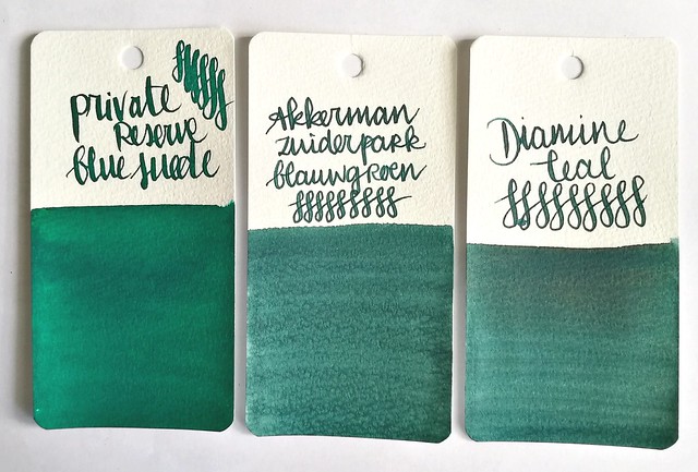
Ink swabs on maruman word card paper. From left to right: private reserve blue suede, Akkerman zuiderpark blauw-groen and Diamine teal.

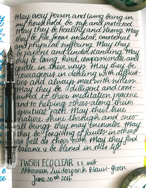
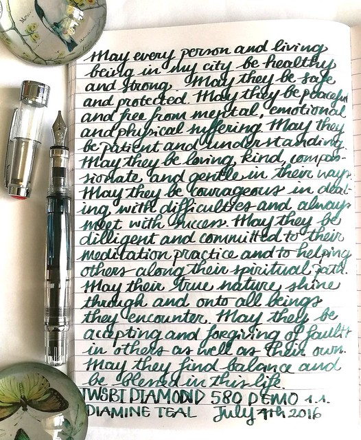
Right off the bat I thought the latter two inks look so much alike when I wrote with them and seeing the ink swabs side by side, well there is honestly not much difference at first glance! But there are a few subtle differences in writing though. A couple of example pages from my loving kindness written meditation journal.

twsbi and teal
TWSBI Eco with Akkerman Zuiderpark Blauw-Groen - a nice looking teal color. But the swab makes the ink look more interesting to me than the writing sample does. There is a bit of shading but not a lot. Also it writes a bit dry. Maybe I have to reset the nib and feed and give it a good cleaning, The lady did fill er 'up right out of the box...

twsbi and teal
TWSBI Diamond 580 with Diamine Teal - Found this ink flowing better also this ink is darker and has more shading. Granted it could be the nib that does make the difference. The 1.1 on the Diamond 580 is a number 6 vs. the number 5 on the ECO (and mini) has a broader width and writes a lot wetter.

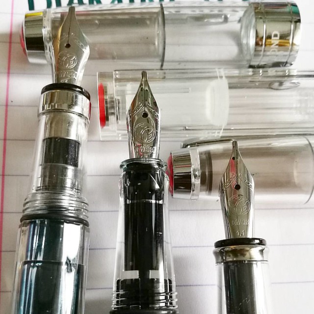
The twsbi stubbs are definitely among my fave writers. LtoR: Diamond 580, eco, mini with 1.1 stub nibs. #twsbi #fpgeeks #fpn #fountainpennetwork #fountainpen #stubnib #seriousnibbage #demonstrator #nibshot @twsbi
Comparison shot of the 1.1 stub nibs on the 3 TWSBI's. The nib on the ECOand Mini are the same. The section of the ECO is smaller than the other two pens which is just a little on the small side for me, but not uncomfortable.

It's clearly TWSBI for this friday's #fountainpenfriday @appelboompennen 😉 #twsbi #twsbieco #twsbi580 #twsbimini #demonstrator #fountainpen #fpgeeks #FPN #fountainpennetwork #stubnib #handwriting #penmanship #promotepenmanship #ilikebigstubs #battleo
The 1.1 nib definitely have differences among each other in writing. My fave writer of the 3 remains the Diamond 580, I just like the line width a little better. Also look at the shading in the Diamine Teal!

I am very pleased with the newest member in my TWSBI collection though I am still on the fence if I want a whole bottle of either ZBG or Diamine Teal. I'll need to write a bit more with them first to decide. See reviews from Ana's of The Well Appointed Desk on Diamine Teal and Akkerman ZBG for more info on the inks. Which of these would you prefer?

Thanks for stopping by and have a great day!

Namasté

2016/07/04

Mailart Monday: Star Man

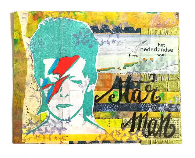
On today's mailart monday I wanted to share a collage piece I made for a swap on Swap-Bot Mail Art Postcard Random hosted in the group Sealed with Love. What I literally did for this swap, I took a hand full of small paper scraps from my junk paper boxes and see what I could come up with collage wise. The card below is the result.
mail art Star Man
In the "lucky dip" of papers there were paper scraps from scrap book papers, left over pieces from gelli prints, postage stamp sheet left overs and a home made sticker from my David Bowie Print I made earlier this year. These were "faulty prints" as the print was on the cut line of the sticker sheet. But I'm glad I kept these none the less, as it's fun to use in projects such as this (plus you know I can't throw away anything, so yeah...) I stamped some stars on the card with Brilliance lavender ink and sealed the card with artists medium. Afterwards I decided to put some accents on the  lettering with a white gel pen.

mail art
And then the Star Man was ready to be mailed out! I'm happy to say that the recipient liked this card and the lyrics was stuck in my head for a week! Want to sing along?


All together now...

There's a starman waiting in the sky
He'd like to come and meet us
But he thinks he'd blow our minds
There's a starman waiting in the sky
He's told us not to blow it
'Cause he knows it's all worthwhile
He told me
Let the children lose it
Let the children use it
Let all the children boogie

This card is also suitable for #32 "use songtext/lyrics" of the craftorij summer challenge prompt :) 
Thanks for stopping by and have a great day! Shout out to all my USA friends, hope you all are having a great 4th of July celebration!

namasté

2016/07/03

Craftorij Summer Challenge week 4

June is over and crossed into another month of the CZC index card challenge! High time for another update on my take of the daily prompts of week 4. I did a couple of "double takes" on a couple of these, but I still managed to do all the cards for this week, so yay!


CZC22CZC22
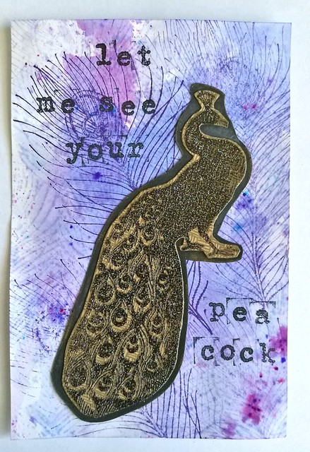
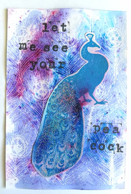
CZC 23 use feathers version 1 and 2

Both are made on a background of Brusho and using Carmen's Veranda peacock stamps. Version one the single peacock feather and version two the back ground feather motive. The peacock is stamped on another piece of paper, embossed and adhered to the index card.

CZC23
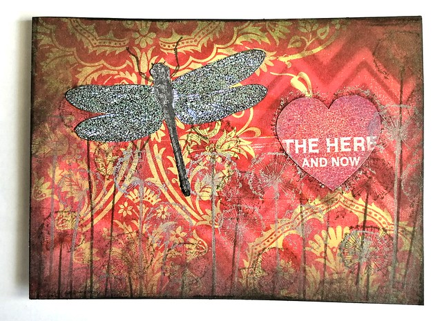
CZC 23 use a chevron motive
I started on scrap book paper, stencil of the chevron over it and dabbed my ink tool on it with some distress inks. And used the Carabelle "the here and now" stamp set.

CZC24
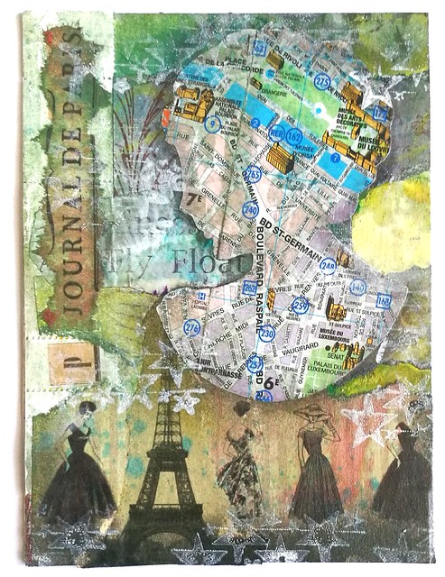
CZC 24 Use a map
Made a paris themed collage, used a touris map from Paris for the silhouet cutting of the buste and various Paris themed papers. This piece was sent for the CC sender's choice June swap via swapbot.

CZC25
CZC25


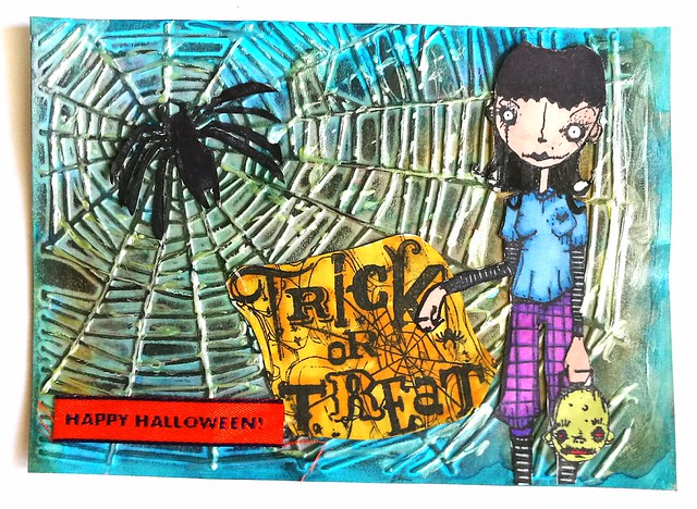
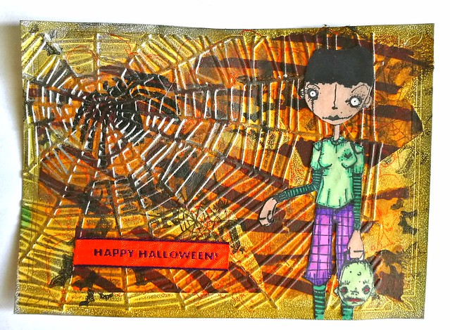
CZC 25 Halloween/Creepy - also made 2 version of this prompt
Stamps used from stampotique and inkadinkadoo. The spider is hand carved. It was fun using the cuttlebug for embossing again :)

CZC26
CZC 26 Make 1 majuscule and doodle it from the inside
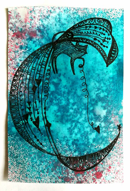
Doodled a letter Zenspirations style on an ink sprayed card. The cat is a stamp I incorporated in the design.

CZC27
CZC 27 Black and white
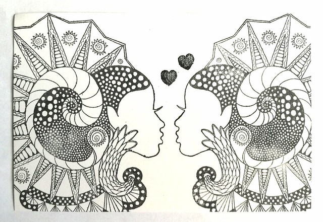
I used these gorgeous stamps from Lost Coast Designs, they are mirror images from each other and super cool!

CZC28
CZC 28 - travel
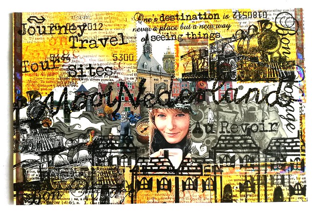
I made a travelling/commute card collage with ols train tickets, left overs from a coupon and postage stamps, with stamps from technique tuesday and yellow owl workshop.

And that's it for another week! These were some fun prompts and my fave of the bunch was the doodle letter!

Thanks for stopping by and have a great day!

namasté