2016/11/21

Mailart Monday: Pressed for time!

The first weeks of november I was on holiday with my husband to Seville (and Andalucian region of Spain) which was amazing! I miss the wonderful food, weather and ambiance so much already. With a couple of posts scheduled I hope you didn't notice the absence. I have a bit of work to catch up to and also write a report of my trip and telling you about my fave spots there (found a heavenly stationery shop or two which I want to tell you about!) Hope to get it all done this year. Yeah scary thought, just a little over a month and we'll be in a new year already!

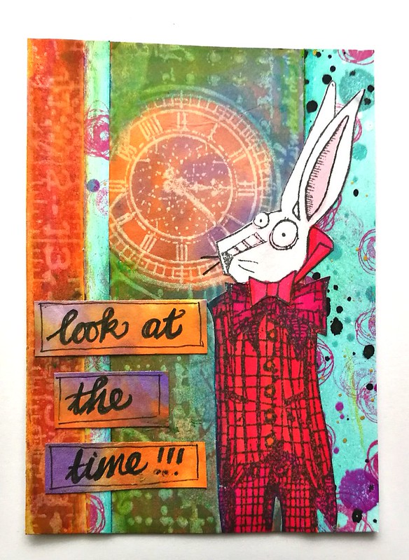
Anyway, even though I missed the sunshine (it was a sunny 23C there!) it felt good to be home and see my Meesha (a friend of ours was cat sitting) and do some crafts again. This fortnight's challenge at Stampotique with theme human with animal head, got me inspired to make the below ATC:

ATC

This ATC is an assembly completely made with leftover scraps and pieces from various projects.  The background and strips I wrote on were made with left over scraps from my halloween masterboard and this birthday card. I cut of the heads of one of the Rabbits I had colored in for use on the High Tea Party and assembled it on the body of Bowtie (which I turned into a Butterfly and have stamped and colored in a few times for various projects). I added some Distress Crayons in the background to highlight the background clock and called it done. The challenge is a fun one and even when pressed for time, ATC's are the perfect size to make something new out of the left over pieces on my desk. I'm also sending this one out to one of my partners for the ATC swap at Stampotique group, as the theme is circles.

Thanks for stopping by and have a great day!

namasté

2016/11/20

Creative sessions: Cyanotypes

Cyanotype class
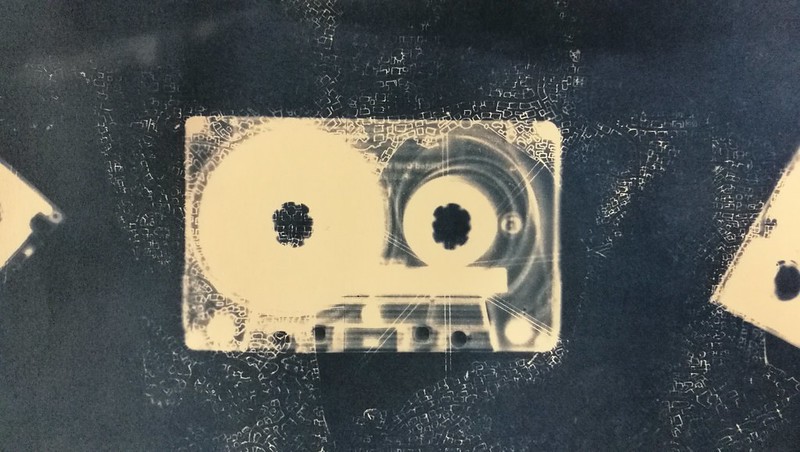
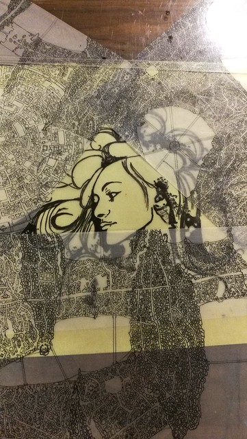
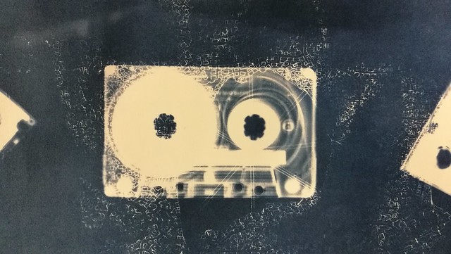
(Cyanotype with cassette tape and technical drawing)

When I was browsing through my local university's creative workshop course (LAK) for the fall, I had noticed something they had not offered before a "cyanotype" workshop. Below a blurb from the course website:

"Cyanotype (making blue prints) is one of the first photographic techniques and was discovered in 1842. By the use of two photographic chemicals you'll learn to make watercolor paper photo sensitive. In fact, we transform watercolor paper into old-fashioned paper, which results in beautiful Prussian blue prints. (EDIT: to know more about the cyanotype history and technique see here)
During the course you will learn about the chemical background of the process and you get started with all its features. It's surprisingly approachable; blueprints can be made of objects, pictures, drawings and photo's.

After you've tried all options during the course and have learned all the tips and tricks, you can continue at home, because you don't need darkroom!"

Well, I was very intrigued by it and signed up for the 6 week course and it was so incredibly fun! There was a group of 10 people and the course was given by Janet Keukelaar, owner of PAR, who was very encouraging and had a fun way in teaching us the technique. All whom attended were very prolific in what they made and I've got some super fun prints out of it.

A visual impression:
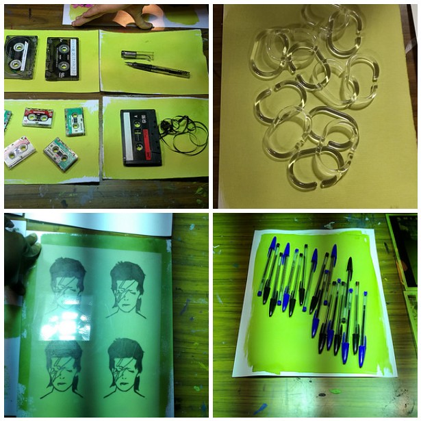
cyanotype process
First off you coat your watercolor paper (any kind of paper could work but watercolor paper is proven to be best for this technique) with the chemical solution and let it dry well. We used different kinds of foam rollers and brushes for the application and blow-dryers to speed up the drying process.
As you can see, the chemical coating is a bright yellow one. None of that lush blue in this part of the process! Then we placed the coated paper with the object/drawing/photo negative we wanted to have a cyanotype of under a sunbed (UV light exposure) for 7 minutes (give or take). During the exposure your print will turn into a darker brownish color. As you can see you can experiment with a lot of fun 3D objects as well! And don't worry, my beloved Lamy Vista fountain pen is totally ok after the UV-light exposure.

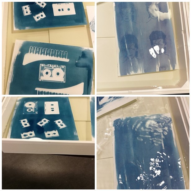
cyanotype process 2
After the exposure you let your print soak in a tub of cold water for 15 minutes. Here is where the magic happens, the brown washes away, the unexposed parts turn white while the exposed parts turn blue! The longer you soak, the more detail will appear. Like true analogue photography! Also the water turned into a pee yellow color as the evening went on... a fun fact I wanted to share ;) Now comes the drying time...

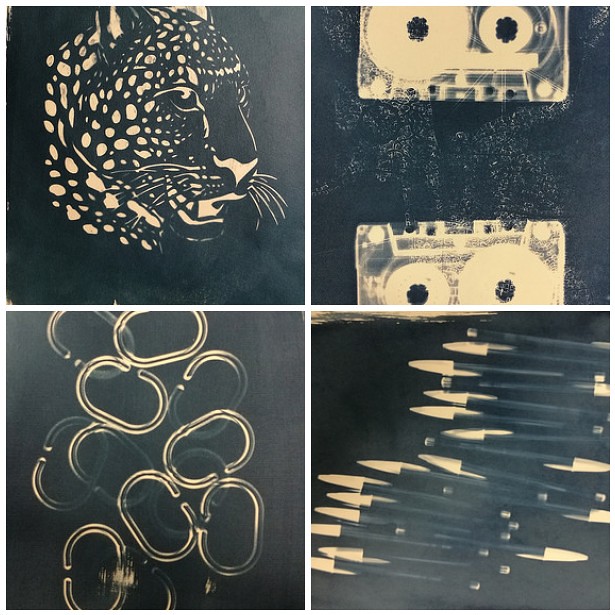
cyanotype process 3
The longer you let your print dry, the darker the blue gets. It's good to experiment with the amount of coating, because the more of the solution you let soak in, the darker it gets. If you want a lighter print, experiment with using less solution and/or a longer soaking time. I love the deep dark blue these prints have. Also it takes a bit of trial and error to get the prints crisp but that is all part of the experimentation.

Cyanotype class
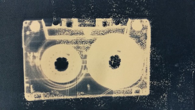
You can also experiment with layering images and objects on top of each other during the exposure process, like I did with the Hera print above and cassette tape below with the addition of technical drawings my husband made.

Cyanotype class
I just completely LOVE how these cassette tape prints turned out! Look at the fine detail of the drawing that came through!

And also a fun thing to experiment with is double exposure:
Cyanotype class
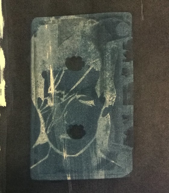
I coated my Bowie print again and placed a cassette tape on it. In the 1980-1990s this would have been a fun mixed tape cover, don't you think?

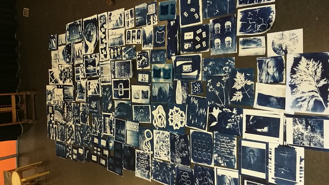
We all made such cool prints! On the last day we spread them on the floor to make an overview picture
Cyanotype class
And this is like only 1/2 of the whole production the class made!

If you get the chance to try a cyanotype workshop I would highly recommend it!  For people in the Leiden aria, Janet does offer these workshop at her gallery/studio PAR and also offer the sepia variant called Van Dyke. I definitely am going to try that next year! And you can also experiment at home by buying one of these DIY kits she has curated. Oh and look at how awesome that kaleidoscope kit is?!

If you're interested in seeing more of the prints I made, it's in my flickr album below:

Cyanotype class

And I am looking forward to work more with these prints, either in mail art or in my art journal. So to be continued...

Thanks for stopping by and have a great day!

namasté
2016/11/18

Mini Art Journal: Kiss

Last week I showed you some work in progress pieces of my experimentation's with The Crafter's Workshop Gold Gesso and I've taken the Klimt image to work on for an Art journal spread.

the kiss

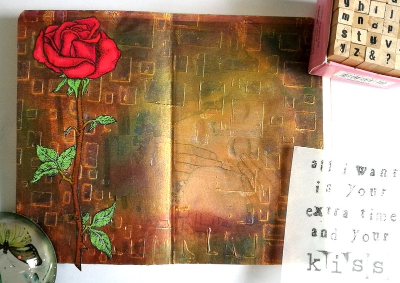
The Gold Gesso was a base on the Klimt print on which I have applied some metallic rub-ons with my fingers. The gesso provides a smooth surface on which the metallic paste just glides over. I have used some purple, green and red colors. The gold outline of the rectangles are still clearly visible and that gives it a fun effect. The Open Rose is a rubberstamp from Carmen's Veranda, which I stamped with memento black on sticker paper, colored with Letraset Pro markers and cut out.

the kiss

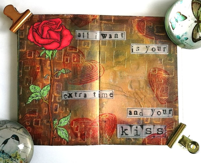
I cut the page to size and glued it to my art journal and added the rose to it. Then got some vellum and stamped some lyrics from a Prince song this image reminded me of; "All I want is your extra time and your.....KISS"
(eta: yeah I know it's "I just" instead of "all I" but I glued it in before I realized the mistake... oh well, it's all part of the process ;)

the kiss

I stamped the hand carved heart stamp a few times for the fun of it and cut and outlined the lyrics and this is what the finished spread looks like :) It's something fun and different and I definitely liked how the rub-ons work on gold gesso. Definitely going to experiment with that more. Also Carmen's Veranda has a this Klimt Kiss as a stamp and see what I made with that over here. 

And to ring in the weekend fun, let's all sing along to  - Kiss - from Prince :) 

Thank you for stopping by and have a great weekend :)

namasté

2016/11/16

Pens and Ink: TWSBI Al green with Montblanc Jonathan Swift

TWSBI al green with MB jonathan swift

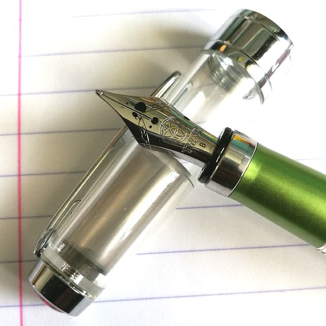
As some of you might know, TWSBI releases some Limited Edition specials from time to time and there was one special edition I was really into, the TWSBI AL Green, which was released in a small batch earlier this year. It took me a while to find it, as it seemed to be sold out everywhere, but with some luck and Google-Fu I found out they had one left at Scrittura Elegante, a stationery shop based in the Netherlands. So after not too long of a wait, the pen arrived and I excitedly tried to pick a color to match the beautiful body!

TWSBI al green with MB jonathan swift
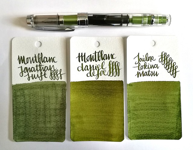
I decided a nice mossy green would suit the pen body well. The mossy greens above I thought would make a great match; Montblanc Jonathan Swift (seaweed green), Montblanc Daniel Defoe (palm Green) and Sailor Tokiwa Matsu (evergreen pine). The swabs are done on Maruman Word cards, by the way. It was a difficult choice but in the end I sent with Jonathan Swift because I had not yet used that ink in a pen before, so it was high time I break in the bottle!


TWSBI al green with MB jonathan swift
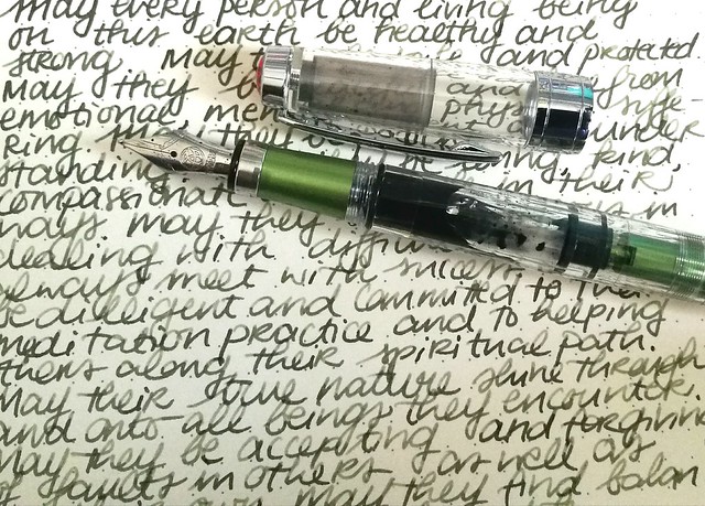
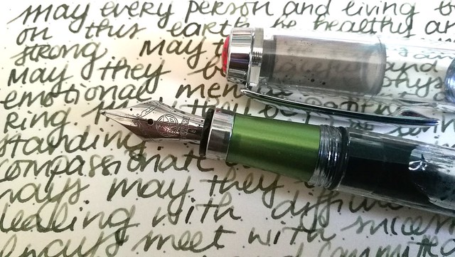
I requested a B nib on my TWSBI Al Green as I have almost all the range of the nibs in the TWSBI line up, except for this one. I have to say that I was a bit disappointed with the line width as it isn't as broad as I hoped it would be. In writing this B nib looks more like a Pelikan steel medium to me. But still, it's not that bad, the ink flow keeps up well and does bring out the shading in this JS seaweed green. See a review of the TWSBI AL Green by ArtGlen on youtube to know more about the pen.

TWSBI al green with MB jonathan swift
It's been a emotional week in many aspects and it's in these difficult times we need to keep our compassion high and cultivate empathy, no matter how difficult it can be. Writing the Loving Kindness Metta Meditation in my journal on a daily basis helps to gain focus and center my compassion. Carving out pockets of time to sit down and write down a hopeful, loving warm wish into the world, may not seem like much, but it's sometimes the only thing I can do to help alleviate my sorrow. In Buddhist terms sending out a positive compassionate wish to help people whom are suffering creates connectivity and empathy. If you want to know more about this, I highly recommend the book "A Fearless Heart: How the Courage to Be Compassionate Can Transform Our Lives" written by Thupten Jinpa the official English translator of his holiness the Dalai Lama, Tenzin Gyatzo. I was lucky enough to attend a workshop about compassion and a book reading by Thupten Jinpa earlier this year in May (read about it in the last paragraph here) and it was really inspiring as it was hopeful. In this world we're being confronted with large extremes nearly every day, with practicing/cultivating this meditation technique, I hope to send out more compassion to those whom need it.

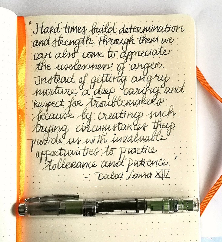
This quote from the Dalai Lama is encouraging and definitely struck a chord:
Trying times

“Hard times build determination and inner strength. Through them we can also come to appreciate the uselessness of anger. Instead of getting angry nurture a deep caring and respect for troublemakers because by creating such trying circumstances they provide us with invaluable opportunities to practice tolerance and patience.” his holiness the Dalai Lama XIV


Something to ponder on with my next meditation session...

Thank you for stopping by and wishing you all a wonderful day.

namasté

2016/11/14

Mailart Monday: A simple Thank You

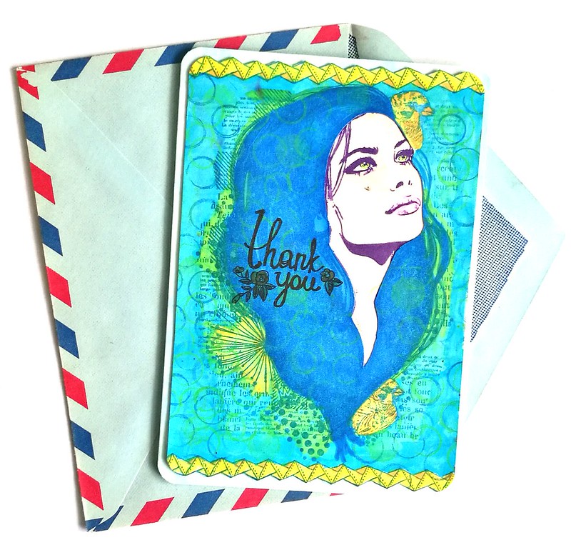
thank you card
In the times we live in, we often take things for granted. Sometimes a simple gesture, like sending a thank you card to someone, can make a big impact. It will at least bring a smile to someone's face and show them that they are appreciated. For this mailart monday I made a thank you card using stamps from Carabelle Studio's, Katzelkraft and Studio light.

thank you card
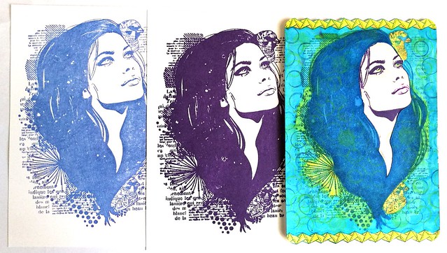
I used this stamp from carabelle studio's as focal point. I made a layered card because I wanted her hair blue and her face more pronounced in purple. With an exacto knife I cut out the shape of her face on the blue stamped card and I adhered it on top of the purple one. It gave a beautiful sharp focus on the woman's face.

thank you card
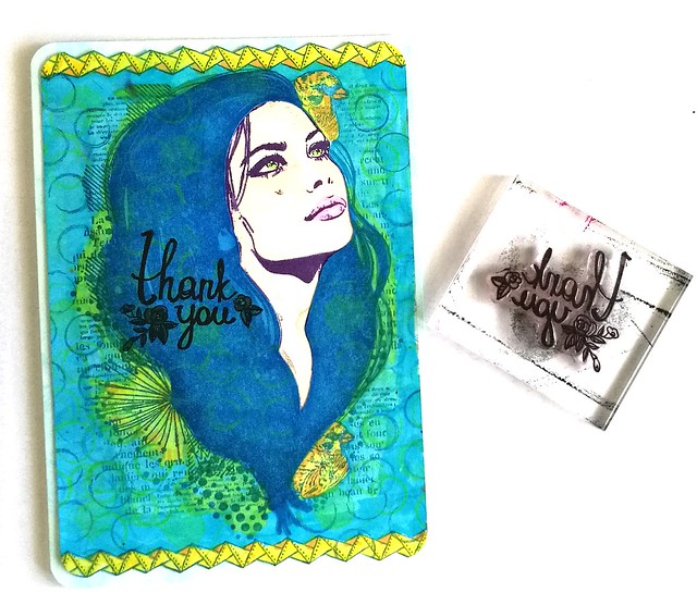
The card is colored with blue and yellow promarkers. I then stamped the Les Ronds stamps from Katzelkraft. I stamped it with memento paris dusk and staz on opaque green on her hair as well. For the top and bottom I used one of the borders and colored that yellow. I cut out the edges of the border. This beautiful handlettered thank you stamp is from creative chalk/studio light which I stamped with Staz On black.

thank you card
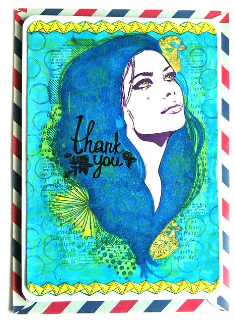
I gave her face subtle colors and highlighted her eyes and lips with promarkers. Then adhered her on a double sided card and rounded off the corners with a punch. She is now ready to be mailed and hopefully the receiver will be aware of the fact that they are appreciated.

Entering this for the november 2016 Craft Stamper Magazine "take it make it" challenge.

Thank you for stopping by and have a wonderful day.

namasté